
Bereft Nothing vs. Fecund Nothing (or Broken Icons vs. Glitched Gifs or the Dead End Zero vs. the Via Negativa)
Curt Cloninger
1. bereft nothing
media which (paradoxically/merely) re-present the impossibility of representing "nothing."
Such media enlist the viewer as a meaning-making machine, in order to make the meaning of "nothing."
Although a limit of the semiotic system is indeed approached, the system itself necessarily remains intact and un-exceeded. The viewer resides within and functions to maintain the system. The system continues to function well enough to represent its inability to represent.
Such media looks "like" nothing, but "nothing" is not experienced.
Two Bereft Nothings
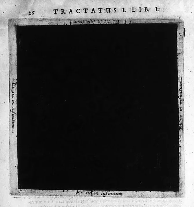
Robert Fludd's 1617 re-presentation of the formless pre-universe, and the "broken image" icon.
"Presentation... is presented in its very inadequation, adequate to its inadequation. The inadequation of presentation is presented" (Derrida) [1].
2. fecund nothing
media which trigger aporia in the viewer in order to engender a kind of supra-semiotic experience of nothing.
Such media enlist the viewer as a meaning-making machine in order to sabotage that meaning-making machine, so that other affective, material, a-linguistic forms of experience may rise to the surface. The semiotic system is not "dismantled" (impossible), but rather used as a launching pad to bootstrap an accompanying affective experience which then exceeds it.
Two Fecund Nothings
Arakawa + Gins installation and book project, The Mechanism of Meaning, and glitched digital media are examples of this more apophatic approach. Surfaces are not merely occluded, blackened, or erased. Instead, the mechanisms by which surface effects are produced and by which they are "read" are themselves foregrounded and destabilized, deferring the semiotic finality of the surface image.
Bereft Nothing vs. Fecund Nothing
1. bereft nothing
It is important to note:
Affect and semiosis are always already occurring with both of these media tactics. (How could they not be?) Both affect and semiosis are refracting through and folding in and out of one another. The difference is simply this: the "bereft nothing" tactic calls on the viewer to ignore the (often considerable) affective and material excesses produced by its semiotic paradox. Such excesses are treated as incidental and are not purposefully exploited. Whereas the "fecund nothing" tactic uses the ever-present regime of semiotic meaning-making as a lure which then becomes a trap, the aporia of which is purposefully meant to release an excess of experiencable affect.
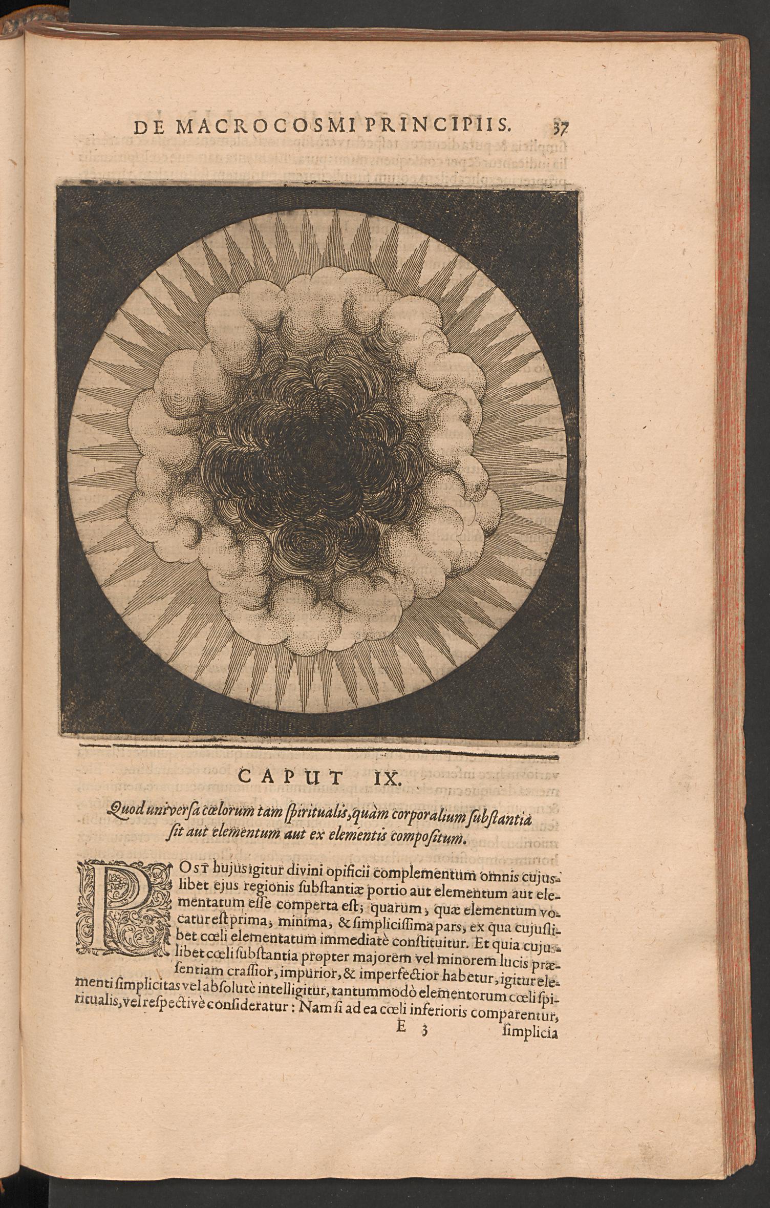
In 1617 Robert Fludd writes a book called THE HISTORY OF THE TWO WORLDS (macrocosm and microcosm), or, more properly, Utriusque Cosmi, Maioris scilicet et Minoris, metaphysica, physica, atque technica Historia (The metaphysical, physical, and technical history of the two worlds, namely the greater and the lesser).
In it, Fludd famously illustrates the formless pre-universe made of a material called "hyle.”
Fludd *writes* of hyle:
"This primal material is a primordial, infinite, shapeless existence, as suitable for something as for nothing; having no size or dimension, for it cannot be said to be either large or small; having no qualities, for it is neither thin, nor thick, nor perceptible; having no properties nor tendencies, neither moving nor still, without colour, or any elementary property..." [2]
An admirably apophatic bit of writing. In the above paragraph, Fludd presses us into service as meaning-makers, only to confound our ability to make meaning.
But...
When Fludd transitions from writing about hyle itself, to writing about his own visual representation of hyle, the disclaimers begin:
Fludd on visually representing hyle:
"...And here, honestly following the descriptions of Mercurius Trismegistus and Moses, we have painted an imaginary picture of this formless matter, as a black smoke, or vapour, or a dreadful gloom, or the darkness of an abyss, or, in a word, any kind of unfinished, raw, impalpable material.""[3]
Fludd freely admits the failure of his image to properly illustrate formlessness. "we have painted" (but it is actually a Matthäus Merian etching). "imaginary picture" (a kind of double remove from actual stuff). hyle "as" a list of analogs (falls back on analogical adequation. a further [thrice] remove). Fludd is bracketing our expectations of the picture. Don't expect it to convey too much semiotic meaning.
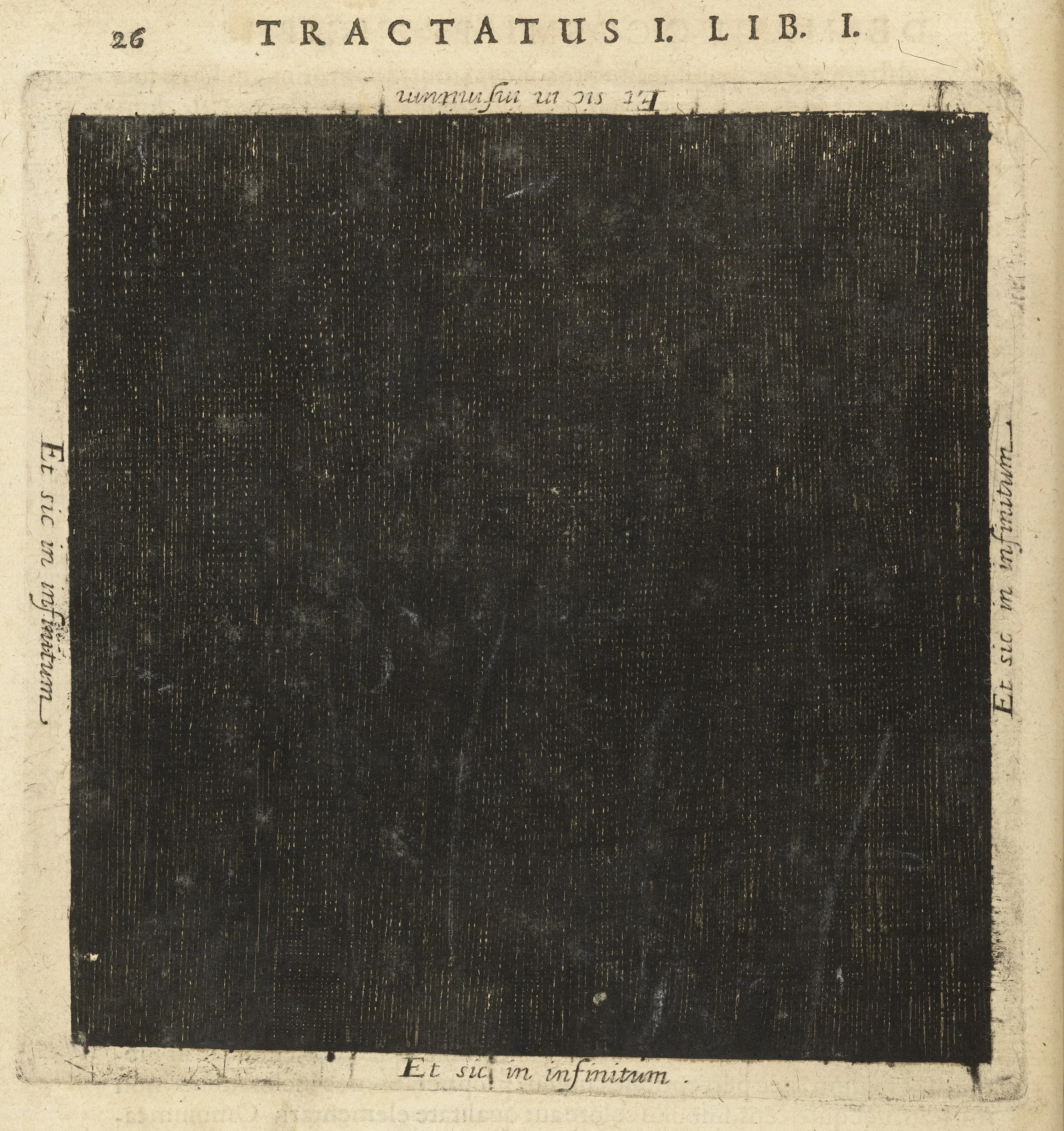
And so *here* *is* (a digital representation of) (one insantiation of) Hyle's famous image of *nothing.*
(Et sic in infinitum = And so on to infinity)
Handy instructions for navigating nothing: Clicking on the image will open it in a new browser tab. Clicking on it again will magnify it to full resolution. Scroll up and down to explore. Close that browser tab to return to this page.

But...
the image is actually doing much more than Fludd claims. It is veritably exuding excessive material affect (all of which Fludd means us to ignore as merely incidental). Instead, we are going to ignore Fludd, and get into the materiality of the image.
The Square (into circles)
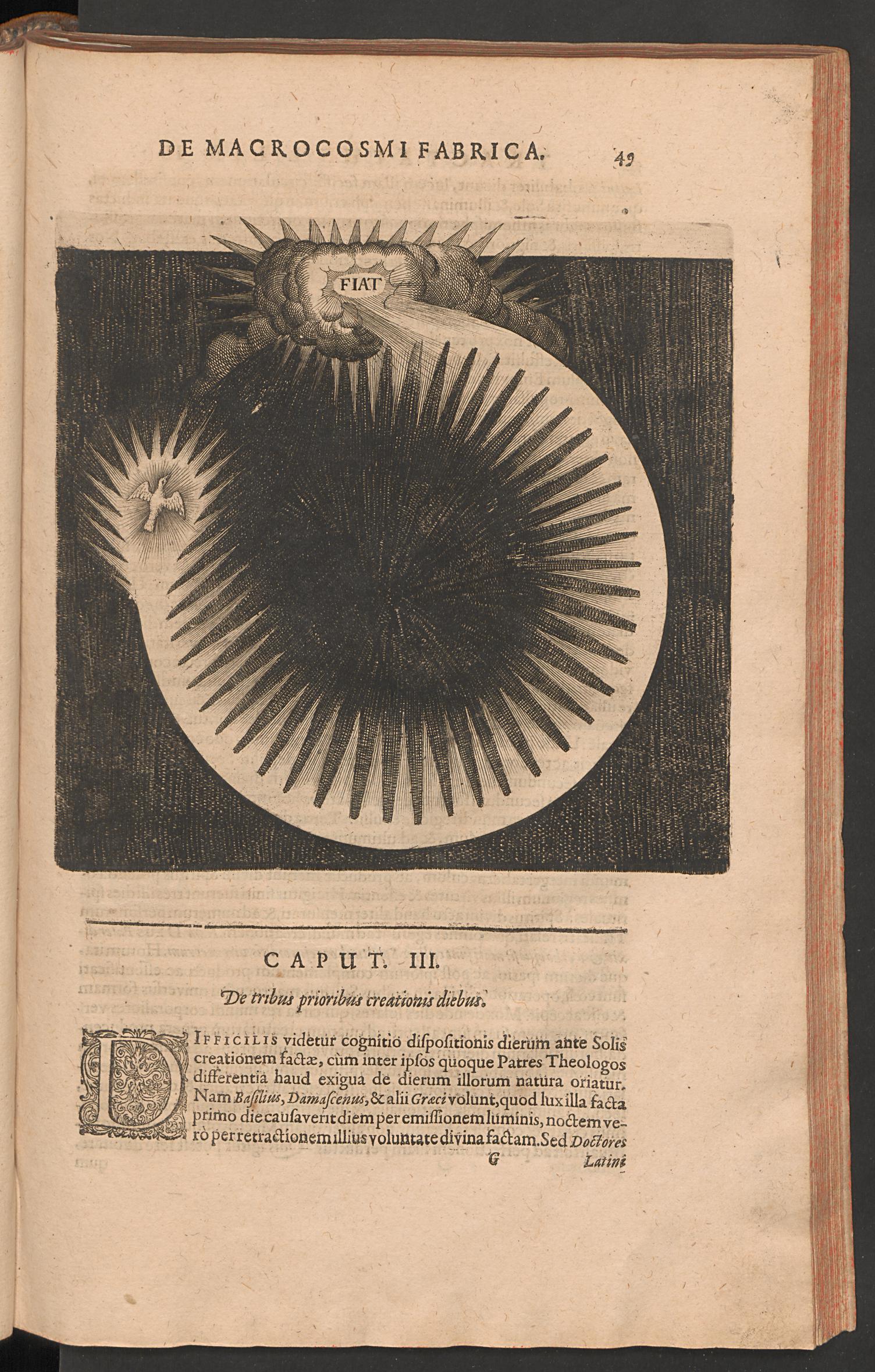
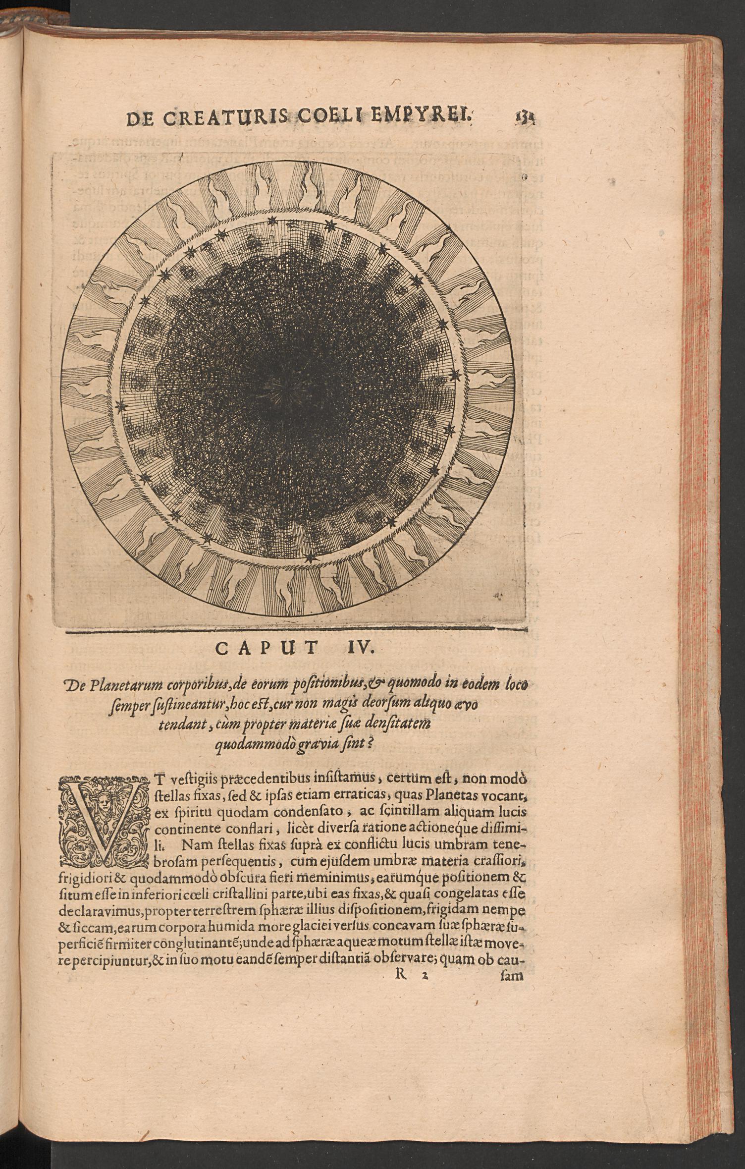
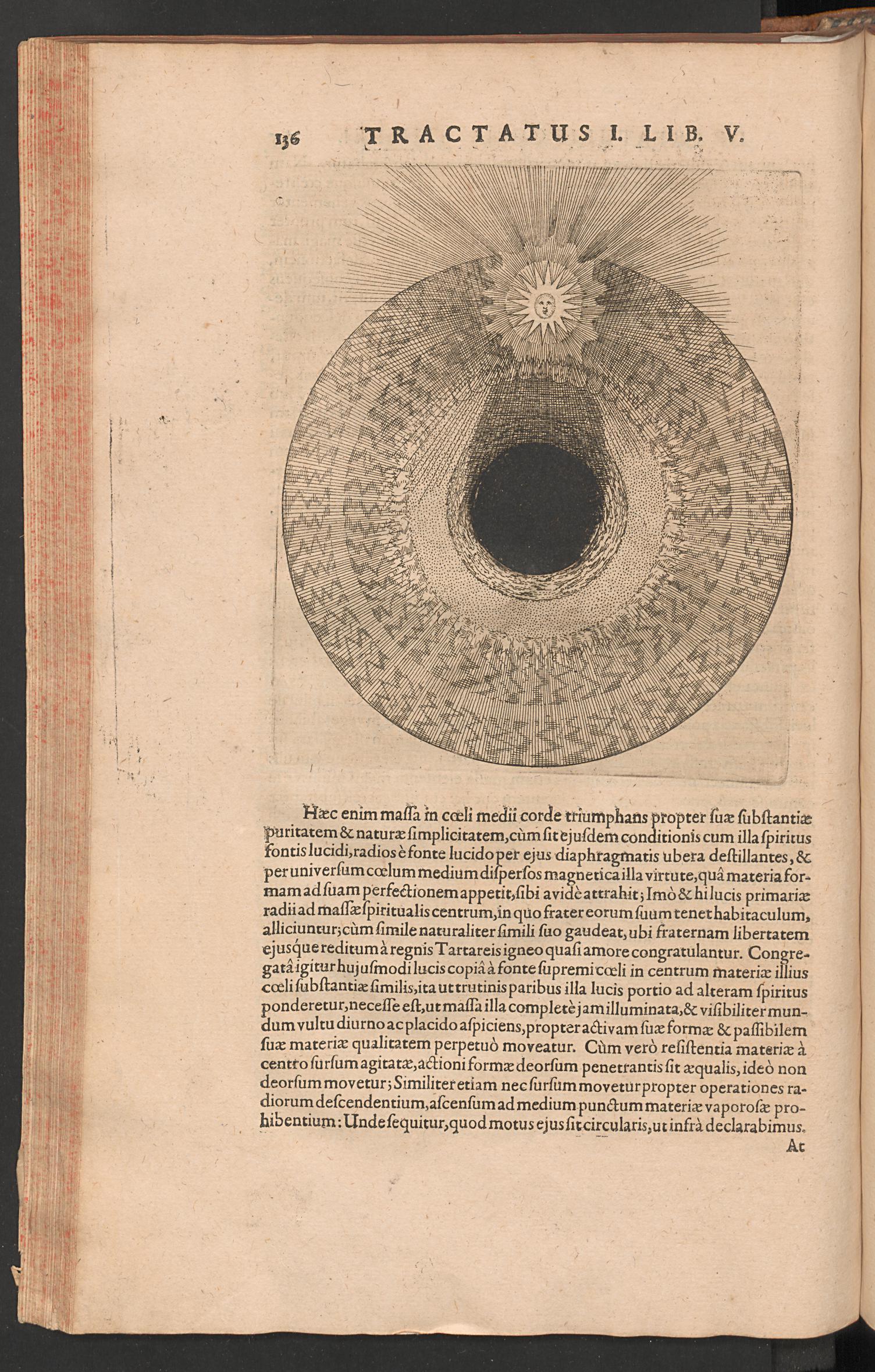
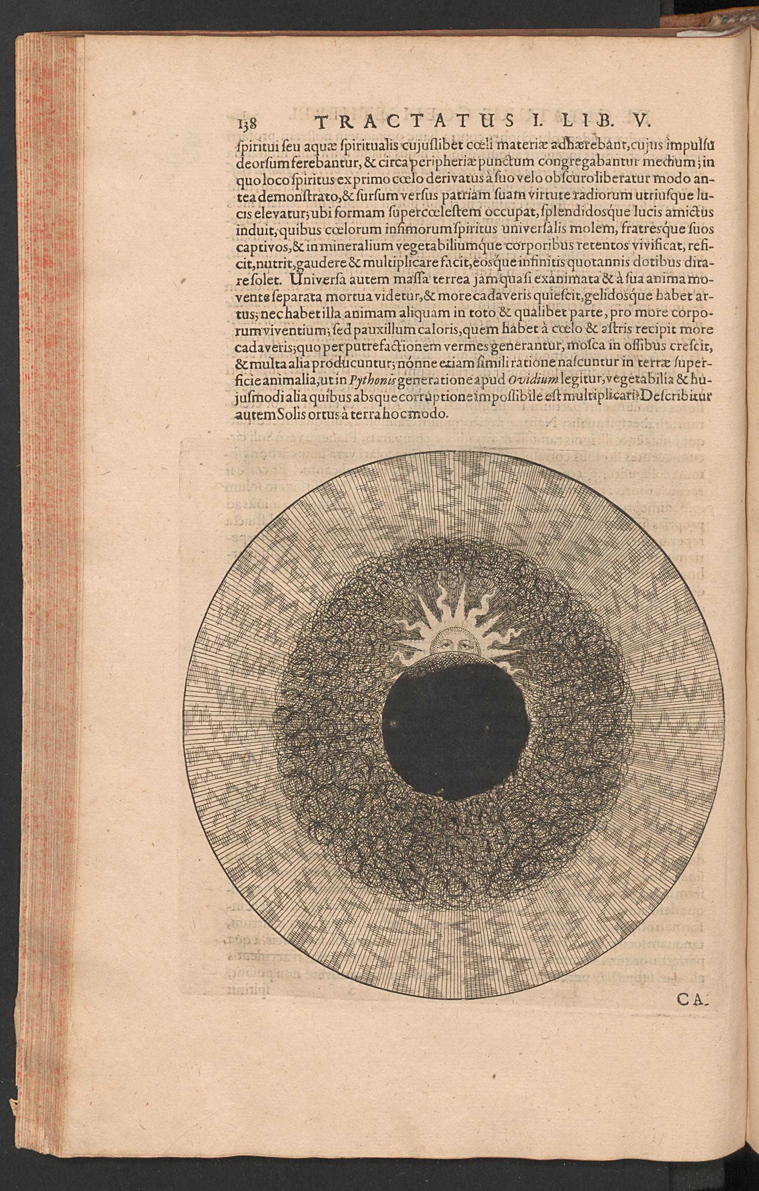
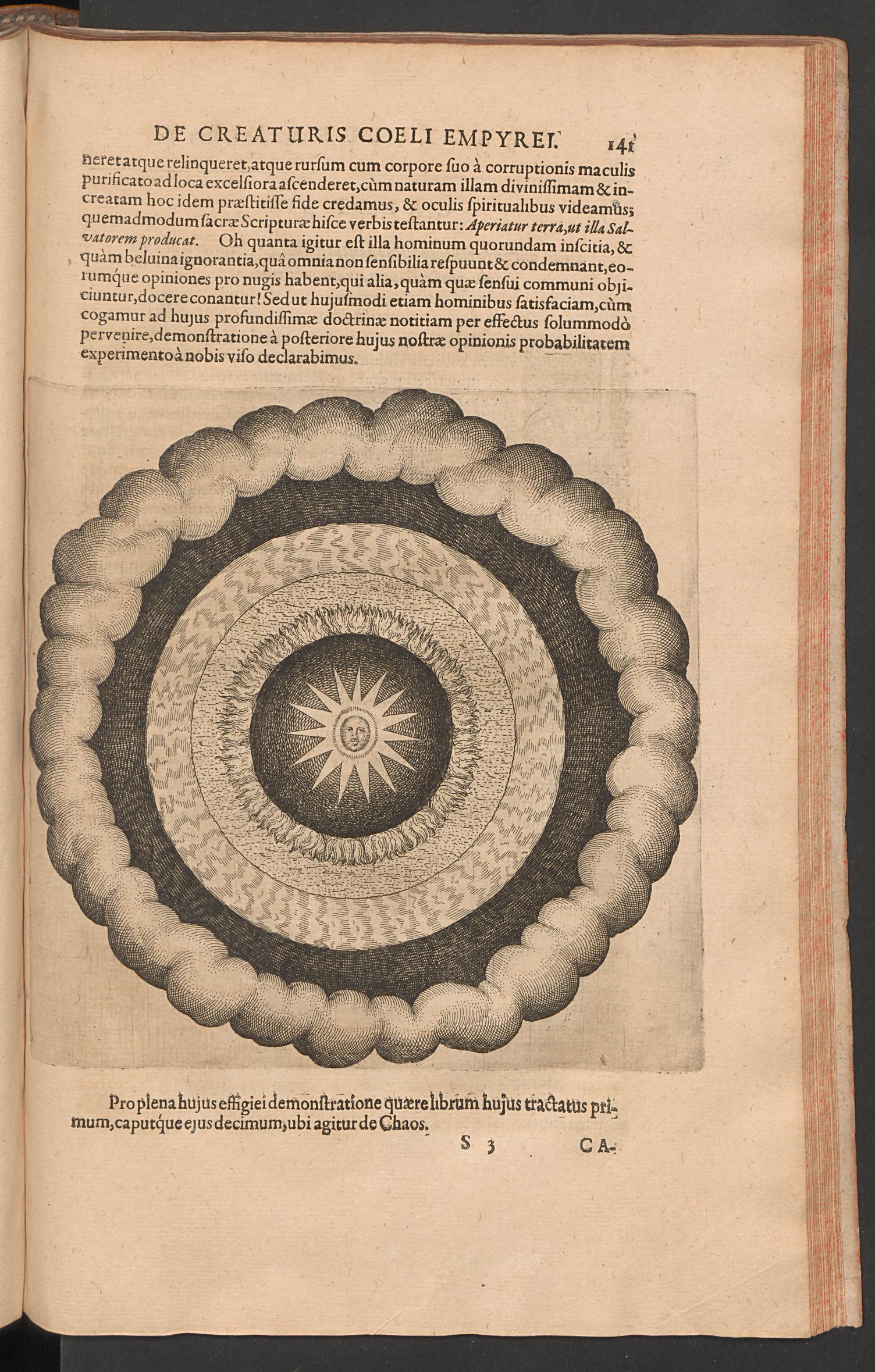
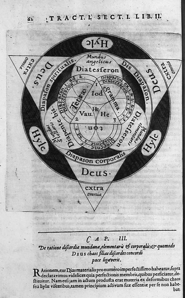
Below is Fludd's illustrated version of the progressive creation of the macrocosmos.
Why is the created cosmos a circle? Because Mercurius Trismegistus says God's creative light turned back on himself (a hermetic, theological reason) [cf: the second image (p.49) in the sequence below]. In a later diagram (at the very end of the sequence of images below), Fludd labels the space outside of the circle of the cosmos extra omnia = outside of everything.
Handy instructions: Click on the image to advance forward. Click on the arrows to move forward or back.
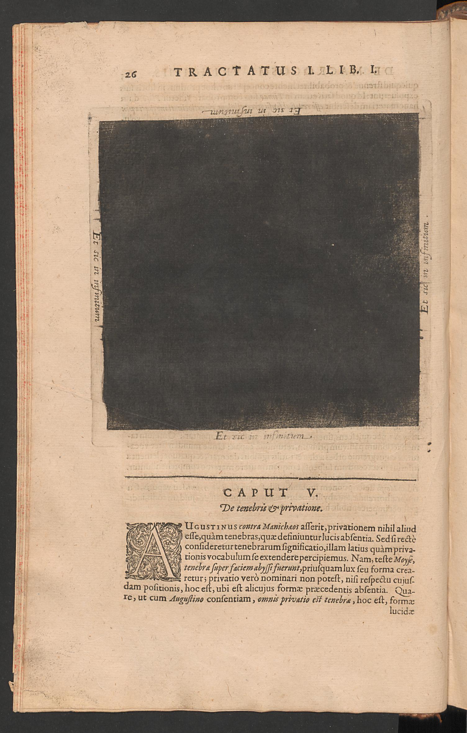
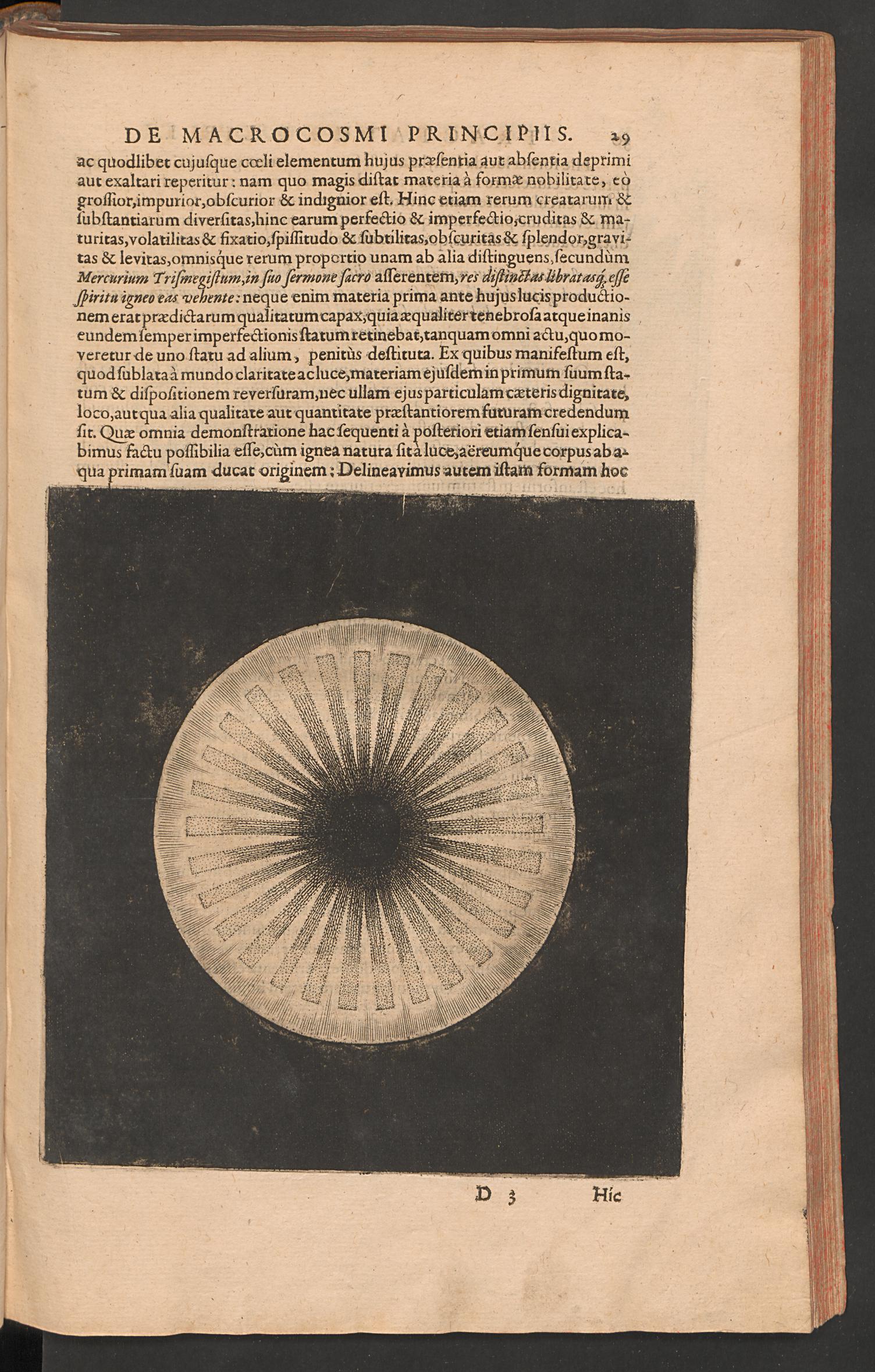
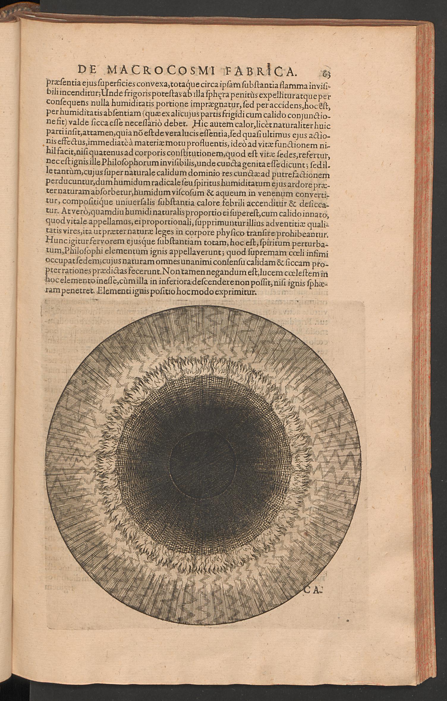
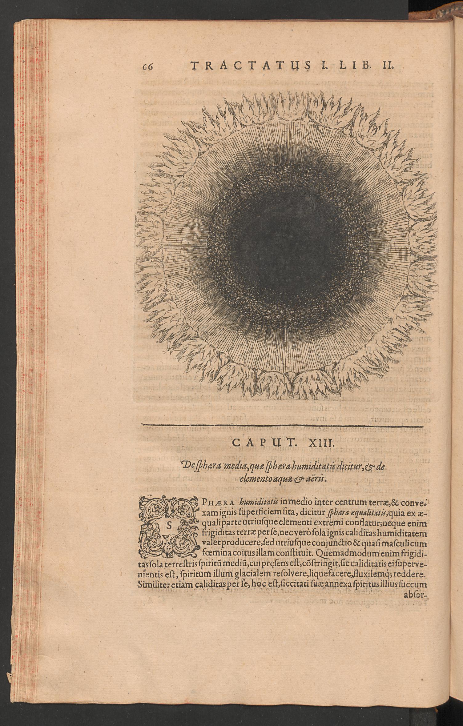
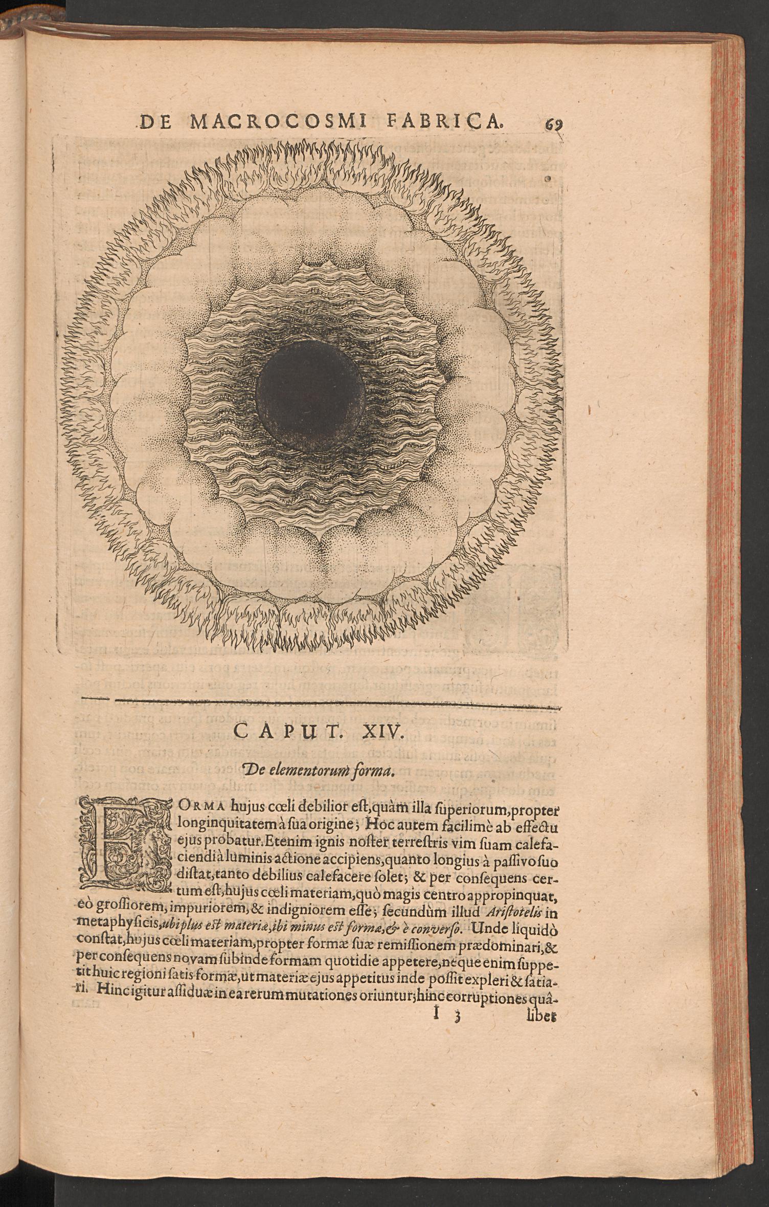
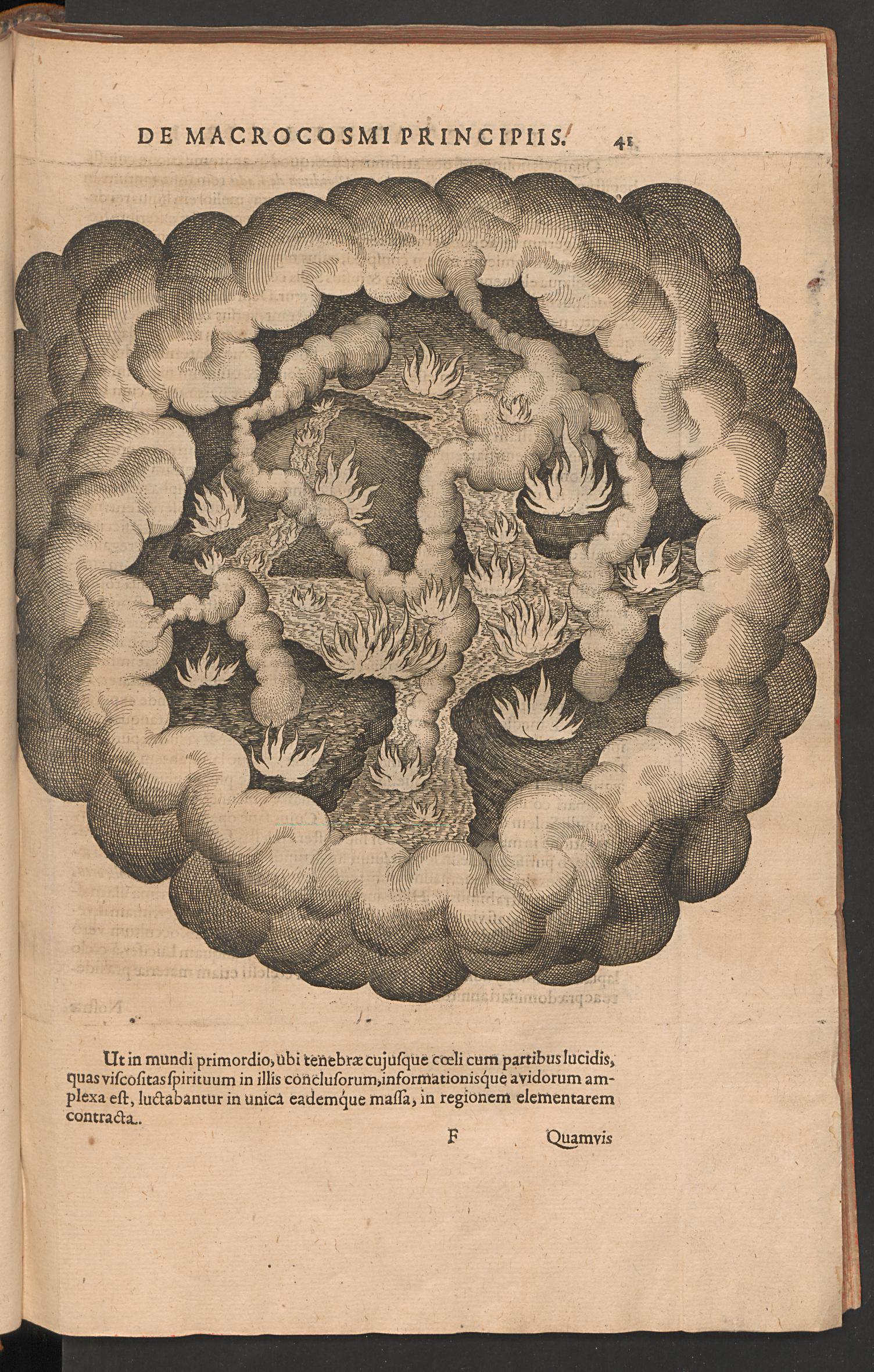
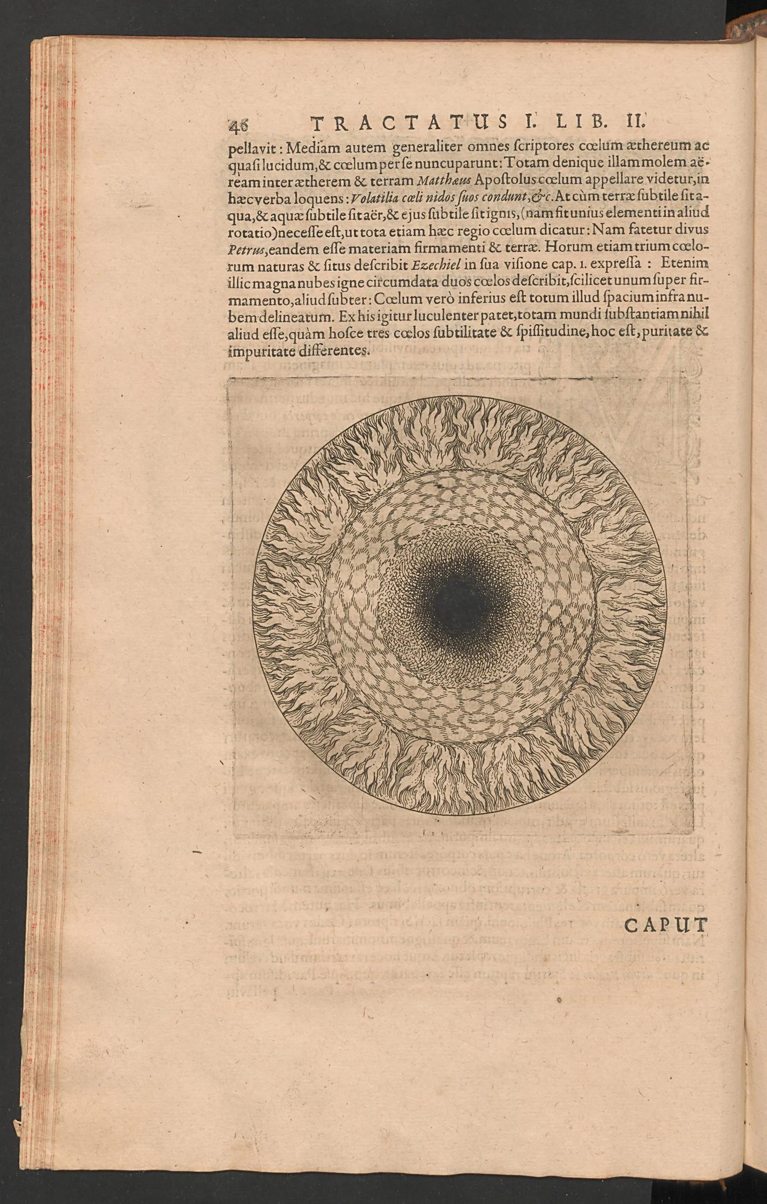
So then why does the primordial nothing begin as a square? The answer is technical, not theological. The hyle must seek and attempt to exceed the very edges of media representation, and in Fludd's case, those edges happen to be a square copperplate. Why square? Because paper pulp dries most readily on a wire mesh grid. Because the etching must fit on the rectangular page of the book. Because it is more cost-effective to cut a flattened copperplate into squares than into circles.
All these material processes and histories are now brought into view once the medium is hypertrophied. But Fludd purposefully and immediately cordons off all these material affects and excesses with his text border (Et sic in infinitum), returning us to the realm of linguistic meaning-making, lest the material get out of hand.
The Crosshatching
Fludd says hyle is homogeneous, because it can't contain varying intensities of heterogeneous difference. But he also says it has no qualities or pattern, and homogeneity seems like a kind of pattern.
Fludd himself sketched the other diagrams in his book, and Matthäus Merian translated his sketches into etchings. Fludd says he painted the hyle diagram, but there is no extant record. What would he have painted? Whatever Fludd's original painting looked like (if there even was one), it was up to Merian to translate Fludd's painting, or his written instructions, into a copperplate etching.
Merian used crosshatching, but the hyle diagram is thicker and less symmetrical than other crosshatched shadows in Merian's other more standard etchings. What drove Merian's formal decision to crosshatch the hyle diagram so asymmetrically?
Such questions foreground the agency of the subcontracted craftsman, and the international chain of production: author Robert Fludd [England] hired publisher Johann Theodor de Bry [Germany] who hired engraver Matthäus Merian the Elder [Switzerland].
Matthäus Merian's Street in a Village with Cow in the Left Foreground. 1620. (note the symmetrical crosshatched shadows)
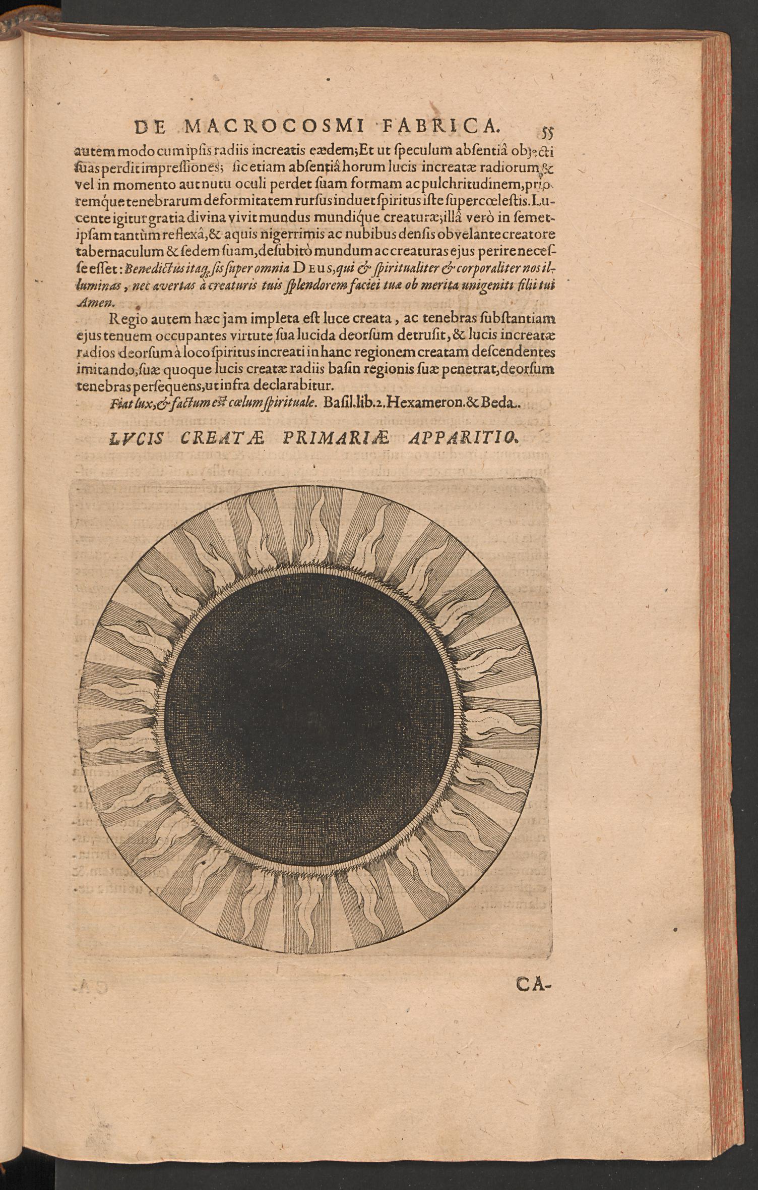
Matthäus Merian etchings from pp. 49 and 37 of The Macrocosm. 1617. (note the symmetrical/directional hatchings of the formed hyle)
THE BLEED (along the x and y axes)
Because of the denser cross-hatching, each individual printing of the hyle plate is more variable than would be in a printing run of an ordinary etched plate. Some inkings of the copperplate retain more ink than others. Some pressings press harder than others. Furthermore, over hundreds of years, due to the density of ink retained by the plate, in various pressings, parts of the ink have flaked off, unevenly exposing areas of the substrate. These material variances don't normally manifest in etchings of cows, but with this particular hypertrophied copperplate, they do.
Below are various printings of the original plate. Along the edges of the etching (x and y axes), almost every printing bleeds differently.
Handy instructions: Clicking on any of the images to see them in a larger size. Click again to advance forwad. Click the arrows to move forward or back.

![Getty Research Institute Library [Los Angeles]](https://images.squarespace-cdn.com/content/v1/53da691ce4b0106ba2018340/1490047810420-HNZ11NEZAJ4YMX62F5CB/Getty_Research_Institute+library_los_angeles_archive_org_26_M.jpg)
![Saxon State Library Dresden [Dresden, Germany]](https://images.squarespace-cdn.com/content/v1/53da691ce4b0106ba2018340/1490047820488-V7LO1YEIANOF1RJHIJV1/Saxon_State_Library-State_and_University_Library_Dresden+26_00000034.tif.large_M.jpg)
![Herzog August Library, [Wolfenbüttel, Germany]](https://images.squarespace-cdn.com/content/v1/53da691ce4b0106ba2018340/1490047830842-WT5O296Z4APV6PR6LUKC/herzog_august_library_26_00024_M.jpg)


THE BLEED (along the z axis)
Also, because the printings are so ink-saturated, they even show through, to varying degrees, on the reverse side of the page (z axis).
Jung Library Zurich. Page 26 (verso) - Page 25 (recto)
Bancroft Library UC Berkeley. Page 26 (verso) - Page 25 (recto)
Getty Research Institute Library [Los Angeles]. Page 26 (verso) - Page 25 (recto)
Saxon State Library Dresden. Page 26 (verso) - Page 25 (recto)
But...
all these curious and unique material properties that emerge due to hypertrophying the medium are bracketed by Fludd as merely incidental. They fall outside of Fludd's circumscribed, hermetically-sealed, semiotic, meaning-making world. And yet, [t]here these material properties all are.
And...
before we move on, just to celebrate the sensual materiality of Fludd's hyle one last time, here is an angled picture I took of the diagram, from the edition housed in Harvard's Houghton Library.
Handy instructions: Clicking on the image will open it in a new browser tab. Clicking on it again will magnify it to full resolution. Scroll up and down to explore. Close that browser tab to return to this page.

Bereft Nothing vs. Fecund Nothing
2. Fecund Nothing
Whereas Fludd's hyle is an example of bereft nothing, enlisting the viewer as a meaning-making machine in order to make the meaning of "nothing;" Arakawa and Gins' installation and book project The Mechanism of Meaning is an example of fecund nothing -- the viewer's ability to make meaning is purposely sabotaged and counfounded, so that other affective, material, a-linguistic forms of experience may rise to the surface. Rather than making the semiotic meaning of "nothing," the viewer is stranded in a state of aporia, unable to make any definitive semiotic meaning at all.
The Mechanism of Meaning is a series of cognitive visual exercises (like in a child's primer for adults) meant to disrupt a person's ability to make meaning.
In the First edition of the book, Arakawa and Gins describe their own goals for the project:
"This project is... an animated... cartoon for [nonsense and/or] meaning. The animation or the mechanism of meaning occurs through... the interaction of languages [visual-verbal-tactile etc.] by the viewer working out the exercises on his own terms (sense or nonsense)...
...to increase the effort required (and thus make it more apparent?) and to prolong the time necessary (to allow enough time for the setting of a trap?) for the viewer's mechanism of meaning to operate..."
"Of course you are the mechanism of meaning."[4]
Later the artists deemed the descriptive sections above to be over-determining and removed them from all subsequent editions.
The entire series of exercises was shown in solo shows at several locations (initially hung on walls, and later placed on the floor as installations). The exercises are also published in 4 different book editions, each a revision of the last. All of this occurred over a period of about 40 years.
The Curious Case of the Dot (Edition 1)
Below is the first exercise in the entire series as it appears in the first edition of the book. The initial straightforwardness of the exercises is the Trojan horse, the lure, the trap, the (false) promise of semiotic understandability.
Handy instructions: You may want to clean your computer monitor before participating in this exercise: Clicking on the image will open it in a new browser tab. Clicking on it again will magnify it to full resolution. Scroll up and down to explore. Close that browser tab to return to this page
![Edition 1 [Full page view]](/s/1a_dot_full.JPG)
Edition 1 [Full page view]
![Edition 1 [Detail view]](/s/1b_dot_detail-6hhg.JPG)
Edition 1 [Detail view]
The Curious Case of the Dot (Edition 2)
Now let's look at the same exercise in the subsequent edition (2) of the book. Some of the edition revisions are overt and intentional (color, additional figures), but others differences seem slight and incidental, and some differences seem outright accidental. (It is worth noting that the edition 3 instance of this exercise is identical [more or less] to the edition 2 instance.)
Where is the dot in the left-hand circle section? Why is the dot present in the circle section of the accompanying installation documentation? Is this dot discrepancy intentional? Is it a misprint (and if so, why did they re-misprint it again in Edition 3)? Are those extra subtle dots actually just dust on the book page? Are they dust on my digital camera? (These are my books. I took these pictures.) Or are they dust on your screen?
Handy instructions: Clicking on the image will open it in a new browser tab. Clicking on it again will magnify it to full resolution. Scroll up and down to explore. Close that browser tab to return to this page.
![Edition 2 [Full page view]](/s/2a_dot_full-r6xl.JPG)
Edition 2 [Full page view]
![Edition 2 [Detail left hand]](/s/2b_dot_detail-9bcw.JPG)
Edition 2 [Detail left hand]
![Edition 2 [Detail installation documentation]](/s/2c_dot_detail_installation.JPG)
Edition 2 [Detail installation documentation]
The Curious Case of the Dot (Edition 4)
Now here is the same exercise in Edition 4 of the book (which appears as part of the catalog for their 1997 Guggenheim show).
The dot has returned to the (now right-hand) circle section. But what on earth is going on in the documentation of this instantiation of the installation? (Scroll down for detail views.)
![Edition 4 [Right-hand view]](/s/4a_dot_full.JPG)
Edition 4 [Right-hand view]
![Edition 4 [Detail, right-hand]](/s/4c_dot_detail.JPG)
Edition 4 [Detail, right-hand]
![Edition 4 [Detail, installation documentation]](/s/4b_dot_detail_installation-8bpy.JPG)
Edition 4 [Detail, installation documentation]
![Edition 4 [Super Detail, installation documentation]](/s/4b_dot_double_detail-gs9m.JPG)
Edition 4 [Super Detail, installation documentation]
The Curious Case of the Dot (Edition 5)
And finally, the same exercise, not from a book or an installation, but from the website edition of the exercises (which I'm calling Edition 5).
The main (?) dot has again disappeared from the circle section. The other (minor? incidental?) dots cannot be dust on *my* digital camera or *my* book, since *this* digital image was downloaded directly from *their* web site.
![Edition 5 [screenshot]](/s/5b_Mechanism-of-Meaning-1-Neutralization-of-Subjectivity-panel-1.jpg)
Edition 5 [screenshot]
(Yikes!)
Since Arakawa and Gins mean to undermine the viewer as a meaning-making machine, suddenly all of these material, technical, incidental(?) differences refuse to be bracketed as non-meaningful. These differences keep asserting themselves back into the frame. What are we to make of them? And this is just the first of dozens of similarly destabilizing exercises! All of these exercises approach "nothing" in a fecund way. They don't attempt to re-present nothing. Nor do they occlude a visual something. These exercises approach nothing because they confound our ability to make something of them. They approach nothing because we can make nothing (definite) of them.
Whereas Fludd means us to regard differences between the various hyle printings as "merely" technical and incidental, in The Mechanism of Meaning, such differences become centrally relevant. Or, more precisely, our inability to conclusively determine whether or not they are relevant becomes centrally relevant (perhaps).
Which leads us to...
Any rigorous attempt to undermine the viewer as a semiotic meaning-maker will eventually lead to a re-estimation of the contingent relevance of the formal, technical, material aspects of media.
FURTHERMORE, such underminings destabilize old semio-centric, anthropo-centric regimes and lead outward + inward toward surfaces and substrates and materialities and affects, distributing and dispersing the semiotic realm into flows, economies, processes, materials, bodily ways of knowing, and affective resonances + forces. Humans are undone as primarily meaning-making machines and distributed more fine-grainedly into broader ecological flows.
Footnotes
[1] Jacques Derrida, The Truth in Painting (Chicago: University of Chicago Press, 1987) 131.
[2] Robert Fludd, The Origin and Structure of the Cosmos, trans. Patricia Tahill (Edinburgh: Magnum Opus Hermetic Sourceworks, 1982) 21.
[3] Ibid.
[4] Shūsaku Arakawa, Madeline Gins, and Lawrence Alloway, Mechanismus Der Bedeutung [werk Im Entstechen: 1963-1971] (München: Bruckmann, 1971) 27. Note: The original text is in German. This English translation is from a hand-typed insert on "Ronald Feldman Fine Arts Inc." letterhead which was found inside the used copy of the edition I purchased through the internet. At the bottom of the insert is typed "Arakawa, Mechainsm of Meaning / Verlag F. Bruckmann KG / (Munich, 1971)”.
This page is adapted from a presentation I gave at the "[image here]" conference at Harvard in 2016. Thanks to Felix Burgos for helping wrest it into its present form.
Curt Cloninger is an artist, writer, and Associate Professor of New Media at the University of North Carolina Asheville. His art work has been featured in the New York Times and at festivals and galleries from Korea to Brazil. Exhibition venues include Centre Georges Pompidou (Paris), Whitney Museum of American Art (New York), Granoff Center for The Creative Arts (Brown University), Digital Art Museum [DAM] (Berlin), Ukrainian Institute of Modern Art (Chicago), Black Mountain College Museum + Arts Center (Asheville), and the internet. He is currently writing his fifth book, entitled Some Ways of Making Nothing: Apophatic Apparatuses in Contemporary Art. Curt maintains lab404.com , playdamage.org , and deepyoung.org in hopes of facilitating a more lively remote dialogue with the Sundry Contagions of Wonder.