Cargill is an American agricultural corporation, that was established in 1865 in Minnesota. One of the top15, according to Fortune 500, USA companies, Cargill specializes in agricultural services and management as well as health and Pharma segments. The company is privately owned.
Meaning and history
Cargill is a large U.S. agricultural corporation that is one of the top 10 largest companies in the world. Cargill operates in four main areas: agriculture, food service, financial services, and industry. The company employs approximately 170,000 people in offices and facilities around the world.
The American private corporation was founded by the Cargill and McMillan families in 1865. Its development began with the purchase of a small barn to do business in Iowa. From its founding to the present day the corporation has been a leader in its field. Gwendolyn Sontheim Meyer, the heiress to the Cargill agricultural empire, owns 7% of the stock.
What is Cargill?
Cargill is the name of a huge American agricultural corporation, which supplies food, agricultural, financial, and industrial products, and services worldwide. Founded in the middle of the 19th century, today Cargill is one of the world’s top10 largest and most influential companies.
1865 – 1930
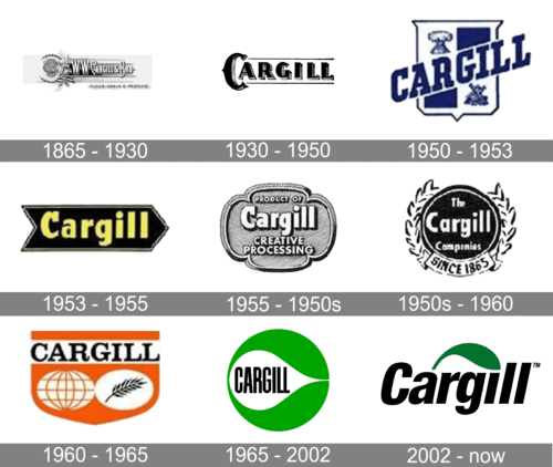
The very first Cargill logo was created in 1965 and stayed active for more than sixty years. It was a traditional composition, formed by an emblem, depicting a stylized monogram with intertwined letters in different fonts, followed by a title case maceio the in a fancy serif font with elongated lines, tall contours and sharp corners of the characters. All letters were set in white and featured thin outlines and light shadows, which added volume to the composition.
1930 – 1950
The redesign of 1930 has created a modern and simple version of the Cargill badge, with just the stylized logotype written against a white background and enclosed between two thin horizontal lines, coming out of the enlarged “C” to the right. The first letters of the inscription was set in a wishbone style, while all.
Other characters featured a more traditional serif font.
1950 – 1953

The very first logo for the American corporation was introduced in 1959 and boasted a classy traditional crest with a massive diagonally placed logotype, crossing it. The image was executed in a blue and white color palette, which looked bright and fresh, evoking a sense of professionalism and reliability.
1953 – 1955
The redesign of 1953 introduced a more modern and minimalist Cargill badge, where the bold yellow lettering in a title case was set on a black background, which had a horizontally stretched arrow shape and boasted a thin black and yellow outline. It was a simple yet memorable and powerful badge.
1955 – 1950s
In 1955 the Cargill visual identity gets redesigned again, and this time the new concept is being used by the company. The refreshed Cargill badge features a smooth shape or a rounded crest with thick curved lines framing it. The main logotype was set on the upper part of the badge and had two lines of additional lettering in a traditional sans-serif, set under it.
1950s – 1960

In the late 1950s, the badge gets more powerful and slightly aggressive but adopting a solid black circle as its main element. The white lettering was set on it in three levels. The black medallion was outlined in white and black and accompanied by an ornate leaf wreath, with a ribbon arched along its bottom part. On the ribbon, there was a bold black “Since 1865” datemark.
1960 – 1966
The redesign of 1960 introduced a bright modern Cargill badge, where three elements were set on a bright orange background, which featured a pennant shape. The upper part of the badge was taken by a white horizontally set rectangle with enlarged black logotype in an elegant serif typeface. As for the main part of the pennant, it has a white and orange globe image on its left part and a white circle with a black spike on the right.
1966 – 2003

In 1966 the logo was changed again. The new badge got a green, white and black color palette and a completely new design. It was a bright green circle with a white drop placed in its middle and horizontally oriented. On the white background, there was an uppercase black logotype executed in a modern narrowed sans-serif with bold lines of neat letters.
2003 – Today
The Cargill logo is a tribute to the company’s agricultural heritage. Green, being one of two main colors of the brand’s visual identity, symbolizes nature with its energy and the company’s progressive approach to it.
The Cargill logo is composed of a wordmark with a graphical symbol on its top and a company’s motto on the right.
The brand’s name inscription is executed in a bold italicized sans-serif typeface, which is close to Helvetica Neue Cond Bold Oblique, created by Eduard Hoffman and Max Miedinger. The font looks strong and solid and reflects the company’s power and trustworthiness.
The stylized leaf, placed above the wordmark, starts from the top of the letter “A” and ends above the “I”, replacing its dot. Its elegant rounded shape adds brightness and sophistication to the logo, celebrating the brand’s heritage. The symbol was inspired by the original Cargill logo, designed in 1966.
The company’s motto “Helping The World To Thrive” is placed in the right from the nameplate and set in three levels, executed in black and “Thrive” in dark green, corresponding to the emblem’s color.
Font and color
The elegant yet solid and confident logotype from the primary badge of Cargill is set in a classy traditional sans-serif typeface, which looks very similar to the iconic Neue Helvetica Pro 87 Condensed Heavy Oblique font.
As for the color palette of the Cargill visual identity, it is set in a strict combination of black and dark green, which looks professional and serious, showing the company as a reliable and trustworthy one.


