

![]() Carrefour Logo PNG
Carrefour Logo PNG
Carrefour is a brand of a French hypermarket chain, which was established in 1958. Today the company has more than ten thousand retail stores mainly across Europe and is one of the most famous shopping destinations.
Meaning and history
![]()
The name of the company, Carrefour, translates from French as “Crossroads”. And the visual identity of the famous store chain has always been based on its name’s meaning.
What is Carrefour?
Carrefour is the name of one of the most famous and visited supermarket chains in Europe. The company started in France and today has dozens of stores in many European countries, offering its customers a wide range of foods and cosmetic goods, along with clothing and home decor items.
1960 – 1963
![]()
The very first insignia of the company was designed in 1960 and featured a lowercase inscription, horizontally placed inside a white cross, which was located on a dark rhomboid background. It was a graphical interpretation of the crossroads, pretty nice and simple, yet stayed for only three years.
1963 – 1966
![]()
The redesign of 1963 brought hew shape to the emblem and new color palette. Now the black lettering was placed on a white horizontal stripe, located on a red circle and two white arrows were pointing the lettering from up and down. The logo also didn’t last long, but the “two arrows” concept became a basis for the brand’s iconic logo design.
1966 – 1972
![]()
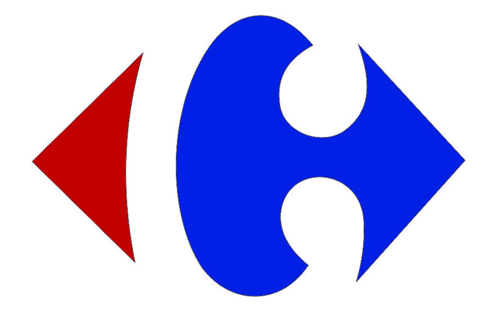
Miles Newlyn creates the legendary logo in 1966. It hasn’t changed much by today, as it was a brilliant idea and professional execution. The logo is composed of a bold white letter “C” placed on a red and blue rhombus.
It is pretty difficult to see the letter, as the famous emblem is usually seen as two arrows, red and blue, pointing to the different sides of the center. But once you pay attention to the negative space between the arrows — here it is.
The color palette of the visual identity is a tribute to the French tricolor, reflecting the company’s roots and heritage.
1972 – 1982
![]()
As for the wordmark, it was placed under the emblem and drawn in blue.
1980 – 1982
![]()
The designers preserved a rhombus with the company’s initial, which also formed two arrows that the company became associated with. They brought back the darker blue color palette, similar to the one seen back in 1966. In addition, the name was capitalized, which gave it more significance. Otherwise, the logo stayed very much like the previous version.
1982 – 2009
![]()
The Carrefour logo designed in 1983 was fully based on the previous version, but the color palette was slightly elevated and darkened up, while the lines of both the emblem and the lettering were cleaned and strengthened. The inscription changed its style from the lowercase to the title case, which added more professionalism to the logo and started evoking a sense of trustworthiness and reliability. The lines of the letters became bolder and more stable.
2009 – Today
![]()
The current version was created in 2009, it was a delicate redesign of the previous version, held by Wolff Olins. Not much changed, just the blue color gained a lighter shade and the typeface of the inscription was refined, as well as the contour of the white “C” on the emblem.
Font
The typeface from 1966 was executed in the lowercase and used an old-style font, which was similar to French Typewriter Bold. The “C” on the emblem was executed in the same font, with a bold circle on the ends.
The typeface was changed to a bolder and more modern one in 1985. Now it was a Typewriter Serial Extra Bold, and the first “C” was capitalized.
The current logotype is executed in a more elegant and sleek serif typeface, which is pretty close to Cooper Medium font with its clean lines and rounded serifs, but the letter “C” is modified — its ends have larger circles.
Review
The iconic French supermarket chain has everything you may need — from fresh foods from all over Europe to outdoor furniture and plants. The selection of items here is really impressive, and all the clothing and homeware goods are sold at pretty affordable prices.

All the supermarkets have also huge para-pharmacy departments, where a wide range of supplements and hygiene products are available, along with the skin and body care products and perfumes. The stores also affect the selection of make-up and hairstyling goods.
As for the main department, grocery, Carrefour offers a huge range of fresh and frozen meat and seafood, dairy products and cheeses from Italy, France and Germany, charcuterie and bakery, along with fresh and organic fruits and vegetables.
There is also an International department, where you can find groceries from all over the world. A big selection of sauces, frozen foods, and wines.
The culinary section is full of ready to eat and ready to cook dishes, including pasta, salads, pies, meat and vegetarian plates cooked according to the recipes from different cultures.
The company offers a bonus discount card for its customers and constantly run different special offers and deals, where you can collect a point for your purchases. There is also an opportunity to shop online via the Carrefour website or their beautifully designed mobile app, which is available for both iOS and Android operating systems.


