The top league of the Italian football league system, Serie A was established in 1898. Taking into consideration such a long history, it’s only natural that the league’s logo has undergone considerable modifications.
Meaning and history
Italian Serie A is one of the most reputable national leagues in the history of football. Formed in 1898, the league adopted the current competition format in 1929. Until then, the competition was held at the regional level and followed by a Serie of finals.
Today the championship in Serie A includes twenty teams, which face each other both at home and away. The three teams, which take the last positions in the tournament line-up, give way to the three best teams from the Serie B, the second-level league of Italian football. The three teams, taking the highest lines in Serie A qualify for the European Cups.
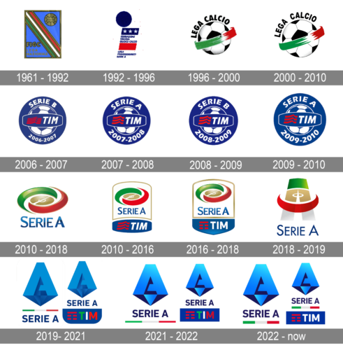
As for the visual identity, the Italian football league has had an impressive amount of redesign throughout the years, jumping from square geometry to circular, and finally switching to a unique three-dimensional emblem in a bright shade of blue, which today is recognized all over the globe.
What is Italian Serie A?
Italian Serie A is the top-level football league in the country. It was established in 1898 and in 2020 it gained the status of the world’s strongest national league. Today Serie A is composed of 20 professional football clubs, which compete for the Scudetto and Coppa Campioni d’Italia, the league’s trophies.
1961 – 1992
The Serie A logo, designed in 1961, was one of the most long-lasting in the federation’s history. This simple yet professional and strong badge stayed for more than thirty years and started being synonymous with the Italian Serie A. So it’s was a vertically oriented Neue rectangle in a thin gold outline with a diagonally stretched Italian flag coming from its upper left to the bottom right corner. Each stripe of the flag was separated from another with a thin gold line. In the upper-right blue triangle, there was a gold drawing of a football, while the bottom left contained a gold “FIGC” monogram in a black outline and the smaller gold “Lega Nationale” inscription under it.
1992 – 1996
The redesign of 1992 completely changed the image of the federation. Now the logo turned white blue and red and got a solid blue circle placed above it. The main part featured three segments: the top one in blue with three five-pointed stars on it, the whole in the middle with the “Federazione Italiana Giuoco Calcio” in blue sans-serif letters, the plain red gray underlining it, and another inscription “Lega Professionisti Serie A” in the same font. It was simple yet confident and professional, just like it has to be for an organization of this type.
1996 – 2000
In 1996 the logo was redesigned again, this time in a clean and modern concept — a black and white football enclosed into a thick smooth orbit executed in the color of the Italian flag — green, white, and red. The “Lega Calcio” wordmark was arched above the left part of the ball, written in the uppercase of a bold traditional sans-serif typeface, with straight cuts of the lines.
2000 – 2010
The contours of the badge were cleaned and modified in 2000. The elements became bigger and the lines — bolder and cleaner. Fewer gradient shades were on this version, and plainer white, which added brightness to the badge. As for the logotype, it also got more air between its letters, and switched the typeface to a more lightweight one, although still in a simple sans-serif.
2006 – 2007
For the 2006 — 2007 season a new logo was created. A solid blue circular emblem with white outlines, a white and blue football in the middle, an arched inscription on top of it, and a date mark under. The football was horizontally crossed by a blue banner, also with a white outline, having a “TIM” lettering on it, and a red graphical emblem near.
2007 – 2008
In 2007 the datemark was replaced by the “2007 — 2008” one, and the color palette was lightened up a little. Also, all of the logo elements got their white lines bolder and softer. The red flag on the left from the “TIM” inscription was now formed by three red lines, not five, and this made the logo look cleaner and neater. No further changes followed.
2008 – 2009
In 2008 the federation comes back to the blue shade from 2006, making the red elements brighter. Nothing else was changed in this version, only the datemark replaced by “2008 — 2009” for the upcoming season.
2009 – 2010
The elements got bigger in 2009 and the color palette became a bit calmer and softer in the same year. All the contours got cleaned and under the blue and white football on the emblem, there was now the “2009 — 2010” arched along the contours of the blue circle.
2010 – 2018

A completely new logo concept for the Serie A football league was introduced in 2010. It was a stylized rounded image of a stadium field in gold, outlines in gradient elements in three colors of the National flag of Italy — green, white and red. The gradient blue inscription in a thin and elegant sans-serif typeface was written under the emblem, having its long bars slightly flared by their ends.
2010 – 2016
Another version of the new badge was created a few months after the three-dimensional rounded emblem was flattened and placed on a white background enclosed in a thin gold frame. This element was placed above another one — a solid blue banner with the white “TIM” in a slanted sans-serif font, and a red flag, composed of three weaving lines on its left.
2016 – 2018
The redesign of 2016 was more a merger of both badges from 2010. The new logo was composed just like the second emblem — two parts, with the “TIM” blue banner, but was executed in the same three-dimensional style and gloss as the first rounded stadium with the “Serie A” inscription. All contours got cleaned and all elements — enlarged. More air, motion, and energy in the new badge.
2018 – 2019
The palette of the logo used in 2016-2018 added new colors to the color scheme described above. In addition to the white, dark blue, and red of the Telecom Italia (TIM) logo, it also featured golden and green. It was dominated by white, which made the overall visual effect lighter.
Having eliminated the “TIM” lettering, the current Italian Serie A logo preserves the iconic dark blue for the lettering “Serie A.” Gold, red, and green also stay, but now they form a large “A” with an orbit-like element around it.
2019 – 2021
In 2019 the federation introduced a new design concept of its logo. The stylized geometric “A” in two shades of blue became the main elements of the new insignia. The letter was solid and stable, like a concrete element, and had its shadow making up a triangle under the letter, which also looked like a diamond due to the use of several shades of blue. This stylish and powerful symbol was accompanied by an underline — a thin green, white and red bar, as a celebration of Italy, – and a bold sans-serif inscription in all capitals of a traditional clean sans-serif typeface. There was also a secondary version of the badge, where the tricolor bar was removed, and the blue banner was added to the bottom part of the logo — with the straight “TIM” in green, white and red, and a stylized flag on its left. The flag was composed of a horizontal line, and four shorter ones were placed under it in two levels.
2021 – 2022
The redesign of 2021 slightly switched the color palette of the badge, making the contrast between the shades stronger. The tricolor bar moved from between the emblem and the text to the very bottom of the composition. As for the secondary version, it was also changed, and the banner now had all of the corners straight and sharp (unlike the previous version, where the bottom angles were rounded).
2022 – Today
La riprogettazione del 2022 ha mantenuto intatte le piramidi A blu sfumate tridimensionali, ma ha giocato un po’ con le sottolineature e gli striscioni di sponsorizzazione. La scritta sullo scudetto TIM è ora impostata in tinta unita bianca, da cui è stato rimosso il tricolore italiano, ma la linea con frammenti verdi, bianchi e rossi è apparsa anche sotto la scritta “Serie A” sulla versione estesa dello scudetto.


