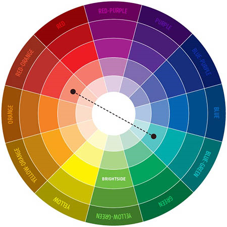
Nancy Merrill’s A Photo a Week challenge this week is about contrasting colors, using a color wheel which shows which colors contrast with each other.
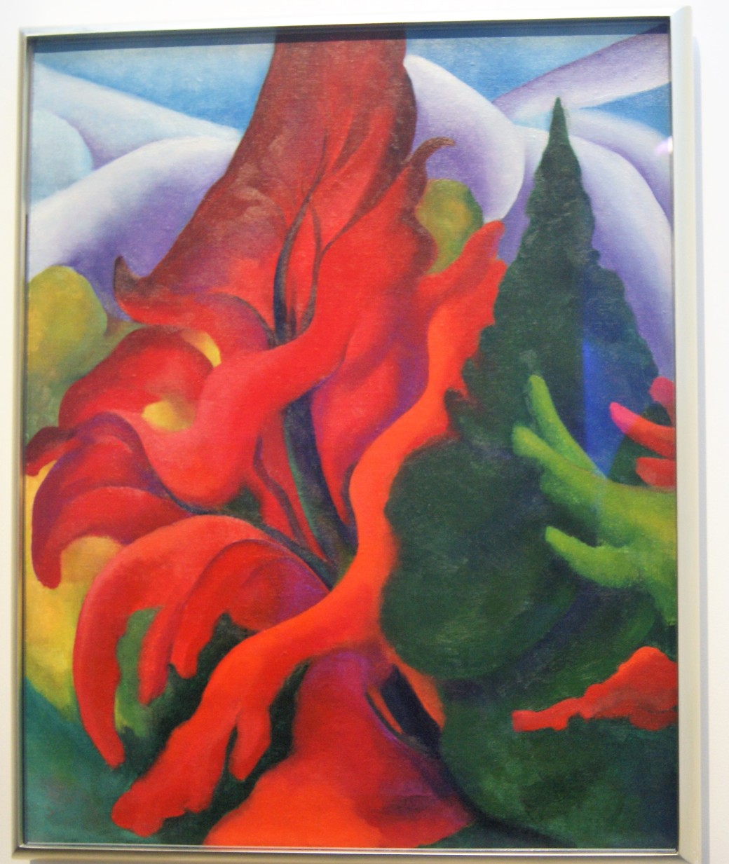
In art, we often see paintings with colors that seem to pop out of the image. An artist may use what are called “complementary colors” (contrasting colors) to emphasize something in an image, such as an orange flower against a blue sky, or to create interest using contrasts. Here is an example by Georgia O’Keeffe, called “Trees in Autumn” (1920/21 oil on canvas, at Georgia O’Keeffe Museum in Santa Fe, New Mexico).
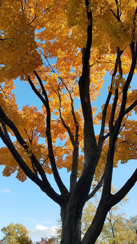
Here’s a photo I took of a tree in autumn.
As one can see from the color wheel above, the primary colors (blue, red and yellow) are matched with secondary colors (green, orange and purple) which provide the greatest contrast. Blue is matched with the secondary color that is created by combining the other two primary colors (red and yellow). Thus:
Blue’s complementary color is orange.
Red’s complementary color is green.
Yellow’s complementary color is purple.
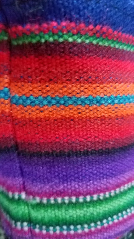
Weavers are very adept in using contrasting/complementary colors to create colorful patterns. This is a close-up of a Peruvian woven sling I use to carry my water bottle. Note the green stripe against pink on one side and maroon on the other (both versions of red), or the blue stripe in the middle surrounded by orange stripes.
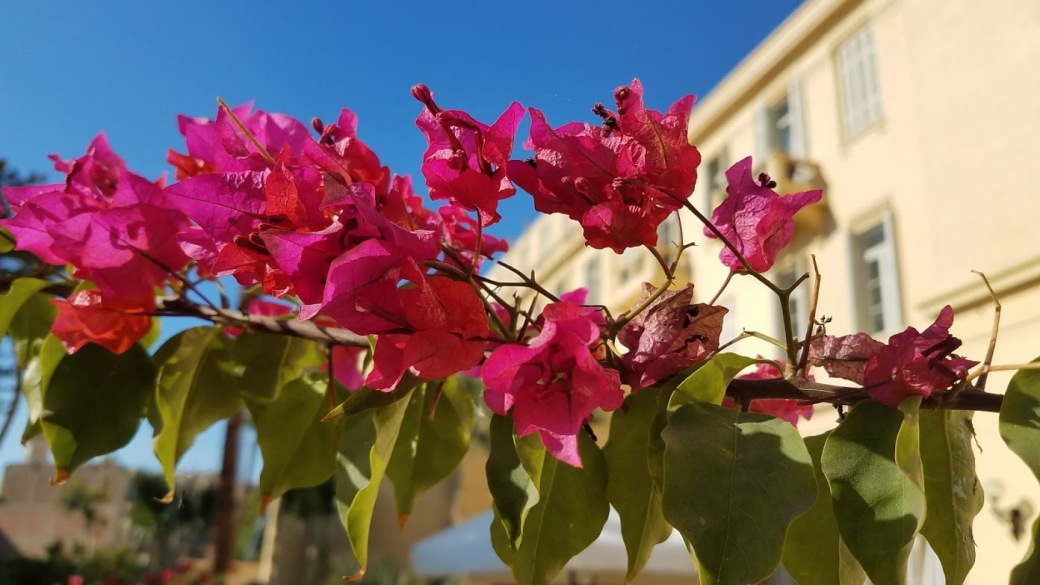
Nature is also excellent at creating contrasts:
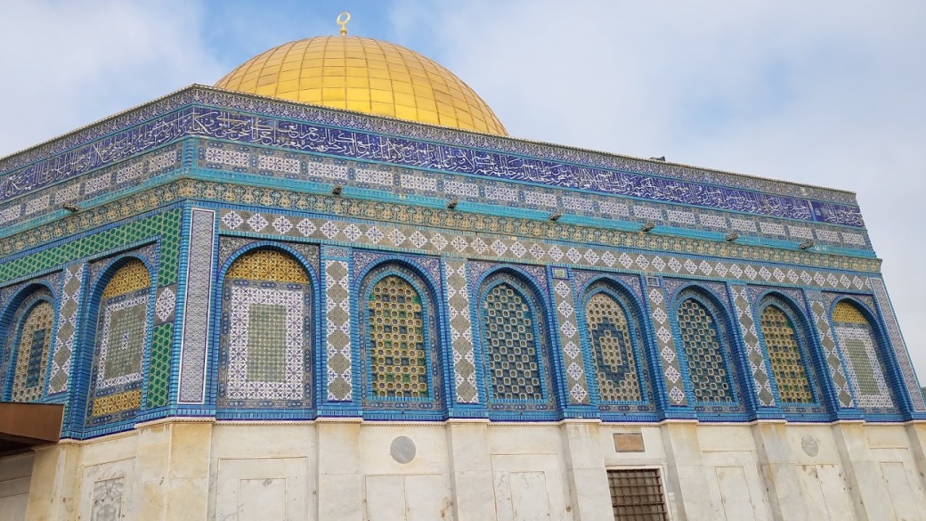
We see this same contrasting beauty in architecture, such as Dome of the Rock in Jerusalem, Israel, with its famous golden dome contrasting with the blue sky and with the blues in the tiles on the walls. The artist(s) who created these lovely patterns with tiles had an innate sense of contrast, making the designs of the whole building stand out, impressing viewers.
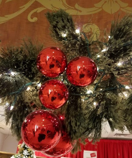
The Christmas season is represented by red and green, which naturally complement (or contrast with) each other, making holiday decorations pleasing to look at.