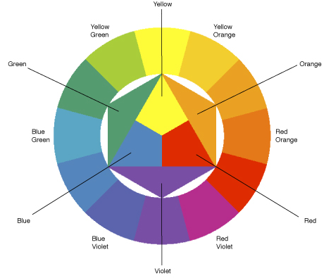
The Chromatic circle of colours is a theory based on the mixture of colours.
We are no longer talking about coloured radiations of light but rather colours as a substance, such as paints for example.
For a Makeup Artist, the comprehension of this theory is KEY in order to create simple mixtures.
The better you understand this theory, the better the outcome.
The centre of this circle is composed of our three “primary colours”. These are the purest of colours – pure because they have not gone through any mixes. Blue, yellow and red. (I know i’m repeating myself but bare with me, this is the important stuff)
Right outside the triangle of the three primary colours you will find the “secondary colours”: green, orange and purple. These colours are the result of an equal mix of two primary colours.
Green, which is composed of the blue and the green.
Purple, which is composed of the blue and the red.
Orange, which is composed of the red and the yellow.
And finally outside the secondary colours of the circle, you will find the “tertiary colours” (yes tertiary is a word, i double checked.)
These colours are the direct result of the mix between (in equal parts again) of one primary colour and one secondary colour.
Turquoise: mix of blue and green.
Plum: mix of red and purple.
Copper or golden yellow: mix of yellow and orange.
Lime green: mix of yellow and green.
Indigo: mix of blue and purple.
Vermilion: mix of red and orange.
The Complementary Colours:
In the Chromatic Circle the “complementary colours” are pairs of colours that are of opposite hue.
Because they oppose each other, creating contrast, once placed alongside one another, they compliment the opposing colour – hence the name “complimentary colour”.
Perfect example being: the red Christmas ornament which will appear all the more red once placed on the green Christmas tree.
Here’s the interesting part, we just said that when they are placed alongside each other they compliment one another but what happens when mixed together? Well guess what, they NEUTRALIZE each other.
Hairdressers (colour technicians rather) use this trick all the time. For example, if you you have orange hair and you want to go blonde as an example, the colour technician will mix in a little concentrated blue pigment into the hair colour in order to cut the orange.
So how can you tell what is a colour’s complimenting opposite?
Easy, but you need your secondary colours.
Since a secondary colour is composed of two colours, here’s the logic behind it.
Green is composed of blue and yellow so the colour that hasn’t entered its composition is red, therefore making red its complimentary colour.
Purple is composed of blue and red and the colour not engaged in its composition is yellow, thus making yellow its complimentary colour.
Orange, being composed of red and yellow, having blue play no part in its composition, makes blue its complimentary colour.
So knowing what we know now, the following will make total sense.
As a Makeup artist you will obviously come across faces with imperfections.
How will we correct them? By using its complimentary colour! (How refreshing to actual learn something you will apply in real life @ all the b.s. classes i had to take along the years)
Red pimple/scar: green corrector
Blue circles under the eyes: Peachy or orangish corrector
Purple circle under the eyes (black eye? :/): yellow or golden corrector
Green circle under they eyes: peachy or pinkish corrector.
Now, how do we highlight a colour. Comment le mettre en valeur?
Blue eyes: golden or orangish eye shadow hues.
Green eyes: pinkish or mauve eye shadow hues.
Amber/brown eyes: turquoise or blueish eyeshadow hues.
It is essential that you learn to mix your own colours with the now acquired knowledge in order to adapt to each client. Don’t forget – the client’s hair, skin tone, outfit and even personal preference will also influence the choices you make as an artist. So don’t be shy, it’s your canvas.
Tomorrow i will cover the warm colours vs. the cold colours. Can’t wait