Key Takeaways
- Our UX benchmark of 100+ large e-commerce websites shows that “Homepage & Category Navigation” performs “poor” on average
- Indeed, there’s significant room for improvements — particularly within the topic of “Category Taxonomy”
- This article will cover 12 commonly observed e-commerce Homepage and Category Navigation UX issues, and illustrate the best practices we’ve verified to perform the best with end users.
Designing a user-friendly e-commerce Homepage and Category Navigation requires solid information architecture, systematic labeling and hierarchy, and an engaging and useful homepage — and that’s just the beginning.
Our latest Homepage & Category Navigation e-commerce UX benchmark contains the following:
- 13,000+ Homepage and Category Navigation UX elements that have been manually reviewed and scored by Baymard’s team of UX researchers
- 7,000 best practice (and worst practice) examples from 100+ top-grossing e-commerce sites in the US and Europe (performance verified)
In this article, we’ll show you a portion of our large-scale Baymard Premium research findings to provide you with an overview of the current landscape of Homepage and Category Navigation e-commerce UX, as well as 12 pitfalls to avoid.
The Current State of E-Commerce Homepage and Category Navigation UX
Product finding is key to any e-commerce business — after all, in order to buy a product, customers must be able to find the product first.
During our large-scale Homepage and Category Navigation usability testing, site abandonments were common, and subpar user experiences were the order of the day.
For example, throughout testing many participants had trouble finding suitable products matching basic criteria, such as “a pair of cross-training shoes” or “a spring jacket”.
However, designing a user-friendly Homepage and Category Navigation UX is not an easy task.
For this analysis, we’ve summarized the 3,000+ UX performance scores for 2022 across the topics in this theme, and plotted the benchmarked sites’ navigational user experience across these topics in the scatterplot above.
Each dot, therefore, represents the summarized UX score of one site across the guidelines within that respective topic of the Homepage and Category Navigation experience.
Despite the importance of Homepage and Category Navigation for users’ ultimate ability to find a suitable product, our latest UX benchmark shows that performance for the average top-grossing US and European site is “poor” (made up of 20% “decent”, 34% “mediocre”, 41% “poor”, and 4% “below poor”).
Moreover, there are no sites that perform exceptionally well, or even just well, for end users.
Below we’ll discuss in more detail the results from our research by sharing 12 general Homepage and Category Navigation pitfalls.
For each pitfall we’ll provide examples of sites that get it wrong, as well as best practice examples from our large-scale testing and benchmarking, across 4 of our Homepage and Category Navigation topics, beginning with Category Taxonomy.
3 Category Taxonomy UX Pitfalls
The category taxonomy is at the core of any e-commerce site.
A site can adhere to every single guideline in the rest of the topics in the Homepage & Category research theme, but if the category taxonomy is off, users will have trouble finding products on the site.
After all, it doesn’t matter how much time you spend on beautiful design, product images, and landing page optimization — the user’s overall e-commerce experience will falter if foundational elements such as the category taxonomy aren’t solid.
The repercussions of a poor category taxonomy can be even more devastating than immediate site abandonments — it may lead to permanent brand damage.
When it comes to Category Taxonomy, the average site runs into significant issues, with a massive 88% performing “mediocrely”, “poorly”, or worse — by far the weakest of the subareas.
Furthermore, a significant 33% of sites perform below “poor”.
In particular, overcategorization remains the single most important category-based navigational issue for the average e-commerce site.
For inspiration on Category Taxonomy implementations, see Adidas, which features a “perfect” UX performance in this topic.
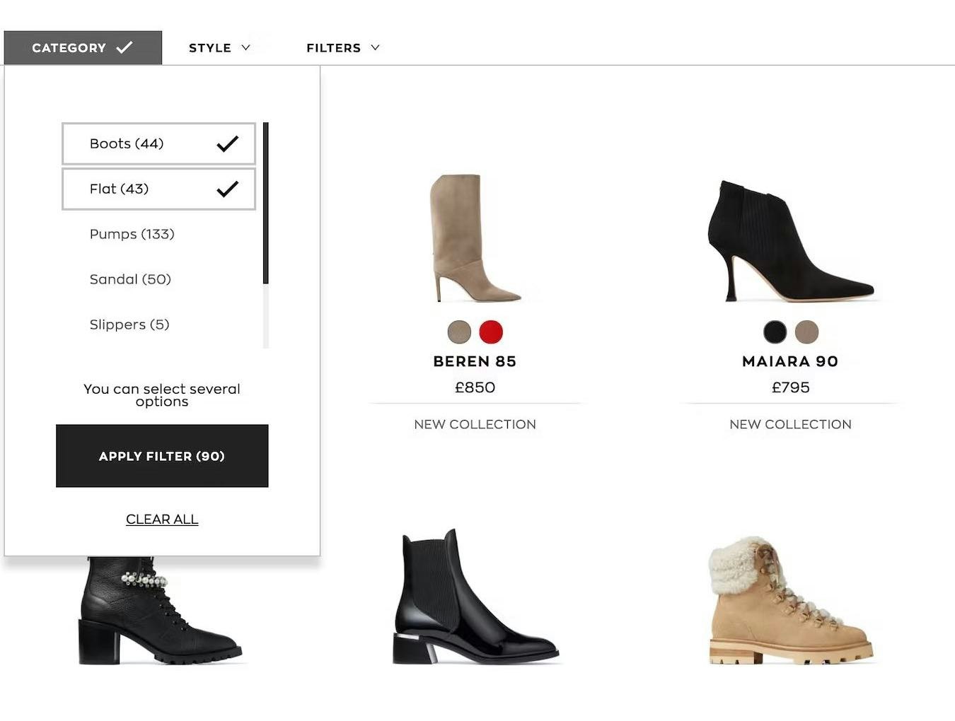
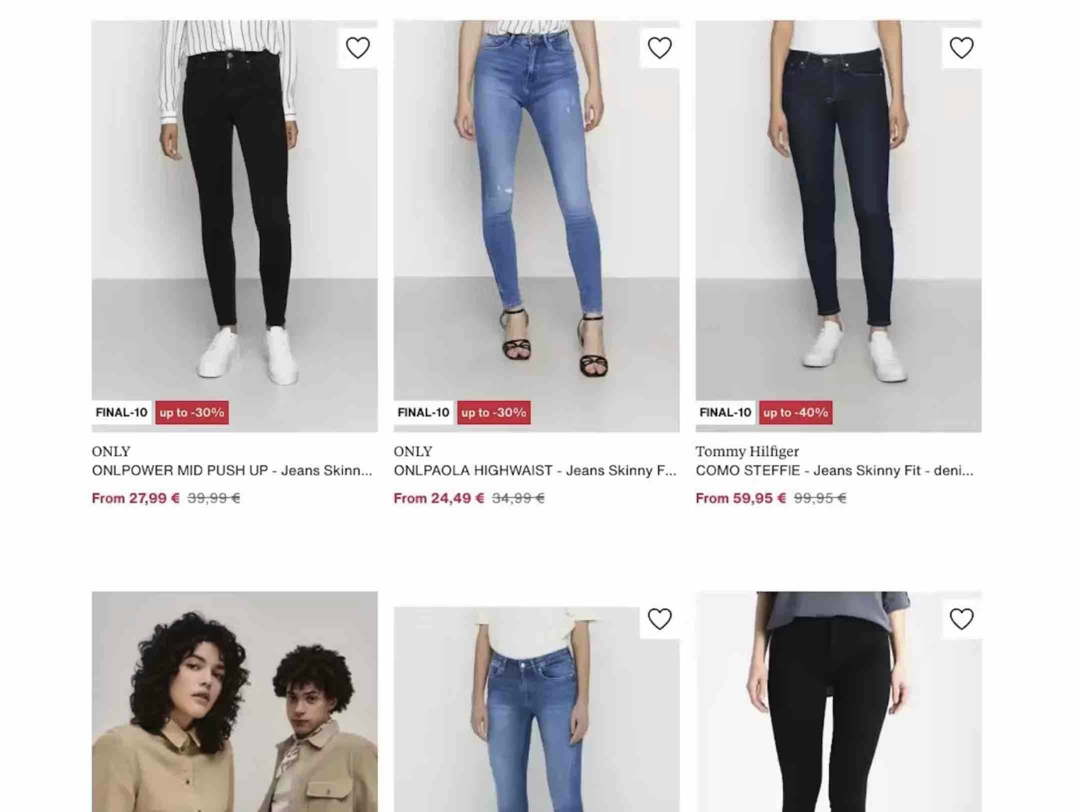
1) 88% of Sites Incorrectly Implement Product Types with Shared Attributes as Separate Categories
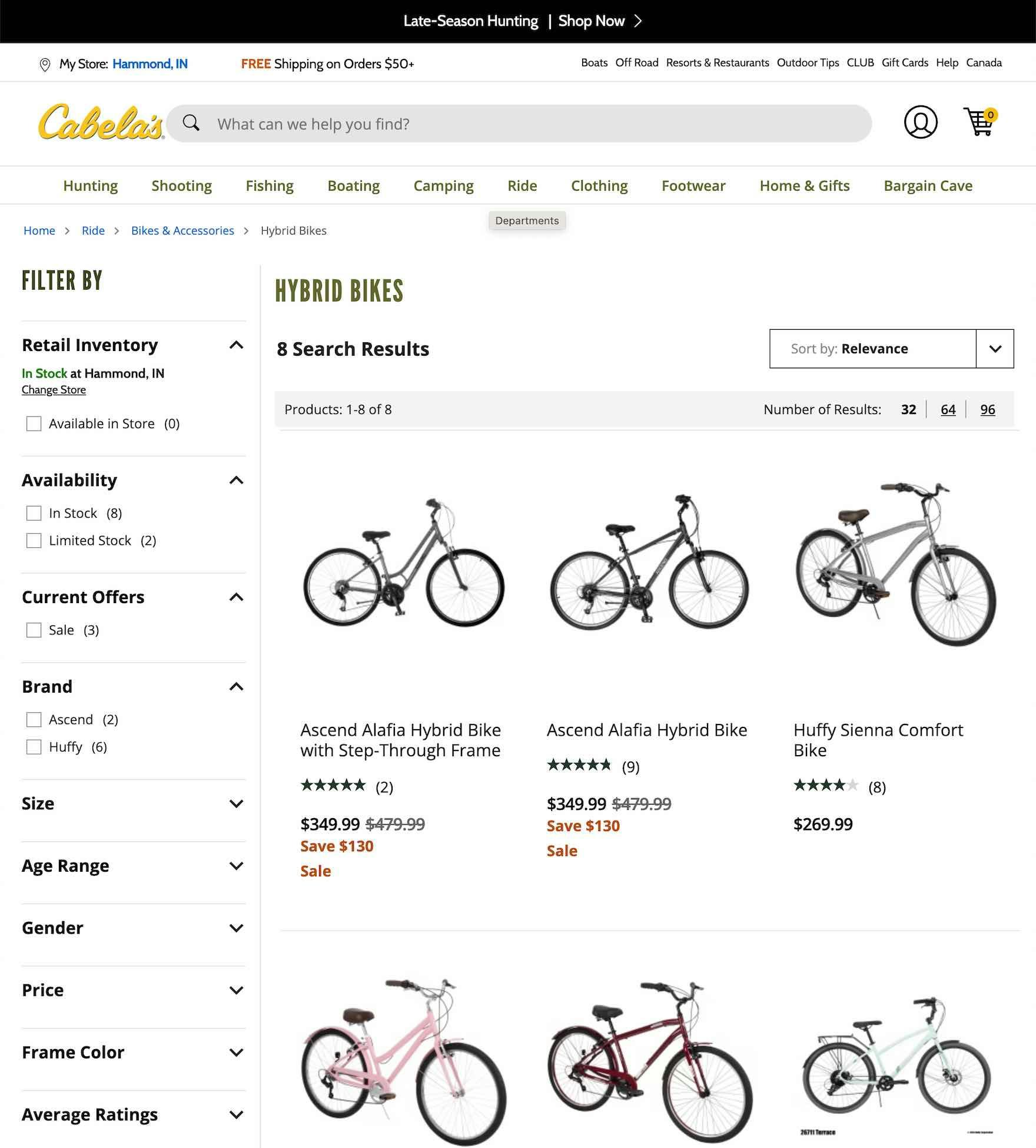
At Cabela’s, “Hybrid Bikes” are implemented as a subcategory of “Bikes & Accessories” — making it difficult for a user to get a list of “All Bikes”.
During both desktop and mobile testing, multiple sites had overcategorized product types.
This can be critically harmful, as it needlessly limits the user’s ability to mix and match different criteria to get the exact list of products they want.
Moreover, overcategorization makes it very difficult for users to get an overview of all products of a certain type.
Unsurprisingly, during testing this led many users to abandon sites due to the confusion and limitations introduced by such mismatches.
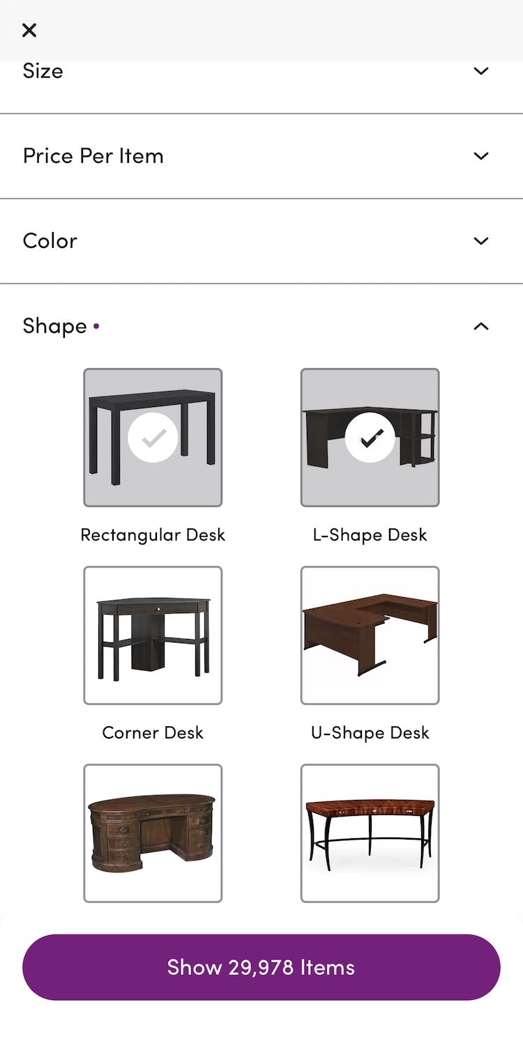
On Wayfair’s app, shapes of desks are correctly implemented as filters, rather than subcategories. This allows users to get an overview of “All desks” as well as mix and match desk shapes by filtering for them.
To address this issue, product types should be implemented as filters (used to narrow down product lists within categories) when most product attributes (e.g., “brand” and “style”) are the same across the product type.
This allows users more control over product lists and allows for users to get a solid overview of categories and subcategories.
If, on the other hand, most product type attributes aren’t shared then the product types can be implemented as separate subcategories (i.e., part of the product catalog hierarchy).
However, it’s important to note that the vast majority of sites have issues with overcategorization, rather than undercategorization, and thus should implement product types more often as filters within the same subcategory.
Despite how detrimental it is to users’ product-finding abilities, 88% of sites don’t correctly implement product subtypes with shared attributes as filters (up from 74% in 2020).
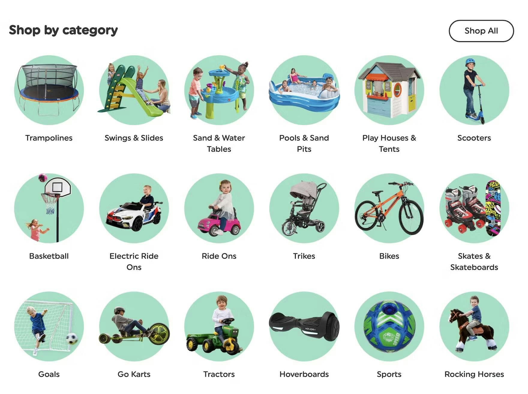
2) 82% of Sites Don’t Divide Categories and Subcategories into Manageable Chunks
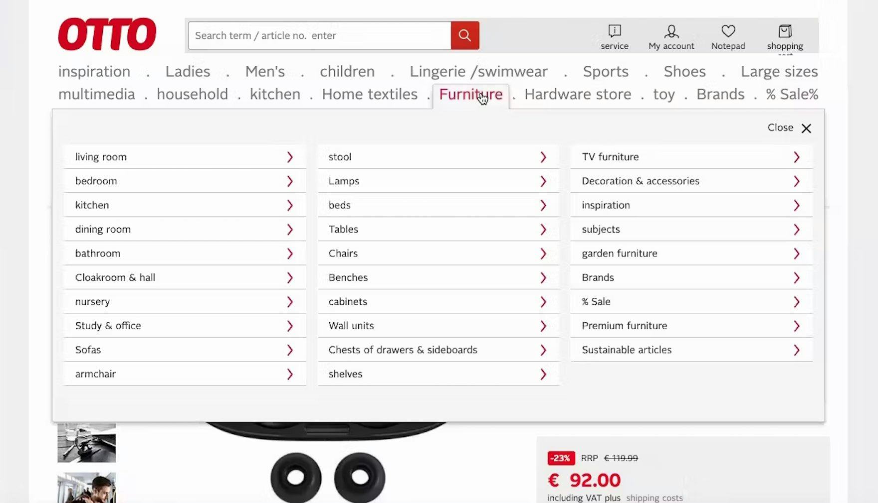
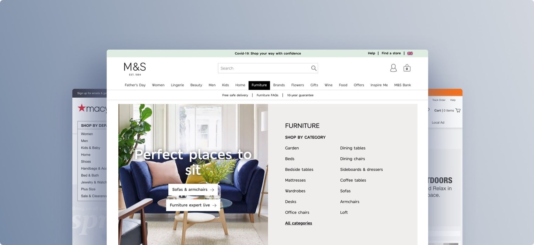
“It could be less crowded…more easy to run through. So if you’re looking for something you really have to look for it.” The list of 29 subcategories in the “Furniture” category of the German site Otto make it hard for users like this test participant to pick out the most relevant one.
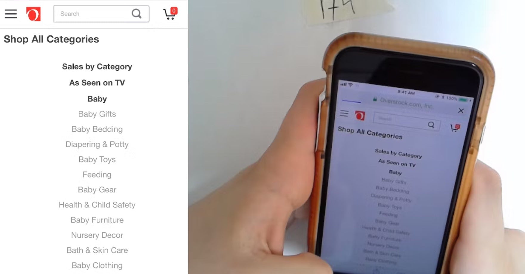
“It gives me a lot of junk on here…I’m actually going to search for it instead, it would be a lot easier.” A participant at Overstock found the long list of subcategories overwhelming.
During testing, many of the sites’ hierarchies were perceived by users to be “overwhelming”, “cluttered”, or “confusing” because one of the benefits of drop-down menus — that they can hold an almost unlimited number of options — is also their Achilles’ heel.
Indeed, most users began to feel overwhelmed when they were presented with more than ~10 subcategory options to choose from.
While navigating or scanning long lists of categories on desktop is difficult, on mobile the task is even harder, as users will have to scroll through the options — a time-consuming and laborious task — and will find it difficult to establish an overview of the navigation.
Furthermore, there’s minimal information scent provided on mobile, as users can’t hover menu items to potentially learn more about the category, and there’s less space to include inline text descriptions of the items.
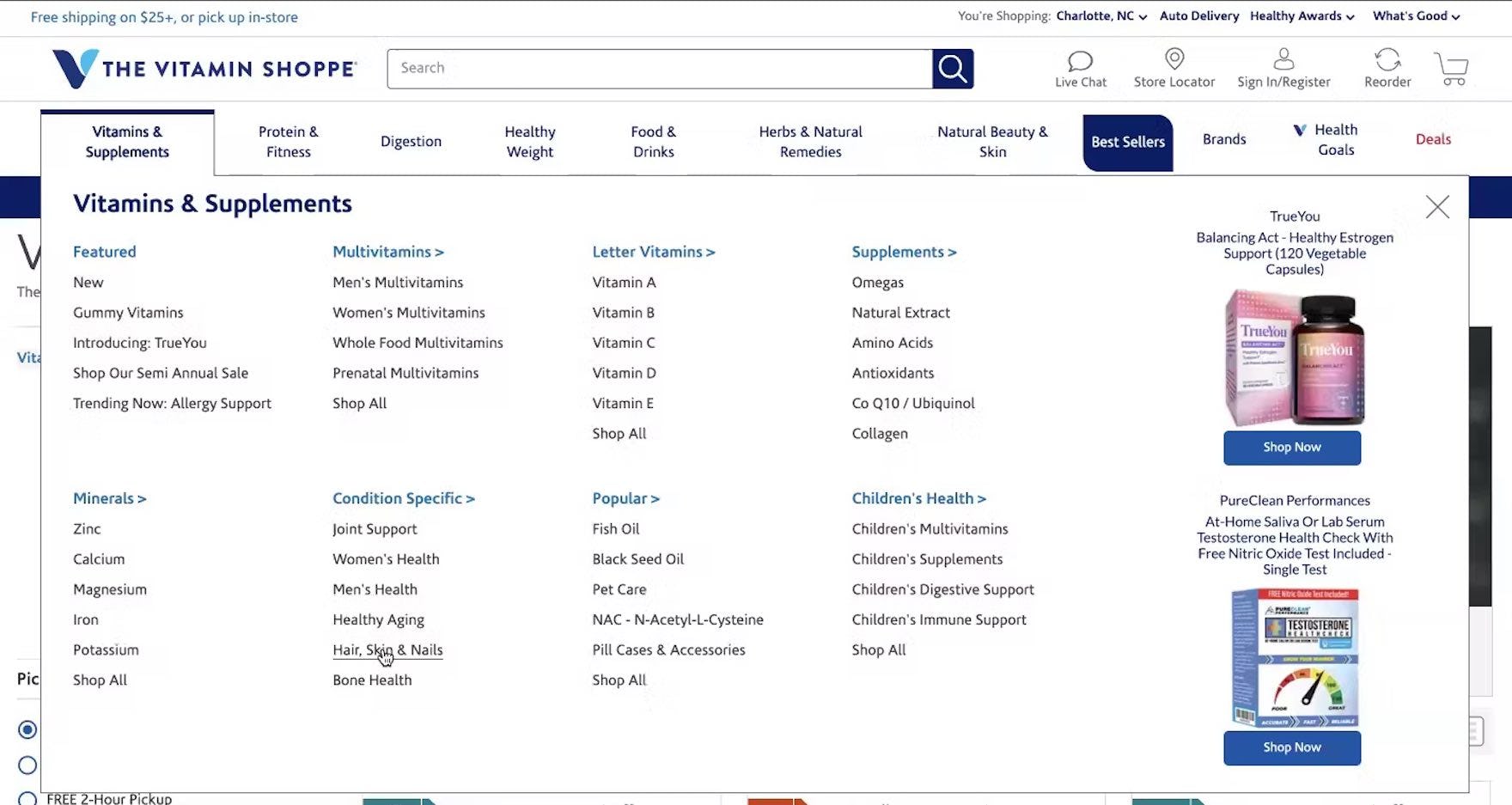
“So if we go back to ‘Hair, Skin & Nails’…they do break it down pretty nicely.” The fact that a manageable amount of subcategories were included under each category on The Vitamin Shoppe made it straightforward for this test participant to choose the most suitable one.
To address this issue, divide categories and subcategories into manageable chunks: subdivide when reaching around 10 categories, and aim for at least 10 products in the categories at the deepest level.
Despite the damage to users’ site perception, 82% of sites have poorly curated category hierarchies (up from 60% in 2020).
3) 83% of Sites Incorrectly Implement “Sales” or “Deals” Filter-Based Categories
Our large-scale product-finding testing has consistently shown that there’s a subgroup of users keenly interested in finding items “on sale”.
Some users enter the site and immediately are concerned with finding the latest deals.
Others, after having explored the site’s products for a while, decide to seek out sale items.
In either case, testing revealed that having a “Sales” or “Deals” filter-based category is key to helping interested users quickly locate sale items.
Yet how the “Sales” scope is implemented is crucial.
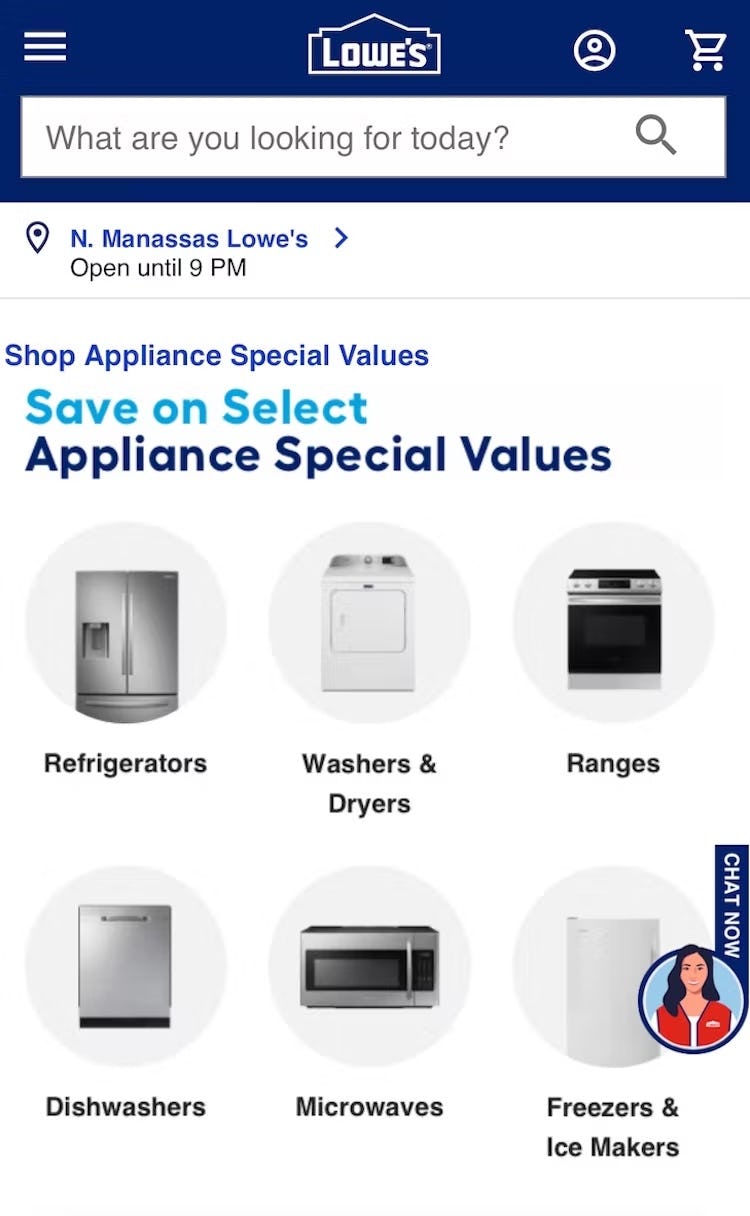
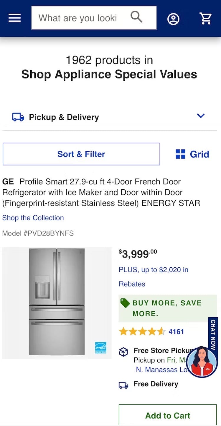
At Lowe’s, users enticed to see sale appliances (first image) risk getting an overly narrow impression of the appliance product list when they arrive at the “Appliance Special Values” list — it’s not easy to find a way to “View All Appliances”, and some users will misinterpret the “Sales” list as representing “All Appliances” (especially given that there are nearly 2,000 products listed).
If implemented as a category, a subgroup of users will get stuck in the “Sales” scope, or find it difficult to exit the category to view the broader list of products within the category (i.e., both products on sale and not on sale).
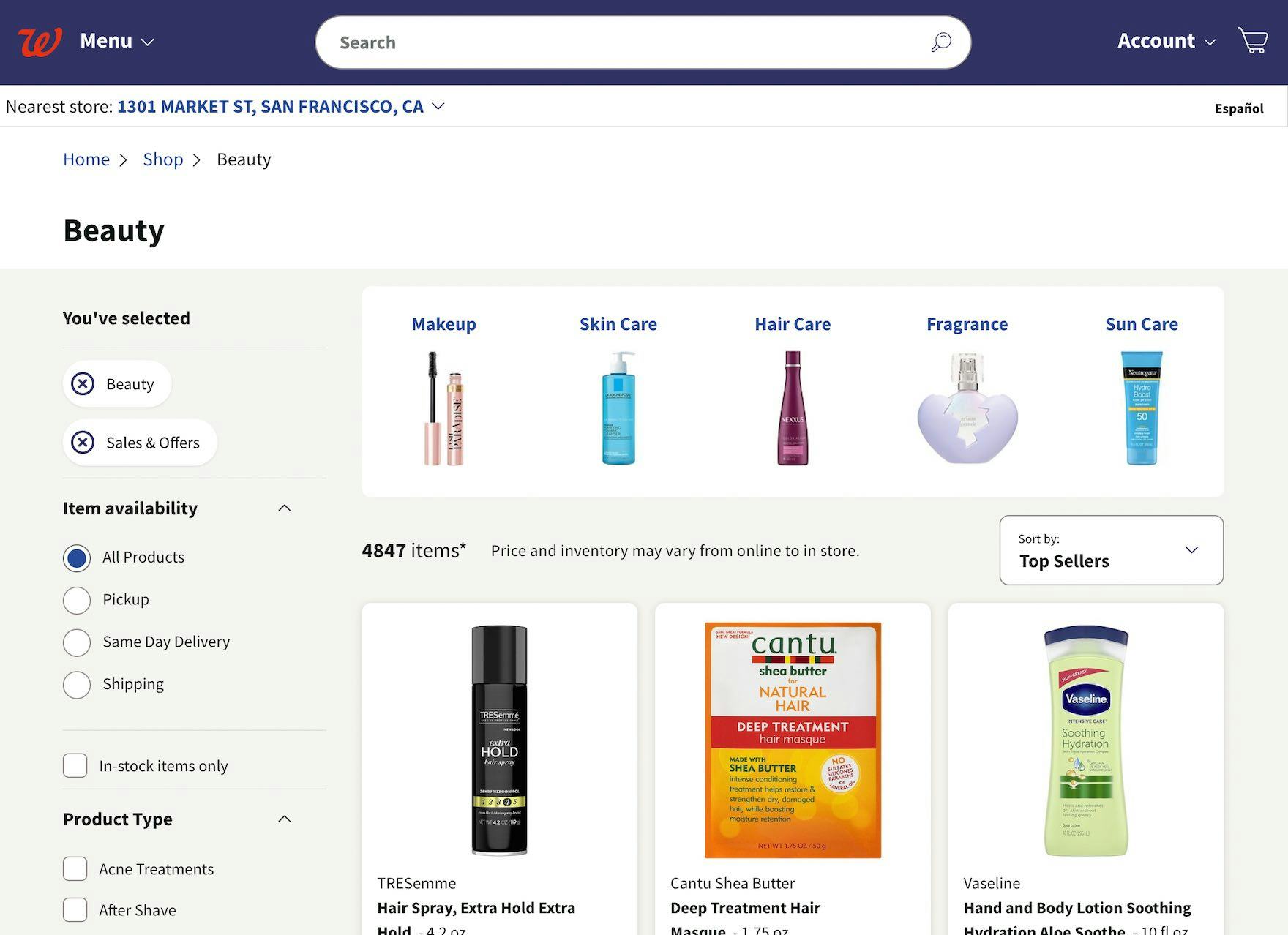
At Walgreens, a “Sales & Offers” filter allows users in the “Beauty” category to get a product list with only these products but, crucially, it’s also easy to get a broader product list by deselecting the filter.
Therefore, “Sales” should be a filter applied to relevant product lists — it should never be implemented as a “true” subcategory within relevant product types (though it may appear to be to end users).
Yet 83% of sites with “Sales” scopes incorrectly implement “Sales” scopes as categories.
3 Main Navigation UX Pitfalls
A site’s main navigation is the visual representation and user interface for the category taxonomy, and it serves as the primary interface for browsing the site’s product catalog.
Having a user-friendly main navigation UI is as important as having a solid category taxonomy, as what the user sees and interacts with largely determines if they will be able to navigate the site intuitively or are halted every time they try to browse the site’s categories.
Our benchmark reveals that the average e-commerce site performs mediocre to poor when it comes to the “Main Navigation” user experience.
In particular, there are 4 UX issues e-commerce sites get wrong when it comes to “Main Navigation”.
For inspiration on Main Navigation implementations for desktop, see Thomann and Zooplus, both of which have “perfect” implementations.
4) 19% of Sites Don’t Make Headers Clickable
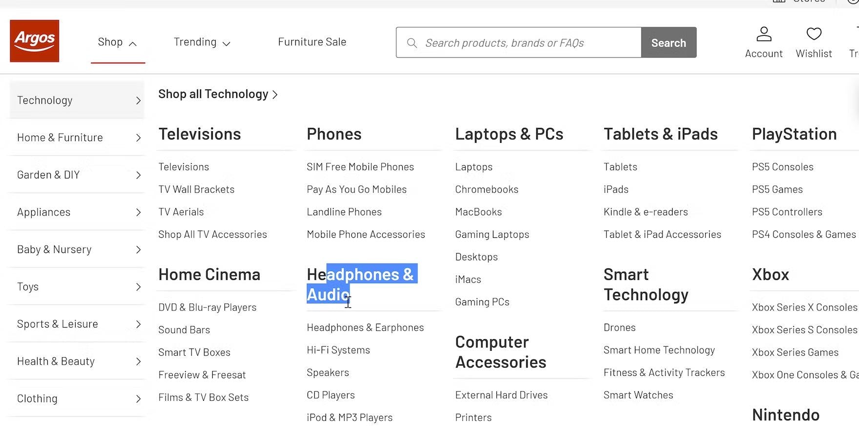
“And also these things themselves aren’t linked, so I can’t click on that to the category.” A test participant on Argos UK wanted to get an overview of the “Headphones & Audio” category but found that the heading was static text. For users who want to browse broad product scopes, links that only lead to individual subcategories (like “Hi-Fi Systems” in this example) are much less useful.
During testing, at many of the tested sites the grouping of the drop-down categories were only text labels, not clickable parent categories.
This conflicted with the expectations of the majority of the participants, who anticipated the headers would be clickable and often tried clicking them despite the cursor indicating the item wasn’t clickable.
Some users want to click on main navigation headers to stay in a fairly broad product scope; for example, in the hope of landing at a curated intermediary category page, which could assist them in their selection of a more defined scope.
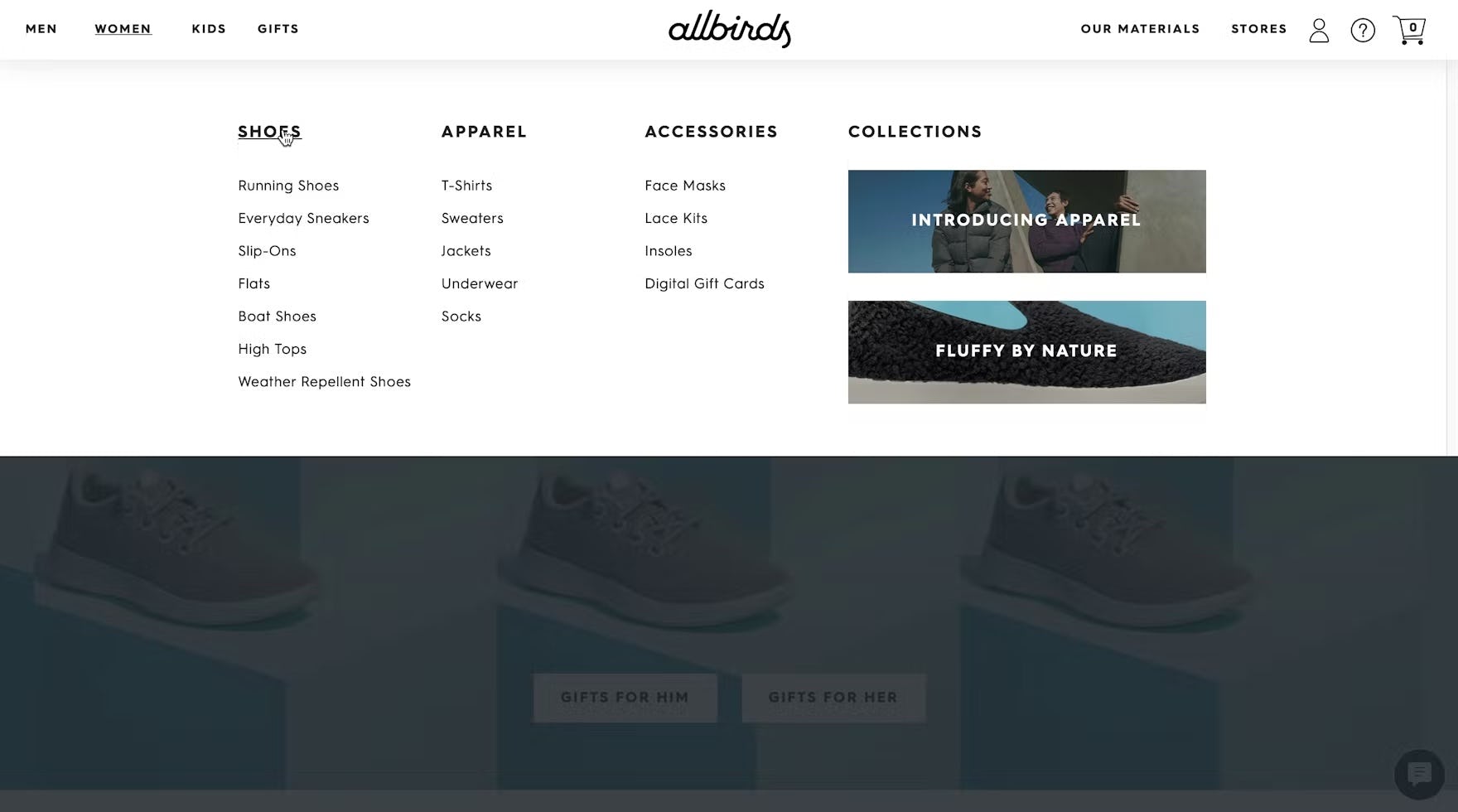
“I would first look at ‘Shoes’.” Rather than select one of the available subcategories of shoes, this participant on Allbirds opted to see all shoes by clicking the “Shoes” category within the drop-down menu.
Having parent categories be part of the actual product catalog hierarchy (and not just shallow text labels) is critical in supporting explorative product browsing.
Users who haven’t fully decided what they want, or who are looking for inspiration on what to purchase, can dip their toes in broader categories before diving into highly defined ones.
Despite conflicting with the majority of users’ expectations, 19% of sites don’t provide clickable parent categories (down from 21% in 2020).
5) 64% of Sites Don’t Have a Hover Delay
During testing, hover-based drop-down menus outperformed other main navigation menus because they enabled users to easily explore categories and accurately select a well-defined scope.
However, participants ran into severe usability issues with “flickering” behavior with menus that opened and closed immediately as participants moused over the menu.
Additionally, within the menu many participants accidentally triggered sibling categories, making it difficult for participants to use the main navigation menu effectively.
To avoid the “flickering” of the hover-based drop-down navigation itself, there needs to be a hover delay — a minimum amount of time the user has to hover the trigger area before the drop-down content appears.
Typically a delay of 300–500 milliseconds will suffice in eliminating the worst of the “flickering” issues, without introducing needless friction for intentional hover interactions.
Additionally, an intelligent mouse path algorithm could be used to determine the user’s intent and prevent the accidental triggering of sibling category menus.
Despite the disruption to users’ navigation, 64% of sites have hover-based drop-down menus that are difficult to interact with and control (up from 52% in 2020).
6) 89% of Sites Don’t Highlight the User’s Current Scope in the Main Navigation
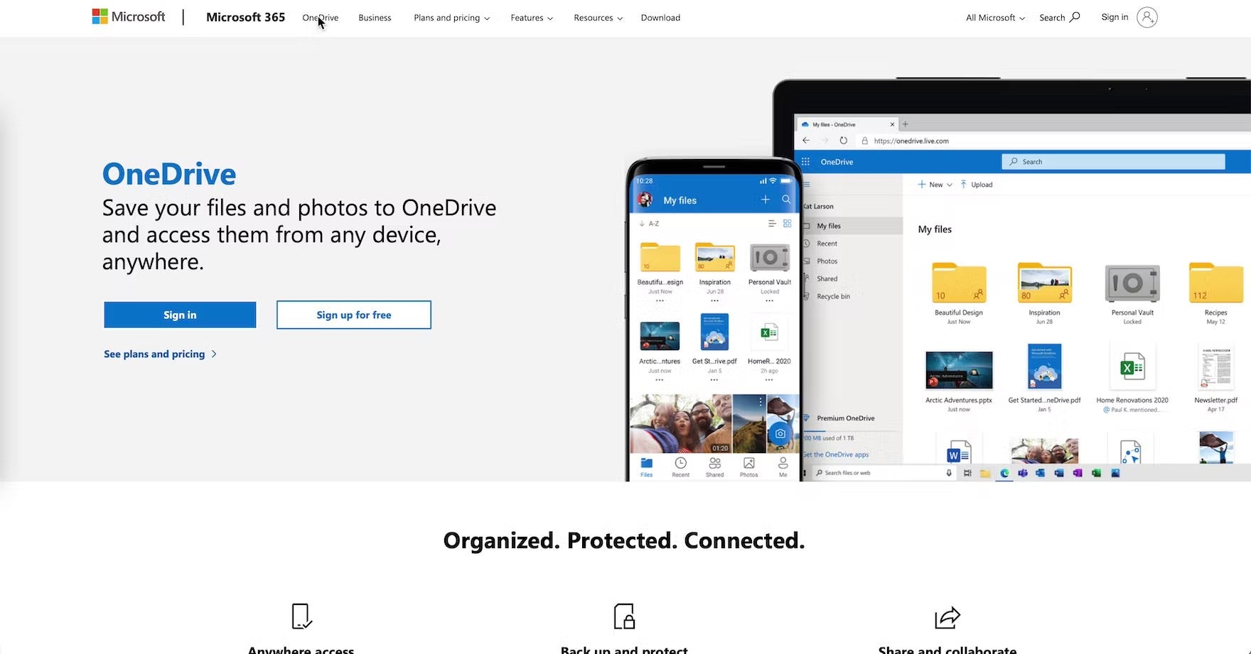
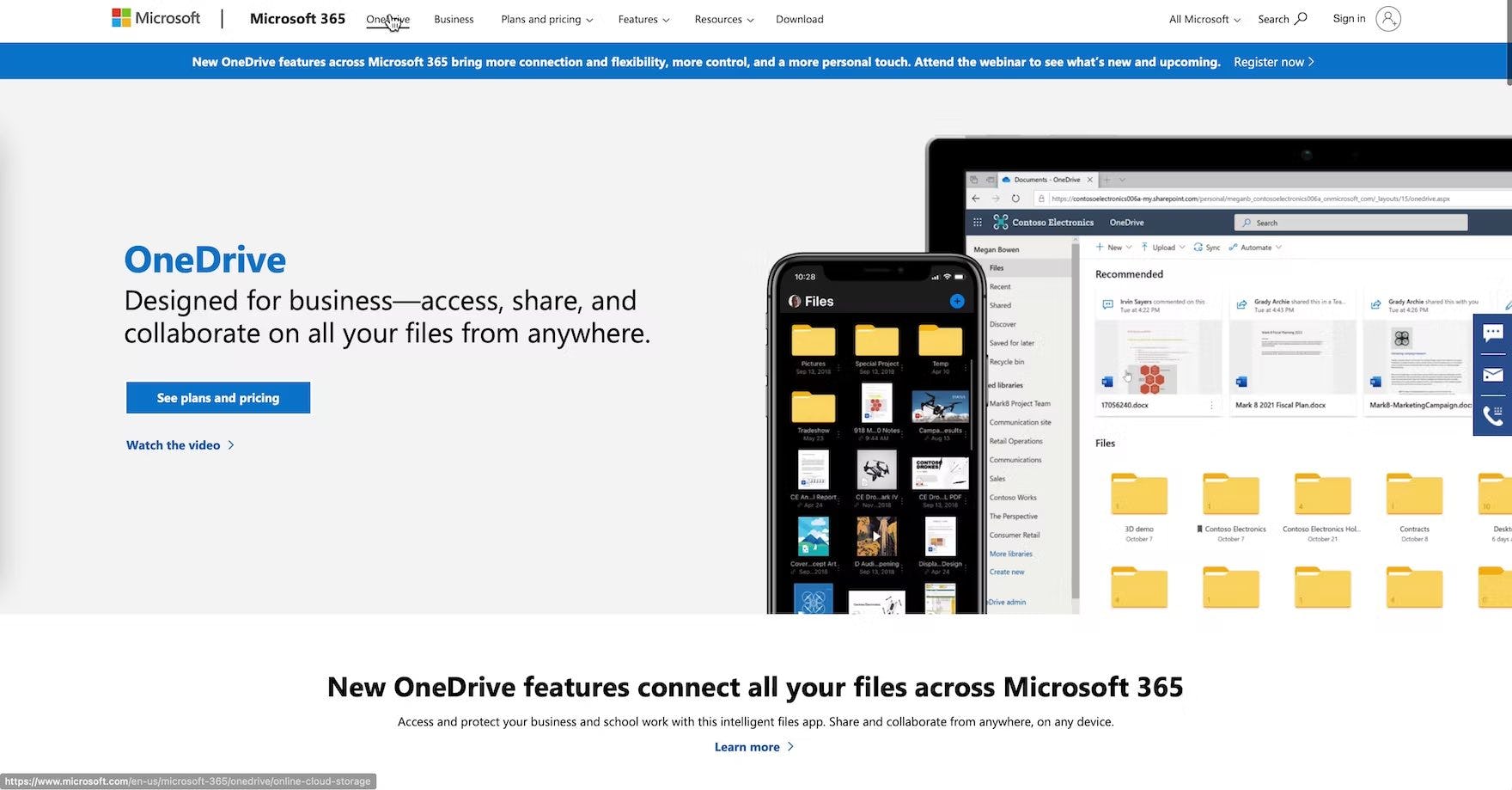
“I guess I didn’t realize that this OneDrive was the ‘Personal’ one (first image), and this is the ‘Business’ one (second image). I guess that was a little confusing. The ‘Business’ one is obviously what I’d be looking for.” This test participant was slow to recognize that the information he was viewing wasn’t relevant to his research of business cloud storage and sharing services because his current location wasn’t highlighted in the main navigation.
During testing, when the current top-level scope wasn’t highlighted in the main navigation, it made it unnecessarily difficult for participants to determine where they were in the site hierarchy.
Additionally, failing to highlight the current scope in the main navigation also makes it more difficult for users to begin to learn and internalize the site’s structure.
Even when breadcrumbs are implemented perfectly, some users still rely on the main navigation to help quickly understand where they are, or to reassure themselves that they are where they thought they were.


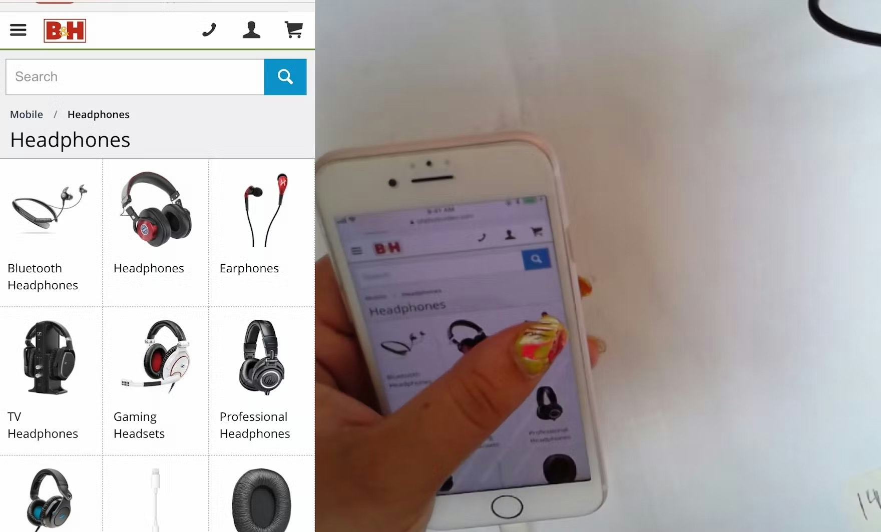
This test participant arrived directly at B&H’s “TVs & Entertainment” category page (first image) from off-site. She experienced severe disorientation, as she was unfamiliar with the site and struggled with the terminology. Looking for wireless speakers, she opened the main navigation and tapped the “TVs & Entertainment” category (the category page she was already on; second image), which simply closed the main navigation. Mobile users often struggle with understanding where they are in the site hierarchy.
On mobile, even though the main navigation isn’t permanently displayed, users also rely on it to give them a sense of where they are on a site, especially if they arrive directly to a product details page from off-site.
Indeed, during mobile testing, when the current scope wasn’t highlighted in the main navigation, users had more difficulty figuring out where they were within the site hierarchy — putting more strain on breadcrumbs (which were often absent, inconsistently implemented, or truncated) and terminology to perform perfectly to help them learn the site hierarchy.
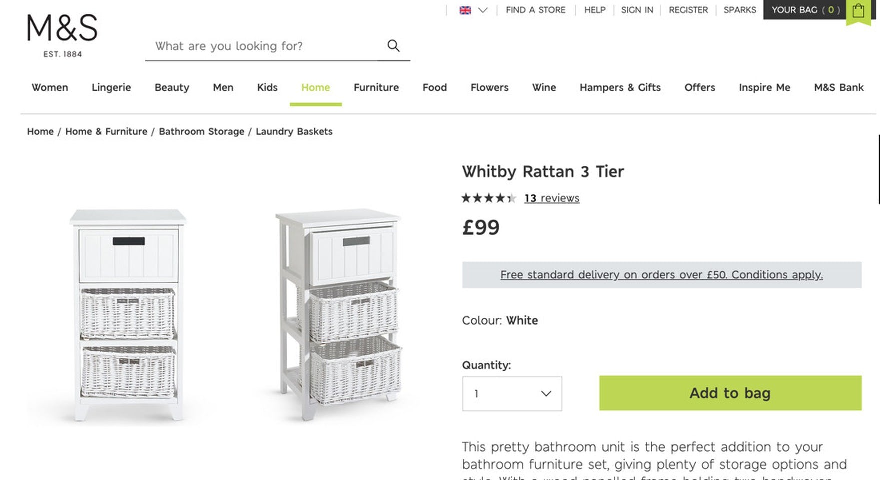
At Marks & Spencer, the top-level category is highlighted in the main navigation on desktop (first image) and on mobile (second image). Highlighting the current scope in the main navigation can be as simple as a change in the font or background color: the key is to make sure the “current scope” styling in the main navigation sufficiently distinct from the other main navigation options.
Fortunately, providing information on where users are in the main navigation has a somewhat “low-cost” solution: simply highlight their current scope in the main navigation by styling it differently than the other top-level main navigation options in the permanently visible main navigation (on desktop), or within the main navigation viewport (on mobile).
Despite the importance of orientation cues to the e-commerce shopping experience, a staggering 89% of sites don’t highlight the user’s current scope in the main navigation (more or less unchanged from 90% in 2020).
3 Homepage UX Pitfalls
Although many users, including first-time visitors, will land directly at an intermediary category page or a specific product page through direct links (e.g., links shared on social media), promotions (ads and PPC), or through organic search results, the homepage is still a vital aspect of an e-commerce store.
Within Homepage, the average site performs from “mediocre” to “decent”.
This is the only area where the performance of just above 50% of sites falls within a “decent”, “good”, and “perfect” UX performance.
However, there are still 3 areas in particular for improvement when it comes to the Homepage.
For inspiration on Homepage implementations for desktop, see Build.com, Williams Sonoma, and Dell, all of which have “perfect” implementations.
7) 51% of Sites Use Overly Aggressive and Distracting Ads on the Homepage
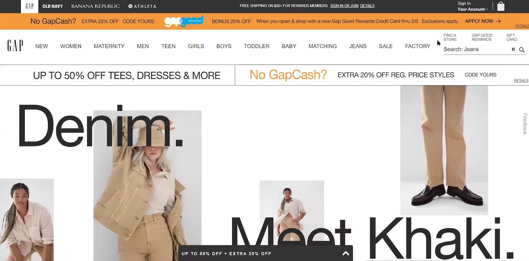
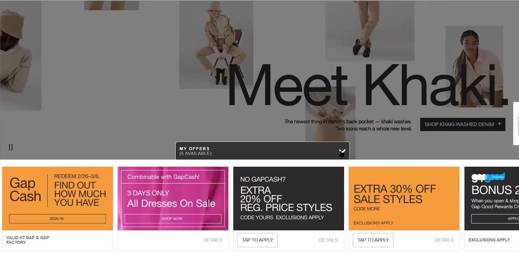
“This one is killin’ me. You know with this, there’s so much going on…and then I’m scrolling down and then this comes up. ‘My Offers’, taking up the whole screen, it’s distracting.” The ads and offers at the top and bottom of the GAP homepage caused issues for this test participant. Distractions like these impact the ability of users to assess a site’s product catalog and set a negative tone.

“I will say my preference on apps or web browsers is when it’s a little bit less, huge, because I have to scroll to get to what I’m looking for, which is, obviously, to shop for clothing.” Large ads at the top of homepages, such as the ASOS app homepage, can slow the process of product finding.
During testing, overly flashy ads in a prime content location on the homepage (particularly in the upper part of the page) were often met with negative reactions from users.
Meanwhile, our mobile testing revealed the potential for homepage ads to cause even more — and more severe — issues due to the reduced size of the viewport.
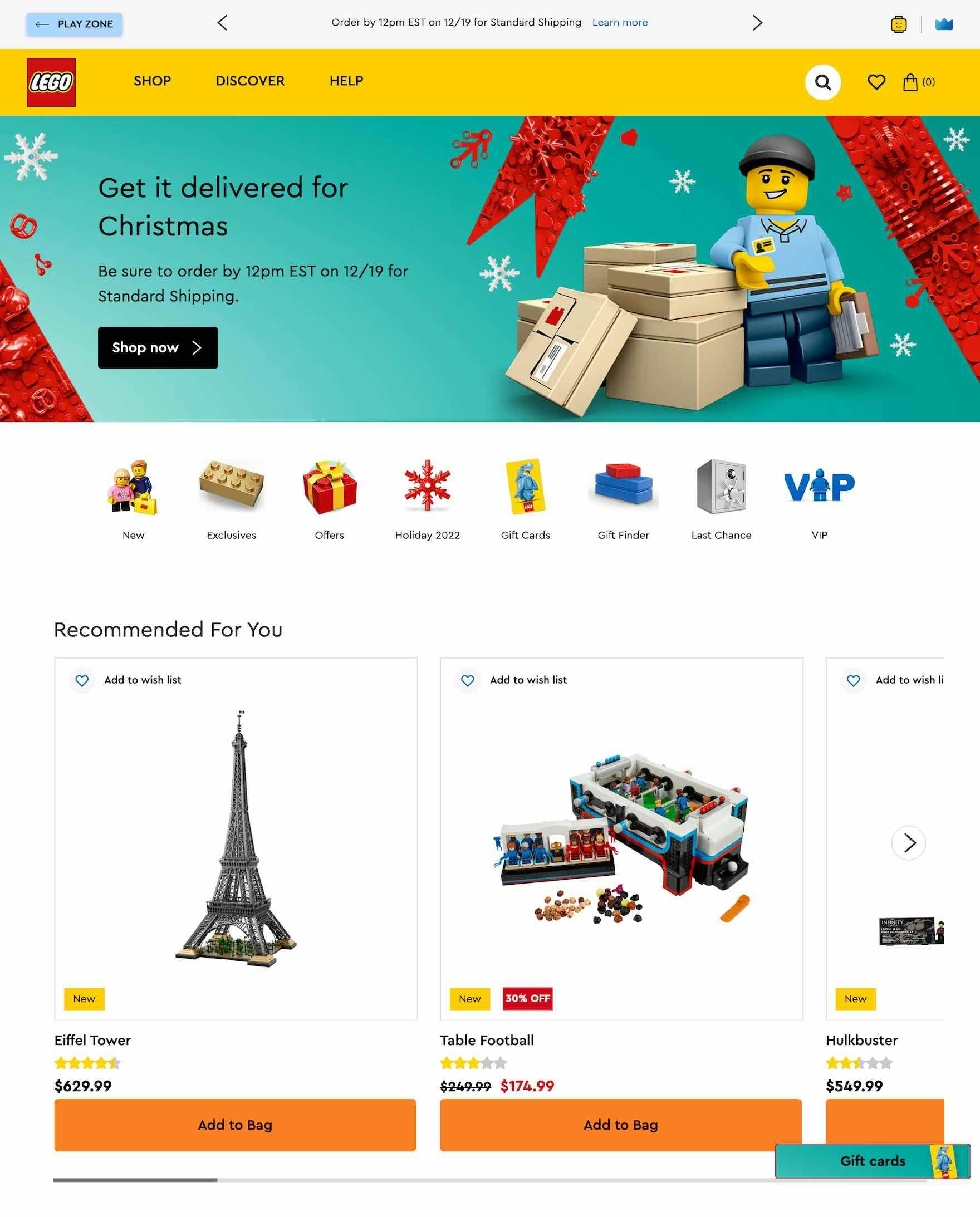
LEGO avoids ads in prime areas on the homepage, allowing users to focus on product finding.
Therefore, for both desktop and mobile, it’s critical to be particularly mindful of the size, placement, aesthetics, and integration of the ads within the overall homepage design.
In particular, avoid placing ads and any ad-looking content in prime content locations on the homepage and avoid pop-up banners or dialog overlays.
On mobile homepages, ads shouldn’t be overly prominent or visually distracting.
Despite the risk of setting a poor first impression, 51% of sites have issues with “ad-looking” content on the homepage (down from 59% of sites in 2020).
8) 28% of Sites That Use Carousels Implement Them Incorrectly
Carousels are appreciated by some users for their large, attractive imagery.
Indeed, when implemented with care, carousels are a powerful way to promote features, offers, and wizards.
Yet, they can cause more harm than good if serious usability issues aren’t addressed.
In particular, carousel slides can autorotate on desktop sites, but not too quickly (especially if they include text), and autorotation should temporarily pause while hovered and permanently pause after any user interaction.
On mobile sites, carousel slides shouldn’t autorotate at all (due to the lack of hover).
(For more about carousel slides on desktop and mobile sites see our article on carousels.)
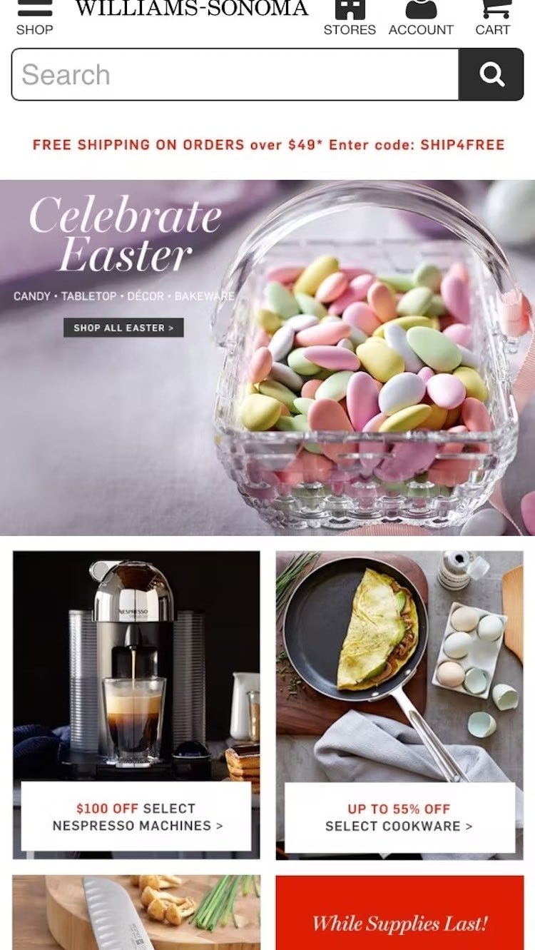
A generally better-performing alternative to carousels is simply displaying the slides as dedicated sections at the homepage, as seen here at Williams Sonoma.
Alternatively, using static content sections scattered throughout the homepage in combination with featured categories was observed to perform well during testing.
This instead relies on users scrolling the homepage, a vastly simpler and more ingrained web interaction.
Despite the interaction issues carousels can cause, our benchmark shows that, of the sites that use a carousel on the homepage, 28% implement it incorrectly (admittedly much improved over 2020, when 75% of sites that had carousels had issues with their implementation).
9) 43% of Sites Don’t Style Clickable Interface Elements Effectively
It’s not clear on Firebase whether there is just one link per element — the blue “View all…” text — or whether the features below are also clickable. Users who wish to jump straight to view these features, which are in fact links, could well miss out on a shortcut.
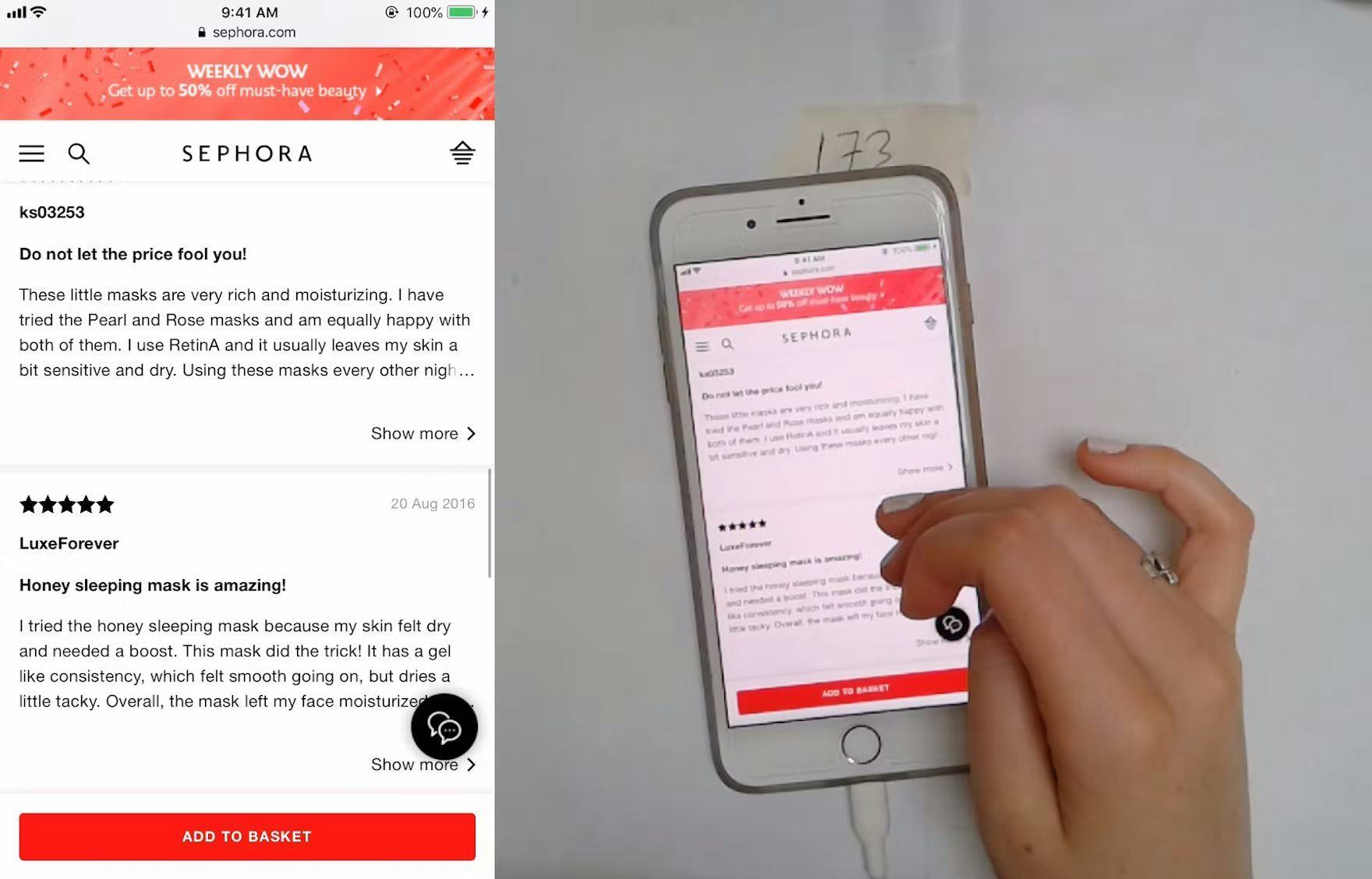
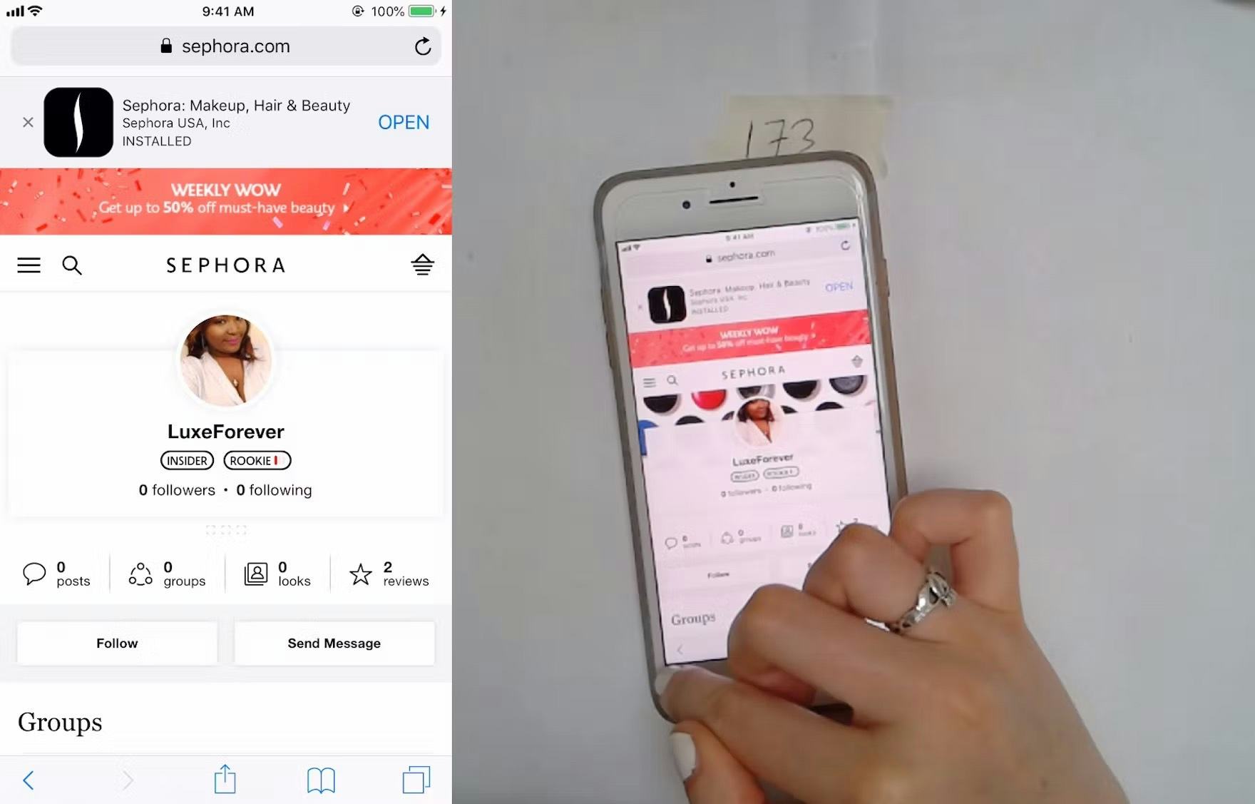
“I don’t care who that person is…”. A test participant at Sephora was scrolling user reviews and inadvertently tapped a link to a reviewer’s profile page. Note the position of her finger in the first image, which is far from the reviewer’s profile name. Yet the hit area was so wide — and unclear — that this participant wound up on an unintended detour (second image).
During testing, users were observed to hesitate when multiple items were enclosed in a single visual element.
This was due to the fact that it was unclear if the visual element was one large hit area leading to a single page or whether there were multiple distinct hit areas leading to different pages.
Ambiguous hit areas can cause users to miss links to desired content, or take unwanted detours, on both desktop and mobile sites.

Wayfair makes it clear that both the title and thumbnail of subcategory links lead to the same place by using a unified hover area.
Hit areas are crystal clear on HP’s mobile homepage. The use of borders, background colors, and arrows help users to instantly discern them.
To address the issue of ambiguous hit areas on desktop, hover effects and styling can be leveraged to make it clear if a visual element leads to a single location or multiple different locations.
Meanwhile, on mobile it’s crucial to always make it clear what elements are links, make each visual element a single hit area that goes to one location, and to ensure that the hit area for links matches the size of the visual element.
Despite how vital it is to the overall navigation experience, 48% of sites don’t make it obvious to users what in the interface is clickable, where those clicks are going to take users, and where the hit areas begin and end (up from 43% in 2020).
3 Intermediary Category Page UX Pitfalls
An intermediary category page is not a traditional list of products.
Instead, it’s a page with subcategories that help the user select an even better defined category before displaying any products.
It’s almost like a storefront for a particular product category, guiding the user to select subcategories, filters, or specific promoted products.
The average site performs quite poorly when it comes to Intermediary Category Pages, with less than 18% of sites performing “decent” or better.
Notably, 26% of sites have UX performance below “poor” in this topic.
In particular, failing to clearly highlight subcategories, and provide paths to highlighted products, are the main issues most sites have.
(Note: Intermediary Category Pages should be avoided for most if not all DTC, small product catalog sites.)
For inspiration on Intermediary Category Page implementations for desktop, see Dell, which has the best performance of all the benchmarked sites.
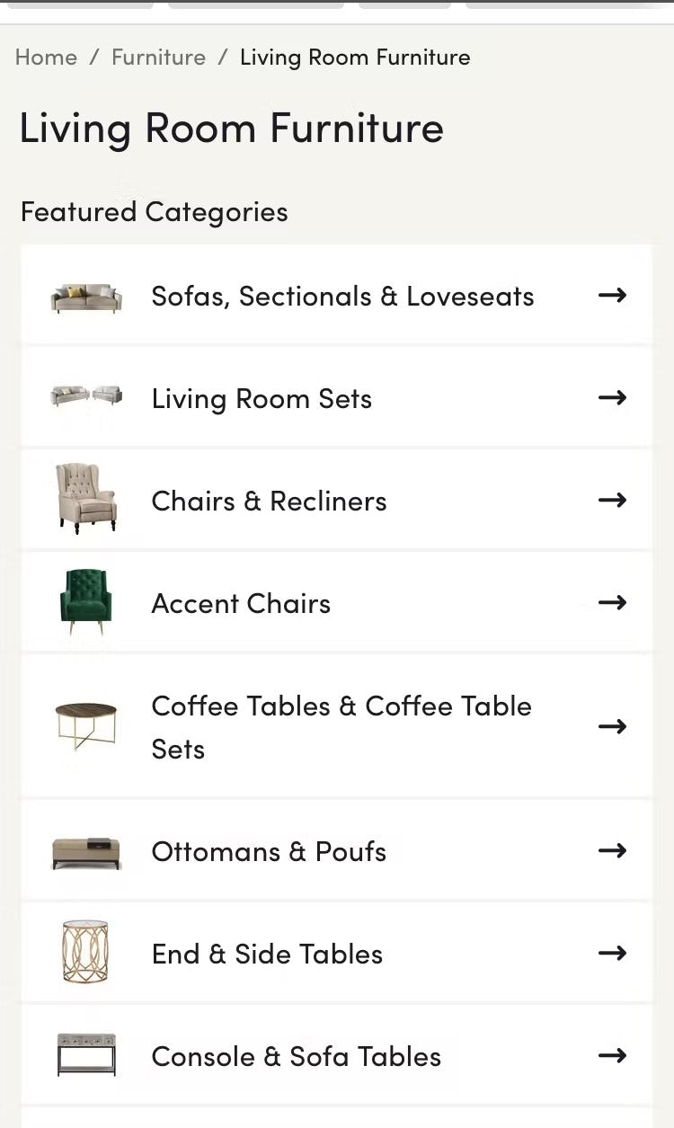
10) 79% of Sites Are Missing or Have Hard-to-Interpret Subcategory Thumbnails

During testing of Overstock, we observed participants struggle to choose a subcategory from intermediary category pages when they only included text links. Text can be difficult to scan and offers minimal information scent.
The fact that users will have to scan a lot of text-only headings on this intermediary category page on Zalando will slow them down considerably when looking for the most suitable navigation path.
During testing, when intermediary category and subcategory pages lacked thumbnails, or had thumbnails that were difficult to interpret, participants had more difficulty determining how to best navigate from intermediary category pages.
Indeed, users will hesitate more when evaluating and deciding among text-only subcategory links with no accompanying thumbnail.
In short, the purpose of the intermediary category page — as a jumping off point to explore subcategories or products — is hindered when users aren’t offered important visual guidance.
These thumbnails on Smyth’s Toys make it perfectly clear what product types are in each subcategory.
On the contrary, users more easily navigated subcategory links on intermediary category and subcategory pages that were accompanied by clear, representative thumbnails.
Therefore, clear subcategory thumbnails should always be provided on intermediary category pages on both desktop and mobile sites.
The thumbnails on Wayfair’s intermediary category page clearly represent subcategories rather than specific products. Their minimized size reinforces their purpose as “visual labels”, enhancing information scent, as they are only large enough to recognize without seeing the detail necessary for product listings.
Additionally, ensure the subcategory thumbnails are easy to interpret at a glance, and make it clear what product type they represent.
Despite hindering users’ navigation decisions, 79% of sites use text-only subcategory links, or representative thumbnails that are difficult to interpret, on intermediary category pages (up from 33% in 2020).
11) 28% of Sites Don’t Feature Subcategories as the Primary Content on Intermediary Category Pages
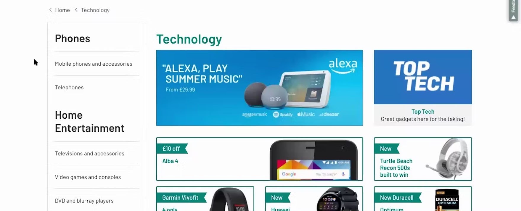
“I have a lot of offers, but I don’t see the categories anymore. I would expect that if I opened the page, I would see more stuff.” When subcategories aren’t easy to locate on intermediary category pages, such as on this one at Argos (UK), users have to work harder to find a way to access a relevant subcategory.
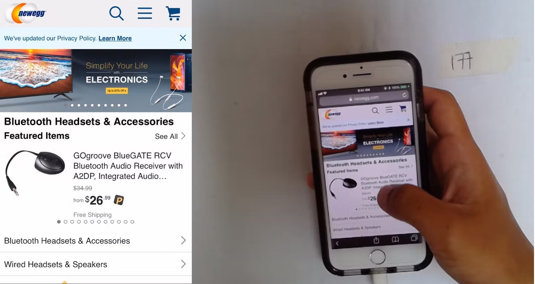
This test participant, looking for headphones on Newegg, tapped on the “Bluetooth Headsets & Accessories” menu item, which took him to an intermediary category page with ads and a very prominent promoted item at the top. Seeming surprised by the prominent featured item, he focused intensely on it rather than the more subdued subcategory navigation below it.
During testing, some intermediary category pages performed poorly because they prioritized promotional or auxiliary content above subcategory navigation.
Such implementations distract users from their original task of navigating to an appropriate subcategory and make it more difficult for users to find and choose among subsequent navigation paths.
Furthermore, without clear access to subcategories, some users will have difficulty identifying that they are on intermediary category pages at all.
This intermediary category page at B&H Photo includes only subcategory thumbnails. By avoiding a cluttered page with different kinds of links interspersed, the site clarifies the purpose of the page and streamlines navigation to subcategories.
Intermediary category pages perform best when they prioritize subcategory navigation, locating subcategories front and center at the top of the page.
Despite the potential to ease navigation, 28% of sites don’t feature subcategories as the primary content on intermediary category pages (down from 48% in 2020).
12) 35% of Sites Don’t Provide Direct Access to Products Featured in Inspirational Imagery
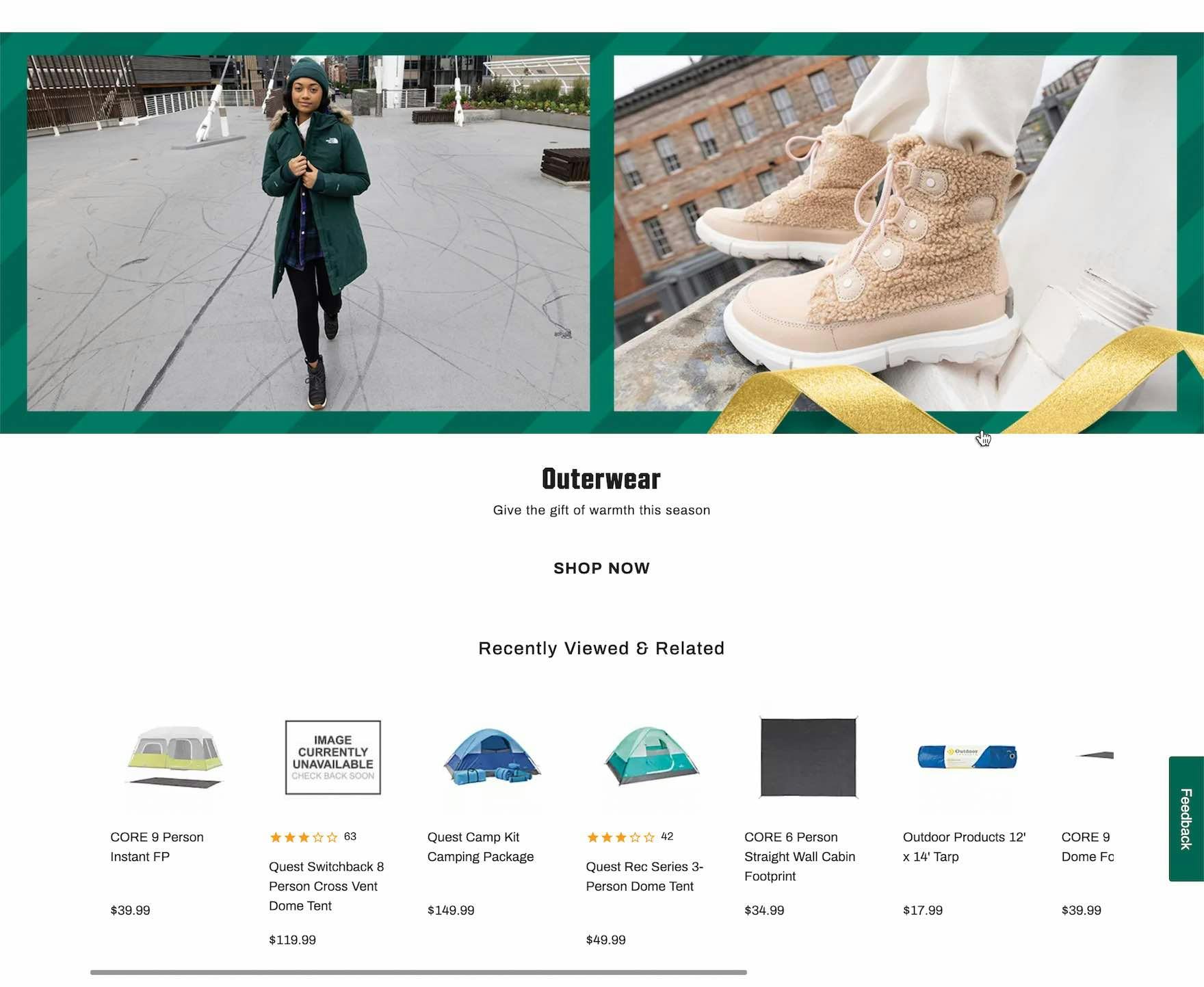
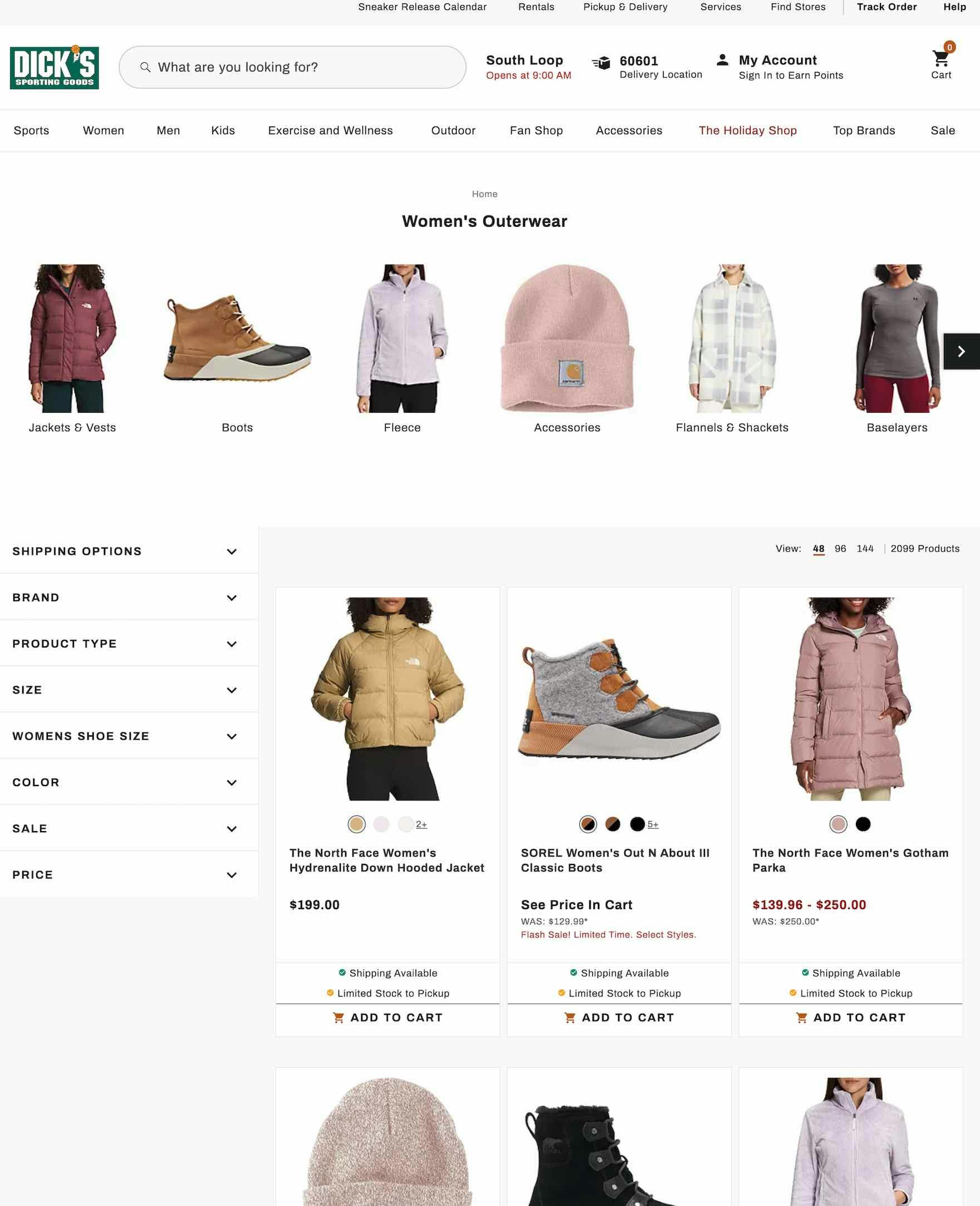
At Dick’s, the intermediary category page prominently features products in “Lifestyle” images (first image). Yet clicking on the image sends users to a general product list, and the featured products aren’t within the first 10 items in the list (second image). Users can be inspired to explore featured products on intermediary category page but their ability to find (and purchase) the item is hindered if it’s not immediately available.
During testing, participants on intermediary category pages often found it baffling that a site didn’t provide direct access to products featured in inspirational images.
As one participant said, “I want this — what do I do? I want this one”, as he struggled to find a product featured on an intermediary category page.
If it’s difficult to access products featured in inspirational imagery on intermediary category pages, users can quickly lose patience and may be unwilling to put in the effort required to locate the desired items manually.
On mobile sites, the consequences of not linking to products included in inspirational imagery can be even more problematic because the effort required to hunt down the desired featured product is increased.

The fact that the featured products on the intermediary category page (first image) appear at the top of the linked product list (second image) on the Argos mobile site means that users don’t have to scroll far to find the relevant items.
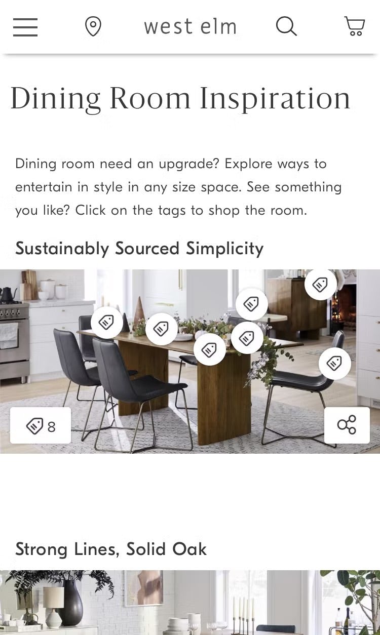
There is no hover functionality on mobile, so on West Elm’s mobile site individual product tags appear when the image is tapped. The persistent tag icon in the lower-left corner indicates that there are 8 products linked to from the image — tapping a tag takes users to the product details page for the depicted item.
Therefore, provide direct access to all the products depicted in inspirational images on intermediary category pages by including the products at the beginning of the linked-to product list.
Alternatively, have links to curated pages, or directly link to individual products.
Despite significant frustration for users, 35% of sites don’t provide access to products featured in inspirational imagery on intermediary category pages (up from 22% in 2020).
Improving E-Commerce Category Navigation and Homepage UX
L.L. Bean is one of the top performers of all our benchmarked sites when it comes to Homepage and Category Navigation; in particular, for the performance of its Homepage.
Our 2022 Homepage and Category Navigation benchmark reveals that many sites have slid backwards when it comes to their UX performance.
Whereas in 2020 the performance for the average top-grossing US and European site was “decent”, in 2022 the average performance has regressed to “poor” .
Clearly, much work needs to be done to improve the performance of the average site’s Homepage and Category Navigation UX.
Implementing the 12 best practices described in this article will go a long way toward taking the average site’s performance from “poor” to “decent” (or even “good”):
- Implement product types with shared attributes as filters instead of categories (88% don’t)
- Divide categories and subcategories into manageable chunks (82% don’t)
- Correctly implement “Sales” or “Deals” filter-based category (83% don’t)
- Provide clickable headers in the main navigation (19% don’t)
- Provide a hover delay for the main navigation drop-down menu (64% don’t)
- Highlight a user’s current scope in the main navigation (89% don’t)
- Avoid overly prominent ads on the homepage (51% don’t)
- Correctly implement carousels (if provided) on the homepage (28% don’t)
- Style clickable interface elements clearly (43% don’t)
- Provide clear and representative subcategory thumbnails (79% don’t)
- Present subcategories as the primary content on intermediary category pages (28% don’t)
- Always provide direct access to products depicted in inspirational images (35% don’t)
This high-level analysis of the current state of “E-Commerce Homepage and Category Navigation UX” focuses on only 12 of the 41 navigation UX parameters included in our full Baymard Premium research catalog.
The other 29 issues should be reviewed as well to gain a complete understanding of e-commerce navigation and to identify site-specific issues not covered here.
For additional inspiration, consider exploring the more than 2,300 “Homepage & Category” desktop and mobile Page Design Examples we’ve collected, as these showcase Homepage and Category Navigation implementations at the top 100+ US and European e-commerce sites and can be a good resource for navigational redesigns.
This article presents the research findings from just a few of the 650+ UX guidelines in Baymard Premium – get full access to learn how to create a “State of the Art” e-commerce user experience.
If you want to know how your website performs and compares, then learn more about getting Baymard to conduct a UX Audit of your site.