Designing the perfect niche website is like crafting a gourmet masterpiece. Just as this delectable dish can lose its allure in an untidy setting, even the finest content can perform poorly without impeccable design.

To help you win on the design front, we searched the internet to bring you the best niche website designs that we absolutely love.
![Get Inspired: 77 Examples of Exceptional Web Design [Free Download]](https://no-cache.hubspot.com/cta/default/53/c791aced-6180-48a5-916d-b2d76cec1836.png)
These examples span the entire design spectrum from minimalist to maximalist, showcasing intuitive navigation and compelling copy. But that‘s not all — we’ll also provide you with a snappy guide for creating your own niche website design.
Best Niche Website Design Examples
- Sneaker Freaker
- Visor Down
- Chop House Steak
- PetaPixel
- Discerning Cyclist
- Epic Gardening
- PC Part Picker
- 9to5Mac
- Cup of Jo
- The Zoe Report
- Pinch of Yum
- Vintage Car Collector
- Alo Moves
- IMO Flicks
- Sorry, I was on Mute
- Foxy Lady Driver’s Club
- North Coast Golf Co
1. Sneaker Freaker
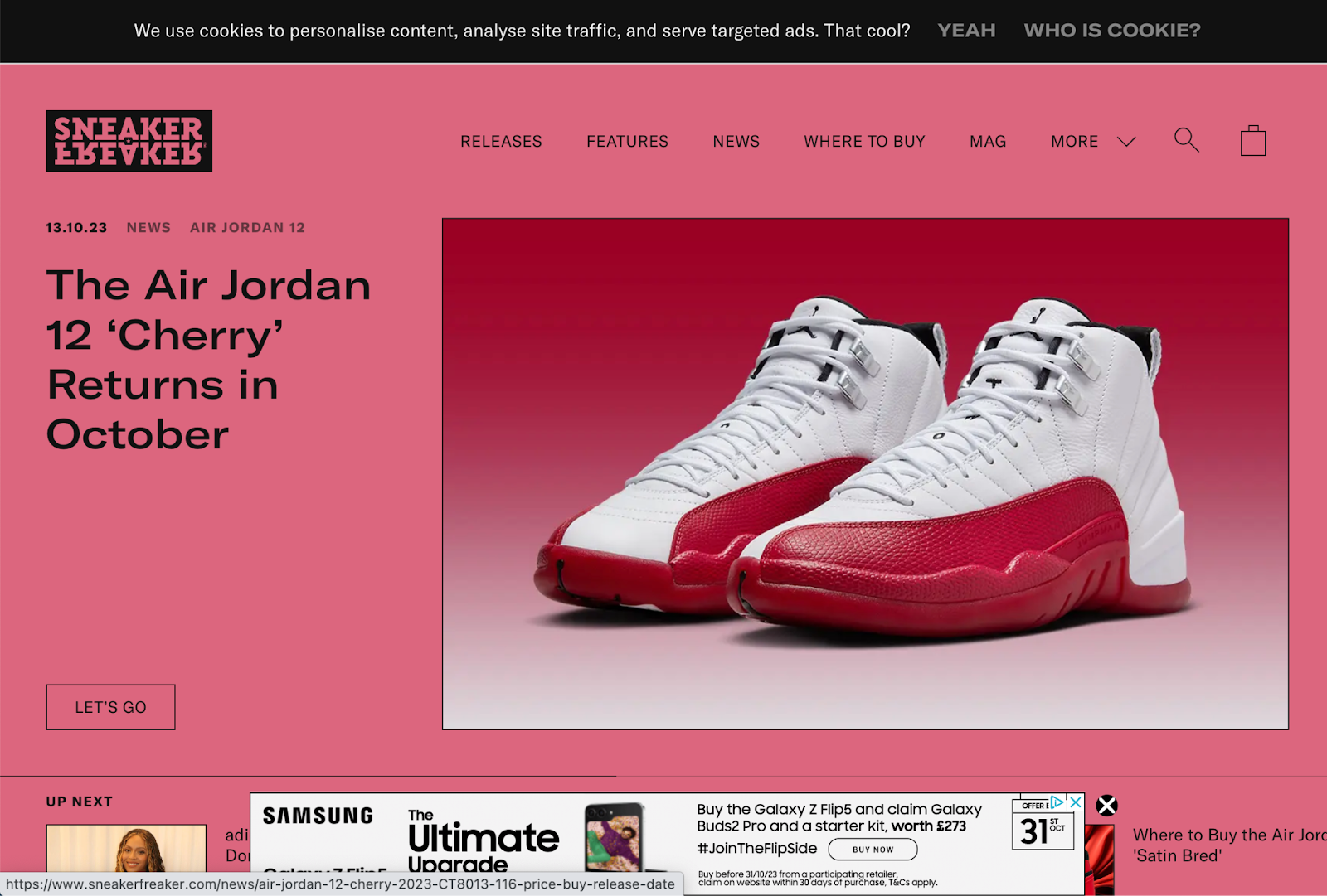
Everyone loves a pair of good sneakers, and really, what’s not to love? Sneaker Freaker has all the details about sneakers, recommendations, news, and even where to buy your dream pair.
What we love: First, the logo is superb. It features the brand's name in a sleek and bold typeface, perfectly balanced for readability and visual impact. The nice contrasting backgrounds of the automatic full-page slider also blend well with the logo. In five words, the visual imagery is spellbinding.
Another feature we love is the infinite scroll of the Releases tab, which could get users to continue scrolling until they hit ‘Add to cart.’ Also, the interviews, reviews, and opinions that Sneaker Freaker shares have brilliant designs that their 200,000+ organic monthly visitors will love.
2. Visor Down
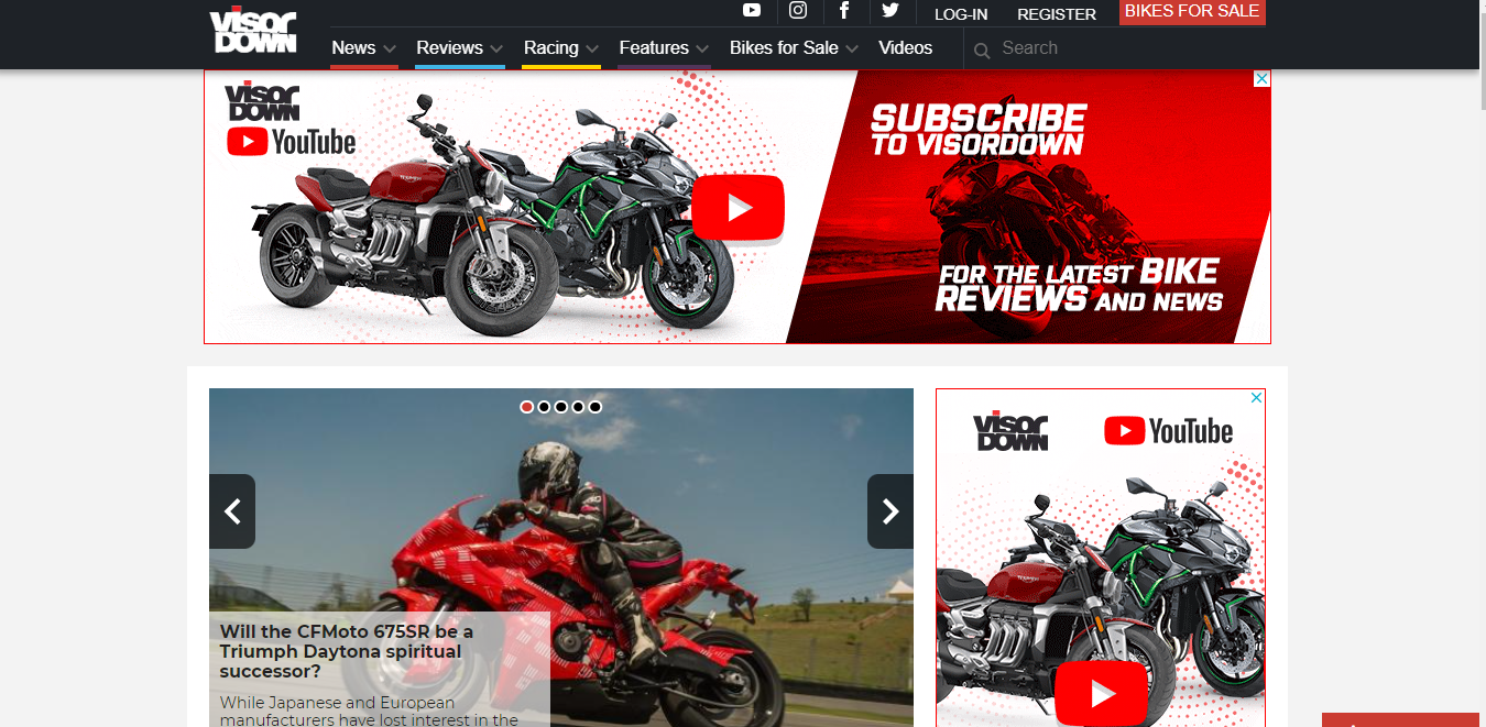
Safety is paramount and Visor Down emphasizes this by making its content front and center for bike enthusiasts who land on its site.
What we love: The website has a typical blog look and still holds attention. On the homepage, there’s minimal design and several blog posts. Using bikes as featured images in articles also provides clarity about what new readers can expect.
Visor Down also does a fine job of categorizing its articles, which gets over 130,000 organic monthly visits in an easy-to-use navigation menu. This navigation menu is great for SEO because it reduces the number of user clicks when finding a piece of content.
3. Chop House Steak
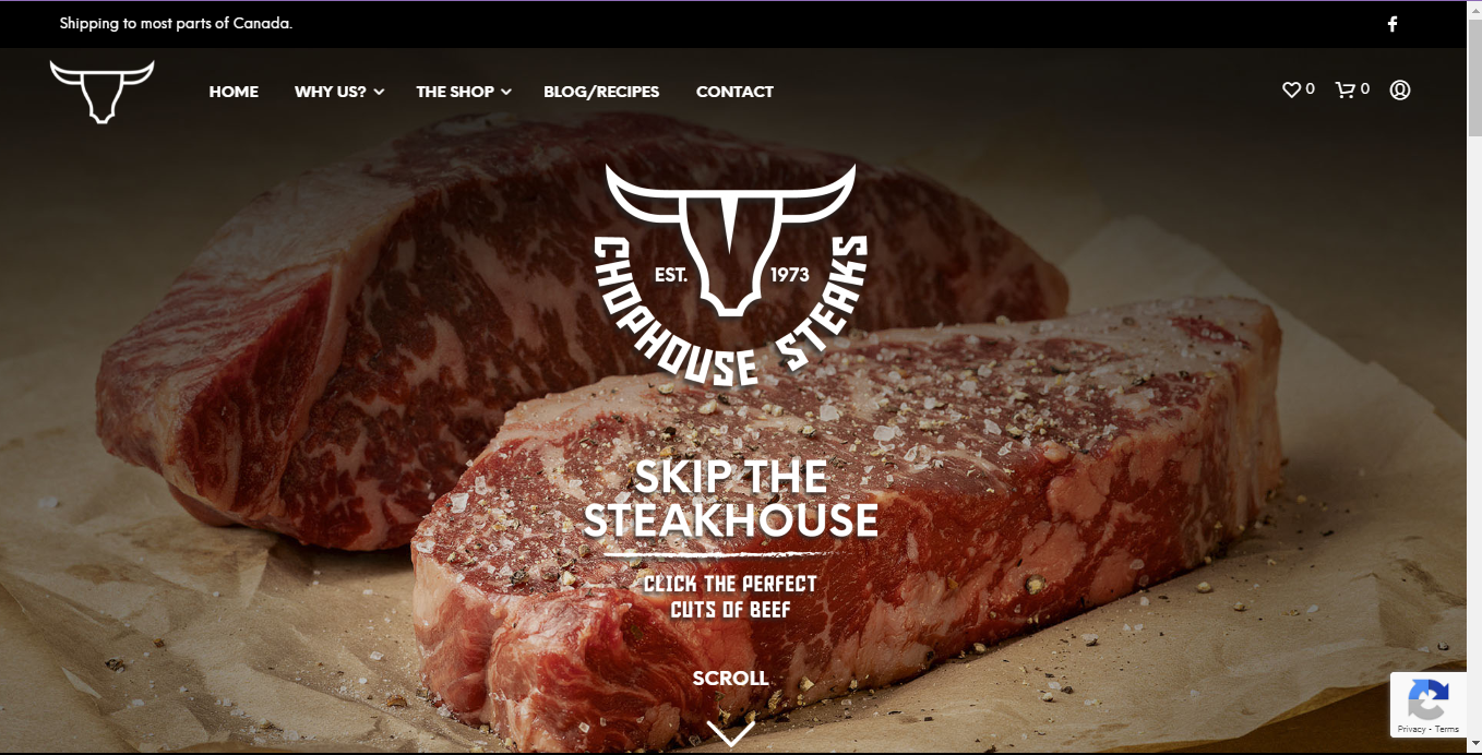
Picture this: “Hey, mirror! Tell me, who‘s the rarest of them all?” If that didn’t crack you up, don‘t worry. It’s just the heat and the meat setting the tone for a mouthwatering experience. That’s what you get from Chop House Steak!
What we love: Chop House Steak has a breathtaking, clean, and modern design that is easy on the eyes. The logo and color scheme of black, white, and red are simple, yet elegant.
As you land on the homepage, the image of well-cut beef reassures you that you’re in for a treat. A noteworthy design element is the subtle but inviting scroll arrow that beckons you to explore and savor the finely cut steak. It's a small touch that adds to the overall user experience of this site, which gets over 47,000 monthly visitors.
4. PetaPixel
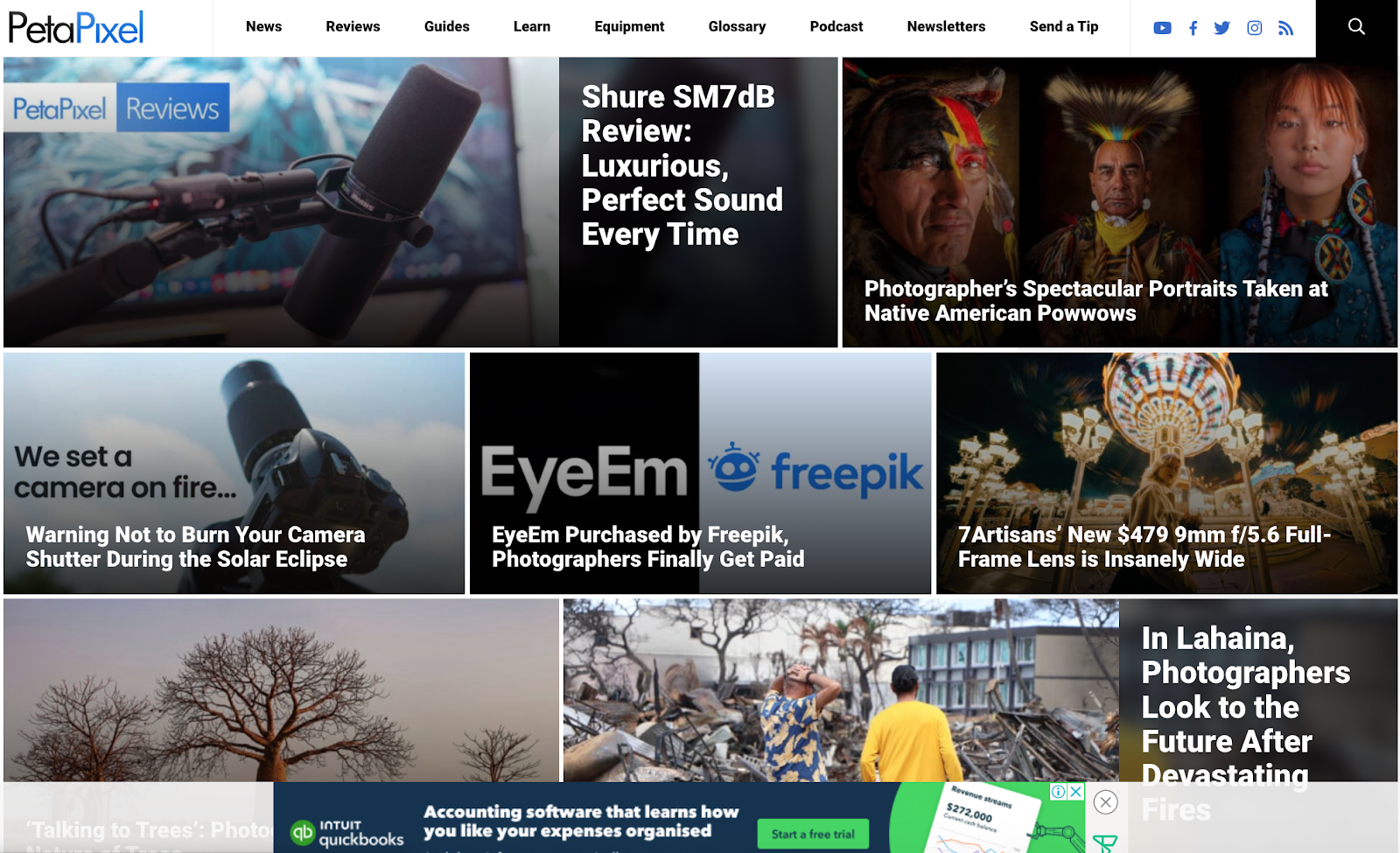
PetaPixel is a one-stop shop for over 510,000 people looking for all things camera and photography.
What we love: The homepage immediately grabs your attention using a blend of captivating visuals and white bold fonts displayed in a grid layout. Each thumbnail and copy provides a glimpse into the website’s diverse photography content, which includes camera news and tips, photography education, and product reviews.
One interesting design element is the “send a tip” button on the menu, which allows readers to pitch and feature stories on PetaPixel. Allowing the publishing of user-generated content is a genius way to engage their audience and increase their traffic.
5. Discerning Cyclist
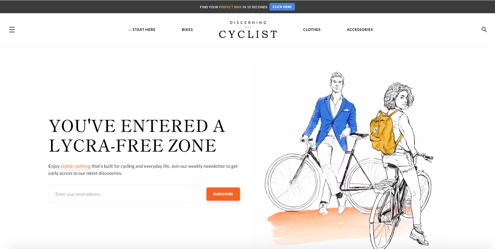
Discerning Cyclist certainly lives up to its name. It provides beginner and pro cyclists with bike content and the best bike recommendations, clothes, and accessories.
What we love: What’s not to love? The stunning bike illustrations, intuitive navigation menu, clean and minimalist design — everything about Discerning Cyclists is elegant. Using black text on a white background makes scrolling the homepage easy on the eyes and helps draw attention to other sections.
At the topmost part of the website, you’ll find a catchy call to action — 'Find your perfect bike in 10 seconds.’ Clicking it leads you to a ‘What type of bike should I get' page. Here, visitors can answer a short quiz to discover their preferred bike and enter their email address to see the result. This is an excellent way to hook new visitors and build an email list.
6. Epic Gardening
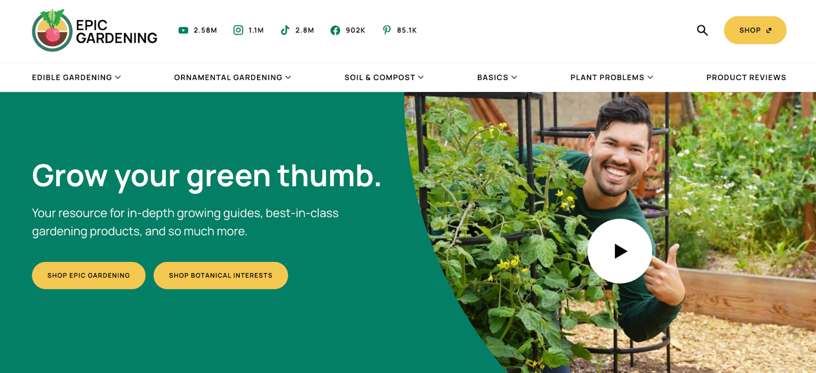
If you’re looking to design a niche website in the environment or sustainability niche, take a page from Epic Gardening.
What we love: The typical website will have a navigation menu beside its logo. Not Epic Gardening. The owner of this niche website, Kevin Espiritu, brilliantly displays and uses his number of social media followers as social proof.
On the homepage, Kevin also shares a video about helping 10 million or more people grow a green thumb. This humanizes his brand and lets him connect to his audience.
We also love the vibrant color schemes on this website. The creative blend of green and tan in various sections of the site evokes feelings of nature, growth, and tranquility. Plus, the enticing and high-quality thumbnails are sure to drive more user engagement.
7. PC Part Picker
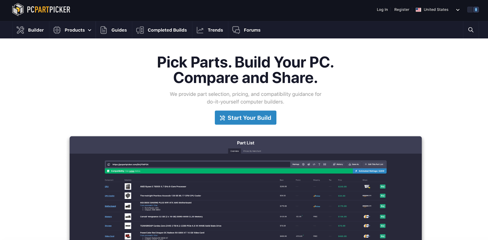
Aiming to guide readers to build their computers themselves, PC Part Picker embraces a simple approach to its website design.
What we love: The use of whitespace ensures the site isn’t cluttered. We love the bold headline which states what the site is about, followed by the subheading that shows how the brand helps, and a compelling CTA button that communicates the next step users should take. Also, the screenshot below the CTA shows a great visual overview of various selected PC components, helping users to better envision what building their PC might look like.
One thoughtful design feature is the dark mode toggle button on the top right of the menu. It allows users to switch between a light or dark background and reduce eye strain during night browsing. This provides a seamless user experience for the site’s 1.5 million monthly organic visitors.
8. 9to5Mac
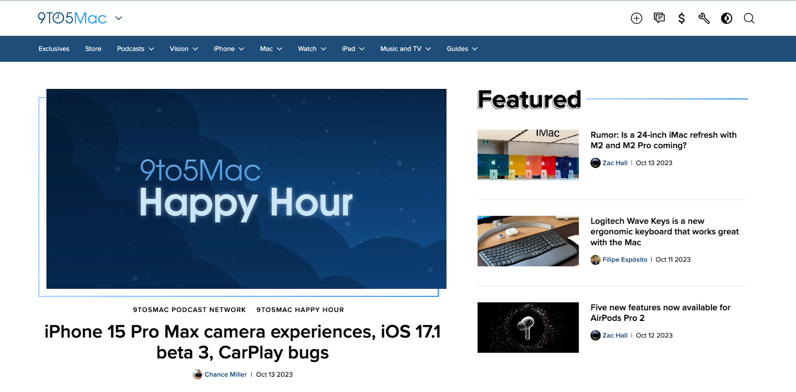
If you love Apple, you’d surely love 9to5Mac as it’s your go-to website for Apple product news and reviews.
What we love: This site predictably embodies Apple’s clean and minimalist approach to its website design. Though it follows a typical blog structure, the eye-catching cover images set against a white background make the entire website look beautiful.
Another feature we like is the use of icons on the navigation menu. Also, similar to the PC Part Picker website, there’s a dark-mode toggle button on the menu that allows users to choose between a light and dark interface. All these contribute to the visual appeal and user-friendliness of this site, which attracts 1.5 million monthly organic visits.
9. Cup of Jo
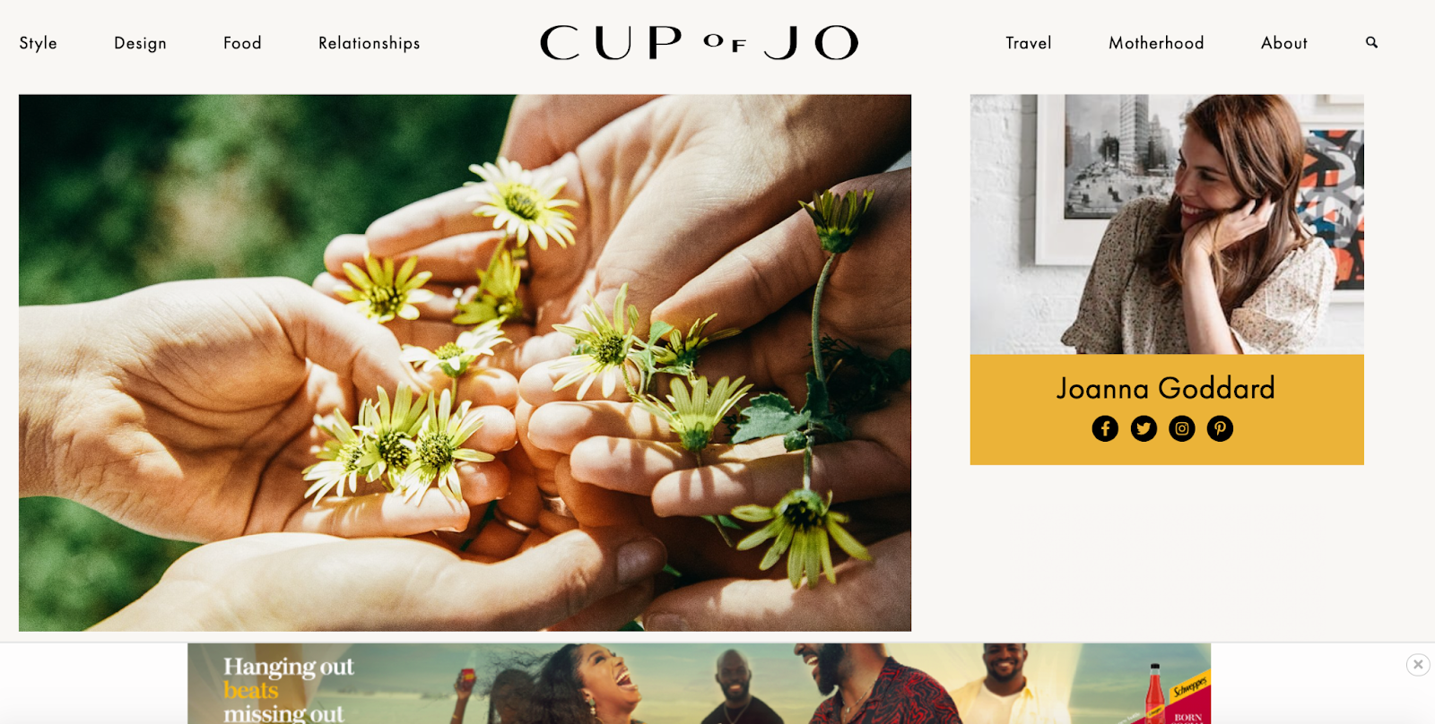
Cup of Jo, where every click feels like a sip of warmth and wisdom. It's like your favorite comforting mug, filled with relatable stories and delightful surprises.
What we love: This simple yet compelling lifestyle blog draws visitors in with its genuine, relatable content. Cup of Jo’s website layout is playful, sleek, and simple to use. The well-spaced navigation menu makes its content easy to find by topic. Scrolling down the homepage, you’ll come across a ‘most commented’ section (for blog articles) — something you rarely see on typical blogs.
10. The Zoe Report
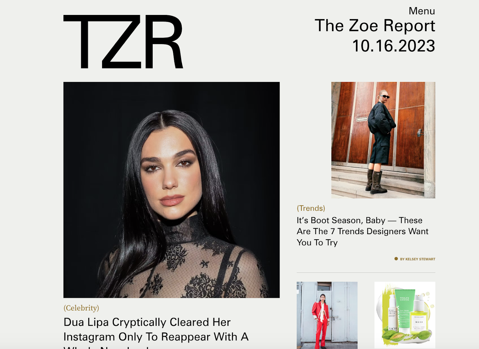
This website is like a style guru — it‘s chic and alluring, a perfect match for The Zoe Report’s fashion-forward vibe.
What we love: The unique homepage design features high-quality cover images that showcase celebs and the latest fashion trends. Each image has a compelling headline to entice clicks from fashion enthusiasts. We particularly love the background color choices. They enhance readability and ensure the images are eye-popping.
Also, The Zoe Report uses infinite scrolling to increase visitors’ dwell time. For a site that generates over 400,000 monthly visits, it’s a brilliant way to expose users to a plethora of engaging fashion-related content.
11. Pinch of Yum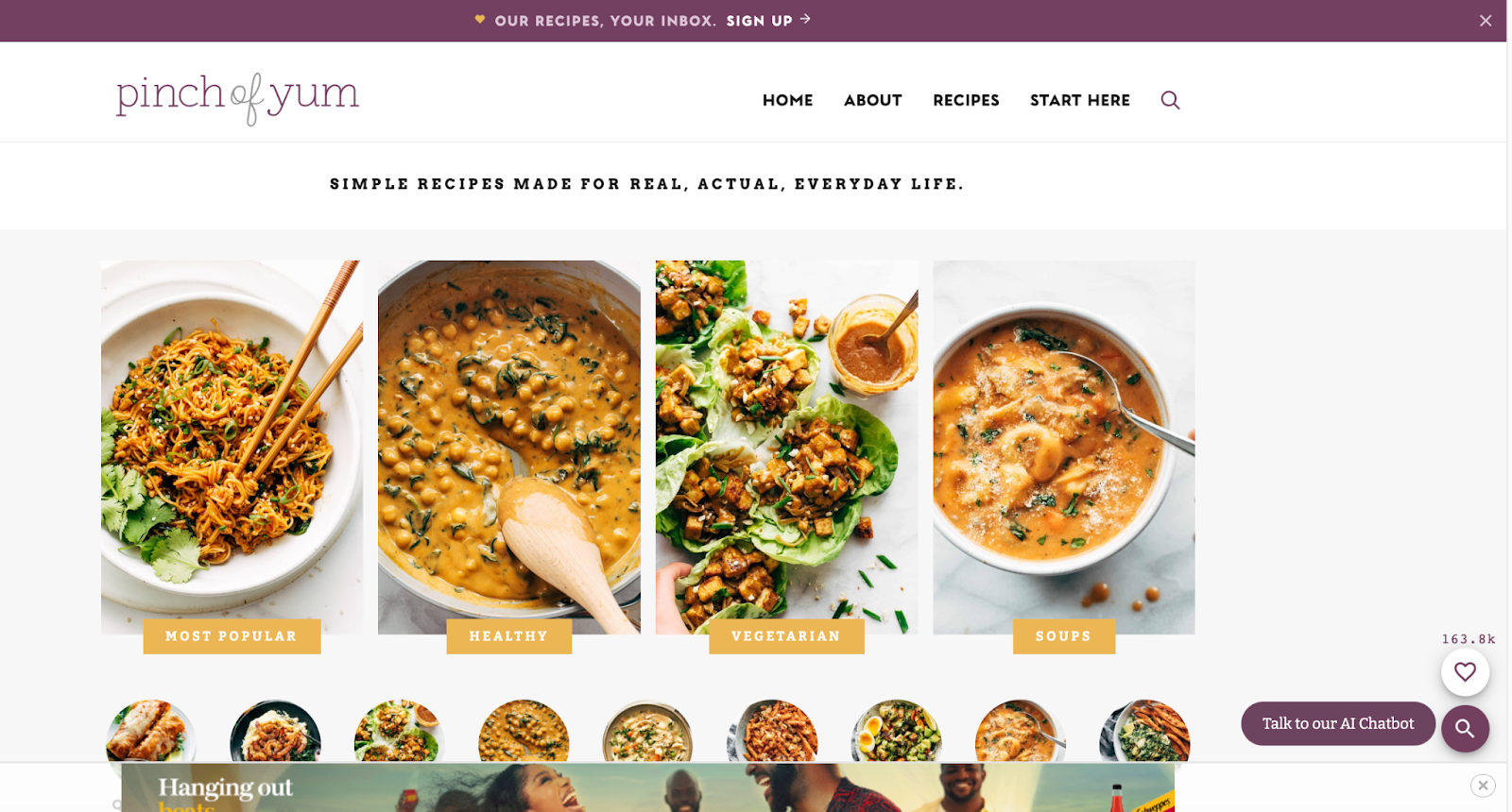
Besides making delicious healthy recipes, you can tell that Lindsay, the site owner, loves purple. Its combination with the white backdrop makes this website clean and aesthetically pleasing.
What we love: The mouthwatering recipes on the homepage are just spectacular. Using eye-catching food images to segment the various categories also improves the overall user experience.
Considering that Pinch of Yum has over 500 recipes on its blog, adding a search icon on the homepage ensures users can quickly find their desired recipes. This ensures that this website of 1.7 million organic monthly visits is user-friendly.
12. Vintage Car Collector
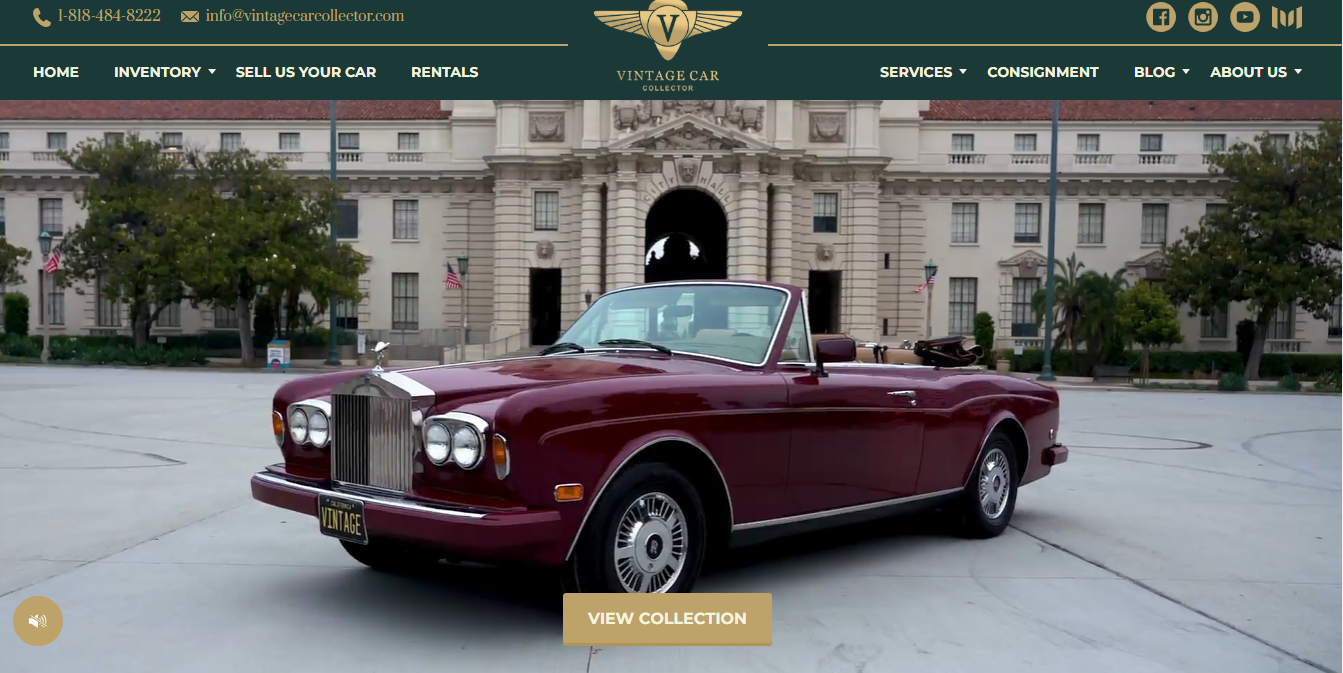
When it comes to ‘class,’ the Vintage Car Collector is definitely the winner.
What we love: This website is vibrant and modern. The full-screen videos on the homepage display an assortment of vintage cars that could rival James Bond’s car collection. This instantly shows customers they can expect — an array of vintage Mercedes, Jaguar, Rolls Royce, and the likes — as shown in the Featured Inventory.
13. Alo Moves
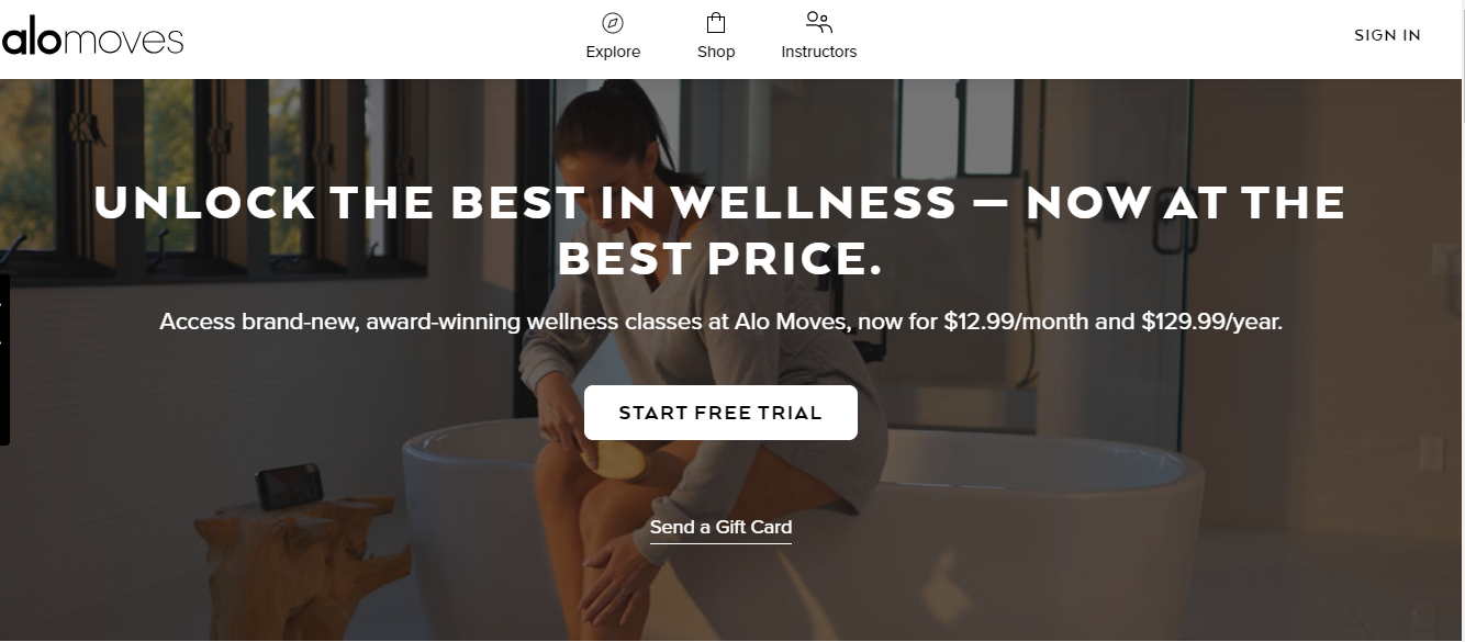
Alo Moves is an award-winning wellness brand that lets affiliates partner with it.
What we love: The Alo Moves homepage begins with a catchy full-width video background that shows an inclusive array of people performing yoga. Straight off the bat, prospects can also see the amount they can pay to use their service. Using lots of whitespace on the entire site also makes the website easy on the eye.
Overall, this website of nearly 100,000 monthly organic visitors is modern, sleek, and evokes the feeling of Zen that could make prospects subscribe to a free trial.
14. IMO Flicks
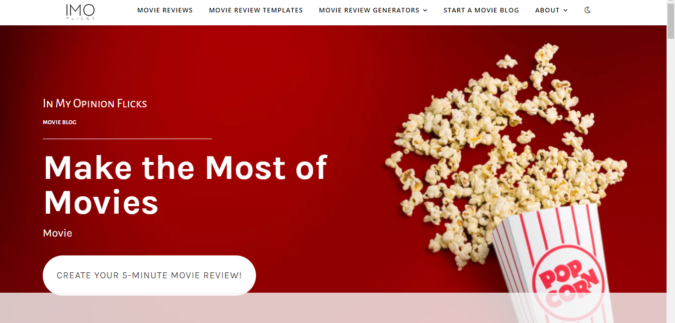
IMO Flicks creates a great movie scenery with its red-themed background and spilled popcorn.
What we love: This website is simple but still creates a cohesive experience. We love the accessibility feature of the navigation menu, which allows users to toggle from dark to light mode. The rest of the homepage has blog post recommendations for visitors to dive in and learn if their favorite movie is a hit or a miss.
15. Sorry, I was on Mute
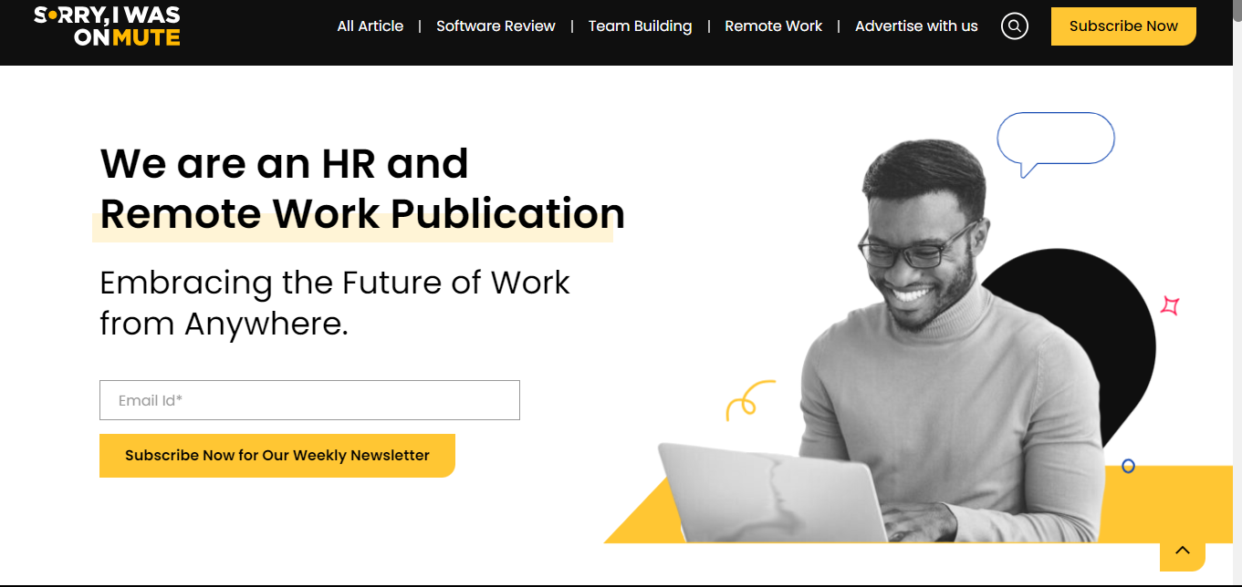
SIWOM is a POC-owned publication by Aakash Gupta, from Sydney, Australia. This niche site has a corporate feel and is built for HR and remote teams.
What we love: Its use of bold fonts, immersive images, and whitespace makes its content easy to read. This website also has over 9,000 organic monthly visits, so its inclusion of a search icon on the website is ideal for boosting user experience.
16. Foxy Lady Driver’s Club
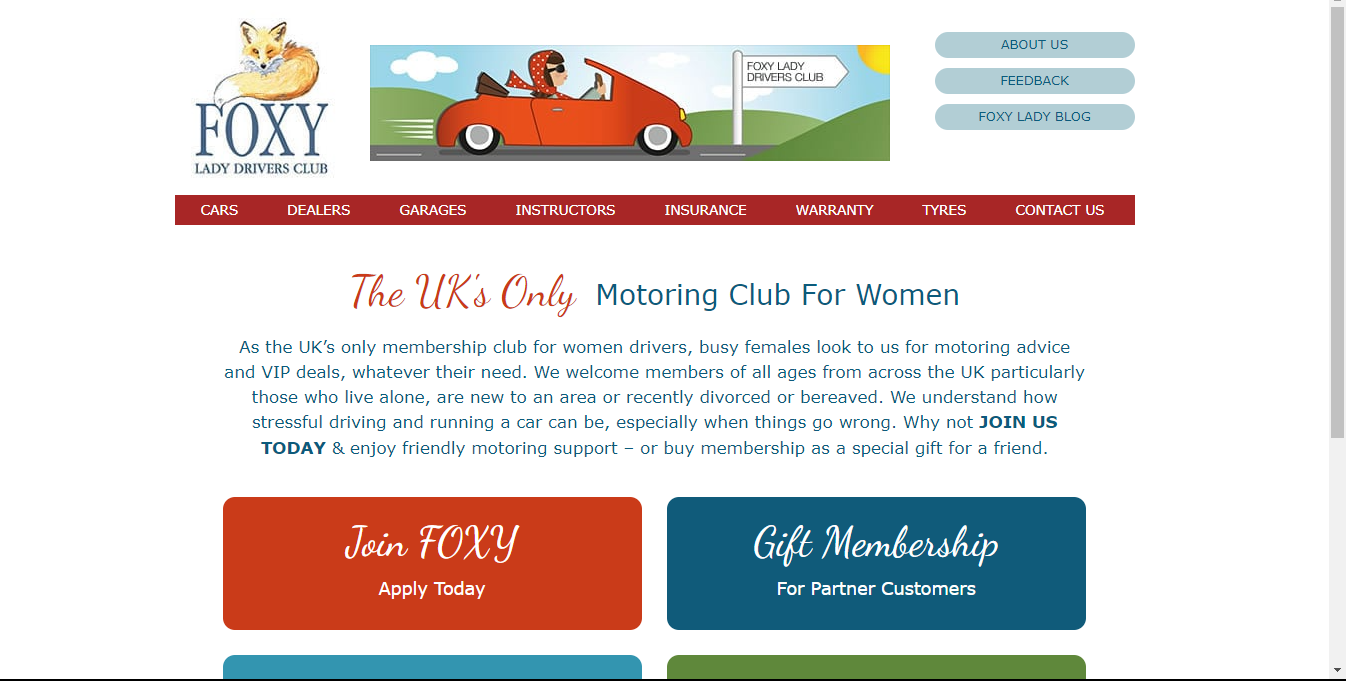
Classic cars have become popular among women over the years, because why not? The FOXY Lady Drivers blog is dedicated to educating and serving a community for female drivers.
What we love: The whiff of nostalgia that catapults you to websites in the early 2000s before animations and 3D images.
17. North Coast Golf Co
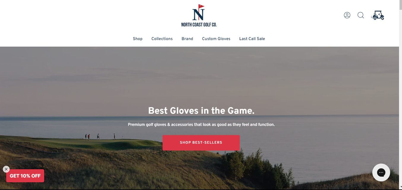
North Coast Golf Co is a website that sells premium golf gloves. More than that, they take their corporate social responsibility seriously.
What we love: The website is designed for golf lovers to take action instantly.
Landing on the homepage, the first image in the full-width slider states the brand’s value proposition and encourages golfers to ‘shop best-selling’ gloves. Unmotivated to shop? The second and last image on the slider may give a true golf enthusiast a rethink. How so? The brand promises to plant a tree for every ‘Bogey the Bear’ product they sell. Two images, great microcopy, one goal. Brilliant!
Another design feature we love is the use of a golf cart as the add to cart icon. This tells the 1,500 monthly organic visitors of this brand that North Coast Golf puts lots of thought into its content, design, and its products.
How to Design a Niche Website
Find a profitable niche
When deciding on a niche, look at social media trends, your interests, the niche long-term viability, and your monetization options. These have to come together to make the niche worth your time.
For instance, if a niche doesn’t interest people, no level of design will entice them to stay on such a site. If you lack interest in the niche, the same scenario plays out because you won't publish content often.
Conduct market research
Before going head-on into a niche, uncover what your competitors are doing, what's working, what to avoid, and how to differentiate yourself. Market research helps you do this, understand your target audience, and identify unique selling points.
Visualize what your niche website will look like
We can’t create what we haven’t envisaged. So think and do some research. How do you want the site to look? What design elements do you have and how do you think they’d fit into your site? Have great social proof? That should be front and center. Do you want to humanize your brand? People should know this once they enter your site.
By itemizing each of these elements, you get a general idea about the layout and content you need, and this makes designing your niche website a lot easier.
Select a website theme or template
After choosing a domain name and hosting your site, you need to select a suitable website theme and template. Finding a theme with many pre-designed layouts helps you design your site faster without having to worry about coding.
Platforms like HubSpot, Theme Forest, Template Monster, and Envato offer a range of website themes. Each theme comes with pre-built designs relevant to a specific industry.
Define your brand elements
Having your brand elements helps you establish consistency throughout your website. Brand elements include colors, logos, fonts, typefaces, images and apertures, and patterns that can add flair to your site. While this list seems like a lot to bother about, you can start with the smallest details, such as choosing one primary and two complementary colors. Afterward, proceed to typography and progress from there.
Start the design process
With your template or theme, brand elements, and site layout idea, the next step is to design your web pages. To do this, use content management systems, such as HubSpot, WordPress, Wix, and Squarespace. Your niche website should have a homepage, blog page, about us page, and contact page. You can also include a 404 page and an FAQ page.
It helps to keep SEO in mind when designing as this will help your site to rank high in search engines and attract organic visitors.
Do post-design tests
This ensures your website functions effectively and meets user expectations. These tests typically involve checking elements, such as website speed, responsiveness, and browser compatibility.
Niche Website Designs to Inspire Yours
A well-designed niche website will serve you well. It shows your audience you’ll always go the extra mile to deliver the best content, experience, and products. All you need now is to get inspiration from the niche website design examples in this guide and start building something memorable.


![20 Best Filmmaker Website Examples We Love [+ How To Make Your Own]](https://lh7-us.googleusercontent.com/3pG46rohpxjh8Gc6rCZo_xt0Mp7sSSMdM4_TQO4PTGfSJ3IP2uiCNlHXTD-9GRN2tF4KO22m1mQ9jhcTLQHuP1FHXBLEVVHskrmCfezXym-FWG_Zx6V3gFrHzCMi8oWalZgI3QC9CA3yf2HjV0OAI4w)

![31 Makeup Artist Website Design Examples We Love [+ How To Make Your Own]](https://blog.hubspot.com/hubfs/makeup-artist-websites.png)

![20 Retro Website Design Examples We Love [+ How To Make Your Own]](https://blog.hubspot.com/hubfs/Google%20Drive%20Integration/retro%20websites_32023-Apr-19-2023-07-39-17-5853-PM.png)
![31 Night Club Website Design Examples We Love [+ How To Make Your Own]](https://blog.hubspot.com/hubfs/Google%20Drive%20Integration/Copy%20of%2031%20Night%20Club%20Website%20Design%20Examples%20We%20Love%20%5B+%20How%20To%20Make%20Your%20Own%5D.jpeg)
![25 Actor Website Design Examples We Love [+ How To Make Your Own]](https://blog.hubspot.com/hubfs/Google%20Drive%20Integration/actor%20websites_22023.png)