Category Archives: grotesque

Enrico Baj

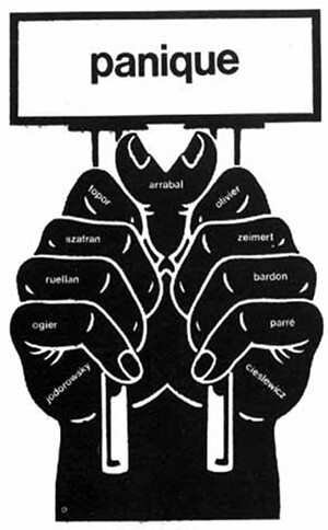
What follows are some notes on Baj with pointers to some interesting paintings. I can’t remember when and where I first discovered Baj. Perhaps through Virilio, or by way of Topor or Joe Colombo?

Kitsch by Dorfles

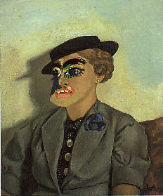
Kitsch (1968) – Gillo Dorfles

Enrico Baj (October 31, 1924 – June 16 2003) was an Italian avant-garde artist and art writer. Baj’s work shows similarities with Jean Dubuffet, Roland Topor and the COBRA group. It has a grotesque quality. Baj has also collaborated with Paul Virilio in a book on art horror, Discourse on the horror of art.

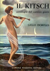
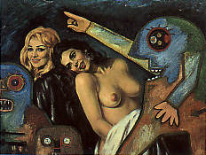
The book on Enrico Baj I bought today is an edition by Ronny van de Velde. Its title is Modifications. It is the catalog of an exhibition which was held in Antwerp in 1998. (détrompe l’oeils or modifications by Daniel Spoerri, Enrico Baj and Asger Jorn). It brings to the fore a to me unknown fascination of Baj with kitsch in his paintings from the 1959-1964 period. One of the paintings shown, the 1968 “Miss Paganini Non Ripete” depicts UFO’s superimposed on the same painting that Gillo Dorfles used on the cover of his 1968 book Kitsch, an anthology of bad taste (shown above). Many paintings in Modifications have this same working method, works of bad taste “detourned” by Baj.

The tropes of the Polish film poster

Danton poster made  in 1991 by Wiesław Wałkuski, for a 1983 film by Andrzej Wajda

It seems that my current interest in the work of Polish-French artist Roland Topor brings me again to the work of the Polish film poster makers. Their work is fantastic, figuratively and literally. Why is it that graphic design is at such a qualitative height in Poland. And why is it that their work is so unbelievably strange?

The tropes of the Polish film poster school are the fantastique, grotesque, weird, uncanny: pierced and punctured bodies, cut-out figures, dismembered limbs, independent body parts, eerie physicality and visceral transparency.

As to the why, the site owner of Polish film posters has an explanation:

A lot of patronizing drivel had been written about the ‘Polish School’ of poster design being a ‘product’ of a ‘resistance to Communism’ or some such (and by extension, of an overwhelming desire to breathe free under the learned guidance of a Bushmonkey-on-a-cheney). That view, espoused by Western writers who don’t know any better, and Polish ones (who should know better) has been omnipresent lately. No matter that the idea of art as an expression of political circumstance is par excellence a classic communist one.

In fact, quite the opposite seems to be true : free from commercial stranglehold, these artists produced brilliant works over an extended period of time. A lot of talented people found themselves in the right place at the right time. Like any artistic movement (or ‘school’), it had its own dynamics, peaks and valleys. Indeed, some of the most accomplished works were political (pro-socialist). And now the fact that Polish film poster is dead (and had been so since 1989 when the film distribution was privatized) is further evidence of that.–http://www.cinemaposter.com/index.html

As an encore I give you one more poster with the theme of independent body parts:

poster by Lech Majewski 1977 for Le Mouton enrage (1974)
sourced here.

About 500 more movie posters of the same site here.

I’ve reported on the paratextual qualities of the film poster here.

Experience is like a comb to a bald man

[Youtube=http://www.youtube.com/watch?v=tMFymZJWaEE]

Roland Topor portrait by Frantz Vaillant of Topor et moi.

Question: I was looking into the love life (cherchez la femme) of Roland Topor (who I consider the finest draftsman of the twentieth century) but could find nothing. Has there been a Topor biography? Yes there is, by  Frantz Vaillant.

The grotesque, the fantastique, niche marketing and printmaking

The Waking dream: Fantasy and the surreal in graphic art, 1450-1900 (1975) – Edward-Lucie Smith [Amazon.com] [FR] [DE] [UK]

My purchase of Quatre siècles de Surréalisme brought me back to the book pictured above (which I do not have in my possession, but which I feel covers the same terrain as Quatre siècles, please correct me if I am mistaken, in fact I believe the link between both books is French art historian Aline Jacquiot), of which Paul Rumsey says:

The tradition of the grotesque is particularly alive in prints. The fantastic is especially suited to the graphic medium, and it is possible to track almost its entire history in etchings, engravings and woodcuts. A fine book The Waking Dream: Fantasy and the Surreal in graphic Art 1450-1900 charts this progress through Holbein’s Dance of Death, the macabre prints of Urs Graf, the engravings of Callot, seventeenth-century alchemical prints, scientific, medical and anatomical illustration (I adapted the embryonic development diagrams of Ernst Haeckel for my drawing Species/Gender), emblems, the topsy-turvy world popular prints, Piranesi’s Prisons (which influence my architectural fantasies), Rowlandson, Gillray (whom I studied for guidance on how to draw caricature for drawings like my Seven Sins) , Goya, Fuseli and Blake, and into the nineteenth century with Grandville, Daumier, Méryon, Doré, Victor Hugo’s drawings and Redon. The tradition continues with the Symbolists and Richard Dadd, Ensor and Kubin, through to Surrealism, which recognised many of the artists of the grotesque and fantastic tradition as precursors. It is via Surrealism that much of this work has come to be appreciated. In the twentieth century this type of imagery has permeated culture, and is found everywhere, in diverse art forms including: the satiric installations of Kienholz, the drawings of A. Paul Weber, the cartoons of Robert Crumb, the animated films of Jan Svankmajer, photographs by Witkin, plays by Beckett, science fiction by Ballard, fantastic literature like Meyrink’s The Golem, Jean Ray’s Malpertuis, the art and writings of Bruno Schulz and Leonora Carrington, films by David Lynch, Cronenberg and Gilliam; all are part of a spreading network of connections, the branching tentacles of the grotesque. — Paul Rumsey

The significance of printmaking vs. oil painting is that of mechanical reproducibility. A print has always been much cheaper than an original, thus more democratic, thus more fantastic (it has to please fewer people, can address itself to niche markets), thus more nobrow.

Informe, abjection and Robert Gober

Happy birthday Robert Gober. Google gallery.

I have found 35 useful sources for the informe, the abject, and religious purity, which tend to be related in current discourse. These terms are often seen as variations on a theme but should be considered as quite separate according to Rosalind Krauss (see October Winter 1993 and Krauss, 1997).

Three theorists appear in this discourse: Georges Bataile, Julia Kristeva, and Judith Butler.

The artists that have been associated with the informe, the abject, and the grotesque include Fontana, Joel-Peter Witkin, Robert Gober, John Miller, David Hammons, Cindy Sherman, Kiki Smith, Paul McCarthy, Mike Kelley and David Lynch. [1]

Dessins Erotiques – Bertrand

Dessins Erotiques II (1971) – Bertrand


While Bertrand is not exactly canonical to me (too Giger-esque for my tastes), he was published by Eric Losfeld (and anything published by Losfeld is of interest to me). Besides, I quite like the grotesque eroticism on the cover above. Tip of the hat to John Coulthart, who appears to be new to me. I’ll try to find more on Bertrand and Hubert Juin, who wrote the text to this volume.

Here is the first series of Dessins Erotiques

Dessins Erotiques (1969) – Bertrand

This one has an introduction by cinema critic Raymond Borde.