- Home
- :
- All Communities
- :
- Products
- :
- ArcGIS Dashboards
- :
- ArcGIS Dashboards Blog
- :
- Dashboards That Pop: Sparklines
Dashboards That Pop: Sparklines
- Subscribe to RSS Feed
- Mark as New
- Mark as Read
- Bookmark
- Subscribe
- Printer Friendly Page
- Report Inappropriate Content
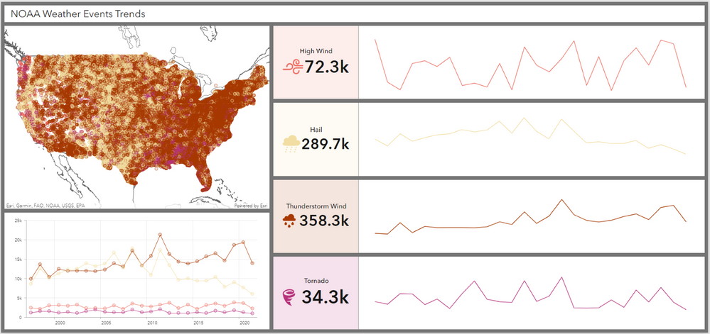
Today we will be continuing our exploration of the different kinds of charts you can create in ArcGIS Dashboards by talking about Sparklines.
What are Sparklines?
Sparklines are a very simplified serial chart without axis, coordinates, or legend that focuses on a single category. “Oh, that’s real helpful.” Like all charts, they are quite useful when used properly. Sparklines should be used to examine and compare trends over time. Let’s look at an example.
We’ll start with this line chart showing NOAA Storm Events over time.
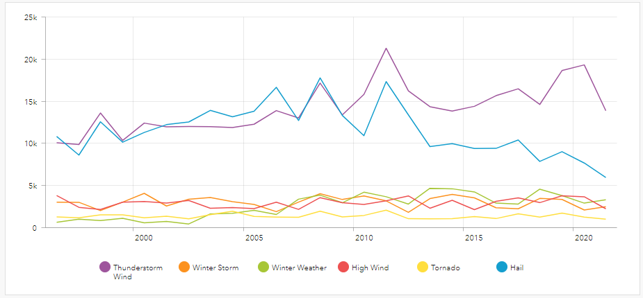
In this chart can you really see how Tornado events behave? Can you accurately compare it to Thunderstorms Wind?
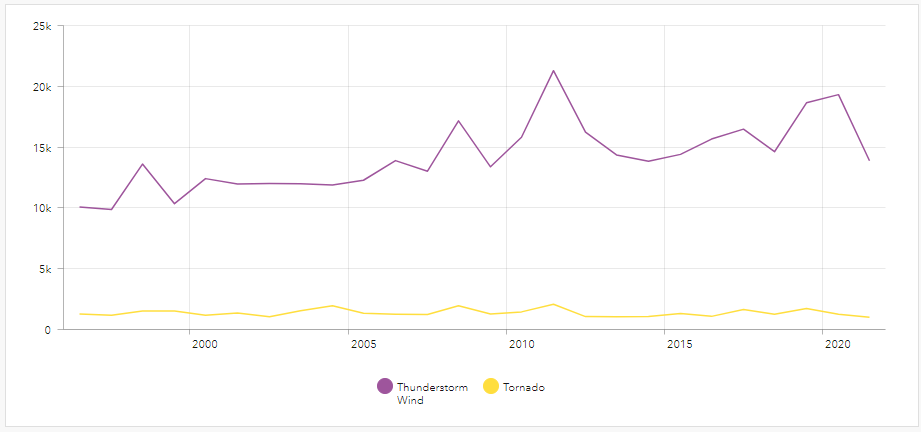
Here we removed all distractions to better focus on the two storm event types. This chart is a great way to display that there are significantly more Thunderstorm Wind events than Tornados over this time period. What it is not great at is showing the trends. Looking at this chart Tornados appear relatively flat with only minor variations and Thunderstorm Wind events have some significant peaks.
Let’s create a sparkline for our Tornado events to really understand how they are tending.
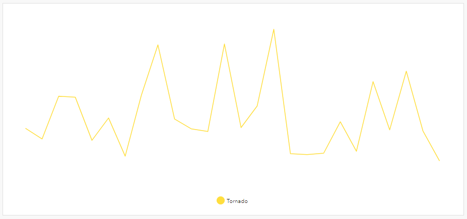
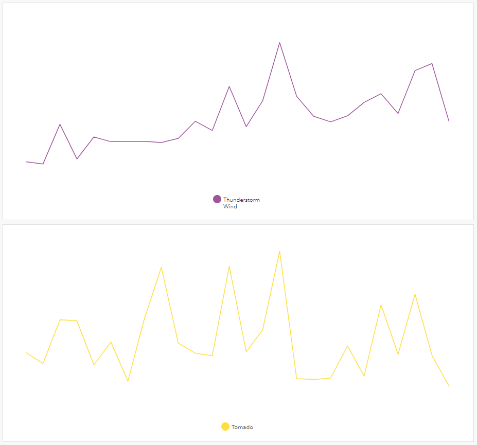
As we can see, Tornado events are quite a bit more volatile than our line chart led us to believe. The large difference in the number of Thunderstorm Wind events and Tornados extended the value axis of our line chart, which then flattened the Tornado events.
By pulling Tornado events into its own chart, the value axis is constrained to the values that make sense for these events. This allows the peaks, valleys, and plateaus of the data to be visible.
If we want to compare trends across Thunderstorm Wind events and Tornado events, we can create a series of sparklines called multiples.
How to Create Sparklines
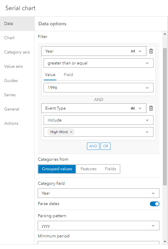
Add a serial chart to your dashboard and select a date/time field as your category field. Do not split by any fields. Remember, sparklines are simple and focus only on a single category. Use the data filter to display a single subcategory.
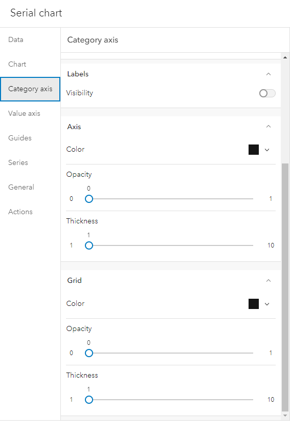
For both the Category Axis and Value Anix, turn off labels, and give the Grid and Axis opacity a value of 0.
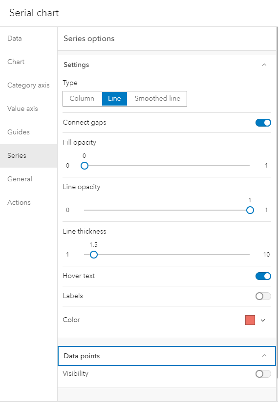
On the Series tab, change it to a line chart and ensure that data points are toggled off.
Additional Blogs
You must be a registered user to add a comment. If you've already registered, sign in. Otherwise, register and sign in.