Featured

222 – Potentially singing

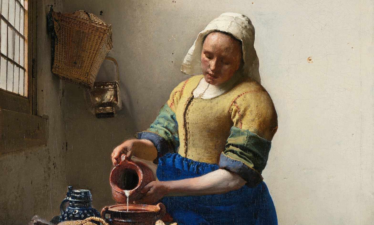
Carel Fabritius, The Goldfinch, 1654. Mauritshuis, The Hague.

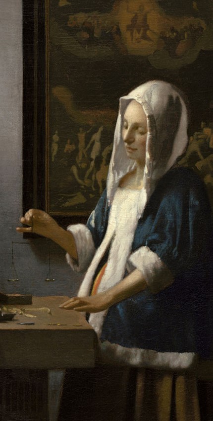
Some paintings are so simple they seem obvious, while others simply defy explanation. I feel certain that today’s painting falls somewhere between the two: a painting of a bird that has somehow become an international celebrity, with an expression as inscrutable as the Mona Lisa, or, closer to home, The Girl with the Pearl Earring. Indeed, the subjects of these two Dutch paintings glance over their shoulders to look at each other from the opposite sides of the room. Or at least, they did ten years ago when I last saw them together, and I presume they still do: I’ll find out within days. However, despite the fame of the avian protagonist, the artist responsible remains relatively unknown. But then, he did die tragically young. I want to celebrate him this week, on Monday 6 May at 6pm, when I will talk about Carel Fabritius and the Art of Delft – making it clear that it is Not Just The Goldfinch. I’ve realised that there won’t be a huge amount of ‘Delft’, to be honest, as Fabritius’ works, however few, are so interesting that I will spend most of the time with them. While we’re about it I can recommend Laura Cumming’s Thunderclap most highly. It is a personal memoir about growing up with art, and its value for our lives, framed by encounters with the Dutch master’s paintings.

The week after Not Just The Goldfinch I will be in Delft – but the following Monday, 20 May, I will talk about Tate Modern’s powerful, colourful exhibition Expressionists. This will be followed (27 May) by another Tate exhibition, looking at the tireless, totally committed, and sadly misunderstood Yoko Ono. I’ve also set up the next set of In Person Tours of the National Gallery, which will be the last ones before a summer break:
Monday 17 June at 11:00am: NG05 – Siena in the Fifteenth Century
Monday 17 June at 2:30pm: NG06 – Piero and the Court of Urbino
Tuesday 18 June at 11:00am: NG07 – Perugino and Raphael (morning)
Tuesday 18 June at 2:30pm: NG07 – Perugino and Raphael (afternoon)

If you missed The Last Caravaggio I will repeat it next week, on Thursday 9 May at 6pm, for ARTscapades. And if you’re not free then, unlike me they have the personnel to post a recording online – so you can catch up with it within the following fortnight or so. Any other events will eventually get posted on the diary – although admittedly I have been known to forget things (as indeed I did for next week’s talk). But now: The Goldfinch.

A description of this painting could be so simple: a bird stands on a semi-circular perch – the upper one of two – its body facing to our right, while its head is turned to look over its shoulder, almost as if it is turning to look at us. The two perches curve around a grey box, which is supported by two similarly grey brackets against a cream coloured wall. The bird is evidently captive: a ring is threaded around the top perch, with one end of a chain attached to it. The other end secures the goldfinch. The chain hangs behind the lower perch, and loops down between the two brackets. The red colouration of the bird’s face, and the golden flash on its wing, tell us it is a goldfinch.

Each separate colour of the plumage is applied with distinct brushstrokes, which are carefully, and on the whole thinly, applied. The exception is perhaps in the yellow of the wings, which seems to have been built up more thickly, an effect known as impasto. Elsewhere the thin strokes do not entirely cover the layers of paint which had been applied earlier, leaving gaps which help us to build up a history of their application. Somehow this technique adds to the feathery texture. At times the strokes were applied ‘wet on wet’ – and the brush has picked up the earlier paints to create streaks of colour – a ‘feathering’ of different paints particularly clear in the buttery brown brushstroke just under the top of the black section of wing, which continues down to the shadow created by the raised yellow feathers. The way in which the paint has been applied suggests that the brush was stroked and dabbed onto the painting to fill in areas of colour with the required subtlety and delicacy – although there is never any attempt to pretend that this is not a painting. On this small scale it looks remarkably painterly. We see the materials involved and the manner of their application, unlike the work of a slightly older artist, also a student of Rembrandt, Gerrit Dou, who is known as a fijnschilder – a ‘fine painter’. His works barely hint at being paintings, their making disguised in a bravura display of what we would now see, anachronistically, as photographic: a highly detailed naturalism. Not that Fabritius shies away from illusion. Look at the thin, gently undulating lines on the perch, strokes with tiny brushes that span the gap between the ring and the goldfinch’s tail, which show the light glinting off the perch. Above and to the left of the ring three small strokes likewise glint off the joint of a hinge: the grey box has a lid which is attached to the wall, and could be lifted up – presumably by the goldfinch itself, looking for food, or maybe water. The Dutch title for this painting is Het puttertje. De put means ‘the well’, and de putter ‘the water drawer’ – someone who draws water from a well. The last syllable, ‘-je’ is a diminutive – ‘the little water drawer’. In the Dutch Republic, goldfinches were trained to pull up water from a bowl in tiny thimble-like buckets. Maybe it’s the protestant work ethic.

What is the point of this detail, you might ask? There is no more information than in the last one – less, if anything, as we can see neither the perch nor the chain. But we can see the background – and there is a lot of it, compared to the size of the Goldfinch. Fabritius was a master of painting walls, creating the texture of the rough plaster with scumbled layers of closely matched paints. He was also a master of negative space: he does not focus in on his subject, as others might, framing them tightly and pushing them forward. Nor does he proclaim the goldfinch’s importance by placing it top centre of the visual field. It is some way down the painting, and off to the right – which only serves to make it seem more real. This is the full width of the top of the painting – which shows you how much space there is to make the goldfinch stand out, to convey its diminutive size, and also, perhaps, its vulnerability. If you look carefully around the edges – at the top, left and right – there seems to be a narrow border which has been painted over. This is part of the original setting of the painting, but I’m afraid I don’t have the space to go into that today: I’ll have to leave it until Monday. It is particularly relevant to Delft! The light comes from the top left, from over our left shoulders – you can see that from the bird’s shadow, below it and to the right.

The direction of the light is confirmed by the shadows of the perches, the upper one cast on the grey box, the lower one onto the wall. And while the shadow to the right of the box may seem to contradict this – the angle goes up to the right – this is the result of the scalloping of the bracket, curving from thin to thick as it goes up. Notice how both perches look as if they curve up from the wall on either side. I have little doubt that they were, in fact, horizontal – this is just a clue that we are looking up. The goldfinch is perched above our heads. To the right of the lower perch, a small area of paint has flaked away, revealing grey plaster underneath. To the right of this there is a clear vertical line which is another remnant of the original setting – which must, as we have just seen, have been high up. However painterly the style – look, for example, at the single, vertical stroke at the top of the right bracket, disguising the brown layer beneath, but barely hiding it – the chain itself is exquisitely delicate, every single link traced onto the surface, with those at the top left glinting in the light, as does the ring which allows the goldfinch a limited freedom of movement, flying back and forth in a prescribed arc, with barely enough space to flap.

There is yet more space at the bottom of the painting, again allowing the subject to be seen and understood. Space can be a luxury, and here it adds status: in the middle of this pictorial void is something that deserves to be seen. At the bottom (which is closer to our eyeline, if we are looking up at the painting) is the signature, carefully inscribed in capital letters on top of areas of re-worked paint as if it were drawn on the rough surface of the wall itself. It was 1654, the year in which Fabritius would die at the age of 32.

As I suggested above, his few remaining paintings (thirteen are generally accepted) reveal that Fabritius had a truly original sense of composition. The painting is by no means symmetrical: we have already seen how the goldfinch is on the right. However, the box and the perches are placed exactly symmetrically on the central vertical axis, while the top perch skims the central horizontal: underneath the apparent freedom is a rigid geometry. The bottom of the chain hangs to the right of centre though, implying the movement of the bird, which just happens to stand with its body lined up along the diagonal from top right to bottom left: nature organised by art, a celebration of illusion. There is also a sense of trickery. The shadow of the bird, and of the two perches, assure us that the light comes from the top left. And yet, the shape of the brackets, and the positioning of the bird, make the shadow of the box look as if the light is coming from the bottom left – but this is just Fabritius playing with our expectations, I think: the shadow is entirely logical, even if it is unexpected.

What does this all add up to? Art historians have struggled to interpret the painting: what does it mean? Or is this the wrong question? Does it mean anything at all? Or is it pure observation? And if so, why was it painted? Why this particular subject? None of the answers are entirely satisfactory, and we fall, as I said at the beginning, between unnervingly simple, and enigmatically sublime. One thing, though, is certain. If you have ever felt sorry for the goldfinch, trapped in its limited world, don’t worry – because there is no goldfinch. There is only paint. We can see how the paint was applied. We can see the layers, and the way the colours blend. We are also told, in a tract of painting that is – not coincidentally, I’m sure – exactly the same width as the distance between the outside edges of the brackets, the name of the man who painted this, and when he did it. So we can have no doubt that this was made. It is a fabrication. Fabritius was a man who made things. And yet, we believe in the goldfinch. One of the things that this painting is about – and there could be many – is the magic of art, and our willing suspension of disbelief that turns a mixture of oil and dirt into a delicate creature, living and breathing – and potentially, even, singing – just above our heads.

Featured

221 – Caravaggio: the witness witnessed

Michelangelo Merisi da Caravaggio, David with the Head of Goliath, 1606-07 or 1609-10. Galleria Borghese, Rome.

I was very lucky to be able to get into the National Gallery before opening time last week, and had the unequalled opportunity to see The Last Caravaggio on my own. In terms of the National Gallery’s ‘small and perfectly formed’ Room 46 exhibitions, this is undoubtedly the smallest – there are two paintings, two books and a letter. Of course, it is a ‘must’ for any lover of Caravaggio’s work, but by 10:30 a small queue had formed. At eleven it had stretched across the landing, and by 12 it continued downstairs and across the Annenberg Court – just so that you know. The exhibition is free, but they can only fit 39 people into the room. I will talk about The Last Caravaggio on Monday, 29 April at 6pm, looking at both of the paintings in the exhibition in detail, explaining the significance of the books and letter, and putting it all into the context of Caravaggio’s life as a whole. The following week, on 6 May, I want to think about another artist who died even younger than Caravaggio, and whose early death has denied him the fame he undoubtedly deserves – even though his masterpiece is, in itself, one of the celebrities of the art world. The talk will explore Carel Fabritius and the Art of Delft – making it clear that this is Not Just The Goldfinch. Thereafter, I will introduce two exhibitions at Tate Modern, which look at the Expressionists (20 May) and Yoko Ono (27 May). As ever, keep your eye on the diary for more information.

I have discussed the story of David and Goliath before, when I looked at Bernini’s sculpture (see 132 – Giant, or Giant Slayer?). In that post I used Caravaggio’s painting as a comparative illustration: both are in the same collection in Rome, although they are in different rooms. I also discussed the story at length when talking about the Pesellino painting, The Story of David and Goliath, as part of the National Gallery’s recent exhibition. But, long story short (as if you didn’t know it), David was a shepherd boy who took up the giant Goliath’s challenge of one-to-one combat to resolve the war between the Israelites and the Philistines. With God on his side, David triumphed, using nothing but a slingshot and a stone, which hit the Giant’s forehead and knocked him dead. The boy didn’t even have a sword – so he took Goliath’s, severed the head, and returned to King Saul in Triumph – the subject of a second painting by Pesellino. Caravaggio depicts a moment just after the climax of the story, with David looking down at the severed head, the sword still in his hand.

Caravaggio’s early works were richly coloured, using widely ranging palettes and a detailed depiction of form and texture. As his all-too-brief career progressed, the palette simplified, the colour drained out and the darkness crept in. There is no implication in the biblical narrative that this story would have happened at night, nor would it make any sense: battles almost inevitably happened during the light of day. How else could you see who you were fighting, or know where to aim? It is so dark here though, that it cannot be anything other than night, which of course adds to the drama of the depiction. However, there is just the vaguest hint that David is not exactly ‘outside’. The top left corner of the painting is cut off by a diagonal that can be read as the dark, olive green flap of a tent, and another piece of fabric hangs almost vertically down the right side of the painting. A strong light shines from the left, almost on a horizontal: the boy’s face is in shadow on our right, the line between light and dark being as vertical as possible given the forms of the facial features. There must be a bright lantern hanging by the ‘door’ of this tent. We can see the taut tendons in the neck, and the clavicles at the top of his sternum, tense as a result of the extended left arm, which is raised and strongly foreshortened: the direction of the light means that the arm is brilliantly illuminated along its full length.

This arm thrusts the severed head towards us, blood pouring down below it, but not in an overly shocking way – it is too dark to cause much concern. Caravaggio brilliantly captures the moment of surprise as the apparently invincible giant realises that he will be defeated by an innocent child, this fleeting thought captured on his face by the sudden, unexpected death, so recent that the eyes are still crystal clear. It is as if he is still alive, still thinking and feeling, the brow crumpled in thought. The small, bloody wound in his forehead caused by the shepherd boy’s stone is hidden by the shadow from a lock of hair. The right eyelid droops, the eye unfocussed and clearly no longer seeing, even if the lively glint in the left eye contradicts our understanding of the situation. The mouth is open – the last breath was a gasp – the lower lip glistens and the peg-like teeth catch the light.

David is dressed unusually – he seems to have taken his left arm out of the sleeve of his shirt and tucked it in into the belt of his tan-coloured britches. Maybe that is some of the sleeve hanging down in front. The rest of the shirt – if that is what it is – is worn over his shadowed right shoulder. The right arm is all but hidden in the profound darkness. He still holds the sword, the point lowered and out of the picture, its angle being parallel to the thrust of the arm – on the surface of the painting, at least, although not in the imagined depth of the space.

The position in which the sword is held is hard to explain, pressed as it is against his thigh, putting pressure on the britches, and inflecting the lines of the folds. The angle of the sword, and its position, right next to the groin, has led to lurid speculation – especially as the britches are not fully fastened: we can see the shirt where it has been tucked in. Almost inevitably with Caravaggio, these speculations are related to the artist’s own sexuality, something I have no particular interest in, if I’m honest, but we might come back to it. However, the sword includes a detail which might give us a better lead concerning Caravaggio’s line of thought. It is inscribed with the letters ‘H.AS O S’, usually interpreted as an abbreviation of Humilitas Occidit Superbiam – meaning ‘humility kills pride’. This is a quotation from one of St Augustine’s commentaries on the Psalms, and the relevant the full passage can be translated thus:

David is as a figure of Christ, just as Goliath is as a figure of the devil. And because David laid Goliath low, Christ is the one who has slain the devil. But what does it mean that Christ is the one who has slain the devil? Humility has slain pride. Since I cite the example of Christ, my brothers, humility is commended to us par excellence. For he has made a path for us through humility. Since through pride we had retreated from God, we were not able to return to him except through humility, and we did not have anyone to hold before ourselves for our imitation.

We will certainly come back to this!

The darkness visible through the shirt tells us that this is certainly a late painting: look at the wonderful freedom with which it is painted. A number of long, rapid, loosely-painted brushstrokes flow diagonally from the shadowed shoulder across the otherwise naked torso. The shirt is thin, judging by the amount it has wrinkled, and yet it does not appear to be translucent. We don’t see the light flesh tones of the chest or stomach through it, but the darkness. The white paint was applied directly onto a dark ground. This technique was first fully explored by Tintoretto in the 16th century, and is a great time saver for artists painting nocturnal scenes. Rather than working your way down from light to shadow as you would have to on a white background, here you work your way from darkness up to the light. However, the shadowed edges of forms do not need to be painted at all, as we fill them in with our imagination. Here, the shadows caused by the wrinkling of the fine cotton are an absence of overpaint, rather than an application of a darker hue. But then the dark ground seeps through the flesh tones as well. The outline of David’s back – to our right of his body – is defined by what appears to be light reflecting onto the torso at the edge of the shadowed rib cage. But this is artistic license – there is nothing in the painting to explain what the light could be reflecting from. The thinness and transparency of the white paint is a common feature of the late work – a development which reaches unprecedented extremes in The Last Caravaggio – all of which suggests the usual date given for the execution of this painting: about 1610, the year of the artist’s death at the age of 38. However, the Galleria Borghese, in whose collection the painting has resided for over 400 years, now suggests the date given at the top: 1606-07 or 1609-10. To understand why this might be the case, we should question the assumptions we have made about who is looking at whom. But just to point out the difference between a ‘mature’ painting and a ‘late’ one (though how can it be ‘late’ at the age of 38?), here is an earlier version of the same subject in the Kunsthistorisches Museum in Vienna, which they date to ‘around 1600/01’.

So much is similar between the two paintings. Both are nocturnal, with a bright light coming horizontally from the left. The sword is held in David’s right hand, with the head in his left, thrust towards us by the strongly foreshortened arm. The costume is also the same: tan coloured britches and a white shirt tucked in at the waist, hanging over one shoulder, with an arm withdrawn. The head looks surprised, the mouth gapes, and blood pours down in the shadows below the severed neck. Stylistically though they are rather different. In the earlier work the forms are fuller, and more clearly defined. Although it was also painted on a dark ground, the darkness is not nearly so visible through the flesh, or, for that matter, the shirt. In this painting it is more obvious that one of the arms has been taken out from its sleeve – the cuff is clearly visible tied just above David’s right hip. However, in this earlier painting it is the right arm which is bare, which makes more sense: he holds the sword in his right hand, the same hand that would have swung the sling. Freeing this arm from the clothing would have allowed him greater freedom of movement, a greater swing. In the later painting the unclothed left arm associates this freedom of movement with the head, thus bringing the relationship between victor and victim closer. There are a least three other notable differences, quite aside from the format of the painting (landscape in Vienna and portrait in Rome). First is the position of the sword, held nonchalantly over David’s shoulder. This may be a relaxed pose, but it still allows him to swing the blade again. A second difference is in his state of dress: the britches are more obviously gaping. This might be a reference to the biblical account. Saul was worried about the young boy’s ability to defend himself, ‘And Saul armed David with his armour’ (1 Samuel 17:38). However, David had never worn armour – he hadn’t ‘proved’ it, meaning that it was not tried and tested – ‘And David said unto Saul, I cannot go with these; for I have not proved them. And David put them off’ (1 Samuel 17:39). He ‘put off’ the armour – but the bible doesn’t suggest that he ‘put off’ all of his clothes – as the sculptures of Donatello and Michelangelo might suggest. In Caravaggio’s paintings David wears down to earth clothing, over which armour could have been worn. The sloppy garb of the young boy might simply result from the removal of ill-fitting armour, and could even suggest a lack of concern about his appearance in the face of God’s enemy. A final difference between the two paintings is the direction in which the boy is looking. In the earlier version his gaze is directed towards our right, into the shadows, and his expression is contained and in control – potentially proud, perhaps, and, I would say, on the verge of a smile.

The expression of the Galleria Borghese David is strikingly different – and unlike that of any other David that I know. His head is tilted, and the raking light casts most of the face into deep shadow. Rather than the potentially proud and imminently smiling figure, here his look is downcast, his lips pursed, his brow furrowed. There is a sense of deep regret – even sorrow – at what he has had to do. He even seems sad for the death of Goliath. Why should this be? It might help to look again at the face of the giant, and compare it with a portrait of Caravaggio himself, by Ottavio Leoni, which is now in the Biblioteca Marucelliana in Florence.

Although usually dated around 1621, eleven years after Caravaggio died, no one has ever doubted the authenticity of this chalk drawing, presumably copied from an earlier sketch.  It reveals an interesting aspect to the painting: Goliath is a self portrait – suggesting that Caravaggio saw himself as a slain giant. In terms of the subject generally, St Augustine’s interpretation of the story – in Christian terms – that it represents the triumph of Christ over the devil, (or, if we take it more generally, of good over evil), was one which was understood through the ages. But how does this apply to the famous painter? If his is the slain pride, someone must have humility, and that would also be the artist himself, presumably. He could be saying that he has – finally – found the humility to overcome his own pride.

The painting entered the Borghese collection as early as 1613, and records suggest that it was in Naples in 1610. An early biography implies that it was painted for Cardinal Scipio Borghese in 1606, though… However, given the existence of two other Davids by Caravaggio – the one above, in Vienna, and an earlier work in the Prado, in which David crouches over the prostrate body of the giant – it is not entirely clear which, if any, of the paintings the sources refer too: there could have been others which are now lost. However, 1606 was a significant date. It was the year in which Caravaggio murdered Ranuccio Tomassoni, and fled from Rome. After this there was a price on his head, quite literally: a reward for killing him, which in this painting David seem to have done. On leaving Rome his first lengthy stop was in Naples. His guilt at the murder, and his worry that it had potentially ended his own life, could be expressed in the downcast glance of the shepherd boy. From the moment he fled Caravaggio sought pardon from the Pope, Paul V: born Camillo Borghese, he was the uncle of Cardinal Scipio. If not painted during his first stay in Naples, from 1606-07, he might have painted it on his return from 1609-10 – hence the dates the Galleria Borghese gives for the painting. Throughout his flight he continued to ask the Pope for forgiveness, which would allow him to return to Rome. This painting was, in all probability, his way of asserting the fact that he had learnt his lesson: humility had finally conquered his own pride. However, there is another possibility.

It has been suggested that this painting is actually a double self portrait. If Goliath looks older than the man we see in the Leoni portrait, the idea would be that David is a younger version of the same person. This would be poetically beautiful, as we would be seeing the young Caravaggio looking with regret at his future self, although I can’t convince myself that this really is him a second time. However, what I have no doubt about is that one of the witnesses of the Martyrdom of St LucyThe Last Caravaggio – seen on the right, below, is none other than Michelangelo Merisi da Caravaggio.

However wild and unruly his life, he was a profoundly religious man, and regularly portrayed himself as a witness to the miracles he painted. There are a number of suggestions for the identity of the model for the young David. These include one of Caravaggio’s assistants, a contemporary artist, or the the artists’ ‘obsession of the day’ who did not requite his love (hence the sense of being ‘slain’). And, as I mentioned above, it has also been suggested that it is the young Caravaggio himself. But whoever it was, it is clear the man who portrayed himself so often as a witness is here being witnessed, and that what is seen causes sorrow. He died two months short of his 39th birthday, and as we always do, we inevitably end up wondering what he would he have gone on to do had he lived. Given the development of his work up to this point, it seems hard to avoid the conclusion that all that was left for him was darkness.

Featured

220 – At the end of the day

Frederic Leighton, The Garden of the Hesperides, c.1892. Lady Lever Art Gallery, Port Sunlight.

After some delay I will be very happy to talk about Frederic Leighton and Flaming June at last – this Monday, 22 April at 6pm. This is a superb opportunity to focus on a painting which is widely recognised as the masterpiece of a former President of the Royal Academy, especially as its usual home, in Puerto Rico, is not exactly on everyone’s doorstep. The following week, 29 April, I will look at The Last Caravaggio, putting the National Gallery’s two-painting exhibition into the context of the artist’s life as a whole. On 6 May I will look at one of Delft’s leading artists, Carel Fabritius – making it clear that his work was Not Just The Goldfinch. This will be followed by Expressionists (20 May) and Yoko Ono (29 May), which will both be introductions to exhibitions at Tate Modern: keep your eye on the diary, as they will go on sale as soon as I can get myself together. The May In Person Tours are selling fast, but there are still a few tickets left for each:
Wednesday, 8 May at 11:00am NG04 – Florence: The Next Generation
Wednesday, 8 May at 2:30pm NG05 – Siena in the Fifteenth Century
Thursday, 9 May at 11:00am NG06 – Piero and the Court of Urbino (morning)
Thursday, 9 May at 2:30pm NG06 – Piero and the Court of Urbino (afternoon)

But for now, rather than Flaming June, I would like to talk about a different painting by Frederic Leighton.

When I started writing this post a few weeks back I was sitting more or less directly underneath it, as I was in the café of the Lady Lever Art Gallery. I was sitting there because (a) I wanted to have another look at the painting, (b) they do great scones, and (c) they have WiFi, and at the time I didn’t, which is why Monday’s talk was postponed. The Garden of the Hesperides was first exhibited at the Royal Academy Summer Exhibition in 1892 – which is what gives it the date ‘c. 1892’. However, it is neither signed, nor dated, so we don’t know exactly when it was finished: it could have been completed the previous year, given that many artists built up their annual submissions to the Summer Exhibition gradually, in between shows. Indeed, it might even have been started before the 1891 exhibition. Leighton’s paintings, like those of many artists of the time, function as a sort of ‘stylistic chain’, with ideas developing from one painting to the next. In each case he would make choices to resolve the problems arising from the chosen subject, and the alternative solutions to these compositional concerns often inspired subsequent works. The importance of The Garden of the Hesperides for the development of Flaming June is the reason I chose to write about it today – even before I realised that it was just around the corner at the Lady Lever: it’s only a quarter of an hour’s stroll, so even closer than the Walker.

Before we go any further, it would be good to clarify who the Hesperides were – but it’s really not that simple. If you want all of the suggestions about them (at least, I assume they are all there) you could do worse than look at the Wikipedia page, but the Encyclopedia Britannica entry is undoubtedly clearer – if less detailed. Suffice it to say that the many and varied classical sources suggest there were anywhere between three and seven of them (although a chest designed by Edward Burne-Jones in the Birmingham Museum and Art Gallery only includes two), and they were blessed with a large number of possible names. Leighton settles on three, which was the ‘original’ number, and the most commonly accepted. Hesperos means ‘west’, with Hesperus as one of the names for the evening star, which is seen in the west, and associated with the setting sun. As a result it was often assumed that the Hesperides lived on an island to the ‘west’ of the known world, just off the coast of Spain. I’ll feed in more information about them as we explore the painting.

If we were talking about a renaissance work of art we would call this a tondo, a circular painting. It is displayed in the original frame designed by Leighton himself. The three Hesperides are sitting in the shade of a tree, which has a massive and gnarled trunk growing from bottom left to top right, the branches forming a canopy across the top of the tondo. The main role of the Hesperides was to tend their garden and guard this tree with its golden apples. The fruits were highly prized, and feature in a number of myths: The Judgement of Paris, Hippomenes and Atalanta and the 11th Labour of Hercules to name but three. The tree was a gift from Gaia, goddess of the Earth, to Hera on the occasion of her marriage to the ‘King’ of the Gods, Zeus. If you’re more familiar with the Roman names, that would be the wedding of Juno and Jupiter.

The three women sit – or sprawl – in relaxed poses, their heads lolling to one side, their eyelids drooping. It is sunset, after all (look at the orange glow on the horizon), and they appear to be in a state of eternal drowsiness. I spent a long time trying to find a good, high-resolution image of this painting to pick out some details, but they all seemed to be slightly out of focus. Finally I realised that they are out of focus. However crisp the intricate folds of the central light orange dress might appear, the faces are all slightly blurred, and that was Leighton’s intent: this is a painting of drowsiness. If I’m honest, they all look just how I feel when I’m nodding off to sleep in an armchair after a rather good lunch. We see different aspects of the three maidens: on the left, in profile; in the centre, facing towards us; and on the right, at an angle. They all rest on the trunk of the tree alongside another, unmissable presence: the serpent Ladon, who helps them keep guard, and who, I would suggest, is the only one lively enough to do so.

The Hesperides were described by Hesiod as being ‘clear voiced’, while Euripides called them ‘minstrel maids’ – apparently they delighted in song. The nymph on the left is indeed strumming at a lyre, her lips parted, as if she is singing. Her brilliantly coloured dress would suggest that she is Erytheia – ‘the red one’. She leans back against the trunk of the tree, with her torso at the same angle, and her head tilted back. Her profile stands out clearly against the pale, evening sky, and the sharply defined line of the sea on the horizon almost cuts into her throat as she sings. Her right arm, shadowed and relaxed as it nonchalantly plucks at the strings of the lyre, stands out against the brilliantly lit trees growing by the sandy beach at the water’s edge. She sits on a red cloth only a shade deeper than the deep orange (rather than red, if I look again) of her dress. This is precisely the exploration of close shades of similar colours which interests Leighton in Flaming June. This nymph also has similar, exaggerated bodily proportions to those seen in the later painting. Compare the length of her torso, from shoulder to hip, as she leans against the trunk, to her thigh, from hip to knee. The latter is enormously elongated, adding to the sense of drawn out drowsiness. This lengthened thigh becomes one of the central features of Flaming June. The lower leg – from knee to foot – is relatively short by comparison. The angle of her right leg reveals the sole of her right foot, while the left foot, propped up on the flexed toes, shows the only tension in her body. In my mind this is an echo of the right foot of the right hand angel in Michelangelo’s Manchester Madonna – but I could easily be wrong.

The central figure wears a light orange robe – I suppose it could be described as ‘peach’, or a light ‘salmon’. This may be Leighton’s representation of Hesperia, whose name means ‘sunset glow’. Her figure epitomises the contrast between crisp focus – seen in the clear definition of the legs beneath the skirts, and the multitude of rippling folds in the thin drapery which surrounds them – and the lassitudinous blur of the face, lolling to one side in the shade of the tree. Seen closer, this detail reveals that none of the three nymphs are actually resting against the bark itself: they are using the serpent Ladon’s long sinuous flank as their pillow. The loops and curves of his form are not easy to trace, but there is just a hint of the metallic sheen of the scales to the left of the tree at the top of this detail, and lower down it curves behind the heads of the three Hesperides. Ladon also encircles Hesperia, wrapping around her shins and across her waist, where the light touch of her right hand tells us that this is in no way stressful – it could even be comforting. The thinner form of the creature leaves the detail on the right, almost as if leading on from Hesperia’s gesture. The nymph’s right knee is tightly bent, the left knee less so – a posture which goes back to the Torso Belvedere, which was much favoured by Michelangelo. A variation of this composition, with the foot of the fully flexed leg tucked under the more open knee, is also adopted by Flaming June: we will look at its origins in more depth on Monday. Also derived from Michelangelo is the ruching of the fabric around an element which binds the form. Here Ladon causes the bunching of the fabric, whereas in the paintings and sculptures of Michelangelo it is often a belt or ribbon.

If we are following the most ‘popular’ sources, the name of the third nymph should be Aigle, but as this means ‘dazzling light’ I can’t see that this was necessarily Leighton’s intention. This painting adopts a palette which was one of his favourites in the 1890s, exploring the ways in which colours are affected by the light. Here the olive green of the robe is inflected by the warm glow of sunset. It could be catching light reflected from Hesperia’s dress, or it could be a shot silk, with warp and weft made of green and orange threads. While the back of her head lies on Ladon’s flank, this third nymph also leans on her sister’s arm. She holds a dish on her lap, and lazily fingers its contents – but it is hard to tell what they are: a pot-pourri of sweet smelling petals, perhaps?

This is a truly sensuous painting, with references to all the senses. Sight is primary: we are looking at the painting after all, but we also hear the sound of the lyre. Whatever is in this bowl, it is being touched, and if it is not also sweet-smelling in itself, we will see later that a beguiling scent is essential to the meaning of the painting. But how about taste? We will get to the ‘golden apples’ on the tree later, but to our right of ‘Aigle’ is a ceramic jar, which may contain wine. Behind it are pink flowers, which again allow the possibility of fragrance. However, in this detail, it is really Ladon who stands out, his head bold against the glistening sea. His role, as I have said, was to help the Hesperides guard the golden apples, and he certainly seems to be the most alert of those present. In one version of the myth of Hercules, his 11th labour involved stealing one of the golden apples – he slayed Ladon and took the apple from under the noses of the nymphs. In another version, while Hercules held up the sky for Atlas, Atlas was able to get into the garden easily: he was commonly believed to be the father of the Hesperides.

Looking back to the three nymphs I can’t help but admire Leighton’s composition and colour. He has painted three women who are similar enough to be sisters, but in three different poses, all of which are relaxed and sensuous, using a harmonious palette which speaks of the dusk, and of the sun setting over nature. I am also intrigued by the way he varies the focus on the figures, and creates different depths of form, almost like a sculptor. If you imagine the three women as if they were carvings against a painted backdrop, Hesperia is in the highest relief and her dress in the sharpest detail. Erytheia and Aigle would be carved in a lower relief, with Erytheia perhaps the flattest of all. It strikes me that this is precisely how Michelangelo worked in the Taddei Tondo – which was acquired by the RA in 1829, and so would have been well-known to Leighton. The most ‘finished’ part of the carving is the most important – the baby Jesus, who is in the deepest relief at the centre of the sculpture – a tondo. Even though it is a painting, the same is true of the Manchester Madonna (which was acquired by the National Gallery in 1870, and so easily accessible). The Madonna herself is in the centre in ‘high relief’, with the angels flanking her further back – much as Hesperia is flanked by Erytheia and Aigle. Leighton’s admiration of Michelangelo’s work is widely acknowledged, and is revealed by contemporary photographs of his studio, in which he displayed black and white photographs of the Italian master’s sculptures (I’ll try and hunt some out for Monday). But there is, of course, more to this painting than just the three clear-voiced maidens.

At the top we see the canopy of the tree spreading below the curving frame. The broad, scaly flanks of the serpent loop around the massive trunk, with a last loop and the tip of the tail hanging from one of the slimmer branches on the left. Against the pale sky, which is streaked with clouds coloured a mid-blue in the dull light of dusk, we can see one branch thickly laden with fruit, and there is another, brighter, and clearer, in the foreground at the top right.

If we hadn’t noticed before we can see here that Leighton has accepted the relatively modern interpretation of the ‘Golden Apples’ of the Hesperides which suggests that they were, in fact, oranges. This is clear not only from the shape and colour of the fruits, but also from the leaves, typical of the long, pointed forms of citruses generally. This identification is also true for the garland which circles the frame, made up of bound branches of fruits, leaves and flowers: as ever I am grateful to the Ecologist, who has confirmed that they are accurate depictions of orange blossoms. In the corners of the frame are stylised shells, set against a waving pattern – together these features must surely refer to the island setting of the garden and its surrounding sea.

The bottom of the painting also reveals a watery setting – although this must be an inland freshwater pond. Two egrets perch in an oleander bush, one resting, the other alert, with one wing raised, and its neck arched as it scans the water for fish. The still, flat surface of the pond is dark and mysterious, but reveals reflections of the draperies of the Hesperides, interrupted by a few petals of one of the blossoms which are floating just to the right of centre. Aigle’s green drapery falls over a rock which projects out over the water casting a deep shadow. I can’t help seeing an echo of Leonardo’s Virgin of the Rocks here – the drop at the front of the renaissance painting is rarely commented on, but have another look. This might just be my renaissance ‘heritage’ being over-active, but given the references to Michelangelo, it is not impossible. The Virgin of the Rocks was bought by the Gallery in 1880 and so it is more than likely that Leighton would have known it, particularly given his interest in the art of the time.  

In terms of the impact of the painting, the detail at the bottom left is one of the most important. Egrets may be an increasingly common feature of the British landscape, but back in 1892 they would have struck an exotic note. Admittedly, it would probably have been read as ‘oriental’, even if the Hesperides were inhabitants of the occident, towards the setting sun – but it would certainly have served to locate the image as being ‘other’. The implications of the oleander might also be unfamiliar – but, within certain circles, it was a notable feature of the artistic culture of the late 19th Century. Among other references, in 1881 Oscar Wilde opened his poem By the Arno with the lines,

The oleander on the wall
Grows crimson in the dawning light.

In 1865 Matthew Arnold, a friend of Leighton’s, had written Thyrsis, a Monody, which Wilde could well have known: the setting is the same. The poem deals with the premature death and burial of a young poet – a friend of the author’s – in the Arno valley:

(For there thine earth forgetting eyelids keep
The morningless and unawakening sleep
Under the flowery oleanders pale)

The connection between overpowering scents, sleep and death, might change our thoughts about this remarkably sensuous, even decadent painting. The air is heavy with languorous music, the taste of rich wine and somniferous odours: a beautiful and compelling decadence. This aspect of the work is explored more fully in the catalogue of the Leighton House Museum’s 2016-17 exhibition Flaming June: The Making of an Icon, which cites the two poems I have mentioned above – and more. Along with the miniature display currently at the museum, and the Royal Academy’s larger (but still modest) exhibition, the catalogue will be an essential source for my talk on Monday. At the end of the day, though, the most important thing is the painting: Flaming June. Don’t miss this opportunity to see it.

Featured

Transfigured (and Repeated)

Apse Mosaic, c. 549. Sant’Apollinare in Classe, Ravenna.

This coming Monday, 8 April, at 6pm, I will be Revealing Ravenna – or at least, talking about the remarkable mosaics, putting them in their historical and religious context, and explaining why the best Byzantine art is in Italy, rather than Istanbul. The following week I will be lucky enough to visit them in person. But seeing that not all of you can come with me, and not all of you will be free on Monday, I thought I would re-post a blog about one of the mosaics today – particularly as this one will not really get much of a look in, because it is some way out of Ravenna. The week after I get back I will finally be able to talk about Frederic Leighton and Flaming June. The talk has been rescheduled to 22 April as a result of technical issues (which, I am relieved to say, were finally resolved yesterday). The last talk in April, on Monday 29, will also be about a last – an introduction to the National Gallery’s small-scale exhibition, The Last Caravaggio.

There are still a few places left for some of next week’s In Person Tours – with the best availability on Tuesday 9 April at 11:00am for NG03 – The Northern Renaissance, looking at works by Jan van Eyck, Hans Memling and Dirk Bouts: do come along, as it will be the last time I will lead this tour. Information about the others can be found in the diary, of course. The next set of ‘IPTs’ will be in May, as follows:
Wednesday, 8 May at 11:00am NG04 – Florence: The Next Generation
Wednesday, 8 May at 2:30pm NG05 – Siena in the Fifteenth Century
Thursday, 9 May at 11:00am NG06 – Piero and the Court of Urbino (morning)
Thursday, 9 May at 2:30pm NG06 – Piero and the Court of Urbino (afternoon)
Shortly after this I will head off to Delft with Artemisia, and there are still one or two places left if you are a fan of Vermeer, or have always wanted to see The Goldfinch, and would like to spend a few days in an idyllic, thoroughly Dutch city. Meanwhile, back to Ravenna.

I have not often visited the church of Sant’Apollinare in Classe for the simple reason that it is a little out of the way – although maybe not as far as I used to think. Classe (two syllables, clas-sé) is now effectively a suburb of Ravenna, but it was originally the port of the Roman city, its name coming from the Latin for ‘fleet’ – classis ­– and it was about 4km away. Each time I go, I am struck by the simple majesty of the building, although this is the result of complex historical processes which, it turns out, are not simple at all. The church itself has a standard ‘basilica’ structure, with a central nave and two side aisles, separated by arcades, which lead to three apsidal endings. Originally the walls of the nave would have been covered with mosaics, but these have been lost. They were replaced with frescoes in the 18th Century, of which only the roundels with portraits of the bishops of Ravenna have survived, just above the arcades. The upper part of the walls, and the walls of the side aisles, have been stripped back to bare brick – wonderfully evocative, but decidedly modern in ethos. But at least they do not distract from the central apse, which is the true treasure of the church.

The basilica was dedicated to St Apollinare (five syllables – A-pol-lin-ar-é) in 549 – which gives us the approximate date for the mosaic within the apse. It was founded by Ursicinus, bishop from 533-536, and was dedicated by Maximian, who had managed to get a promotion. Ravenna became an archdiocese, and so Maximian was Archbishop from 546-556. Apollinare himself was said to have been the first bishop, having been converted to Christianity by none other than St Peter, although the ‘life’ which reports his deeds and martyrdom was, in all probability, written by Maurus, Archbishop from 642-71. There is no concrete historical evidence that Apollinare ever existed, if we’re honest, and Maurus almost certainly wrote his ‘life’ to make the diocese of Ravenna look more important, and to emphasize its apostolic origin. Indeed, one of the major subjects of the mosaics is the apostolic succession.

In the semi-dome of the apse we see Apollinare, dressed as a bishop, with his arms raised. This is the attitude taken by an orant – someone at prayer – a common image in early Christian art. Walking towards him are a number of sheep: six on each side, making twelve in total, like Jesus’s apostles. But why are they sheep? Well, the earliest images of Jesus show him as ‘the Good Shepherd’, and indeed, priests and vicars today still refer to their congregation as their ‘flock’. Here Apollinare’s flock is the same size as Jesus’s. Apollinare therefore stands in for Jesus. If not Christ’s vicar on Earth, he is at least Christ’s vicar in Ravenna – and this is precisely what the apostolic succession is all about. In John, Chapter 21, Jesus appears to his followers after the Crucifixion and asks Peter the same question three times. This is the last of the three (John 21:17):

He saith unto him the third time, Simon, son of Jonas, lovest thou me? Peter was grieved because he said unto him the third time, Lovest thou me? And he said unto him, Lord, thou knowest all things; thou knowest that I love thee. Jesus saith unto him, Feed my sheep.

He has already, in Matthew 16:18-19, told Peter that he will give him the keys of the kingdom of heaven:

And I say also unto thee, That thou art Peter, and upon this rock I will build my church; and the gates of hell shall not prevail against it. And I will give unto thee the keys of the kingdom of heaven: and whatsoever thou shalt bind on earth shall be bound in heaven: and whatsoever thou shalt loose on earth shall be loosed in heaven.

Either of these quotations, taken separately, would serve to affirm Peter’s position as the first leader of the church after Jesus. Together, the message is reinforced. Peter takes Jesus’s place, and then, according to the belief current in Ravenna, Peter both converted Apollinare and appointed him bishop: so Apollinare takes Peter’s place, in Ravenna at least. In the mosaic he leads 12 sheep as Jesus led the 12 apostles. Above his head is a blue circle, set with stars and a jewelled cross. Three more sheep stand on the ground, two people appear in the golden sky, and a hand appears from the clouds. But I’ll come back to these details later.

About 120 years after its dedication, the church was partially remodelled, and additions were made to the mosaics above the arch of the apse. We see Christ blessing in the centre, surrounded by the symbols of the four evangelists. On the left the eagle stands for St John, the angel is the symbol of St Matthew, and the lion – as anyone familiar with Venice will know – is St Mark. This leaves the ox to represent St Luke. The most handy mnemonic to remember these is the plant which makes such good hand cream – the ALOE. If the letters stand for Angel, Lion, Ox and Eagle they are in the right order for the canonical arrangement of the gospels – Matthew, Mark, Luke and John. Below these symbolic beasts, and once more against a golden sky, twelve sheep have left the gates of two jewelled cities – Bethlehem and Jerusalem – processing towards Jesus in the same way that their equivalents do towards Apollinare just below.

Further down, below Apollinare, there are four figures depicted in the mosaics between the windows. They are all bishops, all of whom were Apollinare’s successors. In traditional accounts, he was the first Bishop of Ravenna, his episcopacy lasting until his martyrdom in 79 CE. From left to right the first of the chosen few is Ecclesius, the 24th Bishop, in position from 522-532, who founded the church of San Vitale (home to some of the glorious mosaics I will discuss on Monday). He is followed by St Severus (c. 308-c. 348), the 12th bishop; Bishop Lacuna (dates unclear); and Ursicinus (533-536), 25th Bishop and the founder of this particular church. OK, so there never was a Bishop Lacuna, it’s just that I can’t get a good enough detail to be able to read his name and tell you who he is [I have looked it up online again, three years after I originally wrote the post: it is Bishop Ursus, whose episcopacy was either 370-396 or 405-431 (it was a long time ago, and the historians are still arguing about it) – he founded the cathedral in Ravenna]. These four bishops show us, in abbreviated form, how the apostolic succession continues – Jesus appointed Peter, Peter appointed Apollinare, and he is followed by a number of successors in turn, down to the present incumbent. But what exactly is going on above Apollinare’s head?

Most striking is the jewelled cross in the blue circle. In the apse mosaic of San Vitale, Jesus sits atop a similar blue circle: it can be seen to embody the cosmos, over which he rules. The cross needs no explanation, although the jewels with which it is embossed express its value, as they do for the cities seen on either side of the mosaic in the additions. There are twenty of them in the cross: four on either arm (reminding us, perhaps, of the four evangelists), leaving 12 going from top to bottom – a reference, perhaps, to the 12 sheep, and so to the apostles. In the very centre we see, as an apparently minute depiction, the face of Christ. To the left and right of the cross are the letters alpha and omega, the beginning and the end of the Greek alphabet, as God proclaims more than once in the Book of Revelation. This is chapter 1 verse 8:

I am Alpha and Omega, the beginning and the ending, saith the Lord, which is, and which was, and which is to come, the Almighty.

Underneath the cross are the words SALVS MVNDI – ‘the health of the world’ – or, to put it more explicitly, ‘salvation’ – and above we see (although not very clearly) ἸΧΘΥϹ – ‘ichthys’, the Greek word for ‘fish’. The fish was one of the earliest symbols for Jesus, and is derived from an acronym. The letters stand for the Greek words meaning ‘Jesus Christ, Son of God, Saviour’. Nowhere in this image is Jesus explicitly named, nor, with the exception of the tiny image of his face, is he visible. But what of the three sheep, and the two people in the sky? Should we see the sheep as three of the apostles, by comparison with the others below? And if so, who are they? They are not named. However, the two half figures in the sky are. The one top left is labelled ‘Moyses’ – or Moses. The top right inscription is harder to read, but it is Elijah. The presence of these two Old Testament prophets is the key to understanding the mosaic. Here is Matthew 17:1-3 (it helps to know that ‘Elias’ is a version of ‘Elijah’):

And after six days Jesus taketh Peter, James, and John his brother, and bringeth them up into an high mountain apart, And was transfigured before them: and his face did shine as the sun, and his raiment was white as the light. And, behold, there appeared unto them Moses and Elias talking with him.

This is The Transfiguration, itself transfigured. The three sheep represent Peter, James and John. Matthew says that ‘his face did shine as the sun, and his raiment was white as the light’, but in this mosaic Jesus is transfigured into pure symbol, whether as the cross, or as the words: ‘alpha and omega, salus mundi’, and ‘ichthus’. Too perfect to represent, Jesus becomes entirely transcendent. Later on (17:5) Matthew tells us that, ‘a bright cloud overshadowed them: and behold a voice out of the cloud, which said, This is my beloved Son, in whom I am well pleased’. The disembodied hand is that of God himself, and is the visual equivalent of the ‘voice out of the cloud’. And how better to represent ‘a bright cloud’ than with the light reflecting from a gold mosaic?

In the context of the church the meaning of the mosaic becomes clear. At the top, Jesus is seen as if in Heaven, blessing the congregation. His word is conveyed by the four evangelists beside him, and preached by the twelve apostles who process towards him – albeit in ovine form – from Bethlehem and Jerusalem. Below, in the apse – on Earth – he is transfigured. Seen in the presence of Moses and Elijah, and witnessed by Peter, James and John, this is the Son of God. In a direct line below him, Apollinare takes his place, having been appointed by St Peter, where, praying, he leads his own flock. His role is then taken by successive Bishops and Archbishops, whose throne would originally have been in the apse, directly behind where we now see the relatively modern altar (the same was true for all churches, although the only English cathedral to have its cathedra in this original position is Norwich). Everything – the mosaics, the architecture and the original fixtures and fittings – would have combined to say that the apostolic succession continues to this day.

The steps leading up to the altar date from the restructuring of the church in the 670s. By raising the floor a crypt could be created beneath the high altar for the display of the relics of Sant’Apollinare, allowing pilgrims to pay homage without disturbing the celebration of the mass. In the mosaic, Apollinare appears directly above his own relics, as well as directly above the modern-day Bishop, who would be, in a more worldly and less symbolic way, presiding over his own flock. There should be no doubt as to the authority of this man: it descends from Christ, is justified by his suffering on the cross, and has been passed down from the first Bishop, himself installed by St Peter.

By the 9th Century the harbour silted up and the importance of Classe diminished. Not only that: pirates patrolled the nearby coast, and they would not be cowed even by the direct display of God’s authority. To protect Apollinare’s relics from the raids, they were moved to a church in the centre of Ravenna. Built as the chapel of the palace of King Theoderic, and dedicated to Christ the Redeemer in 504, in around 540 it was re-dedicated to St Martin and then, in 856, it was re-dedicated a second time, to Sant’Apollinare. Today it is known as ‘the New Sant’Apollinare’, or Sant’Apollinare Nuovo. The changes of dedication are reflected in subtle changes to the mosaics, which take on an added complexity. But that’s one of the things I’ll be talking about on Monday.

Featured

A Second Helping of ‘The Last Supper’

Tilman Riemenschneider, The Last Supper, 1499-1505, St. Jacobskirche, Rothenburg ob der Tauber

I’m so sorry, I won’t be able to talk about Flaming June on Monday, 1 April – you can blame a combination of TalkTalk and Openreach. We’ve finally made it to Merseyside, and should have been connected to the internet on Monday, but instead they sent an engineer on Tuesday. The WiFi worked for two hours, but hasn’t done since. The online ‘bots’ are always useless, and the online chatlines drawn out – and useless. So far they have done nothing to help. There is no guarantee it will be up and running by Monday. I would head to London, but there are engineering works on the line to London so the journey would take twice as long, and, as an extra insult, cost four times as a much. Still, it’ll be Easter Monday, so maybe a break would be a good idea.

The following week I will be in London. My talk Ravenna Revealed, on 8 April at 6pm, will look at the Italian city’s glorious mosaics, some of the best Byzantine art that has come down to us. For me this will be preparation for a visit to the town itself with Artemisia, the ‘adult’ branch of Art History Abroad. That trip has been full for a long time, but there are still a few places available if you fancy joining me in Delft in May – especially if you’re a fan of Vermeer or missed the big exhibition last year. It’s a beautiful, small town, far more truly Dutch than Amsterdam, with picturesque views, fine churches, a great museum and impressive restaurants. We will have a day trip to The Hague to visit the Mauritshuis (with three Vermeers – including The Girl with the Pearl Earring and the View of Delft – not to mention Fabritius’ The Goldfinch), and on the way back to the airport we will stop off at the Rijksmuseum to see their four Vermeers (including The Milkmaid), among other treasures. So that’s a fifth of Vermeer’s surviving works! Full details are given on the blue link above, or here: it would be lovely to see you (please mention my name if you do book – thank you).

There are also still a few spaces left for the next In Person Tours of the National Gallery on 9 and 11 April, looking at Jan van Eyck and the northern renaissance, the second generation of Florentine renaissance artists, and the fifteenth century in Siena – for links to those, giving full details, it would be best to check the diary. I have rescheduled Frederic Leighton and Flaming June to Monday 22 April, just after I have returned from Delft (if you have booked for that already, you should have had a least one email detailing the change of date, and offering alternatives should you not be available). I will follow that up on Monday 29 April with an introduction to the National Gallery’s upcoming exhibition, The Last Caravaggio, which is due to open on 18 April. For now, though, as it’s Maundy Thursday (Maundy: from the Latin mandatum, ‘command’, referring to the instruction that Christ gave to his Apostles to love one another), I thought it would be good to think about The Last Supper. This turns out to be the very first post I wrote specifically for this website, as you’ll see below. The first three weeks of the blog were posted on my Facebook Page, and started just before lockdown. It was only at the beginning of the fourth week that I managed to find this, a better forum. I have edited the text as little as possible to hold onto the very specific feeling of that peculiar time.

Day 22 – Tilman Riemenschneider, The Last Supper, 1499-1505, St. Jacobskirche, Rothenburg ob der Tauber.

It is the beginning of Week 4 of #pictureoftheday and I bring you a whole new innovation: I finally have my own website, and if you want to, you can head to the ‘home’ page and subscribe to my blog:

http://www.drrichardstemp.com

Alternatively, of course, you can just keep reading it here. But if you know anyone who might like it, who is not on social media, please do tell them!

On with today’s picture! We are continuing, really, from #POTD 18, where I talked about Christ’s Entry into Jerusalem, a relief carving on the left wing of Tilman Riemenschneider’s Holy Blood Altar. The Last Supper here is another detail from this remarkable structure, which is enormous, and quite hard to understand from a photograph. Nevertheless, you can see one view of the whole thing here: 

As with most carved altarpieces like this the most important part is the central section, with carved wooden sculptures encased in what is effectively a box.  This section is called the ‘corpus’, as it is the main ‘body’ of the altar. This can be shut away with the two wings, which are hinged like doors. The wings were never decorated as richly as the corpus – sometimes they were just painted, a far cheaper form of decoration than carving, whatever the relative values are now, and sometimes, as here, they were carved, but in low relief. The wings would be kept closed to protect the corpus from dust, and opened during the Mass, or on special feast days. In particular, they would usually be kept closed during lent, a period of calm, quiet contemplation, where any notion of celebration or of excess is supposedly put away. However, as the corpus of the Holy Blood Altar illustrates The Last Supper, which takes place towards the end of Lent, it might not make sense to close it off. In addition to this, the physical structure of the piece – the carpentry as much as the sculpture – implies that it might not have been possible to close it anyway.

The corpus is raised above the altar by what is often called a ‘predella’. In a painted altarpiece this would be a strip of pictures on the box which supports the main panel, but in this case it is more of an open framework designed to house a small crucifix, and two adoring angels. It was at the Crucifixion that Christ’s blood was shed. This is, of course, of huge importance given the name of the altar. The church of St James boasted a relic of the Holy Blood, and the altar was designed as an enormous reliquary. Above the corpus, effectively standing on the roof of the Upper Room where the Last Supper is taking place, there are two kneeling angels holding another cross. There is no figure of Jesus here, but there doesn’t need to be, as it is this cross which contains the precious relic: Jesus (or at least, his blood) is actually there. On either side we see the Annunciation. The Angel Gabriel, standing on the right, announces to the Virgin Mary that she will be the mother of God. But he announces the coming of the Messiah across the relic of the Holy Blood – so with the news of Jesus’ birth comes the inevitability of his future death. At the very summit of the filigree work decorating the superstructure is one last sculpture – Jesus himself, as the Man of Sorrows. He is dressed in a loincloth and wears the Crown of Thorns. He points to the wound in his chest from which the blood flowed. As he is directly above the relic, it is as if the blood flows down into the reliquary cross – and on, downwards, into the chalice at the Last Supper. Or it would, if we could see a chalice.

That is the point of this sculpture: it was at the Last Supper that Christ instituted the Eucharist. According to Mathew (26:26-28):

‘And as they were eating, Jesus took bread, and blessed it, and brake it, and gave it to the disciples, and said, Take, eat; this is my body. And he took the cup, and gave thanks, and gave it to them, saying, Drink ye all of it; For this is my blood of the new testament, which is shed for many for the remission of sins’.

Before the 10th plague of Egypt (see #POTD 21, yesterday), the houses of the Israelites were marked with the blood of a spring lamb, which was sacrificed and then eaten. The blood on the door told the avenging angel not to kill the firstborn of that household – the Jews would be saved. Jesus takes this symbolism for himself, and becomes, as John the Baptist announced, the Lamb of God, who takes away the sins of the world. In the Eucharist, the bread and wine become his body and blood. In Christian belief, Jesus becomes the Passover lamb, and his blood means that Christians will be saved.

Nevertheless, we are witnessing a slightly different point in the drama, just before the institution of the Eucharist. Jesus has announced that one of the number would betray him – and some of them are still discussing which one it will be. The man on the far right appears to be accusing his neighbour, who points to himself as if to say, ‘No, not me guv’nor’. The three above them are looking confused – and maybe a little guilty. The implication is that, whenever anyone does anything wrong, they are effectively betraying Jesus. However, they seem to be unaware that we have already reached the denouement. Judas has stood up and is ready to leave, clutching a moneybag containing the thirty pieces of silver – the blood money – in his left hand. He gets a fantastically central position – but not, apparently, a chair. Maybe he has kicked it away, and it has fallen out of the frame. 

Actually, it’s better than that. The whole sculpture is carved out of several different blocks of wood, all fitted together – and Judas is carved out of a block on his own. Look at the structure of the woodwork making up the floor of the room: can you see that his feet rest on a separate plank? Well, the whole figure can be removed, and tonight, in St Jacobskirche, maybe it will be. Judas will leave the building. This would then allow a better view of the youngest of the Apostles, John the Evangelist, asleep on Jesus’s lap. And a clearer view of Christ’s right hand, withdrawn, almost limp, as even he appears to be wary of blessing Judas.

This really is the perfect piece of drama. Looking again at the overall structure of the altarpiece, we see the Entry into Jerusalem in the left wing (#POTD 18), and, as I suggested then, the fact that you can only see the shoe on the donkey’s foot from the left-hand side implies we should be with the Apostles, following Jesus, through the gate and into the city. This takes us into the Upper Room, depicted in the corpus, where we see Jesus and the Apostles at the Last Supper. From here, Judas heads off to the high priests – and to the arresting soldiers – while Jesus goes to the garden of Gethsemane, depicted in the right-hand wing of the altarpiece. The drama continues from left to right, taking us ever closer to the point where blood – the Holy Blood – is actually shed.

Even within the Last Supper, the drama is palpable throughout the day. On Sunday I showed a picture of the windows of the Upper Room seen from behind the altarpiece – they let light in from the windows of the church itself. The biblical characters are illuminated with the same light as we are, they are in the same world as us, and we become part of their narrative. I had wanted to see this, Riemenschneider’s masterpiece, for thirty years, and I finally saw it for the first time last December. I was lucky enough to spend the whole morning with it. It was a beautiful, crisp, winter’s day, with milky sunshine and a blue sky. Sitting in front of the altar, it was at first evenly lit by a diffuse light. As the Earth revolved the sunlight fell first onto Christ’s hand – the one that had shared food with Judas, the one that appears unable to bless the departing traitor – and then, it fell onto Judas himself. He appears almost blinded by the light… and makes to leave.

Featured

Another task for Mary

Dirk Bouts, The Virgin and Child, c. 1465. The National Gallery, London.

On Monday 18 March I will reach the third leg of my Stroll around the Walker, and will look at the beautiful and varied images of Mary and Jesus in the Liverpool collection in a talk entitled The Virgin and Child… and other relatives. Not only is this one of the themes of their new display, Renaissance Rediscovered, but other paintings in the Walker (which I have not yet discussed) remind us that this subject matter is endlessly diverse, while yet more can also add to our knowledge of the complex relationships within the extended holy family – as understood by the medieval church. Sadly I don’t have time to write about any of the Walker’s own paintings this week (I’m busy in London with In Person Tours), so I’ll leave that until Monday and re-post a blog, originally title Mary, multi-tasking, about a painting in the National Gallery. I fell in love with it when it was exhibited at the Dulwich Picture Gallery in the exhibition Reframed: The Woman in the Window. There won’t be a talk the following week, as I will finally be settling in to the new home (hoorah!), but I’ll be back on Monday 1 April to talk about the Royal Academy’s unheralded display looking at Frederic Leighton and Flaming June. The week after (8 April), I will be Revealing Ravenna, exploring the city’s history via its art and architecture – and most importantly, the stunning mosaics. The next group of In Person Tours will follow this. On Tuesday 9 April at 11am I will repeat NG03 The Northern Renaissance, and that afternoon, Tuesday 9 April at 2.30pm, I will continue with NG04 Florence: The Next Generation. On Thursday 11 April I will move on to a new session at 11am with NG05 Siena in the Fifteenth Century (Morning) and repeat it at 2:30pm for NG05 Siena in the Fifteenth Century (Afternoon). Details of the tours can be found via these links on Eventbrite, and in the diary. For now, though, let’s look at this wonderful painting by Dirk Bouts.

Dirk Bouts, The Virgin and Child, about 1465. Oil with egg tempera on oak, 37.1 x 27.6 cm. https://www.nationalgallery.org.uk/paintings/NG2595

What better choice for an exhibition entitled The Woman in the Window? After all, The Virgin and Child appear to us through one window, and there is a second in the background – an idea which is elucidated, along with so much else, in the exhibition’s thoroughly researched and brilliantly written catalogue by curator Jennifer Sliwka. The Christ Child sits on a cushion on the window sill, supported by his mother’s left hand, his legs and back echoing the horizontal sill and vertical frame respectively. Mary proffers her breast for him to feed, and looks down tenderly, swathed in her traditional blue mantle. A red cloth of gold hangs over the wall on the right, and on the left the second window looks out on the surrounding countryside, and a not-too-distant city.

What role does Mary fulfil in this painting? Primarily, of course, she is the mother of Jesus – or, to give her the title bestowed unequivocally by the Council of Ephesus in 431, Theotokos, the Mother of God. This not only defines Mary’s status, but also confirms Jesus’s divinity. Her role as mother is demonstrated through her act of feeding, although, given that it was common for members of the moneyed classes to employ wet nurses to suckle their babies, Mary’s nurturing and care of her own child would have been doubly significant. Her ‘sacrifice’ in this regard also became equated with Jesus’s care for us. In the same way that Mary fed Christ from her breast, the wound in his side, from which blood and water flowed when pierced with a spear at the crucifixion (John 19:34), feeds us spiritually.

As well as Mother of God, Bouts also shows Mary as Queen of Heaven. The red cloth in the background is the same as that hung behind her when enthroned. It is a cloth of honour, used to enhance the status of medieval monarchs and serving to emphasize their physical position while holding court. It can also include a canopy, or baldachin, which effectively crowns the throne, as it does in the National Gallery’s Donne Triptych by Hans Memling. However, when ‘used’ as the cloth of honour, the fabric would be directly behind the monarch. Here it is hung to one side, suggesting that ‘Queen of Heaven’ is just one of several roles that Mary performs. The green trim with which the cloth is hemmed hangs on the central axis of the painting, implying that the cloth takes up half of the background – but notice that the framing is not symmetrical. In the foreground the light comes into the window from above and from the left: the inner face of the window frame on the right is well lit. The joints between the stones from which it is constructed are angled differently, telling us that Bouts had a good sense of spatial recession, even if this isn’t a geometrically consistent perspectival system. Nevertheless, these lines lead our eye into the painting, and into a space made holy by the presence of mother and child. The underside of the frame at the top, and the inner side on the left, are both in shadow. On the left there is less of the frame visible than on the right, suggesting that our view point is to the left of centre, as if we are directly in front of Mary, who is likewise positioned slightly to the left.

The window at the back is also important. The inside of the frame and its tracery are in shadow (which is not surprising, given that they are ‘inside’). I can’t help myself seeing the shape of the cross in those dark lines. The light would appear to come from the right here, but we can’t see the other side of the tracery to see if it is lighter or darker, so it is not necessarily inconsistent. As so often in paintings of this time (and so, one would assume, contemporary houses) there is glass in the upper sections of the window, but not in the lower (see, for example, the Arnolfini Portrait). The shutters are perfectly defined, and you can even tell that, in bad weather, the lower shutters would be closed first, and then the upper ones shut over them, if you wanted to keep out the light as well as the cold and rain. Rust streaks down from the iron nails in the lower panels. This detail is, I suspect, purely naturalistic, and helps up to believe in the setting. The glass too, is an example of naturalism, but it is also symbolic: light passes through glass without the glass breaking. In the same way, Jesus, both God and Man, passed through Mary, and she remained virgo intacta – intact, unbroken. Glass, and light passing through glass, is symbolic of Mary’s virginity. One of the many epithets applied to her was fenestra crystallina – ‘the crystal clear window’. Placing her blue mantle next to the (anachronistic) church tower, blue as a result of atmospheric perspective, and reaching up to the deeper blue of the zenith, helps to emphasize Mary’s role as Queen of Heaven. But it also, perhaps, suggests another role – Ecclesia, a personification of The Church.

Bouts was not stupid. He painted the blue with the most expensive pigment, ultramarine, but he didn’t waste it. He painted it over a ground layer of azurite, a far cheaper form of blue. This was standard practice, to make the painting look good, but not to be too costly. And he didn’t use gold for the cloth of gold, although this was as much a display of painterly skill as anything else. I can see four different colours there: a ground layer of brown, and then, over the stylised leaves, cross-hatching of a creamy-butterscotch colour. The fruits are stylised pomegranates – I know, they really don’t look much like pomegranates, but comparison with other painted fabrics – not to mention real fabrics – shows different degrees of stylisation. They appear to have been woven in a different way to the leaves, and rather than cross hatching Bouts has applied texture with dots, both orangey-brown and a light cream. Seen this close up the vertical line of light cream dots looks unconvincing – but seen from a distance it becomes clear that here, as across the whole surface, the fabric is creased by careful, regular folds. Elsewhere, as below the line of dots, it is the contrast of light and dark which defines the folding.

Jesus is not sitting directly on the cushion, but on a white cloth, held next to his hip by Mary’s hand. This may well be his swaddling, but it is inevitably reminiscent of the shroud to come. That’s the third reference to his death, by the way. The first was Mary’s breast, with its echo of Jesus’s wound, the second was the cross formed by the transom of the rear window. And there is a fourth. Look at the delicate way in which Bouts has painted the creases of the baby’s hands and feet. In 33 years – more or less – they will be pierced with nails. Even as an infant he is showing us his hands much as he will as in some versions of the Man of Sorrows which show his wounds post-crucifixion. We are never allowed to forget why this fragile infant has come to earth. And yet, I find his expression in this painting delightful, if not entirely easy to define. Is he slightly sleepy? And content, maybe, having eaten? I can almost imagine a gurgle.

The light coming from the left casts a shadow of Jesus on the inside of the front right window frame – the edge of his head and his elbow – and indeed, the light on his body is beautifully painted. Look at the way his left hand stands out against the fully illuminated arm behind it, for example, or the light reflected from the window frame which edges his left arm and elbow, making them stand out from Mary’s dark cloak. There are also the subtly varied shadows on the different joints of the fingers of his right hand. Look, too, at the gentle pressure applied by Mary’s fingers on his stomach, and on her own breast, which even wrinkles slightly – such delicacy of depiction!

Dirk Bouts, Portrait of a Man (Jan van Winckele?), 1462. https://www.nationalgallery.org.uk/paintings/NG943

The composition of The Virgin and Child is not unlike a standard formulation for portraiture. Here is Bouts’ own Portrait of a Man from 1462 (the date is ‘carved’ into the wall at the top right) also in the National Gallery. His arms are firmly placed on a window sill, although in this case there is no surface visible: it would have been represented by the original frame of the painting, which no longer survives. We know that he is at a window, though, as the light casts a shadow of his head on the back wall – in the same way that Jesus’s shadow is cast onto the frame in today’s painting. There is also a window in the background, with a similar view, apart from having a distant town, rather than nearby city. However, this window has no tracery. It is more modest than that at the back of Mary’s house, although similar, perhaps, to the foreground window through which we see her. By painting The Virgin and Child with the same formulation as a portrait, Bouts makes them, too, look like they are sitting for a portrait, thus making them look more ‘real’. Not only are they appearing to us in the window, but they are very much a part of our world, the world we live in and see around us. But why did Bouts feel compelled to paint the window frame, when the picture frame could have fulfilled the same function – as it would have done in the Portrait of a Man?

This is not the original frame – although it is a style that was common for paintings of this period. However, we don’t know if the original frame was painted: many were (for example, the Portrait of a Man by Jan van Eyck in the National Gallery). And if it was, it makes sense that, rather than being cut off by the frame, the white cloth hanging below Jesus may have hung over the frame – as if it were a physical connection between us and the divine.

Mary is seen as the Mother of God, the Crystal Clear Window, Ecclesia, and the Queen of Heaven – the last role emphasized by the cloth of honour hanging in the background. Jesus sits on a green cloth of gold cushion, the underside of which is red – the same red as the cloth of honour. But then, the green of the cushion is the same colour as the green trim of the cloth, centrally located and seen only at the very top of the painting, where it leads our eye back down and connects to the cushion. If Mary is Queen of Heaven, Jesus, sitting on inversely coloured fabric, is its King, making Mary the Sponsa Christi or Bride of Christ. This is a title now commonly given to consecrated women whose life is dedicated to Jesus, but it also relates to the interpretation of that most intriguing of Jewish texts, the Song of Songs, or Song of Solomon, long seen by Christian theologians as an allegory of the love of the Church for Christ – or, for that matter, of the mystical marriage of Christ and the Virgin, as King and Queen of Heaven. In that light, Chapter 2, verse 9 is of particular interest:

My beloved is like a roe or a young hart: behold, he standeth behind our wall, he looketh forth at the windows, shewing himself through the lattice.

Admittedly the rich language of the King James Version is not at its clearest here, but the implication is that the bridegroom (Christ, in the Christian interpretation) is outside, and looking in at the bride (‘Mary’) through the window. This is one of the origins of an idea which culminates, poetically at least, with Petrarch (as quoted by Sliwka in the catalogue cited above). In the third verse of his ‘song’ Vergine bella, che di sol vestita (‘Beautiful Virgin, who is dressed by the sun’) is the phrase ‘o fenestra del ciel lucente altera’ –  ‘o noble and bright window of heaven’. As well as fenestra crystallina – ‘the crystal clear window’ – Mary was also seen as fenestra coeli, ‘the window of heaven’. It is through her that we can heaven’s beauty and truth. The window frame through which The Virgin and Child appear to us is a symbol of that concept, and represents yet another of the many roles that the Virgin adopted for the medieval and renaissance church. That is presumably why Bouts wanted to paint the whole stone frame, rather than relying on the painting’s wooden surround.

The images of the Virgin and Child from the Walker Art Gallery which I will talk about on Monday are perhaps not as complex as this one, but each reveals a different facet of Mary’s character as it was built up by the Church over the centuries, and adds to our understanding of her importance for artists in medieval, renaissance and baroque art. There are some remarkably beautiful and unexpected paintings, worth looking at whatever the different messages they convey, so I do hope you can join me.

Featured

Back to the Crossroads

Angelica Kauffman, Self Portrait at the Crossroads between the Arts of Music and Painting, 1794. National Trust Collections, Nostell Priory, West Yorkshire.

This Monday, 11 March, I will talk about the Royal Academy’s long-awaited exhibition Angelica Kauffman. And to introduce that, I am re-posting an entry from the early days of this blog – ‘day 14’ to be precise. I know that, because it says so. I started posting on my Facebook Page (and still do…), but then transferred it onto WordPress (which is why I gave the original date of posting). I’ve posted about Kauffman since, but wanted to re-visit this particular entry because at the time I was already looking forward to this exhibition. My attitude is a reminder of just how optimistic – or maybe naïve – we all were that a global pandemic might easily blow over in a couple of months. I would write about this painting differently now – but have left the text as it was, although with the addition of some more details of the painting (easier to format with WordPress than Facebook…). In the heading above I have used the title for the painting which is used in the exhibition, Self Portraint at the Crossroads Between the Arts of Music and Painting, although four years ago it was called Self Portrait Hesitating Between the Arts of Music and Painting – you’ll be able to see why it has changed below. The following week (18 March) I will continue my Stroll around the Walker with a talk entitled The Virgin and Child… and other relatives, before taking a week out to move. I hope I’ll be moving then, it’s still not 100% certain. On Monday 1 April (four years after today’s post was originally published) I will talk about Frederic Leighton and Flaming June – currently the focus of two small, free, but un-heralded displays at the Royal Academy and Leighton House. Two In Person Tours next week have one place available each as a result of cancelations – see the diary – and soon I will also post details of the May IPTs… Meanwhile, let’s see how positive I was being when we were a mere ten days into lockdown (the blog having started four days before that).

‘day 14’

Originally posted on 1 April 2020

Two weeks of #pictureoftheday already! Thank you so much for all your ‘likes’, comments, queries, requests, and ‘shares’ – yes! Especially for the ‘shares’, keep on doing that, I’d be so happy if even more people could get to read these ramblings. And if there’s anything you’d like me to cover, please ask!

That’s what I’m doing today – a request – for art by a woman. It shouldn’t be a request, I know. I should have done it already, and will do more in the future! And yes, I know I could have jumped straight in with Artemisia, but by now everyone knows about her (that won’t stop me in future, though), and it is really sad that the opening of the National Gallery’s exhibition has been delayed: let’s just hope it doesn’t get cancelled altogether. Another exhibition I’m really looking forward to is Angelica Kauffman at the Royal Academy. As it’s due to open on 27 June [2020], I suppose there is still some hope it could open on time.

Kauffman was a wonderful artist, as I hope today’s painting shows, and a very clever woman – which I hope you will understand by the time I’ve finished. She was born in Chur, in Switzerland, which a Swiss friend of mine once spent a very long time trying to persuade me not to visit. I went all the same, and it wasn’t that bad, to be honest, but I probably wouldn’t rush back. I do want to go at some point, though, as their museum was being refurbished, and I missed the Kauffmans. Kauffmen? Not that there should be that many there – the family moved to Morbegno (in Italy) when she was one, and then moved again (to Como) ten years later. She was trained by her father, and assisted him from the age of 12. She moved to London in 1764, by which time she was 23. She rapidly became a hugely successful portraitist, and in 1768 was one of only two women to be founder members of the Royal Academy. But she was not just a painter of pretty faces – she spoke German, Italian, French and English, and the subject matter of today’s painting shows she was well educated in other ways too.

It shows her, as the title tells us, ‘hesitating between the Arts of Music and Painting’. She is central, in white, with her body facing towards us. Not only is she making sure we do not miss her by taking up as much of the painting as she can, with her shoulders full width across the surface, and her gestures taking up just a little bit more space, but the white makes her figure ring out from the darker background and the rich colours of the allegorical characters. It also gives her a higher moral status – white makes her look virtuous – while unifying the composition by matching the white of Music’s chemise and the off-white of the score on her lap, together with the headdress of Painting. One of the techniques used to balance Music and Painting on either side of Ms Kauffman is dressing them both – at least partially – in red. 

Music is relaxed, and seated, looking towards the artist with a winning gaze, which is returned. She pulls the artist’s right hand – the hand Kauffman paints with – towards her. Meanwhile, Painting looks concerned, almost anxious. She points towards a temple atop a steep hill in the top right-hand corner of the painting. If you look back to Music, you will realise that the diagonal of the hill, and the pointing arm, actually starts in the score, undulating across Music’s knees and echoed by Kauffman’s right arm. 

The artist’s left hand points towards the palette, which has four dabs of paint on it – there’s not a lot there, as if work has only just begun. We see mustard yellow, ochre, red, and – a dark burgundy? The mustard yellow and red seem to be the colours of Painting’s clothes – the darker versions for the shadows maybe – with the hint that Painting herself has only just begun: there is more work still to do. Painting is not finished. What is missing from the palette, then, is the blue of her dress. Is it fanciful to imagine that she wears this blue robe in the same way that Mary does in so much Christian art – because it was the most expensive pigment and became associated with the most important person in the painting? What is certainly true is that Painting is wearing red, yellow and blue – the three primary colours – everything that painting is made of. But is she the most important? Or, of the two arts, is she more important than Music? We know the choice Kauffman would make, as we know her as an artist. She knows it too, and so, I think, does Music. Why else would she clasp that right hand so tightly, while Kauffman gestures to the palette with a look of compassionate regret on her face? Music is being rejected.

A lovely idea, but it’s cleverer than that. It is a direct reference to classical mythology, and particularly to a subject called Hercules at the Crossroads: here is Annibale Carracci’s painting of the subject from 1596.

Xenophon of Athens, writing some time in the 4th century BCE, tells us that, as a young man, Hercules was faced with a choice between Virtue and Vice – should he take the hard, upward road, a life of toil and responsibility which would eventually lead to glory, or should he opt for an easy life of pleasure and enjoyment (i.e. going to the theatre and listening to music with a woman in a see-through skirt, by the look of it). Shakespeare was clearly aware of this parable, and, changing the context, gives the following words to Ophelia, after her brother Laertes has told her to be virtuous:

Do not, as some ungracious pastors do,
Show me the steep and thorny way to heaven,
Whiles, like a puffed and reckless libertine,
Himself the primrose path of dalliance treads…

The parable was well known in 18th century England. Kauffman’s great friend was Joshua Reynolds, first president of the Royal Academy (was her admission a rare case of Jobs for the Girls?) and he had adapted it in 1760-61 for his portrait showing David Garrick between Tragedy and Comedy.

Reynolds, Joshua; David Garrick between Tragedy and Comedy; Samuel Johnson Birthplace Museum; http://www.artuk.org/artworks/david-garrick-between-tragedy-and-comedy-19617

For Garrick, the implication is that Tragedy is hard, but leads to glory, whereas comedy is easy (well, look at her), and fun. This was painted a few years before Kauffman arrived in London, but she may well have seen it – after all, the first of her portraits to be exhibited in London was of Garrick (see below). This idea, with the sitter peering over the back of a chair, was invented by Frans Hals [yes, I’ve edited this sentence], and would be picked up later by Reynolds – presumably inspired by Kauffman. Many years later, a more extreme version would be used in a photograph of Christine Keeler.

Despite all of this, Angelica’s self portrait is not drawn directly from Reynolds. Look at Painting’s hand pointing up to the Temple of Art, and compare it with Virtue’s right hand in the Carracci – it’s far more like that.

Hercules at the Crossroads comes from the Farnese Collection in Rome, but it was moved to Parma in 1662, so even though Kauffman moved to Rome in 1782, 12 years before painting her self portrait, she probably hadn’t seen the Carracci first hand [I could well have been wrong back in 2020, though – the Farnese collection was moved again, to Naples, in 1736. Even though she settled in Rome in 1782, she was invited south to Naples that same year by Queen Maria Carolina (Marie Antoinette’s sister), where she painted an enormous Portrait of Ferdinand IV of Naples and his Family. She may well have taken that opportunity to see the King’s collection. However, be that as it may…] Given that Virtue and Painting are on opposite sides of their respective images, I wonder if she had taken the idea from a print, where the gesture would have been reversed? This does not imply that she lacked invention – quoting from the work of others was a way of signalling that you knew about their art, acknowledged it, and, if you did it well, ‘owned’ it. You were part of that world. As Picasso is supposed to have said (though I doubt that he did), ‘Good artists copy. Great artists steal’. Wherever she got that gesture, she is saying one thing, and saying it rather clearly at that. As far as she is concerned music comes easily to her, and, much as she liked ‘her’, for Angelica it was a case of ‘I’m sorry, it’s not you, it’s me…’ So Music is deserted in favour of Painting. Painting is hard, but painting is rewarding, and painting will win her a place in the Temple of Art. A little bit of false modesty perhaps, but being an artist was never easy, and even harder – especially hard – if you were a woman. She had to fight for everything she could get. Women were denied an artistic training because it was thought they didn’t have the necessary intellect, let alone the necessary education. It really helped having a father who was an artist, but even with that training she still goes all out to say, ‘Not only can I do this, but I do know the Classics, and I also know about European art’. She definitely deserves her place in the Temple of Art – let’s just hope we get to see that exhibition!

[When the exhibition was cancelled – rather than postponed – a few months later, it seemed likely that it would never see the light of day. However, four years after I posted this, the RA is finally paying an appropriate tribute to one of its founder members. Trust me, it was worth the wait: I do hope you can join me on Monday. As a post script, here is Kauffman’s signature, painted on her own belt.]

Featured

219 – Sargent and sprezzatura

John Singer Sargent, Lady Agnew of Lochnaw (Gertrude Vernon), 1892. National Galleries of Scotland.

Don’t believe what the critics say. And for the same reason, you shouldn’t believe what I say. No one can be expected to know everything. Critics very often have no time to think about what they’ve seen, and they could be having a bad day anyway. At least one of the reviews of Sargent and Fashion at Tate Britain (which I will be talking about this Monday, 4 March at 6pm) was excoriating, complaining that there were dresses in the way of the paintings. That man is an idiot. Most critics seem to want every exhibition to be old-fashioned, uninspired, ‘this is the artist and everything he stood for and certainly in chronological order’ type affairs (and yes, I used ‘he’ deliberately). There is still value in ‘dare to be square’ displays – I love them – but there is also enormous value in looking at things from different points of view. This is an exhibition about the relationship between John Singer Sargent and fashion. It does what it says on the packet. It never claims that it represents everything that could be said about Sargent, nor would that be possible in one exhibition. Just reading one or two of the labels is enough to convince you that (a) the curators know what they are talking about and (b) fashion is a quintessential feature of Sargent’s practice. So why would you complain about the dresses? Rant over, but just in case you’re worried, on Monday not only will I show you some glorious painting but also some wonderful clothes.

Until recently I hadn’t realised that Sargent and Fashion was originally supposed to open in Boston in 2020, and then transfer to Tate Britain in 2021, but of course… global pandemic. The same is true of Angelica Kauffman, which did successfully open in Germany in 2020, but failed to make it to the Royal Academy. At the time it seemed like it had been lost for ever, but it opens in London today (2 March), and will be the subject of my next talk, on 11 March. That will be followed by The Virgin and Child… and other relatives, the third leg of my Stroll around the Walker. I’ve timetabled it for 18 March even if the following week, 25 March (the Feast of the Annunciation), might have been more appropriate. However, it looks like I might finally be moving into the new Liverpool home that week, and it would probably be an idea to settle in and make sure the WiFi is working before I plan any more talks! For anything else, including the last couple of places on the March In Person Tours (there will be more in April) see the diary.

This has long been one of my favourite paintings by Sargent, and I stop by to look at it whenever I am in Edinburgh. Why do I like it so much? Well, I think it looks fantastic. Sometimes even art historians have to admit that personal taste feeds into things, and whatever I do to understand a work of art and what makes it tick, on occasion pure aesthetics take over. That certainly happens here: I’d be happy to stop at this point, and invite you to sit and look at this photograph for the next five minutes instead of reading – but of course you’d do far better to go and see the object itself. I love the colours – the pale blue of the back cloth, subtly shifting tone as it undulates around the off-centre chair, the ivory dress, rendered opaque or semi-transparent according to its location, and especially the lilac sash wound around the waist and trailing off to the bottom right. I also love the sitter’s commanding gaze, and her relaxed pose – although, as so often with Sargent, she may not be quite so relaxed as you might, at first glance, suppose.

I’m using a different digital file for the details – the previous image is truer to colour, as far as I can remember, but not particularly high resolution, so from now on the colours will be slightly subdued. The photographs (and details) in the Tate Britain catalogue are fantastic, by the way, and allow you to see Sargent’s technique superbly. The different essays and articles are also superb, although, as so often, I’ve spent most of my time just looking at the pictures.

The subject of today’s painting is Lady Agnew of Lochnaw. Born Gertrude Vernon in 1864, she married Sir Andrew Noel Agnew, 9th Baronet of Lochnaw, at the age of 25. Three years later, in 1882, Sir Noel commissioned this painting, and it was completed in the same year after just six sittings – which was very few, for Sargent. It was exhibited at the Royal Academy Summer Exhibition in 1893, and is the painting which did more than any other to make Sargent successful in Britain. He had settled definitively in England in 1886, but the ‘locals’ were initially wary of commissioning portraits from someone whose somewhat scandalous reputation had followed him from Paris, and who might paint them in too damnably French a manner. It’s said that Lady Agnew was recovering from flu when she first arrived at Sargent’s studio, and the first thing she did was to slump into a chair – so he painted her just like that. I doubt it somehow: his work shows a very practiced nonchalance, what the 16th century Italian author of The Book of the Courtier, Baldassare Castiglione, called sprezzatura – the ability to perform a complicated act with apparently little effort. The ‘apparently’ is important here: every brushstroke looks easy, but would be impossible without years of experience – and enormous talent.

The chair, and its precise position, are very important. It is pushed to the left of the painting, and angled out towards our right. Seating Lady Agnew in the back corner puts her face right in the middle of the painting. A pale blue Chinese silk hangs behind the chair (it looks sadly drab in this detail, but see above), and hangs very close – as if the chair has been pushed back into it (see the way it is shadowed on the left of the image), or even hung over the chair like a canopy – as if this were, in fact, a throne. This is perhaps overstating Lady Agnew’s status – baronets are at a level just below the five ranks of the British nobility. The signature is at the top left of the painting (‘John S. Sargent’), and orangey-yellow Chinese symbols can be seen in vertical columns, most clearly on the right of the painting.

I’ve described Lady Agnew’s gaze as ‘commanding’ – but it is not directed towards us. She looks over our head – which implies that she was not actually looking at Sargent during the sitting. Her right eyebrow is slightly raised, and there is an intriguing echo between her two eyebrows and the two curving elements of the chair frame which spring from a central feature. This is typically rococo furniture, and genuine at that, dating back to the 18th century. As one of Sargent’s studio props it features in more than one painting – including another in the exhibition which I will show you on Monday of a far plainer woman, who, even so, is quite brilliantly painted. Or, at least, her dress is… The patterned upholstery is suggested by free brushstrokes, each short, broad mark implying the petal of a flower, or a leaf. There are also some longer, thinner cream brushstrokes, running vertically, which tell us that the fabric had a sheen. Lady Agnew wears a pendant on a thin, gold chain, the rectangular, facet-cut stone held in a gold mount. In other photographs – and the painting itself – the lilac colour makes me think it was an amethyst.

It took some time – as it often did – to decide what Lady Agnew would wear. In the end, they settled on a relatively simple white dress, accessorized with a lilac sash at the waist and matching ribbon in the sleeves. The choice of white was probably deliberate. When he was a student in Paris Sargent had got to know Whistler, who later would be one of the people who suggested he would do well to settle in England. He needed a studio and, not coincidentally, took one recently vacated by Whistler himself at 31-33 Tite Street. Oscar Wilde lived at No. 34 – not directly opposite, as a result of the vagaries of British numbering of houses (and the numbers have changed since the 19th century), but a little further along the road. Back to the point: maybe Sargent and Lady Agnew chose a white dress in homage to Whistler’s ‘Symphonies in White’. It’s important to remember that every portrait is a form of collaboration between the artist and their subject. Like all paintings, a portrait is a form of conversation, or negotiation, allowing both sides to get what they want. Quite apart from the subject’s appearance, there is the correct representation of status and character, or, for the artist, the chance for a bravura display of painterly skill. As often as not, though, Sargent’s subjects would come up with a number of alternative outfits and he would choose the one that he wanted. As often as not, he went for one of the simpler choices in black or white.

There is so much going on in this detail – a wonderful confluence of colour and forms all apparently licked onto the canvas with freedom and expertise – exactly that ‘bravura display of painterly skill’ I mentioned above. The broad sash encircles Lady Agnew’s waist, and is tied in a bow above her left hip. The edges of the sash catch the light, while a deep shadow is cast between the bow and the arm of the chair. The ribbon in her left sleeve bunches the fabric together: above the ribbon it is semi-transparent, and we see the flesh tones through it, while below it is the same opaque creamy ivory as the rest of the dress. Lower down we see the arm clearly, the flesh tones no longer modified by the fabric. However, her arm falls behind the arm of the chair, which casts shadow onto the flesh – and as a result, not so much of it can be seen after all. Her right wrist is also partially hidden – in this case, thanks to the rise of the left leg, which is crossed over her right. We can just see the ‘heel’ of her thumb, and the beginning of her index finger holding a magnolia blossom. The broad, looping petals which fall away from the central cluster on either side are typical of this flower. The curve of the petals is not unlike the exaggerated curve at the end of the arm of the chair.

Some artists excel in the painting of white – Raphael, for example, and Sargent’s contemporary (and friend) Sorolla. The skirt is one of the passages which exemplify this, and reminds us that white rarely looks purely white. Here it moves between ivory and cream, with broad, bold, lighter highlights. There are also grey shadows which convey the almost metallic sheen of the fabric. Some of the ‘white’ is also lilac, coloured along the right of the legs by light reflecting from the sash. The sash itself flows in long fluid strokes towards the bottom right, creating pools of shadow in its dialogue with the skirt, while the forms of Lady Agnew’s left arm continues their conversation with the arm of the chair.

I started by saying that I love the colours in this painting – and I do – but I also love the complexity of forms. The previous detail (which overlaps with the one just above) demonstrates this, but it is seen at its best here. The sash forms a continuous, steep diagonal flowing from the waist to the bottom of the painting, folding over the seat of the chair, but otherwise with simple, strong lines. On either side are the ‘dialogues’ and ‘conversations’ I’ve just mentioned, a syncopation of forms created by the edge of the skirt as it folds into shadow, and the curves of the arm of the chair with their rococo combination of broad and tightly inflected curves. Lady Agnew’s left arm hangs down, brilliantly illuminated between the shadow cast on the blue, Chinese fabric and the dark space between her arm and that of the chair. The light on the chair arm is enhanced by a lick of creamy paint just next to her sparkling gold bracelet. The bow in the sash is level with the ribbon in her sleeve, and with the bunching of the sleeve which the latter causes, each of these features getting paler as you move to the right. The shadows in the grooved folds of the bunched, lower section of the sleeve echo those in the moulding of the kink in the arm of the chair just below. This kink hides part of her arm, and casts shadow onto it, while lower down her hand hides the bottom part of the moulding. Her thumb and forefinger echo and frame the curve of this moulding at its lowest extremity. The extension of her arm, and the way in which she is grasping the chair, suggests to me that she was maybe not quite as relaxed as her overall pose might suggest. There is a tension here which matches that in her raised right eyebrow.

If we look back at the painting as a whole we can see that everything is very carefully placed. The forms flow down from the waist, with the legs leading to the bottom left corner, and the sash spreading in the opposite direction. Her torso, central, is entirely upright. The extended left arm frames the right edge of the painting, a role performed on the left by the side of the chair. As I said above, seated in the back corner of the chair Lady Agnew’s face is in the middle of the painting – but it’s more specific than that. Her right eye, the pendant, and the magnolia all lie on the central vertical axis, a geometrical rigor belied by the apparently spontaneous pose. Sargent is in total control, while making everything look entirely natural, free, and even improvised. This is sprezzatura – and, as we shall see on Monday, it was a practiced nonchalance that he had perfected by the time he completed his very earliest paintings.

Featured

218 – Living two lives

Dante Gabriel Rossetti, Proserpine, 1881-82. Birmingham Museum and Art Gallery.

With the appalling news that over the next two years the Birmingham City Council will be cutting its arts funding to leading institutions by 100%, I am especially looking forward to talking about the exhibition Victorian Radicals: From the Pre-Raphaelites to the Arts and Crafts Movement this Monday, 26 February at 6pm – I hope it will persuade you to see a superb exhibition and support at least one of the city’s cultural institutions. As far as I can tell, the cuts do not apply to the Birmingham Museum and Art Gallery, but my guess is that they are using this paying exhibition of their own extensive holdings to build up some money for a rainy day, just in case – even if it was planned months, if not years, before the recent news. The exhibition has toured the States with enormous success, as has another which has just opened at Tate Britain: Sargent and Fashion (which I will be talking about the following week, 4 March). On 11 March (keep an eye on the diary) I will cover the Royal Academy’s Angelica Kauffman, an exhibition I’ve been looking forward to since it was postponed during lockdown: at the time it seemed like it had been cancelled for good. There are still a couple of places available for my In Person Tour NG03 The Northern Renaissance at the National Gallery on Wednesday 13 March at 11:00am and Wednesday 13 March at 2:30pm, but the others are full – more will follow, I hope, in April.

Rossetti painted eight versions of Proserpine, not all of which have survived. This is the last, completed in the year he died, 1882. There is also a version in coloured chalk. Why was he so obsessed with the subject? The model is his muse and lover Jane Morris, and a consideration of the painting and its place in their lives might help to explain his infatuation with the story. I’ve started with an image of the painting in its frame. As we will see on Monday the total image was a key element of Pre-Raphaelite practice, but all too often museums focus on the paintings themselves while cropping the frame – an essential element in the way the work is seen, and often the creation of another (or even, the same) artist-craftsperson. The tall thin format is enhanced by the almost plain bands of gold on either side, giving us the sense that we see Proserpine – to use the painting’s title – through a narrow doorway. She looks out to our left, apparently unaware of our presence, clasping something to her chest, and holding one wrist in the other hand. Her full, sea-green dress falls over a ledge on which stands a lamp or censer, and a whisp of ivy climbs the wall at the back, passing the edge of a brilliant patch of light. Pieces of paper appear to have been stuck to the painting at top right and bottom left.

This detail comes from a photograph of the painting taken out of its frame – we can see the edges of the canvas which have not been painted. This close we can also see that the piece of paper at the top right, although painted, appears to be attached, trompe-l’oeil fashion, with pins at the corners, although these don’t stop it from curling back at the top right. It is tightly inscribed with the fourteen lines of a sonnet. The paper is affixed over the ivy, which spreads behind the head of Proserpine, the woody stem a subdued version of her flaming red hair, the leaves echoing her green eyes. The sonnet is Rossetti’s own, and entirely legible – here is a detail, and a transcription.

Afar away the light that brings cold cheer
Unto this wall, – one instant and no more
Admitted at my distant palace-door
Afar the flowers of Enna from this drear
Dire fruit, which, tasted once, must thrall me here.
Afar those skies from this Tartarean grey
That chills me: and afar how far away,
The nights that shall become the days that were.

Afar from mine own self I seem, and wing
Strange ways in thought, and listen for a sign:
And still some heart unto some soul doth pine,
(Whose sounds mine inner sense in fain to bring,
Continually together murmuring) —
‘Woe me for thee, unhappy Proserpine’.

Given that sonnets are always fourteen lines, they can be remarkably varied. This one is presented as two verses, the first of eight lines, the second of six. The rhyme scheme is intriguing. For the first verse, A-B-B-A-A-C-C-A, implies a particularly heightened pronunciation of ‘were’ at the end of the eighth line – more like ‘weir’. The rhymes of the second verse, D-E-E-D-D-E, tell us that Proserpine should rhyme with ‘sign’ and ‘pine’. Like ‘were/weir this suggests to me that Rossetti and his associates spoke very posh English. Rather than Proserpine, the Greeks called her Persephone, and she was the daughter of Demeter. One day, picking flowers in Enna (as mentioned in line 4) she was abducted by Hades and taken to the Underworld. For the Romans she was Proserpina, her mother Ceres, and the God of the Underworld was Pluto. The Latin names might make more sense given that Enna is in the centre of Sicily, and Rossetti was essentially an Italian born in England. However, although it is now part of Italy, it is worthwhile remembering that Sicily played an important part in the Greek world. Indeed, some of the best surviving Greek temples are to be found on Sicily. But maybe that’s beside the point.

According to Ovid, Pluto had been checking the roof of his realm after Phaeton had crashed to the earth when Cupid shot him with a golden arrow. Proserpina, who was indeed picking flowers with her friends, was the first living thing he saw. He fell madly and desperately in love with her, grabbed her and headed back home. Ceres mourned the loss of her daughter, and as a result, given that she was the Goddess of Agriculture and Fertility, all the plants started to die. Eventually she got permission to reclaim her daughter from the Underworld on the condition that Proserpina had not eaten anything. However, the pomegranate was her undoing. She had eaten just one seed (according to some sources) but that was enough to force a compromise: for six months a year she must remain in the Underworld. For the rest of the year she could return to the light of the sun. Once above ground, Ceres relented and everything started to grow again, but when Proserpina had to return to the Underworld, the creeping death set in once more. And so on, year after year – hence the cycle of seasons, Autumn, Winter, Spring and Summer. As with everything in Ovid, everything is always subject to change, to Metamorphosis.

Proserpina holds the pomegranate close to her chest, and the gash in its skin, from which she has eaten, approximates to the red of her lips, not to mention her hair. And as well as the leaves, her eyes also echo the colour of her dress.

Her right hand holds her left wrist, the elongated, but elegant fingers holding lightly, and suggesting a sense of regret – if only she could have pulled the other hand away, and not eaten. The fingers of the left hand, equally elongated, equally elegant, also touch the pomegranate delicately: a melancholy memory it would be better to forget, but which cannot be let go.

Pinned to the parapet is a thin scroll bearing the signature DANTE GABRIELE ROSSETTI 1882. Above it, on the marbled surface, a space left clear by the abundant green fabric, which appears to have been swept to the side specifically for this purpose, is occupied by a censer. It’s bittersweet perfume matches the melancholy of the image. So many of our senses are engaged: sight, as Proserpina looks out to the illuminated world (and we look in to the painting), touch and taste, given that Proserpina holds the pomegranate and remembers its flavour, and, with the censer, also smell. Maybe even hearing as well, if we imagine someone reading us the verse, telling us the story. The censer reminds me of the words of the carol We Three Kings, which tells of the interpretation of the gifts brought to the baby Jesus: ‘Incense owns a deity nigh’. That was certainly the reason Rossetti included it here. In 1877 he wrote to W. A. Turner, a collector who had bought an earlier version of the painting:

The figure represents Proserpine as Empress of Hades. After she was conveyed by Pluto to his realm, and became his bride, her mother Ceres importuned Jupiter for her return to earth, and he was prevailed on to consent to this, provided only she had not partaken of any of the fruits of Hades. It was found, however, that she had eaten one grain of a pomegranate, and this enchained her to her new empire and destiny. She is represented in a gloomy corridor of her palace, with the fatal fruit in her hand. As she passes, a gleam strikes on the wall behind her from some inlet suddenly opened, and admitting for a moment the sight of the upper world; and she glances furtively towards it, immersed in thought. The incense-burner stands beside her as the attribute of a goddess. The ivy branch in the background may be taken as a symbol of clinging memory

Looked at again as a whole, the painting could easily be titled ‘Clinging Memory’. Notice how two of the ivy leaves to the left of Proserpina’s forehead reach up to the top left corner, while the branch below starts from the right, below them, and then continues down the painting curving left, and then back again to the right. The ivy echoes the flow of her head, neck and then dress, the last of these trailing off into the bottom right corner of the painting just as the last, tiny leaves of ivy trail off at the bottom right of the stem. She echoes the ivy, she too is ‘clinging memory’.

It is, surely, the archetypal Pre-Raphaelite painting – a good story, beautifully told. And Jane Morris is surely the archetypal Pre-Raphaelite woman, with her flowing red hair and pouting red lips. This is so much the case, that I often used to wonder how much ‘art’ was going on here? How much was Rossetti making her into his ideal through his use of paint? On seeing photographs, though, you realise there was no invention. She really did look like this. You just have to compare the painting with this detail from a photograph taken by John R. Parsons in 1865, one of a series in which Morris was posed by Rossetti himself.

This print, together with many others, is in the collection of the V&A. You can click on that link – or here – to see them all. I sometimes wonder if even Rossetti couldn’t quite catch how remarkable she was. In 1881, the year today’s painting was begun, Henry James met Jane Morris in Italy, and wrote to a friend that she was ‘strange, pale, gaunt, livid, silent, yet in a manner graceful and picturesque’. He also remarked that she was not without her merits. ‘She has, for example, wonderful aesthetic hair’.

Born Jane Burden in Oxford, she was the daughter of a washerwoman, and a stablehand. Rossetti was in the City of Dreaming Spires in 1857 to paint murals in the Oxford Union, and it was at this time that he got to know second-generation Pre-Raphaelites Edward Burne-Jones and William Morris. Having met her in the street, and being struck by her beauty, Burne-Jones and Rossetti asked Miss Burden to model for them, but it seems that she didn’t even know what they meant. However, once she’d found out, she agreed, and the rest, as they say, is history. But not the history one might have expected. It was William Morris who proposed to her: the two were married in 1859. Rossetti would marry Elizabeth Siddal the following year, but sadly that was not to last: within two years she had died. Having modelled for him before their respective marriages, Jane Burden – now Morris – returned to Rossetti’s studio in 1865. Their mutual interest was rekindled, blossoming into a full-blown affair. In 1871 William Morris visited Iceland, while his wife and friend, Jane and Gabriel, leased Kelmscott Manor, not so very far from Oxford. From then on her winters were spent in London, summers in the country. Kelmscott was hardly Enna, but there were flowers in an extensive garden. London was not exactly the ‘Tartarean grey’ of Rossetti’s sonnet – even if it was one of the most polluted cities in the world at the end of the 19th Century. Nevertheless, the parallels are clear. Jane continued to be Rossetti’s main model and muse, and even though their affair did not last so very long after that idyllic summer of 1871 (‘the light that brings cold cheer’?), they were friends until his death in 1882. In the painting, Proserpina looks out at a flash of light from the world of the living, while Dante Gabriel Rossetti remembers his moments in the light with Jane, who was trapped in her loveless marriage. It wasn’t William’s fault, and he certainly didn’t abduct her. He was a totally devoted husband, and devastated by her betrayal with his good friend Rossetti. He coped with it all with extraordinary dignity. But, towards the end of her life, Jane quite clearly stated that she had never loved Morris, even if marriage to him had changed her life. Given the chance, she would have done it all again. Year after year.

Featured

217 – Of Pelicans and Queens

Nicholas Hilliard, Queen Elizabeth I, about 1575. National Portrait Gallery, London.

After an enjoyable stroll around the first half of Room 1 at the Walker Art Gallery in Liverpool earlier this week (thank you to all those who came!), I’m looking forward to returning for (The High) Renaissance Rediscovered this Monday, 19 February at 6pm, looking at the 16th Century works, including Elizabeth I’s twin – or at least, the twin of the portrait I want to think about today – not to mention a fantastic image of her father, Henry VIII, and paintings by Cranach, Titian, and Michelangelo (possibly) among others. On 26 February I will introduce the Birmingham Museum and Art Gallery’s highly praised exhibition Victorian Radicals: From the Pre-Raphaelites to the Arts and Crafts Movement which has been a huge success in the USA and heralds the re-opening of the museum after what is beginning to seem like the obligatory refurbishment. The exhibition has a lot in common with Sargent and Fashion, my talk about which will follow on 4 March: rich colours and fabulous frocks for a start. And talking of fabulous frocks…

Detailed accounts were kept of the Royal Wardrobe during the reign of Elizabeth I, and after her death over 2000 gowns were recorded. That’s a different gown every day for five and a half years! This was surely one of the most elaborate, with puffed sleeves slashed and inserts sewn in to imply a white chemise (and there would have been a real one underneath), together with insistent embroidery in gold thread, patterned as a knotted net framing trefoils. There are also a lace ruff and cuffs, pearls, a jewelled necklace and collar, yet more jewels and a fan. However, despite this excess, the overall image is one of magnificence, and of dignity, implied not only by the Queen’s demeanour, but also by the deep red background, additionally conveying royalty and wealth. Elizabeth remains aloof: concerned with affairs of state but in control, a person we must admire, but might fear to approach.

Her red hair is tightly curled around her high forehead (the latter a sign of beauty in the 15th and 16th centuries), mimicking the looping edges of the impossibly delicate (and delicately painted) headdress, from which a diaphanous veil hangs, spreading down behind her neck and over her shoulders. The headdress echoes the form of a crown – she is Queen, after all – but also of a halo: here and elsewhere the artist is subtly playing on the imagery of the Catholic Church. Although Elizabeth was Protestant, she was keen on some aspects of Catholic worship: singing, for example – and in this she could be seen as responsible for the great English tradition of church music. Her face is pale, without a mark, you could even say ‘immaculate’ (which might tell you where we are going…), this pallor and perfection speaking of her famed virginity – which, whether historical fact or convenient fiction, remained her official status.

It is this face which helps confirm the identity of the artist. On the left is a detail from a miniature by Nicholas Hilliard, also from the National Portrait Gallery. The pattern for the face is the same, and so is the depiction of tight curls around the forehead, each hair painted individually and wound in spirals of brown, butterscotch and cream. The intricate details are painted in the same stylised, diagrammatic style which helps to define Hilliard’s oeuvre. There is a difference in appearance though, which is hardly surprising given that the miniature measures a mere 5.1 x 4.8 cm, as opposed to the oil painting, which is 78.7 x 61 cm. Technical analysis reveals that, in the oil painting, the eyes, nose and mouth were originally lower – suggesting that Hilliard altered his plans once he had started painting. This suggests this is an autograph work, and the original: copyists tend not to change their minds. Even though he is famed for his miniatures, it is known that Hilliard also painted in oils. He also wrote, and says that one of his miniatures – maybe this one – was painted outside, the Queen sitting for him in a garden. He explained that she didn’t like shadows in her portraits: the diffuse outdoor lighting would have helped him to realise this. Why didn’t she want shadows? Well, they would have shown her age. As we have seen, there isn’t a mark on her face, not even the finest wrinkle. By 1575, when this was probably painted, she would have been 42 – getting on a bit, for the 16th Century.

The ruff is tightly wound, like her hair, and is regular, like the headdress. It speaks of the same profusion, order and attention to detail. Her necklace – with groups of four pearls alternating with richly set jewels – is a more elaborate version of one worn by Elizabeth’s stepmother, Jane Seymour (see 211 – Hans Holbein: the other side of the mural?). The chain, or collar, which hangs from her shoulders, although an elaboration of the pearl-and-jewel motif, is also similar to that worn by her father in the Whitehall Mural (see 207 – Making a Monarch…), not to mention the portrait at the Walker which we will look at on Monday. By echoing Henry VIII’s choice in jewellery she is making some sort of claim for the continuation of the Tudor dynasty. The puffed sleeves, too, echo Henry’s padded shoulders, while the layering of clothes – especially when combined with the slashing – speaks of a similar wealth of materials. But I wonder if these puffs of chemise have another implication?

A red rose is held delicately between the thumb and middle finger of her right hand. It is said to refer to the Tudor dynasty, but the red rose was the symbol of the House of Lancaster: to be a true Tudor rose, it should be combined with the white of the House of York. Am I right in seeing the placing of the rose next to one of the white puffs of undershirt as not entirely coincidental? The oval form of the white fabric is similar to the foreshortened top of the rose. Together, maybe, they imply the combination of the two houses, the stock from which the Tudor rose will be bred. Or am I seeing things? What is clearly visible, though, is the insistent patterning of the gown with the gold embroidery, regularly elaborated with pearls, which also form a slim belt and ‘chain’. The regularly looping cuffs have the same form as the ruff, and this is echoed by top of an ostrich feather fan. Just above the hand, pinned to Elizabeth’s chest, is the jewel which gives this painting its name, ‘The Phoenix Portrait’.

The myth of the phoenix is well known, although ancient in origin: there is only ever one, and it lives for many years. At the end of its life it is consumed by flames, and reborn from the ashes. As such, in Christian mythology, it becomes a symbol of Christ’s death and resurrection. The flames can also be seen as purifying, and so it also becomes a symbol of purity and regeneration. Elizabeth I, as Queen, had a problem: how could the monarch marry a man? In a Christian marriage (and many others, I’m sure) until relatively recently, the wife was supposed to be subject to her husband. But how could the Queen be subject to one of her own subjects? It wouldn’t make sense. The only solution would be to find someone of the equivalent rank – which would mean a marrying a foreign King, or, at least, the heir to a throne (as her elder half-sister Mary had). With this came the inevitable risk that the rule of the country might pass out of English hands. Hence her choice: to remain the Virgin Queen. But that implied that the Tudor dynasty would not continue. However, if Elizabeth were like the Phoenix, she could remain pure, and virginal, and yet the dynasty would be regenerated. Precisely by what means was not made clear, but increasingly in the 1570s – when this portrait was painted – Elizabeth became associated with the Phoenix.

There are also other associations at play here. There were other virgin queens, after all. Or rather, one other: Mary, the Virgin Queen of Heaven. One of the many epithets applied to Mary was Rosa Senza Spina – ‘a rose without thorns’ – the beauty without the results of sin: immaculate. As well as its link to the Tudors, the rose which Elizabeth holds can also remind us of Mary. After all, we have already noted that Elizabeth has the hint of a halo: in some respects her image would have replaced that of the Virgin Mary in the popular imagination, she becomes the mother of us all. The Phoenix brooch was not Elizabeth’s only jewel, of course – with over 2000 gowns, there must have been many more.

Compare these two, for example. The phoenix brooch is on the right, and on the left is another, very similar in format: a bird with raised wings and a neck bent down to our right. However, its colour and behaviour are different: it is a Christian symbol called ‘the pelican in her piety’. It was a widely held belief that pelicans pecked at their own breasts and fed their young with their blood – a misunderstanding that might have arisen from seeing a pelican preening its chest feathers. It became a symbol of Jesus’s sacrifice – particularly given the bleeding wound in his chest. Worn by Elizabeth, it represents her sacrifice, giving her life for her country and her subjects. It also presents her as a mother to the nation. The pelican brooch is a detail from a remarkably similar portrait, the one held by the Walker Art Gallery.

Although the gowns are different, the portraits are otherwise effectively mirror images. Indeed, a tracing of one of the faces can be matched exactly to the other. As the Phoenix Portrait was altered during its creation, it makes sense to suggest that it was painted first, and a tracing was used by Hilliard – or his workshop – in order to start work on the Pelican. Stylistically, too, it seems clear that they are from the same workshop – and that’s not all. Dendrochronology (used to date paintings by comparing the tree rings visible in the wooden panels) has revealed that both panels were made from the wood of two different oak trees. However, both use wood from the same two trees, which confirms – as if the elaborate depictions and mirrored faces did not – that the two portraits have a common origin. They are true twins. There is plenty more to say about the Pelican Portrait – but I shall leave that until Monday.

Featured

216 – Between Earth and Heaven

The Master of the Aachen Altarpiece, The Crucifixion, about 1490-5. The National Gallery, London.

I’m really enjoying getting to know the Walker Art Gallery in Liverpool – it has a fantastic collection, with some real gems – and am looking forward to starting my online stroll around the museum this Monday, 12 February with a talk entitled Renaissance Rediscovered. This name is derived from the gallery’s own title for the refurbishment of the rooms housing the earlier parts of their collection. One of the things we will consider is how appropriate it is, particularly as I will start with works from the 13th and 14th centuries, which would be counted as medieval, rather than renaissance, according to most accounts. We will look in detail at the most significant paintings, while also discussing the value of works which in other situations we might overlook. This exploration will continue the following week with The High Renaissance, or, to be more precise, with works from the 16th Century. I will then take a break from the Walker to visit the Birmingham Museum and Art Gallery, and their exhibition Victorian Radicals (the Pre-Raphaelites and the Arts and Crafts Movement, 26 February) before heading down to London, and Tate Britain, for Sargent and Fashion (4 March).

I wasn’t sure which of the Walker’s many treasures to write about today, and then realised that one of the paintings is actually on loan from the National Gallery: it’s the central panel of a triptych of which the Walker owns the wings. It makes sense to look at it in detail today, as this will allow me to spend more time on the wings on Monday. Another reason for writing about this particular image is that Lent starts on Wednesday (yes, it’s Shrove Tuesday, or Carnival, next week). Three years ago, in 2021, we were in lockdown, which meant I had the time to write a post every day during Lent. Each post looked at a single detail of a single painting, thus gradually building up a fuller understanding of it – without initially knowing what that painting was. As it happens, it was in many ways similar to today’s example. You can start following that, if you feel like it, by clicking on the word Lent

This is not the prettiest painting. Indeed, it is one of the more grotesque works that I’ve written about, but art is not only about beauty, it is also about truth: the grotesque elements of this image say a lot about the cruelty of the acts performed over Easter, and speak to the suffering of Jesus. This is not Charles Wesley’s ‘Gentle Jesus, Meek and Mild’, even if he does appear remarkably at peace, despite everything. The cross on which he is crucified is planted in the centre of the painting, his figure placed frontally towards us. His mother, the Virgin Mary, and apostle, St John the Evangelist, stand at the foot of the cross in what, by the time this was painted, had long been their traditional places. Mary is on our left and John, our right, under Jesus’s right and left hands respectively. There is more space around these three main figures than anywhere else, and their pure bold colours – blue for Mary, red for John, and pale, naked flesh for Jesus – make them stand out from the crowd. They are isolated in the midst of what is otherwise a riot of forms in movement, of rich, patterned colours, and bold emotions. There is almost too much to look at.

You could argue that Jesus’s unique being – both fully God and fully human, two natures in one being – is expressed by the placement of his body. Above the waist his background is the sky, the ‘home’ of his Father in Heaven. Behind his legs we see the earth, and the impinging human figures. His loin cloth flutters above the horizon like a low flying cloud, the tonal values close to those of the distant mountains, rendered pale by the aerial perspective. He is framed by the sky, the open space around him allowing him to be seen more clearly than anyone else, and isolating him from the noise and activity with which the painting is otherwise filled. This space is created by the valley sloping down between the hills to the left and right, the line of the horizon echoing the curve of his arms. The hills on either side also connect the two thieves to the world with which they were so nefariously involved. They are traditionally disposed, with the Good Thief at Christ’s right hand, and the Bad at his left. Even if they do not have the ‘signifiers’ which in other paintings can help to identify them, there are subtle differences in the way they are depicted which confirm that the hierarchy of ‘right’ and ‘left’ – from Jesus’s point of view – is enough to tell us which is which.

It is better to be at the right hand of God, particularly as regards the Last Judgement (the damned will be on his left), and although the Virgin and Evangelist are both assured of their salvation (well, Mary has no sin, so does not need to be ‘saved’), her placement on Christ’s right tells us that her status is higher than that of John, however close to Christ he might be. Both their verticality, parallel to the cross, and their location directly under right and left hands, tie them to the figure of Christ. Otherwise, the ‘good’ and the ‘bad’ are in their respective places. Mary, at Christ’s right, is flanked by three holy women, all of whom were also called Mary. In the left foreground the diagonal formed by the kneeling woman continues through the fur hem of her standing companion, this diagonal leading our attention towards Jesus on the cross. John, at Jesus’s left, is surrounded by reprobates: soldiers, and others bent on Christ’s destruction. Although this side is more disordered, there is also a more subtle diagonal, formed by the hilt of the sword, and the back of the crouching man who wears it right in the bottom corner (this will be clearer in a detail below). The standing soldier, whose right arm holds onto an angled spear in an exaggerated gesture typical of the Master of the Aachen Altarpiece, also acts as a repoussoir: with his back to us he is looking into the painting, which encourages us to do the same.

John’s upward gaze also encourages us to look towards Jesus. His eyes are red with sorrow, his hands uncertain, at a loss what to do. Mary looks down, her grief contained, her pale and perfect complexion a reminder that, free of original sin, she will not age: at the very least she must be forty-eight by now (the age she was assumed to have been). You may be able to see the gold decoration of the hem of her cloak as it crosses her white headdress, and if you can, you may just be able to see that it includes an inscription: ‘stabat mater‘. This was the title of a 13th century hymn, and on its own it means ‘the mother was standing’. This only really has its full impact in the context of the phrase as a whole: ‘the sorrowful mother was standing by the cross from which her son was hanging’.

So much of what we see is derived from the bible. In the Gospel According to St John, Chapter 19, verses 25-27 it says,

25 Now there stood by the cross of Jesus his mother, and his mother’s sister, Mary the wife of Cleophas, and Mary Magdalene.
26 When Jesus therefore saw his mother, and the disciple standing by, whom he loved, he saith unto his mother, Woman, behold thy son!
27 Then saith he to the disciple, Behold thy mother! And from that hour that disciple took her unto his own home.

Not only does this explain the presence of the Virgin and St John at the foot of the cross (if not their exact positions), it also gives us the identity of two of the other Maries – the Virgin’s sister (Mary Cleophas) and Mary Magdalene. In Mark 15:40 we read,

There were also women looking on afar off: among whom was Mary Magdalene, and Mary the mother of James the less and of Joses, and Salome.

This ‘Salome’ is completely unrelated to the daughter of Herodias who danced for Herod. The woman we see here is usually called Mary Salome. Like Mary Cleophas (who was identified as ‘the mother of James the less and of Joses’) she was often said to be a stepsister of the Virgin. Together with Mary Magdalene, they are the three Maries who are often seen at the Crucifixion, and later, at Christ’s tomb. Without inscriptions bearing their names it is not always possible to tell which is which, although Mary Magdalene often carries a jar of precious ointment, her main attribute. Here, though, she does not. However, she does stand, giving her a higher status (and making her more prominent, more on a level with the Virgin and St John), and she also wears the most elaborate and expensive clothing. Although Christian myth implied that she renounced her worldly past on meeting Jesus, for artists it was important to retain this display of finery, if only to help us identify her.

Clothing is also significant to define the character of the people surrounding St John. Apart from anything else, there is too much leg on display: the man in the splendidly patterned yellow robe at the left edge of this detail reveals a lot of thigh as his leg extends from his split skirt, while the soldier with his back to us reveals his calf. In neither case would this be deemed appropriate, which tells us that these are not respectable people. Facial features are also telling: the distorted, wrinkled, and scarred faces were thought to reveal the inner person, as ugly on the inside as they are without. The inelegant postures do the same. In this regard, the confusion at bottom right deserves closer attention.

In the foreground we can see something I haven’t seen before. In paintings like this, it is not uncommon for the cruel, even evil, to be mocked, and often it is as if the slovenly soldiers have allowed their ‘trousers’ to fall down, thus rendering them ridiculous, and taking away their power. Here, however, the man appears to have rolled up his ‘trouser leg’. His right calf is clad snugly in blue hose, a straight seam running from behind the knee down to his heel. However, the equivalent left leg of the hose has been peeled off, it seems, and the lower end pinned up to his waist. However, it is still attached to the red and black striped sections, decorated with a pattern of a gold knotted chord, with cover his thighs. We can see that his calf is ridged with varicose veins, and his ankle or shin is bandaged – which might explain why he has looped up his hose. Whatever the precise implication of this injury, there is surely a lack of decorum here, someone who is not dressed respectably, and so someone we need not respect. The same is true of the man crouching on the ground to the right. He is actually kneeling, with one foot crossed over the other. He bears his weight on his bent left arm, the gold-lined sleeve rolled up to reveal a black undersleeve, and in his right hand he holds a pair of dice. His companion, a particularly gormless looking man in a striped tabard, pulls at a black mop of hair belonging to a third man, who is bending over towards us, on one knee, with the more upright leg visible and clad in red hose. It’s a complex arrangement of figures which is hard to read, but they are the men mentioned in Matthew 27:35 –

And they crucified him, and parted his garments, casting lots.

These men are a fulfilment of Psalm 22:18 –

They part my garments among them, and cast lots upon my vesture.

Above them, at the top of the painting, we see the Bad Thief, in the most remarkable, contorted pose. This extreme stretch, with body arched and taut, and arms and legs twisted, confirms his identity, and reflects the convoluted wickedness of his soul. The flesh pulls against musculature and ribs, and we cannot see his face, just glimpsing the underside of his chin, his nostrils and a hint of an eye. The jagged, discoloured loin cloth adds to the sense of unpleasantness, even discomfort. This pose is echoed in the background as part of the next episode in the story: Jesus is taken down from the cross by Nicodemus and Joseph of Arimathea, while John supports the Virgin – who has collapsed to the floor in her grief – and two of the Maries look on.  The pose of the Good Thief here is also an echo of the main image.

His body is also contorted, with the arms and legs wrapped in different directions around the cross. However, I can’t help thinking that he looks more tranquil: his body is more relaxed and not wracked with either tension or guilt. On being told by Jesus that they will see each other in Paradise he is assured of his own salvation, and his face appears both rested and serene. Even the loin cloth is an indicator of his serenity – particularly when compared to the jagged energy of the Bad Thief’s greying fabric. His hair is curiously dark (it is usually shown the same light brown as Jesus’s), and oddly long, falling over his face in what seems to me a peculiarly 21st-century way. In the background we see another image of Christ, some way behind the Good Thief’s feet.

This is an earlier episode from the story, the Via Crucis, or ‘Way of the Cross’. Still wearing the purple robe and crown of thorns with which he was dressed in mockery by Pilate’s men, Jesus is carrying the means of his execution on the road to Calvary, the place where he will be crucified. He is still mocked and beaten. A rope is tied around his waist. One end is held by a man in a blue smock with red leggings who leads him forward, the other end by a man in striped blue hose and armour who kicks him as he falls. There are two other soldiers, one of whom prods Jesus with a long stick or spear. The other stretches back his right arm as if preparing to strike.

The two small, additional scenes form a continuous narrative leading from the background on the left (the Via Crucis) to front centre (The Crucifixion), and then to the background again (The Descent from the Cross), almost as if a camera were panning across and zooming in to the most important part of the story. However, the painting was originally more complex than this. As I said at the top, The Crucifixion is currently on loan to the Walker Art Gallery in Liverpool. They own the two side panels of the triptych, and together they help to complete the story. When they were closed, another, less usual narrative could be seen, not only brilliantly painted but also surprising in content: we will look closely at these outer panels on Monday.

In the detail above I said that Jesus was on the road to Calvary, a place name derived from the Latin word calvaria, meaning ‘skull’. It has another name, which is actually the same: ‘Golgotha, that is to say, a place of a skull’, to quote Matthew 27:33. The skull in question can be seen in full view, front and centre at the base of the cross.

In legend this was the skull of Adam, the first man, and the first to die. On his grave was planted a shoot of the tree of life, which was eventually used to make the cross on which Jesus was crucified, the cross being planted in exactly the same place as the tree from which it was hewn. No, none of this is in the bible, but it was widely believed anyway. In the painting it gives the Master of the Aachen Altarpiece an excuse for a glorious still life detail. The skull is expertly depicted, and is flanked by a caterpillar and a frog, neither of which is entirely of the earth. The frog started life as a tadpole, and regularly returns to the water. It is somewhat slimy and not necessarily pleasant, and was often related to death, decay and even the forces of evil (think of the witches in Macbeth, with their ‘eye of newt and toe of frog’). The caterpillar, worm-like, might seem similarly ‘unpleasant’, but at least it will be redeemed: it will ‘die’, and enter a tomb – its cocoon – before emerging as a butterfly, far more beautiful and destined for the sky. This death and resurrection into a superior, heaven-bound form is not only related to the death and resurrection of Christ, but of mankind in general. From being gross, and earthly, we will transcend our mortal remains to become pure spirit: the butterfly was a symbol of the human soul. In Ancient Greek ‘butterfly’ and ‘soul’ were even the same word: psyche.

On either side of the skull are beautifully naturalistic renderings of different plants. From left to right they are – with different degrees of certainty – common knotgrass (Polygonum aviculare), prickly sow-thistle (Sonchus asper), oleander (Nerium oleander), maidenhair spleenwort (Asplenium trichomanes) and plantain (Plantago major). There’s a nice dandelion further to the right of this detail, too. Whatever the symbolism (and it varies, from the results of sin to the possibility of salvation), the Ecologist reliably informs me that they are all – with the exception of the more Mediterranean oleander – plants that grow in settings which have been disturbed by humans. This very specific ecosystem has no symbolic value, nor would the concept have been understood by the artist. Nevertheless, it is an example of superb observational skill, and an embodiment of the interest in the world around us which was an essential element of renaissance thought. You could argue that the observation of the humans in the painting is not of the same order – but how ‘human’ are they? The heightened depiction of their grotesque behaviour is, perhaps, an accurate rendition of their inhumanity. The outer wings of the triptych constitute similarly astute observations of church practices of the day – but we will have to wait until Monday to think about that.

Featured

Back to the King.

Rosalba Carriera, King Louis XV of France, 1720-21. Gemäldegalerie Alte Meister, Dresden.

This Monday, 5 February at 6pm I will be introducing one of the National Gallery’s fabulous, focussed, and free exhibitions, the second in their Discover series, with a talk I am calling Discovering Liotard. However, as I am in London this week delivering a number of In Person Tours (see below for the next set!), I haven’t had a chance to write a post specifically about Jean-Etienne Liotard. This is a real pity, as he was a remarkable artist with the most brilliant technique. The range of textures he could replicate with the often-matte medium of pastel is remarkable, and it is such a revelation to see his great masterpiece, The Lavergne Family Breakfast, compared with its equivalent in oils – but as I will do that during the talk there is, perhaps, no need for a blog. Instead, I would like to revisit a post from last year about another great pastellist, Rosalba Carriera, the woman who, you could argue, single-handedly popularised the medium. The following week (12 February) I will start my Stroll around the Walker – an occasional series looking at my new ‘local’ art gallery in Liverpool. This first talk will introduce the earlier part of their new hang, Renaissance Rediscovered. I have a couple of exhibitions to see this week, but it may be that the second of these Strolls will follow the week after – I’ll know more about that by Monday: do keep your eye on the diary. However, I already know that the In Person Tours will continue in March (the next time I’ll be in London with time on my hands!). I will repeat NG02 The Early Renaissance (in Florence) for one last time on Thursday 14 March at 11:00am, and will also repeat NG03 The Northern Renaissance twice, on Wednesday 13 March at 11:00 am and Wednesday 13 March at 2.30pm. There will also be a new tour, NG04 Florence: The Next Generation, looking at mid-century Florentine artists, including Fra Angelico and Fra Filippo Lippi. That will also take place twice, on Tuesday 12 March at 11:00am and Tuesday 12 March at 2:30pm. But let’s have a look at one of my favourite pastels first!

It is a bust-length portrait of King Louis XV, who must have been ten when it was painted (see below). He had succeeded his great grandfather Louis XIV five years earlier, and, until he reached his majority (at the age of 13) in 1723, his great-uncle, Philippe II, Duke of Orléans, was regent. The painting is often listed as Louis XV as Dauphin, which is odd, as he was Dauphin (heir to the throne, the French equivalent of the Prince of Wales) from the age of two until he became King at five. He is clearly older than that here. The Gemäldegalerie Alte Meister (‘Painting Gallery of Old Masters’) in Dresden, which has the best collection of Carriera’s work, and to which this painting belongs, correctly calls him King. I say ‘painting’ advisedly, as pastels have always, traditionally, been called paintings, even if they are done with crayons rather than brushes. My primary school training (painting is with brushes, drawing with pencils and crayons) fights against it, but there you go. Pastels are, like paint, a pigment supported in a medium. The pigments are the same, but for pastels the medium is gum arabic (or an equivalent), mixed with a ‘filler’, often kaolin (a type of clay). The medium supports and protects the pigment, as well as fixing it to the support, just as it does in a paint, and the technique is used, as it is with a paint, to colour broad areas of the support – which, for pastels, is a thick, prepared paper. Rosalba Carriera was the early master of the developing medium – and Liotard was one of her great successors, as we shall see on Monday.

Her control of the technique was second to none, and you can see that here in the subtle variation of tones across the King’s face, which models the form in three dimensions while not making it too solid and sculptural. It is possible to blend different coloured pastels together, either with the fingers or rolls of paper (a process known as ‘stumping’), but you cannot mix them freely on the surface as you can with oils. This means that, if you want a greater degree of subtlety, you need a large number of different crayons covering the whole range of hues and tones (colours and shades). As well as her subtlety of tone, Carriera was also remarkably adept at suggesting that you can see things which aren’t actually there – the hair for example. The locks on the right of the image were built up on a very deep brown, which is just shading – there is nothing especially ‘hair-like’ about it: it’s almost plain, unmodulated black. But then the swift strokes of auburn on top of it, tipped with touches of butterscotch, give it all the lustre of youth and build it up into vibrant curls. All of this encourages the mind’s eye to fill in details for the almost black shadows which, in reality, have no detail. The King’s eyes are given catchlights with the smallest dab of a white crayon, and the mind expands these to fill the whole surface of the eye, white and all, with a liquid glow. The catchlights also help to focus the eyes on us – or maybe, looking just past us.

The lace of the stock is also a marvel of abbreviation. Using a white crayon again, she would have run the length of it across the surface, creating a white haze, almost like a semi-transparent gauze. Then, using a sharpened end, she would have drawn in a few loops of white around the edges to create the sensation of lace. For the water silk of the sleeve the orange/red base was elaborated with darker red lines, and some of the spaces then filled with freely drawn white lines of different strengths to suggest different intensities of reflected light. Where there is less reflection, the base shows through more.

The King’s status is made clear at the bottom of the painting. Wrapped around his back and across his left arm is an ermine-lined cape, telling us that he is King. He is also wearing a light blue ribbon, and a Maltese Cross-shaped badge. These are the accoutrements of the Order of the Holy Spirit, established by Henry III of France in 1578: by this point Henry considered the older Order of St Michael to be somewhat devalued. In French ‘blue ribbon’ is cordon bleu. The order was supposed to have had such lavish banquets that before long the their nickname – ‘Les Cordons Bleus’ – became synonymous with haute cuisine. Well, that’s one theory. The badge shows the Holy Spirit in the form of a dove mounted on the Maltese cross, the details of which are all symbolic (with numbers relating to the gospels and the beatitudes, for example), although Carriera, for probably obvious reasons, shows it only schematically.

Rosalba’s fame had spread from Venice as early as 1700, and she was invited to Paris by some of the leading lights in the arts. Notable among them was Pierre Crozat, a great patron, who is seen as especially important for his promotion of the work of Antoine Watteau (whose portrait Carriera painted). While in France she wrote a fascinating journal made up of regular entries which are, by turns, succinct and intriguing, informative and amusing. This has been transcribed and translated into English by Neil Jeffares, whose exhaustive Dictionary of pastellists before 1800 is (a) the go-to resource for anyone interested in the subject and (b) available for free online. For the Dictionary, click on Dictionary, and for the Journal, click on Journal.

Carriera was in Paris for nearly a year, and she makes many references to her encounters with the King, whether seeing him dine, inspect the troops, or sit for a portrait. For example, on 14 June 1721, she ‘Began the small portrait of the King’. Then six days later, (20 June), ‘Thursday, in heavy rain, went to the King, and began his large portrait’. She went back the next day: ‘I went to the King’s with a terrible headache; then went to the table of the Duke Governor, who took me by the hand, and said: “you must have been nice for the King to be so patient”. It’s hard to imagine. A ten-year old head of state of what was arguably the most powerful nation in the world, sitting still for long enough to have his portrait taken… particularly with everything that might happen (see 25 June). She was back again the next day (22 June): ‘Went with others to the King’s’. It seems to have become almost habitual. My favourite entry, though, is undoubtedly three days later: ‘25. Went with my brother-in-law to finish the King, who suffered three small accidents: his gun was dropped, his parrot died, and his dog fell ill.’ I can’t imagine how the poor little Sun King coped with it all. I’m not sure how Rosalba Carriera coped with it all either: she must have had the patience of a Saint (she does seem to have been quite religious). The ‘brother-in-law’, by the way, was Giovanni Antonio Pellegrini, one of the great men artists of Venice (why does that sound stranger than ‘women artists’?), who had married Rosalba’s sister Angela, and had previously spent a number of years decorating some of the Stately Homes of England.

So far we have mentioned two portraits of the King – one small, one large – but there are others. On ‘First of August, Thursday. I had orders from the King to make a small portrait of him for the Duchesse de Ventadour, and on the same day I began another small portrait also of the King’ and two days later she ‘ordered ivory for the miniature of the King’. Again, on 19 August, ‘Started the small portrait of the King’. There are also references to copies… It’s hard to say which version this is, but it could be one of the four ‘small’ portraits mentioned on 14 June, 1 August (two examples) or 19 August. The last three could be the ones later referred to as copies – it’s hard to tell. Still, they were all made in 1720 so it seems safe to say he was 10. But we can’t be 100% sure.

Overall the portrait has an extraordinary sense of confidence, and even, swagger – for a 10-year-old, whose father and grandfather were both dead by the time he was two. His chest faces to the front left, with his left shoulder towards the front right, thus defining two diagonals going back in space. He turns his head to look out towards us, even if he doesn’t appear to be entirely focussed on us. Affairs of state weighing on his young shoulders, perhaps. Or a dead parrot. His stock traces a diagonal from top right to lower left, and is paralleled, however briefly, by the ermine at the bottom right corner. The blue ribbon echoes this on the opposing diagonal, the lines of both stock and ribbon also being echoed by the locks of hair falling over both shoulders. These short, overlapping diagonals, the tumbling curls of the hair, the delicacy of handling and the delicacy of colour are all features which alert us to Carriera’s importance for the development of the Rococo. I think it’s a fantastic portrait, and I am lucky enough to have seen it in the flesh three or four times now (some of you might even have been there). On Monday, though, I will be talking about one of the great men pastellists – Jean-Etienne Liotard: I do hope you can join me!

Featured

215 – Pesellino, the King, and the Kaiser

Francesco Pesellino, Saints Mamas and James, about 1455-60. Royal Collection Trust/His Majesty King Charles III.

To introduce my next talk, which is about the National Gallery’s jewel of an exhibition Pesellino: A Renaissance Master Revealed (this Monday, 29 January at 6pm), I would like to talk about a painting which is part of the Royal Collection, which, as a whole, is held in trust for the nation by the King. We’ll get to that soon. The next talk, a week later, will cover the Gallery’s other wonderfully focussed – and free – exhibition, Discover: Liotard and The Lavergne Family Breakfast. After this I will start an exploration of the Walker Art Gallery in Liverpool, my new ‘local’. The talk will celebrate their beautiful refurbishment and rehang, which they have called (whether accurately or not) Renaissance Rediscovered. It will be the first in an occasional series about the gallery which I am calling A Stroll around the Walker. In the real world (rather than online), I’ll be in London next week for some more in-person tours of the National Gallery, and there are still one or two places available for each of the visits - if you’re free. In terms of chronology, if not actual dates, the first will be NG01 – The Early Italians, on Thursday 1 February at 11:00am, looking at work from the 13th and 14th Centuries. However, if you want to jump forward to the 15th Century, then NG02 – The Early Renaissance (in Florence), will take place twice on Wednesday 31 January at 11am and Wednesday 31 January at 2.30pm. The day before I will also deliver NG03 – The Northern Renaissance, starting (I hope!) with The Arnolfini Portrait. Again there will be two talks, on Tuesday 30 January at 11am and Tuesday 30 January at 2.30pm. Details of all of the above are in the diary, of course, together with information about my trips abroad with Artemisia, which are rapidly filling.

At first glance today’s painting seems simple enough – two standing saints (we know they are saints because both have halos). Closer to us, and on our left, is a young man, or even boy (and yes, it is a boy: remember that miniskirts for women weren’t invented until the 1960s – and his hair isn’t dressed, or covered, as it would be for any respectable woman at the time this was painted). He stands with his weight on his left leg, his right extended behind him, with one hand on his hip. He wears a very short blue tunic and a long olive-green cloak, thrown back over his right shoulder to reveal a golden yellow lining. To our right an older man – he has longer hair and a beard – stands with both feet more firmly on the ground. He wears an ankle length red robe, and an equally long red cloak – they are not easy to distinguish. He holds a staff in his left hand and a book in his right. Lions lurk on the left of the painting, one just nuzzling its way around the boy’s cloak. The most unusual thing about this painting – catalogued on the Royal Collection website as RCIN 407613, described as measuring 140.5 x 58.5 x 3.4 cm (the last measurement being the thickness of the panel), and painted in oil on poplar wood – is its shape: almost rectangular, but with the top right hand corner cut away. This partly explains the full title given on the website: Saints Mamas and James (A fragment).

The painting of the faces is both delicate and refined, with subtle outlines defining the most important forms, and an understated modelling of the features: the corners of the saints’ mouths, their eye sockets, foreheads, and necks – and also the dimple in the boy’s chin. The older saint’s staff has two rings carved around the shaft. The lower one can be seen in this detail, level with his cheek, and above his beautifully (and accurately) articulated left hand. This is a pilgrim’s staff, which serves to identify the owner as St James Major, the older of the two apostles called James. His shrine, in Santiago di Compostela (where Sant Iago – St James – is believed to be buried) is the destination of one of Europe’s greatest pilgrimages. The missing corner of the painting is very much in evidence here, as is a stray piece of what might appear to be green drapery running along the diagonal.

The fabric continues around the oblique corner of the ‘fragment’. Next to it we see the sky, a negative space which, compositionally at least, suggests that the fabric is related to the figure of St James, following as it does the fall of the cloak which is hanging from the Saint’s left arm. Towards the bottom of this detail there is also some red drapery – but what either green or red represent cannot be deciphered from this little evidence.

All four of the hands in this detail are superbly painted, and all are articulated in different ways, holding, clasping, or resting. They line up along a loose, low diagonal, leading our eyes towards the impinging green drapery. St James’s right hand holds a book with a dark turquoise cover, delicately painted clasps, and shiny metal studs (at least they are shiny, or reflective, when they are in the light). The boy holds a leaf in his left hand. It represents a palm of martyrdom, which tells us that he was killed as a result of his faith, even if it doesn’t tell us which martyr he is. His right hand rests against his hip, with the palm turned out. It holds up the cloak just next to a clearly delineated belt, gold with red dots. His right elbow projects towards us, pushing into our space, and revealing the hem of the sleeve which runs along the arm and stretches around the point of the elbow.

Like the hands, the feet direct us from left to right, with the exception, perhaps, of the boy’s right foot, which points to the bottom left corner. However, his left is ‘in profile’, pointing to our right, in parallel with St James’s left foot. The older saint’s right foot is at a slight diagonal, giving a sense that he is more fully turned to our right than the boy, and almost implying that the boy’s right foot will also turn in this direction. St James’s feet are unshod, whereas his companion wears curious calf-length, animal skin sandals, with heels and toes uncovered – an attempt, presumably, to create some form of archaic footwear.  Pesellino seems to enjoy the interplay of the colours in the drapery, with the looping of the gilded hem of the short blue tunic, the waving alternation of gold and green along the hem of the cloak, and the counterpoint between the boy’s pale legs, and the shadowed, columnar folds of the orange lining. The lions appear all but incidental, although one seems to be attempting to edge its way into the painting, while a second looks up towards the boy. A third remains all but hidden, its muzzle appearing behind and below that of the first. They tell us – if we know the story – that the boy is St Mamas. Never heard of him? Don’t worry, this is possibly the only painting in which he appears, and we only know who he is thanks to some remarkable surviving documentation (more about that on Monday).

St Mamas’s pose might have struck you as familiar – particularly if you are a fan of of Donatello. It is the reverse of his enigmatic bronze David, with which it shares the hand on hip, and exaggerated contrapposto – the classical pose with one weight-bearing leg straight and the other bent. Pesellino has, admittedly, relaxed the bent leg, and drawn it back behind the other, and has changed the position of the other hand, but otherwise the borrowing is unmistakable: even the peep-toe sandals derive from this precedent, even if the material from which they are made is different. This quotation tells us two things: first, that Pesellino had been in Florence (which, to be honest, we knew anyway) and second, that Donatello’s sculpture must pre-date 1457, the year in which Pesellino died. This is useful, as the bronze has been notoriously difficult to date (current theories suggest ‘1435-40 – or later’ - on the V&A’s website – or ‘c. 1440’ according to the Florentine institution which owns it, the Bargello).

There are so many different aspects to ‘The History of Art’ – which, as I have been discussing recently, should really be ‘the Histories of Art’ – and one of them is the history of collecting. I have stated quite clearly that this painting belongs to the Royal Collection – and it does, even if that’s not where it can be found. Here is a detail from another painting in the Royal Collection which shows today’s work as it was displayed back in 1851.

The detail comes from the third image, a watercolour by James Roberts of Prince Albert’s dressing room in Osborne House (on the Isle of Wight), which was painted in March 1851. Albert was one of the first people to collect ‘early’ Italian paintings, and to display them together in a domestic space like this. There is no evidence of a ‘missing top right corner’, though, so how did that come about? The watercolour dates to the middle of the 19th Century. By the beginning of the 20th century it was known that there was a similar painting in the collection of the Kaiser of Germany. Here is a photograph of it, taken from The Illustrated London News of 2 February 1929.

Like the Royal Collection painting it shows two saints. Admittedly only one has a halo, but mitres – as worn by the bishop on our left – create problems if you imagine a halo as a flat gold plate rather than a mystical, symbolic radiance. There is really nothing here to tell us who this bishop is, nor is there much evidence concerning his companion, a bald, beardless man holding a book (like St James’s, it is a bible, presumably). He appears to be wearing a pale grey robe, but as this is a black and white photograph that might be misleading. The text below the photograph mentions a ‘full story’ on the ‘page opposite’ – so here are both pages together.

The headline reads ‘COMPLETED BY THE KAISER’S PANEL: OUR PESELLINO MASTERPIECE’, while the story tells us that the painting, The Trinity, with Angels and Saints, by Francesco Pesellino, was in Room IV of the National Gallery. The Trinity was purchased in 1863, it says, while the top left angel was acquired in 1917. Its companion at top right was bequeathed by Countess Brownlow in the same year, while Saints Mamas and James were leant by ‘His Majesty the King’ in 1919 (the King at the time was George V, great grandfather of the present monarch, and the painting is still on long term loan to the National Gallery). Am I right in detecting a vague sense of outrage that part of ‘our’ painting was in the hands of the Kaiser, particularly as, when the gallery acquired the two angels, the two nations were at war? While I’m about it, I’m intrigued by the use of the word ‘our’: to whom does it refer? It is not the National Gallery speaking, but The Illustrated London News – who clearly didn’t own it – it’s not ‘theirs’. The ‘our’ can only refer to the British (or rather, the entire population of the United Kingdom of Great Britain and Northern Ireland). I realise that not all of you are UK citizens, but, for those of us who are, this is indeed ‘our’ painting, as indeed are all of those owned by the National Gallery’s paintings – although not necessarily the loans. That’s why I noted at the top of the post that the Royal Collection is held in trust for the nation. However, I have no idea how long this has been the case, given that it was, in its origins, a private collection, owned by some of the nation’s wealthiest inhabitants (who just happen to be royalty). However, as Neil MacGregor stressed when director of the British Museum, we are effectively holding these artefacts in trust for the world as a whole, and for this reason alone, apart from any other, we owe them a duty of care. Even earlier, while he was director of the National Gallery, MacGregor was thinking in similar terms when he wanted to emphasize the public ownership not just of the paintings in the National Gallery, but of all the British public collections, with the astonishing realisation that almost everyone in the United Kingdom lives within 50 miles (I think – I can’t remember the precise distance) of works of art that can be seen for free. Long may it remain.

As for the ‘outrage’ about the Kaiser – well, we have a short cultural memories. It would be worthwhile considering how ‘our’ Saints Mamas and James entered the Royal Collection in the first place: it was bought by Queen Victoria as a gift for her husband on his birthday (26th August) in 1846. At the same time she bought another painting for her eldest child, Victoria, Princess Royal, which also depicted two saints, Saints Zeno and Jerome – also by Pesellino. Twelve years later Princess Victoria married Frederick III, King of Prussia, who, after three decades of married life, in 1888, became Emperor of Germany – but only for a mere 99 days before he died. He was succeeded by by his eldest son, Wilhelm II, who was Emperor – or Kaiser – until his abdication at the end of the war in 1918. His mother Victoria had died in 1901 – the same year as her mother, ‘our’ Queen – and it would have been then that the Kaiser inherited Victoria’s Saints Zeno and Jerome – if it hadn’t automatically passed to her husband when she married (I know nothing about the legal status of married women and their possessions in Prussia). The painting was finally acquired by the National Gallery in 1929 – as covered by The Illustrated London News – and has remained there ever since. All of the surviving sections have long been integrated as seamlessly as possible. Here is a photograph of the painting as it appears in the exhibition which I will be talking about on Monday – with a suitably devout onlooker included for good measure.

From a distance you might not notice that the main panel is reconstructed from five separate sections, but up close, with light reflecting from the surface, this is entirely obvious. There is so much more to say – and I hope to have time to add a few more details on Monday – but for now I’ll just add that the predella panels arrived separately, even if one is still missing. It’s in the Hermitage in St Petersburg, and although the National Gallery has borrowed it in the past, now is really not the time. Even the main panel isn’t complete: the legs of Saints Zeno and Jerome are still missing. Jerome’s main symbol, or attribute, is a lion, and there must have been one in the missing section: it would have appeared in symmetry with Mamas’s lions in some way. It could still be out there, I suppose, so keep your eyes open. Every time you pass a pub called ‘The Red Lion’ check the pub sign – they tend to be roughly the same format as the missing section of this altarpiece…

Featured

Double Negative

Sybil Andrews, Via Dolorosa, 1935. British Museum, London.

I started this blog, as I’m sure most of you know, just before we went into lockdown. One of the results of that remarkable year (or two) was that we realised that being negative could be a positive – i.e. testing negative for covid was a good thing. Two years later, in July 2022, I was getting particularly interested in the concept of negative space – and I wanted to re-post a blog I wrote then as it features the work of Sybil Andrews, who is also included in the National Galleries of Scotland exhibition The Printmaker’s Art. I will show you the work in question in the second of my talks, to Rego, this Monday, 15 January at 6pm, which covers the rich array of 20th and 21st century prints in the exhibition. If you weren’t able to make Part 1, don’t worry! Monday’s talk will cover different material, and introduce new ideas, so will effectively be ‘free-standing’ – and I’ll add in any ‘repeat’ information as necessary (it’ll be good revision for me!). After this, the next two talks will be on January 29 and February 5, and will introduce two exhibitions at the National Gallery, about Pesellino and Liotard respectively. In between these I have arranged another set of in-person tours of the National Gallery. If you haven’t managed to get to one of these so far, it might be as well to start at the very beginning, with NG01 – The Early Italians, on Thursday 1 February at 11:00am. This will look at work from the 13th and 14th Centuries. However, if you want to jump forward to the 15th Century, then NG02 – The Early Renaissance (in Florence), will take place twice on Wednesday 31 January at 11am and the Wednesday 31 January at 2.30pm. The day before I will also deliver NG03 – The Northern Renaissance, starting (I hope!) with The Arnolfini Portrait. Again there will be two talks, on Tuesday 30 January at 11am and Tuesday 30 January at 2.30pm. I know the dates seem odd, with the chronology going in opposite directions, but I have my reasons. As ever, all this (and sometimes more) will soon be in the diary. Click on the blue links to book via Eventbrite, and please check that you are clicking on the right link. And if you have booked already, please check you have tickets for the right time, as I might have sent out the wrong links (for which, if I did, many apologies). While I’m at it, if anyone missed my talk on The Impressionists on Paper at the Royal Academy, I will be repeating it on Tuesday 23 January at 6pm for ARTScapades – and if you’re not free then, they record their talks, so you can always catch up later. But I should return to The Printmaker’s Art, and the wonderful Sybil Andrews who I enjoyed getting to know back in 2022 – and especially the Via Dolorosa, which became a particular favourite.

The subject is not strictly biblical, but rather, part of church tradition. The Via Dolorosa is the Way of Sorrow, and is a processional, pilgrimage route in Jerusalem, taken by the faithful who want to follow the steps that Jesus took on the way to his crucifixion. The current route was established in the 18th Century, but is based on earlier, medieval versions. Although this print was executed in 1935, a version of it was later incorporated in a series of Stations of the Cross which Sybil Andrews worked on from 1946-78, in which it represents Station IV: Christ meets his Mother. The series was never completed –  Andrews made only 10 of the 14 traditional Stations – and although Station V marks the point at which Simon of Cyrene takes the cross, he is already present. Simon’s role on the road to Calvary is mentioned in all three synoptic gospels. For example, in Matthew 27: 31-32 we read,

31 And after that they had mocked him [Jesus], they took the robe off from him, and put his own raiment on him, and led him away to crucify him.
32 And as they came out, they found a man of Cyrene, Simon by name: him they compelled to bear his cross.

In the linocut Jesus is wearing red, ‘his own raiment’, as opposed to the ‘royal’ purple garment in which he was dressed as part of the process of being mocked by some of the bystanders. Simon, already bearing the cross, which ways down between the broad arcs of both arms, seems to wear nothing but a loin cloth. In her grief, the Virgin, in her traditional blue, lunges at her son in desperation, her left knee bent, her right leg stretching behind. The long, urgent reach of her body makes a strong diagonal from the bottom left corner of the image up towards Jesus’s head. He collapses around her, his face lost behind hers, her face hidden by his left arm, which crosses over her right. Their hands rest on each other’s shoulders, the echoing gestures complemented by the sharp inflections of their elbows: these two people are in harmony, they share a common grief. To the left of the Virgin is Mary Magdalene – identified by her long, red, flowing robe (darker than Jesus’s to ensure that he is the focus of attention), and by her long, red, flowing hair – which echoes that of Jesus.

The Virgin stretches up between the Magdalene and Jesus, as if they are a pair of brackets containing her. The Magdalene’s form curves in from the left, and Jesus’s from the right, showing how they try to comfort Mary in her inconsolable grief, but also how they support her. One of the Magdalene’s arms stretches under the Virgin’s, while Jesus’s rests on it, setting up a rhythm linking all three figures. And yet Mary is left isolated, the blue ringing out clearly against the off-white background of the paper. The space between the Virgin and Jesus reminds me of nothing so much as a bolt of lightning, as if that is what has struck her down. It is this ‘negative space’ which fascinates me. Put succinctly (I hope), the ‘positive space’ is the space taken up by the subject matter – in this case Mary and Jesus. The ‘negative space’ is the space in between – all of the composition which is theoretically not part of the subject. It is something that intrigued Sybil Andrews, and I was, in turn, intrigued to read in a biography (details below), that she found reliefs from the Chinese Han dynasty at the Victoria and Albert Museum ‘“tremendously exciting,”… especially the artists’ use of negative space’. I’d show you an example, but, to be honest, I can’t quite pin down what (in the V&A) is being referred to here, and anyway, it might get in the way…

However, look at the negative space created by Simon of Cyrene’s legs, and the equivalent shape formed by Jesus’s leg and foot: both have a similar, straight diagonal at the top (leading in different directions), and a similar broad curve leading down from the upper end of this diagonal. These similar, off-white forms are part of the rhythm of the image. Notice also the curving, triangular section between Jesus’s legs and Simon’s. The same shape appears under Simon’s left arm: another echo, more harmony.

At the top of the image Andrews has titled and signed the work, labelling it as the ‘1st State, No. 1’ – she made other ‘1st states’, apparently, with only minor variations to the wood grain of the cross, before printing the edition. The looming diagonals of the cross help to structure the composition, and reinforce the energy of the Virgin’s dramatic move towards her son. Indeed, the two diagonals of the cross are an abstraction of the bodies of Mary and Jesus. The cross also frames the figures, with the negative space between it and the embracing figures of Jesus and his Mother pushing them towards us.

This is a linocut, or linoleum block print, a technique invented early in the 20th Century, of which Sybil Andrews was one of the first exponents. I will talk more about the technique, and Andrews’ use of it, on Monday. For now, I will limit myself to pointing out that this image uses only three colours of ink, described by the British Museum (which owns this particular version) as ‘red, viridian, dark blue’. The red defines Jesus’s robe, the Magdalene’s face and the sides of the cross, the viridian, like a jade green, can be seen in Simon’s loin cloth and the highlights of the Virgin’s drapery, while the dark blue forms the rest of this robe. Everything else you see is a combination of two of these colours, or, in the case of what might look like black, all three. Three different ‘blocks’ were used, each cut into a single sheet of linoleum, with each being inked in succession. The paper was carefully lined up, laid on top of the blocks, and pressed down. Inevitably the ink would ‘bleed’ out from the blocks, so the printed paper, as a whole, looks like this:

When framing a print, the frame is often an equivalent to the size of the paper as a whole, while the mount is cut to reveal only the image – basically, the cropped version that I showed you first. But if this is a 20th Century technique, what could be the relevance to Mary Beale, an artist working in the 17th Century? Well, compare these two details:

A version of the linocut, and the painting from which this detail comes, both belong to the Moyses Hall Museum in Bury St Edmunds, and both are on show there now [or were, back in 2022…]. The museum is currently exhibiting their collection of Andrews’ linocuts in a display which will be on show until September at the latest – although I couldn’t find any secure information about the dates (I did ask, but to no avail…). Having spent some time looking at Via Dolorosa, I was then struck by this detail from one of Beale’s portraits. The deep blue in the depiction of the Virgin Mary is derived from the traditional medieval iconography, and relates, in part, to the expense of the pigment ultramarine, the very pigment which Beale is using here. Colouristically, therefore, there is a connection between the two images. In addition, though, the highlights and dark shadows in this oil painting create a counterpoint with the Virgin’s robe in the linocut, I think. Beale makes a very specific choice to splay the fingers of this hand, creating curving triangular forms, not unlike those seen in the print, which exist as blue ‘negative spaces’ between the fingers, and between the forefinger and the hem of the bodice. I was also impressed by the way in which the chemise forms a long, gentle curve which approximates to the more linear, geometric form created by the horizontal of the top of the hand and the diagonals of the blue bodice leading up to the shoulders, a rhythmic form which I imagine Sybil Andrews would have enjoyed. The detail comes from this painting:

Beale, Mary; Self Portrait; St Edmundsbury Museums; http://www.artuk.org/artworks/self-portrait-10558

Traditionally described as a self portrait, I was happy to read that Penelope Hunting, author of the most recent and authoritative book on the subject, My Dearest Heart: The Artist Mary Beale, doubts this identification. I’m slightly baffled as to what the subject of this painting is, though: if you have any thoughts about the urn and brazier, I’d be interested to hear them (I have some ideas, as it happens, and they make more sense if this isn’t Beale!) While I’m talking bibliography, there is also a recent example dedicated to Sybil Andrews, On the Curve, by Janet Nicol, although it has precious little about her art. Jenny Uglow’s Sybil and Cyril: Cutting through Time is certainly more incisive (pun intended).

Having been struck by the ties between what are otherwise two unconnected images – and let’s face it, if I had seen the works in two separate museums I would never have made the connection – I was also struck by the notion of ‘negative space’ – something which is not, supposedly, the subject of a composition, but is a vital part of it. Had you heard of either artist before? You’re a sophisticated lot, so I’m sure you had. But they do not exist in a standard ‘History of Art’. Indeed, until relatively recently, women had been notably absent – certainly before the 20th Century. And yet, they were vital, even important in their own day. But since their deaths they have become negative spaces – notable for their absence – and I can’t help thinking that the concept is a valuable tool for thinking about a history of the art made by women. Which is precisely why I talked about the two artists together back in July 2022.

Featured

214 – Rembrandt and the State of the Art

Rembrandt van Rijn, Christ Presented to the People (‘Ecce Homo’), state V, 1655. National Galleries of Scotland.

Happy New Year! And greetings from Liverpool – I’ve started the process of moving here, which may take a while to complete… In the meantime, the world of ‘online’ remains, and I will start afresh this Monday, 8 January at 6pm with Part 1 of my introduction to the exhibition The Printmaker’s Art: Rembrandt to Rego. That link will take you to a reduced-price ticket for both talks, but if you are only interested in one, these two links, 1. From Rembrandt… (8 January) and 2. …to Rego (15 January) will let you to book for each talk individually. The exhibition is drawn from the collections the National Galleries of Scotland, and is housed in the Royal Scottish Academy Building in Edinburgh. Although it is organised thematically, according to the different techniques of printmaking, I am currently enjoying the process of deconstructing it, and rearranging the exhibits in chronological order to see if we learn anything in the process – a sort of ‘History of Printmaking’, if you like. After these two talks I will take a week out (to see ‘Rothko’ in Paris), but will return to consider two rather lovely exhibitions currently at the National Gallery – those dedicated to Pesellino (29 January) and Liotard (5 February). I am also planning some more in-person tours for the end of January, and will give you more information soon: keep your eyes peeled on the diary for that, and for links to book the Artemisia trips to Ravenna and Delft which I will be leading in April and May respectively.

Included in Monday’s talk will be an explanation of each different printing technique, and of the specific language used by print afficionados. For today, though, I just want to think about one of each: this is a drypoint, and we are looking at the fifth state of the print – out of a total of eight. I’ll explain both of these terms once we’ve had a chance to think about the image itself. Rembrandt is illustrating a very specific text from the bible – the Gospel according to St John, chapter 19, verse 5 (or John 19:5, to use the usual abbreviation). As usual, I am going to give you the verse – and those preceding it – so we can see precisely what it is that Rembrandt is interested in. It is Holy Week, Jesus has been arrested, and brought before Pontius Pilate.

19 Then Pilate therefore took Jesus, and scourged him.
And the soldiers platted a crown of thorns, and put it on his head, and they put on him a purple robe,
And said, Hail, King of the Jews! and they smote him with their hands.
Pilate therefore went forth again, and saith unto them, Behold, I bring him forth to you, that ye may know that I find no fault in him.
Then came Jesus forth, wearing the crown of thorns, and the purple robe. And Pilate saith unto them, Behold the man!

In the Vulgate – St Jerome’s Latin version of the bible – the words ‘Behold the man’ are given as ‘Ecce Homo’ – which gives this particular image its name.

Rembrandt imagines a platform in front of a large, civic building with wings projecting to the left and right, or maybe inside an open courtyard. People have gathered in front of the platform as witnesses to the event, entering from a colonnade to the left, or coming down a staircase on the right. Others watch from windows in the façade, and a few more stand on a balcony to our right. Christ and Pilate stand near the front of the platform, framed by the dark shadows of an arch through which they have presumably entered. They are surrounded by a number of soldiers and officials.

Pilate wears a large turban – an exoticizing touch, used as a sign that we are not in Europe. Pilate was, after all, the Roman Prefect in Judea, although having said that, his first name, ‘Pontius’, could imply that he came from southern Italy. However, that is by no means certain: Roman citizens could come from anywhere within the Empire.  He holds – as he often does in northern European images – an incredibly long and thin staff of office. Despite the non-European headgear, his cloak is lined with ermine, a European symbol of royalty, used here to remind us of his high status. We can see the lining thanks to the gesture of his left hand, which is held out towards Jesus, as if to say, ‘Behold the man!’ – ‘Ecce Homo’. The weapons and costumes of the group surrounding the protagonists fall somewhere between non-specific ‘biblical’ imaginings and the observed reality of the renaissance and baroque. Rembrandt is giving a sense of the near past, something the original viewers of the print might have been aware of, even familiar with, but nevertheless leaving a sense of difference: this is not exactly here and now, but something the viewer could understand. Jesus’s costume is indistinct, but he certainly does not have the crown of thorns, as John’s gospel suggests that he should, and if he is wearing a purple robe it is unusually short: his knees and calves are clearly defined. From this detail alone I would suggest that Rembrandt is more interested in the mood of the event than a precise illustration of the text, and in particular, he is interested in Jesus’s vulnerability.

Above the archway is a blank area of wall framed by two pilasters, each of which serves as the backdrop to a sculpture. On our left a blindfolded figure holds a pair of scales, while on the right a second holds a club and wears a lion skin. These are personifications of Justice and Fortitude. Justice, considered to be unprejudiced, is therefore shown as blind, and holds scales to weigh up – albeit symbolically – the degrees of good and bad. Fortitude is represented by the classical hero Hercules, who slayed the apparently invincible Nemean lion, and thereafter wore its skin for his own personal protection. These are precisely the sorts of virtues you would find on the façade of a Dutch town hall. In Amsterdam, what is now the Royal Palace was originally designed by Jacob van Campen as the town hall. Construction took place between 1648 and 1665, although it was sufficiently far advanced to be officially ‘opened’ in 1655. On the façade facing Dam Square, a figure of Justice stands to the right of the pediment, with Prudence (rather than Fortitude) standing to the left. Given that Rembrandt was working on this print in the year that the Palace was opened, it may well be relevant. This is just one of the ways in which Rembrandt tells his story: by finding contemporary equivalents for far-off, biblical events, thus making the narrative more comprehensible for his contemporaries.

The window to the left of the façade is another example: it is designed with contemporary, classical-style architecture, including framing pilasters, the one on the left including a relief carving of a lily. Looking out of the window is a woman in contemporary (i.e. 17th Century) dress. To the right of her is a reminder that this is an ‘official’ building: there are soldiers lurking in the shadows.

And now for those technical terms. This is a drypoint. You can see that from the blur around most of the lines in this detail, most notably across Jesus’s chest. Elsewhere the blur creates a sense of extra shadow. This blurring is a feature of drypoint. Unlike engraving, in which a sharp, V-shaped tool called a burin is used to cut out distinct slivers from a copper plate, thus creating a groove with clear-cut edges, in drypoint a sharp, hard, pointed metal tool – a needle or stylus – is used to gouge out a groove. The material from the groove is pushed to one side, a bit like soil when ploughing, and remains on the plate as a bur. This bur – effectively a ridge of gnarled-up copper – gathers ink in the pits of its rough surface alongside the ink which gathers in the groove which has created it. When the image is printed this results in a blurred line. With engraving, because the burin makes a far more clear-cut groove, the lines are sharper, more clearly defined. However, with each successive print that is taken from the plate of a drypoint, the bur is gradually worn down – so later prints from an edition (I’ll get to that term on Monday – or in week 2…) are less blurry than the earlier prints.

Having dealt with one of today’s terms – drypoint – let’s move on to the second: what is a state? Compare and contrast the following two images:

It is relatively rare that a work of art is completed in one session. Admittedly some artists – notably modernists and beyond – make such ‘spontaneity’ a feature of their work. But on the whole, art is a process of trial and error, of gradual development. This is certainly the case with printmaking. It’s worthwhile remembering that, with a print, the artist is almost always working back-to-front: the process of printing results in a reversal of the imagery. Having worked on the plate the artist might want to get some idea of how the finished design will turn out – so they ink the plate and pull (i.e. make) a print. The resulting image may not be entirely satisfactory, in which case the plate could be reworked, and a second print could then be pulled. The first print would be state I, and the second, state II. For the Ecce Homo Rembrandt apparently went through a series of eight states, with the above two being states V and VIII. What is interesting about this is that we might have assumed that states I – VII were not satisfactory, which is what led to them being reworked. So why do examples still survive? Why were they not discarded? Well, drawings and sketches are of interest because they show the artist’s mind and hand at work, and the same is true of the different states of a print: the developmental process is of interest in itself. In addition to this, different collectors have different tastes, and each might prefer a different state – so keeping examples of all the states can maximise the artist’s potential sales. The numbering of the states post-dates the event: it could be that there were originally 10 different states of this image, but so far art historians have only identified 8, based on what is known now from surviving collections.

The Dutch Republic of the 17th Century was important for many reasons. Having broken away from Spanish Rule, it became officially and predominantly Protestant, as opposed to having Catholicism imposed by the Spanish. It was ruled by a rising merchant class who wanted to show off their wealth. They had the world’s first, modern stock market (and the first stock market crash), and they also had what was effectively the world’s first art market, not to mention the first dedicated ‘collectors’ – and collectors can be particularly obsessive. Not only might they want an example of the work of each of the most important artists, but they might also want examples of each of those masters’ prints, and even, an example of every state of each of those masters’ prints. By pulling multiple prints of each state, an artist was more likely to make more money from them – providing they had the right client base, of course.

But what are the differences between these two states? I’m going to leave you to consider this at your leisure, while pointing out the most obvious, and most remarkable, which can be seen at the bottom of the image. Again, compare and contrast.

The difference is striking and clear. In the fifth state there is a crowd of onlookers of all ages in front of the platform. They are mainly men, with a few women, who are looking after babes-in-arms and toddlers. A single man steps in from the right, his shadow falling onto the platform, and another figure – possibly also male – leans round at the far left. In the eighth state it is only these last two which survive. The others have been burnished out (the process of polishing the plate smooth again), and replaced with shadowy texture, and two deep, dark and ominous arches. A ghostly figure remains, central, and looking out at us – but Rembrandt seems to have lost interest in either defining this figure more fully, or removing it entirely. The effect of the change is to increase the focus on Jesus, and to make the image as a whole darker, starker, and more intense. There is now no one between us and the protagonists – which puts us in the position of the crowd: we are now the onlookers. In all four gospels a Passover ritual is related: the people present were allowed to choose a prisoner to be freed – Jesus, or the notorious prisoner, bandit, or even murderer Barabbas. They choose the latter. By removing the crowd, Rembrandt puts us in the position of those who choose. He assigns the blame to us. It’s a chilling idea.

Elsewhere he gouges again and again into the copper plate, adding more details, and deepening the shadows. One effect is to make Christ appear more haggard, more fragile, and more of a victim. It is darker, and more emotive. And yet the choice of Barabbas will always be the same.

Featured

213 – With Berthe in the Bois de Boulogne

Berthe Morisot, A Horse and Carriage in the Bois de Boulogne, after 1883. The Ashmolean Museum, University of Oxford.

If you want an exhibition to help you cope with the stress of Christmas, or to get you going – gently – in the New Year, you could do worse than heading to Impressionists on Paper at the Royal Academy – the show I will be introducing this Monday, 18 December at 6pm. Each painting or drawing is a delight to the eye, and includes the most famous, such as Monet and Van Gogh (admittedly not an Impressionist…), as well as some who are less familiar: I’ve been particularly struck by the works of Zandomeneghi. There will then be a break for Christmas, and I will return in the New Year determined to increase our knowledge of the different techniques used to make prints – thanks to the National Galleries of Scotland and their exhibition The Printmaker’s Art: Rembrandt to Rego. On that link you can book both talks at a slight discount, or you can book the free-standing talks individually. On Monday, 8 January I will talk about the earlier artists (1: From Rembrandt…), and then the following week, 15 January, we will get up to the modern day (2: …to Rego). I am also offering some more in-person tours of the National Gallery in London. The morning tour of The Early Italians filled up very quickly, so I will do another at 2.30pm on Wednesday, 17 January. For those who have done this tour I am also doing ‘National Gallery 2’ – i.e. The Early Renaissance (in Florence), but you don’t have to have been on the first to do the second, and there are still just a few tickets left on Tuesday, 16 January in the morning (11.00am) and afternoon (2.30pm). All this information is also in the diary.

I’ve written about Berthe Morisot a couple of times before this year, in March, when the Dulwich Picture Gallery staged their exhibition of her work (see 192 – Role Reversal), and before that, in February, when I was delivering a series of talks on women artists (186 – Morisot and Motherhood). But I wanted to look at her again today because, in many ways, she was the archetypal Impressionist, and because her works on paper best express that idea. Indeed, as Ann Dumas says in the catalogue of the RA’s exhibition, ‘Watercolour was ideally suited to Berthe Morisot’s fluent, luminous technique as her evocation of a summer’s day in the Bois de Boulogne reveals’. Similarly, Christopher Lloyd tells us that her watercolours ‘were constantly praised at the Impressionist exhibitions for the variety in their execution and wide-ranging subject matter’. As it happens, the fluent, flickering brushstrokes were commented on by contemporary critics, some of whom noted their ‘feminine’ nature. They too pointed out the fact that this made Morisot one of the best exponents of the style – but this was not necessarily a compliment. It fed into the idea that the artists were imprecise, and created works of art which were not ‘finished’. The ‘femininity’ was, if anything, a criticism, the sign of a lack of focus. If I’m honest, I’m not convinced that we have entirely escaped this condescension, as the context of the quotation from Christopher Lloyd’s essay reveals. While talking of Édouard Manet, he says,

‘Watercolours by his sister-in-law, Berthe Morisot, were constantly praised at the Impressionist exhibitions for the variety in their execution and wide-ranging subject matter. Indeed, the brushwork of Morisot’s stronger watercolours is comparable with Manet’s in its energy and confidence.’

First, I would suggest that defining Morisot primarily as Manet’s sister-in-law, rather than putting that fact into a bracket or subordinate clause, could be seen as belittling her status as an artist in her own right. Second, we could also argue about the use of the terms ‘energy’ and ‘confidence’, which, like the comparative ‘stronger’, could be seen as masculine qualities, particularly when compared to Manet. This might imply that the more ‘male’ Morisot’s work was, the better… You might disagree with me, and fair enough if you do, I’m probably being over-picky, but the fact remains that Morisot exhibited in seven of the eight Impressionist exhibitions – three more than either Monet or Renoir – and was a prime mover in the organization of the group. In the exhibitions she was given a status equivalent to that of her male contemporaries, as the following extract from the catalogue of the ‘first’ exhibition shows.

At the time the group called themselves ‘The Anonymous Society of Artists, Painters, Sculptors, Engravers, etc.’ (…it was never going to catch on!), and they were listed alphabetically in the catalogue. As a result, ‘Mlle MORISOT (Berthe)’ comes after ‘MONET (Claude)’. Both exhibited nine works, and each included four oils, and five works on paper.  This in itself is part of the rationale of the Royal Academy’s exhibition: works on paper were exhibited alongside oil paintings, and given an equal status, arguably the first time that this had happened. Enough talking, let’s look.

The first thing to notice is that trees are not necessarily green. Sometimes they are blue – but they are only blue when they are in the shade. Following the general theory that shadow is the absence of light, together with the idea that sunlight is predominantly yellow or orange (depending upon the time of day – and, of course, artistically rather than scientifically speaking), then the absence of that light would be represented by its opposite. If you set out a simplified colour wheel, then yellow is opposite purple, and orange, blue. Hence the deep blue (or maybe indigo?) shadows that we can see here. We are in the Bois de Boulogne, the much-frequented pleasure park on the edge of 19th Century Paris, which by now is well within the suburbs. The horse and carriage can be seen on the left of the painting, standing out as a result of the brown and ochre hues with which they are painted, different from the otherwise pervasive blues and greens.

However sunny the bright green and greeny-yellow leaves of the tree on the right might appear, the sky is not blue. Morisot leaves the paper blank, a use of the non finito – to use an Italian term for ‘unfinished’ – for which the Impressionists became famed. You don’t have to say everything, after all, as long as you say enough, and the presence of this ‘space’ at the top of the painting is enough for us to know that we are looking at the sky. Actually, there is a very pale wash which takes up some of this space, but elsewhere the white of the paper constitutes one of the luminous, unifying features of the work. The regular, short, dabbed brushstrokes are another. From this detail alone we can’t see the trunks of all of the trees, nor can we see where the trees are growing. Nevertheless, the blue of the leaves on the left and the light greens on the right help to bring the latter forward, and make the former recede. If we check with the full image (above and below), this is confirmed: the ‘blue’ trees are beyond the track along which the horse and carriage are driving, while the ‘green’ tree is on our side.

The white of the sky is reflected in the pond at the bottom right of the painting, with the blues here being the reflections of the shadows in the trees, together with the shadows of the reeds growing in the water. Notice how deftly Morisot paints each individual leaf, a flick of the paintbrush which I imagine as going upwards, lifting the brush off so that the tops of the strokes are pointed like the leaves themselves. There is also a curved, zig-zag stroke of blue running through the water, an indicative feature of Morisot’s style, her ‘handwriting’ if you like, which she used when painting in oils as well as in watercolour – a daring gesture which speaks to her talent. You can also find it in the National Gallery’s Summer’s Day.

Two people sit at the back of the open carriage, painted in the same brown as the horse, which nevertheless seems lighter as it is not framed by the same strokes of a deep indigo. The driver is barely sketched in, and far paler. The blue of the shaded trees, and the blue shadows cast on the grass by the trees, frames the browns of the horse and carriage, thus making them stand out clearly, as well as embedding them firmly ‘in the Bois de Boulogne’, as the title of the painting suggests. Travelling from left to right, and slightly into the depth of the painting, the carriage will soon pass behind the brown vertical of the trunk of the brightly-lit tree. The horizontal axis of the vehicle and its movement, and the vertical axis of the trunk, help to stabilise the image. Before long the riders will pass a woman who is walking away from us, wearing a brown shawl and carrying a red-brown umbrella, or parasol – I don’t know for sure that’s what it is, but I can’t imagine what else it would be. There is something of the same red-brown hue in the tree above. I have no idea what that is, but its presence helps us to pick out the parasol, and reminds us that everything belongs here.

The blues and whites of the pond, and the greens of the grass and reeds, tie the bottom of the painting to the top, thus unifying the image as a whole. The brushstrokes themselves are very different, though. At the bottom the grass is a wash of colour, and there are also long, flowing lines. At the top, as a complete contrast, there are short, broken, scattered dashes, giving the sensation, perhaps, of the leaves blowing in the wind. As well as unifying the image from top to bottom, and making sense of the painting as a two-dimensional image, the colours also help to hold it together in depth. The greens of the brightly lit tree are roughly at the same depth as those of the grass, but these are framed – in front and behind – by the shadows in the pond and the shaded, further trees. Uniting the foreground and background in this way is a technique often associated with Cezanne, and I wonder to what extent these two artists were looking at each other’s work.

At first glance this may appear to be a simple, inconsequential sketch, but I think this apparent ‘simplicity’ reveals Morisot’s innate talent. I’m not sure that everything I have mentioned was a deliberate choice, but I am sure that it came to her naturally. You’ll have to go to the exhibition to see if the same spontaneous brilliance was shared by the other artists who are included – although I suppose you could also join me online on Monday.

Featured

212 – A yellow book

Ramon Casas I Carbó, Jove decadent. Després del ball, 1899. Museu de Montserrat, Spain.

Don’t be fooled by fame and celebrity – there are some wonderful works of art by artists who only make it to the footnotes of art history, of whom you may never have heard. The ‘poster girl’ for the Ashmolean Museum’s spectacular Colour Revolution (about which I will be speaking this Monday, 11 December at 6pm) is a painting by one such artist, perhaps: Ramon Casas, one of whose works could be found in a corner of the National Gallery’s sprawling After Impressionism exhibition, whose name I had only previously known as an associate of the young Picasso in Barcelona. I’m afraid I object to what they’ve done to the painting online, and on the cover of the catalogue, but you’ll have to join me on Monday (or check the Ashmolean’s website) to find out why! The following week (18 December) I will talk about the Royal Academy’s popular Impressionists on Paper – which ties in with some of the developments covered by Colour Revolution in a rather satisfactory way. It also has some fantastic work by some lesser-known artists, as well as a couple of unexpected works by the most famous. In the New Year – well, that’s in the future – but I hope I will have decided what I’m doing by next week! However, I do know that I will be arranging more in-person tours of the National Gallery: for those of you who couldn’t join me for The Early Italians I will repeat that visit on Wednesday, 17 January, 11:00-12:30. Meanwhile, as ever, keep your eyes on the diary.

Casas was a leading artist in the Modernisme movement, the Catalan version of Art Nouveau, whose most famous exponent was the architect Antoni Gaudí. He was one of the founders of Els Quatre Gats – ‘The Four Cats’ – a bar and club which also exhibited art, inspired by an equivalent club, Le Chat Noir in Paris. It was based at the Casa Martí, designed by one of Gaudí’s most brilliant contemporaries, Josep Puig i Cadafalch. Do seek out his buildings if you go to Barcelona: they are wonderfully elaborate, and far easier to take on board than Gaudí’s other-worldly elaborations – I’m hard pressed to say which of the architects I prefer! Els Quatre Gats is a Catalan expression meaning ‘just a few people’, with the implication that they are also a bit strange. ‘The usual suspects’ might be a better translation… It opened in 1897 but closed, due to financial difficulties, just six years later – although it was ‘revived’ in the 1970s, and is now a rather good restaurant. In its short, original life it became the meeting place of the avant garde, with what is probably Casas’ most famous painting being exhibited there almost as a shop sign.

Ramon Casas and Pere Caseu on a Tandem is a double portrait of the artist and the proprietor of the establishment, effectively two of ‘els quatre gats‘. The tandem illustrates the idea that they were going to break with tradition, as expressed metaphorically by the inscription at the top right: ‘To ride a bike, you can’t keep your back straight’. It was at Els Quatre Gats, in 1899, that the young Pablo Ruiz had his first solo exhibition… or, to give his matronymic, as well as the patronymic, Pablo Ruiz y Picasso. He was seventeen. In the same year Ramon Casas also had his first one-man show – even though by this stage he was an ‘old man’ at 33. Despite having largely funded Els Quatre Gats his exhibition was held at the Sala Parés, the oldest gallery in Barcelona, and it was on this occasion that today’s painting was first exhibited.

I love the extravagance – the richness of colour, and the complete collapse of the subject, the ‘young decadent’ of the title. This is usually translated as ‘a decadent young woman’, but there is no indication of gender in the Catalan, even if it is obvious when we look at the painting. Is this complete collapse the result of exhaustion? The full title suggests that it might be – ‘Young Decadent. After the Dance’. However, it could equally well be ennui – maybe the dance was just too, too boring. The young lady has returned home, taken a book to read, and collapsed on the sofa. She can’t even be bothered to read the book. The diagonal of her body is not the strong, muscular diagonal of baroque art – which would be closer to 45˚ to the horizontal – but more shallow, and broken by the fall of the legs. It’s this shallowness which communicates a sense of lassitude, I think, of ‘not being bothered’ about anything. The fall of the arm, and the long black length of fabric between the arm and the skirt increase the sense of sprawling. The right arm is apparently lodged behind the cushion, and the hand, resting on top of the cushion, is holding a yellow book. She really couldn’t spread out much further, she couldn’t take up any more space.

To the right of the painting the shallow diagonal of the body is matched by the cushions, which form an equivalent diagonal continuing all the way to the left of the painting. Where the legs collapse over the front of the sofa, and the parallel of body and cushions is broken, the flat green surface of the seat emphasizes the ‘absence’ of the skirts, and helps to increase the sense of collapse. The wall appears to be decorated in a similar green colour to the sofa, although it is in shadow, which helps to push the sofa, and so the subject, towards us. On the central vertical axis of the painting the yellow book rings out bright and clear, but the woman’s chin, almost embedded in her chest, confirms the suspicion that she is unlikely to read any more any time soon.

There is something almost spider-like about the figure, with the black skirt, the scarf-like fabric, and the sleeve all radiating from the woman’s torso. I know, there aren’t eight such ‘projections’, but even so… Clearly the green of the sofa and of the wall are the most dominant elements, but a suggestion that the room might contain even more, equally brilliant colours is given by the rich red, yellow and green of the rug which appears at the very bottom of the painting just underneath the one visible foot. There are also some green objects, and maybe one yellow, leaning against something – probably the wall, but apparently the picture frame – in the bottom right-hand corner. They could be more books, or possibly journals. The painting was first exhibited by one of Barcelona’s art journals, Pèl e Ploma, ‘Hair and Feather’. The title would seem to have nothing to do with art, but the implication is ‘brush and pen’, or, in other words, paintings and drawings. The publication was financed – as Els Quatre Gats had been – by Ramon Casas himself, and he designed many of its covers, adapting Jove Decadent for one of them. Maybe he is implying that the future issues of the journal, which maybe we are seeing lined up in the bottom right-hand corner, would be entirely suitable both for the young and the decadent…

Given that the model’s outfit is entirely black, it is hard to make out what the material which falls almost equidistant between her arm and her legs is, but in the print version of this image it is clear that this is indeed one end of a form of scarf, which is tied in an enormous bow under her chin. In the painting you might just be able to make out the two loops of fabric falling below her cheek and towards the pillow on the right, and to the left of the bright flash of red formed by her mouth. The other end falls along her drooping left arm. Her right arm disappears into the cleft between two of the cushions. Casas seems to be enjoying following the different lines of fabric, and exploring the spaces between the cushions and the way in which her head is subsiding into one of the gaps. Almost matching her lips, her hair is a flaming red, piled up on top of her head, falling over her brow, and flicking out above her nose and under her left ear.

Although exhibited in Barcelona, the canvas was painted in France. The model was Madeleine Boisguillaume, the daughter of a fabric merchant who, after her father’s early death, supplemented her earnings as a seamstress by modelling. She posed first, apparently, for Henri de Toulouse Lautrec, and then Casas and his colleague (and associate in the publication of Pèl e Ploma) Miquel Utrillo, who was an art critic and father (probably) of the better known Maurice. Like Casas, he was one of Els Quatre Gats – the four men who founded the eponymous club – as was Santiago Rusiñol, who also employed Madeleine. While in Paris they would all hang out at Le Chat Noir, not to mention the more famous Moulin de la Galette. Photographs suggest that Boisguillaume really did dress like this.

The key to the painting, though, is the book that Madeleine is holding. It may look like a small and insignificant tome – even if the cover is a brilliant yellow – but look how similar it is to a book currently on display in the exhibition at the Ashmolean museum.

I’m not talking about those on the left and right, but the small one at the bottom centre of the photograph. Those to left and right are relevant, though. They are copies of The Yellow Book, an equivalent in some ways to Pèl e Ploma, although with a greater interest in literature. Published in London between 1894 and 1897, it was illustrated by Aubrey Beardsley, and associated with notions of aestheticism and decadence. When Oscar Wilde was arrested in 1895, he was carrying a yellow book – but not The Yellow Book – one of the others. However, it is believed that Beardsley suggested this particular yellow colour because of the French equivalents – a multitude of books which were like the closed volume, bottom centre, as well as the open one at the top, which is also yellow, even if you can’t see its cover. They are both the type of book that your maiden aunt would be mightily displeased to see you reading: the yellow cover was enough to tell you that its contents would be thoroughly disreputable. One of these two has a title which is sufficiently unpleasant for me not to want to tell you, but the other is almost delectable in its prolixity: The Secret Loves of an Imperial Countess, in her own words, Followed by the Saucy, Curious and Amusing Pleasures and Adventures of Several good-time girls of Paris. It was written by P. Cuisin and published in Paris in 1850. The fact that Madeleine Boisguillaume has such a yellow book in hand is enough to confirm the title of the painting: she really is a young decadent. Precisely which scurrilous novella she has been reading we will never know, but the genre, together with The Yellow Book in England, help to explain why the decade became known as The Yellow Nineties – where ‘yellow’ can be read as equivalent to ‘naughty’. There were other, more wholesome reasons, though, which I will of course mention on Monday. As for the greens – well, they could be altogether more toxic…

Featured

211 – Hans Holbein: the other side of the mural?

Hans Holbein the Younger, Jane Seymour, c. 1536-7. Royal Collection Trust and Kunsthistorisches Museum, Vienna.

On Monday I talked about Hans Holbein the Younger’s origins in Augsburg, and his career in Basel, and next week I’m looking forward to talking about his time in England with Holbein II: Realism and Royalty (Monday 27 November at 6pm). It will be an introduction to the Queen’s Gallery exhibition Holbein at the Tudor Court, focusing on the master himself, as there is much else on show besides: the exhibition does more than it says on the packet. If you missed the first talk, and can’t make the second, I’ll be delivering an edited version of both as a study evening for ARTscapades on Thursday, 30 November – they record their talks, so you can always catch up later. I’ll be away the following week (in Hamburg with Artemisia), and so there will only be two talks in December, bringing some much-needed colour with the Ashmolean’s spectacular Colour Revolution (11 December), and then the Royal Academy’s promising Impressionists on Paper (18 December). I’m still planning the New Year – so do keep your eye on the diary. And of course, if you have any ideas, including anything you would like me to talk about, do let me know via the contact page.

I’ve recently written about the Whitehall Mural (see 207 – Making a monarch, a mural, and more) and Holbein’s portrait of one of Henry’s potential wives, Christina of Denmark (199 – The One that Got Away), but today I would like to go back to the Mural, and look at the woman who was on the other side from Henry VIII, his third wife, Jane Seymour. This drawing of her is typical of Holbein’s beautifully delicate use of coloured chalk. Many drawings like this survive, and, as we shall see on Monday, they document Holbein’s circle of patronage and the increasing success and status he enjoyed as a portrait painter. However, although they are part of the process of developing a finished portrait, they are not sufficient: they have a great deal of detail in the face, but other elements have only been sketched in. It seems highly likely that there were other drawings – for the hands, and details of the costume, for example, which this image, along with the others, does not provide. This particular drawing seems to have been used more than once: it was lengthened by the addition of an extra strip of paper along the bottom, and lines have been drawn below the join, and just below the neckline of the bodice, implying that there might have been versions of the portrait in different formats.

Holbein knew how to work efficiently. The drawings are all on paper which was prepared with a pink wash before he even started. This meant that he didn’t have to worry about the flesh tones. He would sketch faint outlines in black chalk, and gradually refine and strengthen them. Different elements were shaded in coloured chalks – black, yellow and brown for the headdress and red for the lips in this example. The eyes are picked out with green watercolour. The outlines, once secure, were heightened with pen and ink, which is particularly clear along the outline of the face on our left, and around the tip of the nose, the top of the nostril, and between the lips. He also uses it to define the eyelashes, the space between them and the whites of the eyes telling us the thickness of the eyelids. There are delicate suggestions for the patterning of the headdress, but, as I said above, this is not enough to explain his understanding of the costume in the finished painting.

Not all of the painted versions after Holbein’s drawings which survive are by the master himself, but this one, in the Kunsthistorisches Museum in Vienna, is. It is really worthwhile looking at in detail… so we shall.

Jane Seymour wears a typical Tudor headdress known as a gable hood – so called, because its structure is reminiscent of the gables at either end of a pitched roof. The white band which frames the face is decorated with a motif repeated in Seymour’s jewellery. Flowers with four gold petals surrounding a dark gemstone alternate with squares of four equally sized pearls. A striped, golden fabric folds over her high forehead, and a patterned red and gold cloth wraps around the ‘gable’, with a black hood stretching behind and folded over the head.

The alternating flowers and pearls frame the neckline, hemming the bodice and sleeves, and also make up the necklaces. From one of these, effectively a choker, hangs a pendant. A second necklace hangs lower, and is tucked into the bodice. This strikes me as an odd thing to do, as it could be scratchy, but it was common practice: women in several other portraits wear necklaces in the same way. It looks as if the brooch, which is pinned to the front of the bodice, is hanging as a pendant from the longer necklace – even if the red velvet of the bodice is in between them. A pattern of triangles – or diagonal and horizontal lines – is embroidered in gold thread around the hems of the velvet (‘inside’ the flower-and-pearl bands), and in the lining of the oversleeves, which are folded up so that we can see them (they are more visible in one of the details below). Small, individual stitches – again in gold thread – can be seen along the seam to our right of the bodice. The brooch itself is both intricate and delicate. It shows Jane Seymour to be an observant Christian, as it is made up of the first three letters of Jesus’s name in Greek – ‘ihs’ – with the horizontal line which tells us that this is an abbreviation being used to turn the ‘h’ into a cross. This was a formulation devised by St Bernardino of Siena in the 15th Century. It was used by him as the ‘Name of Jesus’, at which, according to the bible (Philippians 2:10), and the well-known hymn, every knee shall bow. With no little irony, given what had just happened to the church in England, and the way in which the break from Rome would develop, this symbol – the Name of Jesus – would soon be adopted by the Society of Jesus (the Jesuits), which was founded just three or four years after the portrait of Jane Seymour was painted. As a jewel, though, this brooch could easily have been designed by Hans Holbein himself.

The British Museum has many of Holbein’s designs, including nine for brooches. The one on the right was almost certainly designed for Jane Seymour: it combines the ‘H’ of Henry VIII with the ‘I’ equivalent to the ‘J’ of Jane – as seen in the Whitehall Mural. The letters in the brooch Seymour is wearing are defined by cut stones, whereas those in the drawing are probably meant to be worked in gold, but apart from that, the combination of letters hung with three pearls is remarkably similar.

Seymour also wears rings: there are three on her left hand, one of which looks remarkably like a simple wedding band. She has a belt made of the flower-and-pearl pattern, from which hang chains which vary this motif with the addition of tiny paired chalices decorated with spiralling gold patterning and gold handles. The undersleeves appear to be a richly patterned grey (or silver?) brocade, buttoned to allow the chemise to puff out. The latter has delicate black embroidery on the cuffs. The panel of the underskirt is made from the same grey/silver brocade as the sleeves.

The costume Queen Jane wears in the Whitehall Mural is remarkably similar. The painting was destroyed in the Whitehall Palace fire of 1698, but this reduced-size copy by Remigius van Leemput, still in the Royal Collection and included in the current exhibition, was painted in 1667, so we know (roughly) what the original looked like. The cut of the clothes is not identical – the neckline is notably different, for example. Apart from that, the posture is the same, and the structure of the clothes very similar. The fabrics are different, though: the oversleeves are lined in ermine – emphasizing Seymour’s royalty in this dynastic portrait – and the undersleeves and skirt are red velvet. Other details are identical: the three white ‘puffs’ of chemise visible below the sleeve on our right, for example. It seems highly likely that the original drawing, at the top of the post, was used to develop a cartoon for the mural much like that for Henry VIII which survives in the National Portrait Gallery. Here is an edited version to suggest how they might have worked together.

We don’t know why the cartoon for Henry (and his father, Henry VII) survives, but that for the other side of the mural doesn’t. There were many copies of Henry’s portrait, which might explain the cartoon’s survival. However, as mother of the heir to the throne, Jane Seymour was also important, which would explain the different versions of the portrait which were made. Nevertheless, she wasn’t queen for long. The couple married in private on 30 May 1536, and their son, the future Edward VI, was born on 12 October 1537, just over sixteen months later. But within two weeks Jane had died, from complications arising from the birth. Heartbroken, Henry VIII was nevertheless on the hunt for a new wife the following year: the portraits of Christina of Denmark and Anne of Cleves are the result.

Jane Seymour was Queen for little more than 16 months, but it coincided with Holbein’s presence at the Tudor Court, and for that we must be thankful. At least we have a beautiful, delicate drawing and a stunning, intricately executed painting to remember her by.

Featured

210 – Hans Holbein, already in the picture

Hans Holbein the Elder, The Basilica of St Paul, 1504. Staatsgalerie Altdeutsche Meister, Augsburg.

I am looking forward to the exhibition Holbein at the Tudor Court at the Queen’s Gallery, and so wanted to write about Holbein today. This is by Hans Holbein, although probably not the Hans Holbein you are thinking of. Today’s painting is by Hans Holbein the Elder, father to the better known artist, and I’ve chosen this painting as it will be the first image in the first of my two talks about his son, Holbein I: Religion and Reform on Monday, 20 November at 6pm. I want to look at it today because there won’t be nearly enough time to talk about it in detail on Monday. The following week I will talk about the Queen’s Gallery exhibition in Holbein II: Realism and Royalty. While the first talk will introduce Holbein himself, his background (including his training in his father’s studio) and the early part of his career, the second talk will be a thorough investigation of his work in England at the court of Henry VIII. After a week off, during which I will visit Hamburg with Artemisia, I’ll try and bring some colour to the winter months, in the hope that they won’t be as dour as the autumn has been. I’ll look at the spectacular Colour Revolution at the Ashmolean in Oxford, and then Impressionists on Paper at the Royal Academy. It’s all in the diary, of course. Before you read any further, I should warn you that I’ve written a ridiculously long post – possibly the longest ever – but I make no apology for that, it’s a remarkably intricate painting. If you just want to know the precise reason why I chose it, you might want to jump straight to the final paragraph!

This complex work could be described as a triptych, painted as it is on three separate panels which are then elaborated by arched framing elements painted in gold, typical of German architecture and design in the late 15th and early 16th centuries. It was one of a series of paintings representing different Roman basilicas which decorated the Dominican convent of St Catherine. The building of the former convent now houses the the Staatsgalerie Aldeutsche Meister in Augsburg, which owns the paintings. As well as this one, the Staatsgalerie has a painting dedicated to Santa Maria Maggiore, also by Hans Holbein the Elder, and a San Giovanni in Laterano by Hans Burgkmair the Elder. All are of a similar format, and contain an image representing the church in question, together with scenes from the life of the dedicatory saint. Each also has a scene from the life of Jesus, top centre: we can see that here, and will come back to it below. On a small scale like this it is not that easy to read, but Holbein the Elder makes it perfectly clear where St Paul is by giving him an unusually coloured cloak – effectively a light sky blue, which rings out across the surface in ten different locations. The saint actually features more often than that, though – you could argue that he appears in the painting as many as fourteen times. It’ll be easier to look at each section individually, though.

Although the disposition of stories isn’t strictly left to right, that is roughly how they are arranged. The first, and one of the most important parts of the story, is to be found at the top of the left panel, with St Paul, in his sky-blue cloak and deep turquoise robe, reaching up from a white horse which has collapsed underneath him. He stretches up to the sky, looking towards the beams of light which shine down from heaven, the latter effectively represented by the area above the curved, painted framing element which acts here as the vault of heaven. This is the conversion of Saul (later Paul) as described in the Acts of the Apostles, Chapter 9, verses 3 & 4:

3And as he journeyed, he came near Damascus: and suddenly there shined round about him a light from heaven:
And he fell to the earth, and heard a voice saying unto him, Saul, Saul, why persecutest thou me?

Saul had been on his way to Damascus to punish the Christians on behalf of the Roman Empire, and he was blinded by this brilliant light. The Lord then appeared to a man called Ananias, and sent him to seek out Saul of Tarsus.

17 And Ananias went his way, and entered into the house; and putting his hands on him said, Brother Saul, the Lord, even Jesus, that appeared unto thee in the way as thou camest, hath sent me, that thou mightest receive thy sight, and be filled with the Holy Ghost.
18 And immediately there fell from his eyes as it had been scales: and he received sight forthwith, and arose, and was baptized.

We see the baptism at the bottom left – this is the point that ‘Saul’ takes his Christian name ‘Paul’. Ananias is clearly identified: his name is embroidered multiple times around the hem of his black cape. However, we have to assume that the man being baptised is Saul from the context and from his facial appearance – light brown hair and a medium-to-long beard – as the sky-blue cloak is nowhere to be seen. Holbein the Elder shows himself to be a skilled painter of the male nude, not to mention being aware that baptism in the early Church (and up until the 11th and even 12th centuries) was a matter of full immersion, rather than sprinkling.

Paul appears twice more in this section, though. Behind the font, to the left, is a circular tower, in which Paul is imprisoned – we can see him, his beard and halo, but most clearly, the cloak, through the diagonal bars that prevent his escape. He hands a letter through the bars to a man dressed in early 16th Century clothing. Although Paul was arrested at least 5 times, according to the Acts of the Apostles, this is presumably a reference to the last, in Acts 28:16:

16 And when we came to Rome, the centurion delivered the prisoners to the captain of the guard: but Paul was suffered to dwell by himself with a soldier that kept him.

It is assumed that he wrote many of his epistles – to the Ephesians, Philippians, and Colossians, for example – whilst imprisoned at this time. As a result they are sometimes referred to as the “prison” epistles. The ‘soldier that kept him’ may be the one represented at the top right of the detail above, leading Paul over a bridge to the right of the depiction of Saul on the road to Damascus – the cloak and halo are the most visible parts of this tiny representation.

Paul appears at least six times in the central panel. The Basilica of San Paolo fuori le Mura (St Paul without the Walls) is represented as a stylised cut-away, in a form unlike any it ever took. At the top centre of this detail we can see the chancel arch, with three steps leading up to the chancel itself. Paul is preaching to the gathered assembly – three men and a woman – in front of the high altar. The altarpiece is represented by two Romanesque arches, not unlike the tablets of the law. As with the baptismal font, Holbein the Elder appears to be aware that, early on, the church used the rounded arches of the Romans before it adopted what were, in the north of Europe, still considered to be the ‘modern’ gothic forms (although, as the tracery shows, he was already moving on towards the Renaissance). The name of the Basilica is written above the altar, and the flame of a lantern reminds us that a service is in progress. A second woman sits on a chair outside the chancel, her back to us, but looking in towards the preaching Saint. The piers which flank the chancel arch are enriched with sculptures, three on each side. Those on the far left and right are in profile, and in shadow, so that I, for one, can’t identify them (at a guess, they are Aaron and Moses). However, the four in the light are clearer. From left to right they are St John the Evangelist, carrying a chalice from which a serpent emerges; St Paul himself, anachronistically carrying the sword with which he would later be executed (see below, both in picture and text!); St Peter, with the keys to the Kingdom of Heaven; and St James the Great, dressed as a pilgrim and carrying the cockle shell awarded to pilgrims reaching his shrine in Santiago di Compostela.

The beheading is shown in the foreground. Paul arrives from the right, an iron collar around his neck attached to a chain. He appears to console St Peter, dressed in a red cloak (German artists did not use the colours for saints with which many of us are familiar from Italian art). On the left the executioner sheaths his sword, while the corpse lies below, blood gushing from its neck. The serene looking head sits in the centre of the floor. Two other images of Paul appear at the back left and right: they are also related to the beheading. None of this is in the bible by the way – Paul was very much alive at the end of the Acts of the Apostles. It is all reported in apocryphal sources though. These details are derived from the Golden Legend (to which I have often referred), a collection of stories, some of which were already nearly a millennium old when they were gathered together by Jacopo da Voragine towards the end of the 13th century. As he was being led to his execution, we are told, Paul met a noble woman, a Christian, named Plautilla, and said to her,

Farewell, Plautilla, daughter of everlasting health, lend to me thy veil or kerchief with which thou coverest thy head, that I may bind mine eyes therewith, and afterwards I shall restore it to thee again.

We do not see the kerchief in the beheading itself – the head is left uncovered so that we can see it clearly for our own devotions. But he must have had it. After his execution – and yes, he had been beheaded – this is what he did:

The blessed martyr Paul took the kerchief, and unbound his eyes, and gathered up his own blood, and put it therein and delivered it to the woman.

Hard as this is to believe, it might be easier to understand if we could actually see it. But only some of the elaborate account is illustrated. After the execution, Plautilla confronted the butcher, the man responsible for beheading Paul:

Then the butcher returned, and Plautilla met him and demanded him, saying: Where hast thou left my master? The knight answered: He lieth without the town with one of his fellows, and his visage is covered with thy kerchief, and she answered and said: I have now seen Peter and Paul enter into the city clad with right noble vestments, and also they had right fair crowns upon their heads, more clear and more shining than the sun, and hath brought again my kerchief all bloody which he hath delivered me. 

And, if you don’t believe that, on the left (below) you can see Peter and Paul entering the city ‘clad with right noble vestments’ with ‘right fair crowns upon their heads’, and on the right Paul is delivering the kerchief, in which he has ‘gathered up his own blood‘, to Plautilla.

Paul’s head appears twice in the detail above, which is taken from the top of the right-hand panel. At the top left it can be seen on a pole which is held by a man surrounded by sheep, whereas in the centre of the detail it is the Pope himself who carries it with reverence in a white cloth, much as a priest might hold a monstrance containing the consecrated host: it is clearly considered to be a holy relic. Again, we are with the Golden Legend. It seems that, according to the stories, the heads of people who were executed were all thrown into the same valley. At a certain point it was decided that the valley should be cleaned:

… and the head of S. Paul was cast out with the other heads. And a shepherd that kept sheep took it with his staff, and set it up by the place where his sheep grazed; he saw by three nights continually, and his lord also, a right great light shine upon the said head.

The shepherd is the man in red, on the right, whereas the ‘lord’ is to the left of the head, in grey, and wearing a fashionable grey hat – a chaperon. The story continues:

Then they went and told it to the bishop and to other good christian men, which anon said: Truly that is the head of S. Paul. And then the bishop with a great multitude of christian men took that head with great reverence …

The body of the Saint appears centrally in the right-hand panel on its funeral bier, the scantly clad torso echoing the scene of baptism on the left. Having been promised a new life through baptism, Paul now has gained that new life – in heaven – through death: the pairing is deliberate. However, his head has been placed, somewhat unexpectedly, at the corpse’s feet. Yet again, this is a direct reference to a story in the Golden Legend – indeed, it is the continuation of the same sentence:

And then the bishop with a great multitude of christian men took that head with great reverence, and set it in a tablet of gold, and put it to the body for to join it thereto. Then the patriarch [presumably the man shown as Pope] answered: We know well that many holy men be slain and their heads be disperpled in that place, yet I doubt whether this be the head of Paul or no, but let us set this head at the feet of the body, and pray we unto Almighty God that if it be his head that the body may turn and join it to the head, which pleased well to them all, and they set the head at the feet of the body of Paul, and then all they prayed, and the body turned him, and in his place joined him to the head, and then all they blessed God, and thus knew verily that that was the head of S. Paul.

Yes, this is an old translation, and I love it – it is the version by William Caxton, no less, and was published in 1483. ‘Disperpled’ is an obsolete word for ‘scattered’. I’m going to start using it more.

Holbein the Elder does not attempt to show the body turning to join the head… but that is hardly needed. To right we can see Paul’s final appearance on the altarpiece, being lowered from a window in a basket, and we are back with biblical authority: Acts 9:23-25. Paul – still known here by the name he grew up with, Saul – has been very successful and the local Jews are not happy that so many people have been converted:

23 And after that many days were fulfilled, the Jews took counsel to kill him:
24 But their laying await was known of Saul. And they watched the gates day and night to kill him.
25 Then the disciples took him by night, and let him down by the wall in a basket.

We see the act of escape on the far right of the painting, opposite the image his imprisonment on the left of the left panel. This symmetry is a metaphor, surely, of the soul being freed from its earthly prison, the body, as a result of death. There is one final section of the painting to look at.

At the top, almost as if mounted on the vault of San Paolo fuori le Mura, we see the mocking of Christ, and the crowning with thorns. This is taken from Matthew 27:28-29. There is a very similar account in Mark, although Holbein the Elder has definitely drawn on Matthew, as Mark says that the robe was purple, whereas Holbein the Elder has clearly chosen scarlet:

28 And they stripped him, and put on him a scarlet robe.
29 And when they had platted a crown of thorns, they put it upon his head, and a reed in his right hand: and they bowed the knee before him, and mocked him, saying, Hail, King of the Jews!

The man kneeling beside Jesus and handing him the reed is particularly elaborately dressed, with enormous, richly embroidered sleeves and intricately patterned hose – as if Holbein the Elder is making fun of contemporary excesses in fashion. But then the soldier at the back right – one of two men ramming down the crown of thorns with a long stick, because it is too thorny, too dangerous, to hold – is hardly less ornately dressed, with a regularly studded jerkin attached at the front by a number of red leather and gold buckles. Jesus, meanwhile, maintains a serene, transcendent expression. On either side grotesque figures gesticulate – scribes and pharisees, presumably, although the man with the peaked and domed hat is presumably Pontius Pilate, given that he holds a commander’s baton (although he could be Herod, as King). The hat itself is based on one worn by the Byzantine Emperor John VIII Palaeologus to the Council of Florence in 1438, which Holbein the Elder could have known about from a medal by Pisanello.

However, whatever is in the painting, and however much I have said (without even starting on the style of the depiction, the artist’s superb control of composition, use of colour, or ability to direct our eyes around the painting), it does nothing to explain why I wanted to look at this particular work by Hans Holbein the Elder, rather than any other, in order to introduce his son. Let’s look again at a detail of the baptism of St Paul in the left-hand panel.

Paul stands demurely in the baptismal font, his hands lowered to preserve his modesty as he looks down at Ananias conducting the service. To the right there is a man looking out towards us dressed in early 16th Century clothes – a dark grey coat over a black jacket. In front of him stand two boys, identically dressed in light grey-green coats, with various objects attached to their belts. The one on the right is taller, and has longer hair, and seems to be looking after his younger brother: he rests his left hand on his younger brother’s left, and puts his right hand on the boy’s back. The younger boy rests his right hand on his own shoulder – and possibly on his father’s right hand, which we can’t actually see. ‘Dad’ seems to indicate the younger boy by pointing with his left forefinger. Dad is none other than Hans Holbein the Elder, and on the right is his first son, Ambrosius, who was born around 1494, and whom Hans taught to paint. But then, he taught his second son to paint as well. Born around 1497 he must have been six or seven when the Basilica of St Paul was painted in 1504. This is Hans Holbein the Younger, and for a long time this was thought to be his first appearance in the History of Art. Both dad and brother seem to focus on him. Was there any way of knowing that he would grow up to be more famous than the both of them? Could he already have been showing extraordinary talent at the age of seven? It seems hard to believe it, and yet… who knows? Why else is dad pointing at him specifically? Franny Moyle, author of the recent biography of Holbein, believes that he was considered a child prodigy, and may even have been educated by the nuns of St Catherine’s (whose building now houses this painting). She has even identified an earlier portrait of the boy in the same museum, with the five-year-old Hans holding a fish next to Jesus in the Feeding of the Five Thousand – he clearly was a golden boy. But we will look at that painting, and what our seven-year-old did next, on Monday.

Featured

Doggedly re-posting

William Hogarth, The Painter and his Pug, 1745. Tate Britain, London.

I’m not much of a dog person, but I have developed a fondness for William Hogarth’s pet pug, not least because it rejoiced in the name of Trump (no relation). This portrait – if that’s what it is – belongs to Tate, rather than the National Portrait Gallery, but as I have been using a different Hogarth Self Portrait, which is from NPG, to advertise my third ‘re-visit’ – looking at some of The Georgians, this Monday, 13 November at 6pm – it seems like a good time to re-visit this particular painting as well. I will then continue this autumn’s theme of portraiture with two talks about Holbein, the first introducing his background and early work (Holbein I: Religion and Reform on 20 November) and the second introducing the Queen’s Gallery exhibition Holbein at the Tudor Court (Holbein II: Realism and Royalty on 27 November). If you click on this link you can by a ticket for both talks at a reduced rate… I will then move on to brighten up the winter with some colour (it’ll be in the diary soon), but that won’t be for a while, so let’s get back to Trump.

The Painter and his Pug 1745 William Hogarth 1697-1764 Purchased 1824 http://www.tate.org.uk/art/work/N00112

I questioned, above, whether this really is a portrait. It would seem so obvious that it is a self portrait that we don’t stop and question what genre of painting it actually is. After all, Hogarth is not presenting us with a direct image of himself, but shows us a painting within a painting. The image of Hogarth is, in itself, an object which he has depicted. The likeness of the artist is painted on an oval canvas, and rests, unframed, on a pile of three books. If you get in close, you can see light reflecting from the tacks which pin the canvas to the oval stretcher. Next to the painting lies a palette resting on some fabric, and a curtain hangs down from the top right corner, falling behind the dog. This is a collection of objects – canvas, books, palette, cloth: surely it is really a Still Life? The dog features in the same way that birds, insects, or even occasional frogs do in earlier Still Life paintings (see, for example, Picture of the Day 27). Alternatively, you could suggest that this is a portrait, pure and simple, of Trump, the proud and upright pug seen to the right. He is more real than the image of Hogarth, who, in this case, would have been included as one of the ‘attributes’ of the subject, Trump, telling us more about him: not just what our hairy hero looked like, but more about his background. For a dog, that would include the appearance of the owner, an aspect of the canine character that is usually omitted from the genre of pet portraiture. If this is indeed a portrait of a fully rounded hound, then we would expect the other objects to include further references to his occupations – nowadays, I suppose, that would include balls, mangled toys, and possibly even a dog chew or two. But no such luck – there is no other hint of animal husbandry. There are, however, books.

It seems highly unlikely, judging by what little I know about dogs, that Trump could read. Even if he could, it would surely only be the cleverest canine that would enjoy Shakespeare, Swift and Milton (specifically Paradise Lost), the very words written in gold lettering on the spines of the books. These clearly relate more to the owner than the owned, and appear to be the influences or inspirations that Hogarth is claiming for himself. Indeed, as the painting rests upon the books it would seem to suggest that they are the very foundations of his art.

Another way of looking at it is that his painting, sitting on top of Milton, Swift and Shakespeare as it does, represents the very apogee of artistic achievement. But why does he limit his own appearance to a painting, while showing us the ‘real’ Trump? Maybe he wants to say that he is his art – this is not just what he looks like, but his very essence, as if to say, ‘we are what we do’. The palette says the same, in a subtler and more sophisticated way. This is not, it would seem, the palette of a working artist – there is no paint on it (even though he included grey-scale daubs in an engraved version), nor are there any brushes (although technical analysis shows that at one point there were, stuck through the thumb hole of the palette). Instead there is an inscription: ‘The LINE of BEAUTY’, after which comes, in fainter script, ‘And GRACE’. Further to the right is his signature – or at least his initials – and the date, ‘W.H. 1745’.

This is as much the painting of a theoretician as of a practical painter. In 1753, eight years after the completion of this work, he would publish The Analysis of Beauty, a summation of his thoughts on art, expressed in essence by the Line of Beauty – the S-shaped curve we see on the palette. It implies not only a sense of flow in any depicted form, which he says is more interesting and varied than rigid, straight lines would be, but also gives a sense of liveliness and movement to a painting. It also, he believed, echoes the way in which our eyes look around an image.

As ever, things are never that simple. He was still formulating his ideas when this self portrait was completed in 1745, and painted out the words ‘And GRACE’ – only for them to be revealed again as the overpainting gradually became transparent. Even the line itself is not as simple as it may appear. An S-shape, yes, but one that casts a shadow on the palette. It is, in the world of the painting, a three-dimensional object, like a gold wire floating impossibly above the flat surface, resting with the lightest touch at either end. It is, in a way, a statement of the power of art to create things we do not know, or which can not exist within our physical world. In his book he would describe the line of beauty as being two dimensional, whereas the line of grace was three-dimensional – suggesting that this is the latter. However, it seems that he hadn’t settled on this distinction by the time the painting was completed, and so tried to cover ‘And GRACE’. This still leaves us with Trump. Why is he here? And why is he ‘more real’ than Hogarth himself, given that the artist is ‘relegated’ to a painted image?

X-ray analysis tells us that Hogarth had initially planned a more formal portrait to feature in this ‘Still Life’. In all probability it was more like the miniature by André Rouquet illustrated on the right. However, that formality – fully bewigged and dressed with cravat, waistcoat and jacket – was relaxed to show the artist in his cap and house coat, the way you would meet him ‘at home’, rather than dressed to the nines in performative fashion when out in Society. This is the man himself. And he was, of course, a man who loved dogs. He had a succession of pugs – Pugg, Trump and Crab are known by name, but Trump was the favourite, and gained the most renown. Apparently Hogarth often remarked how similar they were, and in this painting the proud pooch becomes an emblem of Hogarth’s pugnacious nature. The scar on the artist’s forehead, of which he was rather proud, might even imply that he (like Trump?) was a bit of a bruiser, although as it happens it was the result of an accident in his youth, rather than the trophy of a fight.

Trump himself became a well-known character. He probably appears in four other paintings, and nowadays he even has his own Wikipedia page, which will tell you what the paintings are. Not only that, but he was modelled in terracotta by the great French sculptor, and friend of Hogarth, Louis François Roubiliac – whose terracotta bust of the artist (which, like the miniature above, belongs to the National Portrait Gallery) I will talk about on Monday. Sadly the original Trump has been lost. Wedgwood made a version in black basalt ware based on a cast he got from a plaster shop owned by a man called Richard Parker. Neither the Wedgwood nor the plaster cast seem to have survived either: I certainly can’t track down any photographs. However, the Chelsea Porcelain Factory also released a white version, probably based on a similar, commercially available, plaster cast.  So here is Roubiliac’s Trump in a version by the Chelsea Porcelain Factory, now in the V&A. That’s what I call celebrity.

When I first posted this, the painting was included in the Tate Britain exhibition Hogarth and Europe, which led me to question how our painting related to the rest of the continent. Presenting the artist as a typical British Bulldog (or rather, Pug), and resting on three of the great British authors, there wouldn’t seem to be anything ‘European’ about it, until you realise that The Line of Beauty – that sinuous S-shaped curve – is, in itself, one of the founding compositional principals of Rococo art and design. As so often, Hogarth may have expressed disdain for everything ‘overseas’, but he was a great lover of its art. But was that even what Tate Britain’s exhibition was about? You’d have to look up my review in the Burlington Magazine to find out (and sorry, you’d have to pay for it on that link, but you could look it up in a library).

It’s possible that Trump – or more likely, Crab – originally made an appearance in the NPG self portrait. However, the featured dog was painted out, probably because he had adopted a rather disrespectful stance, as dogs regularly do. I’ll see if I can find an X-ray to show you where he was – and what he was doing – in time for the talk on Monday.

Featured

Reverting to Type

Elisabetta Sirani, The Penitent Magdalene, 1663. Musée des Beaux-Arts et d’Archéologie, Besançon.

I first got to know today’s painting when I wrote about it back in November 2020, but only saw it for the first time in the flesh (flesh being the operative word) the week before last, when I was in Hamburg. It features in the exhibition Ingenious Women, which is the subject of my talk this Monday, 6 November at 6pm. The painting is every bit as brilliant as the not-so-terribly-good reproductions had led me to believe, and confirmed the sense I had that Elisabetta Sirani really was a great artist. The exhibition as a whole is superb, and a great contribution to the field. It looks at the work of about 30 different women, some of whom are more famous than others (Sofonisba Anguissola, Rachel Ruysch and Angelica Kauffman are among the better known, Michaelina Wautier and Catharina Treu perhaps less familiar). It is hung thematically, exploring background, training, and opportunity, examining the different strategies the artists employed – consciously or otherwise – to develop their careers, and how they were enabled to a greater or lesser degree by the men in their lives who were also artists. This approach is not without its criticisms – but I’ll explain what I mean by that on Monday. The following week I’ll be back at the National Portrait Gallery, looking at The Georgians, and then will dedicated two talks to Hans Holbein. You can either book both together, at a discount, or each one individually. Part 1, Religion & Reform, will be on Monday 20 November, while Part 2, Realism & Royalty – an introduction to the Queen’s Gallery exhibition which opens soon – will follow on Monday 27. It’s all in the diary, of course. But back to the re-post of a blog which is now nearly 3 years old. I was starting from an assumption that all artists were men. Bear with me. I also hadn’t put the name of the artist at the top of the post…

Typical! You take a subject as sensitive and emotive as the penitence of Mary Magdalene, a woman struck with remorse at her sinful past, an existence spent earning money from the debauchery of the flesh, and you turn it into an excuse for men to stare at a display of the very flesh that has caused her downfall, a voluptuous, sensuous image that contradicts the very nature of the profound changes in this woman’s life, and that goes as far as to question the title of the painting itself. In short you objectify her. Typical indeed, and only to be expected from a paternalistic society in which men paint for men, for their own private pleasure. But before you get too outraged, there is just one small problem with this attitude…

The problem is, that it was painted by a woman – Elisabetta Sirani. It questions the notion that art might be gendered – or, to put it another way, that women might paint women in a different way than men would. I’m not saying that painting isn’t gendered, by the way, but… well, it’s complicated.

Sirani was a very successful artist. I have talked about her before, back in May, with Picture Of The Day 62 – Portia, but, in case you don’t have time to read up about her there, here’s a brief reminder. She was born in 1638 in Bologna – and that was where she seems to have spent her entire life. It’s quite possible she never left the city. I say entire life, but she died, tragically young and under unexplained circumstances, at the age of 27, leaving behind over 200 paintings. Like her older contemporary, Artemisia Gentileschi, she was trained by her father, who was an artist, and like Artemisia her earliest surviving work was painted when she was 17. By 20 Elisabetta was already enormously successful, and soon after she founded an academy for women artists [n.b. in the last three years – since I first wrote this – this assumption has been questioned]. Her early death was mourned by artists and intelligentsia alike, and she was buried in great pomp in San Domenico, one of Bologna’s most important churches, alongside the city’s most famous artistic son, Guido Reni, who had trained her father.

If we can believe what we see in this painting, having repented and mended her ways, Mary Magdalene has retreated to a cave to read the bible and contemplate Christ’s sacrifice on the cross, while meditating on death, and mortifying the flesh. This should not be in doubt. The bible stands open at the left of the painting on a ledge which also supports a candle stick. We can just see the base of the candle, though not the flame itself, which illuminates the scene with a supernatural brilliance.

The precise fall of this light is beautifully traced across the painting, while a second light source, the moon, silvers the edges of the cave, and can just be glimpsed in the sky outside. Within, the candle illuminates the underside of the right arm of the delicately carved and coloured crucifix, against the base of which the bible is leaning. The wound in Christ’s chest is lit, revealing a dash of red blood, as are the side of his face around the eye socket, and his halo. The light even flicks across the edges of the titulus attached to the top of the cross, on which the letters I.N.R.I. (Iesus Nazarenus Rex Iudeorum – Jesus of Nazareth, King of the Jews) are summarily sketched. It also casts a shadow from the surprisingly low-slung loincloth, and defines the firm thigh muscles of the saviour’s tautly bent right leg. It’s not just the Magdalene who is sensuously depicted. The candle illuminates Mary’s chest and neck, models the contours of her face with delicate sensitivity, and casts a shadow onto the wall of the cave behind her. Her golden hair glows around her face, falling copiously over both shoulders.

A strand of hair crosses her chest, and lies between her breasts, while another wraps around her left arm, and under the knotted cat o’ nine tails. She holds the whip in her right hand, the end of its handle resting provocatively close to her left nipple (the other nipple is caressed by a shadow from her pink robe, which frames, but doesn’t clothe, her torso). Her left hand is poised on top of a skull, the symbol of her meditations upon death and of the transience of flesh, which sits almost too comfortably in her lap.

To understand the extreme sensuality of this painting, surely it would be useful to know more about the life of Mary Magdalene? The problem is that none of it is in the bible. What we are looking at is a fiction, but one that was believed for well over a millennium. If we do go as far as to read the bible, we will find the first mention of the Magdalene in Luke’s Gospel, at the beginning of Chapter 8. Here are the first two verses:

And it came to pass afterward, that he went throughout every city and village, preaching and shewing the glad tidings of the kingdom of God: and the twelve were with him, And certain women, which had been healed of evil spirits and infirmities, [including] Mary called Magdalene, out of whom went seven devils…

Immediately before this, in chapter 7, Jesus was at dinner with the Pharisee Simon, when the following episode occurred – I’ll give you verses 37 and 38, and the very last verse of the chapter, verse 50:

And, behold, a woman in the city, which was a sinner, when she knew that Jesus sat at meat in the Pharisee’s house, brought an alabaster box of ointment, And stood at his feet behind him weeping, and began to wash his feet with tears, and did wipe them with the hairs of her head, and kissed his feet, and anointed them with the ointment…. And he said to the woman, Thy faith hath saved thee; go in peace.

Of course, there is no connection between this episode, and the fact that, immediately afterwards, in the next chapter, Mary Magdalene is mentioned for the first time. Or is there? Well, if you keep reading, and presuming you’ve already read Matthew and Mark, after Luke you would get to the Gospel According to St John. And this is what you would read in Chapter 11, verses 1 & 2:

Now a certain man was sick, named Lazarus, of Bethany, the town of Mary and her sister Martha. (It was that Mary which anointed the Lord with ointment, and wiped his feet with her hair, whose brother Lazarus was sick.)

Now, Luke doesn’t say that his ‘woman… which was a sinner’ was called Mary, but in John 11 she has done exactly the same thing – so maybe she was called Mary, and maybe indeed she was the sister of Lazarus and Martha. However, in the next chapter (12), in the first three verses, John tells us:

Then Jesus six days before the passover came to Bethany, where Lazarus was, which had been dead, whom he raised from the dead. There they made him a supper; and Martha served: but Lazarus was one of them that sat at the table with him. Then took Mary a pound of ointment of spikenard, very costly, and anointed the feet of Jesus, and wiped his feet with her hair: and the house was filled with the odour of the ointment.

So, is John’s mention of the event in Chapter 11 referring to what would happen later in Chapter 12, or what we might already have read in Luke 7? Mary would certainly become associated with precious ointment. Mark’s Gospel, chapter 16, verse 1, tells us that after the Crucifixion,

And when the sabbath was past, Mary Magdalene, and Mary the mother of James, and Salome, had bought sweet spices, that they might come and anoint him.

And this is why Mary always has a jar with her after she has visited Jesus’s tomb in paintings of the Noli me tangere, which is recounted in John 20 – have a look back to the version by another of Italy’s great 17th Century women, Fede Galizia: 104 – Don’t touch!

Basically, we are discussing the identities of three people: (1) Luke’s ‘woman… which was a sinner’ from Chapter 7; (2) ‘Mary, called Magdalene’ from Luke, Chapter 8, and (3) Mary, sister of Martha and Lazarus, from John, Chapters 11 & 12. However, way back in 591, the year after he became Pope, Gregory the Great delivered a homily for Easter in which he conflated these three women, and Mary Magdalene was identified as the sister of Martha, a former sinner who had repented, only to became one of Christ’s most ardent followers. It wasn’t until 1969, under Pope Paul VI, that the Roman Catholic Church finally recognised them as three separate people. But for the History of Art that is almost irrelevant: from 591 – 1969, as far as the Roman Catholic Church was concerned, Mary Magdalene was a repentant sinner. And for most people, that meant a repentant prostitute. That effectively includes the whole of European art since the fall of the Western Roman Empire (less a century or so), which includes everything in the National Gallery in London, for example. For that matter, it also includes today’s painting from the Musée des Beaux-Arts et d’Archéologie, Besançon. But why would a woman like Elisabetta Sirani, who knew all too well the problems that women faced, choose to paint the Magdalene like this?  Well, I’m afraid I’ll have to leave you to think about that. People are more complex than we might expect [but maybe it’s one of the things I will think about on Monday].

Featured

209 – Rubens: a nude, with nuance?

Peter Paul Rubens, Samson and Delilah, about 1609-10. The National Gallery, London.

Relatively few people get their own adjective, but as far as Rubens is concerned, that could be a good thing. ‘Rubenesque’ can be positive or negative, or an all-too-obvious attempt to be polite, I suppose, it depends on your attitude. A basic definition would probably be ‘curvaceous, womanly, voluptuous’, while it also implies the sexualisation of the fuller female figure. The curators of Rubens & Women at the Dulwich Picture Gallery – about which I will be talking this Monday, 23 October at 6pm – are aiming to find more nuance in the great Flemish master’s appreciation of the female form. Indeed, they successfully show that he did paint all aspects of womanhood (as I hope to explain) even if (as I shall also discuss) they have stretched their optimism a little far at times. I am currently in Hamburg, though, and have just seen Ingenious Women at the Bucerius Kunst Forum – it’s a superb exhibition, and, I think, a valuable contribution to the study of women as artists. It will be the subject of my talk on 6 November. The week after that I will head back to the National Portrait Gallery for part I of The Georgians. The autumn’s theme of portraiture will then continue with two talks dedicated to the Queen’s Gallery exhibition Holbein at the Tudor Court on Monday 20 and 27 November – they will go on sale soon (keep checking the diary). Both of my November in-person tours are full, I’m afraid (or rather, I’m glad to say…), but I’ll see how those go, plan accordingly, and let you know about future developments.

It’s such a pity that this painting is not in the exhibition in Dulwich – it may not have occurred to the curators, or they may not have been able to borrow it, or there may not have been space. But I really think it does have ‘nuance’ (even if I confess to being wary of the over-use of this increasingly nuance-free term). The story of Samson and Delilah is a complex one, but one of the things I have always admired about this painting – and about Rubens generally – is the brilliance and clarity of the story telling. Even if you don’t know it (and I’m going to pretend that we don’t), you can get a pretty good idea of what is happening just by looking. Before you read any further, have another look and ask yourself what is the first thing that you notice? What is the brightest part of the painting, for one thing?

Four people are gathered in a room, with soldiers just outside the door. It is night time – the sky is black, and there are numerous light sources, from the brazier on the far left to the torches held by the soldiers. A strong man, all but naked, is slumped over the lap of a young, blonde, fair-skinned woman, while an older woman leans over this couple and a second man attends to the hair of the first.

What is the brightest part of the painting? To my eye, it is the young woman’s flesh: her shoulder, neck, and the lower part of her face. And her breasts, of course, which are, for some reason, uncovered. She is reclining on a chaise longue in a flowing, rich red dress, with a similar golden-orange fabric hanging beneath. Above, a deep purple drape enhances the sense that this is a day bed – even at night. It is the brazier on the far left which illuminates the young woman’s flesh, and there is a warm, orange glow at the bottom of the painting, giving a warmth to the legs of the chaise longue, and to the man’s back where it would otherwise be in shadow.

Earlier I said that the soldiers were holding torches – plural. One is immediately apparent, held centrally in the doorway and reflecting off the armour and face of the man holding it. But over his shoulder is a younger man, with no beard, whose neck is illuminated – he must be holding another torch, hidden behind the first soldier. They are pushing their way into the room, the tentative gaze of the man on the left, who has his arm on the door, and the commanding stare of the man on the right – as if he is worried that the other is making too much noise – suggest that this is a form of ambush. To the left of the door a flagon casts a shadow onto a column which supports two glass vessels – decanters – which both reflect and refract the light. It shines on the surface of the glass and illuminates a patch of the wall at the back.

The details at the top of the painting tell us what the story is about. There is second brazier which illuminates the statue above it of an all-but naked woman holding the hands of a boy with wings – Venus and Cupid, the Roman gods of love. This tells us that we are in a pagan environment, and, although Rubens is giving us the wrong religion, we know that this is neither a Christian nor a Jewish household. The purple curtain hangs down, looking almost like over-ripe fruit, next to the glinting decanters, and to the right of them the soldiers appear at the door. This is a story about love (or is that lust?), about drink, and about the army. Meanwhile, the old woman shades her eyes from the glare of the candle so that she can see what is going on.

The light in this painting is playing so many roles. It highlights the details which Rubens has included in the background to tell us what the story is about, and it gives us a sense of character as well. It is the brazier on the far left which illuminates the young woman so brightly, after all. It also enhances her appearance: she is blonde and pale skinned, features which were celebrated as signs of beauty and of refinement throughout western European history. The man is darker skinned, and muscular: it is the fall of the light and the resulting shadows which tell us precisely how muscular he is. He appears to be fast asleep. The head resting on his right hand suggests as much, even if the hanging left arm might imply death (but if Rubens had wanted to show him dead, he would probably have painted him paler). And then there is the fact that his hair is being cut so cautiously: if you don’t want him to wake, you would need to be careful. Why worry how you do it if the man is dead? And while we’re at it, why is she topless? Why is he nearly naked? I’m sure you don’t need to ask: something has been going on… Or has it?

For those of you who don’t know the story, the account I am going to give you is not exactly what it says in the bible (the Book of Judges, Chapter 16) – but it is a version of the story which Rubens’s painting would allow, even if I am taking some licence. Samson was an Israelite hero, enemy of the Philistines (not Christian, not Jewish, but not Roman either, despite Venus and Cupid, but we’ll have to let that pass: the sculpture functions as a non-biblical ‘idol’ suggesting ‘love’ and a religion outside ‘the book’). The Philistines could not defeat Samson, and wanted to know his secret. He clearly liked the Philistine beauty Delilah, so they got her to find out. She invited him round, flirted with him, offered him drink, and implied she might offer him more. He seemed interested, so she offered him more drink, and asked him the secret of his strength. After more flirting, and quite a few more drinks, and, I suspect, a certain amount of pouting on both sides, Samson eventually confided that he had never had his hair cut, and that was where his strength lay. At that point he collapsed unconscious on her lap, she called in the barber – and her maid, it seems – and then summoned the soldiers. End of story – almost… You’ll have to look up what happened next.

The barber does seem to be going about his job in an oddly complex, even awkward, way. OK, so this is a very strong man who doesn’t want a haircut, so you’d have to be careful, but crossing the hands over like this doesn’t seem to be entirely necessary. I can’t help thinking that Rubens was showing off how well he could paint hands: not everyone could. Not only that, but the fall of light is extraordinary. It’s not just the brilliant illumination of the back of the left hand which is holding the lock of hair, or the light glinting across the top of the left forearm, but especially – and remarkably – the shadows that the scissors cast on the forefinger of the right hand which is holding them.

But why is the maid there? She’s not mentioned in the bible. Admittedly, anyone as wealthy and refined as Delilah would be expected to have a maid. However, given the way that Delilah is dressed, and that she has a sculpture of Venus and Cupid in her room, together with the ‘over-ripe’ appearance of the purple curtain, maybe she isn’t really that refined after all. There are quite a few northern European paintings with an old woman watching over a young woman in a low-cut dress (admittedly lower than low-cut in this case), with a young, handsome man (who has been drinking) in attendance. The implication is that the younger woman is a prostitute, the older a procuress, and the man a client. Samson is visiting a prostitute. That’s hardly heroic, you might think, hardly biblical, but think again. Judges 16:1 says ‘Then went Samson to Gaza, and saw there an harlot, and went in unto her.’ However, that’s not Delilah. Verse 4 says, ‘And it came to pass afterward, that he loved a woman in the valley of Sorek, whose name was Delilah.’ Rubens is combining the two verses, and is doing it deliberately. What is the moral of the story, after all? It’s quite simply, ‘Don’t Trust Women’. They may be beautiful, but they will betray you, and hold a power over you which will unman you. It was a commonly told tale. In German this ‘trope’ is known as Weibermacht – the Power of Women. The story of Samson and Delilah is just one of the oft-cited examples. Others include Aristotle and Phyllis, and Hercules and Omphale, you’ll have to look them up. After all, it was the 17th Century, hardly an enlightened era, and this was painted by a man, for a man – Nikolaas Rockox, art collector, patron, and friend of Rubens who served as the Mayor of Antwerp on more than one occasion. He hung it over his fireplace, which explains the warm glow at the bottom of the painting and across Samson’s shadowed back (Rubens, being a brilliant artist, includes real light from outside the painting as part of the narrative, thus making his image look more ‘real’). Here’s a painting from the Alte Pinakothek in Munich by Frans Francken the Younger, painted around 1630-35. It’s called Supper at the House of Burgomaster Rockox, and it shows the painting in its original location.

So that sums it up. Painted by a man, for a man, and it’s the 17th Century, so what do you expect? It’s misogynistic, and Rubens ratchets up the misogyny by suggesting that Delilah was a prostitute – which is not what the bible says. Not much nuance there, really. And not only that.

Have another look at the old woman, and at Delilah. Look at their heads, and the angle of their heads to their shoulders, and the curve of their shoulders. Look at their profiles. This could be the same woman. Delilah may be beautiful now, but the older woman – that’s what you’d end up married to. Don’t trust physical beauty, it won’t last – you should rely on ‘inner beauty’, which she clearly doesn’t have, because she’s so deceitful.

However, let’s think again. Look at the expression on Delilah’s face – she’s not the evil, triumphant villainess, is she? And look at her left hand. Yes, it’s ‘too big’, but no! Rubens did not ‘get that wrong’ – I’ve ranted about his before. I get so annoyed when people get caught up in petty naturalism. This is art, it’s artifice, it’s not meant to be real, it’s meant to show us something beyond what looks ‘right’. And that over-sized hand tells us that she has power, yes, but she also has a care for him: that hand is not oppressing him, or containing him. It is a consoling hand, even if he cannot sense that, given that he’s asleep.

Any great work of art allows of more than one interpretation – just look at all the different interpretations of Shakespeare you’ve seen (well, I hope you’ve seen) – and I think the same is true of this painting. I’ve given you the standard interpretation, let’s call that the ‘Male Chauvinist’ interpretation. I’m using broad brushstrokes here (though sadly not with as much skill as Hals). And surely this interpretation is supported by the bible. Why is Delilah doing this, anyway? It say in Judges 16:5, ‘The rulers of the Philistines went to her and said, “See if you can lure him into showing you the secret of his great strength and how we can overpower him so we may tie him up and subdue him. Each one of us will give you eleven hundred shekels of silver.’ So she was doing it for the money. She was little better than a prostitute.

But did she have a choice? Let’s face it, the whole of the Philistine army is waiting outside the door – she had to do it. Interpretation 2: This is a woman being used as part of the men’s power struggle, a cog in the male machine, a victim of men’s needs. What choice does she have? I’m going to call this the ‘Old School Feminist Interpretation’. As I say, broad brushstrokes. Very broad.

But wait yet again – eleven hundred shekels of silver? Each? That’s a lot of money. And she has the means to get it. Try looking at it this way (interpretation 3): this is a woman using what she’s got to get what she can. She is entirely empowered. This would be the ‘Post Feminist’ interpretation. I used to call it the Spice Girls interpretation (‘I’ll tell you what I want’), but that only tells you how long I’ve been talking about it. I think the painting allows all three interpretations – but not just the first. Look at that hand, how softly it lies on his back, large as it is, and potentially damaging, and look at her face, the regret in her eyes, after she has betrayed him. That’s nuance.

Featured

208 – Some are born great

Frans Hals, Portrait of Catharina Hooft with her Nurse, 1619-20. Staatliche Museen zu Berlin, Gemäldegalerie.

I have rarely been so excited at an exhibition as I was when visiting Frans Hals at the National Gallery. I was excited to go, yes, but on seeing the first paintings, the thrill increased. I’ve seen quite a few of them before, and yet they seemed more brilliant than ever. His handling of paint is second to none – unprecedented in its freedom and apparent spontaneity – and his ability to capture both the appearance and character of his subjects is also unparalleled. I have no doubt that he was a better painter than Johannes Vermeer, but was he a better artist? Well, that depends on how you define artistry, and it also relies on personal taste. I certainly think people should be queuing round the block to see this exhibition, but perhaps the fact that Hals was far more productive than Vermeer means that it does not seem so ‘special’. Or maybe it’s because there are no novels or films inspired by his work… But you must go – you’re in for a treat! Either that, or sign up for my talk this Monday, 16 October at 6pm. The following week I will look at another of the 17th Century’s most dazzling artists, Peter Paul Rubens, whose output was even greater than that of Hals, but don’t let that blind you to his virtuosity and subtlety. In subsequent weeks I will introduce an intriguing exhibition currently in Hamburg, Ingenious Women, and return to the National Portrait Gallery for a third visit – looking at (some of) The Georgians. Before then, though, a new project: in-person tours. This is a trial, looking at the early Italian paintings in the National Gallery, which have been beautifully rehung and superbly lit in the lower galleries. I will give the same 90-minute tour twice, at 11:00am and 2:30pm on Thursday 9 November, and am limiting the numbers for a better experience. These links will take you to Eventbrite, which is better for in-person events than Tixoom, I believe.

This is a relatively early painting by Frans Hals, although he seems to have been a slow starter: he would have been about 37 or 8 when it was painted. Having said that, he was still working at the age of 80, so there was more than enough time for him to catch up. As an ‘early work’, though, there is absolutely no sense that he was still learning – it is a painting of the most profound brilliance, both in terms of its technique and its originality. The basic idea may seem quite simple, and yet it is entirely innovative. The rising merchant class of what would be recognised, about three decades after this was painted, as the Dutch Republic wanted you to know who they were, and so portraiture reached new heights. It was not only the pater familias who should be represented – and so commemorated for future generations – but also the lady of the house. She usually retained her own family’s name as a sign that she was from a background of equal status to that of her husband. And then there was the hope for the next generation, and the continuation of the greatness which husband and wife brought with them. Young Catharina Hooft is presented to us as the queen of the household, ruling over her domain, supported by her most loyal courtier, her nurse. And that is what is truly astonishing about this painting. In the tradition of family portraiture, which was still developing, boys were watched over by their fathers (to the right – our left – of the family), and were frequently shown learning what it was to be a man. On the left (our right), the girls are with their mothers, preparing to be good wives – and so, good mothers – with flowers (beauty), fruit (fertility) or dolls (maternity)… In this case, though, we have a servant, who receives almost as much attention as the young mistress. Portraits were usually of the great and the good, and servants, if included (and I can think of a couple of examples), tended to be in the background, or off to one side. Placing the nurse at the centre of attention is entirely unorthodox, but a stroke of genius.

Not much to see in this detail, you might think, and yet – Catharina’s dress takes up about one third of the surface of the portrait. Not a huge amount of fabric, admittedly, given the size of the subject, and yet, relative to the size of the subject no expense has been spared. Catharina Hooft was born on 28 December 1618, and would have been less than two – possibly less than one – when this was painted. To say that her skirts would reach to the floor implies that she was able to stand. They certainly allow for movement, as the dress is incredibly broad for her tiny frame. This wealth of material is overlaid by what appears to be a second, shorter overskirt attached to her bodice or jacket. Every square centimetre is richly embroidered – in gold – with stylised foliage and fruits, which not only emphasizes the enormous wealth of the family to which she belongs, but also the fact that the same wealth is reliant on her future fecundity for it to remain within the family down through the generations – not something that would have occurred to her just yet, I would imagine. She would marry at the age of 16, though.

As well as the overskirt, there are full-length embroidered sleeves and an embroidered cape attached across her shoulders, not to mention the most delicate starched lace cuffs and collar. She has multiple gold chains around her neck from which hangs a polished red jewel, as well as an equivalent gold bracelet and a gold belt (the last of these more subtle). The necklace frames a beautiful section in the lace panel which runs the length of her bodice, one of three octagonal details, the other two of which are disguised by the jewel and belt. In her left hand she is holding a rattle, with a teether that appears to be silver, set in a gold mount. However, it is more likely to be ivory (coral was another common material used for teething). There are also gold bells, which, as well as amusing the child, were also supposed to ward of evil spirits, as was coral, if used. The nurse is holding an apple, proffering it to her ward, and I can’t help seeing the apple and rattle as standing in for an orb and sceptre. In 1631 Velázquez would use this metaphor in a portrait of the young Balthasar Carlos, heir to the throne of Spain. The objects in question are held by one of the court dwarves, who stands in front of the Prince acting as a mock monarch. Hals, despite living in a republic which was in the process of freeing itself from Spanish rule, seems to have got there a decade earlier, and so Catharina appears as a proper little princess, heiress to the family fortunes.

Of course, the full force of the painting comes from the faces. Catharina is surprisingly self-possessed for one so young – but then, that was Hals’s great talent: the communication of character. She looks us straight in the eye, a pleasant smile on her face, her plump, pink cheeks glowing from her otherwise pale (and therefore, given the time, genteel) complexion. Her entirely delightful appearance is framed by a diadem-like lace fringe on her headdress, and the starched, lace-trimmed collar which we noted before. Light reflects from the collar onto the side of her cheek, helping to define the curve of her jaw. The nurse’s expression is more equivocal – a smile, yes, but one that speaks of duty and service. Her complexion is slightly swarthier – she is of humble origins, after all – and she does not look us fully in the eye: she has something on her mind, undoubtedly. Her headdress is not without ornament – thin bands of lace – and her simple ruff is fastened with a red ribbon, a hint of which can be seen where the collar parts at the front. And at this juncture is the most wonderful gesture, the action of a child who is not fully in command of their limbs, as Catherina reaches out to her nurse to touch, or hold, or show affection, or maybe distance – as if she were saying ‘don’t get too close – this is about me’. There are many elements which differentiate the status of the two subjects of this portrait, Catharina’s gesture being just one. The complexions, and the complexity of dress are two more, and there is also an interesting difference in the way the mouths are painted.

In both, the lips are divided by a simple painted line. For the nurse this is a particularly bold brushstroke, rough and ready like the woman herself. For Catharina it is far finer, and more delicate. But then, she is only one, or two at the most… It’s not a technique I noticed Hals using in the other portraits, but maybe I didn’t look closely enough, so I’m heading back in there now to check – I’ll let you know what I find on Monday. I’d love to tell you more about Catharina’s future – but I’ve said enough already. She does have a Wikipedia page of her own, though, so you can check there to see what happened next, and how she looked as a ‘grown up’. Well, at eighteen – but she’d been married for two years already by then, so…

Featured

Revisiting, too…

Sir Peter Lely, …the Virgin and Child, 1664. National Portrait Gallery, London.

I will be Revisiting the NPG for a second time this Monday, 9 October at 6:00pm, and in this instalment of the survey I will reach The Stuarts. To introduce that, I am also revisiting an old post: it was originally ‘Picture of the Day 61 – …the Virgin and Child‘, back in May 2020. I was delighted, if initially surprised, to see the painting take its place in the newly refurbished National Portrait Gallery next to a very imposing portrait of King Charles II. What is a religious work doing there? Isn’t this a ‘portrayal’ rather than a ‘portrait’? Well, read on…! (I get very exercised about the improper use of the word ‘portrait’, but more about that another day). I shall then break away from the NPG (returning in November with The Georgians), but continue with 17th Century portraiture: Frans Hals will be on 16 October. I saw the exhibition yesterday, and frankly it is the BEST exhibition this year. I enjoyed it more than Vermeer. Go and see it. On 23 October I will talk about Dulwich Picture Gallery’s Rubens & Women – which is also good, and includes some of the most impressive displays of artistry… but I’d advise you to take some of the texts with a pinch of salt (to find out why, sign up for the talk!). At the end of the month I’ll have a week off, coming back in November with some women (and their men), some Georgians, and two talks about Holbein – but keep your eyes on the diary for all that. Meanwhile, let’s see what I had to say about Sir Peter Lely’s act of devotion two months into lockdown:

“Last Monday we looked at Sir Anthony van Dyck’s Cupid and Psyche painted for Charles I [the one I accidentally erased, but then re-posted – see Day 54 – Psyche V], which I suggested was quite possibly more than a little sacrilegious from a Catholic point of view. My precise words were ‘It’s entirely outrageous’. So this Monday, I wanted to balance that outrage with something altogether more respectable from the Stuart Court, this painting of the Virgin and Child, glowing with health and happiness, by Sir Peter Lely. 

Like most great British artists of the time, Lely wasn’t British at all, having been born in the Netherlands in 1618. He trained in Haarlem, and was accepted as a Master of the Artists’ Guild there in 1637. It seems more than likely that he would have known Judith Leyster (POTD 34), who became a Master of the same guild four years earlier, when Lely would have been 15 and presumably already well into his apprenticeship. He arrived in London some time around 1643, and his talent meant that before long he was painting portraits for Charles I. Then, when Charles, for obvious historical reasons, had no head for portraits, he carried straight on painting Oliver Cromwell. With the Restoration in 1660 Charles II knew that, to be accepted as King, he had to look like a King, and people had to know what that looked like – so one of the first things he did on his return to England was to appoint two Royal Portraitists, including Lely, who became Principal Painter in Ordinary in 1661.

Painting the Virgin and Child seems like a curious choice for Lely, a Dutch artist, who grew up and trained in Protestant Haarlem, and who was now working in a Protestant court – even if both old king and new had Catholic wives. It’s an especially lush image, though, the rich blue of Mary’s cloak glowing with the clarity and wholesomeness of a Madonna by Sassoferrato, the Italian Baroque artist whose work constituted a Raphaelesque revival. The parallels with Raphael can be seen here too: the Madonna and Child lean towards each other, creating the pyramidal composition typical of the High Renaissance. This is strengthened at the base by the blue horizontal of the cloak, reaching from Mary’s knees to the folds by her hips. Her posture – upright back and horizontal left leg – echoes the verticality of the fluted classical column and the horizontal cornice or capital on which Jesus rests his feet. All of these compositional devices serve to frame him better. He must be supported by his Mother’s left hand, as his feet barely touch the surface. They reach towards each other with touching affection, but look out to us, subtle smiles on their lips – and maybe a slightly sleepy look in Mary’s eyes. Well, I’m sure that even holy babies can keep you awake.

I first saw the Virgin and Child at the end of January [2020] in the British Baroque exhibition at Tate Britain, which sadly closed a month before it was due to, for obvious reasons.  A pity – it was a revelation. The Lely was hung next to the painting on the right here, and not so far away from the one on the left. The latter is the not-so-obviously Catholic (from this portrait, anyway) Catherine of Braganza. She arrived from Portugal in 1662 to take up her position as Queen, and she and Charles were married twice – a secret, Catholic ceremony followed by a public, Protestant one. This might make it look as if Charles had appointed two Court artists before one wife, but the contract had already been signed the year before – not that she was present at the time. But then, negotiations had begun during the reign of Charles I: by the time he was beheaded in 1649 she was still only 10. When finally married, at the advanced age of 23, her dowry included Tangiers and what was then called ‘The Seven Islands of Bombay’ – the British Empire started here, effectively. She was allowed to practice Catholicism, and even had her own Chapel. She also had her own artist, Jacob Huysmans, who painted both of these portraits. Again, as a great British artist, he was Flemish – and so Catholic – having been born in Antwerp in 1633.

Catharine’s portrait shows her in that guise favoured by more than one Queen, the Shepherdess. After all, she would be able to look after her flock: Charles’s subjects were now her own. It was painted early in her reign, and is packed full of symbols of her hoped-for fecundity – the ducks in the bottom left, the lambs, the flowers carried by the cherub, the cherubs themselves (there are more in the background), and especially the orange blossom in her hair. She calmly strokes the head of a particularly docile lamb, the implication being that she is equally meek and mild: this sweet girl provides no militant Catholic threat. OK, so it’s a very low-cut dress, but her first official portrait was so square-laced it looked as if she would never fit into Charles II’s court.

But what is its relationship to the other painting? It depicts John the Baptist as a rather gawky teenager, complete with long, lustrous and above all healthy Stuart hair. You wouldn’t get hair like that on a diet of honey and locusts. He has the softest of camel skins wrapped around his right arm, with an off-the-shoulder blouse of the subtlest royal purple, matched with a pale pink cloak. In the crook of his left arm is a bamboo cross wrapped round with a small scroll bearing the greeting ‘Ecce Agnus Dei’ – ‘Behold the Lamb of God’ – with which John greeted Jesus. Another docile lamb (clearly one of Huysman’s specialities) sits cross-legged beside him. His right hand points, as if illustrating the word ‘Behold’, but he doesn’t seem to have the energy to lift it up high enough to point at the lamb. Typical teenager. Despite this diffidence, I suspect that somewhere in the background Huysman’s inspiration was Caravaggio. And however you interpret whatever I’ve just said, I do think it’s a rather elegant painting, and really rather surprising when you read what has been painted in the top left hand corner: ‘Duke of Monmouth’. Who was he? You may well ask. He was James Scott, and in case that doesn’t help, he was the son of Lucy Walter. Still not helping? He was the eldest illegitimate son of Charles II, and this was painted at the earliest in 1663 just after Charles had ennobled his son, and even gone as far as bestowing him with the Order of the Garter. Evil to him who evil thinks! From this point onwards he was regularly seen in the company of the King and Queen – a thorn in her side, perhaps, but it’s a very clever portrait. According to the Bible, John the Baptist was asked if he was the Messiah, to which he replied that he was a voice crying in the wilderness ‘Prepare ye the way of the Lord’. The relevance to the contemporary situation would have been clear: the Duke of Monmouth was not the King’s legitimate heir – but one was on the way, thanks to Catherine. Having him painted by Huysmans – her artist – makes it look like she was totally happy about it. Tragically, despite several pregnancies, none of Catherine’s children lived. She must have led a very difficult life.

But why did the curators of the British Baroque exhibition hang the portrait of Monmouth, dressed up as John the Baptist, next to Lely’s Virgin and Child? Is it simply to fulfil the promise of the scroll, ‘Behold the Lamb of God’ by putting a painting of Jesus next to it? Come to think of it, it is a little unusual for Jesus and Mary to have such dark shiny hair – unless you’re in Spain – you could even argue a family resemblance with John the Baptist, I suppose. Well, maybe I should give you the full title of this painting. Naughty of me not to have done so before, really:

Barbara Palmer (née Villiers), Duchess of Cleveland with her son, probably Charles FitzRoy, as the Virgin and Child

So yes, that’s the reason – like James, Duke of Monmouth, as St John the Baptist it is another portrait of someone playing a role, someone in fancy dress, a genre which was rather popular in portraiture during the Stuart dynasty. But who was Barbara Villiers? Well, she was the favourite mistress of Charles II in the 1660s. And Charles FitzRoy? Well, ‘Fitz’ comes from the French ‘Fils’ meaning ‘son’, and ‘Roy’ comes from ‘Roi’, meaning ‘King’ – Charles, son of the King. So this is the King’s favourite mistress, and one of his illegitimate sons (to be honest they don’t even know which one) dressed as the Virgin and Child. And if that’s not ‘entirely outrageous’ I don’t know what is.”

Revisiting this post has reaffirmed my conviction that the rehang of the NPG is a huge success. Even the one wall on which today’s painting can be seen says so much about the reign of King Charles II, but I will try and explain exactly what I mean by that on Monday. I’m not going to discuss the contemporary relevance of this painting under King Charles III though. You can do that for yourselves.

Featured

207 – Making a monarch, a mural, and more

Hans Holbein the Younger, King Henry VIII; King Henry VII, c. 1536-37. National Portrait Gallery, London.

This week I will start what might turn out to be an occasional survey of the recently refurbished, refocussed and reopened National Portrait Gallery in London (whether I get all the way through depends on what other ideas take my fancy after the first two weeks), and it would seem to make sense, as the song says, to ‘start at the very beginning’. Although not the earliest person represented in the collection, the earliest painting is an anonymous early-16th Century portrait of King Henry VII. However, given the motto, ‘like father, like son’, today I am going to write about two kings – if not three. Although titled The Tudors, my talk on Monday, 2 October will also include a brief history of the NPG, and the ‘new’ experience you would have if visiting (while I’m on the subject I’m thinking of starting some ‘in person’ tours of this and other museums – do let me know, preferably via the contact page, if you’d be interested). The following week I will carry on with The Stuarts, and, as with the first week, as well as the dynasty in question, I will also look at people other than royalty. The NPG is essentially a museum of British history rather than an art gallery, however much art it may appear to contain, and as well as kings and queens, that includes the great and the good, and increasingly, the normal and down to earth. After two weeks I’ll break off the survey (for now) as by then the autumn’s exhibitions will have bedded in, in my mind, if nowhere else. I will continue with portraiture, though, talking about Frans Hals (at the National Gallery) and Rubens (at the Dulwich picture gallery). I hope to have those on sale by Monday, but keep your eye on the diary just in case.

This image of Henry VIII is remarkably familiar, presumably from historical dramas and films. Holbein’s depiction of the monarch has often been used as a character note for any actor taking on the role of a man who is just beyond his prime, both in terms of physical fitness and ruling power, and in the first stages of a descent into morbidity. At this stage – in 1536-7 when the image was made – Henry was in his mid-forties, with a decade left to go. He adopts the ‘power stance’, which may be familiar given that it was revived by the Tory party from 2015 onwards to disastrous effect. It really doesn’t work if you don’t have the appropriate clothing. A tight skirt, rather than a pleated under-coat with britches, really gives the wrong impression (Theresa May), and, while your legs should be firmly planted, they really shouldn’t be too widely spread (George Osborne – check the link if you doubt me). If you really do have majesty, and gravitas – and the best portraitist of the day, let’s face it – then it works. It helps to wear the right layers: an overcoat with short, padded sleeves over a long-sleeved undercoat enhances the effect. Henry VIII had probably not reached the full degree of his ‘obesity’ at this stage. Remember that, as a young man, he was tall, fit and sporty. The appearance of ‘heft’ here is achieved by the layers of clothing which are hung from, and draped around, that broad, lofty frame.

The point is made clear by comparison with the image of his father, King Henry VII, founder of the Tudor dynasty. He appears far slimmer, with a narrower, taller hat (as opposed to his son’s broader, flatter headgear, just visible at the bottom of this detail). The hat alone adds to the sense of ‘tall and slim’, which is enhanced by the vertical fall of the collars of his two coats and the rest of his drapery, as we shall see below. Both monarchs – father and son – stand in front of an architectural setting, using the new (to England) classical language of architecture, with overlapping pilasters supporting an entablature consisting, it would seem, of only a frieze. While the pilasters (on the left side of the detail) are carved with decorative vases and flowers – a feature given the somewhat inaccurate term ‘candelabrum’ – the frieze shows two mythical creatures, a mermaid and merman, possibly, or what would be termed as ‘grotesques’ (the sort of decoration you would find in a grotto) with vegetal and animal forms morphing one into the other. These two hold a plaque, or shield, which is inscribed with two letters, and elaborately patterned. It reads ‘H & I’, which can be interpreted as ‘H & J’, given that the letters I & J were effectively interchangeable. The plaque celebrates the union of Henry VIII and his third wife, Jane Seymour, who is, nevertheless, nowhere to be seen. But then, the image has obviously been cut down: apart from anything else, Henry VII has lost his left elbow.

The contrast between father and son is most obvious here. Henry VIII’s ‘breadth’ is emphasized, not only by the flat, wide hat, but also the jewelled chain around his neck which stretches wide to rest on his wide, wide shoulders, themselves enhanced by the broad, fur-lined, turned-out collar and the padded short sleeves. Compare the number of horizontal, or near-horizontal lines used to depict the son with the preponderance of verticals used for the father. The materials depicted are also different. The royalty of Henry VII is emphasized by the use of ermine, a weasel-like creature with pure white fur and black tip to the tail, whose pelts were reserved for royalty. You can see it used for the collars and cuffs, and even for lining the sleeves of the overcoat. This is visible thanks to a rather large cut in the sleeves themselves, ‘slashing’, a fashion choice intended to display the structure of the garments and the layering and material value of the expensive fabrics being worn. Given that neither of his parents was a monarch – Henry VII seized the crown in 1485 – it was of vital importance to emphasize his royal status. However, as Henry VIII was the son of a king, he didn’t have to worry so much about his ‘royalty’. Instead it was power – and particularly power as expressed through wealth – that was important. Although the image I have chosen is monochrome, I can see numerous jewels – on chains, as pendants, and sewn into the fabric – and I am imagining materials in rich colours and cloth of gold.  ‘Unlike father, unlike son,’ you might think, unless you look at the right hands. Father holds onto his robes, and son to his right glove (a sign of elegance and sophistication, removed to reveal the powerful hand, with yet more jewellery), and yet the hands themselves are exactly the same. If we doubted Henry VIII’s potency, the codpiece reminds us of his manliness and vigour, which was far more of a concern for him than his royalty, as his first two wives had failed to give him a son.

The first detail I showed you might have suggested that Henry VII was considerably taller than his son, but clearly he was not – as you can see here, he is standing on a higher step. Rather than having his feet rest on the cold stone, a cloth is spread out to keep his shoes clean and his feet dry and warm. The cloth seems to pour over the step onto the lower level, and Henry VIII is also standing on it. This is just one of the details intended to promote the idea of the continuity of Tudor rule. Henry VIII’s feet are set wide apart (though not too wide), thus helping to create the stable pyramidal composition of which (as you’ll know) I am so fond, and this structure is enhanced by the spreading skirts of the coats above, which taper towards the waist. The under-skirts are short enough to reveal Henry’s knees, beneath which he wears garters holding up his short stockings. That on the left leg reveals him to be a member of the Order of the Garter, as every monarch since Edward III has been. It’s hard to read, but you might be able to make out the lettering ‘Y PENSE’, part of the order’s motto ‘honi soit qui mal y pense’, usually translated as ‘evil to him who evil thinks’.

The above description looks at the image as we see it, but doesn’t explain what’s going on at all. The reason for this is that Holbein never meant us to see it: it is a cartoon, a preparatory drawing the same size as the work for which it was prepared. I would show you the work itself, The Whitehall Mural, but that was painted onto a wall (which is, after all, the meaning of the word ‘mural’: think of ‘le mur’ in French, or ‘il muro’ in Italian: both mean ‘wall’). The wall in question was part of the Palace of Whitehall, which was all but completely destroyed by fire in 1698, during the reign of King William III. However, we know what the mural looked like from copies and engravings. Here is one currently on display in the NPG (I’ll explain where you can find it on Monday):

The engraving was made in 1743 and is attributed to ‘George Vertue (after Remigius van Leemput)’. It shows us that what we have been looking at is only about a third of the design as a whole. What we are missing is an altar-like plinth in the middle (meant to be a sarcophagus) bearing a lengthy inscription, and two women: Elizabeth of York, consort of Henry VII and mother of Henry VIII, and Jane Seymour, third wife of Henry VIII. We are also missing some of the architecture at the top. What I described as a frieze is actually an elaborately carved architrave. Above this there is a frieze – decorated and bulging – which is surmounted by a narrow cornice, and crossed by brackets supporting sculptures. We can now see that the cloth both Kings (and their consorts) are standing on is an elaborate rug. It’s worthwhile remembering that only people of the highest status would have a rug on the floor, as they were usually considered too expensive to tread on (an exception being the Arnolfini, who had pretensions above their station). The large, spreading rug assures us that the continuity of Tudor power which the mural was meant to promote was entirely royal. The painting was effectively a family tree. The union of Henry Tudor, a Lancastrian, and Elizabeth – of York – put an end to the Wars of the Roses and initiated the Tudor dynasty. Henry VIII and his wife Jane Seymour would strengthen the family’s rule, thanks to his potency, manliness and vigour, combined with her modest virtue (she holds her hands meekly in front of her body) and fidelity (she looks loyally towards her husband, and has a little dog at her feet).

But why did George Vertue rely on Remigius van Leemput for the design of this engraving, given that in 1743, when it was printed, the mural could still be seen?

The reason is simple enough: George Vertue was relying on a small-scale painted copy which already existed, and which would be far more convenient, given that he would not need to have access to the royal apartments. The Whitehall Mural had been copied by the Flemish artist Remigius van Leemput for King Charles II, who was, for obvious reasons (which we will discuss when we get to The Stuarts) all-too-conscious of the continuation (or otherwise) of the monarchy. In 1688 the painted copy, like the mural, was recorded as being in the Palace of Whitehall – so we are lucky that, unlike the mural, it has survived. Thanks to the subsequent continuity of the monarchy (give or take the odd ‘glorious’ revolution), it is part of the Royal Collection to this day. It reveals the rich colours and cloth of gold I had ‘imagined’ earlier, even if we can’t be sure of van Leemput’s accuracy. Nevertheless, the repeated use of full, rich reds, a colour associated with royal households, not to mention the gold, not only creates a suitably regal appearance, but also creates a visual relationship between the four characters, the implication being that this is a unified dynasty which will last. Apart from a slight difference in the proportions of the figures – hardly surprising given that a life-sized image has been reduced to a mere 88.9 x 99.2 cm (Henry VIII was probably 188 cm tall) – what we see is remarkably similar to the cartoon. However, there is at least one minor difference. Rather than being inscribed ‘H & I’, the plaque on the left says ‘An Do’, short for Anno Domini, or ‘the year of our Lord’. On the right the plaque reads ‘1537’ – thus confirming the date of the cartoon. Whether or not this minor difference was true to Holbein’s completed mural, it is certainly picked up by Vertue in the engraving. Vertue also adds the names of the characters in the string course which separates the architrave from the frieze, although the lettering is probably too small for you to read in this reproduction. But back to the cartoon – why was it made?

This is a detail of Henry VIII’s left hand, holding onto the cord from which his decorative dagger is hanging – more a statement of power than a declaration of violent intent. Drawn and painted with different sized brushes, ink and watercolour on paper, this cartoon is nearly 500 years old, and clearly fragile. Despite recent conservation, cracks and splits are visible, and, particularly along the top edge of the black sheath, there are small white dots which might suggest decay. However, I’m only really including this detail so you can see where the next detail comes from: it is the bottom jewel on the right side of the sleeve, just next to the hem, and above the white cuff of the undershirt.

Aside from wanting to point out the delicate patterning of the sleeve, and subtle shadows modelling the white undershirt as it emerges from the slashing, I am interested in the small dots – appearing either black, or white, or sometimes both – around the jewel, the shirt, the sleeve – indeed, around most of the outlines. They are black and white as they cast shadows, or catch the light, and they do that because they are three dimensional: they are holes in the cartoon, which has been ‘pricked for transfer’. The word ‘cartoon’ comes from the Italian carta, meaning ‘paper’, and specifically cartone, meaning ‘large sheet of paper’. This one is made up of a number of smaller sheets stuck together, as paper wasn’t available in large sizes in the 16th century. Having completed the design, the cartoon would have been placed on top of a blank sheet of paper of the same size, and all of the important outlines were pricked with a pin, the pin going through both sheets of paper. The plain paper, with pin pricks, would then have been held against the wall, and a bag containing soot, or crushed charcoal, would have been banged against it in a process known as ‘pouncing’. The black powder would pass through the loosely woven fabric of the bag, through the pin pricks, and onto the wall. To paint the mural all you would have to do then would be to join the dots, and colour it in – simple really. But if you did that, surely there would be little black dots all over the painting? Well, often they were painted over, so you can’t see them. But sometimes they weren’t. Here is a detail from Lorenzo Monaco’s Coronation of the Virgin with Adoring Saints in the National Gallery, dated 1407-9. This is from the right-hand panel: the blue and yellow robes are St Peter, the white is St Romuald.

The ‘black dots’, or spolvere as they are known (effectively meaning ‘sprinkled with dust’) can be seen quite clearly along the hems of St Romuald’s white robe. But it does make you wonder if the process wasn’t unnecessarily complicated (and wasteful), given the inclusion of the blank sheet of paper. If the cartoon was only a preparatory drawing, rather than a work of art in its own right, why bother? You could just prick the holes in the cartoon, and use that for the pouncing, surely? Well, not if you wanted to hold onto the cartoon.

It could be that the cartoon was saved as the basis for copies of the original design – and, as you can see, such copies were made. This portrait of Henry VIII, from the Workshop of Hans Holbein the Younger, is in the Walker Art Gallery in Liverpool, and you can see it in their newly opened display, ‘Renaissance Rediscovered’ in rooms 1-4 (despite the title, it also includes medieval and baroque works, and covers the 13th-18th Centuries). Like the NPG, this is the result of a three-year refurbishment. While portraits of Henry VIII would have been important across the realm, and throughout his reign, those of his parents and wife might not have been so vital. This might explain why only the left third of cartoon survives. The image of Henry VIII would go on to become the model for the very continuation of the Tudor dynasty which the mural had promoted, as embodied by Edward VI, the longed-for male heir to the English throne. This portrait – also in the NPG – truly is a case of ‘like father, like son’, with the young and sickly Edward being portrayed with the same manliness and vigour attributed to his father, the power of the image intended to counteract historical fact. But that’s another story, of course, and one I shall leave for Monday.

Featured

206 – ‘The cat will mew…’

Agnes Miller Parker, The Uncivilised Cat, 1930. The Fleming Collection.

My visit to Glasgow is rapidly drawing to a close, but my Scottish September still has one last blast: an introduction to the Fleming Collection’s rich and rewarding exhibition Scottish Women Artists: 250 Years of Challenging Perception, which you can catch at Dovecot Studios in Edinburgh until 6 January next year. The talk will be this Monday, 25 September at 6pm, after which October will be taken up with a focus on portraiture. The first two Mondays are potentially the start of a survey of the recently refreshed, refocussed and reopened National Portrait Gallery in London, looking at the Tudors and Stuarts on 2 and 9 October respectively. These will be followed by introductions to the Frans Hals and Peter Paul Rubens exhibitions opening soon at the National Gallery and Dulwich Picture Gallery. As ever, keep your eye on the diary for more.

I only became aware of the Fleming Collection relatively recently. It describes itself as a ‘Museum without Walls’, and started life as a collection for the investment bank Robert Fleming & Company, founded by the eponymous Dundonian back in 1873. When the bank was sold in 2000 the paintings came off the walls of the worldwide offices, and were vested in the Fleming-Wyfold Foundation, which now promotes Scottish art through partnerships with public museums, art galleries and other institutions. I saw an earlier version of Scottish Women Artists at the Sainsbury Centre in Norwich last year, but something about the arrangement of the spaces, or the nature of the hang, made me feel that I hadn’t understood it well enough to talk about it. In Edinburgh the collection is presented in a far more coherent way, I think, and the Fleming’s own works are also supplemented with loan paintings, not to mention tapestries and rugs woven and knotted at Dovecot Studios (who are hosting the exhibition) following designs by some of the same artists. Elsewhere in the building, at certain times of the day, you can access viewing platforms to see weavers at work on the latest tapestries, making a visit doubly worthwhile. Sadly there is no catalogue for the exhibition, but I can recommend Charlotte Rostek’s book Scottish Women Artists, published by the Fleming Collection, which draws on the same material. Their website is also a good place to go: it is incredibly thorough, with good images of all of the works in the collection (by male as well as female artists…), accessible via the ‘collection’ button.  There is such a wide variety of material on display that it was hard to choose what to write about today, but Agnes Miller Parker’s painting was the work which made the biggest impact which I saw it in Norwich. You could also argue that it is a summation of what the exhibition as a whole has to say.

The History of Art has saddled us with a number of fairly unhelpful terms. However, we seem to be obsessed with putting things into boxes, and these terms can sometimes be useful. In this case, though, to say that the painting is a ‘Still Life’ would tell us very little about it – it is more than usually active. And yet, if we consider why this term is inappropriate, it does help us to understand what the artist was doing. The French term nature morte, or ‘dead nature’ is just as unhelpful. But then, even for the Old Masters still lives were frequently in movement, and the dead nature was often alive. It wasn’t unusual for Rachel Ruysch to paint lizards eating butterflies, for example. In this case we see a cat running amok among what could have been a stylish, civilised, and calm Still Life. It has knocked over a vase of lilies, a small statuette, and a glass, and has torn into the pages of an open book. Meanwhile, in the background, a car is driving away at speed. Let’s try and focus in on the cat, though.

Miller Parker has woven such a taut composition that it is not possible to look at the creature on its own. Nevertheless, cropping the image closely does help us to see how brilliantly it is designed, and allows us to consider what gives the feline protagonist such tension. I’m going to ask you to draw some imaginary lines on the image. Start at the tip of the tail and trace the outline of the top of the form (with your eyes, or even a finger), going round the long arc of the tail that curves over the body beneath. The line curls round the rump, past the rear right leg and under the belly. If you carry on past the front right leg it continues in the boundary between the deep black of the flank and the lighter grey of the chest, until it reaches the muzzle: this is one broad curve. If you then start again and pick up the outline where the lower edge of the grey chest joins the front right leg, there is a second broad curve which stretches as far as the left ear (on our right) and beyond – across the top of the head, and round the face until it reaches the muzzle again. These two broad curves together form a spiral drawing us into the cat’s face, with its focus on the alert and intent emerald-green eyes. The cat is a wound spring.

The green eyes are the brightest and clearest greens of those which are distributed across the painting, and predominant in the lower half, seen here. Even if we cannot see the eyes in this detail their presence is strongly felt, not only across the table top, but also in the leaves of the lilies, the spine of one of the books, the print of the banknote under the cat’s paws, and the shadow on the side of the statuette.

Green shadows are, perhaps, a little unexpected. The Impressionists, aware that the sun is seen as ‘yellow’, and that purple is opposite yellow on the colour wheel, often painted purple or mauve shadows, given that shadow is the absence – or opposite – of light. In this case, where the statuette is brilliantly lit (on the left) it is actually shown as white. Nevertheless, conforming with Impressionist theory, the shadowed areas are purple. The greenish colour we see on the far right is not exactly shadow, but light reflected from the other green surfaces. Having said all of that, such a ‘logical’ explanation might not be relevant. As Cezanne discovered (and Matisse celebrated), we instinctively read the changing colours as a modulation of form, showing us the shape of the object in the three dimensions, and green just happens to be the colour which will create the best harmonies within the palette Miller Parker has chosen.

Whatever the colours used, the identification of the statuette itself is important. It is a reduced version of the famous Venus de Milo – the absence of arms tells us as much – and the toppling of the Roman goddess of love is surely relevant to the meaning of the painting. Can the same be said of the flowers? White lilies are often used as symbols of the Virgin Mary, expressing her purity and innocence, but for that it would be more conventional to depcit Madonna lilies (as the name suggests), Lilium candidum. These are Calla lilies (Zantedeschia aethiopica), and even though, in a strictly botanical sense, they are not actually lilies, they are still sometimes interpreted as symbols of purity, and of beauty, by association with Madonna lilies. However, it is worthwhile bearing in mind that a flower contains the plant’s sexual organs. For the Romans – and Freud, for that matter – the Calla lily was linked to human sexuality thanks to the phallic spadix, the yellow protuberance within the vase-like form. Indeed, one myth suggests that Venus cursed the lily for its beauty by adding the spadix in the midst of the pure white ‘petals’. As a result the Calla lily can be specifically associated with both lust and jealousy. The spadix is actually made up of a myriad of tiny flowers, and is what is known as an inflorescence, ‘the arrangement of the flowers on a plant’. What we see as the petals – the white, admittedly petal-like forms – are actually modified leaves. The pink interior that Miller Parker has given the ‘lilies’ adds to the less innocent reading. Both Venus, and sexuality, are overturned in this painting. Or perhaps it would be better to say that it is male stereotypes of sexuality, as represented by the statuette and lily, which are being toppled. Next to them is a red rectangle, with some writing and a black dot: a tram or bus ticket, presumably, suggesting the possibility of travel – and therefore, of escape.

In the lower right corner of the painting we can see a glass and some glasses. The spectacles are lying flat on the table, as are their ‘arms’ – it could be that they are broken, or simply that the stylisation of the forms has made them appear flat. Either way, the glasses are not being worn, which could imply that someone is not seeing clearly. Does the drinking glass have a specific meaning, or is it just another indicator of the havoc created by the cat? If it were either half full, or half empty, we might be able to discuss relative levels of optimism or pessimism, but as it happens, it is completely empty: things must have got pretty bad (if not exactly broken). The cat’s claws pin a pound note to the book – the detail on the lower corner of the note, from our point of view, clearly contains the number ‘1’. Believe it or not, there are also just enough letters in the book to identify it. Visible under the banknote are the letters ‘ION’ – the first two only just visible – and under the right paw we can see ‘TOPES’. We are looking at Love’s Creation by Marie Stopes, published in 1928, just two years before the picture was painted, and in the year in which women over 21 gained the right to vote. It is a novel dealing with concerns which Stopes encountered in her own life – sexual relations, female sexual fulfilment, and equality in marriage, among others. The following year (1829) Virginia Woolf published A Room of One’s Own, in which she famously stated that, in order to be a successful writer, a woman must have a room of her own – with a lock – and an income of £500 a year. In this light, the pound note could be read as a plea for women’s financial independence. In the detail above it is just possible to see the bottom of the spine of the green book – but not what it is.

A few details up I showed you the bottom half of the painting – this is the top half. The green book emerges from behind the torn pages of Love’s Creation, revealing it to be Robert Graves’ autobiography of 1929. I honestly can’t read that, but that’s what it says on the Fleming Collection’s website, which also describes the autobiography as talking about, ‘the change of society post WWI, involving the rise of atheism, feminism and socialism, as well as the changes to traditional marriage.’ Above the book is a bunch of daffodils. Given that the scientific name for them is Narcissus pseudonarcissus can we assume that one of Miller Parker’s concerns was narcissism? The brilliant yellow trumpets and pale yellow petals of the flowers are matched by the yellow of the road outside the window, which stretches to the horizon. Yellow and purple, as I mentioned earlier, are opposite each other on the colour wheel, and are described as complementary contrasts. At times artists have used such a contrast to contain, or frame, different elements of a painting, and in this case the daffodils appear to limit the power of all the purples in the lower half of the picture. Another complementary pair is formed by red and green: the red curtains not only frame the view through the window, but also act to contain the plethora of greens in the painting. In the same way, the small red book leans on the larger green one. I would love to believe that the former is A Room of One’s Own, but there is no evidence to support this identification. The curtains and red book also echo the red, cigar-shaped car. My choice of description – cigar-shaped – perhaps implies something masculine and dominant, even phallic… again. The small licks of colour trailing behind the lower edge of each of the visible wheels, and the cloud of smoke, or dust, trailing behind the car might also suggest male power and thrust. However, even if the generation older than me might still go on about ‘women drivers’, there have always been women drivers. We need look no further than artist Tamara de Lempicka, whose style is not so different from Agnes Miller Parker’s, a painterly version of art deco, ultimately derived from very diluted, but streamlined, elements of cubism. This is a detail from de Lempicka’s Self Portrait in the Green Bugatti of 1929, currently in a private collection. In both cases, rather than male power, the car could suggest female independence – and with de Lempicka that is a certainty.

To sum up – the cat has leapt onto Marie Stopes’ Love’s Creation, ripping a page in the process and grabbing the pound note. In doing so it has overturned Venus and the Calla lily and knocked over a glass. There is a tram ticket (the possibility of escape) and a car (definitely escaping) in the background. Maybe women will be able to make a go of it on their own, finally, now that they have the vote, if only they are not faced with the short-sighted approach of some of the more narcissistic men…

As far as I can see this is a plausible interpretation of the painting, but would it make sense for Agnes Miller Parker?

Scottish by birth, she studied at the Glasgow School of Art between 1911 and 1917, and then taught at the school, although only for a while. One of her fellow students, William McCance, was imprisoned as a pacifist during the war. He was released in 1919, they married and moved to London, where they fell in with Wyndham Lewis, foremost artist of the Vorticist movement – from which Miller Parker’s style in this painting is derived. It is, apparently, one of her few paintings: she became better known for her woodcuts and book illustrations. It seems likely that, a decade into married life, this painting expresses her frustrations. Marie Stopes might have been able to write about it, but for most women the practicalities of life in a predominantly male world were fraught with difficulty. Miller Parker and McCance separated in 1955, at which point she moved back to Glasgow. They finally divorced eight years later.

We cannot be certain how specific this painting is to her own life in 1930: it could be society as a whole that she is calling to account. What is clear, though, is that she has taken one of the established genres of painting – Still Life – and has set the cat among the pigeons, as it were. This Uncivilised Cat will not accept the status quo, and will overturn the accepted values of a patriarchal society. In Act V of Hamlet the protagonist opines, Let Hercules himself do what he may, The cat will mew, and dog will have his day. For Miller Parker, though, however much the men may bark, it is the cat who will have her day. Like so many of the women we will see on Monday, she was undoubtedly challenging perception.

Featured

205 – Coming to an arrangement

James Abbott McNeill Whistler, Arrangement in Grey and Black No. 2: Portrait of Thomas Carlyle, 1872-3. Kelvingrove Museum and Art Gallery, Glasgow.

Last year, in March, I wrote about Whistler’s Mother, and on Monday I will talk about Whistler’s Wife – Beatrix Birnie Philip. However, as the official title of the former is Arrangement in Black and Grey No. 1, today I thought it would be a good idea to talk about No. 2, currently to be found in the Kelvingrove Museum and Art Gallery in Glasgow. As it happens, the best collection of Beatrix Birnie Philip’s work is not far away, belonging as it does to the University of Glasgow, on the other side of Kelvingrove Park. That they can be found in the same city is not entirely coincidental, and yet not entirely connected. I will talk about Whistler – and his Wife this Monday, 11 September at 6pm, and the following week I will be in Glasgow itself. To end my somewhat Scottish September, on the Monday 25th I will introduce the Fleming Collection’s rewarding exhibition of Scottish Women Artists. Mondays in October will be dedicated to portraiture, and particularly that of the 17th Century. I will start by giving two talks dedicated to the recently refurbished and re-opened National Portrait Gallery in London, looking at the 16th and 17th Centuries respectively (later dates, looking at later dates, may follow), and continue with introductions to the Hals and Rubens exhibitions at the National and Dulwich Picture Galleries (the latter not entirely portraiture). Information about all of this will be added to the diary soon.

When I wrote about Arrangement in Black and Grey No. 1 (see 151 – Mommie dearest) I pointed out that the title of the painting makes no mention of it being a portrait. Regardless of the ‘subject’, it is, rather, an example of Whistler’s ongoing concern with ‘Art for Art’s sake’ – but more about that on Monday. The same is not true here. Although the painting was displayed under several different titles during Whistler’s lifetime (if you want a full list, go to the University of Glasgow’s encyclopaedic website), it is now generally given the full title Arrangement in Black and Grey No. 2: Portrait of Thomas Carlyle, and the fact that it was a portrait was acknowledged throughout its early history. Carlyle, the great Scottish essayist, historian and philosopher, had seen No. 1 in Whistler’s studio at 2 Lindsey Row, Chelsea (the address is now 96 Cheyne Walk). Carlyle lived just round the corner, at 24 Cheyne Row (you can visit on Wednesdays – Carlyle’s House is now owned by the National Trust), which Google Maps tells me is only 7 minutes’ walk from Whistler’s former studio.

Like Anna McNeill (Whistler’s mother), Thomas Carlyle sits in profile facing to our left, against the same grey wall with the same black wainscot, the same chair sitting on the same beige floor. However, there are notable differences. For a start, No. 1 is almost square, but subtly in landscape format, whereas the format for No. 2 is definitely ‘portrait’. Is this a statement of intent, or was it decided by the ‘necessity’ of the composition? I’m not sure we can say. An ‘oriental’ curtain hangs to the left in No. 1, which might reflect the everyday interior decoration: the critic William Michael Rossetti – brother of Dante Gabriel and Christina – said of 2 Lindsey Row that ‘Whistler has got up the rooms with many delightful Japanesisms’. However, the black drape, speckled with grey, does not make an appearance in No. 2: maybe it is, after all, more of a ‘portrait’ than an ‘arrangement’. There is one print visible on the wall in No. 1, with the edge of the frame of a second just visible behind Mother’s head. In No. 2 there are two prints, which help to balance the vertical of Carlyle’s torso on the other side of the composition.

I don’t know whether these two prints have been identified (the one hanging near Whistler’s mother has, see 151), but Whistler decided on the imagery early on. Prints with the same format, and apparently the same subject matter, appear in a study for Arrangement… No. 2 which is now in the Art Institute of Chicago (I’ll show you the study, and other preparatory material, on Monday). Top and bottom are in portrait and landscape format respectively, with the imagery in the top print apparently contained within an oval, with an inscription running along the bottom. The lower image is a dark rectangle, but with a horizon line above which a tower projects in the centre: it is clearly a topographical landscape. They might well be Whistler’s own prints, and it might be possible to identify them. Someone might have done so already, but I suspect the University of Glasgow’s website would include the relevant images if they had.

Carlyle himself appears rather sad. It has been suggested that he was still in mourning for his wife, Jane, who had died six years previously, in April 1866. He was certainly not a happy man at this time, writing in his journal, ‘More and more dreary, barren, base and ugly seem to me all the aspects of this poor diminishing quack world’ (which reads like a mangled version of Hamlet’s first soliloquy in Act 1, scene 2: ‘How weary, stale, flat and unprofitable, Seem to me all the uses of this world!’). The melancholy aspect of the figure was one of elements of the painting that Whistler himself appreciated, saying, nearly two decades after it had been completed, ‘He is a favourite of mine. I like the gentle sadness about him! – perhaps he was even sensitive – and even misunderstood – who knows!’

The background of the painting is taken up with three bands of colour. At the top is the cool grey of the wall, stretching a little more than half the height of painting. The beige floor (a carpet?) fills the bottom quarter, with the black wainscot taking up the remainder. A brown rug, or cape, falls over Carlyle’s knees – quite possibly related to the fact that he had not been well. His niece once contacted Whistler to say that he was too ill to attend that day’s sitting, but would be there the following week. But the rug, or cape, is also there for the composition, and for the colour and tonal harmony: Whistler’s mature works are all predicated on the balance, and the perception, of closely related tones (the scale from light to dark) and hues (colours). The brown of the cape, or rug, sits half-way between the colour of the floor and the black of Carlyle’s jacket, while the wall translates the floor’s beige to grey and provides a foil to the hair and beard. Having the extra fabric draped over his knees also strengthens the triangular composition of the figure as a whole.

The cape also harmonises with the gold frame of the lower print: these echoes are what makes Whistler’s work sing. Notice how a tiny, triangular patch of the seat is visible. In tone it matches Carlyle’s left hand, which is resting on his knee, perfectly, even if the hue is not exactly the same. There is a contrast between the hands – one visible, resting on his lap, the other gloved, holding his stick, the first light, the second dark. The un-gloved hand has the same hue and tone as the face, which is above the exposed area of the seat, creating a sense of stability: no slouching here! Balancing the un-gloved hand, on the horizontal, is Whistler’s ‘signature’: a butterfly with a sting. These four light ‘notes’ form an irregular diamond, again adding to the sense of stability. Carlyle’s hat rests on his knee – he is a visitor here, certainly not at home, and not entirely relaxed. The hat overlaps the lower picture frame, thus connecting the sitter to the print: does that have any significance for his life? Or character? Unless the print can be identified, we will never know.

Carlyle liked the painting, his niece writing, ‘even my uncle is beginning to be impressed with the portrait; he remarked to me when he returned from his last sitting “that he really couldn’t help observing that it was going to be very like him, and that there was a certain massive originality about the whole thing, which was rather impressive!”’ However, he wasn’t entirely happy about the process of sitting, commenting at one point that Whistler’s ‘anxiety seemed to be to get the coat painted to ideal perfection; the face went for little.’ This is confirmed by the painting itself. There are numerous layers and alterations making up the coat, whereas the face is painted relatively thinly.

This was not the first time that Carlyle had been the subject of art. Five years before the sittings for Whistler had begun, he was photographed by one of the great, early photographers, Julia Margaret Cameron. She was so determined to take his picture that she travelled all the way from her home on the Isle of Wight to London to meet him – with her camera. Cameras were not the easiest things to transport in the 1860s. One of the resulting portrait is below, on the left. She later wrote, ‘When I have had such men before my camera my whole soul has endeavored to do its duty towards them in recording the greatness of the inner as well as the features of the outer man. The photograph thus taken has been almost the embodiment of a prayer.’ Carlyle also appeared in Ford Madox Brown’s masterpiece, Work – although I’m assuming he didn’t pose for this. He appears in a detail on the right of the picture, and you can recognise him as much from the signature stick, on which he leans, as from the likeness (although as a portrait – or even a face – I think it is sadly lacking: possibly the poorest passage in the painting).

This is the second, smaller version of Work, owned by the Birmingham Museum and Art Gallery, and dated 1859-63. The idea was to encompass the whole of Victorian society, from the wealthy on horseback in the background, to the manual labourers, poor, and indigent in the foreground, the latter grouping chosen from types characterized in Henry Mayhew’s book London Labour and the London Poor (1840). Thomas Carlyle stands on the right of the painting next to F. D. Maurice, one of the founders of the Christian Socialism movement. Carlyle is included as a result of his book Past and Present (1843), in which he praised the work ethic, embodied in the line, ‘On the whole we do entirely agree with those old monks, LABORARE EST ORARE: Work is Worship’. Ironically it was ideas derived from Carlyle’s theories which led John Ruskin to condemn the high prices asked by Whistler, an outburst in print which led to a notorious libel case. I’ll try and cover that on Monday, too.

However much he liked the portrait, Carlyle did not buy it. Completed in 1873, it was finally purchased in 1891 by the Corporation of the City of Glasgow, at the behest of the Glasgow Boys. Not only were the Boys the leading artists in the Second City of Empire at the time, but some of them were also Whistler’s neighbours in Chelsea. Their insistence on this particular painting was related to Carlyle’s position as one of the leading thinkers in recent Scottish history. Whistler himself was also proud of his Scottish heritage: his mother Anna was a descendent of the McNeills of Barra. However, the history of the painting, and its purchase, are far too complicated to relate here, but again you can find the intricate details on the University of Glasgow’s website.

Arrangement in Black and Grey No. 2 was the first painting by Whistler to enter a British public collection – and notably, a Scottish one. In 1903 – the year of his death – he was to receive an honorary degree from the University of Glasgow. This may be the reason why, in 1936, his sister-in-law and heir, Rosalind Birnie Philip, bequeathed his estate to the University. Well, that and the fact that Whistler himself insisted that nothing be left to an English collection. This explains the University’s remarkable holdings of his – and of Beatrix’s – work. One of his paintings, for which Beatrix modelled, is entitled Harmony in Red: Lamplight (c. 1884-86). It is currently on show in the Hunterian Art Gallery, and you can see it below, on the left. Like Whistler’s Mother, there is no implication in the title that Whistler’s Wife is a portrait – although, having said that, they wouldn’t marry until 1888, two years after it was completed. On the right is a painting by Beatrix herself from the National Gallery of Art in Washington D.C. I chose this one because I am intrigued that the colour of the wall is so close to the palette of Whistler’s painting. It is entitled Peach Blossom, giving us no clue as to its meaning or content, nor even why it has that title – presumably the reference is to the colour of the dress. As we will see on Monday, they were clearly meant for each other.

Featured

204 – From May to September…

Margaret Macdonald Mackintosh, The May Queen, 1900. Kelvingrove Art Gallery and Museum, Glasgow.

My Elemental August is drawing to a close: thank you to all of you who attended the talks. I will miss that particular group of women with their resonances of time and place, training and travel, but it’s time to move on to what is proving to be a somewhat Scottish Summer. First up, this Monday, 4 September (and I will try to get the month right from now on) will be Two of The Four – looking at husband and wife team Charles Rennie Mackintosh and Margaret Macdonald, while also including the other two members of The Four, Margaret’s younger sister Frances, and her husband, James Herbert MacNair. The following week we will look at Whistler – and his Wife, Beatrix Birnie Philip, whose works, like those of The Four, are particularly well represented in the collections of the University of Glasgow (a small part of that talk will explain how this came about). To finish off the month, after a week in Glasgow itself, I will introduce a wonderfully rich exhibition which you can see in Edinburgh until January, Scottish Women Artists, a collaboration between the Fleming Collection and Dovecot Studios. As ever, keep checking the diary for anything new! Today, though, I want to look at one of the masterpieces of Margaret Macdonald.

The May Queen is a frieze made up of three almost square panels, painted on thick-weave hessian with gesso (effectively plaster), inlaid with twine and thread, glass beads, mother of pearl, and tin plate and painted in oils. The technique belongs to the world of the decorative arts, and indeed, this was made as part of the decoration of a very specific interior. However, when considering the art of Margaret Macdonald, or for that matter that of the Glasgow school around the end of the 19th century, and even more generally, trends in modern art at that time, it is important to remember that genres were opening out, and any technique or medium should really be seen as equivalent – and as important – as the Old Masters’ favourite, ‘oil on canvas’: you cannot consider the art of The Four without looking at their entire output.

The May Queen of the title is centrally placed, and flanked (framed, even) by four attendant maidens, symmetrically arranged with two on either side. They hold up garlands which surround the central figure and draw the entire group together.

Highly stylised, the Queen stands upright wearing a full dress which disguises her bodily form, falling steeply from the neck and reaching full width at about knee-level, where it curves in to a rounded base, hiding her feet, as if her body were made of a giant bud, or drop of water. She has dark, centrally parted hair, full on either side of her face, which then falls in long bunches of gradually diminishing width to a level just below her waist, where the two bunches join. This conjunction, and its positioning, may be intended to emphasize her sexuality. All of the preceding references to her anatomy are conjectural, though. There is actually no convincing evidence as to the nature – or position – of her body. The fastening of her clothing forms a vertical seam which runs the full length of the figure, not unlike the wing case of an insect. Overall there is the possibility of opening – of taking flight, if an insect, or of blossoming, if a bud. Inherent in this is a sense of the fertility of May, the promise of future growth, and of life.

She stands in front of a tree with a rounded canopy of leaves acting like an oversized green halo, with large pink forms of undefinable nature (but see below) framing her head, as does a series of symmetrically arranged, decorative, geometric lines. These have echoes of insects’ eyes, angular limbs, and potentially, even, a butterfly. Precisely what these elements represent is not clear, though, and indeed, one of the delights – and frustrations – of discussing the work of Margaret Macdonald and the other members of The Four is that they used a personal vocabulary of apparently secret symbolic forms which have never been fully explained. Aside from the bulging, fecund forms of the May Queen herself, the composition is defined by an insistent arrangement of horizontal and vertical elements. However, there is no danger of these looking mechanistic, as they curve, flow and flex, rather than maintaining a rigid structure. Three sets of unevenly horizontal lines scan the panel from top to bottom. A pair at the top define the Queen’s full height. At the level of her shoulders (does she actually have shoulders?) are the garlands held by the maidens on either side, and the ‘ground’ on which she stands is defined by three more lines, the upper one curving down under her feet (if she actually has feet).

If we look at the bottom section of this central panel we can see how sparse the imagery is overall – effectively a drawing made from coloured thread against the textured, buff-coloured hessian. There is no indication when looking at this detail on its own that we are looking at a human form, although there are signs of life. Along the bottom are patches of green from which the lines appear to grow. On either side of the central axis these patches are at their largest, like bulbs, or corms, from which a stem, or trunk, grows vertically. On either side there other plants which grow to the height of he broadest width of the May Queen’s skirts, each with one or two mother-of-pearl petals and sometimes a green leaf.

The focus of interest, though, is at the top centre, around the shoulders and head of the Queen. Flowers – roses, presumably – are set in her hair, and are scattered across the tree. The broad, pink, fruit-like forms are covered in other blossoms. The linear framing elements are at their densest and most complex, surrounding – and revealing – the simple, stylised, apparently innocent face, which has pale pink flesh and deeper pink, blossom-toned lips. It is entirely formal, frontally, even hieratically placed, implying that this is a figure of great importance: the Virgin Mary of medieval art is often presented in a similar way. The garlands held by the maidens are painted purple behind her, and purple and cream in front, and are strung with purple and pink blooms. The May Queen wears a pale lavender cape, reminiscent of insects’ wings, decorated around the hem with leaf- or petal-like pendants. The colour is almost all contained within the bounds of the garlands and the leaves of the tree, and the mass of lines makes it look as if she is trapped within a giant game of cat’s cradle. The increased intensity of colour and line here are what really create the May Queen’s status. At the level of the leaf-like forms the stems growing up from the central corms branch, continue their upwards growth, and become the pink shapes flanking the Queen – rose bushes, it would seem. However, some of the stems break off horizontally towards her head, where they form part of her elaborate coiffure: what initially appeared to be growing up now appears to be flowing down. She is part of the natural world, an emanation of May itself, the spirit of spring growth.

The attendant maidens are entirely symmetrically placed, although not rigidly so, and show considerable influence from the art of Japan, notably in the broad, flat areas of colour and bold outlines. Each pair shares a single green tree and paired rose bushes, if indeed that is what they are, and hold their garlands with a stilted, formalised gesture implying a dance or ritual. They have similar faces and hair to the Queen, but seen side-on do not have the same imposing demeanour. Their parted hair falls in bunches all the way to the ground, and doubles as the hem of their robes.

When looking at the top section of the left-hand panel (the same would be true on the right) two things become more evident. The first is the amount of space that Margaret Macdonald has given them: they occupy little more than the right half of the panel. The negative space to the left adds to the atmosphere by isolating the figures within a world that is clearly worthy of attention, and helps to create a sense of great calm. Also clearer here is the branching of the stems – especially that on the left, which would appear to confirm the identification of the pink forms as richly blossoming rose bushes: individual flowers are blooming along the subordinate stems. As in the central panel the vertical stems suddenly grow horizontally, even forming strict right angles. However close we are to nature, this is a formal garden, with espaliered trees and bushes.

The lower section of the right panel – symmetrical, of course, to that on the left – shows how the growing stems frame the central motif, and create the geometric, rectilinear structure of the composition as a whole. The closure at the bottom right corner is made up of the curving hem of the right-hand maiden’s robe, and a final plant, blooming with tin petals, at exactly the point where its stem becomes a tangent of the broad curve of the falling robe.

The frieze was created as part of the decoration of the White Room in the Ingram Street establishment of the doyenne of Glasgow tea rooms, Miss Kate Cranston. Charles Rennie Mackintosh was commissioned to design the room as a whole – including its furniture and decorations – but the finished product was very much a collaboration. Margaret Macdonald’s The May Queen was paired with an equivalent frieze by Mackintosh, The Wassail. For years I have been unable to distinguish the two stylistically, but writing the above description of Margaret’s work has opened my eyes and helped me to find some difference.

Mackintosh, Margaret Macdonald; The May Queen; Glasgow Museums.
Mackintosh, Charles Rennie; The Wassail; Glasgow Museums.

Aside from the obvious similarities (the three panels, with identical materials, comparable background trees and differently disposed, but nevertheless equivalent rose bushes) and the most evident difference (there are two central characters rather than just one), there are also ways to distinguish the two works stylistically. For Mackintosh the outlines of the figures are far freer, looping energetically around the maidens, as if he were doodling in space. There is no ‘ground’ for them to stand on, or to tie them together, nor any espalier branches containing them at the top. This makes their bodies even more immaterial than in The May Queen. However, the heads are positioned more subtly, and more specifically. Whereas for Macdonald the heads of each pair of maidens are almost exactly the same – at the same height and turned at the same angle – Mackintosh places the heads of the outer maidens higher. This creates a sense of perspective: the inner maidens are further away. The heads are also angled differently. The outer maidens are in strict profile, whereas their inner companions twist their heads towards us at the neck, and lean the top back towards the inner shoulder: they are more naturalistically positioned, and more three-dimensionally conceived. This contradicts the entirely immaterial nature of their bodies, creating a magical, almost hallucinatory effect.

Before the two friezes were installed in their intended location, they were exhibited publicly – but not in Glasgow. The Four were invited to participate in the 8th Secession Exhibition in Vienna, held between 3 November and 27 December 1900. In 1899, the year before, Frances Macdonald had married James Herbert McNair, and in the year of the exhibition itself Margaret Macdonald followed her sister up the aisle and became Mrs Mackintosh. Although all Four contributed works to the exhibition, it was the Mackintoshes who travelled to Vienna to install the material: some of the display can be seen in the photograph above. As a result, it seems, it was Charles and Margaret who received all the adulation, with Macdonald was the overall ‘star’. Glasgow was already a noted presence on the international art scene, thanks to the work of the Boys – now known as the Glasgow Boys – whose paintings were included in various exhibitions across Europe (including Vienna) from 1890 on. The success of The Four in Vienna in 1900 confirmed Glasgow’s status on the world scene. The fact that these artists did not just paint, but also designed furniture, interior decoration, and even buildings (Mackintosh and MacNair were both architects) was an ideal match to the ethos of the Viennese Secession, with its firm belief in the Gesamtkunstwerk – all the arts working together to form a coherent whole. Within a couple of years the Wiener Werkstatte (‘the Viennese Workshop’) was founded, a direct equivalent of the British Arts and Crafts movement, and explicitly inspired by The Four, with founders Josef Hoffman and Koloman Moser asking Mackintosh for advice. Even the first President of the Secession, Gustav Klimt, was impressed, not to mention influenced. In 1902, at the 14th Secession exhibition, he created the Beethoven Frieze – this is just one section:

The Beethoven Frieze, Detail: The Arts, Chorus of Paradise, Embrace, 1902. Wiener Secessionsgebäude.

Unlike the Macdonald/Mackintosh panels, this was a mural, painted onto the wall itself. This means that, like the panels, it painted on plaster. It also included three dimensional elements, gilding, and inserts: glass, as used by Macdonald, but also unexpected, ‘cheap’ materials, like curtain rings. The frieze was only supposed to last the duration of the exhibition: it’s a miracle that it has survived until now. It was explicitly, and undeniably an adoption of the techniques for which Margaret Macdonald was celebrated. It also has an equivalent use of negative space, with most of the frieze effectively ‘unpainted’ (this detail includes one of the densest areas of imagery). There are even ‘Glasgow roses’ growing on a bush surrounding the kissing couple here, with stems branching in an almost identical way to those in The May Queen.

The Four were far more important for the development of art in continental Europe than in Britain, and they were more widely celebrated away from home, however central they were to the art of Glasgow at the time. The influence on the work of Gustav Klimt is just one demonstration of this. However, precisely who was the major innovator of the group is still open to debate. If you want a better idea, I can recommend Roger Billcliffe’s Charles Rennie Mackintosh and the Art of The Four. As well as being a lecturer at Glasgow University, Billcliffe was also Assistant Keeper of the University Art Collection before moving on to become the Keeper of Fine Art at Glasgow Art Gallery – and so has first-hand experience of two of the best collections of their work. His book takes a careful, even forensic look at the evidence to hand – the paintings, drawings, prints and other materials – and has very specific, and well-reasoned opinions about the artists, which are not necessarily what you might expect. They are certainly are not what I had always thought. But if you want to know more about that – then sign up for the talk on Monday! I will try to make it as balanced as possible, and will also try to explain why it is hard to be more balanced. Then I’ll leave it up to you to decide what you think.

Featured

203 – Crivelli’s Original Garden

Carlo Crivelli, La Madonna della Rondine, after 1490. The National Gallery, London.

The National Gallery’s exhibition Paula Rego: Crivelli’s Garden, which I will be talking about this Monday, 28 August at 6pm, celebrates the painting which the late, great Portuguese-born artist created for the dining room in the Sainsbury Wing when it was opened back in 1991, a project relating to her position as the gallery’s first Associate Artist. I will discuss the painting in depth, looking at its origins and its relationship to both the National Gallery’s collection and to Rego’s life and work. Although influenced by many different paintings and life experiences, the composition, on three large-scale canvasses, was inspired by a very specific altarpiece by one of my favourite artists – or rather, by part of that painting – so I thought it would be a good idea to look it today. Paula Rego will bring my Elemental August to a close, giving way to what promises to be a somewhat Scottish September. This will start with A Couple of Couples: Charles Rennie and Margaret Macdonald Mackintosh on 4 September, and then James McNeill Whistler and Beatrix Birnie Philip on 11 September – the University of Glasgow has some of the best holdings of all four artists in their collection. The following week I will be in Scotland itself, visiting Glasgow for five days with Artemisia (there are still one or two places available if you’re interested: see the diary for more details, and please do mention me if you sign up), and the month will conclude on 25 September with The Fleming Collection’s superb exhibition Scottish Women Artists: 250 Years of Challenging Perception which I saw on Tuesday in Edinburgh – more details of that to follow soon. But today, as I said, we will look at Crivelli.

La Madonna della Rondine, or ‘The Madonna of the Swallow’, as it’s commonly known, has the distinction of being one of only two 15th Century Italian paintings in the National Gallery’s collection to still have its original frame. Renaissance architecture, based on Roman forms, frames the main panel, with carved, painted and gilded pilasters supporting an architrave. The two bases of the pilasters are painted, forming either end of the predella, the strip of paintings along the bottom which decorates the box-like structure which would originally have helped to support the painting on the altar for which it was commissioned. This was in the church of San Francesco dei Zoccolanti, Matelica, in the Marche, although as the building has since been restructured, the chapel is no longer there.

The swallow of the title is perched atop the back of Mary’s marble throne, its head all but silhouetted against the flat gold background. Unaware of migration, all people knew was that swallows went away in the autumn and came back in the spring. Inevitably their return became a symbol of new life, and so of Christ’s resurrection. The various fruits and flowers are also symbolic in a wide variety of ways, but, to counter my usual prolixity, I’m just going to say that I don’t have time to go into all of that right now. In this detail we see the heads of four people – the Madonna and Child, obviously (I’m assuming you know who they are), an old man with a long white beard wearing a broad-brimmed red hat, and a young man with long blonde hair (the style of the hair, and the fact that it is not dressed or covered, tell us that this is a man). All four have haloes, so we know that they are all holy. Jesus’s halo has a red cross on it, which is one of the ways we know that this is Jesus, rather than any other holy baby ,(which, in its turn is one of the ways we know that this is Mary, rather than any other holy woman…). Two of the haloes are shown as circles, flat against the picture plane, whereas the others float freely in space, foreshortened to make them look like solid, three-dimensional objects. I don’t think there is any particular meaning to this, it’s probably more of a practical consideration: I think Crivelli is simply making sure that the haloes don’t bump into the red hat and Mary’s crown. However, he often plays with real and imagined space in very sophisticated ways. Placing the bowls of fruit and flowers, which are clearly seen as if from below, against the flat gold background is just one example, the difference between the haloes is another.

The man on the left is St Jerome (c.343-47 – 420), an advisor to the Pope and so retrospectively made into a Cardinal of the church (a role which didn’t exist when he was alive). This explains the ecclesiastical robes, with broad-brimmed red hat, and red cloak. One of his major achievements was to gather all the biblical texts, learn the languages they had been written in originally, and then translate them into a coherent form of Latin, the translation we now know as the Vulgate. He was considered one of the four Fathers of the Church, along with Augustine, Ambrose and Gregory, which is why he is holding a model church. His translation of the bible, together with his other theological writings, help to illuminate God’s word – hence the tiny beams of golden light you might just be able to see shining out of the door of the church. You can read the two books in his right hand as the old and new testaments, if you like, or as the ‘original versions’ (in Hebrew, Aramaic, Greek and Latin) bound into one volume, and the translation (all Latin – the Vulgate).

On the other side is St Sebastian, a third century saint martyred as a Roman soldier who not only converted to Christianity, but who also encouraged fellow Christians to go to their deaths, and therefore, their salvation. You are probably more familiar with him looking like a human pin cushion, stripped to the waist and shot with arrows, but in the Marche he is more often shown fully dressed as a young aristocrat. He does, however, hold a single arrow, which is enough to tell us who he is.

At the bottom of the painting we see more symbolic fruit tied together with string to make a garland. The string itself is tied to a nail just below the golden hem of Mary’s cloak – to the left of the saggy knee of St Sebastian’s tights (or hose, if you want the proper name). The fact that the nail has been hammered in to the step of the throne suggests that it this step is not marble, but wood painted to look like marble. In the same way, the altarpiece is painted on a wooden panel – so this element of the composition is a wooden panel painted to look like a wooden panel made into a step: one more of the sophisticated games that Crivelli is playing about the nature of art and reality. Another is represented by the coat of arms at the bottom centre, which appears to be attached to the front of the step on which Jerome and Sebastian are standing. The front of the step is carved and gilded with decorative foliage, and below it the frame is gilded. Jerome’s red robe falls over the edge of the step, and Sebastian’s bow projects across it – into our space, apparently – and both cast shadows onto it. The coat of arms also casts shadows, and is clearly attached, if this detail is to be believed, in front of the painting and frame. Of course it’s not – this is all trompe l-oeil – tricking the eye. The coat of arms is that of the Ottoni, one of the leading families of Matelica, for whose chapel this painting was commissioned. There were two patrons though, one a man of the church, and another with military connections – hence their choice of Jerome and Sebastian, a Cardinal and a soldier, on either side of the throne. Jerome is at the right hand of Jesus, known as the ‘position of honour’. The church – within religious paintings at least – had the higher status in the church and state dichotomy. Like the fruit, the lion is also symbolic: it is far too small to be a real, fully grown lion. It has a long – and surprisingly neatly combed – mane, and so is clearly not a cub. Its presence confirms that this is St Jerome. In a story which is actually taken from the classical figure Androcles – there are always more stories, and yet they keep being re-used – Jerome removed a thorn from the lion’s foot, which is why it is holding up its front right paw. You might just be able to see the thorn. The lion was so grateful that it remained with the saint for the rest of the latter’s life. Below St Sebastian’s feet and bow, there is a piece of paper.

This is a cartellino, a small piece of paper (we saw one at Flora’s feet last week), bearing Crivelli’s signature. It is apparently attached to the surface of the painting itself, rather than being attached to the fictive, carved, and so three-dimensional step – another example of trompe l’oeil. I’m delighted to see that Crivelli didn’t ‘attach’ it on a level – the detail shows that it’s at a slight angle, which I hadn’t realised before, and suggests he wasn’t being overly careful when attaching it – he’s only human after all! The tilt makes it seem just a little bit more real, stuck on after everything else was finished, even if in reality he would have known it was going to be included from the outset. Enough of these cartellini are painted elsewhere (Bellini was especially fond of them) to suggest that many artists did indeed put their names onto pieces of paper and then attach them to their work with pins, or small blobs of red wax. They would have become detached very easily, which could account for the many unsigned paintings which survive – and for our ignorance about the identity of the artists who painted them. The inscriptions states

CAROLUS.CRIVELLVS.VENETVS.MILES.PINXIT.

As ‘MILES’ means ‘Knight’, this can be translated as ‘Painted by Sir Carlo Crivelli from Venice’, giving us a rough date for the painting. Crivelli was knighted (although we’re not entirely sure by whom, or why) in 1490, and died sometime around 1495 (in that year his wife was described as a widow). Below the main panel is the predella.

In the niche on the far left is St Catherine, holding the spiked wheel which formed one of the instruments of her torture. They tried to kill her by tying her up and scraping her to death with the sharp spikes, but God intervened and broke the wheel – one of the many stories (and there are always more) which are told in The Golden Legend, which I have mentioned often. Some paintings of this show fire coming down from heaven, and sparks flying from the wheel – hence the name of the Catherine Wheel, a type of spinning firework. She also holds Crivelli’s version of the palm of martyrdom, although his botanical accuracy leaves a lot to be desired. To the right of her is an image of St Jerome repenting in the wilderness, his red cardinal’s hat tied to a tree, and a full-sized lion lying down behind him. His study, a shack in the desert, can be seen in the background on the left. The dragon slinking away in the foreground on the right is interpreted as representing the sins of which he is repenting make a final, reluctant departure.

In the centre of the predella is the Nativity – the birth of Christ – set in a stable which is precariously constructed among ruins, and painted with strong foreshortening which pulls our eye towards the walls of Bethlehem in the background to the left. Through the archway on the right we can see the shepherds looking up – as are some of the sheep – towards the angels, who are holding a giant scroll and announcing the holy birth.

To the right of this we see the martyrdom of St Sebastian. He is more traditionally dressed in a loin cloth, strung up on a tree, with his executioners – who had previously been soldiers in his own troupe – shooting him with arrows (one of them, anachronistically, is wielding a cross bow). The tree grows out of a gap in the paved floor which has a bold, more-or-less central perspective. This leads our eye through an arcade to a city wall, presumably intended to represent Rome, in the far distance. On the far right is St George on a white horse with red trappings, subtly evoking the saint’s flag. It looks as if Jerome’s dragon has slinked its way through the Nativity and past St Sebastian – most of the way along the predella – only to meet its final come-uppance here. The choice of St George, paired with St Catherine at the other end of the predella, echoes the choice of Sebastian and Jerome in the main panel, and again relates to the vocations of the two patrons. The three narrative stories between the paired saints tell us more about the people above – Jerome’s penitence below the full-length St Jerome, the Nativity beneath the Virgin and Child, and the Martyrdom of St Sebastian below the clothed representation above. This was just one way of structuring a predella. An alternative was to tell several episodes from the life of most important saint in the altarpiece, usually the dedicatee of the chapel or altar itself, but there were other possibilities.

It was the predella which really caught Paula Rego’s attention. She imagined the possibility of entering the painting, looking round the corners of the buildings, and behind the columns which separate the images, and going as a far as the walls which close off the backgrounds in most of the images. Maybe they were all connected, she thought, and maybe there were other stories of other saints to be found there, hidden away. It was this, the strong perspectives and bold constructions, not to mention the all-but barren landscapes, which inspired her in the painting of Crivelli’s Garden. She combined this with a critique of the male-orientated vision of the vast majority of the paintings in the National Gallery’s collection – but more about that on Monday. Rego’s finished work has similar proportions to Crivelli’s predella, as it happens, albeit on a far larger scale – but I think that’s merely a coincidence.

There must be something about La Madonna della Rondine: Paula Rego was not the only Associate Artist at The National Gallery to be inspired by it. As the first Associate, she was resident in 1989-1990. The fourth, from 1997-99, was Ana Maria Pacheco, who painted Queen of Sheba and King Solomon in the Garden of Earthly Delights – but that’s another story. There are always other stories, and Crivelli’s Garden is full of them.

Featured

202 – Flora, from Florence

Evelyn De Morgan, Flora, 1894. De Morgan Collection.

There have been a plethora of exhibitions of the work of Evelyn De Morgan in the past few years, but I am only now in a position to dedicate an entire talk to her (on Monday 21 August at 6pm), thanks to the exhibition The Gold Drawings at Leighton House.  I first encountered her work at the exhibition Botticelli Reimagined at the Victoria and Albert Museum in 2016 – it was today’s painting which was exhibited – and then she resurfaced in the National Portrait Gallery’s Pre-Raphaelite Sisters in 2019: the catalogue of that exhibition includes what is probably the best writing about her. One of the stars of that show, as far as I was concerned, was Night and Sleep, about which I wrote on Day 41 back in April 2020. In my series An Elemental August: different vistas I am taking her to represent Water, because of the fluidity of her line – and there will appropriately water-themed works in Monday’s talk. But, apart from the four elements of the Greek cosmos, there is also her remarkable use of a very specific element – Gold – which will form the focus of the talk, with her intricate Gold drawings being put into the context of the rest of her output, not to mention her life. The week after, the final talk of the series will look at the National Gallery’s exhibition Paola Rego: Crivelli’s Garden (my rationale here being that Earth, as well as being essential for a garden, can also act as a metaphor for the fertile environment necessary to create art). The following two talks will look at artists whose work is well-represented in the Glasgow Collections, Charles Rennis Mackintosh and James McNeill Whistler, in preparation for my upcoming visit with Artemisia – but check out the diary for more information, including dates, and on-sale dates.

Flora, the Roman goddess of flowers, vegetation and fertility – and so effectively, also, of Spring – is shown full-length in a suitably floral dress, scattering blooms and standing on a lawn growing and strewn with yet more flowers. Behind her is a fruit-laden tree, dark against the clear blue sky, with just a hint of dusk on the horizon. She stands in classical contrapposto, with her weight on her left leg and her right lifting off the ground as if she were walking, or even, possibly, dancing. Over her shoulder is a blood-red shawl, and her hair flies freely in the breeze.

The tree is a loquat (Eriobotrya japonica), presumably chosen as it has the rare distinction of flowering in autumn or winter, so that it bears fruit as early as spring – an ideal demonstration of Flora’s fecundity (for this and all subsequent botanical identification I am, as ever, deeply indebted to the Ecologist, who has recently been offered a chair at Liverpool University, and from January will be Professor of Ecology: congratulations, and thank you!). The loquat has its origins in China, but was known to Europeans as early as the 16th century. It may even have arrived in Portugal back then. The silveriness on the underside of the leaves is diagnostic, apparently, and is one of the many features that De Morgan captures accurately. The full moon hovers in the dusk sky, and below it a goldfinch flaps its wings. Not only is the bird colouristically related to Flora – the red on its face matches that on her shawl – but its association with the Passion of Christ, and therefore Easter, also makes it appropriate for a spring painting, a natural resurrection following the death of winter.

Further down, a second goldfinch looks up towards its mate from the right of the painting, not far from the head of a siskin, whose pair can be seen on the left, just below Flora’s elbow. A third type of bird is shown on her red shawl: picked out in gold, there are stylised swallows. Even if ‘one swallow doesn’t make a spring’ the number represented suggest that the season is well advanced. Admittedly this particular saying is also applied to summer, but I should be able to explain this confusion later on. The red colour of the shawl itself is related to the rich red roses which Flora is clasping, along with the others she is scattering – a metaphor for the way in which the arriving spring brings with it flowers. I particularly like the flick of the beaded red shawl just above Flora’s right elbow which echoes not only the curls of her hair, but also the shapes of some of the leaves and the curve of the siskin’s back and tail.

De Morgan captures the fall of the scattered roses rather brilliantly. It is as if they are frozen in time. The swirls of drapery, on the other hand, seem to have a life of their own, clinging to her bent right knee and curling behind, almost as if they are growing. All over the dress – which is modulated from cream in the light to a buttery yellow in the shadow – we see pansies, apparently growing with their leaves, which are either embroidered or printed onto the fabric. The name ‘pansy’ is derived from the French pensée, or ‘thought’, although that probably has little relevance here. They are included, like so much else, as indicators of spring, even if developments in horticulture mean that there are now varieties which will bloom all the year round. They don’t withstand the heat of summer, which could be relevant: as we shall see, De Morgan was painting in Florence, where the heat can be unbearable.

By the time we hit the ground (a final pink rose can be seen falling from the top of this detail) there is an explosion of flora. In between the left border of the painting and the figure’s right toes is a cyclamen, and to the right of the same foot are two primroses (Primula vulgaris), one the more common yellow form, the other a pink variant. There are also pinkish daisies (Bellis perennis) mid-way between the feet and below Flora’s left heel, and below the latter daisies are the flowers of another cyclamen. The rest of the flowers – whether deep blue, light blue or pink – are florist’s cineraria (Pericalis x hybrida), with the exception of some tiny forget-me-nots (Myosotis) to the left of Flora’s right foot (above the cyclamen), and a periwinkle (Vinca) to the left of the second set of cyclamen flowers.

The bottom left of the painting shows the same species, although the deep pink flower at the very bottom left corner might be ‘new’. The periwinkles can be seen more clearly (to the left of the full cyclamen plant and above a yellow primrose), and there are more forget-me-nots in the bottom right corner of the detail.

The bottom right of the painting also has the same selection, with more scattered roses, but there are also what appear to be double flowering ranunculus blooms, with tightly-packed petals in either yellowy-orange or red. The ‘new’ flower in the previous detail might also be a ranunculus. In addition, there is a cartellino – a small piece of paper, or label – inscribed with a verse and, on the underside, curled round on the right, the signature: ‘E De M. Maggio 1894’ – Evelyn De Morgan, May 1894. May is the month of spring, even if nowadays we associate its arrival with March. The Romans celebrated Floralia – the festival in honour of Flora – from 28 April – 3 May, and in Britain these rites survived with the celebration of a May Queen well into the twentieth century (there was a maypole in our playground at school, although I don’t remember anyone ever dancing around it). This ‘traditional’ celebration of spring is followed close on its heels by the arrival of summer in June (optimistically speaking – it’s still raining here in August), with ‘Midsummer’ being 21 June. This might explain the confusion over which season is ‘made’ by the arrival of an appropriate number of swallows. From 1890 until 1914 Evelyn and her husband William De Morgan (renowned potter, some of whose work I will include in Monday’s talk) spent the winter months of every year in Florence – and in this particular case at least, that could continue through to May. It was in Florence that Flora was painted. As far as I can read it, I think this is a correct transcription of the verse, for the benefit of those of you who have some Italian:

   Io vengo da Fiorenza e sono Flora
Quella città dai fior prende nomanza
   Tra Fiori son nata ed or cambio dimora
   Fra I monti della Scozia avrò mia stanza
Accoglietemi ben e vi sia caro
   Nelle nordiche nebbie il mio tesoro.

It uses antiquated Italian – even for the late 19th Century – including the medieval form of the city’s name, Fiorenza, as opposed to the ‘modern’ version, Firenze. The medieval form (like the English) is closer to the Roman name ‘Florentia’ – the flourishing city – and so to Flora herself, but also ties in with the ‘Pre-Raphaelite’ ethos of the painting, influenced as it is by an artist born many years before Raphael. As a sophisticated group of cognoscenti you will have seen the parallels already, and I hinted as much when I said that I’d first seen the painting in the exhibition Botticelli Reimagined. Before we get to that, though, here is my translation of the verse (you will understand why I never became a poet). It is rough, I know, but I wanted to try and replicate the rhyme scheme, and allude to quaint archaic forms (or rather, in this case, Scots dialect – apologies to my Scottish readers).

   I come from Florence, and I am Flora –
That city from the flowers takes its name.
   Born among flowers I’m now an explorer:
   The hills of Scotland soon will be ‘ma hame’.
Welcome me well so that my treasure
   Amid the northern mists will give you pleasure.

The implication is that Evelyn De Morgan painted Flora for a Scottish patron, although precisely who that was remains unknown: the first recorded owner had no known connections north of the border. As for its visual origins, De Morgan’s love – and understanding – of the work of Botticelli must be clear. For one thing, Flora owes a great deal to her namesake in the Primavera, which De Morgan could easily have seen in the Uffizi (in Florence) during her regular winter sojourns.

Dressed as a Florentine bride, with jewelled belt and necklace turned into garlands of flowers, Botticelli’s Flora has a similar dress to that of De Morgan’s, with the draperies folding and flowing in equivalent ways, covered (whether embroidered or printed) with flowers growing complete with their leaves. Both figures also scatter roses. Botticelli associates her with the nymph Chloris, seen emerging from the right edge of the detail. According to Ovid, Chloris was captured and raped by Zephyr, the west wind. To atone for his misdeeds, Ovid tells us, Zephyr transformed Chloris into Flora – hence the flowers coming from Chloris’s mouth as she looks back up at Zephyr whose head is just visible in this detail. This myth explains the origin of spring, as the barren land is made fertile, so it was believed, by the arrival of the west wind. Flora’s dress is also exceedingly like the figure reaching over to clothe the newly born goddess in Botticelli’s Birth of Venus, which is also in the Uffizi.

De Morgan’s Flora has hair more reminiscent of Venus herself, though. The colour may be similar to that of this figure – reddish to fair – but the long curling locks blowing in the wind are closer to those of the goddess. I’ve cut Venus out from this detail for technical, WordPress related reasons, but you don’t need to take my word for it. We know that Evelyn de Morgan knew Botticelli’s painting: she copied a detail from The Birth of Venus, and her study has survived. Like today’s painting is owned by the De Morgan Collection.

In this small sketch De Morgan conveys the gilding which Botticelli used freely across his paintings with strokes of cream-coloured paint, but elsewhere – including in her painting of Flora – she picks out details in gold – real gold – just like her Florentine inspiration. She became especially interested in the use of this particular material, a metal, and an element in its own right, to the extent that she executed a considerable number of drawings using gold, and gold alone. It is a highly unconventional technique and one that was practiced by very few artists. As far as I know, she was the major exponent. But that’s the subject for Monday’s talk, so I shall leave further discussion of it until then. In the meantime, I’m hoping that this discussion of spring will finally herald the belated, and welcome arrival of summer.

Featured

201 – The Presence of Absence

Gwen John, A Corner of the Artist’s Room in Paris, c. 1907-9. Sheffield Museums Trust.

When I saw the subject of today’s post in the exhibition Gwen John: Art and Life in London and Paris (about which I will be talking this Monday, 14 August at 6pm), it seemed remarkably familiar to me – there was a feeling in the back of my mind that I had lived with it for some long time. And yet, the label of the painting told me that it belonged to the Sheffield Museums, and although I have been to Sheffield, and have visited one of the museums, I can’t say I remember seeing Gwen John’s work. So I want to look at this painting today not only because I think it’s beautiful, but also because its familiarity is something of a mystery. Maybe the ‘familiarity’ is part of the painting itself. The talk will be the second in my series An Elemental August: different vistas. As I said on Monday, in trying to slot these four artists into my Art Historian’s title, I have finally decided that Lucie Rie should be associated with Fire – because of the kiln – and that Gwen John will represent Air – there is certainly an ethereal, airy quality about today’s work. They will be followed by Evelyn de Morgan on 21 August, who I’m associating with Water, because of the fluidity of her style, and then, to close the series, Paula Rego (28 August). The National Gallery’s small exhibition, which opened recently, is a celebration of her mural Crivelli’s Garden – and ‘garden’ implies Earth. This has both practical and metaphorical senses, I think: major themes of the mural are nurturing and nourishing. As ever, you can find more details via these blue links or in the diary.

There isn’t much to this painting, you might think – a chair and a table next to a window in an otherwise empty room. But I should remind you – and I know that you know this – that the experience of seeing a painting in real life is very different to what you see in a reproduction. On your screen it might look like an illustration to a blog post, but when seen in the flesh it is very different. Not a large painting, but almost certainly larger than you will see it now (31.7 x 26.7 cm – a bit larger than an A4 sheet of paper), it is far more subtle than colour reproduction allows. It has a mesmerising presence, almost hypnotic.

Gwen John had an uncanny knack for painting the everyday world. Everything seems normal, everything seems real, and yet her perceptive gaze and her focussed sense of composition, combined with an ability to identify and reproduce subtle differences in tone and colour, render the banal significant. For all the world this looks as if we have opened the door to her room and found it empty, the chair, table, and associated objects exactly where they had been left by chance. But, of course, nothing could be further from the truth. In the brilliantly researched, written and readable book which accompanies the exhibition, author and curator Alicia Foster quotes Ida Nettleship, John’s friend and soon-to-be sister-in-law, writing to her mother in 1898, the year they both graduated from the Slade School of Art: ‘Gwen John is sitting before a mirror carefully posing herself. She has been at it for half an hour. It is for an “interior”’. If she could spend at least half an hour posing herself, how long would she take arranging the furniture? This may be an Interior, and yet it takes on the qualities of a Still Life – while still looking entirely spontaneous.

As far as I can tell – judging from the digital file on the Sheffield Museums’ website at least – this is, almost exactly, the top half of the painting. This ‘half’ is divided in two again, with the vertical between ceiling/wall and window cutting the painting more or less down the central axis. This is a dormer window: we are in the attic, which might have a connection to the romantic notion of starving artists eking out a meagre existence, especially as we are in Paris, if it weren’t for the fact that, even in this apparently empty detail, there is no evidence of poverty. All is clean and tidy, whether it is the cream-coloured wallpaper or the crisp, white curtains. Seen like this, the top half of the Interior could almost be an abstract in its own right, with one rectangle divided by a diagonal line into darker and lighter quadrilaterals, and another, equally sized rectangle, divided further into four equal rectangles in various shades of pale grey. However, this is, of course, a window, with a net curtain acting as a veil, while still revealing the buildings opposite. The muted, mottled greys, so close in tone as to be almost indistinguishable, are reminiscent of the work of Vilhelm Hammershøi, sometimes called ‘the Danish Vermeer’, and it is indeed possible that John was familiar with his work. The Nettleships – Ida’s family – knew the artist himself, and saw him when he came to London. As Gwen kept up her acquaintance with the rest of the family even after Ida’s untimely death in 1907, it is just about possible that she too might have met him.

You could argue that there is far more to look at in the bottom half of the painting – although there’s still not much. A wicker chair with the palest of pink cushions is subtly angled away from a small side table. A parasol leans against the arm of the chair, next to some blue fabric, which is presumably some form of garment – although the blue shape seems more important that what it actually represents. A lightweight jacket, maybe, to be worn in the sun, when heading out with the parasol? On the table is a small vase containing blue, yellow and pink flowers, and a few fresh green leaves. The floor appears to be made of hexagonal brick-red tiles.

The flowers form the brightest patch of colour in the painting. If you really wanted to, you could suggest that the rose pink, primrose yellow and sky blue flowers represent highly unsaturated versions of the three primary colours, red, yellow and blue, and as such might speak of the art of painting itself – but I think that this is is coincidental. What I do find interesting, though, is that the vase is placed, as everything else appears to be, haphazardly. It sits above the central drawer, halfway between the knob and the drawer’s left edge. Hammershøi, in a painting included in the Pallant House exhibition (which I will show you on Monday), depicts a more formal interior, with everything arranged symmetrically. His is just one of several paintings chosen to illustrate the work of artists with whom Gwen John had interests in common. I may be biased, but John always seems to come out of the comparison well, her paintings far ‘better’ than those of her more famous (male) contemporaries in my opinion (although the Hammershøi is superb).

I really enjoy her use of negative space in the detail above. The wicker chair is placed so that one of its legs lines up with the two left legs of the side table, the three feet being equally spaced along a diagonal. The arm of the chair scoops under the sloping ceiling, and then the leg curves down towards the table, leaving the cream- or even butter-coloured eaves projecting at a right angle into the space between the table and chair: conversations like this between the elements of a composition always please me.

Returning to the picture as a whole, the table and chair look far smaller in their context: this is a large room, rather than a cramped attic (if one were making assumptions). The light from the window brightens the floor, which is cast into shadow around, and especially under, the chair. This broad, lighter area of flooring makes clear something which we might not otherwise have registered explicitly: there is nobody there. The light bounces off the pale cushion making it clearly visible, thus making an equivalent statement: no one is sitting down. Nor is anyone holding the equally visible, light parasol – there is not even anyone to pick it up. The chair has been turned out to face the empty space, and under the table we see the net curtains, which fall to the ground and part in the centre. Being able to see them clearly like this reminds us yet again that no one is getting in the way. This is absence made present. The lack of a humanity might imply that this is a sad painting, speaking of loneliness and isolation, but not so: the bright, clear, fresh colours of the flowers and the light from the window – the luminous curtains – lift the mood towards an enlightened clarity, and purposeful simplicity, a life that is ordered, balanced, and in control. Notice how the diagonal of the parasol mirrors the downward angle of the ceiling, with the diamonds formed by the overlapping diagonals of the wickerwork echoing this theme. Gwen John is showing us her room, the room in which she was free to do whatsoever she pleased, where she could entertain whomsoever she liked, without criticism, and where she could relax and be herself after the everyday performance of appearing in public. As Virginia Woolf would write in her influential book, A Room of One’s Own was what a woman needed to become a writer. That was published in 1929, but two decades earlier, when this Interior was painted, Gwen John already knew what she needed to be a painter. She is not cut off from the outside world, though – the curtains may be a veil, but the world is still visible, and the parasol and flowers tell us that she both goes out and comes back in. Far from being the shrinking violet of myth, she was a determined woman who knew what she needed in order to succeed in her chosen profession.

However, none of this explains why this painting should have seemed so familiar to me. I suspect that it could be a feature of the painting itself. The naturalistic, and yet unnervingly perceptive observation of everyday details that gives you a direct connection to what you see means that it is already ‘familiar’, while the subtle shifts of tone and colour which make the different parts of the composition look like the others, and yet not quite the same, must add towards this sense. The echoes of forms, and angles, and lines work like rhymes in poetry: when they hit home it feels like you have arrived, and, although unaware of the fact, give you the sense that you always knew where you were going. I suspect it is something akin to déjà vu. You see something, and it instantly forms a memory. But you are still looking, and so already what you see is familiar, yet the memory was formed so quickly that you can’t pin it down, and it seems like it has always been with you. It’s either that, or something more personal.

Last week I mentioned that I had originally planned on becoming a theoretical physicist, but in my second year as an undergraduate my focus turned to geology. By my third year, I had realised that I wasn’t going to be a scientist at all, and should try something new. That is when I stumbled upon the History of Art. As a hungry student of a new subject I was influenced by Jim Ede and Kettle’s Yard, not only developing an admiration of Lucie Rie, but also trying to live as Ede had done, including placing images in interesting and unexpected places. For a year or so one of those images was a postcard from the Fitzwilliam Museum of a painting by an artist a friend had spoken enthusiastically about, the older sister of a reprobate brute of a painter. The sister’s work was far superior, I was told, and showed far great delicacy and artistry. It was, of course, Gwen John, and my thoughts about her and her brother Augustus have not really changed much in the ensuing decades (an idea I will illustrate – briefly – on Monday). My post card lay flat on a small, circular table given to me by my sister. It showed a woman seated in the same wickerwork chair next to a low circular table on which were placed a brown teapot and a rose-pink teacup – the same technique of lifting the whole mood of a painting with a little hint of clear, bright colour. Next to the post card I had a small vase made by the same potter as the dish I mentioned last week, in which I arranged flowers – pinks – of exactly the same hue as the teacup in the painting. I was lucky enough to be living in the Old Court of Clare College, Cambridge, and visible above the other side of the courtyard was the roof of King’s College Chapel. Being on the top floor, in order to see it I had to look out through a dormer window. In Pallant House the painting I had a post card of – The Convalescent – is currently displayed not far from today’s Interior, but it turns out that I didn’t know the Interior at all. It just reminded me of my own room.

Featured

200 – Ede and Rie and Kettle’s Yard

Lucie Rie, Bowl (brown and white inlaid line), 1974. Kettle’s Yard, Cambridge.

I first fell in love with the work of Lucie Rie when I was a student working as a volunteer at Kettle’s Yard, the inspirational home of Jim and Helen Ede, and now one of the University of Cambridge Museums – but more about that later. However, it was there that I saw the touring exhibition Lucie Rie: The Adventure of Pottery which I will be talking about this Monday, 7 August at 6pm. The exhibition has now moved on to the Holburne Museum in Bath, where you can catch it until 7 January, overlapping with either Painted Love or Gwen John, depending on when you go. This talk is the first in my ‘occasional’ series An Elemental August – different vistas, and will be followed on the three successive Mondays by Gwen John, Evelyn de Morgan, and Paula Rego. You can find more information via these links or in the diary. And if you fancy spending more time with great artists, there are still a couple of spaces available on the trip to Glasgow which I am leading for Artemisia, if you happen to be free 17-21 September and would like to join me (please mention my name!). But back to Lucie Rie, and inspiration…

This is how you would see the subject of today’s post in a catalogue – almost like one of the ‘usual suspects’, a police record of a potential criminal. The best of such photographs – like those in the book published to accompany the exhibition – can show the true beauty of the object, and when the objects in question are the delicate, sensitive creations of Lucie Rie their exquisite sensibilities are plain for all to see. But they lack a context – so the remainder of the photographs I am using today are ones that I took myself when I re-visited Kettle’s Yard some forty years after I moved in over the road, during the second year of my undergraduate degree. I was studying Natural Sciences at the time, and although I had ‘gone up’ with the intention of becoming a theoretical physicist and working at CERN, by this point I had realised that I couldn’t do the maths, and instead was intent on becoming a geologist. I confess that I can’t remember if I visited the house while I was so close, but I may well have done. As a young scientist, I was fairly arty.

This is how you would first encounter the bowl in Kettle’s Yard. Jim Ede had been a curator at The Tate Gallery (as it was then known) and had put together a collection bought from – or given by – artists with whom he had become friends. He also also had a wide range of furniture, and a multitude of objets trouvés – pebbles and dried flowers feature significantly, for example. He and his wife Helen had sought somewhere to house the collection, and settled on four small cottages in Cambridge, which they knocked together to form a single home. A modernist extension was added later, initially for temporary exhibitions. Eventually the collection was gifted to the University, which continued Ede’s practice of holding a regular ‘open house’. Every afternoon, from two to four, you could ring on the bell and be let in. By my third year as an undergraduate I had realised that I wasn’t going to be a scientist, and embraced the History of Art, still unsure what I would be ‘when I grew up’. I’m still not sure, to be honest. For that matter, I’m not sure if I’ve ‘grown up’ either. For a couple of years in the 1980s – as an under- and postgraduate, I think – I was one of the people who would be ‘at home’ – opening the door and welcoming the visitors, or on hand around the house to answer any questions. Since then a couple more extensions have been added, to allow for exhibitions (the original extension had become part of the ‘house’) and to provide better facilities for visitors – including, I was surprised to find this year, a rather good café.

I’ve always thought that the house unfolds rather like a snail shell, starting with a small entrance vestibule, where the coats of the relatively few visitors would be hung, and bags left beneath the stairs (things have changed now – there are lockers at the ticket desk in the gallery along the passage before you get to the house). From the vestibule you pass through slightly larger (but still small) downstairs rooms, a larger upstairs room, and then cross a ‘bridge’ to the fourth cottage and the extension. You can see the space and light opening out to the right in the photograph above. There is an even larger room below, with a double-height space created by a rectangular, U-shaped balcony and the white wall hung with a Kilim visible at the very top right corner of the picture.

If you pass the bowl and look back this is what you will see – the steps leading down from the ‘bridge’ are at the bottom left. Ede must have regularly rearranged his collection, but by the time I was getting to know it, the bowl was already exhibited alongside a marble sculpture by Japanese artist Kenji Umeda called Spirality, carved, it seems (although oddly they’re not sure), in the first half of the 1970s. Umeda had studied at Cambridge in the 1960s, and used to help the Edes with the cleaning of Kettle’s Yard. He started his artistic life as a painter but switched to sculpture after a visit to the Carrara marble quarry. Ede had a particular sensitivity to form, colour and tone, and everything had its place – even if, as I suspect, that place changed from time to time. It is no coincidence that the interior of Rie’s bowl, using the deep, rich, red-brown manganese glaze of which she was so fond, harmonizes with the dark wood and semi-circular form of the table. Placed just under the window, Umeda’s sculpture catches the light and shows off the marble at its translucent best, a light, convex contrast to the darkness of the bowl’s concave interior.

Going back and looking down into the bowl you can see that it appears to be etched with very fine lines. This is one of two related, but opposite, techniques which Rie used often. It is sometimes hard to distinguish between the two. This is sgraffito – an Italian word which is the etymology of ‘graffiti’, meaning ‘scratched’. Artistically it can refer to a number of different techniques in different media, but in this case it implies scratching through the glaze. The manganese glaze was applied evenly across the bowl’s interior, and then, with a fine stylus, Rie scratched through it to reveal the clay underneath before firing. Each line was scratched by hand, without the use of a ruler, and this explains the slight unevenness of the lines, quivering, and with irregular spacing, all of which brings the bowl to life: it is not a machine-made object but is subject to human frailty. For me it speaks of great focus, and yet fragility, created by a hand that is undoubtedly in control, but with nerves and blood vessels pulsing through it. The paintings of Agnes Martin hold a similar fascination for me. Although frequently grouped with the Minimalists, she was closer to the Abstract Expressionists, like a Rothko with finer sensibilities: I far prefer her work to his. Like this bowl, some of Martin’s paintings have long, hand-drawn pencil lines which don’t quite reach the edge of the canvas, creating a form of aura, even a sense of longing, or absence, which only adds to their appeal.

If you were now to crouch down to look at the side of the bowl (Jim Ede might have invited you to hold it, but, however tempting, please don’t – you might trust yourself, but I don’t trust the person coming down the steps beside you: they will probably be marvelling at the beauty of the space and light, and not looking where you’re standing…) – but if you were to crouch down, you would see the same effect, but in reverse: fine, dark, living lines against a light background. These are inlaid. After the bowl was thrown, Rie would have scratched thin lines into the exterior of the bowl, then applied a glaze over the whole surface. She would then have wiped off the excess glaze, leaving some of it in the grooves created by the scratching. Sgraffito and inlay look pretty much the same, and occasionally people fail to distinguish – not that it really matters. However, the piece is officially catalogued as ‘Bowl (brown and white inlaid line), 1974’, whereas a caption in the book The Adventure of Pottery describes it as ‘sgraffito bowl, 1974’. These descriptions are not entirely wrong, but they are not entirely accurate either. However, as I said, that doesn’t really matter: the bowl is still just as delicate – both physically and decoratively – and, to my eye, beautiful.

I love the way that the bowl and Spirality are reflected in the varnished tabletop, with the bowl’s reflection almost more like a shadow – the light form somehow looks dark. I also enjoy the echoes of the grain of the wood in the lines on the bowl – whether sgraffito or inlay. The contrast of light and dark is an essential feature of Ede’s arrangement here – a contrast which continues above the table.

Hanging just above and to the right of the sculpture is a painting: William Scott’s Bowl (White on Grey), of 1962. The whiteness of the painted Bowl not only ties in with the exterior of Rie’s ceramic, but also inverts the curving top of Umeda’s marble. This attention to detail recurs across the whole museum, in every room – as I said, Ede had a remarkable eye. The house is a work of art in its own right, constructed from numerous objects, whether ‘art’ or ‘other’, all of which are given more or less equal status. These include four pieces by Lucie Rie, as it happens. Ede and Rie had a regular correspondence, and once, after she had visited the house, she wrote describing it as ‘a unique experience… I shall never forget’. When I visited earlier this year I realised what an inspiration it had been. At home I have transparent and translucent objects of different colours on windowsills, all very carefully arranged to catch the light: woe betide anyone who leaves something in the wrong place. I thought this was my own idea, but it must have been a subconscious memory of the light flowing through glassware and around sculpture not far from where Rie’s bowl is exhibited. I’m not pretending that my home is anything like Kettle’s yard – there’s not nearly so much space, for one thing, not nearly as much art, and far more clutter. However, most of what there is was made by friends, which adds to its value for me. Sadly I don’t own a Lucie Rie – let alone four – although I do have a dish I bought as a 21st birthday present to myself from Primavera, the ‘arty’ shop on King’s Parade in Cambridge, even if I can never remember the name of the potter… It came as a great surprise to learn that that Rie’s work had been sold in the same shop. Primavera was set up by Henry Rothschild (like Rie, a Jewish refugee), and it was he who organised the exhibitions of ceramics in Kettle’s Yard which led to Ede’s acquisition of his four pieces. It’s a tenuous link, perhaps. Nevertheless, one of the results of my afternoons in Kettle’s Yard was the fascination with this wonderful ceramicist, whose work – like that of textile artist Anni Albers – persuades me that the distinction between ‘art’ and ‘craft’ is sometimes an unnecessary distraction: a thing of beauty is a joy forever. I do hope I can share my enthusiasm and fascination with you on Monday.

Featured

Day 54 – Psyche V: ‘Reawakening’

Anthony van Dyck, Cupid and Psyche, 1639-40, Royal Collection Trust.

This is another re-post, but somehow, and I really don’t know how, I managed to delete the original quite a long time ago. I was probably on a train with dodgy WiFi, and maybe even using my phone, all of which would generally result in technological incompetence on my part. But, as it is the only one of the original 100 Pictures Of The Day that hasn’t survived online, it really is time to get it back up there. It also fills in a gap in my telling of the story of Cupid and Psyche, which will be the subject of the second half of Tuesday’s talk, Myth, Allegory, or Simple Story? which concludes the series Classical Mythology in European Art. Details can be found via those links, or in the diary. Then, after ten days or so in Scotland, I will return to Monday evenings for An Elemental August, looking at four women from the late-19th to the 21st Centuries, all of whom had different vistas (the subtitle of the series), as they all spent much of their lives in countries other than the ones in which they were born. The first two – Lucie Rie (7 August at 6pm) and Gwen John (14 August) are already on sale, and the final two (Evelyn de Morgan and Paula Rego) will appear next week. Again, see the diary for more information.

As I finished Picture of the Day 53 back in May 2020, Psyche had performed the last of her tasks for Venus, in an attempt to appease the angry goddess, and win her help in getting Cupid back… Venus, more intent on killing Psyche than helping her, had asked her to go to the Underworld to collect a vial of Persephone’s ‘Beauty’. It’s as if Persephone, like so many celebrities today, had released her own fragrance – and if she had, it would have been called Everlasting Sleep. Psyche had been told that on no account should she open the vial – but what does anybody do under those circumstances? Of course, she opened it, breathed in, and fell asleep, potentially forever… at this point I’ll jump to what I wrote on the next day – this was originally posted on 11 May 2020:

Well, I couldn’t just leave her lying there, eternally asleep… To be honest, according to Apuleius, Psyche thought she was collecting Persephone’s ‘Beauty’ to take to Venus, and that is what she wanted to see – but it turned out to be ‘Everlasting Sleep’ after all. And Cupid, who had been at home all the time, recovering from the wound of the burning oil, finally crept out, only to find her, as if dead, on the road.

And that is precisely how Anthony van Dyck painted her – she could only look more dead if she were paler, I suspect. This painting is not what we, in the UK, expect from Van Dyck – he was, after all, one of the great portraitists. What our ancestors wanted from him was his ability to make them look grander, nobler and more beautiful than perhaps they really were. I say our ancestors – not mine – I’m not that posh. And so this is the only mythological painting that survives from his time as a court artist for King Charles I. It may have been part of a series of paintings illustrating the story of Cupid and Psyche, to which Rubens and Jordaens would also have contributed. The series was commissioned for the Queen’s House in Greenwich, but was never completed. It might have been painted for something else, though, but whatever the purpose, it is a fantastic painting, and should be better known. It is also potentially one of the most outrageous paintings you’ll see, but we’ll come to that later. At first glance, it is a straightforward telling of the story, even if, like Claude (POTD 46), it is almost more of a landscape painting. It’s a curious format – almost square, but marginally taller than it is wide. This shape might be related to its intended location, but as we don’t know what that was, we’re left in the dark. Nevertheless, more than half of the painted surface is taken up with trees and sky. Again, like Claude, these trees are helping to tell the story. One is entirely alive, just like Cupid, towards whom it leans, while the other is profoundly dead, positioned as if emerging from Psyche’s body. Whereas she is all stillness and weight, he is fleeting and light, flying in to find her, his foot barely touching the ground. It is a wonderful painting of contrasts.

Psyche lies on the road, with a gold casket (rather than the white vase we saw yesterday) resting under her right hand, open and empty. This used to contain ‘Sleep’. Her left hand rests on her thigh, holding down the white cloth essential to stop this sensuous image descending to the obscene. Her sky-blue robe (or cloak? – it’s not entirely clear what this is) acts as a blanket beneath her. It is clasped in an entirely blatant failure to cover her breasts, and is painted with van Dyck’s very best silk technique, shiny and slick and airy. ‘Psyche’ means ‘soul’ in Greek, by the way – I don’t think I’ve mentioned that before – so airiness is apt.

Cupid, on the other hand, is entirely concerned with love – or lust – represented by the colour red, just like Charity (see 120 – The Colour of Virtue). Hence the colour of the cloth he is ‘wearing’, every bit as alive as he – while hers is equally dead. In his left hand Cupid holds his bow, although he has abandoned his quiver, full of arrows, on the floor. His nudity is surprising – it is not what we expect from van Dyck (after all, the portraits of the great and the good show the sitters in all their finery– you should see the ones he painted in Genoa!) but it exhibits a remarkable ability on van Dyck’s part to paint the human body. And this particular subject does allow him – given that he has taken some license – to show off both male and female nudes. Having said that, Cupid’s ‘modesty’ is miraculous – the red drapery flies out behind him, curving down, away from the wings, with a splendidly sculptural flourish, then wraps around his body to cover his left thigh, only to appear behind his legs, the final flourish backwards echoing his extended right leg. And yet, there is no hint how it’s held up.

He tilts slightly away from us, so that his right shoulder obscures his chin – but we see his mouth, just open in awe, and his look of love and concern. The curls of his blond hair flick back in the breeze caused by his descent. His wings, emerging delicately from his back, have the whitest of feathers, which fade away with a magical translucency. There are those who say that this painting was never finished. They may well be right, but the delicacy of Van Dyck’s touch is superb here.

And yet, let’s think about this again. Cupid’s right hand reaches out towards Psyche with a gesture, which, if this were a Renaissance painting, would look like a greeting. The Renaissance is relevant here, given his debt to Titian – just look at her legs and that white drapery. But in a Renaissance context, how would you interpret this image? It could so easily be something different. A man with wings has flown in to greet a beautiful woman in blue and white. If it weren’t for the nudity, and were she not asleep, this could be an Annunciation. And of course Charles I – one of the greatest collectors of art, with a Roman Catholic wife – must have known that. To paint Cupid and Psyche as if they were Gabriel and Mary would make a sensuous story blasphemously titillating. And my suspicion is that that would suit Charles I down to the ground. It’s entirely outrageous!

Earlier, I said that the tree behind Psyche is ‘profoundly dead’. However, there is something growing from its base. New life. Maybe all is not lost. Looking back to Giulio Romano’s image with which I finished yesterday, you might be able to see that Cupid is holding one of his arrows in his left hand, and he looks as if he is about to tap Psyche on the back with it. ‘Eternal Sleep’ is not something that a deity would have to worry about – it is a supernatural quality after all. On seeing his love lying there, as if dead, he forgave her, gathered up the ‘Sleep’, put it back in the box and shut the lid. Don’t ask me how. Then he tapped her on the back with his arrow and woke her up – which of course meant that her love for him was renewed. But will they live happily ever after? Not if mum – Venus – gets her way… 

If you want to find out what happens next, I have three suggestions. You could read the original in Apuleius‘ own words (albeit in translation). You could click on the ‘Psyche’ archive link at the bottom of this post to try and locate the next part of the story – Psyche VI (well, that’s a link to it – otherwise I’m afraid the WordPress archives aren’t the easiest to navigate). Or – and this is my preferred option – you could join me on Tuesday, 18 July at 5.30pm, when we will assess whether the story of Cupid and Psyche is Myth, Allegory, or Simple Story? There will be other stories (or myths, or allegories…) in part 1 as well, of course!

Featured

Re-telling the tale (Spinning a Yarn)

Diego Velázquez, ‘Las Hilanderas’, 1655-60, The Prado, Madrid.

Another ‘re-post’ today, as I am currently in Glasgow researching a trip which is coming up in September for Artemisia, details of which can be found in the diary (along with everything else, of course). It looks at a painting which concerns the maltreatment of a human by a deity, a theme that is perfectly summed up by Gloucester, in Shakespeare’s King Lear (Act 4, Scene 1): ‘As flies to wanton boys are we to the gods: They kill us for their sport’. It is one of the main themes of my talk on Tuesday, 11 July, 5.30-730pmHeroes and Humans in which today’s painting will feature. The concluding Week 3 of the course Classical Mythology in European Art will follow on Wednesday 12 July. As well as telling some more great tales, we will think about what the pagan myths meant to the predominantly Christian audience who commissioned the paintings and sculptures we will be looking at. After a short summer holiday I will be back on Monday 7 August at 6pm for an Elemental August – starting with the sublime potter Lucie Rie, who manages to cover earth, air, fire and water. Gwen John, Paula Rego and Evelyn de Morgan will follow on the successive Mondays. I’ll have more news about that next week, so watch this space… or the diary.

My lock down project back in 2020 – writing about a Picture Of The Day every day for 100 days – should have ended with today’s painting, for reasons of symmetry. However, day 100 turned out to be a Saturday, and I had developed a tradition of talking about Giotto’s Scrovegni Chapel on Saturdays… so this was the first painting I wrote about after my daily ritual had ended, at which point we were finally started to come out of lockdown. That context might explain some of what I said back then – but, then again, possibly not!

This painting is, I suspect, almost as complex in its ambitions and implications as the far more famous Las Meninas. Like it’s illustrious predecessor (this is probably one of the last paintings that Velázquez completed) it is very much about the nature and power of art. I’m using the Spanish title, simply because Las Hilanderas sounds so much better than ‘The Spinners’ – and also because it doesn’t put me in mind of a 1960s folk group. There is another title – The Fable of Arachne – but neither really explains what is going on, nor is either entirely accurate. There is, after all, only one person spinning: the old woman at the front left. 

As it happens, Velázquez has illustrated three stages in the production of thread. The woman in the centre, wearing the red skirt, is reaching down to the ground for a ‘clump’ of wool. In her left hand is a carder – not unlike the working end of a broom, but with metal spikes. Carding wool is the process of separating the fibres, and lining them up.  Once done, the carded wool would be handed to the woman on the left, who attaches it to the distaff, which is leaning against her left shoulder. She is pulling out separate fibres with her left hand, and feeding them onto a thread on the spinning wheel, spinning them together to create an even, strong yarn, which will then be wound onto a reel. The woman on the right is then winding the spun yarn from a reel, or skeiner, onto a ball. It’s not clear what the girl on the far right is doing – possibly taking the wound balls of wool elsewhere, or bringing the un-carded wool for the start of the process.  The woman on the far left is pulling back a curtain. At first glance it is not clear why – but I shall come back to her later! There is also a cat, playing with one of the balls of wool, probably because that is one of the essential functions of a ball of wool – to be played with by a cat (I think that’s what’s called a circular argument). [Re-visiting this post, I wonder if the cat also represents the way in which the gods treat humans – ‘as flies to wanton boys’ – or, ‘as wool to playful cats’: a mouse would have driven the message home, but might not have been as picturesque].

Being brilliant, Velázquez manages to show us these stages in wool production while also creating a wonderfully balanced composition – with an old woman spinning on the left facing front, and a young woman winding on the right facing back. They are framed by younger women leaning in on either side, and in their turn, they frame the woman facing towards us, about to start carding the wool, in the centre. Even for Velázquez’ late style this central woman is remarkably freely painted, her face little more than a blur or blob. It’s intriguing to realise that one Spanish word for blob, blot, stain, or mark is borrón, whereas borra can be the sort of rough wool you would use as stuffing. As borrón can be used for the very painterly brushstrokes that Velázquez uses I would love to think – as several scholars have – that this is a deliberate pun.

Meanwhile, in the background, we have moved from raw material to finished product. The wool has been woven into tapestries, which hang on the walls of a brightly lit adjoining room, up a couple of steps almost as if it is a stage. The scalloped edges at the top confirm that these images are fabric, hanging from the walls, and tell us that they are held up in the corners of the room and half way across the walls. As many tapestries do, they have decorative borders and a pictorial centre. There are five people in this room, who in some way seem to echo the five women in the foreground.

The two who frame the group on the left and right look into and out of this subsidiary scene respectively, with the woman on the far right apparently aware of our presence: she looks out at us as we look in at her, past the women in the foreground. She is rather like Alberti’s ‘chorus’ figure who we have seen several times before (e.g. POTD 37), inviting us in, or warning us off. A woman in a blue dress and red shawl has her back to us, while the woman in the centre faces front. She is standing with her back to the tapestry, gesturing to a person wearing armour – a helmet and breastplate – and holding a shield. This is Minerva – Goddess of War and Wisdom – or Athena, if you prefer the Greek names. But as this is a tale from Ovid’s Metamorphoses, and he was Roman, I will stick with the Latin. In her role as Goddess of Wisdom, Minerva was also inspiratrix of the arts, and, as it happens, a dab hand at weaving. But then, so was Arachne – the woman gesturing towards her. In fact, Arachne was so good that she even boasted that she was probably better than Minerva – she certainly claimed all the credit for herself, and denied that she owed anything to the goddess. Minerva was clearly not going to be happy about this, and, disguising herself as an old woman, came down from Mount Olympus (where the gods lived) and challenged Arachne to a competition. They both wove tapestries. Minerva’s showed the twelve Olympian gods enthroned in their palace, with examples of the gods’ punishment of overreaching mortals as a warning to the presumptuous Arachne in the corners. Arachne, on the other hand, wove the loves of the gods – notably the many examples of Jupiter’s infidelities and dalliances with mortals. This angered Minerva, but she could not fault the craftsmanship, and while she appreciated Arachne’s work, she was also envious of her talent. She was, as people might say nowadays, conflicted. And this made her even more angry – she shredded the tapestry and attacked Arachne with her shuttle. The poor girl couldn’t cope with this, took a rope, tied it into a noose and tried to hang herself. But Minerva prevented her – she grabbed the rope, with Arachne hanging from it, and transformed her into a spider – an arachnid, of course – hanging from its thread, destined to spin forever.

It has been suggested that the two most important characters in the foreground – the old woman spinning and the young woman winding – are in fact Minerva and Arachne. However, I don’t think that this is necessarily the case – they could easily be contemporary workers whose activities are effectively ennobled by comparison with ancient myth. Nevertheless, the links between the foreground and background are clear, and Velázquez cleverly charts the development from fluffy lumps of wool (or was that blots, or blobs of paint?) through carding, spinning and winding, to the end product, a glorious, faultless work of art, both appreciated and abhorred by none other than Minerva. The process of moving from craft to concept, from technical skill to intellectual complexity, was one of the major developments in art during the Italian Renaissance. However, in Spain, artists had never really had the same respect. As with Las Meninas, Velázquez is making great claims for his art, the art of painting, in this particular work. From mere blobs of paint he can tell a tale – or, to put it another way, spin a yarn – which shows how dangerous art can be. It can rouse great emotions, it can teach us who we are and what we are capable of, it can stop us being complacent – which is why so many regimes have sought to bend it to their own will. I will leave you to contemplate our present government, and its current dealings with the arts.

But, of course, there is more to it than that. There’s a girl pulling back a curtain, for a start. I can’t see that the curtain has any real function in this space, so what is she doing it for? I’m sure it relates to the tale, told by Pliny the Elder in his Natural History, about the competition between Zeuxis and Parrhasius, to determine who was the best painter. The rules were simple – each paints a painting, and then they decide which one is better. Once the works were completed, they went first to Zeuxis’ studio, where his painting was displayed behind a curtain. He had painted some grapes, and they were so good that when the curtain was drawn back birds flew down to peck at them – what could Parrhasius do that would be better than that? They headed off to Parrhasius’ studio, and he invited Zeuxis to go over and have a look. So Zeuxis went over to draw back the curtain, only to find out that it was a painting of a curtain. Zeuxis may have fooled the birds, but Parrhasius had fooled a person – and an artist at that. And Velázquez has done the same to us. Why is the girl pulling back the curtain? Well, she isn’t. There is no curtain. There is no girl, for that matter, it’s just a painting. But he’s so good that we end up talking about these things as if they are real. Did he know the story? Oh yes. All artists did by the 17th Century. I can’t help thinking that by pulling back the curtain, the girl is referring to the competition between Zeuxis and Parrhasius in order to reveal the story of another competition, the one between Minerva and Arachne – so are we to assume that Velázquez was also in competition with someone? Before I answer that question, let’s stick with the fabric. Surely there is also a comparison between the plain fabric of the curtain, and the elaborately pictorial fabric of the tapestries. And, if we wanted to take it even further, we could even stop and think about the fabric on which this is all painted – the canvas – once plain and flat, now richly decorated with unimaginable depths…

In another section of the Natural History Pliny praises a work by the artist Antiphilus called, ‘the Spinning-room, in which women are working with great speed at their duties.’ You could argue that Velázquez was trying to recreate this fabled image with Las Hilanderas – he is putting himself into competition with Antiphilus. Pliny was making the point that it takes great skill to recreate the sensation of movement in paint. He also refers to a painting of a four-horse chariot by Aristides, in which the horses were running. Inevitably, although Pliny doesn’t mention the fact, the wheels would have been spinning – and this is undoubtedly the effect that Velázquez is trying to achieve with the spinning wheel in his own work, the blurred, concentric lines creating the sensation of movement. By including the references to Pliny, and illustrating one of Ovid’s tales, Velázquez places his own work, in terms of craft and of concept, in relationship to the art of the ancients – but would he, like Arachne, be daring enough to challenge the gods? I’m just going to quote eight lines of the wonderful 18th Century translation of the Metamorphoses which I referred to when talking about Boucher’s Pygmalion (POTD 79) – and here is a link to a contemporary translation as well. We are a little way into Book VI, where Ovid describes Arachne’s tapestry:

Arachne drew the fam'd intrigues of Jove, 
Chang'd to a bull to gratify his love; 
How thro' the briny tide all foaming hoar, 
Lovely Europa on his back he bore. 
The sea seem'd waving, and the trembling maid 
Shrunk up her tender feet, as if afraid; 
And, looking back on the forsaken strand, 
To her companions wafts her distant hand. 

The first of Jupiter’s exploits woven by Arachne which Ovid mentions is the Rape of Europa, and if we look at the tapestry as painted by Velázquez, the version that Arachne has woven is the one painted by Titian for Philip II – which suggests that he was putting himself in competition with Titian as well. The Titian, now owned by the Isabella Stewart Gardner museum in Boston, and [at the time I first posted this] in the exhibition just about to re-open at the National Gallery, was copied by Rubens. Rubens’s version is displayed next to Las Hilanderas in the Prado, just to make the point. Rubens’s own painting of The Fable of Arachne – in which he too quoted Titian’s Rape of Europa – can be seen in the shadows on the back wall in Las Meninas – with the added justification that a copy of it, by Velázquez’ son-in-law Mazo, was actually in the room in which Las Meninas is set.

Not only can Velázquez chart the development from raw material to finished product, from unformed wool to refined tapestry – using blobs of paint to spin his yarn – but he can also acknowledge and recreate the works of the classical masters, while putting himself in the same tradition as Titian and Rubens – his own ‘gods’ of painting. Like Arachne, he challenges the gods, but unlike Arachne, he wins. From a purely personal point of view, I now relish the fact that the work that he quoted is a painting by Titian which I saw just a few days before lockdown. It was one of the last paintings that I saw – and it will be one of the first that I see when the National Gallery re-opens this week. It was, as you may recall, Picture Of The Day 1.

Titian, The Rape of Europa, 1562, Isabella Stewart Gardner Museum, Boston.

Featured

Venus reborn

Alessandro Botticelli, The Birth of Venus, c. 1485, The Uffizi, Florence.

I want to look back to Botticelli’s Birth of Venus today as she is one of the Gods and Goddesses I will be talking about this Tuesday, 4 July (5:30-7:30pm) in the first of my three talks covering Classical Mythology in European Art. On Tuesday 11 July I will move on to Heroes and Humans, and the last talk in the series (18 July) will consider whether what we are looking at is Myth, Allegory or Simple Story? Details are in the diary, which will soon include information about talks in August – on Mondays again – about Lucie Rie, Gwen John, Paula Rego, and, possibly, Evelyn de Morgan (although not necessarily in that order). I’m still thinking about them though.

Today, though, The Birth of Venus – a post which goes so far back that it was originally uploaded to Facebook before I’d even set up this blog. I wrote it on 26 March 2020, less than a week into lockdown. At the time I was asking friends what they wanted me to talk about – and still am, to be honest: let me know if there’s anything that interests you (although, as you’ll have realised, everything now is usually connected to the talk I am just about to give). I can’t for the life of me remember who asked for this particular theme. But thank you, whoever you were. And apologies for the rant about people getting it wrong about artists getting it wrong. This is what I said, when we still all thought the pandemic would be over by Christmas… which was nine months away:

The request I’m following up today is ‘wonky people in early paintings’, and although 1485 is not terribly early from my point of view, a discussion ensued about Botticelli – and as I mentioned Venus yesterday, and talked about the idea of ‘tradition’, this seemed the perfect choice, because there simply was no precedent. When asked to paint The Birth of Venus Botticelli had absolutely nothing to go on, as no one had painted it before. In the terms of yesterday’s Picture Of The Day, no words, no melody, and especially, no ‘backing track’. How did he decide what to do?

The first choice, I suppose, would be to read the original sources, although all artists, in a situation like this, would also have received a huge amount of advice. Whoever commissioned the painting would know what they wanted, in the same way that, if you commissioned an architect to design you a house, you would tell them how many bedrooms and bathrooms there should be, and possibly even how you would like them to be arranged. Very often, the patron would also be getting advice. In this case, the patron was a member of the Medici family: the painting is first mentioned in the middle of the 16th Century, when it was in one of the Medici villas just outside Florence. This leads to the assumption that the idea for the subject matter was suggested by Agnolo Poliziano, a leading thinker of the day, and the man appointed by Lorenzo de’ Medici to be tutor to his children. Poliziano certainly wrote poetry that includes a description of the birth of Venus, including how she was ‘wafted to shore by playful zephyrs’, her hand ‘covering… her sweet mound of flesh’ while ‘the Hours’ are  ‘treading the beach in white garments, the breeze curling their loosened and flowing hair.’ You can read more about that connection here:

http://employees.oneonta.edu/farberas/arth/Arth213/botticelli_poliziano_birth_venus.htm

Botticelli’s painting is not an illustration of Poliziano’s description though – there are too many differences. Even from the extracts above you will realise that there is only one of the ‘Hours’ present (the Hours, or Horae, were goddesses of the seasons, and so of periods of time). In another section of the poem Poliziano also mentions Venus ‘pressing her hair with her right hand’ which Botticelli doesn’t show. Titian does, as it happens, although his Venus isn’t worried about ‘covering… her sweet mound’. What this suggests is that Poliziano, who may well have advised the Medici on what paintings they should have to decorate their villa, and may well have gone on to advise Botticelli how to paint it, provided only one of the sources for this particular image. 

Another source – for both Poliziano and Botticelli as it happens – was almost certainly a classical sculpture known as the Venus Pudica – the bashful, or modest, Venus. The one I’m showing you is called the Medici Venus, because it was in their collection, although it is not know when this particular example was discovered. Either this, or an equivalent sculpture, must have been around quite early, because Giovanni Pisano used it somewhere between 1302 and 1310 for his figure of Prudence on the pulpit he carved in Pisa cathedral. You can see her in the photograph here alongside Fortitude, who is shown in full ‘trophy hunter’ mode.

In neither the classical original nor Botticelli’s painting is Venus either bashful or modest. She may be pretending to cover herself up, but fails completely. What she is actually doing is pointing and saying ‘Look at this, boys!’ Or girls, for that matter. Let’s not be too heteronormative about it. Whatever she is doing, though, the Venus Pudica was undoubtedly another one of Botticelli’s sources, even if the sculpture doesn’t have the strands of hair blowing in the breeze that we can see in the painting. 

For these, we must turn to one of the most important renaissance texts on painting, called, conveniently, On Painting. It was written in Latin in 1435 by Leon Battista Alberti for Gianfrancesco Gonzaga, Marquis of Mantua. Alberti describes not only how to go about being a painter (although he doesn’t discuss practical technique), but also why you should be a painter, and how you can make yourself look better. It must have occurred almost immediately that artists themselves would appreciate this advice, and the following year (1436) Alberti translated the book into Italian as Della Pittura. Many artists read it, and in some cases they transcribed what they had read in the book – often Alberti’s observations on what he had seen and liked – directly onto their paintings. Take, for example, his thoughts on movement: ‘I am delighted to see some movement in hair… where part of it turns in spirals as if wishing to knot itself, waves in the air like flames, twines around itself like a serpent’. Surely that is exactly what Venus’s hair is doing in Botticelli’s painting?

Alberti does find a problem in showing this movement, though, which he explains while talking about fabrics: ‘However, where we should wish to find movement in the draperies, cloth is by nature heavy and falls to the earth’. The solution? It is one of his most bizarre ideas, and goes against the logic, the rationality and the clarity of the rest of the book. No artist in their right mind would dream of doing it – you’d have to be mad: ‘For this reason it would be well to place in the picture the face of the wind Zephyrus or Austrus who blows from the clouds making the draperies flow in the wind’. And again, that is exactly what Botticelli does. Here it is not madness, though, but an essential part of the original narrative. However, at least one other artist – Paolo Uccello – did include both Zephyrus and Austrus in one of his paintings. Admittedly, Vasari did think he was a bit bonkers.

So, there we have it – at least four sources: the original myth, Poliziano’s interpretation of it, the Venus pudica and Alberti’s On Painting. But although that might explain what he’s painted, it does not explain how it’s arranged. There was no precedent. What model could he possibly use? Someone naked in the water, someone on shore leaning over, a couple of people flying around? Surely no one had ever painted anything like this before? Again (see Picture Of The Day 4) the credit goes to Ernst Gombrich, who pointed out that the model was actually the Baptism of Christ, with Jesus wearing nothing but a loin cloth in the river Jordan, John the Baptist on the shore leaning over to baptise him, and two angels, with wings, who attend on the other side. I’ve chosen the one illustrated here because it is in the Uffizi, and not so very far from the Botticelli – even if the angels don’t have wings. It was painted by Verrocchio and Leonardo, among others. 

At this point the Renaissance has truly arrived: no longer is Christian art and architecture drawing on the classical past for inspiration, but a classical subject is drawing on Christian influence. In other words, a Christian subject is wearing classical clothes, rather than the other way around.

The more astute among you will have noticed that I’ve got this far without even mentioning ‘wonky people’, but we’ve been looking at them all the time. Botticelli is a wonderful artist, his figures are elegant, his paintings inspired. But he was rubbish at anatomy. If he was trying to paint an anatomically correct painting, then he ‘got it wrong’. At this point I would like it to be known in no uncertain terms that that is my least favourite phrase spoken about art. ‘He got that wrong’. What does it mean? In order to know if someone ‘got that wrong’ you have to know what they were trying to achieve, and in this instance, anatomical accuracy would have been inimical to Botticelli’s purpose. ‘But’, you say, ‘look at Venus’s right ankle – she has dislocated her foot!’ However, it does create a wonderful, extended, elegant, line, continuing the almost balletic pose of the right leg. Feet and ankles are rarely elegant (although, as so often, I do have a nomination for ‘Best Foot’), and were her foot at the usual angle to the shin, it would jut out abruptly, poking towards us and disrupting the stylised distancing of this deity which Botticelli creates to keep us slightly in awe of her. We don’t need to stop at her ankle. She has no shoulders, and, like almost every figure by Botticelli, one eye is higher than the other. Picasso could do it, so why shouldn’t Botticelli? It is these peculiarities, these awkwardnesses, these quirks, which make the painting so strange and elegiac – it is poetry, not prose, and like poetry the syntax is stretched, the meaning is moved. It is more beautiful than true, perhaps. Or, to put it another way, ‘Beauty is truth, truth beauty’ – in the words of the poet. That’s all you need to know. 

Featured

199 – The One that Got Away

Hans Holbein the Younger, Christina of Denmark, Duchess of Milan, 1538. The National Gallery, London.

The subject of today’s portrait, Christina of Denmark, Duchess of Milan, appears in one of the paintings in the Holburne Museum’s gem of an exhibition, Painted Love: Renaissance Marriage Portraits, which, if you’re interested, I will tell you about on Monday 26 June at 6pm. Today’s painting isn’t included – but Christina is… more of that below, though. In the following weeks I will switch to Tuesdays, for three two-hour talks about Classical Myth in European Art, covering Gods and Goddesses (4 July, 5.30-7.30), Heroes and Humans (11 July), and Allegory, Myth or Simple Story? (18 July, tickets will go on sale after the first talk). Then – I’m going on holiday, so keep your eye on the diary (or the blogs) for news of what comes next… As ever, if there is anything you would particularly like me to talk about, please do let me know via the contact page. Meanwhile, let’s look at a painting which I have enjoyed for many years, partly for its sheer beauty, and partly because it is not as simple as it might initially appear.

At first glance it is ‘just’ a painting of a woman. Commanding, elegant, and serene, she stands on a tawny-coloured floor in front of a dark turquoise wall, brilliantly illuminated by sunlight. The wall is cast into shadow down the right edge of the painting, so she must be standing at a large, open door, or floor-to-ceiling window. The subject herself casts a shadow to our left: the sun is in front of the painting, above it, and to our right, somewhere above and behind our right shoulders. She looks deep into our eyes, her hands held in front of her waist. Apart from her face and a tiny amount of her neck, they are only parts of her body we can see. Other than that, she is clad in black from head to foot.

Her hat, dress and coat are all black. Just visible, but prominent because of its pristine whiteness, is the scalloped hem of the collar of a chemise, peeping out above the high neckline of her dress. The other ‘non-black’ element is the brown fur lining of her coat, rich, and soft, and opulent. It speaks of great wealth, and great warmth. Given that the sun is shining so brightly, I have always imagined that it must be the winter, or maybe early spring: a sunny, but brisk day. Before now though, for some reason, I have never stopped to pin down the date, but it turns out that I was right: it is what we would now class as towards the end of winter. Holbein made the drawings for this painting on the afternoon of 12 March, 1538.

Have a look at her face. What is her expression? I confess I’m not entirely sure… She has a clear, light complexion, evenly almond-shaped brown eyes, the shadows at the corners of which seem to go up just like the corners of her mouth. There is some hint of a smile, perhaps, and yet also a feeling of great solemnity. I would be hard pressed to guess how old she is. She looks mature, and yet not old, serious, and yet somehow fresh. The portraitist’s tendency to flatter might have come into play, though.

The solemnity is undoubtedly the result of being in mourning. It’s hard to see the dress itself in this detail: it is such a pure black that it is almost imperceptible. The dark space where it must be is framed by the fur lining of the coat, which can be seen all the way to the ground, even if it is far less evident than on the luxuriant collar. The coat itself is gloriously painted, with the black satin glinting and glowing in the sunlight, and spreading across the floor in waves. Towards the top of the detail there are some horizontal marks, running in parallel, which I take to be the remains of some folds. Another assumption of mine is that this coat was stored folded up, rather than hanging somewhere, but I could easily be wrong – the lines might be part of the structure of the satin itself (I’m not an expert in fabrics, let alone historical wardrobe practice…).

There is far more material than is actually needed for a coat. Apart from the excess fabric spreading across the floor, the sleeves are puffed to give a greater sense of grandeur and – I have to use this word again – opulence. The sleeves of the dress protrude beyond the fur trim of the shorter coat sleeves, and look softer, and even warmer than the satin: velvet, presumably. The dress has a high, black belt, and the cuffs of the chemise are clearly visible, fuller than the trim collar, framing, and giving prominence to, the hands. Christina is holding her gloves, which were a sign of elegance and sophistication. By removing them, not only do we see them – and recognise her elegance and sophistication – but we also get to see her hands, which were, apparently, famed for their beauty: delicate, pale, with long slim fingers, and without a mark. She was not a working woman. She was, however, married – there is a ring on the fourth finger of her left hand. Or rather, she had been married. It’s not a wedding ring, but a mourning ring – they were worn quite commonly between the 14th and 19th centuries: some are mentioned in Shakespeare’s will, for example.

This, as we know from the title of the painting, is Christina of Denmark, Duchess of Milan. And she was sixteen years old when this was painted. A widow at sixteen – but then (as Shakespeare has already come in to play), in Romeo and Juliet, talking of the heroine when told that she was not yet fourteen, Paris (her intended) says, ‘Younger than she are happy mothers made’. Christina was even younger. In September 1533, a couple of months before her twelfth birthday, Christina of Denmark was married by proxy to Francesco II Sforza, Duke of Milan. He was 28. She finally made it to Milan the following May, and in November 1535, by which time she was nearly 14, he died. Let’s have a look at that expression again.

I have to be honest: she doesn’t look that upset. OK, so it’s 16 months later, but, while she is dutifully dressed in mourning, there is that barely suppressed smile. It’s almost like that situation when you want to laugh but mustn’t – there’s a real sense of control, gritted teeth. She was young, single, and fairly well off – enough to be happy, and, of course, entirely eligible. And – of course – there was someone in Europe looking for an eligible young woman at the time. He often was. He got through five in the end (the sixth, famously, surviving). Jane Seymour, the third wife of Henry VIII, had died in October 1537, and in March 1538 Hans Holbein was packed off to Brussels to paint Christina of Denmark, the widowed Duchess of Milan. He only got three hours with her – between one o’clock and four o’clock in the afternoon – before heading back to England. He would have made sketches, and, in all probability, a coloured chalk drawing with annotations, which sadly no longer survives. Many others like it do, though, and one is in the Holburne’s exhibition (I will show it to you on Monday). Holbein completed some sort of finished image, if not this full-length painting, fairly quickly, and Henry VIII was enormously pleased, ‘in better humour than he ever was, making musicians play on their instruments all day long’ (Shakespeare again: ‘If music be the food of love…’). He proposed marriage: which eligible young woman could refuse? However, Christina is supposed to have replied, ‘If I had two heads I would happily put one at the disposal of the King of England’. I so wish she had said that, but I’m afraid I can’t believe it. Let’s face it, Henry had only had one of his wives beheaded at this point (the first wedding had been annulled, and the third bride died) – so it was hardly a reputation. Still, she didn’t marry him. In 1541 she married Francis, Duke of Bar instead. He succeeded his father as Duke of Lorraine three years later (so Christina became the Duchess of Lorraine), and then died the following year. Christina basically went on to live happily ever after, reaching the ripe old age of 69, having been widowed twice with a total of less than six years married.

After a long-drawn-out diplomatic failure, Henry eventually gave up on Christina, and fell for another portrait, that of Anne of Cleves – who, in one of those bizarre twists of diplomatic fate, was betrothed to Francis, Duke of Bar. The King of England was a better catch though, so Anne married him, thus leaving Francis unexpectedly available… and free to marry Christina. In person, though, Anne didn’t live up to Holbein’s artistry, with Henry famously calling her ‘a Flanders Mare’ (or ‘Belgian horse’, in modern terms – although that’s another one of ‘those stories’, this one dating to the 17th Century). Luckily for her she was divorced fairly quickly, and, as a result, like Christina, she also lived happily ever after.

Painted Lovethe Holburne’s exhibition – revolves around the portraits of eligible youths and maidens, of potential matches like Christina, of happy brides and grooms, and of the desired result: heirs, and even spares. And even if Holbein’s Christina of Denmark hasn’t made it to Bath, Christina herself has. One of the paintings, lent by His Majesty King Charles III, was painted by Jan Gossaert (artist of The Adoration of the Kings which I discussed detail by detail during Advent a few years back). Dating to 1526, it is entitled The Three Children of Christian III of Denmark, and the four-year-old Christina is on the right. You can never tell how someone will turn out.

Featured

Saint Francis, re-framed

Giovanni Bellini, St Francis in the Desert, c. 1476-78, Frick Collection, New York.

The National Gallery’s exhibition, Saint Francis of Assisi, which I will talk about this Monday, 19 June at 6pm, is refreshingly beautiful. It includes a superb and eclectic choice of objects which are beautifully hung and expertly curated to tell a clear story that is simple in its complexity – just like the painting I want to look at (again) today, and just like St Francis himself. Although you could argue that he was complex in his simplicity – if that makes any sense. OK, so there is at least one painting that I hope never to see again, but more of that on Monday. The following week I will look at a delightful gem, Painted Love: Renaissance Marriage Portraits, which has recently opened at the Holburne Museum in Bath. In July I will end the ‘Summer Term’ with a three week course on the influence of Classical Mythology in European Art. In Week 1, on Tuesday 4 July from 5.30-7.30pm, we will meet The Gods and Goddesses and the following Tuesday, Heroes and Humans. These two are already on sale, and the third talk, Myth, Allegory or Simple Story? will go on sale after the first talk. Details are, of course, in the diary.

Today I want to re-visit a post about a painting which really should be in Saint Francis of Assisi – indeed, there is a reproduction of it in the first surprising, and (for me, at least) rather exciting room. But, apart from the legal injunction on the Frick Collection not to lend its works (which they managed to side-step for Vermeer), the 21st Century, unlike the 19th, with its greater technical awareness, knows that this painting is too large, and too fragile, to journey back across the Atlantic. Given the wealth of material to talk about in the exhibition itself, it therefore makes sense to have a thorough look at it today (and, yes, let’s be honest, I’ve run out of time to write about something new…). Bellini’s St Francis in the Desert was originally ‘Day 29’ of my Picture Of The Day series, written as long ago as 16 April 2020: we were not even a month into Lockdown. Looking back, we were all in some kind of desert, and some of us in an involuntary solitary retreat. I was very lucky to find myself in Durham, in company, and close to nature. All this will become apparent from my original, unedited, text:

The sun is still shining outside my window, as it is in this fabulous painting. It captures that wonderful sense of release you get when you’ve been cooped up inside all day, and finally step out into the fresh air, take a deep breath, and enjoy the world around you. This is how I feel each day as I head out for my daily walk, especially when the sky is blue, and particularly now that the traffic has dropped and the air is wonderfully clear.  St Francis has stepped barefoot into the light, holds his arms out as if to embrace it fully, and looks up to the sky.

He is not so very far away from civilisation: there is a walled town on the next hill, just on the other side of a river, but he is in a deserted place. On retreat from the world, he has constructed a study from the trunks of three types of tree – the colour of each is different – and a vine, which meanders upwards and forms a canopy of leaves over the top. A plank of wood projects from a low garden wall as a seat, and a lectern has been constructed with minimum care for joinery: a few 2x2s nailed together at right angles.  On the desk is a book, and a skull. Like any scholar of his day, St Francis meditates on death. But here, now, he is glorying in life.

There are signs of life throughout the painting. His raised garden bed grows medicinal plants. Behind the bench you can see iris leaves, and then the tall, pointed Great Mullein – or Aaron’s Rod (Verbascum thapsus – thanks, as ever, to the Ecologist) among others. There is also a fig tree starting to grow in the foreground, and plantains are taking root in the bare earth.

In the middle distance you can see a donkey, and a grey heron, ever vigilant. Just beyond them is a shepherd – the only other human in the painting – leading his flock just this side of the river. And most charming of all, underneath Francis’s right hand – a small rabbit, poking its head out of the burrow.

You can see the stigmata in Francis’s palms. It was said that, as a result of his special devotion to the Crucified Christ, one day he returned from his private devotions with an image of the cross – not painted on panel, or carved in wood, but in his own body. This is part of the account of the event given by St Bonaventure:

‘…as he was praying in a secret and solitary place on the mountain, Saint Francis beheld a seraph with six wings all afire, descending to him from the heights of heaven. As the seraph flew with great swiftness towards the man of God, there appeared amid the wings the form of one crucified, with his hands and feet stretched out and fixed to the cross. Two wings rose above the head, two were stretched forth in flight, and two veiled the whole body…

The vision, disappearing, left behind it a marvellous fire in the heart of Saint Francis, and no less wonderful token impressed on his flesh. For there began immediately to appear in his hands and in his feet something like nails as he had just seen them in the vision of the Crucified…. On the right side, as if it had been pierced by a lance, was the mark of a red wound, from which blood often flowed and stained his tunic.’

One interpretation of this painting is that it represents the Stigmatisation of St Francis – but as it is so completely different to every other depiction of the story, it can’t be that simple. In every other painted version St Francis is kneeling, one of his followers, Brother Leo, is present, and the seraph can be seen in the sky. Admittedly, this panel has been cut down, so there might once have been a seraph, which got lost in the process. However, to make the narrative clearer, beams of light usually stretch between the protagonists, and even if the seraph had gone, the beams would still be visible. Not only that, but there is no stigma on Francis’s one visible foot, and no wound in his chest.

St Francis founded the Order of Friars Minor, a group of mendicants who, it was intended, would live outside of towns and rely on the charity of others (I mentioned the other main mendicant order, the Dominicans, in Day 24 – The Devils). Following Christ’s exhortation to the Apostles not to worry about clothes or shoes, Francis wanted his followers to be similarly unconcerned about appearances, and to dress with utmost simplicity – effectively in sackcloth with a rope belt. The three knots you can see in the end of the rope stand for the three chief virtues of the order – chastity, poverty and obedience. And there are no shoes – although he does have some simple sandals which he has left under the desk.

He also has a piece of paper tucked into his belt. There is no way of knowing what this is, but it could easily be one of his own writings. One of the most famous texts is the Canticle of the Sun – also known as the Canticle of the Creatures. Here are two short excerpts:

Be praised, my Lord, through all your creatures, 
especially through my lord Brother Sun, 
who brings the day; and you give light through him. 
And he is beautiful and radiant in all his splendour! 
Of you, Most High, he bears the likeness.
Praised be You, my Lord, through Sister Mother Earth, 
who sustains us and governs us and who produces 
varied fruits with coloured flowers and herbs.

A second interpretation of the painting is that it is an illustration of this canticle – Francis has his mouth open, after all, and could easily be singing. He is also clearly enjoying the light of Brother Sun, while surrounded by ‘coloured flowers and herbs’. However, if Bellini had wanted the canticle to be the main subject of the painting, he would surely have included far more of the ‘creatures’ Francis wrote about: many are missing.

Yet another interpretation comes from the way that the Franciscans themselves saw their spiritual leader. As a result of his stigmatisation, and given that he had sought to follow Christ’s teaching, initially taking a group of 12 followers, he was given the title Alter Christus – ‘another Christ’. But Jesus himself, as the leader of the disciples, was associated with Moses, the leader of the Jews. It followed on that Francis was also associated with Moses. And here we see him in the desert – just as Moses had taken the tribes of Israel through the desert – and, as God told Moses, he has constructed himself a tabernacle out of the branches and boughs of trees. Francis did live with the other members of the order, but would regularly go on private retreats. It was on one of these, on Mount La Verna in the Apennines, that he saw the Seraph, in much the same way that Moses saw God in a burning bush on Mount Horeb. Moses realised he was on holy ground, and took off his shoes – and Francis has done the same. But there is no Seraph here – is this interpretation really relevant to this painting? 

No Seraph, no – but there is tree in the top left-hand corner which almost seems to be bending towards Francis, its fresh, Spring leaves almost supernaturally illuminated. Could this be Francis’s version of the burning bush? He opens his body towards the tree – although his eye line is directly upwards, towards Heaven. 

The waterspout that you can see in the bottom left is another possible connection. At one point, in the wilderness, the tribes of Israel had no water. God told Moses to strike a rock with his staff, and when he did, water gushed forth. Directly below the spout there is a kingfisher, although you might be able to see it because it is so dark. And further down, to the right, you can see Bellini’s signature, painted on a trompe l’oeil strip of paper that looks as if it has been attached to the branches of a barren tree.

If Moses had a staff, so does St Francis, in the form of a walking stick, which he has left behind in the study. There are many stories told about this remarkable man. In one of them, his love for all God’s creatures led him to admire a tree – which bent over to greet him. That seems to be happening here. And in another, he struck his walking stick on the ground, and it took root and grew there. For many years, the resulting tree marked the spot. The stump of that tree still exists, apparently, although the Franciscans who will show it to you are fully aware that this is ‘just a legend’. They live on the Island of San Francesco del Deserto in the Venetian lagoon, where St Francis is supposed to have stopped off on his way back from visiting the Sultan of Egypt. The church on the island is, in all probability, the location for which this complex image was painted.

When interpreting art, we tend to ask the question, ‘what does it mean?’ and often there isn’t one, simple answer. Bellini would have taken advice from the patron, and from the Franciscans on the island – he might have had many ideas in mind. When the church was rebuilt in the second half of the 15th Century it was called ‘San Francesco delle Stimmate’ – so the stigmatisation must be part of the meaning. The saint’s joy in creation, as made clear in the Canticle of the Sun, is another. And so are the parallels between the saint and Moses in the wilderness. Bellini is clearly not representing the setting of the actual church: this is not an island in the Venetian lagoon. Having said that, the rocky outcrop on which Francis stands is like an island, surrounded by a sea of green grass. If anything, his retreat looks more like Mount La Verna, even if the walled town is the sort you’d seen in the Veneto – where Bellini was painting – rather than in Umbria, where St Francis settled. 

All of the possible interpretations of this painting are worth thinking about. Bellini may well have been hinting at them all, attempting a poetic evocation of the many rich threads that are woven through Francis’s life. I suspect there is yet one more way of thinking about it, though. This does overlap with the others. It comes from the name of the island: San Francesco del Deserto. Not ‘St Francis in the Desert’, like the name of the painting, but ‘St Francis of the Desert’. He is part of it, part of the desert, and is depicted in the middle of it. It is around him and in him. He is part of creation. And like St Francis back then, we are socially distanced now. We might even be self isolating. But we are not on our own, however lonely it might be at times: we are still part of a whole – part of the main, as John Donne said. No man is an island.

Featured

198 – Looking beneath the surface

Johannes Vermeer, Woman Writing a Letter, with her Maid, c. 1670. National Gallery of Ireland, Dublin.

Today’s painting was my real ‘discovery’ of the Rijksmuseum’s Vermeer, a painting I hardly knew, and might not even have seen before. I think I had been to the National Gallery of Ireland twice, very briefly, before my recent visit, and most of my time was taken up with Caravaggio. Of course when I was there a couple of weeks ago this painting wasn’t – but it will return soon. Vermeer ends this Sunday, and I will celebrate its enormous success the following day, 5 June at 6.00pm, by talking about The ‘Other’ Vermeers, the nine paintings which were not included in the exhibition. I will put them in the context of all the others – so you will see the entire known oeuvre, even if the 28 I discussed before (because they were in the exhibition) will flash past fairly quickly! In case I’ve never mentioned it before, the best resource for anything related to ‘the Sphinx of Delft’ is Essential Vermeer – a website that literally (and pictorially) covers everything: it is an extraordinary act of dedication. After Vermeer I’m having a week off, then on 19 July I will talk about the National Gallery’s rich and rewarding Saint Francis of Assisi, before figuratively heading off to the Holburne Museum in Bath on 26 July to talk about the recently-opened exhibition, Painted Love: Renaissance Marriage Portraits. And for those of you who really like to plan, in July I have carelessly booked my Monday afternoons without time for a breather before 6pm, so will give a series of three talks on Tuesday evenings… There is more information about them, and about a short course for the Wallace Collection, and visits to Glasgow and Hamburg with Art History Abroad, in the diary.

So why was this painting such a ‘discovery’? At first glance it is a ‘typical’ Vermeer, set in the usual corner of the usual room, with a standard selection of his repertoire of decorative elements: a large painting hanging on the back wall; shut windows with a geometric pattern of leading; white and black marble floor tiles on a diagonal; a chair with its back to us; a table covered in a rug; a lady writing a letter; a maid looking out of the window. Nothing remarkable there. But as ever with Vermeer the normal, everyday scene has been stripped down to its essentials, no surplus details, nothing that allows it to sit in the mundane, and yet it manages to remain ‘everyday’. As ever, it is quiet, calm and still. And yet, underneath the surface… well, we’ll get to that.

Vermeer has the remarkable ability to make even the banal appear sublimely beautiful. There is a long, green curtain in the foreground. It’s not clear what the function of this curtain is, but it goes from top to bottom of the painting, and implies, apart from anything else, that this is a room with a very high ceiling – we can’t see the top of the curtain. It may serve to partition off the back of the room, but it has been drawn aside to allow us to see the maid and her mistress. There must be another window closer to us, as the green curtain is lit from the front left, the highlights defining the folds in the fabric, one of which has a noticeable kink, making it look just that little bit more real. Of course, judging by at least one other Vermeer, and a number of paintings by his contemporaries, this might represent a curtain in front of the painting itself – a trompe l’oeil trick to impress us with Vermeer’s mimetic skills. Not that we need that. The white curtain (which is definitely in the room) is enough to assure us of his technical ability. It hangs from its unseen rail just off the vertical, falling over the lower part of the casement window which pushes it in a little. Outside the window a lower shutter is closed, and so no light enters. At the top the curtain is luminous as a result of the transmitted light, some of which seeps through at the level of the horizontal of the casement, but it is dark below: a beautiful contrast. However, the edge of the curtain folds back from the window, and reflects the light entering the left-hand pane – so he shows us the effects of transmitted and reflected light on one piece of fabric. Light reflecting back from the white walls also picks up the crests of the vertical, shadowed folds, making them stand out from the rest of the drape. In the central section of window’s pattern of straight and curved leads – a variant of a type that occurs in several of the paintings I will show you on Monday – there is a stained-glass coat of arms: we are in a noble household. We might have known that, though, from the height of the ceiling.

If Vermeer paints square floor tiles they are always on a diagonal – De Hooch often painted them parallel to the walls. Like the high ceiling and the coat of arms, the black and white ‘marble’ also implies wealth and sophistication. A row of blue and white Delft tiles makes up the wainscotting, but the imagery is not really legible. Unlike other paintings, the tiles do not appear to convey any of the meaning, but sweep our eye into the depth of the room. The chair, angled away from us, and parallel to the diagonal tiles, also directs our attention inwards, although the objects lying on the floor beside it might hold our attention for a while.

NGI 4535

There must be a reason for these things to be there, because, unlike some of his contemporaries, Vermeer seems to have striven to eliminate the anecdotal and unnecessary. The small red disk is a wax seal from a letter, which seems to have been opened, read, and discarded. To the right of it, and a little closer to us, is a dark stick of something, presumably sealing wax, which will have to be retrieved when the lady has finished writing. And then, of course, there is the discarded letter itself. Or maybe it’s just the crumpled ‘wrapper’ – the equivalent of an envelope – and more paper. There is actually a considerable amount of paper, which could either be a very long letter, or a rather short book: both have been suggested. If it is a book, it could be one of the several guides to letter writing that circulated in Dutch Republic in the 17th Century, some of which included templates for set letters, ‘insert name as appropriate’.

Our attention is focussed on the lady writing the letter. With the right, lower shutter closed, the back wall is in shadow. Her white puffed sleeves and headdress catch the brilliant light from the un-shuttered window, and she shines out against the dark wall and the lower part of the picture frame. However, the light does reach the back wall to our right, and the shadow on that side of her headdress and her left shoulder makes her form stand out boldly there too. The quill pen in her right hand also catches the light, while her foreshortened right arm and the left arm parallel to the picture plane both lead our eyes towards the letter. She looks down at it with intense focus, her face framed by two pearl earrings. There is another jewel, glinting on her bodice, and her chemise is elegantly tucked behind it. The bodice itself is a delicate light jade in colour, while the headdress, apparently simple, has elements of lace or an embroidered decoration. This makes it clear that she is the lady of the house, as it contrasts with the darker, more homely garb of the maid, which is more simply cut and has no jewellery or decoration. The maid looks to our left, while her blue apron is swept to the right, drawing our attention back to the table just where the white pattern in the cloth catches the sunlight. The maid’s shoulders are framed by the broad, dark picture frame, and her head sits comfortably in front of the bottom left corner of the painting: the maid and the painting are connected in some way, if only visually. Vermeer was always obsessively concerned with the precise positioning of every element of his compositions, so that we can see everything we need to clearly, and with the right emphasis. Conversely, if it’s better that we don’t see something, or if it will add to the mystery, he will hide it.

How would you interpret the maid’s mood? I am constantly astonished by the variety of readings any one image can get. I have read – somewhere, I can’t remember where – that the maid is smiling. I cannot see that. Her arms are crossed – either with patience, or the opposite, almost clinging on because of the tension. She looks through the window towards the outside world, the source of the discarded letter, and the destination of the reply which she will have to deliver. Even an unchaperoned lady could receive letters, which is precisely what made them so dangerous, and the maid is there to do her mistress’s bidding – even if it goes against the strictly appropriate. Meanwhile, the lady continues to write with quiet determination. I cannot see it any other way.

I mentioned the Delft tiles leading our eye into the depths of the room: the sunlit top of the windowsill, the dark bars of the window frame and the leading do the same. One of the most commonly asked questions about Vermeer’s technique concerns the camera obscura. Forget it, he might have borrowed some visual effects from it, but his paintings were constructed using a pragmatic, practical perspective. For about half of his paintings its clear that he stuck a pin into the vanishing point, and then stretched a string covered in chalk or charcoal across the painting. He then ‘plucked’ it, like a guitar string, snapping it back against the canvas to draw a line – although no trace of this last step remains. We can tell from the windows and the tiles where the vanishing point is, though, even without the ‘snapped’ lines, and the occasional pinprick in the canvas. It sits next to the lady’s left eye, close to the brilliantly-lit bridge of her nose. The vanishing point is theoretically what we are looking at, and so our attention is drawn towards the lady and the fact that she is looking at something, towards her focus on the letter she is writing. Just above is the painting, hanging on the back wall. Although it is not especially clear, it is possible to make out two figures who appear to be naked. One, on the left, sits near to the maid, her legs not visible. Another sits, higher up, above the lady’s head, one of her feet drawn up. She is looking at a lady holding a baby. We can’t see the woman on the left’s legs because she is sitting on the bank of a river, and her feet are in the water. The other naked woman has lifted one of her feet to dry it, as she, too, has been in the river. They were rescuing the baby, who was caught in the reeds in a Moses basket. The basket gets its name from the baby, though, rather than the other way round: this is a painting of The Finding of Moses.

Unlike some other paintings in the background of Vermeer’s works we do not know who painted this one, although it could be part of the collection which his mother-in-law, Maria Thins, had inherited. It has been suggested that the artist might have been by Peter Lely, known as a portraitist for both Charles I and II of England and Scotland, but who was Dutch in origin. He trained in Haarlem, before coming to London in the 1640s. Here is a detail from the Vermeer, and another from a Finding of Moses by Lely which was sold by Christie’s in 2006: you can decide for yourselves if the style, if not the exact composition, is similar, and, therefore, if Lely might have painted Vermeer’s lost original.

The same image also occurs – although on a far smaller scale – in the background of The Astronomer in the Louvre (which we will look at on Monday). The scale is not important, though, apart from reminding us that Vermeer was not painting exactly what he saw. He was making it up, based on things he could see, or had seen, changing the scale to suit the situation, and changing the floor, the windows, the shutters, the curtains, like a designer dressing the stage for a drama as it unfolds before our eyes.

The Finding of Moses probably has a different implication in each of Vermeer’s paintings. Moses was popular with the Dutch in the 17th century, as they associated themselves with the Israelites in Egypt. In the same way that Moses led them out of captivity and on towards the Promised Land, the Dutch had thrown off the shackles of oppressive rulers – in their case, the Spanish – with the added advantage that, according to them, they were already in the Promised Land: the Dutch Republic. However, here I think the aspect of story in question is very different. Moses was, in some ways, a miraculous baby, found floating among the bullrushes – an unexpected baby, if you like, adopted by the daughter of the Pharoah. How could that possibly be relevant to Vermeer’s painting though? Let’s have another look at it, but with an added line. It becomes blatantly clear that the ‘unexpected baby’ is directly above the head of the lady writing the letter, and the line, drawn from the baby and through the vanishing point of the perspective – the theoretical focus of our attention – continues down through the lady’s hand and the chair leg to the discarded letter, and what is, potentially, a letter-writing manual.

What is the connection between the unexpected baby, the woman, and the letter on the floor? And what situation might a standard template for a love letter not suit? Or maybe I am directing your attention too specifically, and we should consider a different aspect of the Moses story? Should we be thinking about his discovery as a precursor of the miraculous birth of Jesus? That’s up to you: you’ve got all of the elements now, you can write your own story. That’s precisely what Vermeer does. He shows you everything you need, but doesn’t tell you what to think. That is why his paintings are so vital: they are profoundly beautiful, and intriguingly enigmatic. As far as I am concerned, though, the calm, ordered surface of this painting is revealed as a fiction – there is a repressed storm of emotion which is only just being held in check – and that was what I had not expected to see, my ‘discovery’, if you like. I suspect that the maid is even more aware of it than her mistress. But look at them again, and decide for yourselves.

Featured

197 – Lavinia, Mary and Margaret

Lavinia Fontana, The Holy Family with Saints Margaret and Francis, 1578. Davis Museum at Wellesley College, Wellesley, MA.

It is very rare that a museum can present an exhibition of the work of an artist who is not only very good, but also relatively unknown – especially when they lived in the 16th Century. But the National Gallery of Ireland has achieved just that with a superb exhibition entitled Lavinia Fontana: Trailblazer, Rule Breaker which I will be introducing this Monday, 29 May at 6.00pm. I understand the title, although I’m not sure I entirely agree with it. Did she break any rules? Part of me suspects that, because she truly was a trailblazer, she got there so early that the rules she is supposed to have broken hadn’t yet been written. I’ll explain what I mean on Monday! The following week (5 June) I will return to that quiet, undemanding genius of 17th Century Delft, Johannes Vermeer, to talk about the paintings which were not included in the Rijksmuseum’s exhibition. Not only will we get to see them, but we will also find out what they can tell us about the paintings which are (or were, for one final week) on show in Amsterdam. Then a week off! I’ll be back on 19 June to look at the National Gallery’s intriguing Saint Francis of Assisi, with its wonderful and entirely apt combination of art both ancient and modern. Today, though, I would like to talk about a superb painting which has somehow found its way into Aoife Brady’s superb catalogue, but, for whatever reason, has not made it to Dublin (there are always complications when dealing with so many different institutions spread across the world). Having written what follows, I realise that the painting is even more complex and rewarding than I had realised when I chose it – both visually and iconographically. A true masterpiece – and I use the term ‘master’ deliberately.

It is always worthwhile remembering that the names we give to paintings today are usually relatively recent in date, and that they are not necessarily a reflection of what the artist originally intended. Very often they are simply descriptions of what can be seen, and Holy Family with Saints Margaret and Francis tells us accurately enough what is in this painting. However, I’m not entirely convinced that this title really conveys what the painting is actually ‘about’. The Holy Family are certainly there – Jesus, Mary and Joseph – but, as so often, poor Joseph is left in the shadows, and on the outside. He is also fairly small, thanks to the perspective – he is some way behind the Virgin, and it is only his left hand, resting on the stick, that thrusts into the foreground. Rather than ‘The Holy Family’ it is more like ‘The Virgin and Child with St Joseph’. Jesus is right in the centre, with his Mother supporting him to the right, and they both glow against the dark background as if lit by an evenly distributed spotlight. But then, the female Saint, St Margaret (we know it’s her from the title if from nothing else), is also well lit, and closer to Mother and Child than either of the men. This implies that she is more important, and so far more a part of what the painting is ‘about’. Maybe we should go for ‘The Virgin, Child and St Margaret with Sts Francis and Joseph’. I’ve suggested naming Francis before Joseph because he is at Jesus’s right hand, in what is generally called the ‘position of honour’. All this quibbling about the title is quite petty, you might think, but we too often take the written word as given, an un-questioned truth, whereas we should really be thinking about what we can see – and we can see the Virgin, Child and St Margaret very clearly, while Francis and Joseph both recede into the shadows, and into the background.

The men are in supporting roles, and help to direct our attention to what is important. We know this is St Joseph because of the role he has adopted: supporting his wife and her Son, but not pushing himself forward. Not only this, but he was traditionally seen as an elderly man, hence he is grey and balding. Nevertheless, he walked to Bethlehem and then on to Egypt while his wife rode on a donkey, which is why he has a walking stick. Added to this, he quite often wears yellow. At a certain point he also became associated with curtains, partly because they were hung on beds, and Joseph was often seen asleep. This was not just because he was old, and prone to nod off, but also because in the bible he had four significant dreams. As it happens, the curtains in the background of this painting turn out to be quite important for the composition, and not just as a backdrop.

Opposite Joseph is St Francis. Not only does he wear the brown habit of the Franciscans, the order he himself founded, but he also has the stigmata, the wounds of Christ. The mark of the nail through the left hand is clearly visible, thanks to the light, and even if the wound in the right hand is not so easily seen, being shaded, it is there. Francis had a particular devotion to Christ’s greatest moments of humanity – his birth and death – so the fact that he is holding a crucifix while looking at the baby Jesus is entirely appropriate (I will discuss his life and legacy more thoroughly on 19 June, of course). Not only do the two male Saints frame the central figures, but their gazes also help to direct our attention. Joseph looks across to the Crucifix, aware that this baby will die too soon, and we follow his gaze. Francis looks past the crucified Christ towards the living infant, thus drawing our attention towards him. The curtain also serves to frame and focus our attention. A lit fold in the material leads from the top right corner of the painting towards St Joseph’s head, and then his gaze takes us on to the crucifix. The two fringed edges of the curtains, right and left, lead vertically down to the Child’s head, and diagonally to the cross respectively. From the latter, the diagonal continues along the crucifix, past Francis’s left hand, to Margaret’s modestly inclined head. Francis’s right hand serves to introduce her, even recommend her, to Jesus, much as a patron would promote a kneeling donor. A stronger diagonal is created by the alignment of heads from top right to bottom left – Joseph, Mary, Jesus, Margaret, with both Mother and Child looking down at the deferential Margaret: in many ways, she is the ultimate focus of attention.

If Margaret is the focus of attention, that does not take away from the fact that Jesus is at the centre. Behind him the curtains are open, revealing nothing but darkness, but serving to make him stand out more clearly, his cruciform halo identifying him as the Saviour. With his right hand raised to bless the kneeling Saint, and his left arm behind his Mother’s neck, he echoes the position of his future self upon the cross. Mary supports his left leg, and we see the sole of his foot, while Margaret’s face, wherever she is looking (and I suspect she is deep in contemplation, and looking with the mind’s eye), is close to his right foot: in her humility she could be on the verge of kissing it. However, given Francis’s stigmata, and the proximity of the crucifix, we are reminded that these delicate feet will one day have nails driven through them. As if that intimation of suffering and mortality were not enough, the cradle echoes details from a sarcophagus, and the table on which it stands is not unlike an altar, a place of sacrifice. The bright, richly coloured figures of Mary, Jesus and Margaret (and they are more richly coloured in the original than this reproduction suggests) stand out clearly in the foreground of the painting, with the two women wearing matching pinks: the relationship between them must be significant.

And then, at the bottom, a touch of the absurd – a monstrous mouth yawning wide, for all the world looking as if it wanted to swallow the altar in one gulp. Its curving tongue lines up with the golden hem of the upper green cloth, and just above that golden hem is the artist’s signature: LAVINIA FONTANA DE ZAPPIS FACIEBAT MDLXXVIII – ‘Lavinia Fontana de Zappi made this 1578’. Fontana, born in 1552, had married Gian Paolo Zappi at the age of 25, the year before this was painted. The marriage negotiations were specific and astute, and we know that because the contract survives: you can see the real thing in the exhibition, and I’ll show you a photo of it on Monday. Zappi was, according to the catalogue, ‘of good social standing but with little potential for earning’. The unconventional contract specifies that he was to move in to Lavinia’s father’s house to live with her, and had to allow her to continue in her chosen profession. This was clearly in his favour, as he had been advised that she was talented, and had the potential to earn good money – which turned out to be true. In many ways he was being invited to take the role of St Joseph: there to support his wife, provide her with legitimacy in the eyes of the public, allow her do what she had to do, and not to get in the way. But why the monster?

According to The Golden Legend, St Margaret, a fourth century martyr, was imprisoned and tortured because she was a Christian. This is what happened next, according to the English edition printed by William Caxton in 1483:

And there appeared an horrible dragon and assailed her and would have devoured her. But she made the sign of the cross and anon he vanished away. In another place it is said that he swallowed her in his belly, she making the sign of the cross, and the belly brake asunder and so she issued out all whole and sound.

At this point, even Jacobo da Voragine, author of The Golden Legend, had his doubts, although he does keep his options open. The next sentence reads, ‘This swallowing and breaking of the belly of the dragon is said that it is apocryphal’.

Now, given that the dragon’s ‘belly brake asunder’ and St Margaret ‘issued out all whole and sound’ it is not entirely surprising that the Saint became the patroness of pregnant women and childbirth. I’m sure it is also the source of the story of Little Red Riding Hood. More to the point, Lavinia Fontana had married the year before this was painted, and in the very year it was painted her first child was born. She went on to have ten more children, although sadly only four would survive to adolescence. Given that the painting measures 127 x 104.1 cm, it is probably too small to have been an altarpiece, particularly if you bear in mind the size of contemporary altarpieces: there are three in the exhibition, all of which are more than two and a half metres tall. They are large paintings: we foolishly assume that women only painted small and delicate works. In all probability this is a private devotional image, the sort of thing that might have been gifted to a pregnant woman, or to one who had recently given birth. We do not know who the patron was, but could Lavinia Fontana possibly have painted it for herself? It does seem entirely appropriate: she would have known how relevant the invocation of St Margaret would be during her future married life. As it happens, Zappi fulfilled all the stipulations of the marriage contract, and was a supportive husband – not unlike St Joseph. St Francis, whose life and religious order were given over to Poverty, Chastity and Obedience, reminds us that, in all humility, we are born to die – although death is, in Christian belief, a joyous rebirth into a new and eternal life. This is pure hypothesis, I know, but it would make sense if this beautiful painting, intricate in appearance and meaning, had been painted for the earthly family of the artist herself. And it would also make sense if we were to call it The Virgin and Child with St Margaret and attendant Saints. Credit where credit is due – and especially to the artist, Lavinia Fontana, who deserves to be better known.

Featured

196 – How to Sleep like a Princess

Vittore Carpaccio, The Dream of St Ursula, 1495. Gallerie Accademia, Venice.

I was in Venice recently for my birthday, and swore I wouldn’t do any ‘work’. It was to be pure pleasure and relaxation. But of course, I’m very lucky, my work is pleasure, and how could I miss an important exhibition like Vittore Carpaccio: Paintings and Drawings in the Doge’s Palace? Added to that, the cycles of paintings that Carpaccio made for different Scuole in the city are some of the greatest pleasures – so I took notes, bought the catalogue, and will report back this Monday, 22 May at 6.00pm. As well as introducing the exhibition, I will also cover other works by Carpaccio that you will be able to see in La Serenissima even after the exhibition has closed. The following week I’ll talk about Lavinia Fontana – there is a superb exhibition at the National Gallery of Ireland – and then The ‘Other’ Vermeers, celebrating the success of the Rijksmuseum’s exhibition (which, by then, will have closed) by looking at the paintings that they could not include. And if you missed my talk on The Ugly Duchess, if you’re quick you could sign up with ARTscapades for the live talk tomorrow (Thursday, 18 May at 6pm), or to catch up with their recording later.

At first glance, this is an image of calm repose. After further investigation, though, it is a little more disquieting, but only until a final analysis does promise peace – a gradual unveiling of depths of meaning which demonstrates Carpaccio’s genius as a storyteller.

We are in a well-appointed if not overly elaborate room, high-ceilinged, well-proportioned, and brightly illuminated. The front wall has been cut away, revealing a rug lying in front of a four-poster bed, which has a single, sleeping occupant. The shutters and doors are open, and a second character enters the room, together with what we can only assume is the light of a fresh dawn, illuminating the floor and brightening the opposite wall.

The ceiling is coffered, with square frames of wood projecting below flat fields which have been painted blue, as if it were the sky seen through a trellis. The back and right walls both have circular windows set into them, and we can see that the one ‘opposite’ uses bullseye glass – the central sections of hand-spun sheets of glass – which allow for illumination but not clear vision. At that height it would not be important to see out anyway. The circular window to the right has light shining through it from below. The exact angle could easily be measured from the way it lights up a section of the ceiling. The precision with which it illuminates two of the coffers – no more, no less – suggests to me that Carpaccio was thinking of some kind of order, presumably divine. The angle of the light confirms the suspicion that the sun is low, and that this is early in the morning (unless, of course, the princess has taken an afternoon nap). There is a certain symmetry in the arrangement of the walls, although it is hard to tell how similar they actually are. However, we can see that each wall has a door with a statue above it, and a pair of windows, the frames made up of green marble columns supporting semi-circular arched tops. The lower, rectangular sections have shutters, which are open, and there is more bullseye glass in the semicircles formed by the round arches. The bedhead also has a semi-circular top – a segmental pediment above an entablature, an idea derived, like the frames of the windows, from the classical language of architecture. The canopy of the bed is covered with a red cloth, fringed with rounded and be-tasselled pennants. It is like the canopy you would find above a throne, and speaks of the royalty of the bed’s occupant. In other ways it is not perfect as a four-poster bed: there are no curtains to provide privacy or maintain warmth. Its design is presumably intended more for clarity, and to allow our understanding of the room and its contents. It certainly allows us to see the door at the back of the room, and the wall to the left.

The door frame is carved with elaborate detail, speaking of considerable wealth. Through it we see a smaller room, with another open window. It is a dressing room or similar, presumably. Above the door is a sculpture of a naked man carrying something. Undoubtedly, like the architectural elements, this is another classical reference. It is usually identified as representing Hercules: that could be a tail projecting to the right, which would belong to the skin of the Nemean lion – but this is by no means certain. What can be identified, although not seen clearly, is the subject of the painting on the left wall. It has a gold frame, and a gold background, and depicts a blue form which takes up most of the picture, although a little less towards the top: it is the Virgin Mary. Despite the pagan references, we are in a Christian household. A lit candle, which has presumably been burning all night, stands in front of the painting on a projecting candelabrum, and a bowl hangs below. The object projecting from it is presumably an aspergillum, the object used to sprinkle holy water: this is a sacred space.

The sanctity of the scene is confirmed by the nature of the visitor – the winged visitor – an angel. As he steps through the door the light also enters the room, spreading out across the floor as far as the doorway at the back left. He looks towards the princess in the bed, sleeping soundly, who lies on her back with her feet towards the door, effectively aligned with her heavenly guest. The room has a high wainscot, topped by a classical cornice, and hung with a pea-green cloth.

In the back right corner the green hanging has been lifted to reveal a cupboard with open doors, containing books and a candlestick. On a table just in front of it are further appurtenances of a scholar: more books, an hourglass, and the thin white curve of a quill pen sitting in an ink well. It seems odd that the cupboards would usually be hidden behind a cloth, but perhaps this is because the implied level of scholarship would not normally be expected of a young lady. But then, she is no normal young lady. There are apparently more books resting on the cornice behind the angel’s head, and, to our right of the door, the cornice closer to us projects over the brightly lit doorframe, pointing to the angel, and framing his wings, at roughly the level where the light catches the golden hair at the back of his head. Light streams through the door behind him, yes, but it also emanates from a patch on his chest, glowing white through the blue of his tunic, drawing our attention towards – as if we hadn’t noticed it before – the palm leaf he is holding in his right hand. The palm is a symbol of victory, and here it is a symbol of victory over death. The princess is Saint Ursula, Virgin Martyr, and she is destined to die: she is currently dreaming of her death.

Only those of the highest status would have a carpet on the floor – with the exception of the Arnolfini, who have bold pretensions – and it is most commonly seen in paintings under the feet of the Virgin Mary, in front of her throne as Queen of Heaven, on occasions when she is sitting under a canopy very much like the one above this bed. With both canopy and carpet, Ursula is depicted as a Virgin Princess of Heaven. As a good girl, she has taken off her slippers – they are blue – and has left them on the carpet in front of the bed. As a good princess, she has taken off her crown, and set it on the step at the foot of the bed. Her cat sits nearby. Or is it a dog? There are similar dogs in other paintings by Carpaccio. It’s hard to tell, the painting is sadly worn – another victim being the small cartellino, the scrap of paper above the pet, which originally bore Carpaccio’s signature. In the background we see the light from the door on the right reaching through the door at the back left. But… wait a moment…

The light from the door on the right emerges from behind the red bedspread and crosses the threshold of the back room. In that room another window is open, or it could be a door, with a step leading out. There is light shining through that open door or window, and it is shining from left to right. The light which enters with the angel shines from right to left. Only one of these can be the light of the sun, and, let’s face it, it must be the light in the back room. The low angled light on the ceiling, the light which announces the angle, and flows into the room with him, must be the Light of God. Ursula will awake to a new day, yes, and it is the light in the back room which shows us that. The light in the foreground also signals a new dawn – a symbolic one – which is also a new life. The princess is dreaming of her death, and yet she sleeps with perfect repose, calm and untroubled, her cheek nestled in her right palm. There is no peace for the wicked, it is said, but her peace is perfect: she is as far from wicked as you can get. Why should she be troubled? Why should the news of her death concern her? She knows that she is going to Heaven, and will go straight there: the palm of victory over death is hers for the taking. Her crown, the crown she has placed so carefully at the foot of the bed, sits precisely between her and the angel: the God-given crown of her father’s earthly kingdom (if we believe, as people did, in the Divine Right of Kings) is also her heavenly crown.

Remarkable as the intricacy and complexity of the storytelling is in The Dream of St Ursula, this is only one of the paintings from a cycle dedicated to her life, and that is only one of the cycles which Carpaccio painted, either on his own (if with the collaboration of his workshop), or as part of another team. There are also drawings associated with it, and with the myriad of other paintings which stood alone. We will look at the very best of it on Monday.

Featured

195 – Behold!

Dante Gabriel Rossetti, Ecce Ancilla Domini! (The Annunciation), 1849-50. Tate.

Today’s painting is the very first thing you will see if you visit The Rossettis at Tate Britain, the exhibition I will be introducing this coming Monday, 15 May at 6.00pm. It’s the perfect choice to start this exhibition, as I will explain below, and a fascinating work in its own right – hence my choice today. On 22 May I will talk about Carpaccio: Paintings and Drawings, covering both the exhibition at the Doge’s Palace in Venice, and also the other paintings by the Venetian master that can be found elsewhere in the city. I’m currently in Dublin to see Lavinia Fontana – it’s a superb exhibition – and I hope to talk about that on 29 May, but I won’t put it on sale until I’m sure that I’ll be in the country that day. However, as you’ll know, I’m already lined up for The ‘Other’ Vermeers – the ones that aren’t in the Rijksmuseum’s sold-out show – the day after that finishes, 5 June. See the diary for more!

Even if the subtitle of this painting weren’t (The Annunciation) the subject would be clear. The angel Gabriel arrives from the left and announces to the Virgin Mary that she will be the Mother of the Son of God. Initially ‘troubled at his saying’ (Luke 1:29) – and that was only at his initial greeting – Mary accepts her role in the divine plan with the words, ‘Behold the handmaid of the Lord; be it unto me according to thy word’ (Luke 1:38). In the Vulgate, from which the King James Version was translated, this is given as ‘ecce ancilla Domini fiat mihi secundum verbum tuum,’ giving Rossetti the title for his painting. However, he adds an exclamation mark: Ecce Ancilla Domini! This could be translated as Behold! The Handmaid of the Lord. The exclamation mark makes it imperative. Whereas the sentence in the bible implies that Mary accepts her position as the Lord’s Handmaid, Rossetti is effectively insisting that we behold her.

When the painting was first exhibited – at the Old Portland Gallery on Regent Street in April 1850 – it was not well received. One reason was that, unlike all precedents, Gabriel has no wings. Both he and Mary wear white, partaking of the same purity, humility and simplicity, which is also expressed by white of the walls. Gabriel is dressed in a simple robe, a length of white cloth with a hole for the head, like the most basic of chasubles (‘a sleeveless outer vestment worn by a Catholic or High Anglican priest when celebrating Mass’). His right arm is unclad, and its muscularity suggests a very corporeal presence, a physicality that is heightened when seeing his body between the hems of the garment.

Gabriel’s head appears against the blue sky – suggesting that, as an angel, he belongs to the heavenly realm. His divinity is made clear by the halo, but that was a late addition, painted three years after the work had been completed: initially his association with the blue of the celestial realm was more direct. He holds a lily, a symbol of Mary’s purity, with the stalk nearest to her, as if he is inviting her to take it. She looks at it with a mixture of curiosity and concern, uncertain whether to grasp it or not. Had she not been shying away, her head – haloed from the outset – would sit comfortably in front of the blue fabric hanging behind her. If she were to take the lily, thus accepting her role, she would have to lean forward, and her head would be framed by the blue cloth. Both angel and virgin would have blue as a background, but, as yet, it is not certain whether or not she will fulfil her destiny to become Queen of Heaven. Above the bloom closest to Gabriel – and of the same order of size and shade of white – the Holy Spirit, in the form of a dove, bridges the gap between the sky and the cloth, between the celestial and symbolic blues.

In many medieval and renaissance images of The Annunciation there is a bed in the background, but here Mary is actually seated upon one, a simple white mattress on a rush mat, with a simple white cushion. Her white robe reaches beyond her feet, she is chastely covered, making her look like a newly married bride in her nightgown. As the male, wingless figure approaches, she shies away. Notice how he casts a dark shadow across the foot of the bed: the promised birth is a death foretold.

Gabriel’s body could be seen below his elbow, and indeed we can also see the full length of his leg. He is all but naked, which seems surprisingly shocking. At the foot of the bed is a strip of red fabric – like a stole, perhaps – which has been embroidered with a white lily. This ties in with myths not included in the bible in which Mary grew up in the temple with other virgins, spinning thread and weaving the veil of the temple. Mary was given responsibility for the red thread, the colour of royalty, the colour of incarnation, the colour of blood. And the lily is inverted – not so much a symbol of purity here, but perhaps one of death (although I suspect that lilies didn’t really gain that symbolism until the 20th Century).

At the very bottom of the painting we see the red cloth hanging to the ground in front of the foot of the bed. The rush matting under the mattress is painted in great detail. Gabriel does not set foot on Earth, but is held aloft on flaming feet – an innovation of the artist’s. His signature appears underneath the left foot: ‘DGR/March 1850’: Dante Gabriel Rossetti, the name by which we know him. He was christened Gabriel Charles Dante Rossetti. His father, Gabriele, who had fled Naples in 1824 under penalty of death, having incurred the wrath of King Ferdinand II, was a scholar of Italian literature, with a particular interest in the author of The Divine Comedy. But compare young Gabriel’s signature here with that on a slightly earlier painting, The Childhood of Mary Virgin (1849).

The Girlhood of Mary Virgin 1848-9 Dante Gabriel Rossetti 1828-1882 Bequeathed by Lady Jekyll 1937 http://www.tate.org.uk/art/work/N04872

The signature reads ‘Dante Gabriele Rossetti/PRB    1849’. His second given name, Charles, was for his stepfather, with whom he did not get on. It might also have seemed too ‘English’. For either, or both of these reasons – or for simplicity’s sake – he removed it. He added an ‘e’ to Gabriel, thus making himself look more Italian – and indeed, he was named after his father Gabriele. And, although friends and family alike called him Gabriel, he put ‘Dante’ – his third given name – first because, well… he put Dante first, as an author and authority. ‘PRB’ stands for ‘Pre-Raphaelite Brotherhood’, the movement founded by Dante Gabriel and six other young men, including his brother William Michael Rossetti, in 1848. (Just so you know, the red you can see in the above detail is part of the same piece of fabric as the one at the foot of the bed in (The Annunciation): in this painting Mary is still working on it. It is in The Rossettis, so I will show you the whole thing on Monday.)

In his painting Ecce Ancilla Domini! Dante Gabriel seems to aspire to the simplicity Fra Angelico achieves in his paintings for the cells of San Marco in Florence. Even the window frame in front of which Gabriel (the angel) appears looks like the recess for the window in the cell. But this seems to be a coincidence, as he had never been to Italy. During the Autumn of 1849 he and William Holman Hunt – another founder member of the Pre-Raphaelite Brotherhood – travelled to France and Belgium, where they saw works by Jan van Eyck and Hans Memling in Bruges. It could be from these that he derived the awkward perspective. It’s not something we notice now, after a century of modernism and abstract art, but in 1850 it was the aspect of the painting that came in for most criticism: the failure to create a coherent space, with a properly foreshortened bed in it.

However none of the above really explains why this is such a good painting to open The Rossettis – but they are almost all there. Painted by Dante Gabriel Rossetti (1828-1882), the models were his brother William Michael Rossetti (1829-1919) and his younger sister, the poet Christina Rossetti (1830-1894). The only sibling who is not represented here, in the first image in the first room, is the eldest, Maria Francesca (1827-76). She was an author, and became an Anglican nun, but there is precious little of hers that can be included in the exhibition, sadly – and the same is true for the other siblings. The bulk of the display constitutes the largest collection of works by Dante Gabriel to be seen together for years. It is quite glorious, and the influence of the family is constantly felt. And there is one more Rossetti – Mrs Dante Gabriel Rossetti – or Lizzie Siddal, as she is better known. Generally thought of as a milliner and model who nearly met her demise posing as Ophelia for John Everett Millais, she has been increasingly recognised as an artist and an important influence on Dante Gabriel. This exhibition states that argument better than ever before. But more about that on Monday.

Featured

194 – Visionary, too

Hilma af Klint, Tree of Knowledge, No. 1, 1913-15. Glenstone Museum, Potomac, Maryland.

Tate is currently hosting a remarkable exhibition, Hilma af Klint & Piet Mondrian, about which I will be talking this Monday, 8 May at 6.00pm. It is remarkable, I think, in that it combines two artists who never met, and who, in all probability, didn’t even know each other’s work. From that point of view, I have never known another exhibition like it. However, they had so many things in common, starting with an early romantic approach to the landscape and evolving towards their own, idiosyncratic and highly individual forms of abstraction, inspired by what would nowadays be seen as occult – or at least, esoteric – theories, which were nevertheless much in vogue at the time. But more about all that on Monday, of course. Thereafter, we will see The Rossettis at Tate Britain, Carpaccio (in Venice), and Lavinia Fontana (Dublin), all of which will take us up to The ‘Other’ Vermeers at the beginning of June. It will all be in the diary soon. But today I want to look at Hilma af Klint herself – or, at least, one of her intricate and intriguing works. Or, rather, part of one of her works…

To give it its full title, this is Tree of Knowledge, The W Series. This is the full series – eight works in watercolour on paper, as exhibited by David Zwirner before it travelled to its new home, Glenstone, in Maryland, USA. As such, it is one of the very few works by the Swedish master not held by the Hilma af Klint Foundation (and the reason why this should be the case will be one of the things we will discover on Monday). What we see in the photo above are Nos. 1, 2, 3, 4, 5, 6, 7a and 7b. She often created series of paintings, rather than individual works, and, having amassed a huge number of them during her nearly eighty years, af Klint catalogued them, giving each series or group a letter or number: Tree of Knowledge, The W Series is actually one of the simpler titles. Today, though, I just want to focus on No. 1.

By the time Tree of Knowledge, No. 1 was painted, af Klint had already created what could be considered the first abstract work of art, and had done that in 1906, some five years before both Kandinsky and Malevich claimed to have been responsible for this major innovation. However, throughout her career she continued to shift between two modes, and this image certainly contains both abstraction and representation, as well as, mid-way between the two, stylisation. As a ‘tree’, it is clearly highly stylised – but in the bottom circle, we can see what could be a root system. I say ‘circle’, but the darker brown oval looks like a foreshortened circle on a horizontal plane, making this a diagrammatic representation of a three-dimensional form, in which lighter brown circle is a sphere. A white trunk grows up into a mottled area, the canopy of leaves. Sets of concentric blue and yellow lines flow up from a red ‘node’, spread out, and loop back around two birds, and continue to loop up and around towards the top of the tree.

To understand why the subject itself was of interest, I’d like to compare it to a couple of other images of trees.

What I’m showing you – and to be honest, where they sit on your screen depends on whether you have a phone, tablet, laptop or desktop – is Lucas Cranach’s Adam and Eve (1526) from the The Courtauld, London; the af Klint; and Yggdrasil, The Mundane Tree (1847), by Oluf Olufsen Bagge, which is illustrated in a superb entry by Nabila Abdel Nabi in the exhibition catalogue – which I can recommend highly. The fact is, trees are not only important for our existence, but, as such, play a vital part in many religions and numerous myths. Christianity has the Tree of Knowledge (…of Good and Evil), under which Adam and Eve are standing in the Cranach. It also has the Tree of Life, later identified as the Cross, with Jesus as the Fruit of the Tree. Norse myth has Yggdrasil, the ‘world tree’. I’m just going to quote what the Encyclopedia Britannica (online) says about it:

Yggdrasill, Old Norse Mimameidr, in Norse mythology, the world tree, a giant ash supporting the universe. One of its roots extended into Niflheim, the underworld; another into Jötunheim, land of the giants; and the third into Asgard, home of the gods. At its base were three wells: Urdarbrunnr (Well of Fate), from which the tree was watered by the Norns (the Fates); Hvergelmir (Roaring Kettle), in which dwelt Nidhogg, the monster that gnawed at the tree’s roots; and Mímisbrunnr (Mimir’s Well), source of wisdom, for the waters of which Odin sacrificed an eye. After Ragnarök (Doomsday), the world tree, though badly shaken, was to be the source of new life.

This description does not correspond exactly to what we see in Bagge’s illustration, but the format is telling, and it gives some idea of where af Klint was coming from. She is illustrating neither the biblical Tree of Knowledge, nor Yggdrasil, but is using a similar format to explain some of her own beliefs.

In the ‘root system’ we see yellow, red, and blue roots: like Mondrian, af Klint had an abiding interest in the three primary colours. For her, they had specific symbolism. Yellow was related to the masculine, and blue to the feminine, while red was associated with love. In 1904 she had joined the Stockholm Lodge of the Theosophical Society (Mondrian would also join the society – in Amsterdam – five years later). Theosophy, usually considered to be an esoteric religious movement, was founded in the States in 1875. It drew on Eastern religions to promote the idea of the evolution of humanity and of the human spirit. At the bottom of the trunk, the red ‘node’ (as I described it above) can be seen as two joined spirals, or two shells, which grow out from separate centres and then combine. Both shells and spirals were used regularly by af Klint to represent the idea of growth and development, and therefore evolution. From these shells issue the two interweaving strands of yellow (male) and blue (female) lines.

At the crown of the tree is a golden chalice. Gold, as in so many world views, represents the divine, and the source of light. The aim of alchemy was to turn base metals into gold, to ‘redeem’ them from their ignoble state: it used much the same language as Christianity. The chalice is rimmed by small white forms, two of which, contained within a figure of ‘8’ – a symbol of eternity – are also seen in the pink centre. Pink, like red, implies love, but in another form. Amongst the ‘leaves’ of the tree further pairings in white, blue, yellow and pink can be seen. The chalice stands on the top of the series of loops which have grown up from the roots, and contained within this top loop is a white bird.

Below this single bird are two more – one white, one black, the basic opposition of light and dark, and potentially, of life and death. In the lowest loop the two have separated, as if the white bird is being chased away, while the colour of the loops has gradually changed, from top to bottom, from white, through cream, to yellow and blue. However, we should probably be reading from the bottom up – as the opposites gradually combine to create unity and light, as they aspire towards the chalice and its divine radiance. To explain at least part of what this is about, I am going to quote from the website of the contemporary Theosophical Society in America:

The three basic ideas of Theosophy are (1) the fundamental unity of all existence, so that all pairs of opposites—matter and spirit, the human and the divine, I and thou—are transitory and relative distinctions of an underlying absolute Oneness, (2) the regularity of universal law, cyclically producing universes out of the Absolute ground of Being, and (3) the progress of consciousness developing through the cycles of life to an ever-increasing realization of Unity.

Hilma af Klint’s work is continually dealing with these opposites, their ‘fall’ from unity, and their evolution towards a renewed harmony. This can all be related in her paintings to the Fall in its Christian sense, and to mankind’s salvation, which is a return to harmony with God. As such, we could read the tree from bottom to top and from top to bottom – there is a continuous cycle at play.

She was not alone in seeking a diagrammatic representation of esoteric ideas: Bagge’s illustration of Yggdrasil is another example, and in the catalogue Nabil Abdel Nabi also draws a parallel to one of the illustrations in Carl Jung’s The Red Book, written, in secret, in 1922. This is Illustration 135.

Again we see a tree, which, like Yggdrasil, has three roots, while the leaves seem to be a source of light. The whole is contained within an egg shape, symbolic, in all probability, of new life, ‘possibly evoking the cosmic egg, or world egg, which features in the creation stories of many Indo-European cultures’, according to Nabi, who sees the Tree of Knowledge as existing within a similar egg-like form. The series as a whole was sufficiently important to Hilma af Klint for her to paint it twice.

If you were really observant, you might have noticed that the previous illustration was slightly different to the one I have used so far, which is the first of this pair, the one now at Glenstone. The second (also seen in the previous pairing) belongs to the Hilma af Klint Foundation. It is less precise, suggesting it was the first to be painted: she is working out her ideas, settling on the colour scheme, and using pencil to sketch the different possibilities for the composition. Once decided upon, the second version (the first illustrated here) is more precise, clearer, and more luminous. It is the second set which belongs to Glenstone, and it was only discovered relatively recently. One of the great advocates of Theosophy – meaning ‘Divine Wisdom’ – was Rudolf Steiner. However, like the beliefs of the movement itself, he too evolved, and broke away from Theosophy to found Anthroposophy, ‘Human Wisdom’, which sought (seeks) to align the original aims of Theosophy with aspects of Christian belief, all backed up by what is described as a scientific method. Af Klint met Steiner when he visited Stockholm in 1908. It was not a happy occasion for her, as he did not approve of her method. Nevertheless, as her viewpoint changed, she too shifted her allegiance towards Anthroposophy and made the second set of Tree of Knowledge as a gift for Steiner. It was probably intended to decorate the Goetheanum, the home of Anthroposophy in Dornach, Switzerland, the entirely original design of which was due to Steiner himself. However, the watercolours were passed on to Steiner’s successor as the head of the movement, and from that collection, sold to Glenstone very recently: Zwirner exhibited them just last year before they headed to their permanent home.

The original series is owned by the Hilma af Klint Foundation, and is the one I will show you on Monday. The reason for the Foundation’s existence, and why we have known so little about this undoubtedly original artist until now, will be just some of the issues we will consider. We will also discover why such esoteric beliefs – shared by Hilma af Klint & Piet Mondrian alike – made sense in the context of the late 19th and early 20th century world view, at a time in which the unseen became manifest. And, apart from all that, we will look at some truly wonderful, life-affirming paintings.

Featured

193 – Visionary

Paul Gauguin, Vision of the Sermon (Jacob Wrestling with the Angel), 1888. National Galleries of Scotland, Edinburgh.

From Shaping Impressionism last week, I am moving on to After Impressionism, the big blockbuster of a show at the National Gallery which I will introduce this Monday, 1 May at 6.00pm, hence my discussion of Paul Gauguin today. ‘Why are they calling it After Impressionism rather than Post-Impressionism?’ you might ask – well, that’s one of the things we will cover on Monday, but basically Post-Modernism is a term that was invented in 1910 by Roger Fry as a title for an exhibition that included artists whose ideas differed from those of the Impressionists, but who didn’t necessarily have a lot in common. Since its first use the term has become somewhat limited in scope, referring mainly to artists who lived or worked in France, but excluding much else. The curators want to give a far broader sense of the rich variety of art in the years after the last Impressionist Exhibition of 1886 and up until the outbreak of the First World War in 1914. It’s a tall order, and the scope of the exhibition is quite breath-taking as a result. But I shall limit myself to my usual ‘hour’ (i.e., 75 minutes). In the following weeks we will see Hilma af Klint & Piet Mondrian, The Rossettis, and, already on sale, The ‘Other’ Vermeers on 5 June – but details of all of these are on the diary, of course.

The curators of After Impressionism focus on three ‘Pivotal Figures’ who played ‘a central role in forging avant-garde art in Europe at the turn of the 20th Century’. One of them was Paul Gauguin. This particular painting is a good example of what was so new about art ‘after Impressionism’. For a start, the colour is striking – strident even – with a vivid, virulent red taking up much of the canvas. I was talking last week about the liberation of the brushstroke from its descriptive function, and in Gauguin we see that colour, too, is no longer describing visual appearance. This is neither red floor nor red sky – indeed, it is hard to specify where one stops and the other begins. Instead of describing, the colour being used for its visual impact and emotive force. People are gathered in the foreground and along the left-hand side of the image, a tree cuts diagonally across the surface, and in the top right we see Jacob Wrestling with the Angel, the subtitle of the painting.

The story comes from Genesis Chapter 32. The full story is told from verses 22-32, but I’m just giving you the central section:

And Jacob was left alone; and there wrestled a man with him until the breaking of the day. And when he saw that he prevailed not against him, he touched the hollow of his thigh; and the hollow of Jacob’s thigh was out of joint, as he wrestled with him. And he said, Let me go, for the day breaketh. And he said, I will not let thee go, except thou bless me. And he said unto him, What is thy name? And he said, Jacob. And he said, Thy name shall be called no more Jacob, but Israel: for as a prince hast thou power with God and with men, and hast prevailed. And Jacob asked him, and said, Tell me, I pray thee, thy name. And he said, Wherefore is it that thou dost ask after my name? And he blessed him there.

You’ll notice that it doesn’t say ‘Angel’ anywhere, but there is one mentioned in Hosea 12:3-5, which refers to the same episode. However, this is not the subject of the painting.

The title (rather than the subtitle) of the painting is Vision of the Sermon: this is not a religious painting, but a painting of a religious experience. The vision is being experienced by the people in the foreground, a group of Breton women and their priest, who is on the far right. He has preached a sermon on this text so vividly that the scene has come to life before them. It could almost be a metaphor for the creative act: the priest has, through his words, brought the episode to life to the extent that the congregation believe they can see it. Gauguin has painted it – and there it is, before our eyes.

The priest frames the image at the right: his face looking down and towards our left stops our attention from straying beyond the picture frame. The women next to him look in, and, like Eugène Manet last week, are acting as repoussoirs, pushing our eyes back towards the vision. Gauguin only shows their shoulders and the very tops of their backs, as if we are there with them, pushing in closer to get a better view. The woman on the left of this detail looks to our right, again directing our attention towards Jacob and the Angel: she and the priest act like a pair of brackets for this small section of the congregation. However, they are cut off from the vision by the tree growing at a diagonal, which seems perfectly placed to frame the woman’s profile. We can tell that Jacob and the Angel are further away because they are smaller, but apart from that we cannot see how far – the unmodulated red gives no sense of traditional perspective. Indeed, it is flat on the surface of the painting.

The left flank of the painting is also framed by the gathered congregation, huddled together nearer to the foreground group, and kneeling on the ground in the top left corner. There is also a cow whose position is impossible to define, but it speaks of the bucolic nature of the scene. Gauguin had tired of the sophistication of Parisian life, just as the Impressionists had earlier tired of the artificial requirements of the official Academy. He headed out to visit an artists’ colony in Pont-Aven, in Brittany: he was looking for somewhere which had not reached the same levels of industrialisation as the French capital. He wanted something innocent, and unsophisticated, where people were living a far more down-to-earth lifestyle. A romantic view of the peasant life, perhaps, and not a little condescending. And if it wasn’t exactly what he was looking for – well, you’d never know that from the painting, in which traditional costumes are on show as if they were worn every day. It was in Pont-Aven that he got to know Émile Bernard, who many consider to be the true originator of the style that Gauguin is using here. Its aims would be summed up best by Maurice Denis in 1890, two years after today’s painting was completed:

‘It is well to remember that a picture before being a battle horse, a nude woman, or some anecdote, is essentially a flat surface covered with colours assembled in a certain order’

We are seeing what now seems like the implacable movement of painting towards abstraction, where the elements of colour, line and form stand for themselves rather than representing aspects of the world we see and live in, those things that all artists since the Renaissance had sought to emulate. Gauguin even said that his paintings were ‘abstract’, but he was not using the word in the same way that we do now, meaning art with no visual reference to objects in the visible world. This particular style was called Synthetism, as the artists wanted to synthesize three things: what something looked like, what the artist felt about it, and the purely aesthetic concerns of colour, line and form (as in the statement quoted above).

Common to the style are strong, bold outlines filled by plane areas of colour. In this example the outlines are perhaps not as bold as in others – but they can be seen clearly around the headdress of the woman on the right in this detail, and they also define the headdress and profile of the woman to her left. There is a limited amount of three-dimensional modelling in the face of the woman on the left, but the red background is implacably flat. The effect is sometimes referred to as cloisonnism, as in cloisonné enamel, in which the cloisons (or ‘compartments’) of single-coloured enamel are separated by gold borders. It is not dissimilar to the appearance of stained-glass windows, in which the coloured glass is separated by black leading.

Jacob and the Angel are seen as if in a compartment of their own, cut off by the tree to the left and the branches and leaves at the top. The brilliant yellow wings and rich blue robe stand out against the red background, making the angel appear other-worldly. The red, both hot and exciting, could easily represent his power, and the energy of the struggle. Jacob and the Angel appear clearly before us, and yet, however much we see them, Gauguin himself was entirely convinced that they were not there.  In a letter to Vincent van Gogh, whom he had met in Paris in November 1887, he said, ‘For me the landscape and the fight only exist in the imagination of the people praying after the sermon.

Art has truly been stood on its head. No longer are artists painting what they see, or what they imagine one could see, thus making the natural world visible, however tempered its appearance might be by their own feelings. Instead, they are finding visual equivalents for what they feel or think, things which do not, and never did exist in the world around us. The choice of colour, line and form represents the artist’s inner world, rather than representing the shared visual world. As a result, the way a work of art is made becomes one of the things that it is about: how paint is applied, and which paints are used, for example, become some of the ‘subjects’ of art.

There is some modelling of form here, yes, but on the whole the whites, blacks, browns – and of course, the red – constitute flat planes defined by lines which, although inflected, are also two-dimensional patterns on the canvas. Where did these ideas come from? Well, one of the major sources was Japan.

On the right is Utagawa Hiroshige’s, The Residence with Plum Trees at Kameido, from the series One Hundred Views of Famous Places in Edo, printed in 1857. This is a photograph of a print the Art Institute of Chicago, but there is another version in the Van Gogh Museum, Amsterdam, which was owned, and copied, by Vincent van Gogh himself. Many artists were influenced by Japanese prints: Monet and Van Gogh, yes, but also Paul Gauguin and Émile Bernard, not to mention the other Synthetists. I don’t know whether Gauguin had seen this particular print before he painted Vision of the Sermon, but if not, there are several, if not many others, in which a dark tree cuts diagonally across the foreground. It is clearly a red sky in the Hiroshige, and it is distinguished from the ground, which is green, whereas for Gauguin there is no distinction. Western European Art was heading forward at a remarkable rate, and these developments constitute what was probably the biggest change in outlook since the Renaissance. In order to innovate they were not looking back, but nor were they necessarily looking forward. Instead, they were looking elsewhere, drawing on art from the rest of the world to find new ways to paint. As so often, they did not fully understand what they were looking at: they liked elements of the forms they saw, the use of line and colour, without having any real sense of what the art meant for the society which was producing it. But it gave them ideas which fuelled their vision of what art should be – and, whatever else we might think about him, Gauguin truly was one of art’s great visionaries.

Featured

192 – Role reversal

Berthe Morisot, Eugène Manet on the Isle of Wight, 1875. Musée Marmottan Monet, Paris.

Last week I talked about a traditional, old fashioned couple, where the man was in the driving seat. This week, we will see woman take the reins: Madame Manet, better known by the name she called herself – as she never let go of the reins – Berthe Morisot. She is the subject of the Dulwich Picture Gallery’s current exhibition, Berthe Morisot: Shaping Impressionism, about which I will be talking on Monday, 24 April at 6pm. If they had staged the equivalent exhibition about one of her colleagues (Claude Monet, you might have heard of him) people would be queueing round the block, but they aren’t, so I can only assume that they don’t know what they are missing. You lot are, however, far more sophisticated, and if you have any sense you’ll hotfoot it to South London in case the hoi polloi find out that she was (a) a far more ardent supporter of the Impressionist cause and (b) arguably a greater innovator.

Thank you to everyone who came to The Ugly Duchess on Monday – and apologies for (and thank you for putting up with) the technical difficulties. If any of you weren’t free, or were, and would like a second attempt at an interruption-free talk, I will be repeating it for ARTscapades on Thursday 18 May at 6pm – I’d offer you all free tickets, but they are a charity, raising money to support our under-funded museums… It’s also worth bearing in mind that they record their talks, so if you’re not free on the 18th, you can catch up with the recording over the following couple of weeks.

After Shaping Impressionism I will talk about After Impressionism at the National Gallery (on 1 May), and the following week head from nature to abstraction with Hilma af Klint & Piet Mondrian – keep an eye on the diary for what comes next.

The painting shows an interior, although the focus is not on the room itself, but on the outside world, the view through the window. In some ways, the real subject of the work is the act of looking, and, because this is a painting, it is also about the act of painting what we see when we look. Our eyes are directed towards the view by the various framing devices – the window frame, for example, which draws our attention to the exterior landscape in the same way that the frame of a painting gives the art a heightened status and proclaims it to be something worth looking at. The view is also framed, to the left and right, by the gauze curtains which hang down on either side. We are also encouraged to look out by the actions of the man on the left of the painting who, sitting on a chair that looks as if it is facing towards us, turns to look over his left shoulder and out of the window. He functions as a repoussoir – literally, something that ‘pushes back’ – thus ‘pushing’ our eyes ‘back’ to the landscape out of the window. However, the amount of landscape we see is relatively small compared., to the size of the painting – the framing elements take up a lot of space. Although the curtains do not entirely block the view, they do restrict it, and the man’s white jacket enhances the drape’s ability to obscure. The predominantly vertical form of the jacket also echoes the fall of the curtain on the right hand side. There is a similar horizontal pairing, with the wall below the window echoed by the row of small, framed glass panels at the top. It may be the weather, or the fact that there are few features visible in the sky, but at first glance these panes of glass might even appear to be opaque. There are many grid-like elements here – not just the verticals of the curtains and jacket, or the horizontals of wall, window sill and upper row of windows panes – but also the posts and rails of the picket fence which marks the boundary of the garden, the two people on the promenade beyond it, and even the masts (and hulls) of the boats in the background.

If you’ve read the title of the painting then it comes as no surprise to learn that this is Eugène Manet, and that he is on the Isle of Wight. He was an artist, but he was not the Manet – that was his elder brother, Édouard. It is August 1875 (in this painting), and the previous December – the 22nd, to be precise – he had married another artist, Berthe Morisot, who had always wanted to go to England. This is them on their honeymoon. Or rather, this is him on their honeymoon, because she is standing behind the easel painting. What is now known as the First Impressionist Exhibition had taken place in Paris from 15 April – 15 May 1874. Morisot had exhibited alongside Monet, Renoir, Degas et al, and had in many ways ‘arrived’ on the scene – although she had exhibited regularly at the annual salon over the previous decade, so in many ways had ‘arrived’ even before her now more famous peers. What seems to have happened is a commonplace for male artists going back to the medieval times: you finish your training, you make your mark, you settle down and get married.

This detail alone shows how fundamental she was to the shaping of Impressionism. Notice how freely it is painted, with the bold, apparently haphazard brushstrokes nevertheless making coherent sense of the shape and structure of Eugène’s jacket. The sunlight shining through the window glances across the front of the collar, shoulder and sleeve, and purple/blue shadows define the unlit sides. This colour choice alone shows Morisot’s mastery of Impressionist colour theory. If sunlight is considered to be a yellowy orange, then the absence of light should be represented by the colours which are opposite on the colour wheel, the complementary colours. Opposite yellow and orange are purple and blue, he colours she uses for the shadows. However, the back of his jacket also includes a lighter peachy colour. There is just a thin sliver of wallpaper visible in the detail above (and just below), edging the left-hand side, but you can see the same peach-coloured paper with orange/red dots under the windowsill in the full painting illustrated above (and in other details below). The light has reflected off the wallpaper and onto Eugène’s back. This explains the peach-coloured brushstrokes: it is reflected light.

The composition is so very specific here: Eugène’s face is neatly framed by the bottom element of the window frame and the top of the fence – allowing him the maximum available view: his view is framed as ours is. He appears to be looking towards the girl standing with her back towards us, although he may well be looking further to the right. The girl herself is depicted on the canvas directly underneath the vertical element of the sash window. Impressionists were ‘supposed’ to be painting what they saw when they saw it, grabbing each moment spontaneously as it came – but that didn’t stop them adding in the artfulness, and arranging things to create richer harmonies: jackets like curtains, hat ‘ribbons almost lining up with the horizontals of the window frames, girls continuing the verticals of the same… that sort of thing.

In the detail above it is clearer that the lower half of the window has been slid upwards (which is, of course, how a sash window works): there are two horizontal framing elements, with the darker one further in, and similarly, there is a lighter, outer vertical element to the right of its darker, inner equivalent.

I read somewhere that Eugène looks relaxed in this painting – but I really don’t agree. The chair faces us, and if he were relaxed, and sitting comfortably, he would be too. But his legs (or at least one of his legs, Morisot is unconcerned about his precise posture) slide over the edge of the chair, and he has to turn through about 120° in order to see out of the window. Not only that, but look at the contorted position of his fingers – the fourth, ‘ring’ finger is buried between those on either side: there’s quite a bit of tension there. And Morisot’s own account of painting him confirms this. She learnt to paint alongside her sister Edma, one of whose paintings is included in the Dulwich exhibition. However, Edma married, and dedicated herself to her family, leaving painting behind. She often modelled for Berthe, both before and after marriage, and the two continued a lively correspondence. During her honeymoon Berthe wrote to Edma from Globe Cottage in West Cowes, on the Isle of White,

“…I began something in the sitting room with Eugène; poor Eugène is taking your place; but he is a much less accommodating model; he’s quickly had enough…”

There is a strong sense that he’d prefer to be outside exploring, rather than being confined to the domestic sphere. You could even suggest that the sketchy style of painting might result from his reluctance to pose for too long. Compare the way in which he is painted in the above detail with the precise focus of the plant pots and their saucers, especially given the brilliant precision in the way the light and shade is defined – notably around the tops of the pots: clearly the plant pots were not in a hurry to get away.

However, this has nothing to do with the willingness or otherwise of the model – it is a fundamental aspect of Morisot’s style. Where precision is needed, she can supply it. If evocation will convey something more eloquently, that is what we see – see below! The plant pots themselves might be models of exactitude, but as for the plants – well, the stems are clear, but the leaves and flowers blend with those of the plants in the garden, and they become indistinguishable. But pictorially, that isn’t a problem. Certainly when looking at the picture as a whole we take it all as given.

The curtain on the right is also the model of Impressionist ellipsis – so much is missed out that is not necessary. The curtain is defined by a few thin white brushstrokes of different densities, which express the depth and positions of the folds. They are either painted on top of the painting of the fence, or of the foliage, or, in the bottom right, over blank canvas. The contrast between the intensity of colour in the garden and the pallor of the curtain over the windowsill could hardly be more marked.

We can see this again towards the top of the curtain. Almost more than any of her Impressionist colleagues Morisot has liberated the brushstroke from its descriptive function, so that dots, dashes and lines evoke the the appearance of the form rather than enumerating each of its material qualities. This detail is also an important indicator of the precision of the viewpoint she has chosen. Just separated from the curtain by a sliver of the landscape is a women in a lavender dress and white apron. She is a woman in service – the nanny of the little girl we have seen before. She has a black belt – which could equally well be a continuation of the boat behind her – and a black hat, which protrudes above the raised window frame. But how frustrating that we can’t see her face. Or is that, in fact, a deliberate choice on the part of the artist?

There is, in fact, a remarkable role reversal in the painting. In Western European society – and indeed in many other societies across the world – it was usually the woman who was restricted to the domestic sphere, while men could travel freely outside. In this painting, whether consciously or otherwise, Morisot explores another possibility: the women have gone out, while the man remains at home. However, it also touches on one of Berthe’s problems as an artist who had, until recently, been an unmarried woman: she wasn’t allowed to go out painting on her own, even if she was just heading to the Louvre to copy the works of others. She had to be chaperoned, just as the little girl is here. Indeed, she even wrote to Edma speaking of her frustration. As a little girl, being chaperoned is not entirely surprising, but as a fully grown woman? At least this girl has the possibility of exploration, and, even given the rapid brushstrokes with which she is painted, we can tell from her clothes that her parents have substance. They can afford a nanny for one thing. Morisot even seems to be showing her awareness that the girl’s future is dependent on the unacknowledged work of a faceless multitude – and maybe that is why the nanny’s face is hidden behind the frame.

However, much of what see derives from the artist’s continued determination to work, and to work unchallenged. There is more than one role reversal here. It is often implied that Eugène gave up his career to support that of his wife, which, if it is true, is admirable, but it does nothing to undermine her own strength of purpose. She certainly didn’t give up her name, and continued to work as Berthe Morisot long after she became Madame Manet. But it wasn’t always easy. When painting en plein air she had a number of strategies to avoid being harassed. For one, she would often start work as early in the morning as possible so as to achieve as much as she could before there were too many people around. The choice of painting the view from the living room was also, in all probability, a pragmatic one. Inside her own space she will not be confronted by curious observers. However, it does mean that she is still constricted to the domestic sphere – even if, in this case, she is the maker rather than the model, an active participant in the world of art, rather than its passive subject.

And talking of subject, I’m am intrigued about the subject of this painting: what is it actually about? What is Eugène looking at? The girl? The nanny? The boats of the Cowes regatta? Is the act of looking out an act of looking forward? Is he imagining the future of his own family? Three years and three months after this painting was finished, the artist’s and the model’s daughter Julie was born, and Berthe would go on to paint the relationship between father and child which few artists – if any – had ever thought to explore. Maybe they are both thinking about that.

Featured

191 – In the driving seat

Jan Gossaert, An Elderly Couple, about 1520. National Gallery, London.

Today’s painting is one that I have loved for years, but rarely get to speak about, so it was a great pleasure to see it in the National Gallery’s exhibition The Ugly Duchess, about which I will be talking this Monday, 17 April at 6pm. The subtitle of the exhibition is Beauty and Satire in the Renaissance, and the couple we will be looking at are not exactly beautiful, but neither is the painting in any way satirical – even if we could approach it with a subtle sense of humour. This begs the question, ‘why is it included?’ Well, you’ll either have to go to the Gallery, or come along on Monday to find out (although there are hints below)!  The phrase ‘small, but perfectly formed’ could have been coined for this exhibition. Every work plays a vital role, the ideas are expressed clearly and succinctly, and there is no padding with irrelevant art: a lecturer’s dream. In subsequent weeks I will give a mini-history of early modernism, with an Impressionist (Berthe Morisot in Dulwich), some Post-Impressionists (After Impressionism at the National Gallery), and, following on from the last works exhibited in the latter, abstraction (Piet Mondrian and Hilma af Klint at Tate Modern) – details via these links, and on the diary, of course.

So what is it I like about this painting? Its directness and apparent honest, the precision of depiction, and the wealth of telling details. A brilliance of technique, inevitably, with exact descriptions of texture and form, resulting from a masterful disposition of light and shade, a superb control of colour, and a penetrating analysis of character. Of course, I have no way of knowing if any of this is an accurate portrayal, as we don’t even know who this couple were, let alone if they looked – or behaved – anything like they appear to. But Jan Gossaert, that great and still neglected master of early 16th Century Netherlandish painting, convinces us that they did. I for one certainly believe him, and believe in this grumpy elderly man – soberly, but wealthily dressed – and his plain and respectful (if not entirely submissive) wife.

There is no flattery here, I think, nor is it caricature, but a direct and uncompromising description of an aging face. The determined closure of the mouth, with bottom lip projecting and upper curling in suggests that many, if not all of the teeth have gone. There are wrinkles, if not large bags, under the hollowed eyes, thoughtful lines between the brows, and slightly sagging jowls. He’s not in a bad shape, for what we might presume to be his age, but there is no vanity here – he hasn’t even bothered to shave for his portrait. The stubble is grizzled, and the hair grey. Strands have fallen out: one hangs down the left side of the neck while a second curls over the fur collar. These details alone put the portrait high in my ranking. Although the act of being portrayed implies a certain regard for posterity, we, the viewers, are not especially important to the sitter: he does not match our gaze, but looks upwards, to the right, as if there is still more to be achieved in what remains of his life.

His achievements so far? It’s hard to say, but a certain wealth. The thick fur collar, which he grasps as if to bring it to our attention, must have cost a fair penny. The subtly decorated walking stick, with its carefully depicted, finely-etched silver top, presumably didn’t come cheap either. But there is no excessive adornment: no rings on the fingers, for example, which are clean, with neatly cut nails, and which are beautifully articulated. Each one is different – look at the phenomenal care with which Gossaert has traced the fall of light and shade on every joint, defining every knuckle and arthritic swelling.

The artist’s skill at the depiction of light is also evident in the portrayal of the wife, notably in the shadow cast across her forehead by her plain white headdress. This nevertheless allows the definition of her right eye socket (on our left) thanks to a small passage of apparently reflected light which traces its outline. Her eyes are downcast, looking to our left, and her slightly protruding lips show that, unlike her husband, she still has her teeth. Her simple jacket has a thin fur lining, and is modestly clasped over her chest (certainly in comparison with The Ugly Duchess, as we shall see on Monday) over a simple white chemise. There is apparently no adornment at all, although her headdress was originally pinned in place by two gold pins. Sadly these were covered many years ago – for no apparent reason – by an unknown picture restorer. The headdress disappears behind the husband’s left shoulder: she is slightly behind him, as she has been for many years, one assumes.

The merciless depiction of the couple’s age is only heightened if we look at the one prominent piece of elaboration in the entire painting: the man’s hat badge.

It depicts a naked couple – man and woman – who gaze into each other’s eyes. The man’s arm appears to be around the woman’s shoulders, and they walk along together, almost as if in a dance. Their show of unity, and their physical form – however sketchily rendered on this tiny scale – couldn’t be a stronger contrast to the Elderly Couple, helping to make the painting as a whole a striking portrayal of the passage of time, if not exactly a memento mori. The naked man holds a staff, and the woman a cornucopia – a horn of plenty. It is not entirely clear who they are, but they could be Mars and Venus, gods of War and Love respectively, which would cast a whole new light on the aging man and woman. Alternately, they could be Mercury and Fortuna, ‘the gods of trade and prosperity’ (I am quoting from Lorne Campbell’s exemplary catalogue of Sixteenth Century Netherlandish Paintings in the National Gallery – the entry for this painting is online, if you click on that link). The latter seems more likely to me, as the man was clearly enriched by trade, but does not appear to be blasé about his good luck. Evoking Mercury and Fortuna would seem entirely appropriate. It implies that the man’s prosperity is not only the result of a successful business strategy, but also reliant on good fortune – which he is not about to risk with an unnecessary display of finery.

All in all the couple behave as they should, and certainly in compliance with all the gender stereotypes of the era. The man is at the front, in charge, and looking up and out towards whatever the future has to offer. By means of contrast, the woman is in his shadow (even if her white headdress makes her presence clear), just behind his shoulder, and looking modestly down. They may not appear to communicate, but there is some sense that they are part of a shared enterprise. And they know their place. In the UK we drive on the left side of the road. Back in the day, it would have been the man who drove, with his fair lady in the passenger seat to his left. Why should this be? Well, everyone was, or was supposed to be, right handed, and with the gentleman to his lady’s right, it meant that he could easily draw his sword and defend her. Not the usual response to road rage, I know, but that is where the relative positions in a car come from. Or for that matter, from the Last Judgement (see Giotto’s version, for example, in Day 38 – Enrico Scrovegni). The blessed are at Christ’s right hand, the damned at his left: the ‘right’ is the better place to be, and so it is the perfect position for the man. Looked at from our point of view – as if looking through the windscreen of a car – that means that the man should be on the left and the woman on the right, just as they are. The man is in the driving seat in this painting. As I said above, they know their place – unlike The Ugly Duchess. But more about that, as I’ve also said before, on Monday.

Featured

190 – Leading a still life

Giorgio Morandi, Still Life, 1936. Magnani-Rocca Foundation, Mamiano di Traversetolo, Parma.

Thank you to everyone who signed up for my two Vermeer talks: it made it so worthwhile to have such an eager audience. However, if you weren’t free, I will be delivering another introduction to the Rijksmuseum’s Vermeer – in person this time – at the Dutch Centre in London on Wednesday 26 April: it would be great if you could come along and say hello! Contrary to my concerns in the last ‘Third Anniversary’ post, my next online talk will be this coming Monday, 3 April, as originally planned, and, as planned, I will look at the wonderful Italian artist Giorgio Morandi. Why was I concerned? Well, I’m currently in Bucharest. I should have been on holiday in Lisbon, but I only managed two days of that before being torn away for a few days filming: I still don’t know when I’ll be back in the UK. However, it will be in time for the talk on Monday, by which time I will have listed more of the following talks in the diary.

Like Vermeer, who was born, worked and died in the same city – Delft – Morandi also led a relatively still life, by modern standards. He too passed his entire career in one place – Bologna, in Northern Italy – although, unlike Vermeer, he did occasionally travel abroad. Coincidentally, Morandi also claimed Vermeer as one of his major influences, particularly during the time-frame of today’s painting. But that’s not the reason for the talk: it is an introduction to the exhibition of the Magnani-Rocca Foundation’s collection of works by the Italian master – fifty in all, including paintings, drawings and etchings – which is currently on show at the Estorick Collection, in North London. It’s been so successful that the catalogue has already sold out once, and the exhibition has been extended until 28 May.

At first glance the connection to Vermeer might not seem obvious, but listen carefully and you might just hear it: quiet, isn’t it? Both artists created paintings of stillness, order, beauty, and calm. These qualities are evoked through a harmonious palette, with muted colours and gently graded tonal values, absolute precision in the positioning of individual elements to create unexpected but satisfying compositions, and a slight softness around the edges. There is visually enough to let us know where we are, but nothing too bold to bring us up short. And the colours themselves allow a comparison – the blue and yellow on the left of this Still Life are so similar to those worn by The Milkmaid or The Girl with a Pearl Earring, for example. But although Vermeer often included Still Life details in his paintings, Morandi rarely painted the human figure. Still Life was his focus, together with regular forays into the landscape. But even in the outside world he treated every building, hill or tree much as he would a bottle, bowl, vase, or tin.

Morandi enrolled in Bologna’s Accademia di Belle Arti – the Academy of Fine Arts – at the age of 17, in 1907. Two years later his father died, and the family – his mother, three sisters and a younger brother – moved into a house on the via Fondazza. He was still there when he graduated from the Accademia in 1913, and it was there that his career developed, flourished and brought him fame. He was still there when he died, at the age of 74, in 1964. I lived on the same street for six months a quarter of a century later, although I’m sad to say I was barely aware of the fact at the time. However, in retrospect, being nestled in one of the least frequented arcs circling the medieval city centre seems entirely appropriate for this, the most focussed of artists. During his lifetime his style formed, evolved, crystallised and then gradually evaporated as he got ever closer to visualising the essence of things. Most of his time in the studio appears to have been taken up with the meticulous arrangement of an ever-growing collection of household objects – they had to be reasonably mundane, or they didn’t really interest him. After that, the actually painting didn’t take so long. By then he knew exactly what everything looked like, and precisely what its relationship to everything else was: he had already spent so long considering those very details, after all. Roberto Longhi, one of Italy’s most important art historians in the 20th Century, described this process as ‘a meditated slowness’. Throughout his oeuvre objects appear and reappear, stepping forward into the limelight, or shyly peering from behind a bolder form, for all the world like characters in a long-running serial.

In this detail we see what is described as ‘a spherical toy’ standing directly in front of two blue bowls stacked on top of each other. The left edge of each element, the ‘toy’ and the ‘two bowls’, lies on the same vertical line, a precision of placement that reminds me of Vermeer’s decision to place a hand, or a flask at the bottom corner of a picture frame, or a book just in front of a chair leg. There is some harmony at work there which creates that longed-for quietude. In the same way, the white rim of the lower bowl is at the same level as the ‘label’ on the unevenly-topped white vessel, which I recognise from a painting in the Tate collection. Its shape has always slightly unnerved me. The curvature of this vessel is mapped subtly by a change in colour, left to right, from a cold, bluish white, through the lightest of pearly pinks, to a duller fawn-grey. The bluish white is probably the colour of the bowls bleeding into that of the vessel. Morandi painted wet on wet: he didn’t wait for one colour, or layer of paint, to dry before continuing with the next – a reminder that the painting, although careful, didn’t take so very long.

The modelling of the tall white vase – one of the leading actors in the subtle drama of Morandi’s career – reminds me of Vermeer’s painting of sleeves, with dabs and dashes of pure white functioning as highlights, puffing out from the shadows of the folds. This bottle has almost human proportions, with full hips – or a voluminous skirt – waisted below a billowing blouse, the torso gradually tapering towards an impossibly long, slim neck. One of the great skills for an artist to acquire is concision, and I suspect that Morandi didn’t paint the shadows at all. They appear to be cast – given that the light is coming from the left – by the body of the object itself, and also by the groove which forms the ‘waist’. But the colours of the shadows are so close to those of the background, I suspect that he was probably painting the vase on a mushroom-coloured ground, only reinforcing the precise shape of the vase with more strokes of the same colour later. The white highlights, indicating the individual swelling forms running vertically, certainly appear to be painted on top of a colour midway between the mushroom and the white. The painting of the highlights of these elements leaves their own shadows behind.

The small bowl in the right foreground is painted a far ‘higher’ white – or, more simply put, it is brighter. This helps to push it forward. The dark shadows underneath both it, and the vase behind it, separate them from the table top, making them just that little bit clearer than might, in ‘reality’, have been expected. This adds a slightly visionary status to the image. The same is true of the way in which the brilliant white edge at the left of the bowl stands out against the vase, which is itself slightly darker than perhaps it should be at that point. If you stare at something for long enough the image burns itself onto your retina and starts to become other-worldly. I think this happens often in Morandi’s paintings, with similar visual phenomena seen in his drawings and etchings as well – we’ll see several examples on Monday. The visual impact of that small, brightly lit bowl even appears to have a physical impact on the vase, the front right curve of which appears slightly dented.

The artist is always aware of the geometry of his forms: the shadow on the inside of the small white bowl is mapped out horizontally, whereas on the outside, to the right, another shadow scans down a diagonal from top right to bottom left, concentric to the right-hand edge of the form. The abstract values of these shadows – horizontal and diagonal – add to the artist’s pleasure in the composition, I think. His signature sits at the very bottom of the canvas, scanning the visible section of the base of the bottle. ‘Morandi 36’ is painted in thin, dark salmon paint, almost like an emanation – a thin wisp of ectoplasm – from the pale pink of the table. Or am I seeing things?

Still Life 1946 Giorgio Morandi 1890-1964 Presented by Studio d’Arte Palma, Rome 1947 http://www.tate.org.uk/art/work/N05782

The white vessel, toy and vase reappear in one of Tate’s two paintings by Morandi (they also have two etchings). This Still Life was painted in 1946, ten years after the Magnani-Rocca painting (which is one from a collection of seventeen), and has a more ethereal, lighter mood. I think this is because the blue bowls have left the stage, their departure followed by the entrance of two more predominantly white forms. One, centrally placed in front of the vase, has a brick-red rim, the other, spiralling fuchsia stripes. The ‘toy’ stands downstage right again (at the front left, from our point of view), and notably, again, in front of another object, this time the unevenly-topped white vessel. And this is precisely where it stands – although on the other side of the image – in an etching in the V&A. As printmaking reverses appearances, though, the position is effectively the same. Dating to 1946, the same date as the second painting, this etching shows us how slowly the drama unfolds. In the intervening decade all that has happened is that the blue bowls have left the stage. The small white bowl is still there, but the ‘new’ forms have not yet entered: there can’t be long to go!

I both admire and respect Giorgio Morandi’s patience and skill. As a printmaker he was an autodidact, learning from old manuals, and relying on his own abilities, rather than using professional printing studios, as most printmakers would. Everything was etched and printed in the house on via Fondazza. His control of the medium was superb, and in 1930 he became Professor of Printmaking at the Accademia di Belle Arti, a position he held for 26 years. But then, I also admire and respect his constant search for stillness and calm. As reported in a superb review of the Estorick’s exhibition in The New European, Morandi once refused an invitation to exhibit his works because the curator’s flashy ideas made the artist worry that his paintings would be denied ‘that tiny degree of quiet that is vital for my work’. As ever, he was using the full force of understatement. I am always happy to spend the time to seek out that deafening ‘tiny degree of quiet’. I think it is something that would do us all the world of good amidst the wittering noises of the 21st century, the 24-hour news, social media, the traffic. Time for some slow looking, I think.

Featured

Three years on…

Day 1 – Titian, The Rape of Europa, 1562. Isabella Stewart Gardner Museum, Boston.

So – it’s three years since I started writing this blog! On the 17 March I walked into London to see the National Gallery’s Titian, and, realising that all the museums were closing, all the theatres were shut, and all my work had been cancelled, I realised there was no reason to be in London. On the 18 March I was rescued by a Knight in Shining Armour (actually, a Ford Focus) and taken up to Durham, where I’ve lived ever since (with regular forays back to London, after the first five months had elapsed…). The next day, 19 March, I started posting on my Facebook Page, then transferred to WordPress – hence the first comment after this paragraph. So thank you to all of you, my loyal followers – by now there are now nearly 1,500 of you! People sometimes ask me why I don’t send out a mailing list of all of my talks and courses – well, it’s all on the diary, and with every post there is a link to the diary in the first paragraph – so, if that’s what you want, just click on that! And I always mention upcoming talks, with links to them, in the first paragraph… so the first paragraph is my newsletter, for those who want a newsletter, and then after that follows the blog, if you’re the sort of person who likes more extensive reading. Having said that, things are always open for change, and I’m having one of those ‘up in the air’ moments when I’m not sure what’s happening next. I may have to change the date of the Morandi talk. If you’ve booked already – thank you! – I’ll get back to you with options if I do need to postpone it. If you haven’t – hold fire… I should know what’s going on soon. Meanwhile, I’m in Amsterdam again… and off for a second visit to Vermeer (I know, it’s hard work, but someone has to do it). But back to what almost seem like more innocent days, with my first post from three years ago.

after 2019 cleaning

Originally posted on 19 March, 2020

In these extraordinary times, I’m going to attempt to write about a painting every day – but where to start? Having made a pilgrimage on foot to the National Gallery on Tuesday to catch the wonderful Titian exhibition just after it opened and immediately before it closed again, I am choosing the Rape of Europa from the Isabella Stewart Gardner Museum in Boston.

The painting is one of six Poesie which Titian made for the man who would become King Phillip II of Spain. They must rank among Titian’s greatest achievements. Not only do they show his phenomenal technique, his astonishing ability to manipulate paint and to form worlds out of colour, but they also demonstrate his brilliance as a storyteller. Drawing on classical mythology, and mainly the Metamorphoses of Ovid, he enters into a common Renaissance debate about the arts: which is better, poetry or painting? Although drawing much of his imagery from Ovid’s text, these are not illustrations.  He adapts the stories, reworks them, finding the perfect way to spin his yarn on canvas. He retells the tales with brushstrokes rather than words. 

Why this one, of the six? Well, although I have been to the Isabella Stewart Gardner Museum at least three times, I can’t in all honesty say I stopped to look at this painting – there are so many other wonders there, and at the time I was either in my early stages of studying art history, and knew nothing, or was obsessed with the Ferrarese paintings in the collection. I’ve come to know the Titian better through talking about the Poesie – particularly when the National Gallery acquired, with the National Galleries of Scotland, the two Diana paintings – and while teaching courses on the art of the 16th Century. I also love the fact that Velazquez knew it in the Royal Collection in Spain, and quoted it in the background of one of his own works. However, before Tuesday, I couldn’t swear that I had seen the original before, so in that respect, it is new to me.

In this work we see how, in his endless and unquenchable lust, in order to get his hands on the beautiful nymph Europa, Jupiter has transformed himself into a bull. He persuaded Mercury to drive a herd of cows down to the beach, and frolicked among them, flirting with Europa, who happened to be there with her companions. She was gradually entranced by his winning ways, and, as she clambered upon his back, he sidled from shore to sea, going from the shallows through the waves, without her realising what deep water he was getting her into. Her companions – and the unwitting herd – can be seen in the distance, helpless on the shoreline.

It’s a problematic story – it is after all a story of rape. Is she entirely unwilling? In this instance it isn’t all that clear, although in other encounters Ovid is explicit about the dread and terror Jupiter’s victims experience. Like Jupiter, Titian seduces us. His means: rich colours and lushly applied brushstrokes, underplaying the horror with a touch of the absurd. I’d never noticed before how cupid rides his fish in much the same bizarre and awkward way that Europa rides the bull, one arm clinging on, waving (not drowning), a leg flying free.

The other fish was a revelation, a new favourite, and I’d like to nominate it as the Best Fish in Art, a category of which I was previously unaware (although I do have two suggestions for the Best Cabbage). Its scales are evoked with flicks of white and blue paint, making it glimmer at the bottom of the painting, as if is merging with the sea, appearing and disappearing, painted with similar brushstrokes and tones to the sea itself, part of the watery world over which Europa is now conveyed.

Eventually she will get her feet back on dry land – on the continent of Europe, which took her name. And eventually we will be able to see these paintings again, brought together for the first time, to be seen as Titian himself never did, all in one room. I am a least glad that these paintings, long separated, must be enjoying some quiet time together, but I am looking forward to seeing them all again when we have got to the other side.

Featured

The Milkmaid Returns (again)

Johannes Vermeer, The Milkmaid, c. 1660. Rijksmuseum, Amsterdam.

The Milkmaid, to whom I want to return today, rejoices in a room to herself in the Rijksmuseum’s stunning Vermeer. Brilliantly reviewed, and now completely sold out, the exhibition will be the subject of my talk this Monday, 13 February at 6pm which I have called Vermeer: Amsterdam ’23. If you are lucky enough to have secured a ticket for the exhibition, I hope this talk will be a good introduction. If you haven’t, I will give you a (virtual) guided tour of the paintings, so you’ll know what is there, with the added advantage that no one will get in your way! Spoiler alert: I will only talk about the Vermeers in the exhibition. The will be no comparative materials, just Vermeer, just looking, in line with the clean-cut design of the display itself. Second spoiler alert (and a date for your diaries, perhaps): on 5 June, the day after the exhibition closes, I am thinking of celebrating its success by talking about the ‘other’ Vermeers – the ones which, for one reason or another, didn’t make it to Amsterdam this year. Trust me, there’s always more to be said! And there will be plenty more before then, of course. On 3 April, for example, I will talk about the Estorick Collection’s fantastic display of paintings, etchings and drawings by Giorgio Morandi from the Magnani-Rocca Collection – you can find more details on the blue link.

Last week I mentioned that one of the women waiting for the ferry in the foreground of the View of Delft looked familiar. Wearing a yellow bodice and blue apron, she is remarkably similar to The Milkmaid. I wrote about her first on 14 February 2021 (during lockdown 3?), and re-posted the blog in the September of the same year when I was in Dresden for the exhibition Vermeer: On Reflection. The Milkmaid was not in that exhibition, but as she has the honour of a room to herself in Amsterdam, I thought I would use this as an opportunity, for the first time, to give her the admittedly dubious honour of re-posting a blog for the second time…

When I first posted this blog I was having trouble deciding whether I find this painting disarmingly beautiful or beautifully disarming – I’m sure there’s a difference. But also, I was wondering, if it is one, or other, or even or both of these things, what is it that creates this impression? It is a painting that, for whatever reason, I do find very beautiful, and this always makes me try to analyse where that beauty lies – a process which can all-too-easily kill the simple pleasures of looking. It is disarming, I think, because at first glance it looks so simple, and yet it is hypnotically compelling. Vermeer paints everything with such apparent honesty and conviction that we remain convinced that there must be something more profound going on than the simple act of pouring milk. To try and work out if there is, I’m going to start at the top and work my way down.

I’ve always loved the way Vermeer paints walls. It’s never a case of getting out the roller and covering the whole surface with white matt. What we see is subtly modulated, with every square centimetre differentiated from every other. The setting – a corner of a room with a window on the left – was not his invention: it had already been used by artists for about 10 years by the time he picked up on it, it seems, and from then on he used it regularly, often returning to the same, or similar, corners. With the window a little way in from the back wall, the corner itself is left in shadow. The light passes through the glass at a diagonal, and illuminates the back wall away from the corner, the illumination getting ever brighter as we move to the right. Two nails are driven into the wall, and the higher of the two, further to the right, is in the light. It casts the sort of diffuse shadow that suggests this is large window, far higher than the part of it we can see in the painting. On the left a wicker basket – used for shopping, presumably – hangs from a similar nail, with a highly-polished copper pail hanging from another on the back wall. Above the basket we see what is probably a small picture: it’s too high to be a mirror. To the left of the nail from which the basket is hanging one of the panes of glass has been broken – there could easily be a a breeze coming through – and in the pane below this the glass is cracked, with the broken edge catching the light. If you go down one more pane, and two to the left, another of the small plates of glass threatens to fall into the room. The attention to detail is breathtaking.

The fall of light from left to right illuminates the maid’s face, showing its bold, simple forms: a down-to-earth presence, whose broad features would have been interpreted as indicative of her lowly status. The light also charts the very specific folds of her simple linen headdress, especially to the left of her face, where the sharp fold at the level of her forehead gradually opens out, so that, as it gets lower, less light falls on the fabric. As the hem curves forward the lower edge is left in shadow.

The light is one of the features which creates the attention-grabbing boldness of the central figure, and renders her monumental. Her right shoulder (on our left), the top of her right arm, and especially the back of her right hand – the one holding the handle of the jug – are brilliantly illuminated, making them stand out against the shadows on the wall. On our right, the shadow which forms the curve of her left shoulder, and the right side of her left arm, stand out against the brilliantly illuminated wall behind. Vermeer enhances this by painting the thinnest of white lines around the edge of the sleeve as it comes down from the shoulder. The reversed contrasts of light and shade push her towards us, making her more immediate, more sculptural, more entirely present. Not only that, but the perspective pulls our eyes towards her. The horizontals of the window frame and the leading which holds the glass in place form orthogonals receding towards a vanishing point, placed at the crook of the maid’s right arm. As the vanishing point is theoretically our point of view, this means that our attention is focussed on the action of holding the jug and pouring.  

The colour is also subtly vital. Her bodice is yellow, and she wears a blue apron. For me this is still a surprising colour for an apron (even given that I know nothing of the history of aprons), especially as Vermeer has used that most prized of pigments, ultramarine. The bodice uses lead-tin yellow, another good, traditional pigment, but nowhere near as expensive. For the sleeves – which are rolled up – he mixes the two to create green. It is almost a lesson in basic colour skills: yellow mixed with blue makes green – and in this case, the specific yellow of her bodice mixed with the distinctive blue of her apron makes this particular green.

The attention that the maid gives to the act of pouring also demands our attention: if she takes it this seriously, then so should we. This is not a haphazard act, but a careful, determined action, the support given to the milk jug by her left hand helping to make sure the liquid flows at precisely the right speed.

The measured flow of the milk has made people think that she is doing something specific, and one suggestion is that she is preparing a bread pudding. There is plenty of bread on the table, after all, and some of the pieces next to her bowl appear to have been broken. You have to put in exactly the right amount of milk, apparently, or the pudding would either be too soggy, or the bread would dry out and become too hard and crunchy. This is simple fare, made from wholesome ingredients with good honest labour. Again the light plays a major part, showing us the deep, sculptural folds in the sleeves and apron, and the form and textures of the bread and basket. Yet it does not do this with the highly focussed detail of a fijnschilder – or ‘fine painter’ – the name for artists like Gerrit Dou whose every surface is an almost microscopic exploration of precise surface textures, without a single brushstroke being visible. In contrast to the fijnschilder, and as if he were a precursor of Seurat and the divisionists, Vermeer builds these objects up through a myriad of dots and dabs of paint. You don’t believe me? Look at this.

When talking about Vermeer it is hard to get away from the theories which try to explain his peculiarly focussed vision by suggesting that he used a camera obscura – basically a form of pinhole camera that projects an image onto a surface and allows you to trace the outlines. However, this would only provide the outlines, and not the colours or textures. Admittedly, the images a camera obscura produces can sometimes include some of the effects he uses – the bright, blurred highlights, for example. Although, if you think about it, you only get bright highlights on shiny objects, not on matt loaves of bread. This may well be the sort of effect you could see with a camera obscura, and that may be where he got the idea – but he would never have seen the particular highlights painted here. They are part of the magic of the image, and create the wonder – and some of the texture – of this fresh bread, the bounty of this work-a-day basket. As it happens, the construction of the perspective also suggests that he didn’t use a camera obscura: it isn’t traced, but drawn. Technical examination has revealed a pin hole in the canvas itself, at the crook of her right arm – the vanishing point. Vermeer would have inserted a pin, and tied a piece of thread to it. This could be covered in something like charcoal dust, pulled taut, and then snapped against the canvas to ‘draw’ lines onto it. It was a common way of working out perspective, as the lines drawn inevitably lead to the vanishing point.

When we get down to the bottom of the painting the lesson in colour continues. Under the apron the maid’s skirt is red – so she is wearing muted versions of the three primary colours, yellow, blue and red. This particular shade also harmonises well with the brick-red floor, and the ceramic pot, one of the truly revealing details in this painting. It is part of a footwarmer – a wooden box, with a perforated top – and the pot would have held hot coals. A practical object perhaps, given that we are presumably in a cold kitchen, ideal for keeping and using dairy products, although the footwarmer is very small compared to the size of the room. In any case, footwarmers were used when seated. Behind it is the wainscoting, made of Delft tiles – local produce, of course, as it was in Delft that Vermeer lived and worked. Three tiles are visible, and the imagery of two of them can be read. On the left is cupid, wings to the left, firing his bow and arrow to the right, and to the right of the footwarmer, there is a man with a walking stick. Are these relevant? Probably. Have a look at this picture from the Sinnepoppen, an emblem book published by Roemer Visscher in 1614.

Any emblem has three elements, ‘pictura’, ‘inscriptio’ and ‘subscriptio’ – or picture, heading, and explanation. For the title of his book, Visscher invented a new word – where ‘sinne’ means the ‘sense’ of the emblem, and ‘poppe’ means the image. By creating a word that combines two elements from which we can determine the meaning, he is echoing the function of an emblem precisely. Neither the pictura nor the inscriptio gives the full sense on its own – they have to be considered together. The relationship between them – what, together, they mean – is explained in the subscriptio. In the example above, ‘Mignon des Dames’ means “the ladies’ favourite” – as in sweetheart, or lover. The subscriptio goes on to explain that modern ladies love nothing so much as a foot warmer, as it provides them with constant warmth. Any man who wanted to pay her court would find himself playing second fiddle to this household object. They can be seen often in Dutch 17th Century genre paintings, but even Visscher’s explanation doesn’t fully account for their presence. That is because Visscher wants you to be as clever and inventive as himself, and is always expecting you to make connections and take the meaning further. Think about it: when seated, the hot coals would fill the user’s skirts with warmth. Presumably, any potential lover would have to prove as reliable if he wanted any degree of success. Combined with the image of cupid shooting an arrow towards the source of heat, the implications are that our maid could easily be the subject of inappropriate attentions, welcome or otherwise. It’s worthwhile bearing in mind that it was usually assumed (by men, of course) that milkmaids were sexually forthcoming.

Having said all that, from this point on you can make up your own mind. And that’s not because I don’t want to tell you what is going on here, or because I don’t know what is going on here, but because Vermeer’s great genius includes the ability to leave things open. Is it coincidence, for example, that her skirt plays with the same tonalities as the earthy floor and the glowing coals, which we can imagine but not see? Does it imply a heat within? Or does the fact that she is standing, at work, rather than sitting down enjoying the welcome updraft, suggest that she is a figure of virtue, rather than potential quarry, worthy of pursuit? It’s possible that the very title of this painting is incorrect, as it happens. A milkmaid would work outside, with the cows, milking. The woman in the painting is really a kitchen maid (although in some households they did double up, apparently). But then, kitchen maids often had the same reputation.

I cannot get away from the care with which she pours, and I suspect that Vermeer is questioning the assumptions we make about the people, and objects, depicted by his contemporaries. The first assumption is that milkmaids – or kitchen maids, for that matter – were bound to be ‘up for it’. After all, in this case, she seems entirely focussed on her work. The tile with cupid and the footwarmer might imply sexual impropriety – but do either have any effect here? In other hands the jug itself might seem suggestive. Artists like Jan Steen regularly show women holding vessels with open apertures towards men who reciprocate with any number of phallic equivalents, from bulging bagpipes to pistols cocked. And yet here the act of spilling – which could be a sign of incontinence – of sexual incontinence, that is – is entirely controlled, and measured. If our maid represents anything, then maybe, for Vermeer, she could be a modern-day Temperance. Compare her with this print by Jan Saenredam, made in Haarlem in 1593, based on a design by Hendrick Goltzius.

This is the most common representation of Temperance – although not the one we saw painted by Giotto, who has her sheathing her sword (see Day 59 – Virtues vs Vices), or for that matter, the version painted by Ambrogio Lorenzetti in his Allegory of Good Government, in which she watches the first known image of an hour glass. In Saenredam’s personification she carefully pours liquid from one vessel to another – usually interpreted as watering down the wine, a true sign of Temperance, as opposed to complete abstinence. This careful, measured pouring is precisely what our maid is doing. And if she is Temperance, then maybe we could interpret another of Vermeer’s paintings, Woman Holding a Balance, as a personification of Justice. The comparison here is also from the series designed by Goltzius in 1593, but this time executed by different student, Jacob Matham. I don’t have time to say more about this painting now, unfortunately, but, as it is in the Amsterdam exhibition, I will include it in Monday’s talk, Vermeer: Amsterdam ’23.

Before then, though, what conclusions can I draw about The Milkmaid? Is she awaiting an assignation, or, conversely, distracting herself from temptation by concentrating on her work? Is she a figure of virtue, expounding the positive values of honest labour? Could she be a personification of Temperance? Vermeer’s focus, his attention to detail, the care with which he has structured the composition, combined colours, balanced tones, and modulated light, not to mention the dignity he gives to his subject, an apparently commonplace maid made monumental, suggests that there must be more than meets the eye. What is this painting about? What is going on? Well, there is a woman pouring milk. What more do you need?

Featured

189 – Vermeer… of Delft

Johannes Vermeer, View of Delft, c. 1660-61. Mauritshuis, The Hague.

As I start writing, I am on the verge of flying to Amsterdam. By the time you read this, though, I will have spent the day in Delft, visiting the viewpoint from which Vermeer saw his native city, seeing the streets he lived and worked in, and the churches where he was christened and where he was buried. I will also have been to the Prinsenhof Museum to see the exhibition Vermeer’s Delft, which will be the subject of my talk on Monday, 6 March at 6pm. It puts Vermeer’s paintings into context, looking at the history and culture of the town in which he spent his brief life, including its art and its science – the developments in optics, which might explain his fascination with perspective, for example. However, there will be relatively few Vermeers, as they are all at the Rijksmuseum in Amsterdam. I will talk about his own paintings in a talk entitled Amsterdam ’23, looking in detail at what is said to be the ‘greatest Vermeer exhibition ever’. If you’re not free on Mondays, I will give both talks as one study evening for ARTscapades on Tuesday 7 March. By Monday, I might also have worked out what I am doing next (don’t tell anyone, but I know – I just need to be sure – and will post details in the diary as soon as I am). Meanwhile, what better today, in order to introduce both upcoming talks, than to look at the city itself, in a view painted by its most famous son.

One of the aspects of Vermeer’s work which is most attractive is the pervading sense of calm he communicates, a perfect balm for our twenty-first century lives which are, for some of us, all too rapidly reaching pre-pandemic levels of business. As it happens, the calm is sometimes only on the surface, like the proverbial swan, for which all the action is taking place under water. But in this painting, started on a late spring day in 1660 (although some have argued it’s early autumn), it is calm throughout – both above and below the reflecting surface of the ‘Kolk’, the triangular harbour just to the south of Delft. Admittedly the clouds are lowering at the top of the painting – but that is just an artistic device to frame the view and encourage us to look into the lighter distance, where the rooves of the houses, and the spire of the Nieuwe Kerk – the ‘new’ church – shine in the sunlight. All is well in this fair city. On the far right two barges are moored in front of the Rotterdam Gate, to the left is a bridge, allowing boats through the ramparts and into the city centre, and to the left again, is the Schiedam Gate. It might help to look at a detail of a contemporary map, published by Joan Blaeu in 1649.

Flowing out of this detail on the far right is the river Schie, which had been diverted to form a moat around the defensive walls of Delft early in the city’s history. Two separate branches of the river can be seen coming along the bottom left, and vertically down from top centre. On the right edge of the picture, just below the river, are three houses: it is assumed that Vermeer made his initial observations and sketches for this painting from an upstairs window of the house on the left. At the right-angled corner at the ‘top left’ of the Kolk (north-east: south is to the right here) you can see a canal going under a bridge between the Rotterdam gate, with its two towers, above it, and the Schiedam gate, a more compact structure, below. If you came out of the Rotterdam gate, over the small bridge, and turned left, the first right would take you along the ‘Weg na Rotterdam’ – the way to Rotterdam. The Schie could also take you there, as well as to Schiedam, as we will see below. Inside the city three canals lead away from the bridge. The lower one is the ‘Oude Delft’, the old Delft, the name coming from ‘delven’, as in ‘to dig and delve’: the canal was dug out, to drain the marshy land, and to provide a transportation route, in the earliest days of the settlement. By the 17th Century it was the poshest place to live.

On the right of this detail is the Schiedam gate. There is a clock at the top of the stepped gable. It’s hard to read, and probably only has an hour hand – with a counter-balance – but tells us that it is somewhere around 7 o’clock. From the direction of the light we know that it is morning. In the centre of the detail there are two towers. On the right is the Parrot Brewery. Much of Delft’s wealth had been derived from beer, but the business was starting to wane: neither the brewery, nor its tower, survives. To the left is the top of the tower of the Oude Kerk – the Old Church – in which Vermeer was buried on 15 December 1675. The church still stands, as does the tower, just as we see it here. Reaching to the left side of the painting is a long building with a red-tiled roof: this is the Delft chapter of the Dutch East India Company, called the V.O.C. from its name in Dutch: Verenigde Oostindische Compagnie – the United East India Company. They didn’t need to say they were Dutch – they knew that. Founded in 1602, the Company’s success brought wealth to the seven Dutch provinces during their war of independence with Spain. That wealth enabled them to win the war, and in 1648 the Dutch Republic finally become an independent nation state. This new-found freedom led to enormous civic pride, which in its turn led to an interest in celebrating the country itself, not just in terms of landscape paintings, but also with a wealth of cityscapes such as the one we are looking at today.

Further to the right, the tower of the Nieuwe Kerk is given particular prominence, brilliantly lit by the morning sun, and standing proud of the other buildings. But however accurately Vermeer appears to have painted this view, he has been artful in the way he has shown things – the very nature of art not being to reproduce exactly what you see, but to make it look better, or more significant, or more interesting. He made the whole view of the city more frieze-like, for example, and played down the projection of the Rotterdam gate to achieve this. He has also shifted the tower slightly and changed its proportions to make it stand out. It is also worth pointing out that you can see through the upper section of the tower – the belfry – because there are no bells there. They were re-hung between 4 May 1660 and the summer of 1661, which provides one of the clues for dating this painting. However, the prominence of the tower might have another significance – a political one. William the Silent, the leader of the Dutch revolt at the start of the Eighty Years’ War in 1568, was assassinated in Delft in 1584, and buried in the Nieuwe Kerk. He was given the title Father of the Fatherland, and his magnificent mausoleum became a place of Protestant pilgrimage, effectively a tourist destination for the proud, newly-independent Dutch. The tomb appears in many paintings of the period, all of which include gatherings of contemplative onlookers. It seems likely that Vermeer is suggesting that the sun shines on this notable place for good reason: the Father of the Fatherland has illuminated the nation as a whole. However, it is also worthwhile pointing out that this was the church in which he was christened, next to which he grew up, lived, and worked, and in which many members of his family were buried.

Putting the Nieuwe Kerk back into its context, we can see that it stands above the right-hand end of the Kapel bridge, which connects the Schiedam gate (to the left of this detail) to the Rotterdam gate (on the right here), the distinctive twin towers of its barbican topped by conical rooves. A wooden drawbridge to its right crosses the moat around the town, and in front of it are moored two boats. They have been identified as herring buses, and have been cited as evidence of global cooling. The 16th and 17th centuries saw what has been called the ‘little ice age’, one result of which, it seems, was that herring swam further south, into the warmer waters, and so could be fished by the Dutch. It’s even been suggested that the herring were an additional source of revenue which helped to enhance the Republic’s enormous wealth, one product of which was the Golden Age of Dutch art. However, this is not the right time of year for fishing herring, which gives us another clue to the date when Vermeer made his initial studies. The boats are here for refurbishment – the masts have been removed, among other things – and usually they would be nearer to the sea. They worked in and out of Delfshaven, the harbour which was created for the express use of the citizens of Delft in 1389 in order to allow them direct access to the river Maas (or Meuse). Now a district of Rotterdam, Delfshaven it is one of the few areas near that once-powerful port to have survived the destruction of the Nazis in 1940, and that one canal maintains its old world charm. Time was not so kind to Delft’s defences. The Rotterdam gate was destroyed in 1836, two years after the Schiedam gate had met a similar fate.

The detail on the left shows the Rotterdam gate, and on the right we can see the River Schie (marked ‘1’) flowing south, and dividing into three branches – just so you know where it is possible to go: Schiedam and Rotterdam, as the names of the two gates suggest, with Delfshaven in between. Technical analysis has shown that Vermeer originally painted the reflection of the Rotterdam Gate far more sharply. As he completed the painting he made it more diffuse, and also stretched it to the bottom of the painting, creating a visual bridge into the heart of the city. The gate itself was originally painted in bright light, but Vermeer later cast it in shadow, presumably so that our eyes would be led into the sunlit centre of the city, and especially towards the brilliantly lit tower.

You might wonder how this all looks today? Well, every building has more or less changed. The Oude Kerk is the same, but you can’t actually see it from this spot now (unless you were in a taller building) and although the tower of the Nieuwe Kerk looks similar, the original burnt down in 1872 and was rebuilt, taller, and more pointed, by P.J.H. Cuypers, who was coincidentally the architect of the Rijksmuseum. But if you really want to know, here is a photograph I took the last time I was there, in 2015.

One last thought. The people gathered on the quay are heading to one of the three destinations mentioned above. The boat behind them is a recently-instituted passenger ferry. The well dressed group of three would have sat in the covered cabin, whereas the more down-to-earth women, each with an apron, would have travelled in the open air.

I can’t help thinking that I recognise one of the two women on the right. She is wearing a yellow jacket and blue apron, and I think she may be heading off to buy some milk… I could, of course be wrong – but in case you don’t know what I’m referring to, well… tune in next week!

It’s taken a while to write this, and by now I’ve got back from Delft: it still looks pretty much the same. And the exhibition is superb. It is entitled Vermeer’s Delft, and I suspected that it would be more about Delft than Vermeer – but no! It is all about him – covering his life and the life of the city, the people he met and artists he would have known. There are various objects like the ones he painted, and some he might even have owned, not to mention a number of fantastic loans I was really happy to see, as well as some curios that I would never have imagined. It is also beautifully designed. As it happens, I have discussed the View of Delft without much reference to Vermeer or his techniques at all – just to the city. The exhibition has a far more balanced view, though, so I do hope you can join me on Monday.

Featured

Donatello, take 2…

Donatello, The Feast of Herod, c. 1435, Palais des Beaux-Arts, Lille.

Well, I’m just off out to talk about Donatello, so I’m afraid I don’t have the time to write a new post now. Instead, I’m going to revisit a post from 6 May 2020: it was Picture of the Day 49. Re-reading it, I was surprised that I said that I ‘kept coming back to him’, as this was only the third post about one of the most important artists in the Renaissance – but then, it was only day 49. After that, I have only written about him twice more, with an extended double post dedicated to the same work, 154 – A Feast for the Eyes and 156 – Second helpings at the Feast, about a different Feast of Herod. They were published last April and May when I was talking about the Florentine outing of the Donatello exhibition. It turns out that the version currently at the Victoria and Albert Museum, Donatello: Sculpting the Renaissance, which I will be talking about this Monday 27 February at 6pm, could hardly be more different. The V&A have taken it as a rewarding opportunity to re-evaluate its holdings of Italian Renaissance sculpture – the best outside Italy – and the exhibition includes works which were not seen in either Florence or Berlin, which hosted its own variation of the original in the interim, but more about that on Monday. After that, I will give two talks related to Vermeer (that link goes to the first talk which – spoiler alert! – is more contextual, and will include relatively few actual Vermeers – they will all be in Vermeer 2), and then a slight pause. But for now – Donatello! This is what I said ‘back in the day’:

There must be something about Donatello that means that I keep coming back to him (Picture Of The Day 25 and 35) – it’s probably the simple fact that he was very good. One of the best, in fact. And this particular image – not his most famous work by any means – has been sitting in my mind for a while for all sorts of reasons. One is that I have mentioned Alberti quite a few times, and I might even have said that he was the first person to write down how to ‘do’ single vanishing point perspective. The technique was worked out by Brunelleschi, best known as an architect, around 1415, and first used in paintings by Masaccio in the years 1425 and 1426. However, a relief carved by Donatello in 1417 suggests that he’d got a pretty good handle on it already, although the relief is fairly worn now, after centuries outside, and only a little bit of it could be classified as ‘in perspective’. But by the time he carved this masterpiece, there is no doubt that he knew what he was doing. 

It is generally dated to ‘c. 1435’ – which is, coincidentally – and I really think it is a coincidence – the year that Alberti wrote On Painting. Both Alberti and Donatello presumably learnt the technique from Brunelleschi anyway. The other reason it has been in my mind is that this is one of the finest exhibits in the Palais des Beaux-Arts in Lille, which is the next place I am scheduled to travel should we come out of lockdown – and as we’re not due to go until December, I’m hoping it may yet be possible [Ha! We finally went in December 2022, two years late…].

When talking about the Resurrection (POTD 25) – one of the reliefs on the South Pulpit in San Lorenzo in Florence – I said that it broke all of the rules, and that is something you can only really do if you know what the rules are. Otherwise you are just doing your own thing. Donatello really did know the rules, some of which he had effectively written himself. The Feast of Herod is a type of sculpture known as rilievo schiacciato (pronounced rill-ee-AY-voh skee-atch-ee-AH-toh), which means flattened, or squashed relief. It was effectively invented by Donatello himself, although he may have been influenced by some of the passages in low relief by his one-time master Lorenzo Ghiberti in his first set of doors for the Florentine Baptistery. Donatello perfected a technique in which the depth of the carving doubles as an indicator of distance. Anything in the foreground is carved in higher relief, and the further away an object is supposed to be, the lower will be the depth of the carving, until objects in the distance will appear as if scratched into the marble background. The effect is similar to atmospheric perspective, whereby the air, dust and haze in between us and distant objects make them look fainter (and this was before atmospheric perspective has developed in painting). There was no precedent for this type of carving at all. Classical relief carving was well known: there were, and still are, Roman sarcophagi to be seen all over Italy. And by the time this particular sculpture was made Donatello had spent some time in Rome itself, where, in addition to the sarcophagi, relief sculptures could be seen all over the triumphal arches and columns. However, it is only ever carved in what we would think of as high relief. Figures appear like statuettes that have been sliced down the middle and stuck onto a flat background, whereas Donatello’s figures move in and out of space as his chisel moves through the marble like a hot knife through butter. There is hardly any real space here, it is a matter of millimetres deep: what we are looking at is an illusion. And, in accordance with the laws of perspective, it is not just the depth of relief that decreases the further back into the imaginary space you go, but any other measurement too. Simply put, things get smaller.

At the top is a photograph of the whole sculpture, measuring a mere 50 x 71.5 cm, taken relatively recently, after it was cleaned. The next photograph, and the details below, were taken before cleaning. I am using them because the translucency of the marble means that, after cleaning, it can be hard to see how delicately it has been carved. The light refracts through surface of the marble, and reflects back out again, creating a wonderful, luminous quality, but confusing the eye. Here, however, the patina allows you to see how remarkable, and how delicate, the detail is. The subject is The Feast of Herod, and Donatello shows it, as so often, as a continuous narrative – more than one part of the story is depicted. Herod had been condemned by John the Baptist for having an affair with his sister-in-law Herodias, and for his pains, John was thrown into prison. During a feast, Herodias’ daughter Salome danced so beautifully that Herod promised her whatever she wanted. Unlike any young girl nowadays, she doesn’t seem to have had a strong opinion of her own (although Oscar Wilde thought differently), so she asked her mother. Herodias was still smarting from the Baptist’s tirades, and told her exactly what to ask for: the head of John the Baptist on a plate. In the centre of the image – indeed, her head is almost exactly in the centre of the panel – we see Salome dancing in quite a frenzy – waving a veil between her raised arms, with her left leg kicked back into the air.

The floor she dances on is marked out with the thinnest of scratches, defining, in perfect perspective, a geometrically patterned tiled floor. Behind her head a pillar supports two arches. To the left of the pillar we see figures standing in conversation in front of a diagonal grid. On the right a flight of stairs goes up diagonally, with a child asleep on the bottom step, and a man in a toga standing and looking to the left. However, he isn’t looking towards Salome. Like the soldiers, standing slightly aghast, and the ragged-looking man who rests on the soldier’s back, his right hand on the soldier’s shoulder, they are ignoring her dance, and looking towards the left of the image. It is as if the dance is a flashback – or as if she is dancing on in triumph, unaware of the consequences. 

On the left we can see what has grabbed the attention of the onlookers. A woman, sitting with her back to us on a bench which runs parallel to the bottom of the image, has shied away in horror. This allows us to see, just to the left of her, a man kneeling down, placing a platter – bearing the head of John the Baptist – onto the edge of the table. The man on the far left – possible Herod himself – places both hands on the table and pushes himself back. The woman next to him – possibly Herodias – puts her hand to her face and looks away. Be careful what you wish for. The other three people at the table seem to be unaffected by it all.  In this detail alone there are the most remarkable things: the solidity of the bench, and the fact that we can see the woman’s feet – and Herod’s – underneath it. The ‘wall’ behind them, carved with decorative details at the right end, which, just a little to the left, are cut across by a straight, vertical line. There is a fabric hanging in front of the ‘wall’, which appears to show a circle enclosing a seated woman with a person on either side. The circle itself is supported by two more people. If this weren’t The Feast of Herod I would suggest it was a tapestry showing the Madonna and Child with Angels. And even given its location, it still could be. Whatever it is, the image is repeated twice: it occurs again just to the left. 

So much of this detail is completely unnecessary. The ‘wall’ appears to be at the base of a temple-like building. It supports three fluted columns, which in turn support an entablature, made up of architrave, a plain frieze, and a cornice, all of which is topped by a triangular pediment. Donatello’s studies of Roman ruins have really paid off. The pediment even has relief carvings itself, showing two reclining figures. I’m not sure how Donatello knew that pediments included reclining river gods in the corners, nor why he thought it necessary to include them here. Nor was there any real point in showing two more reliefs at the back wall inside the ‘temple’ – pairs of legs can just be seen emerging from behind the entablature.  And off to the right there is a building at an angle, with one corner towards us. This is an idea he got from a Giotto fresco in Santa Croce in Florence: he would use it again ten years later in Padua. But, like everything else I have just mentioned, it doesn’t need to be there. It doesn’t add to the story, it is simply Donatello showing off, because he can.

It clearly impressed the most important ‘collectors’ in Florence. After Lorenzo ‘the Magnificent’ de’ Medici died in 1492 an inventory was taken of everything in his possession, and one of the items listed was a ‘Panel of marble with many figures in low relief and other things in perspective, that is, of St John, by Donatello’. It has always been assumed that this was the very relief mentioned. It was valued at at 30 florins, and kept in the same room as paintings by Giotto, Fra Angelico and Filippo Lippi, as well as two other reliefs – showing the Madonna and Child – by Donatello. This must have been the room where Lorenzo kept his special treasures. It might originally have been owned by Lorenzo’s grandfather, Cosimo il Vecchio, who had come back from exile in 1434 and effortlessly taken over the reins of power just as the relief was being carved. Or maybe it was acquired by one of his sons. Piero ‘the Gouty’ was a lover of fine things – given his medical ailments he couldn’t lead a very active life. He had a small study with a glazed terracotta ceiling made for him by Luca della Robbia – all that remains of that is now in the V&A. This sculpture would have looked good in there. And to be honest, if not there – apart from in a private collection – we really don’t know where this would have gone. 

The fact is, nobody has any idea what this relief is for. You might say that it doesn’t need to be for anything, it is art. As Oscar Wilde once said – in his preface to The Picture of Dorian Gray – ‘All art is quite useless’. He meant that art has no function, it is simply required to be beautiful. That description fits this sculpture perfectly. However, the attitude is fine for the 19th Century, and is indeed the central tenet of the Aesthetic Movement, but this is an object from the 15th Century. Everything was made to go somewhere or to do something – an altarpiece, a private devotional panel, a cupboard door, some wainscoting, an over-door panel, a clothes chest, a tray for sweets, a portrait to remember someone by. These are some of the functions of paintings from the 13th, 14th and 15th Century in the National Gallery, for example. But if this was carved simply to impress, because it looked good, and because it showed off Donatello’s technique – if it was a collector’s item – then this is quite possibly Western Europe’s first ‘Work of Art’.