The Citibank logo: A guide to the Citibank symbol

Are you familiar with the Citibank logo? Looking back over Citibank logo history, we can uncover some interesting insights into the brand’s evolution over the years.
Though Citibank seems like a relatively modern financial institution today, it has quite a significant history in the marketplace.
The organization that would one day become Citibank, the City Bank of New York, was founded in 1812 and played a part in many crucial historical events in the United States. Today, Citibank is a subsidiary of the “Citigroup” organization, sometimes called “Citi.”
Currently, Citigroup is the third largest banking institution in the United States, competing with three other major companies: JPMorgan Chase, the Bank of America, and Wells Fargo.
Today, we will be looking specifically at Citibank’s logo and branding history and how the company has transformed its image over the years.
Introducing the National City Bank: A Citibank history
Before we take a closer look at Citibank logo history, let’s discuss the origins of the Citibank company itself. Citibank NA (National Association) is a subsidiary of the Citigroup corporation responsible for banking services within the United States.
The company started as the “City Bank of New York,” founded in 1812 by the statesman and retired colonel Samuel Osgood.
Over the years, the entity that would become Citibank was involved in several historical events. It was the site of one of the first-ever American bank heists and one of the US banks responsible for helping finance the Panama Canal in 1904.
In 1865, the City Bank of New York officially joined the national banking system within the United States and changed its name to the “National City Bank.” By 1868, it had become one of the largest banks in the US.
In 1894, it claimed the title of the largest bank in America and has remained one of the biggest contenders in the financial space ever since.
In 1955, the National City Bank merged with the “First National Bank” and changed its name again to the “First National City Bank.” By 1967, the First National City Bank reorganized as a one-bank holding company, known as the First National City Corporation, or “Citicorp” for short.
Finally, in 1976, Citibank officially chose its new name, “Citibank,” building on its existing nickname from decades before. Today, Citibank is responsible for 2,649 bank branches across 19 countries, 723 of which are located in the United States.
Citibank logo history: The Citibank symbol through the years
Today, Citibank is the subsidiary of one of the world’s largest financial institutions. Citibank and Citigroup (Citi) share a similar logo based on the same essential brand identity. However, over the years, the Citibank logo has undergone many changes.
The timeline of the company’s logo divides itself into two periods. The first era belongs to the “First National City Bank” age between 1955 and 1976. After this time, the “Citibank” period began, and the logo became increasingly modernized.

1955
The first insignia for the company that would become “Citibank” was introduced in 1955 when it first established its new name as the “First National City bank.” The new company was formed by merging the National Bank of New York and the First National Bank.
The logo was highly traditional, featuring a bold serif wordmark with some cursive details around the core words. There was also an ornate seal on the left of the mark, with several intricate details included. The design was intended to convey a sense of trust and heritage.

1962
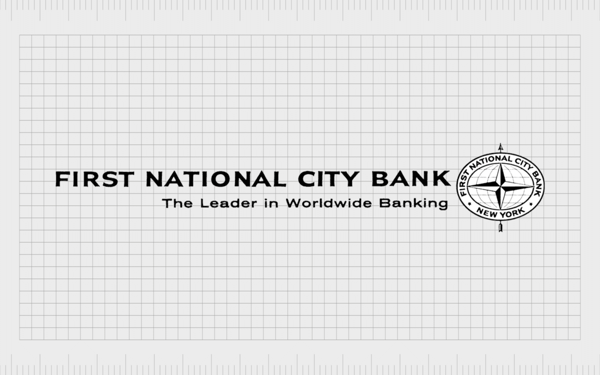
In 1962, the First National City Bank refined its logo, embracing a sans-serif typeface to enhance its modern appearance. The words in the logo also lost their cursive elements, improving legibility and giving the company a streamlined and reliable appearance.
The company began using the tagline “The Leader in Worldwide banking.”
The ornate seal from the original logo was replaced with a new emblem on the right-hand side of the image. This graphic showed a picture of a globe to highlight the company’s worldwide audience. The globe also featured a circular border, with the brand’s name emblazoned around the perimeter.

In 1965, the First National City Bank updated its logo again, removing the Citibank tagline and simplifying the wordmark. The name of the company was now placed on two levels, and the emblem was made slightly larger, shifting back to the left-hand side of the image.
While the core components of the graphic remained the same, the circular border was replaced with a simple square frame. Underneath the earth symbol, the “Citicorp” nickname for the business appeared before the organization embraced its new title.

1976
1976 marked the introduction of the first official “Citibank” logo. Celebrating the company’s rebranding efforts, the logo was reworked with a modern image. The emblem from the previous two logos was converted into a more simplistic design, featuring a cross-shape on a dark black circle.
The “Citibank” wordmark was executed in uppercase and italicized, placed on the left-hand side of the symbol.
The overall image conveyed a concept of innovation and forward motion. The contemporary nature of the design was further enhanced by the stylization of the “N” and “K,” which seem to blend at the end of the wordmark.

2000
In 2000, the Citibank company merged with the Traveler’s Insurance group and began working on a new visual identity. The Traveler’s Group at the time had quite an eye-catching logo, which featured a red umbrella intended to highlight protection and security.
This design was also pulled into the new Citibank logo, with a curved red line connecting the two “I’s” in the “Citibank” wordmark.
The company also changed its design slightly to feature lowercase instead of uppercase letters, with “Citi” depicted in bold. The “Citi” part of the logo is the same design used by the larger Citigroup.
Citibank logo meaning: What does the Citi logo mean?
The Citibank logo today is an emblem of protection, reliability, and trustworthiness. Much of the logo’s most recent design takes inspiration from the previous logo of the Traveler’s Insurance group; only the wordmark element of the emblem remains true to the previous Citibank image.
Various components of the Citibank logo seem to demonstrate deeper meaning. First, the lowercase “Citibank” lettering helps portray the company as friendly and welcoming, as opposed to traditional and stuffy.
The red, white, and blue color palette also helps to represent concepts of trustworthiness, professionalism, and loyalty.
At the same time, this patriotic color palette also draws attention back to the origins of CitiBank as one of America’s biggest banks. The red arch between the two “I’s” in Citibank reminds us of one of the major mergers in the company’s history.
It also maintains the “umbrella” shape, helping Citibank to demonstrate its commitment to safety and protection.
Citibank logo fonts, and colors
The Citibank logo today is an excellent example of an eye-catching and meaningful logo in the financial landscape.
Though relatively simple compared to some of the previous logos in the company’s history, this emblem tells customers what to expect from the brand. The image highlights ideas of security, stability, and reliability.
The Citibank logo also works well alongside various other logos connected to the larger “Citigroup” or “Citi” brand. If you want to take a closer look at the Citibank logo, you can find some useful resources here:
What color is the Citibank logo?
The Citibank logo is often depicted in the colors red, white, and blue. These are highly patriotic shades in the US landscape but are also commonly associated with other key concepts.
As an example, the Citibank logo colors tell customers the brand is trustworthy, reliable, passionate, and powerful. The Citibank logo color hex codes are:
Maximum Red:
Hex: #D9261C
RGB: (217, 38, 28)
CMYK: 0, 0.824, 0.870, 0.149
Ateneo Blue:
Hex: #003B70
RGB: (0, 59, 112)
CMYK: 1, 0.473, 0, 0.560
What font does the Citibank logo use?
The Citibank logo font has undergone several changes over the years, from a complex combination of serif and script-style fonts to the sans-serif typography we know today. The logotype is similar to “Interstate” with a modified “I” to help suit the umbrella component.
The transformation of the Citi logo
The Citibank logo has come a long way over the years.
Beginning with the National City bank logo several decades ago, the emblem has evolved over the course of numerous mergers, rebrands, and brand transformations to become the symbol we know today.
The modern Citibank logo is now an icon of trustworthiness, credibility, and excellence in the financial space. It’s a fantastic example of how companies can enhance their identity over the years as they merge and partner with new companies.
Fabrik: A branding agency for our times.


