
My purpose is to design a book cover, spine and blurb for one specific story in my own style, using only Typography an NO images at all. It must be imaginative and inspiring, relate to the story and convey the information about it clearly.
Frankenstein by Mary Shelley
The story of a mad scientist who created the first technically hand-crafted man and brought him to life, resulting in a disastrous series of consequences to which Frankie himself must put to an end by destroying what he had built.
When researching front covers, spines and blurbs I must NOT simply use the Internet to find examples of books but looking at real books will provide more practical evidence. Books about book design and design companies online will also help inspire my design!
 This my the first example of Frankenstein’s novel adapted in Penguin’s style. It belong to a six book collection each of which have the same style but different images and features and are classified by an imprint know as Penguin Horror.
Front Covers
On the front cover in every book, the images are aligned from top to bottom fill the whole frame of the book.
The main typographic elements sit at the bottom against a black bar in white Blackletter. Blackletter/Gothic writing is normally used for horror-related features and dates back to typography used in the Medieval times up to the 18th century.
Beneath sits the Penguin logo as a white silhouette placed in between the two words of the title Penguin Horror which makes the Penguin illustration stand out as the icon.

Spines
The spines are black like the labels and have similar features to the front covers; fake dripping paint colored like the front full images, same Gothic typography in titles and authors’ names and of course the penguin logo and imprint.
All these elements lie horizontally on the side of the spine to fill space and read more accurately.
Both main typographic elements (title and author’s name) are center aligned on spines and front covers.
Books from the Library (LRC) at college
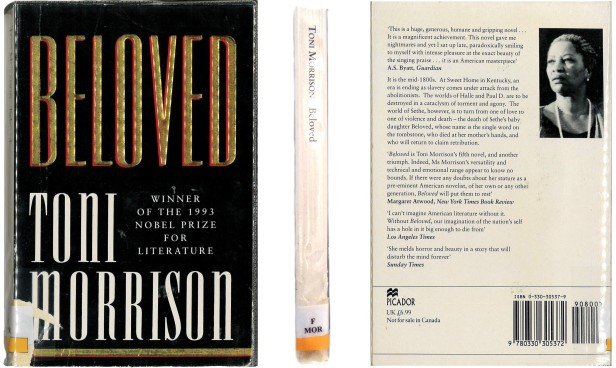
Beloved by Toni Morrison
SULA by Toni Morrison
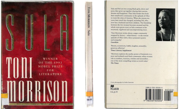
These two non-fiction novels have a unique design and only contain typography on the front covers.
Front
The title and author’s name are the largest typographic elements in the front cover. They almost fit the whole frame and are aligned to the left. A small paragraph describing the author’s success sits in the space between the author’s first and last name and is centre aligned with a different font style.
The title and author’s name have similar features; they are a tall, narrow bold but their typefaces vary. The title is a Square sans-serif style while the author’s name comes off as a neoclassical serif style.
Different coloured backgrounds in the front covers stimulate different moods in the reader depending on the genre and nature of the story.
Spine
On both books, the spine’s background is white (like the back covers) and has only the author’s name and book title aligned horizontally across the spine to the left.
Both elements are black Old Style fonts presenting more simplistic typefaces from the front cover.
It is unknown what is at the bottom of both spines since they’ve been covered up by codename labels.
Back (Blurb)
The blurb’s font is classical, small in size and varying in length. Beside it is a small black and white portrait of the author, presenting her as a historical and anonymous figure. The blurb is wrapped in a square frame and aligned to the left allowing space for the image to sit beside on the top-right.
At the bottom of the back cover is a rectangular label with a barcode fitted in at the right and the company logo and price on the left.
Two other book covers from the LRC have unique designs of their own!
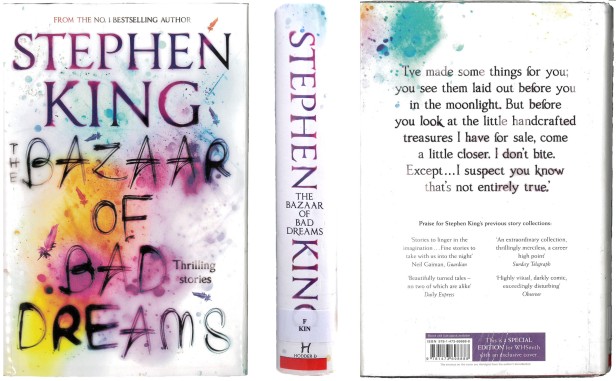
The Bazaar of Bad Dreams by Stephen King
Front Cover
This modern book cover by Stephen King has the author’s name arranged at the top and the title from beneath. Both main typographic elements on the front cover are large and fill the entire page. The type size of the author’s name confirms that the author is indeed famous.
The author’s name is an Old Style font with pink blurs occurring around the strokes while the title seems to be written in marker resembling a Casual style.
The blank white background is covered in blurry vibrant paint splurges, this creates an aesthetic and refreshing atmosphere in the book cover and makes it look like a piece of art along with the title.
Spine
The author’s name is the same design as shown on the front and is aligned horizontally across the spine. The title adopts the Old Style font and sits in between the two names of the author in a vertical position downwards on the spine.
Back (Blurb)
The book cover’s background spreads from the front cover around the spine to the back where the blurb lies.
The blurb is presented as a 18pt (approx) statement from Stephen King himself describing his ‘collection of shorts’ as ‘little hand crafted treasures’ and is enlarged to stand out as the most important aspect of the back cover.
Beneath is a set of four quotes from four individual newspapers (e.g. Guardian) bringing feedback about Stephen’s book lead by a bold heading above.
The novel’s genre is unknown based on little evidence other than the paint-splodged background and sans-serif type but it is presumed to be a romantic/fantasy type of novel.
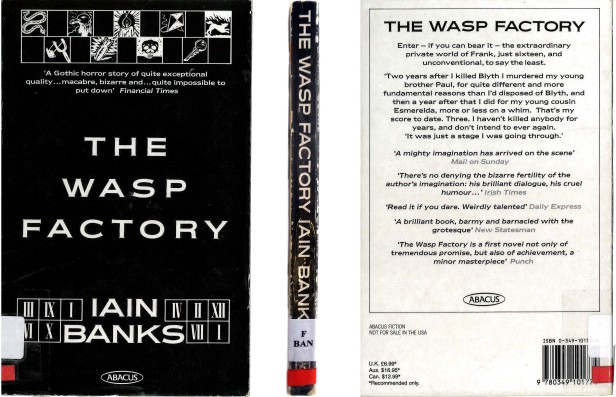
The Wasp Factory by Iain Banks
Front
Similar features but different. Like the previous two covers, the title is aligned within the middle of the book but doesn’t fill the whole frame.
At the top sits a checkerboard panel of illustrations of some sort of spiritual subjects… with an introductory heading beneath. The author’s name is also large and in capitals like the title and sits at the bottom between roman numerals.
The font styles of the main typographic elements appears to be recognized as Copperplate Gothic Bold a thick bold Glyphic serif font used to represent a modern style of typeface with classical features. It’s typeface seems to resemble the book’s genre as a story of horror, tension or suspense.
And because the font is the same it means the author isn’t famous or even well known especially if the name is enlarge and embellished with Roman numerals.
The company’s logo Abacus sits at the bottom at a small size in a different font.
Spine
The spine has the same colors and font style like the front cover. The title and author’s name sits across the spine horizontally almost reaching the edge. Because the title and author’s name can be slightly misreading because they are the same font and are put together tightly looking almost like a full sentence.
Back (Blurb)
The colors in the back cover are inverted; white background, black text. The blurb is center aligned inside the box at the top with a the company logo above the surface. The blurb’s font is the same as the spine and front.
At the bottom sits a barcode on the right while the company name and list of prices sit at the left opposite.
typeasimage.com
Reference relaunch, Penguin Books, 2004 – 2005, 198x129mm


Front Covers
Each design has a coherent style of type and contains no imagery whatsoever.
All typographic elements are normally aligned within the middle from top to bottom.
The title in the middle is enlarged to stand out as the book’s most important feature. It is also coloured black to stand out from the heading above ‘Penguin Guide to…’.
A small quote in the top bar gives brief insight into the story’s subject matter.
In every book cover, Penguin’s logo sits in the black bar at the bottom with the imprint’s name beneath.
The coloured bars at the top distinguish the stories individually into different genres.
Spines
The spines have the same consistent design as the front covers; the three horizontal bars where the main typographic elements sit.
But there are some alterations, the Penguin logo and imprint stands upright like on the front but sits upright in the spine vertically.
In the coloured bar at the top sits not the quote from the front cover but a subtitle ‘Dictionary of…’ giving an introductory to the title.
The type in the book covers is simple, clear and consistent in style. Its bold geometric font in the titles makes the designs look highly attractive along with the other elements and gives the reader an upbeat and informative welcome into its stories.
Great Journeys, Penguin Books, 2007, 181x111mm
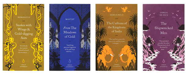
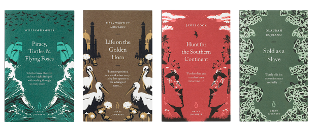
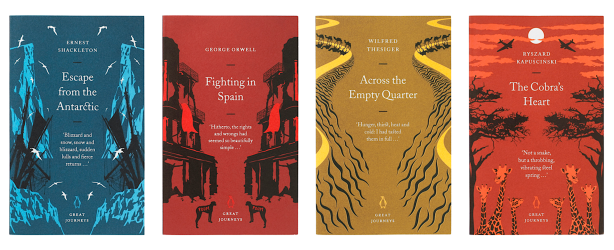
Front Cover
The text is usually aligned within the middle with the elements arranged in vertical order; top – author’s name, middle – title, lower middle – quote from the story, bottom – logo and imprint.
The type’s font style is all Transitional but set at different scales; the title is enlarged to stand out and clarify the story’s identity, the author’s name is small because he/she is either infamous or anonymous and a small bracketed quote below gives insight into what the story is about.
The imagery in the front covers appear from the sides as two symmetrical elements facing the type in the middle and vary in different styles to distinguish themselves and relate to the stories they’re based on. The backgrounds for each cover come in different bright colors and the imagery ranges from dark to bright shades in the detail. The type in the covers stand out mostly for their white colors against the vibrant backgrounds and the detailed illustrations.
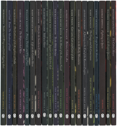
Spines are darker in colour than the front covers. On the side is the author, title and logo. Above the logo is also a country name the story is based in. The author’s name and country category are regular font styles while the book’s title is set in Italics. At the bottom of the spine, the Penguin logo and book number stand upright in between the spine’s widths.
Great Ideas Volume III , Penguin Books, 2008, 181x111mm, Artwork by Phil Baines

Each front cover of Great Ideas comes in a variety of numerous Typographic styles ranging from classical and sans-serif to script and decorative.
The primary colors for the designs are green, white and black or dark grey.
As well as fonts, the types come in different sizes and shapes to reflect the author’s style and/or match the nature of the story.
For each design, the typography is usually in center alignment and almost fills up the whole frame.
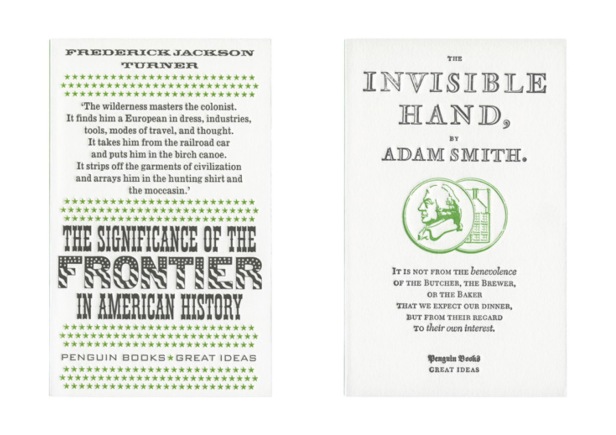
The Significance of the Frontier in American History by Frederick Jackson Turner and The Invisible Hand by Adam Smith
Front Cover(s)
Titles, authors’ names and introductory headings are all center aligned but in different places.
The title in the first book consists of two different fonts; the first and third separate lines are a thick Gothic western like serif font while ‘Frontier‘ in the middle is enlarge overall and in the font of a big thick Grotesque style with American flag imagery inside.
The font in the second book cover is all the same in the title above and introductory heading below.
The heading in the first cover gives introduction to the story before leading to the title, while the title in the second cover starts first introducing the subject before the heading explains more.
Both book covers represent history in the about the 1800’s by specific historical elements; the American flag imagery in the first cover seems to reflect the history of old American in about the Wild West while the two images of the of the guy in the ‘judge wig’ and old house reflect the old times in Great Britain (perhaps…).
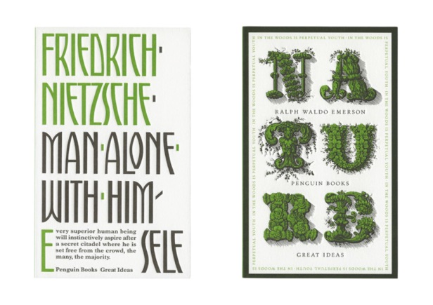
In Consolation to his wife by Plutarch and Nature by Ralph Waldo Emerson

Spines
Great Ideas’ spine design is one consistent style; green with authors’ names in black and titles in white while the imprint and logo sit at the bottom of each book.
So that way it categorizes all the individual stories together, making the collection easier to choose from as well as simplifying the design.
References
- www.penguin.co.uk/books/255163/frankenstein/
- typeasimage.com/reference.html
- typeasimage.com/greatjourneys.html
- typeasimage.com/greatideasthree.html
- thebookdesignblog.com/design-articles/history-marber-grid
