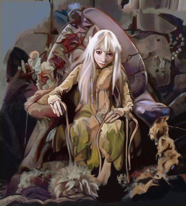
Decided to add colour to my grayscale study. This is not done yet, still quite a lot to do with this yet because it is is keeping me with something to do in the evenings.
42 Likes
This is coming along very nicely. Great values work.
1 Like
Looking great!
1 Like
Thanks!
1 Like
Thank you!
1 Like
Nice! ![]()
![]()
1 Like
Thank you!
Already EXTREMELY Beautiful! “Dark Crystal” takes me back to my childhood…and I adore the prequel series as well! ![]()
1 Like
One of my favorite movies of all time! I would like to see it when it’s finished. It’s looking great thus far.
1 Like
Thanks! I love the movie too, one of those disturbing yet wonderful childhood trauma films. I finished this a while ago- this is an older WIP post.
Here it is, I can’t remember if I showed it on the forum or not:

6 Likes
Great job! Well done,
1 Like
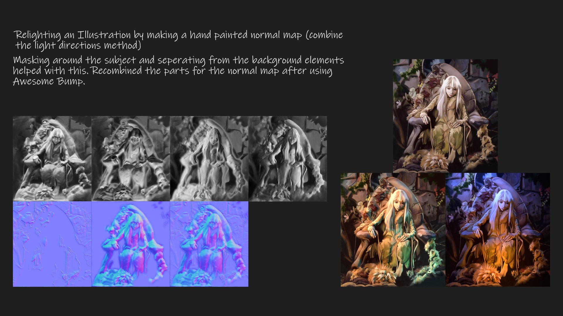
I’ve been experimenting with making hand edited light directions for the creation of normal maps using Krita and Blender with this painting (again- this is a bit of an obsession I have).

Also wondering if painting PBR details using a program I found called ArmorPaint is useful or not to a 2D painting workflow. I read that some artists used to use gold-leaf in their paintings and thought that might be a nice thing to try in digital one day (sorry for mentioning software that isn’t Krita here in advance, but it is Open Source at least).
5 Likes
That lighting technique seems to work well. The results look good. ![]()
I keep meaning to experiment with gold effects myself - both gold leaf and gold paint. I’ve thought about how I might apply it, but never seem to get around to it! ![]()
I remember Grum did a nice gold leaf effect in one of his pictures. The technique is probably different to what you’re trying to do though: Prophecy of the Buddhist-Archangel of the Holy Sausage
2 Likes
Yes that is pretty cool, thanks for sharing!
I worked a bit more on it today, I had to export the PBR textures and put them in Krita because I found that ArmorPaint only exports in square formats. Basically transparency masks to the rescue.

4 Likes
That is crazy good, what an imagination of depth. Stunning!
![]()
Michelist
1 Like
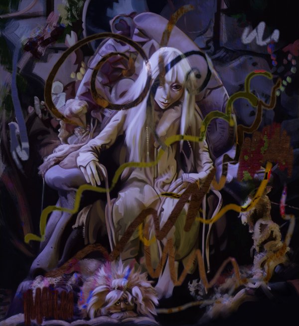
I applied the phong bumpmap filter to the gold elements I made with the transparency maps and tried out the normal map brush for a few other things just to add a bit more dimension to the gold

. This is just a test I don’t think Kira would wear too much bling with this outfit.
Here is another process sheet for the creation of the normal map as well. I’ve written about this technique on my blog. I might update with another article at some point with this picture.
3 Likes