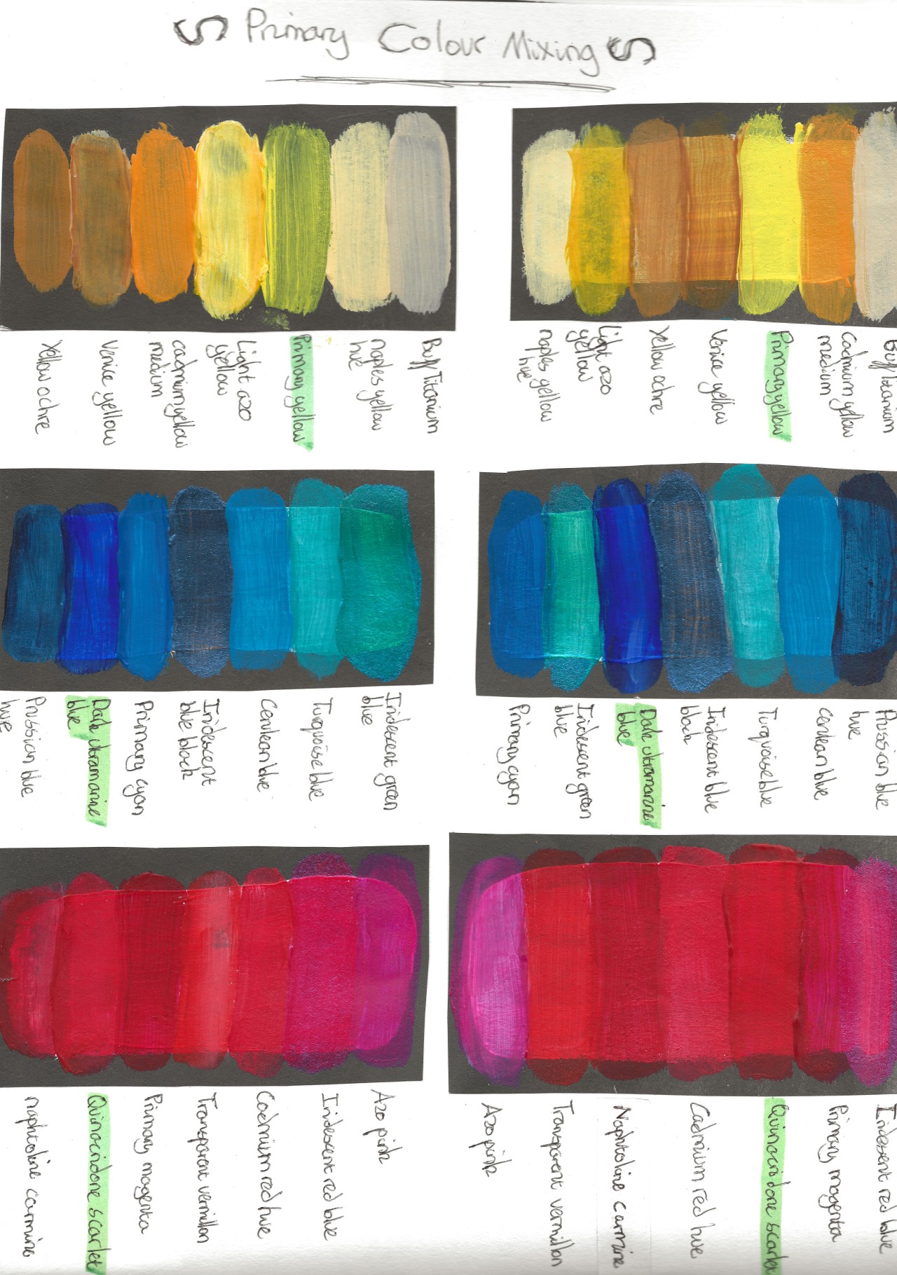
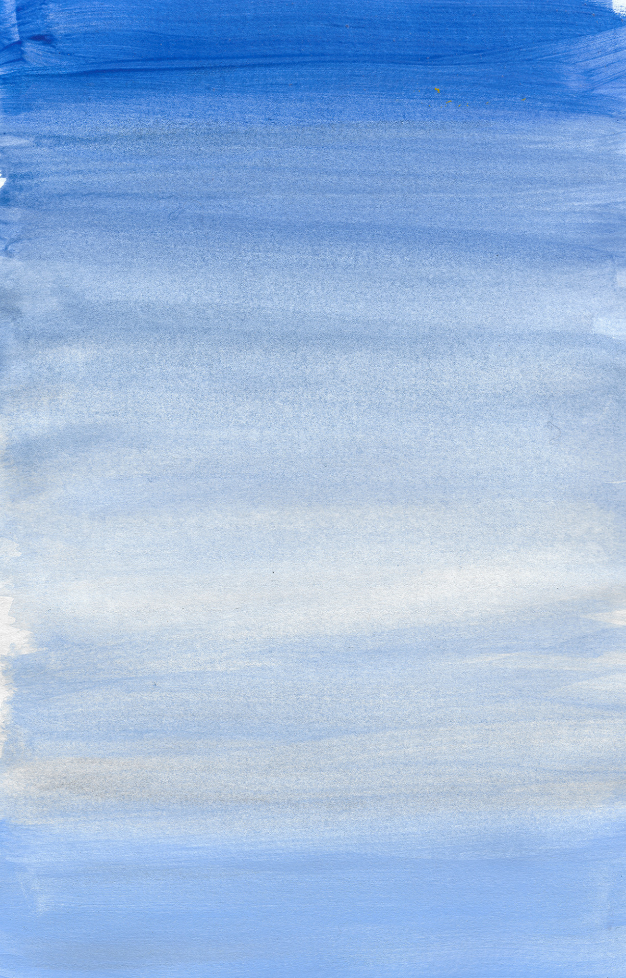
I layed out all my colours in groups of yellow blue and red, and arranged them into an order of light and dark. I then painted this scale onto my neautral grey colour and mixed them up for a second scale to show more juxtaposition beetween hues.
The most intense hues are my primary shades. They can be identified as colours that appear to have no trace of the other primaries in their hue. I have highlighted these in my work above.
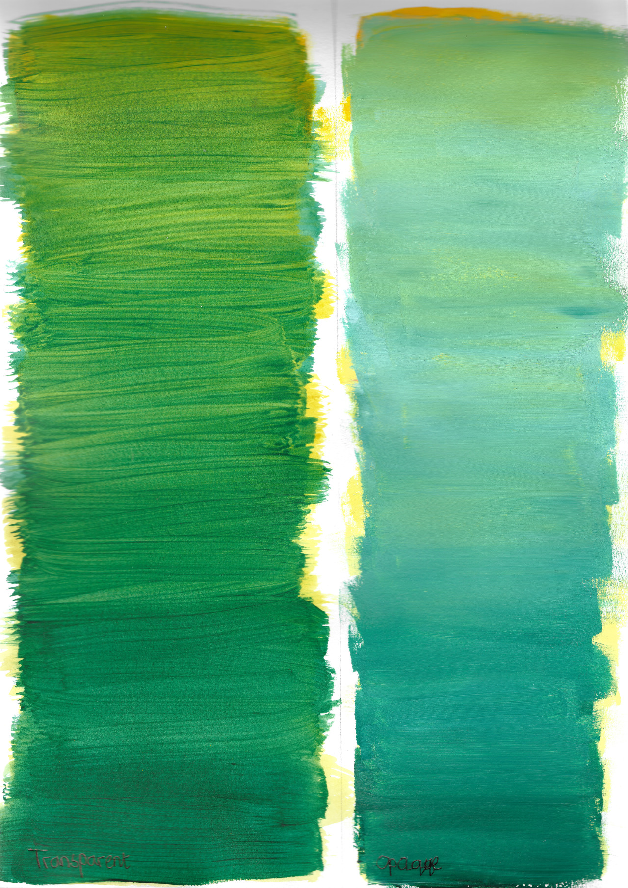
Because some of my shades were quite transparent, I noticed that on the
grey ground it was difficult to get each hue to show up properly so
after my first experiment with yellow I painted a block of white
underneath to counteract this transparency.
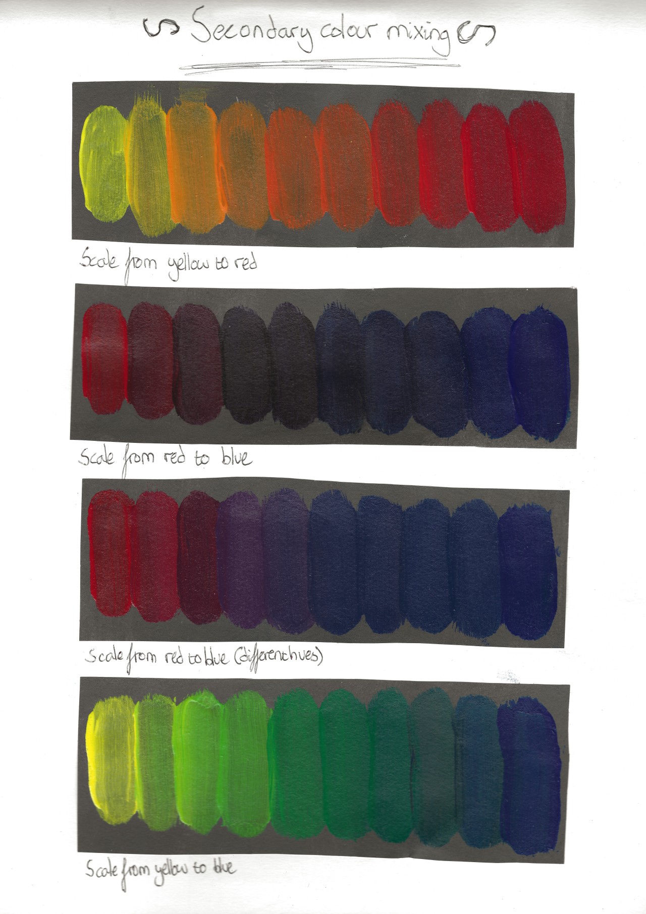
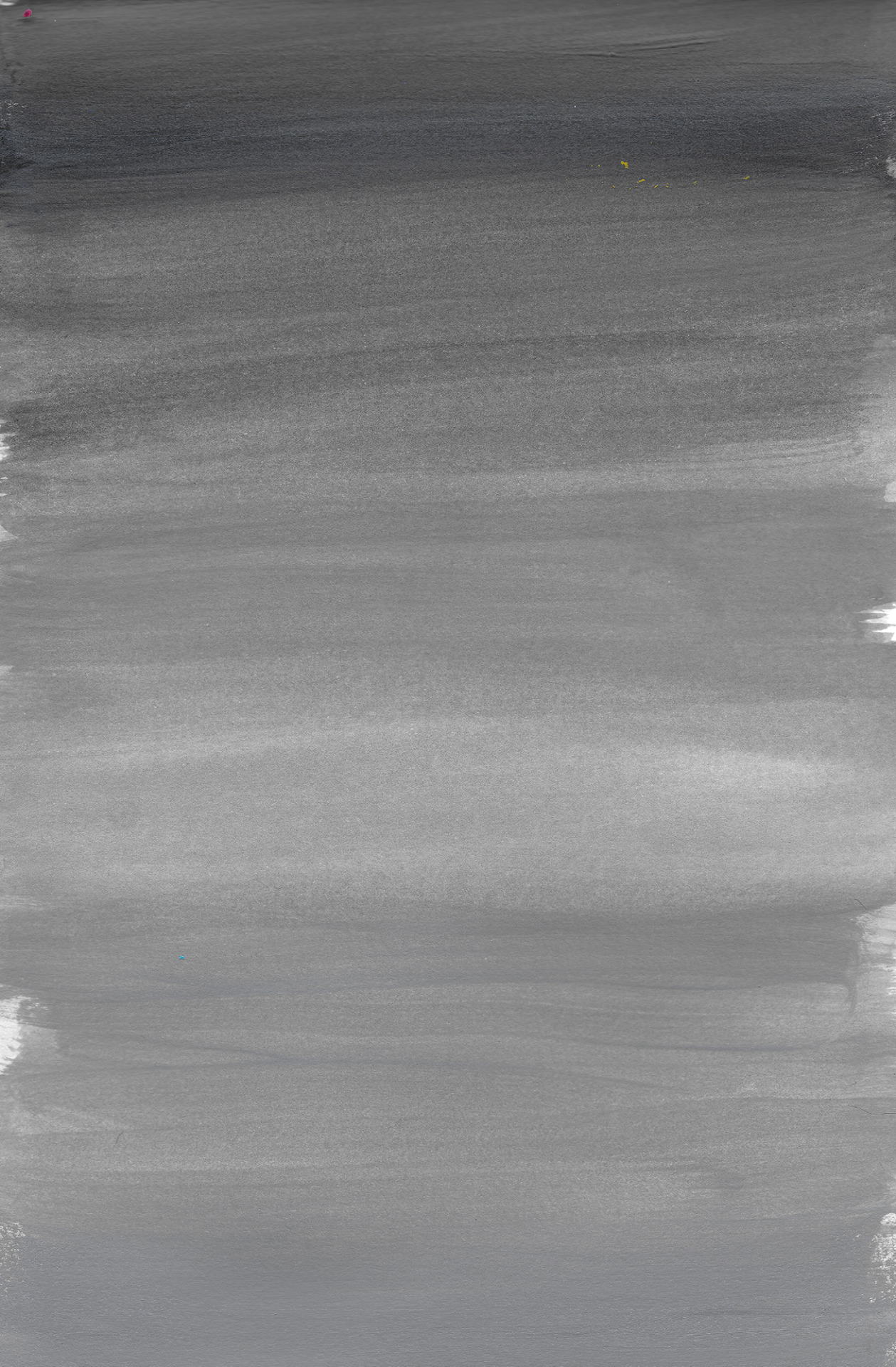
Again on a grey ground, I begun to make scales. I worked from yellow to red, red to blue and yellow to blue in a carefully graded sequence.
Midway between each primary, the secondary colours are achieved (orange, purple and green.) However a dark murky mix between blue and red is not violet. This is why I have a second scale from red to blue where I have used other hues to achieve violet.
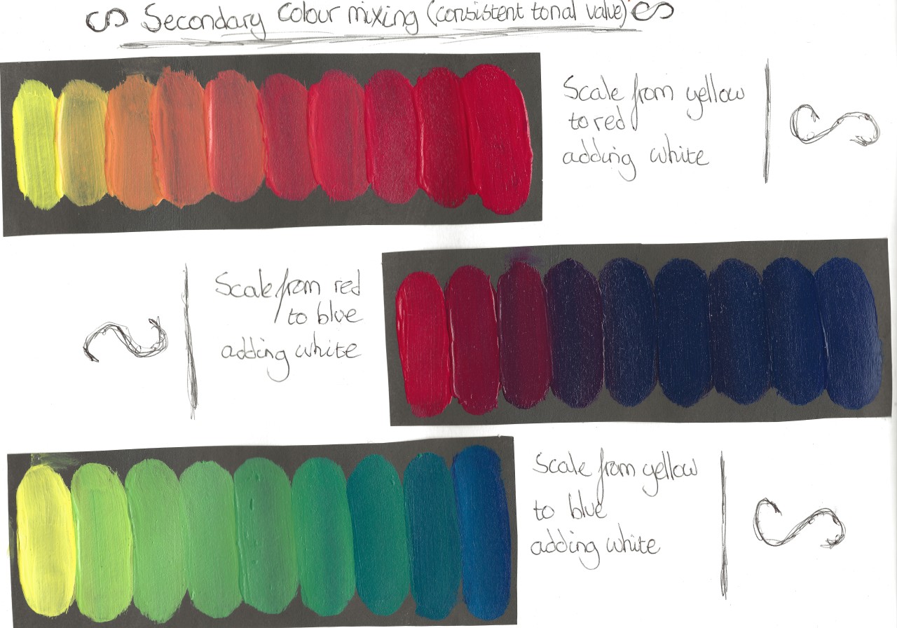
To finish this exercise I repeated my scales but this time I tried to maintain a consistent tonal value by adding a little white. You can see that within each scale, all the individual hues have the same tone as I have balanced them out with white paint.
However, you can see that tonally, the most saturated blue colour on both is different as I have matched the tone of this to the lightest colour (red/yellow). Therefore if I decided to make a scale going all the way through from yellow to red, with blue in the middle, I would have to change the amount of white paint I add to each shade to control the tones.
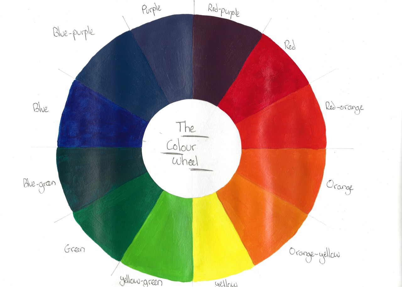
To learn about locating and mixing complementary colours I made my own colour wheel. These are the colours on opposite sides of the colour spectrum.
I first drew a circle and then divided it up into 12 segments. Looking back at my work on Chevreul I mixed the colours from his colour circle. I began with primary red followed by red-orange, then orange and so on around the wheel. I feel like I have achieved satisfactory mixes in my example above.
Next I considered the 12 colours from Chevreul’s colour circle and layed each colour next to its opposite or complementary and did this on my neautral grey ground.
Having them beside each other I now see that I could have added even more white to some of my colour mixes to match the darker tones to the lighter tones like my purple and yellow.
I then made mixtures of each pair of complementary colours which came out mostly as grey, brown or a murky green colour. This is another way of creating broken or tertiary colours.
Putting into words the effect that complementary colours have on each other is very difficult to do although it is easy to see. If I had to describe this I would say that complementary colours make their opposite stand out more and can bring out the intended effects of the other when used in a painting or piece of art.
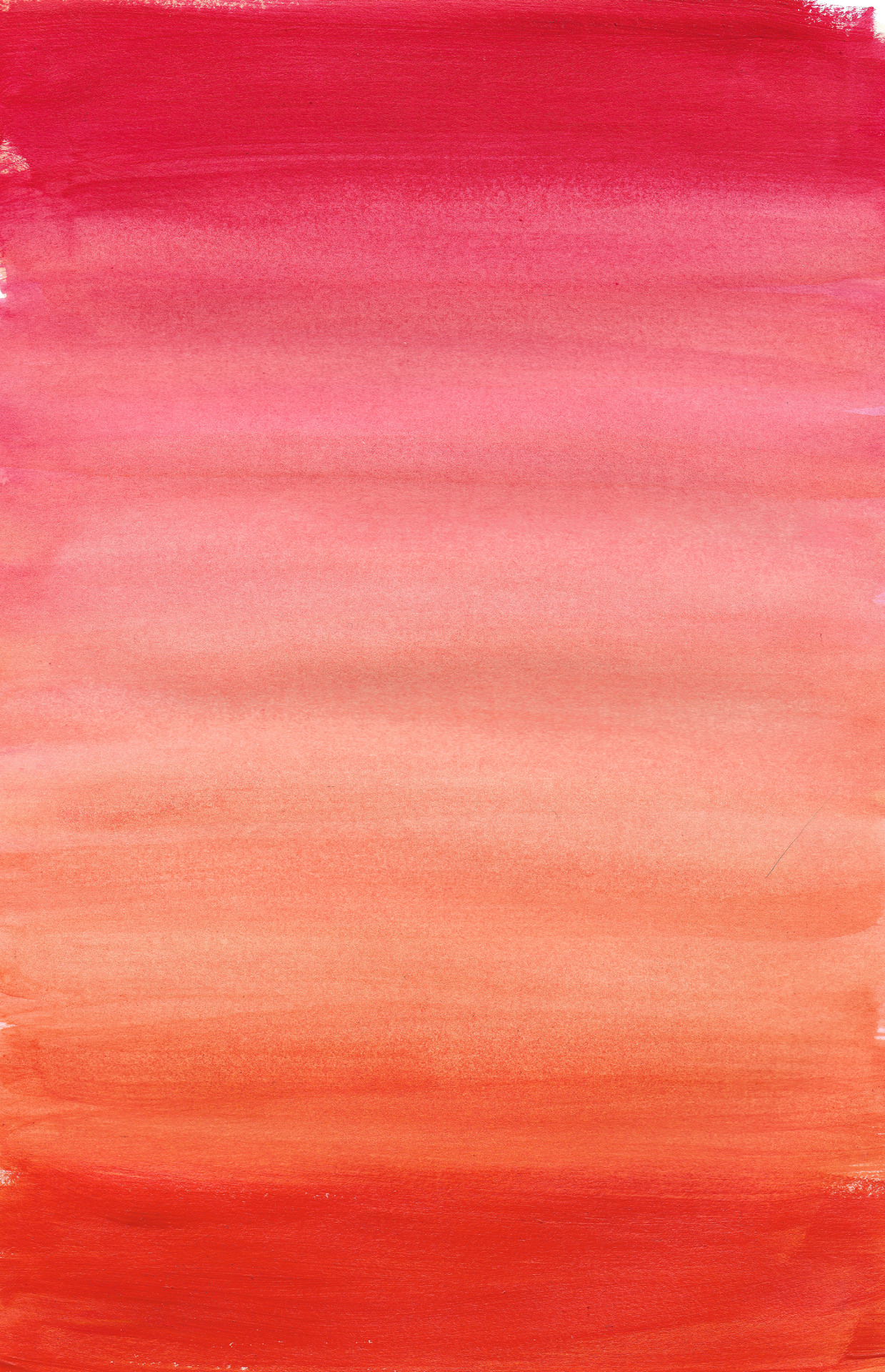
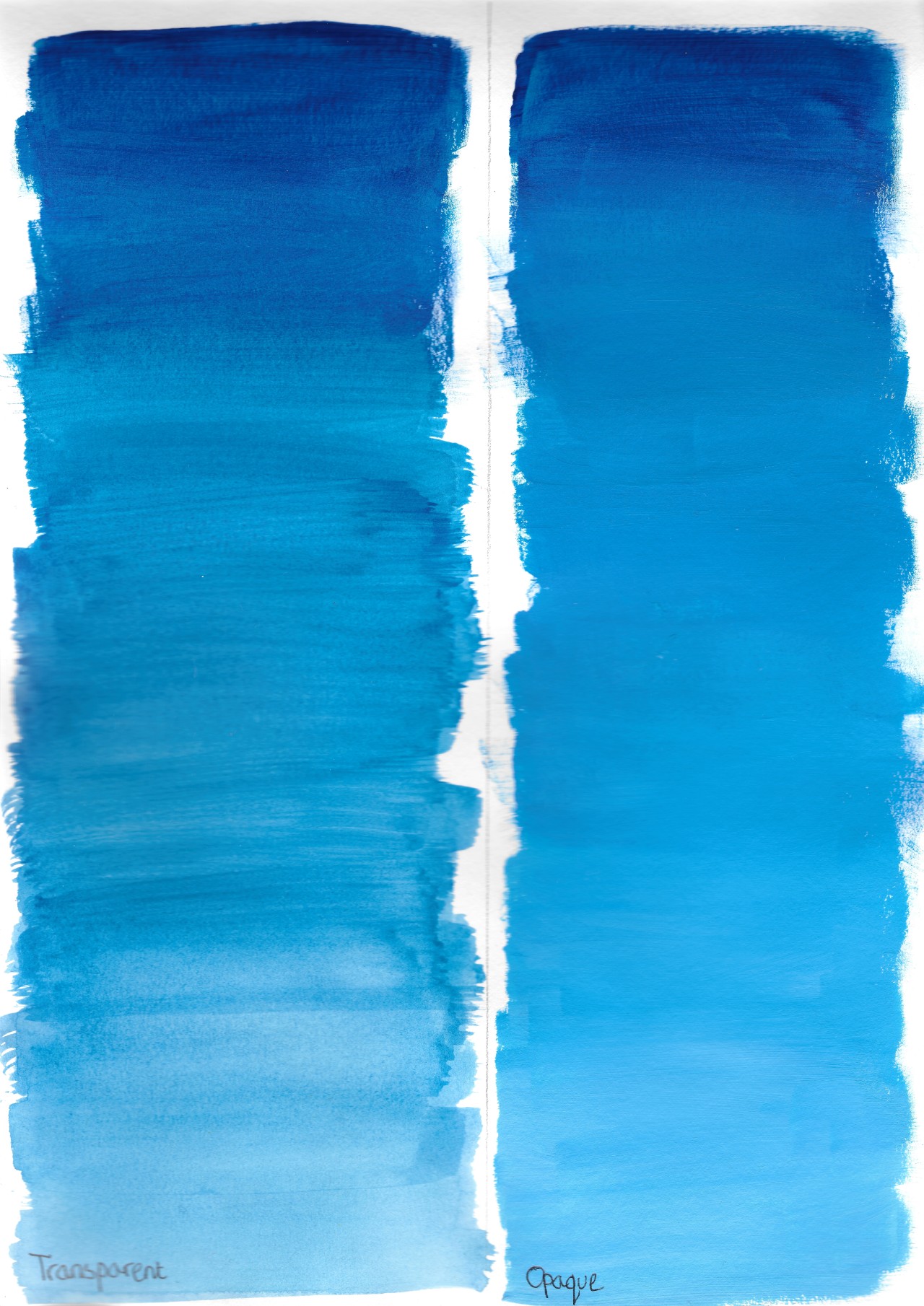
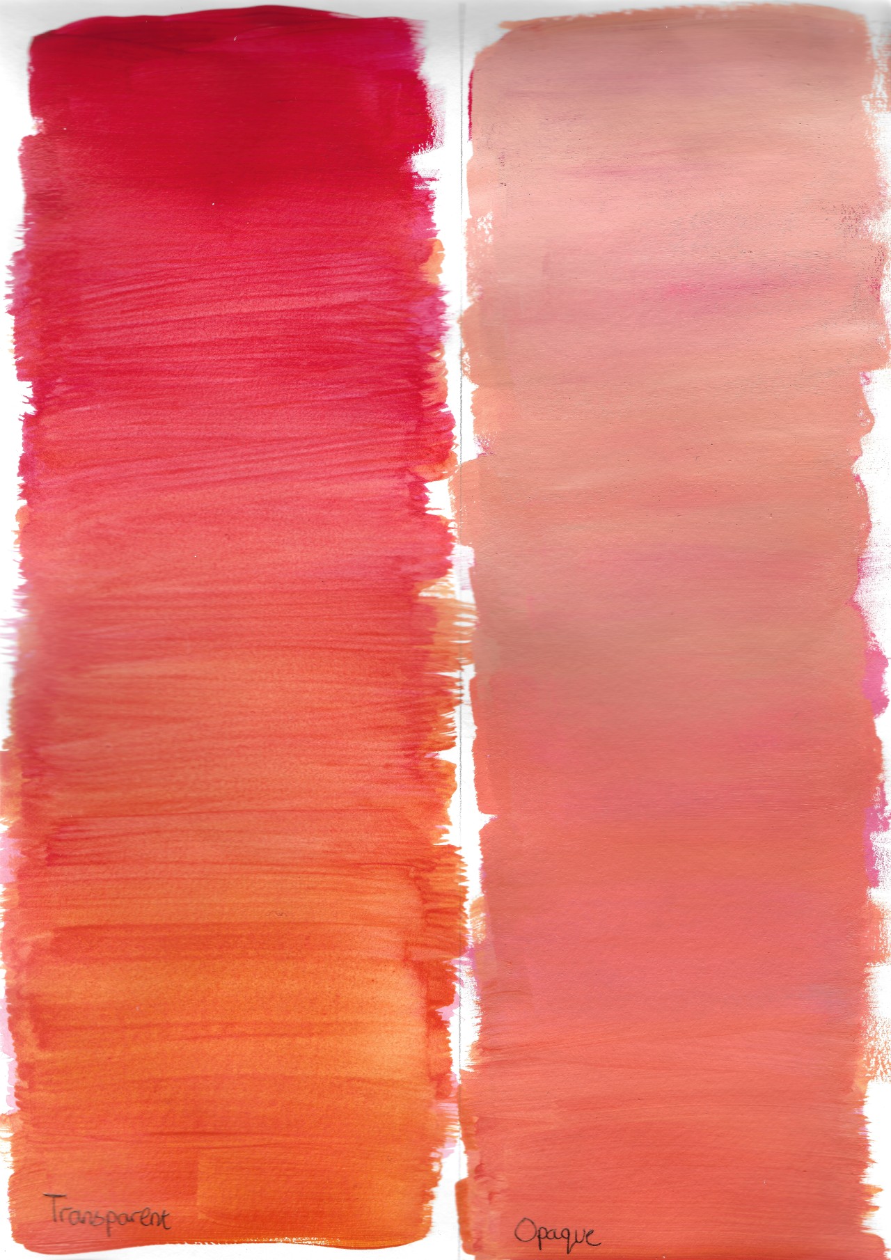
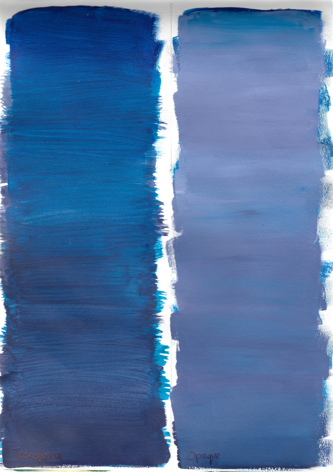
In this exercise I painted graded tones by mixing in white. I chose three washes which I had already painted with transparent colour and tried to replicate them using the opaque colour mixing technique.
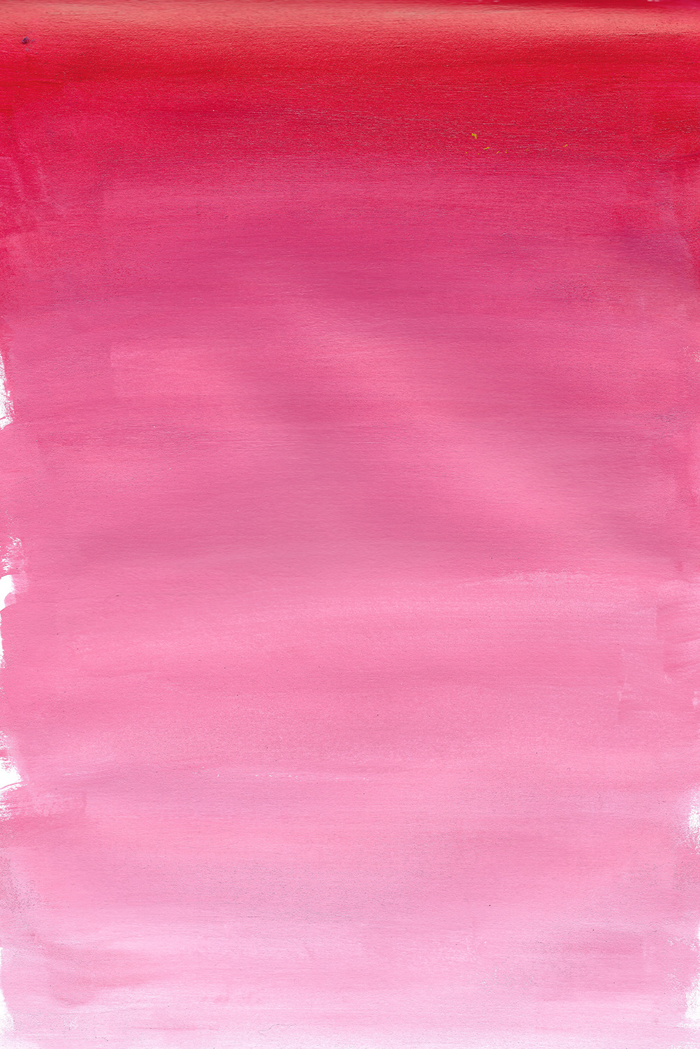
In this painting I created a single colour wash of the same colour red which I used in my transparent experiments. I added a small amount of white paint to the red every time to blend it from dark to light.
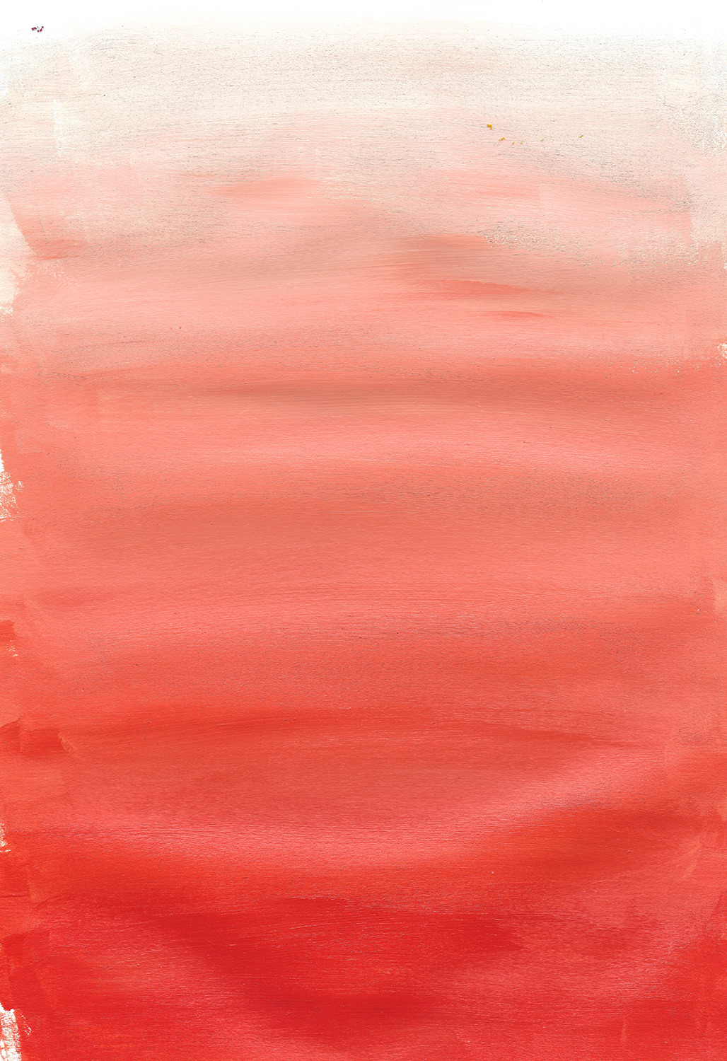
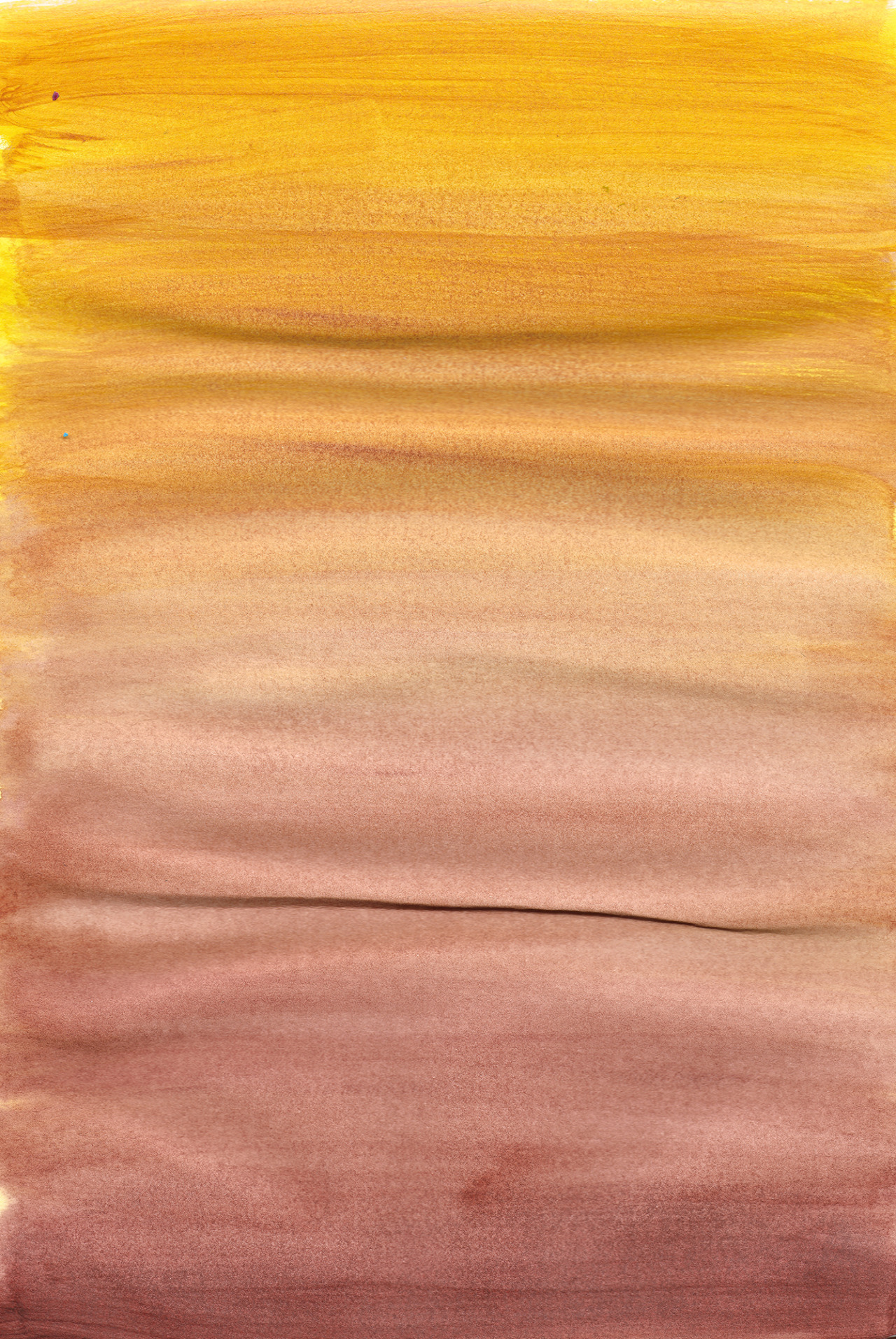
Then in my second experiment I created the same red wash and this time put orange over the top. This is the same orange as my transparent experiments which I applied in the same way with the darker orange over the paler red.
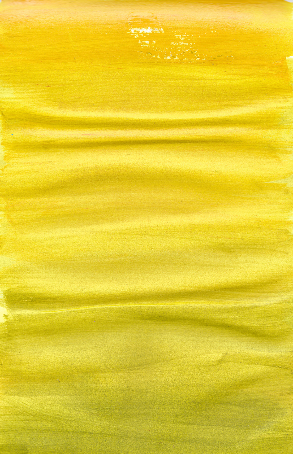
This experiment uses just the orange colour but I did things differently by starting with the lightest colour first. I started with pure white and added a small amount of orange to the mix each time.
Because acrylic paint is so quick drying and I didn’t have the aid of water to keep it wet I was unable to create a wet-in-wet wash using opaque methods of blending. I found that this was a much more difficult way of blending colours because it is harder to mix together at each point without water as a medium. When working with the mix of orange and red I was concerned at first that the orange would completely cover what I had already done with the red, but it did start to emerge towards the end as the white struggled to completely cover the darker shade below it. I much prefer this technique of colour mixing because the colours it producers are far brighter and richer. These methods could work together when you are wanting to overlay a lighter colour on top of something dark. In order to do this I would first use an opaque colour wash and put the transparent wash on top. The colour may be dull but still perceptible whereas an opaque wash would completely cover what is below it.
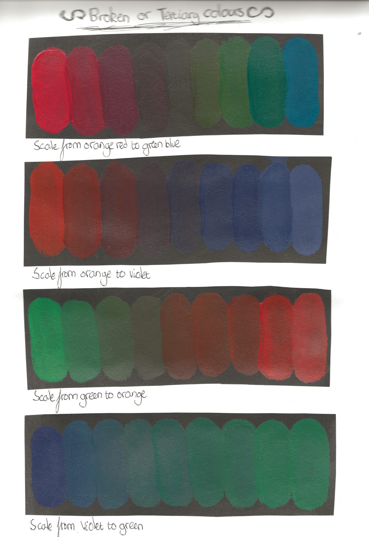
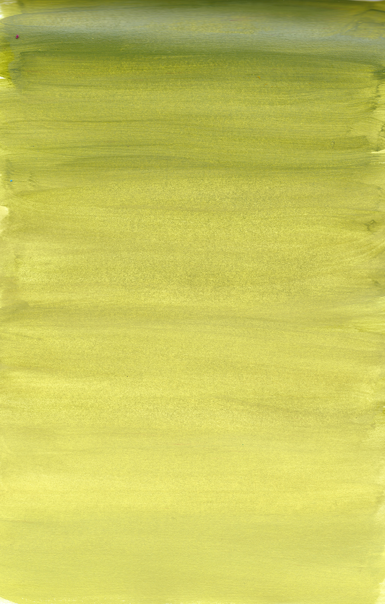
Here I have started by making a scale between an orange-red and a green-blue. Again I have made an attempt at maintaining a constant tonal value by adding some white.
At the midpoint we see a tertiary or broken colour which makes up the appearance of much of our world. In hindsight I should have added more white to my tertiary colours to get them more tonally balanced and more grey and broken.
I repeated this exercise going from orange to violet, green to orange and violet and green. You can see in each scale that the middle tone loses chroma to become broken.
Colour mixes and their effects:
Orange to red - the middle colour is quite grey and dark. This is similar to the colour of the ground or of stones.
Orange to violet - a very muddy blue is created. To me this colour comes across as quite sombre and reminds me of a rainy day.
Green to orange - The mid hue here is a murky brown. This colour is very earthy and something we often see in the outside world.
Violet to green - In the centre we see a dull and murky green. This is not disimilar to the colours of the forest and common camoflage colours.
All in all, the colours that have been made here are very evocative of the natural world and shades we often see in the rural parts of the world all around us.
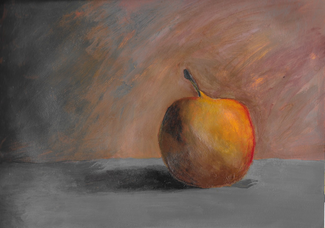
Following on from some previous experimentation with light and shade, I took my research from pencil into my primary medium - acrylic paint. I also used my new knowledge of hard and soft edges to improve the work.
I am quite proud of this painting as I feel as though I have come on quite a way with my skill in creating volume. This was something I previously struggled with, but now I feel like I have practiced enough to start developing light and shade properly in my further assignments.
This painting is of an apple on a simple background, where I started with a yellow wash and built the layers up gradually. My outcome was successful because I took the time to observe each tone individually and correct them to be accuratley blended:
This time, using the same colours as before I painted a single colour wash in red and let it dry completely. Then over the top of this I painted the orange wash. Using this method is more difficult to blend than a wet-in-wet wash because you do not have the water from the original wash to aid you. Because of this the colours do not merge in the same way and I found the wash on top to be stronger than the colour below. I could employ these techniques of building coloured glazes to produce sunset skies, seascapes and abstract colour paintings:
After I had worked on single colour washes, wet-in-wet blended washes and overlaid glazes I experimented with the same techniques in different colours to see how these blended together:
Certain colours worked better than others such as the dark and light
blue combination and the black and grey but others were much harder to
blend such as brown and yellow and green and yellow.
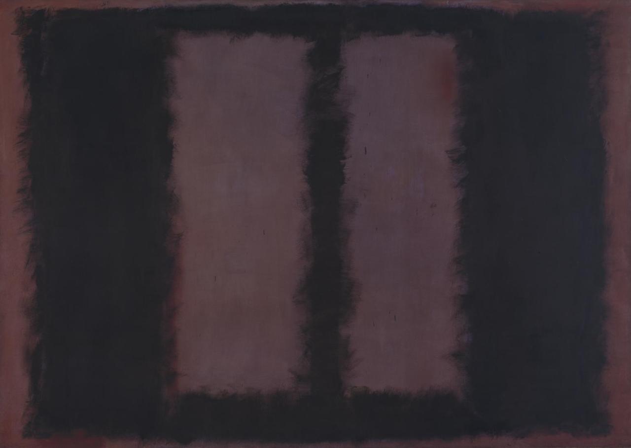
Source: Rothko - Jacob Baal-Teshuva - Taschen - ISBN: 978-3-8365-0426-3
Rothko was commissioned in mid-1958 to furnish the newly finished Seagram Building on Park Avenue in New York with wall paintings.
The room Rothko was to decorate was that of the Four Seasons restaurant, forseen as a noble eatery for elite management. It was the first time Rothko was to paint a related series of paintings as well as the first time he would create work for a specific room.
He used a warm palette of dark red and brown tones, breaking the horizontal structure of his paintings by turning them at 90 degree angles so that he could create a work that would directly relate to the architecture of the room.
The surfaces of colour recalled architectural elements, as columns, walls, doors and windows, giving the viewer a feel of confinement while presenting him with an unreachable world beyond.
Rothko visited the Four Seasons for dinner one night and decided to give up the project on the spot due to the pretentious ambience he experienced.
The paintings now hang in three galleries in England, America and Japan.
I personally love the abstract expressionist work of Mark Rothko because seeing his work is an emotional experience. The colours he uses are so emotive and powerful and the paintings’ grand scale give you a sense of complete awe.
I have visited Rothko’s work at the Tate Modern several times and he has thus become my favourite artist.
Although he has used what appears to only be basic colour washing techniques if you tried to replicate his exact shades of red and brown you would find yourself struggling due to the sheer complexity of his glazing tecniques.
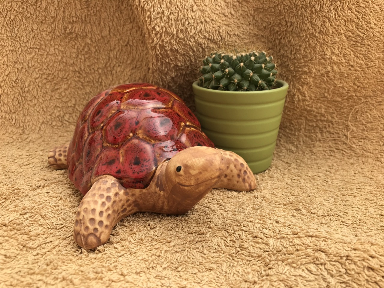
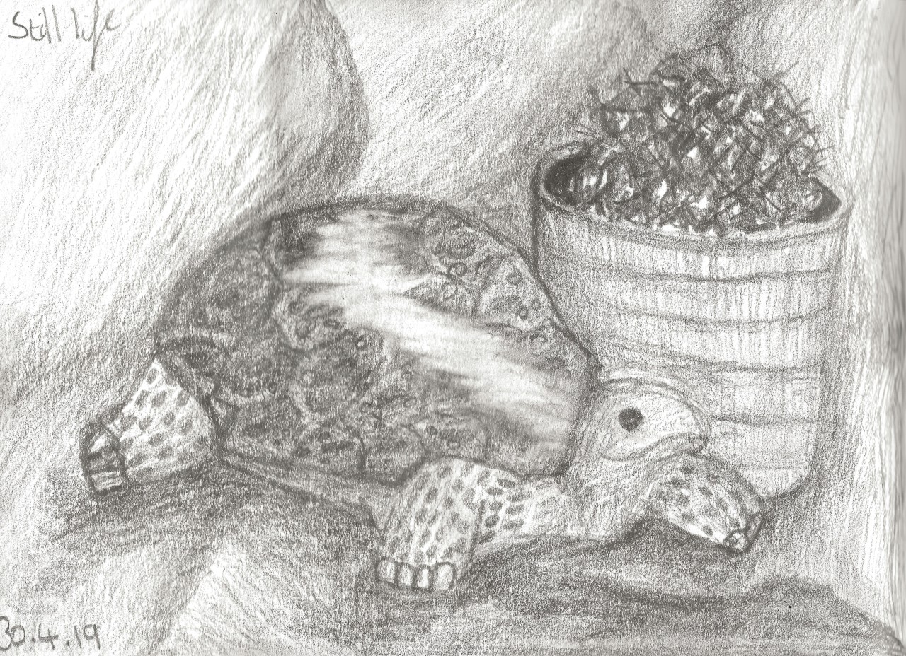
For this exercise I set up a very small still life. The objects I chose were a garden ornament of a tortoise and a small potted cactus. I set them up on a towel, which was a sandy colour, and I felt like my still life had a connection with the desert which is what linked my objects together:
I began by doing a simple pencil sketch of my objects in soft pencil to determine a composition I was happy with and to see my objects in simple tone rather than full colour:
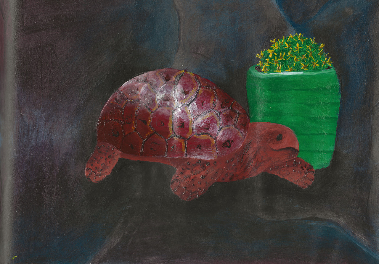
Following on from this I could begin to paint. I transfered the simple outlines of my sketch into my sketchbook to work with. This painting was a colour study using only a narrow range of colours. I chose two hues, one colour and its complementary and balanced them tonally using white paint. The colours I chose were red and green as these were what I naturally saw in my objects. To include a higher tonal range I mixed the complementary colours together to achieve broken colours which I used throughout the rest of my painting:
In this painting I am satisfied with my use of the complementary colours. I was able to match my dark green and red tonally and this gave them an earthy feel. I decided to use a dark background to make these colours stand out more and this was mixed with my two colours but because of the darkness, I should have made the edges of my objects softer which would have created more volume. The markings on the tortoise are quite textured which I feel makes the painting more interesting to view because it is brought to life more. The only colour I included which was not a mixture of my complementaries was yellow as I felt like this was a colour not too disimilar from them and would help to make certain elements stand out. If I were to paint this again I would make sure to sketch my objects larger so they fill the page and there is less background.
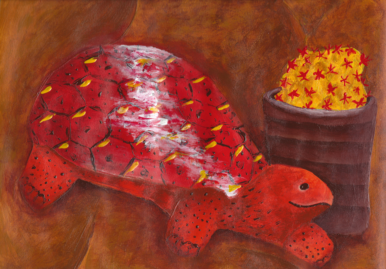
For this painting I used the same arrangement of objects as with my still life with complementary colours so that I could compare the different effects when I had finished. I used the same preliminary sketch as before as well so that the angle and light that I approached my still life from was also the same.
Due to the nature of my objects I decided the mood I wanted to create was a warm, exotic atmosphere, much like the arid desert setting you might find these things in. Therefore I chose my colour palette in advance and worked only with red, yellow, orange and brown in varying shades and hues. I tried to keep my colours fairly similar in tone.
In this painting I feel like I have achieved my desired effect by using warm colours and creating a desert atmosphere. I have tried to heighten effects by making certain hues brighter than they appear and changing some colours completely, for example making my cactus yellow, which gives it a dried out feeling. After painting this still life previously, I decided it would be a more effective painting if the objects took up more of the page and so in this version I have cropped right in on them. I have also made the markings on the tortoise more abstract and slightly softened some of the edges.
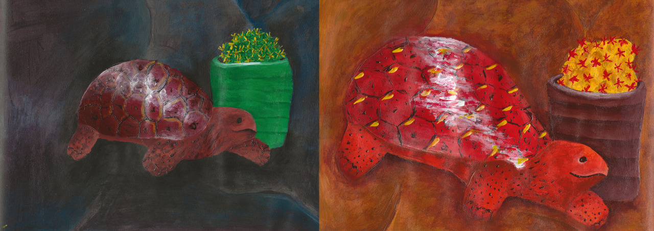
To compare both paintings side by side, you can see the obvious differences. The scale is somrthing I have already mentioned but you can see its impact properly here, one looking distant and one looking close up. Although I have used the complementary colours in my first painting, it looks very dark and cold which is at high contrast with my second painting which is bright and vibrant. By using the same group of objects placed in the same position I have managed to complete two entirely different paintings which goes to show how much of an effect colour can have on the viewer and how it can alter an object’s appearance.
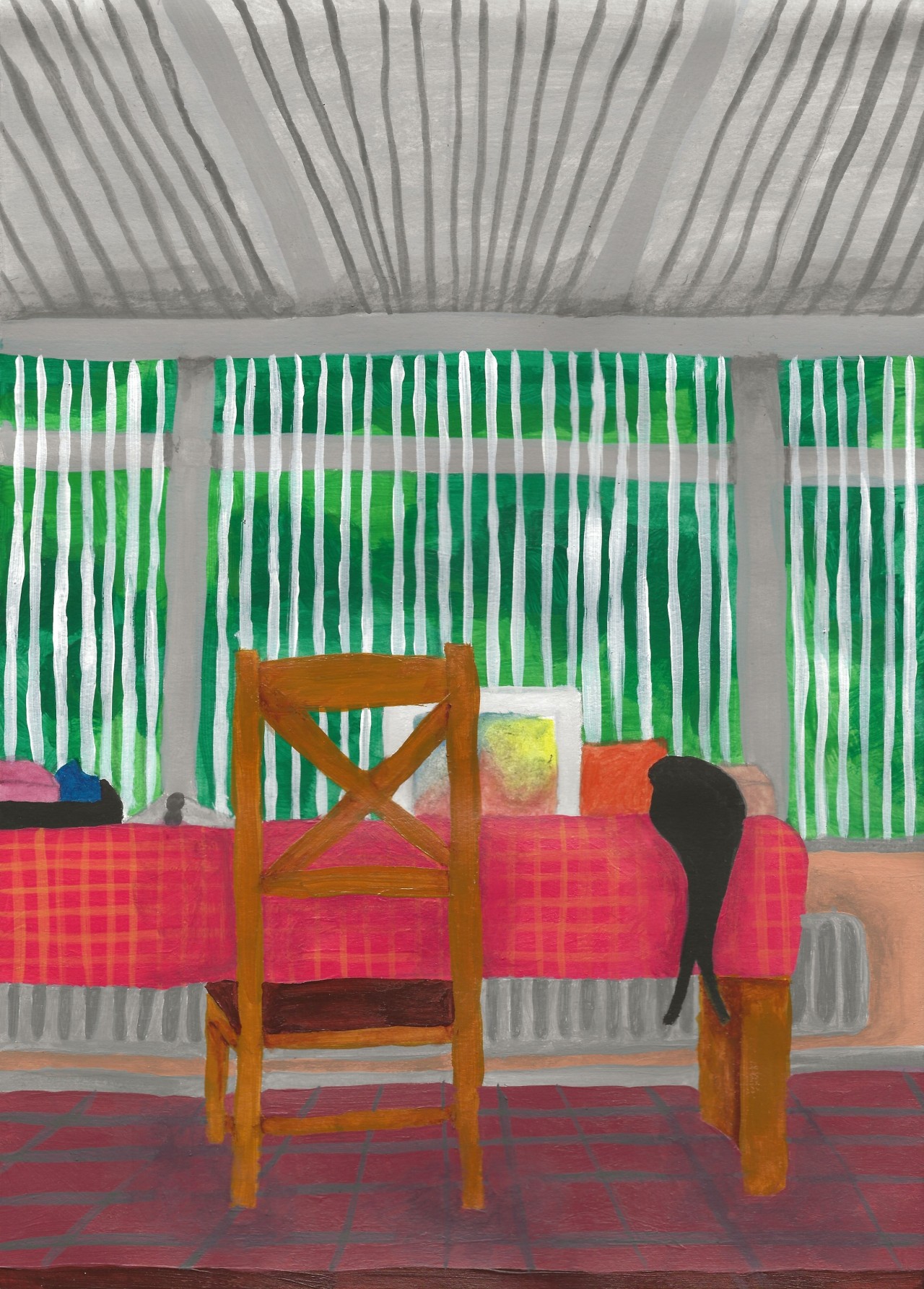
In this exercise the main focus was creating an illusion of space. I decided on the outer limits of my view and that my painting would be A4 and portrait. The area I chose to paint was fairly simple in that it was formed of mainly lines and besides the main structure there were few additional complications. The reason I chose this particular section to paint from one of my previous sketches was becasue of the research on linear perspective I had just done and my desire to execute this in my work.
I started by drawing out the basic lines and shapes I saw in pencil and then I began drawing with paint. I paid most attention to the lines which defined the structure and I assessed the relative scale of objects in my view. Almost all of my shapes were angular and unrounded which made the perspective easier to achieve and I tried to work with a degree of accuracy, measuring proportions with care.
Although this was an exercise in drawing with paint, I did not use a particularly muted palette. Instead, I limited myself to using only earthy tones and tried to achieve an approximate colour accuracy. I am particularly pleased with the blinds as I feel that despite the simple white lines, you can still tell that you are looking out through a window and into a garden. I also think that the roof is fairly convincing because it shows the linear perspective as the lines head towards a vanishing point.
As I was painting the floor I realised that I had made a mistake. I had painted the lines of the tiles so that they got further away from each other as they approached the vanishing point (which I had also done in my original sketch) and this was a fatal flaw in my perspective, so I decided to paint over them and then redraw them. Looking at my completed painting now, if there was one thing I could change it would probably be the area of the chair legs. When looking directly at the chair from where I was positioned, I could only see three of the chair legs, which is what I painted, but I feel this is not successfully conveyed in my painting so I should have used my artistic license to add in the fourth leg or simply moved the chair so it was visible.
I decided to experiment some more with colour washes and overlays. I stuck to the three primary colours which all had successful single colour washes. Adding a glaze over the top completely changes the way they look. The transparent washes, because they are so watery can look streaky from the brush strokes and this was an effect I found difficult to minimise. I particularly liked the opaque overlays because you just get a hint of the bottom layer coming through and it has a dreamy quality. The most successful of these two-colour washes was the red and orange because they blend really well. The least successful was green and yellow together as I found that the Irish green colour completely overpowered the yellow underneath. It has been worthwhile repeating this exercise because I was able to compare the transparent and opaque washes side by side and I also did each wash on a completely seperate page which minimised the creasing of paper.
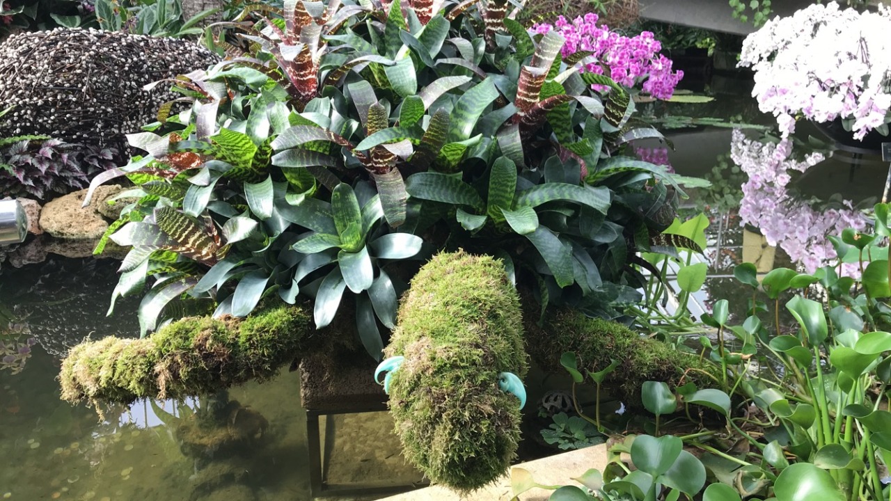
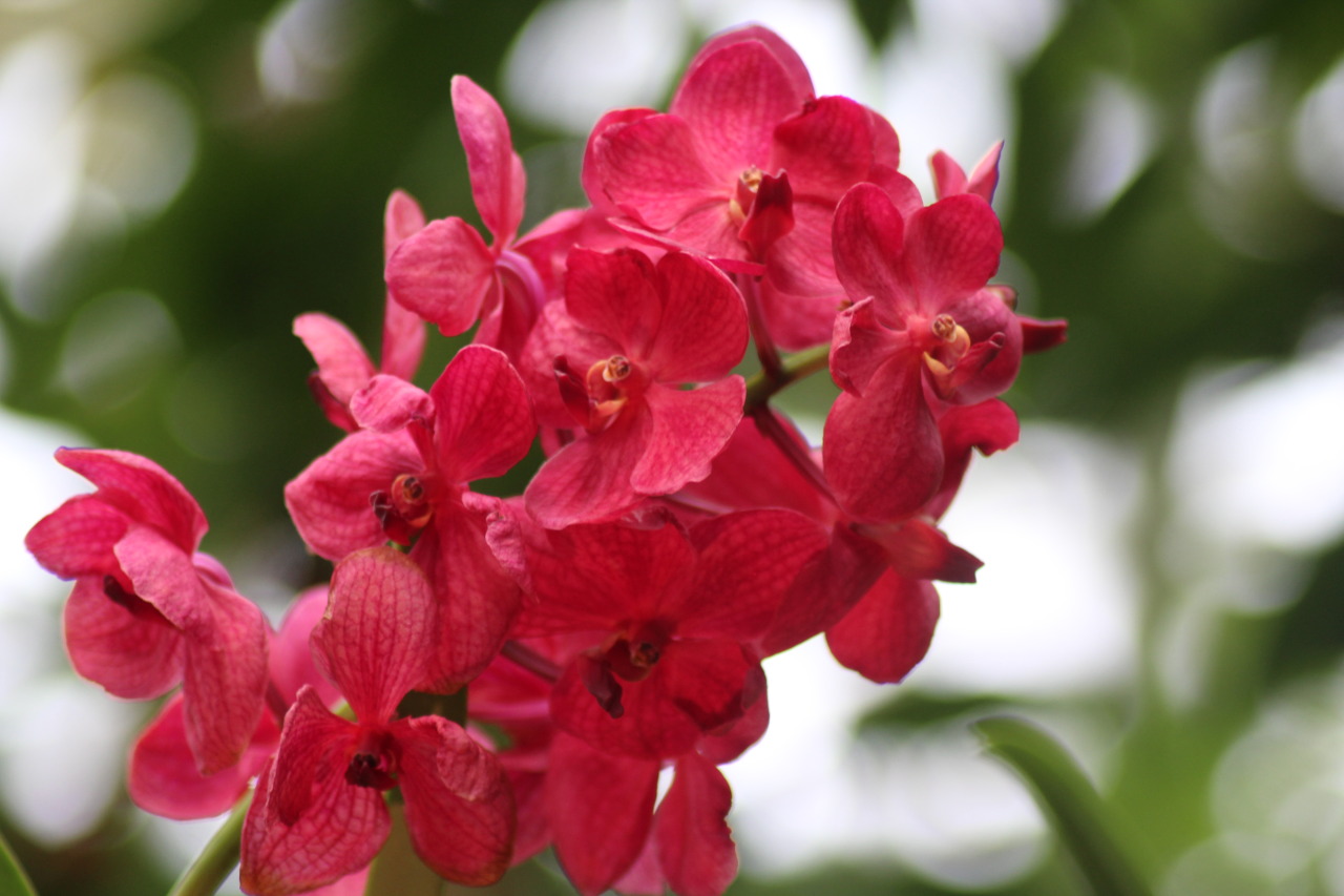
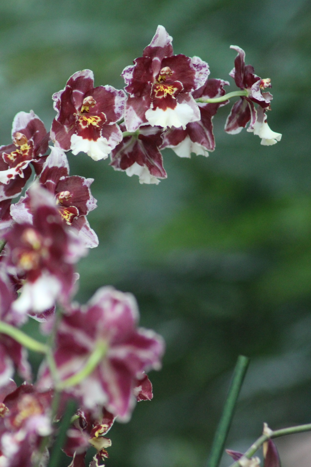
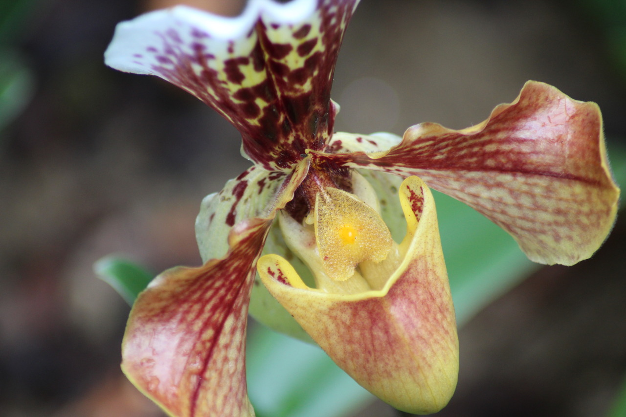
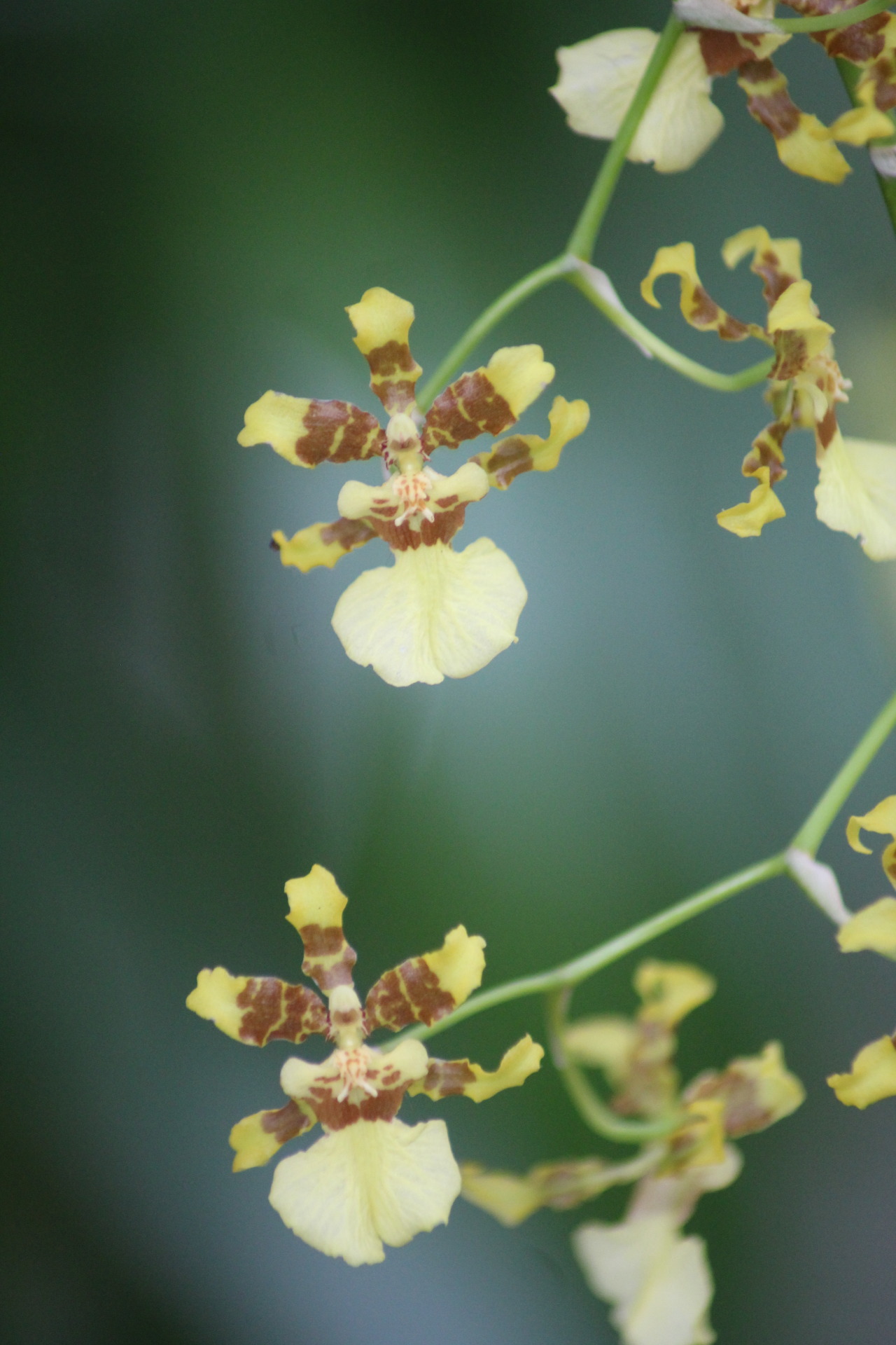
I was inspired for this assignment by my recent trip to Kew Gardens in London. They were holding what they called Kew Orchid Festival:
Celebrate the colour of Colombia
which was on display from the 9th of February to the 10th of March 2019. I had the pleasure of visiting on the 5th of March and I was blown away by what I saw.
In the Princess of Wales conservatory, Columbian culture was bought to life through signts and smells which were landscaped to perfection, including over 6,200 orchids, and that lead you up and down to view the arrangements from high up and bown below. The display also included a ‘carnival of animals’ to celebrate Columbia’s high wildlife biodiversity which
depicting a toucan in flight, a hanging sloth and swimming turtle
all composed of tropical plants.
Also featured were hundreds of colourful hanging vandas which represented Colombia’s famous rainbow river, Caño Cristales,
as well as an enchanting forest scene complete
with life-sized jaguars.There was a display of hundreds of
colourful butterflies which were suspended from the
glasshouse ceiling, and an intricate, golden floating display full of bright yellow orchids in the glasshouse pond depicting the legend
of El Dorado.
Some of the artists involved were
Colombian artist, Vanessa Moncayo González, who transformed the glasshouse film room with colourful Boyacá-style
street-art murals. Another Colombian artist, Omar Castañeda, created sculptures for a ‘treasures of
Colombia’ display alongside Colombian orchids from Kew’s collections. The festival also featured a number of traditional artisanal objects
from different regions of Colombia provided by Artesanias de Colombia,
Tu Taller Design, Yurupari Grupo Folclorico, in collaboration of the
Embassy of Colombia in London.
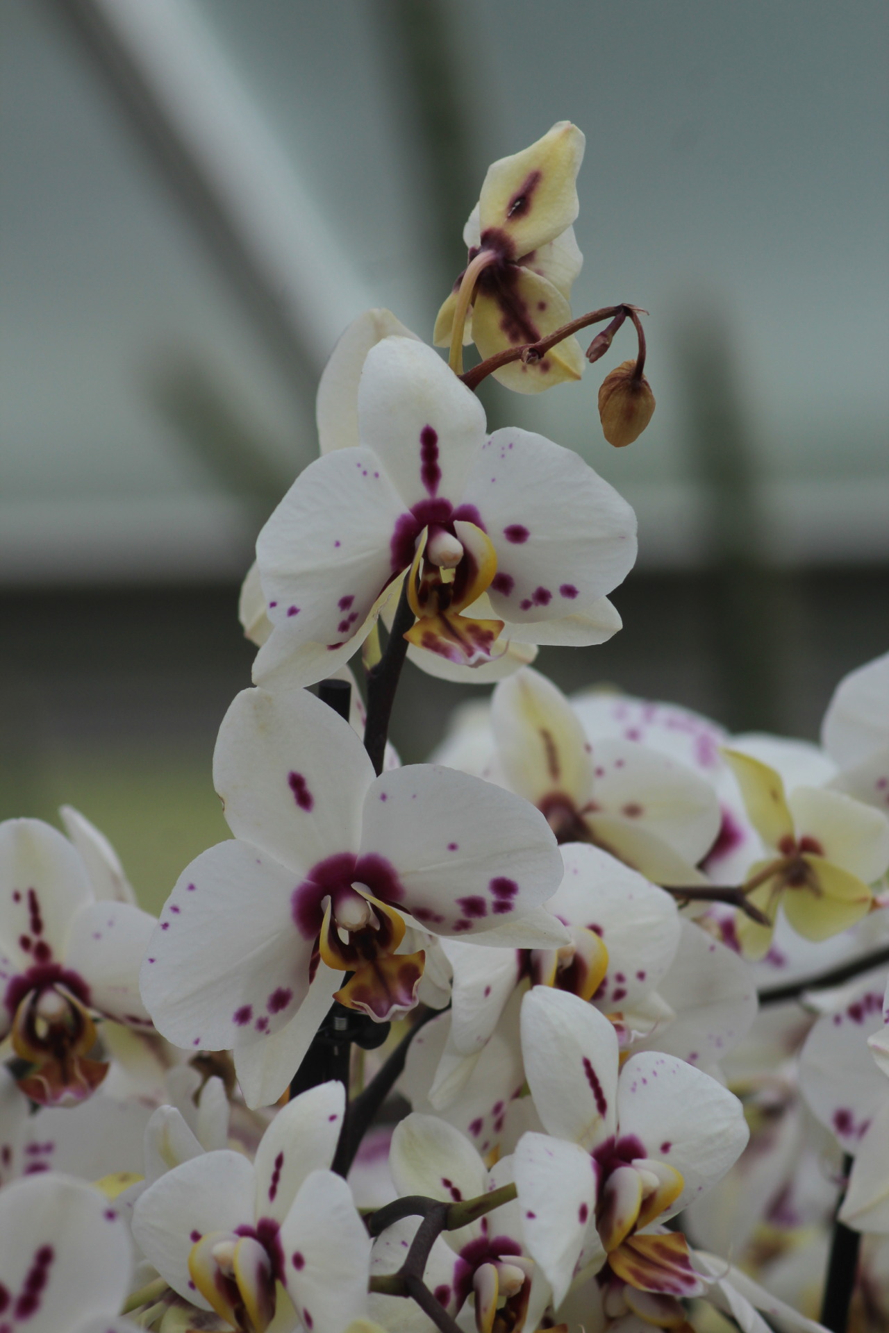
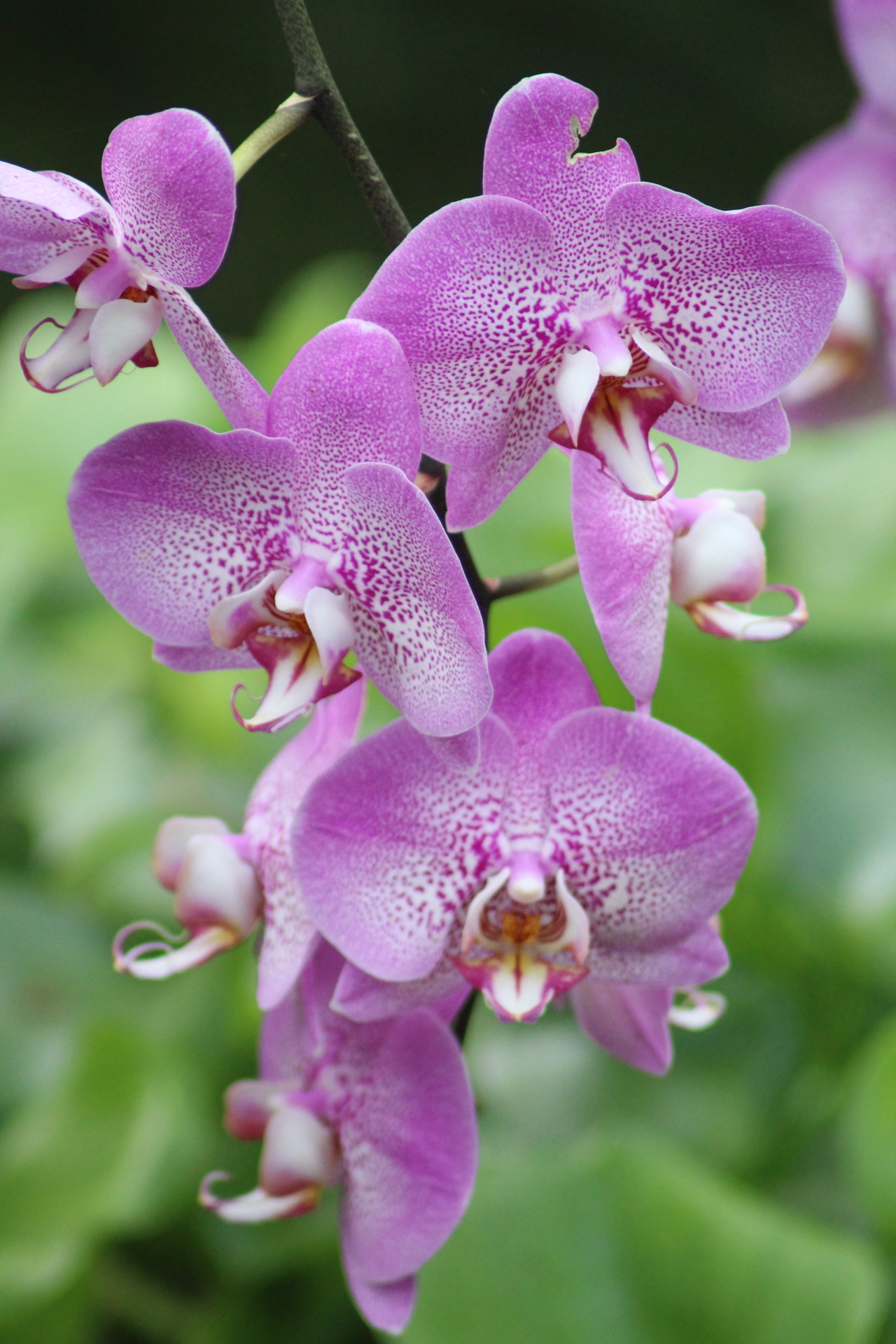
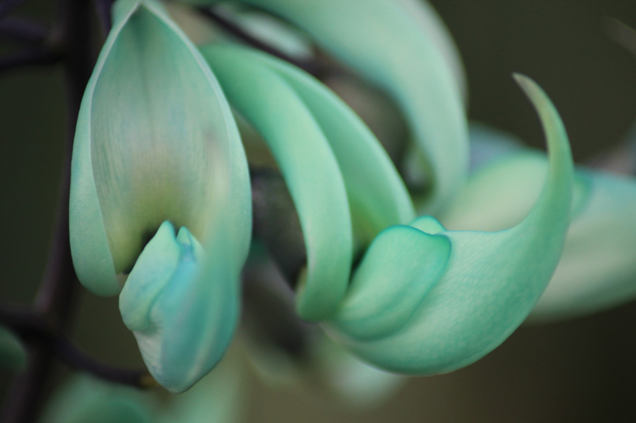
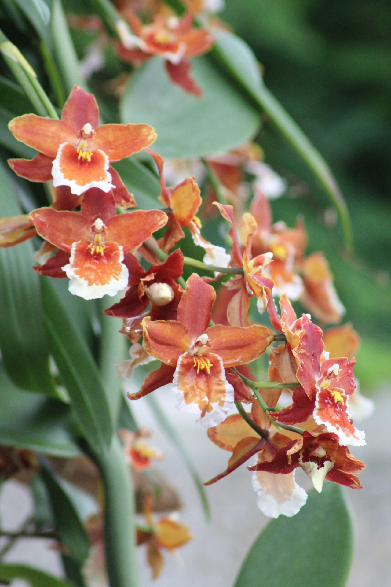
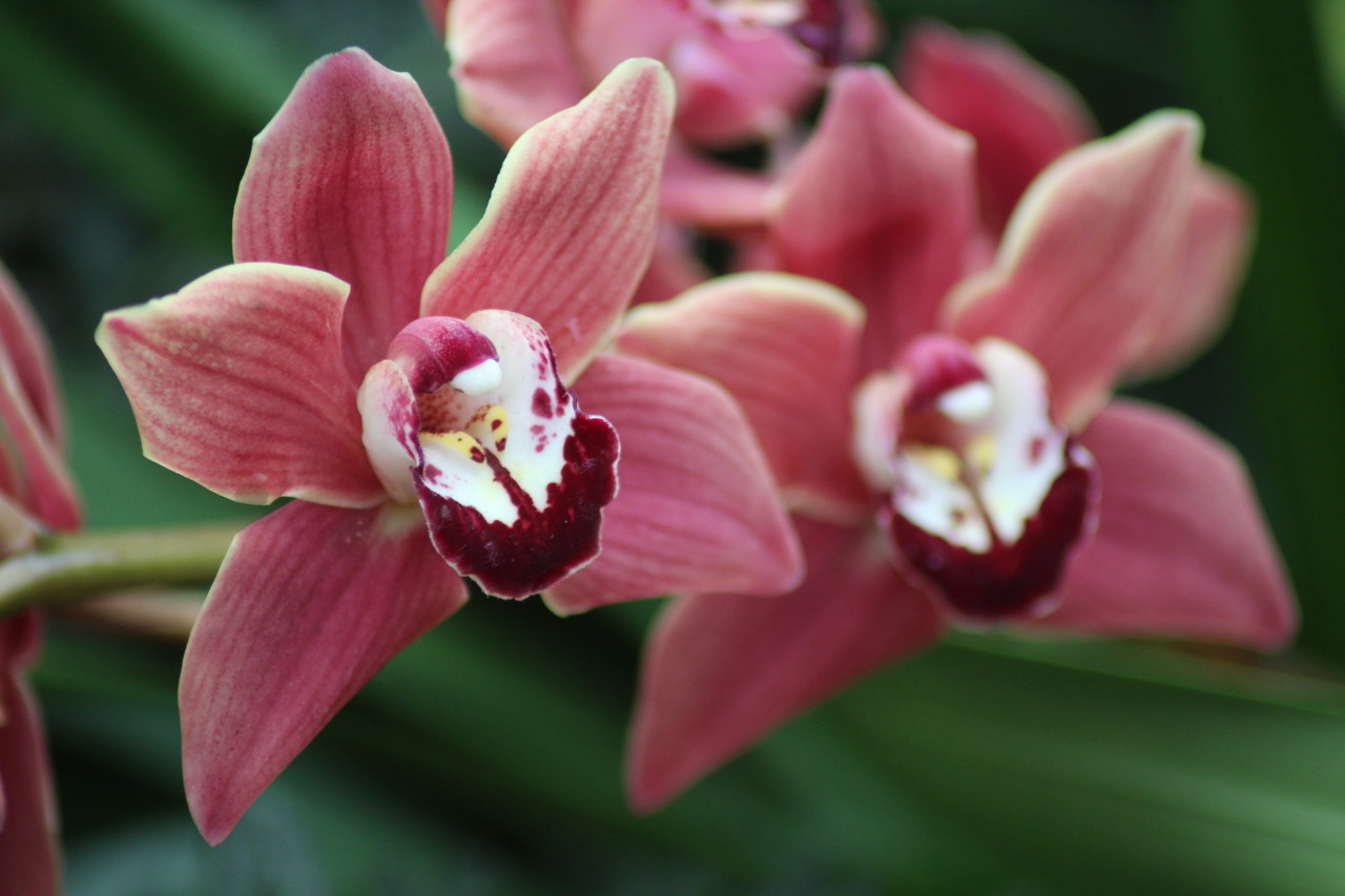
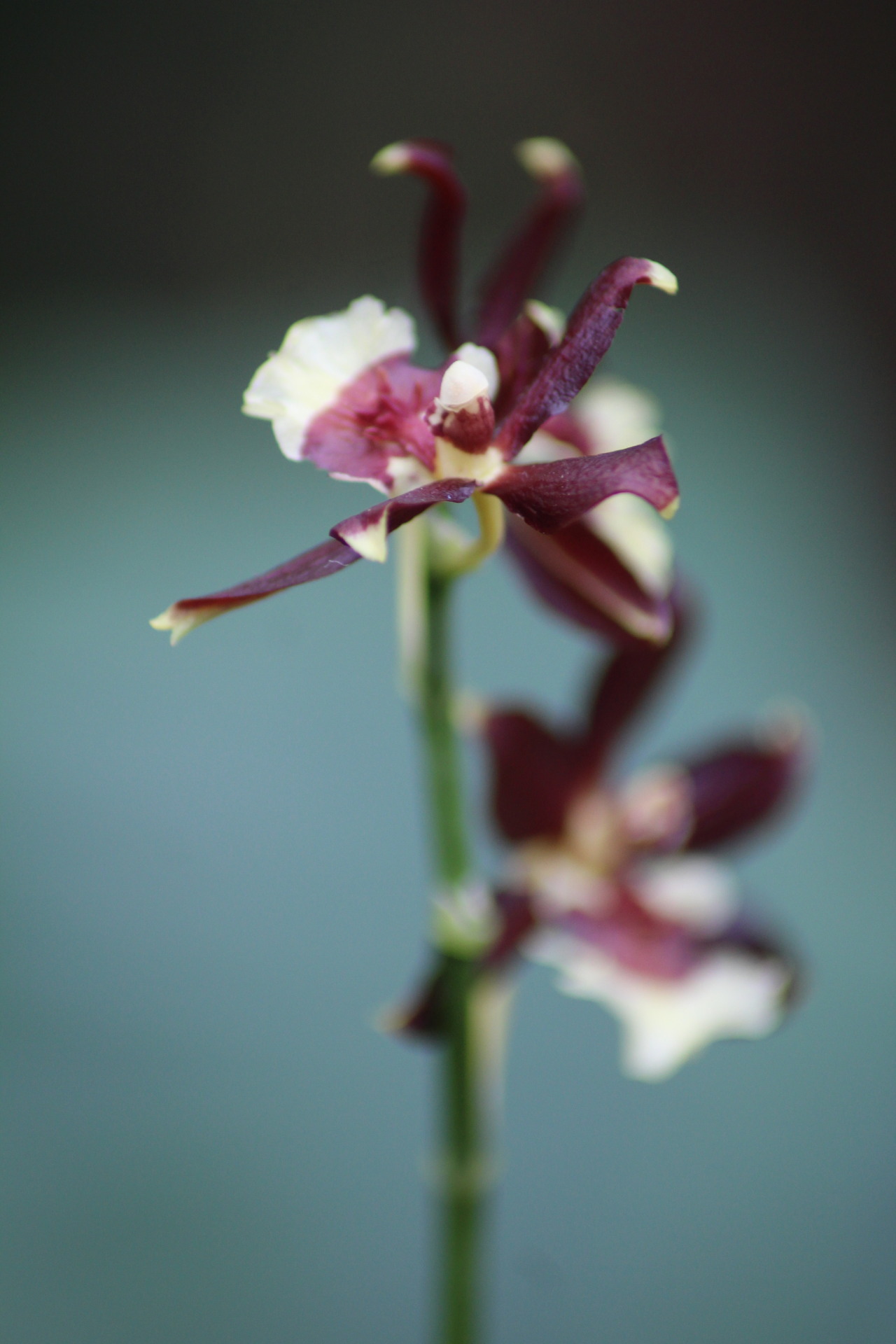
Below are some photos I took of the flowers I saw and was inspired to draw:
Whilst I was at Kew I had the privelage to see the work of an artist named Zuigestu Ikeda. A banker and businessman named Shotaro Kaga visited Kew as a student and fell in love with the orchids on display. Kaga designed and built Oyamazaki Villa along with a large complex of glasshouses. Along with the grower Kenkichi Goto he created a large private nursery to cultivate his imported orchids in Japan.
Ikeda, a botanical artist, was comissioned to paint Kaga’s orchid collection in the 1930′s. He completed hundreds of watercolour paintings and went on to comission the best known craftsmen of the day to make colour woodblock prints of his paintings using the finest materials. The set was completed in 1943 and named the Rankafu series of which only 300 sets were printed. The exhibition I saw is thought to be the first time the prints have been officially exhibited outside of Japan.
This information was taken from display boards at the exhibition in the
Shirley Sherwood Gallery of Botanical Art
at Kew Gardens.
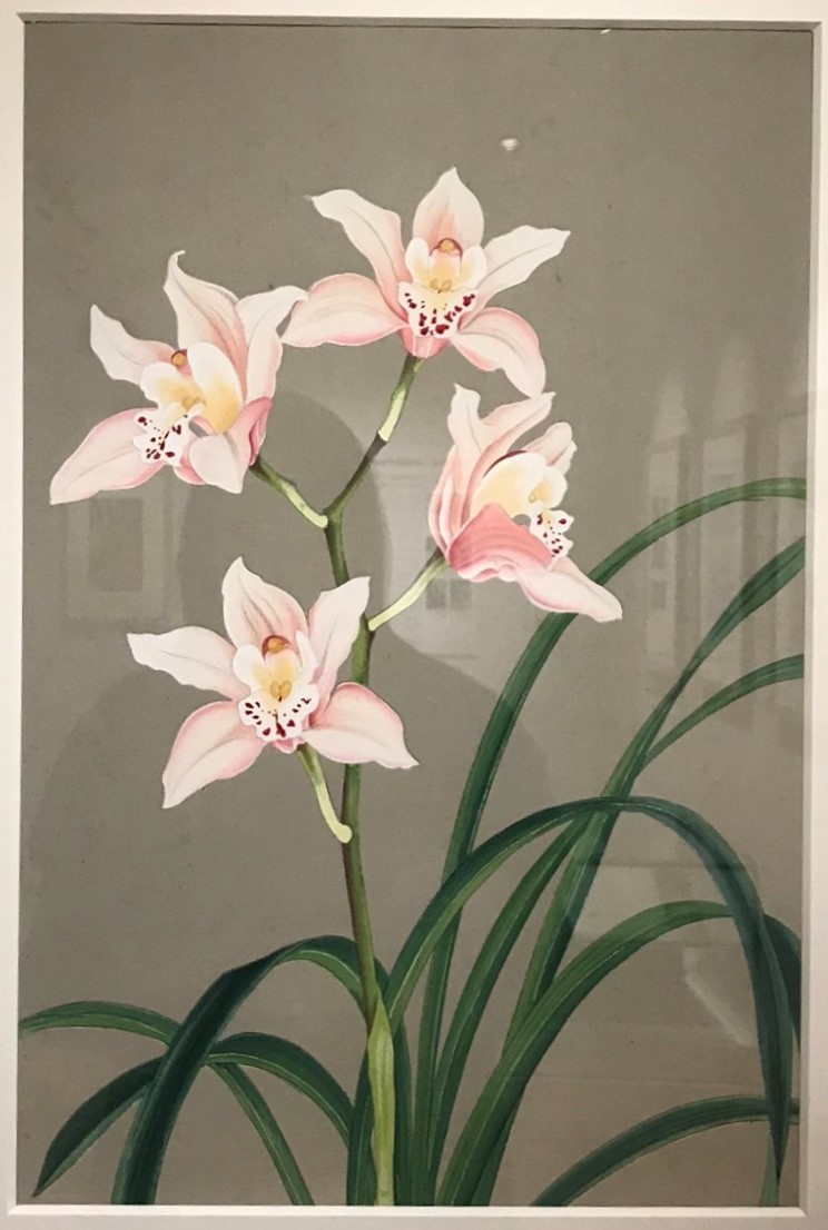
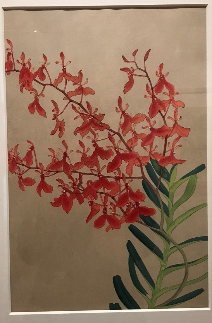
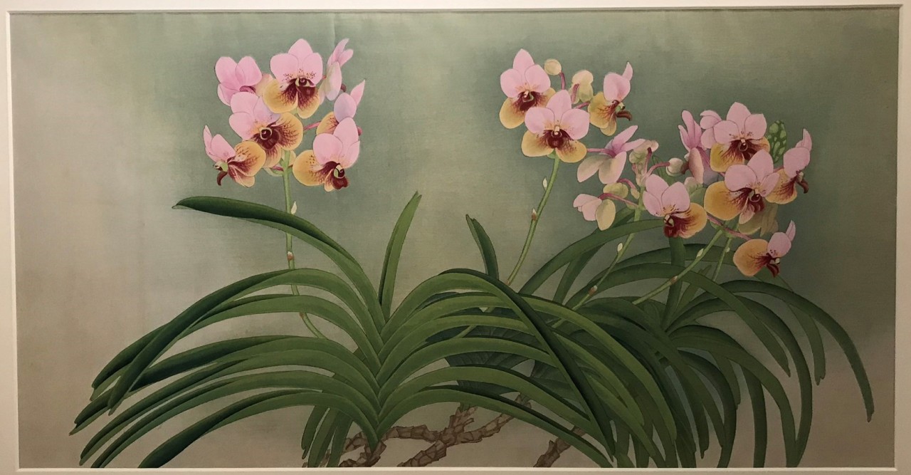
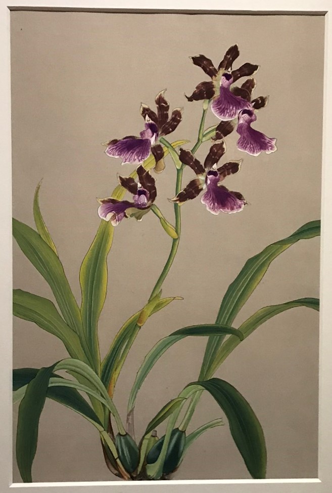
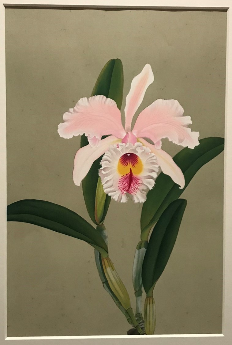
Rankafu Print no. 62 (1946) Paphiopedilum Euphrasia ‘Oyamazaki M. S. K.’
Rankafu Print no. 104 (1946) Zygopetalum maxillare Brazil and north-east Argentina
Rankafu Print no. 10 (1946) Rhyncholaelaeliocattleya (Rlc.) [Blc.] nr. No 487 ‘Oyamazaki’
I particularly love these prints for their subtle complexity. They appear to be simple paintings because of their plain coloured backgrounds but this really brings out the vivid details of the flowers and leaves. Each flower is so complex and Ikeda does a really good job of capturing every little mark and colour on these flowers accurately. His work has inspired me beacuse my mother is also a keen collector of orchids and these flowers can be found all around my house. They are such beautiful plants and they would make great subjects for my still life paintings whether I decide to create a mood, use complementary colours or paint them accurately.
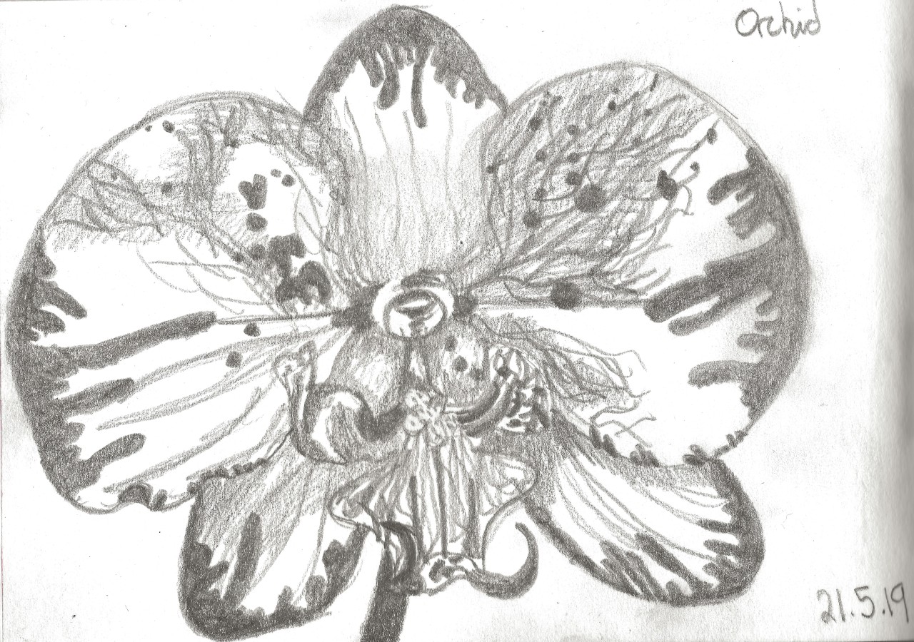
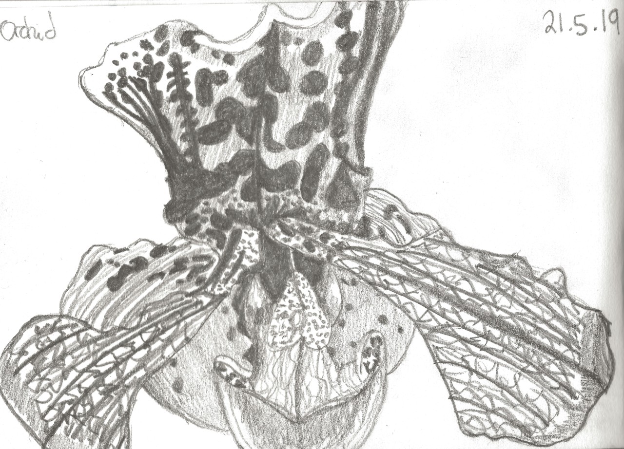
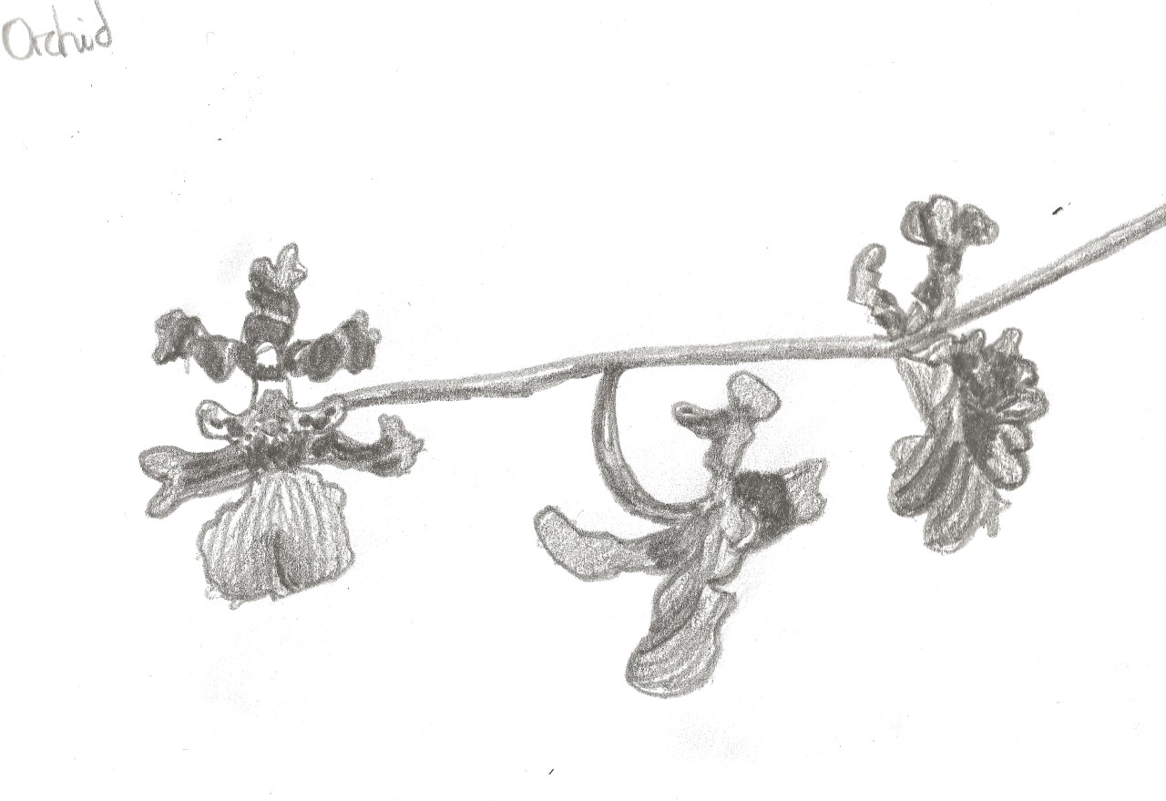
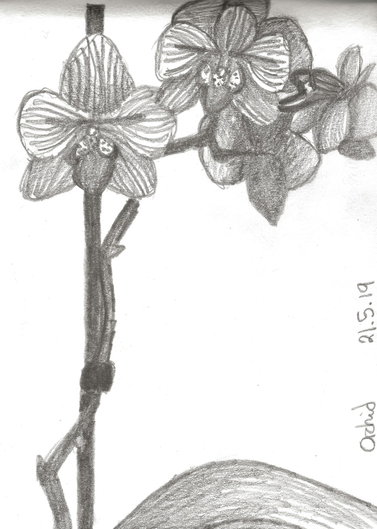
Below are a few sketches which I composed from some of the photos I took at the Orchid Festival. I have tried to focus mostly on the detailed patterns and complex shapes of the flowers:
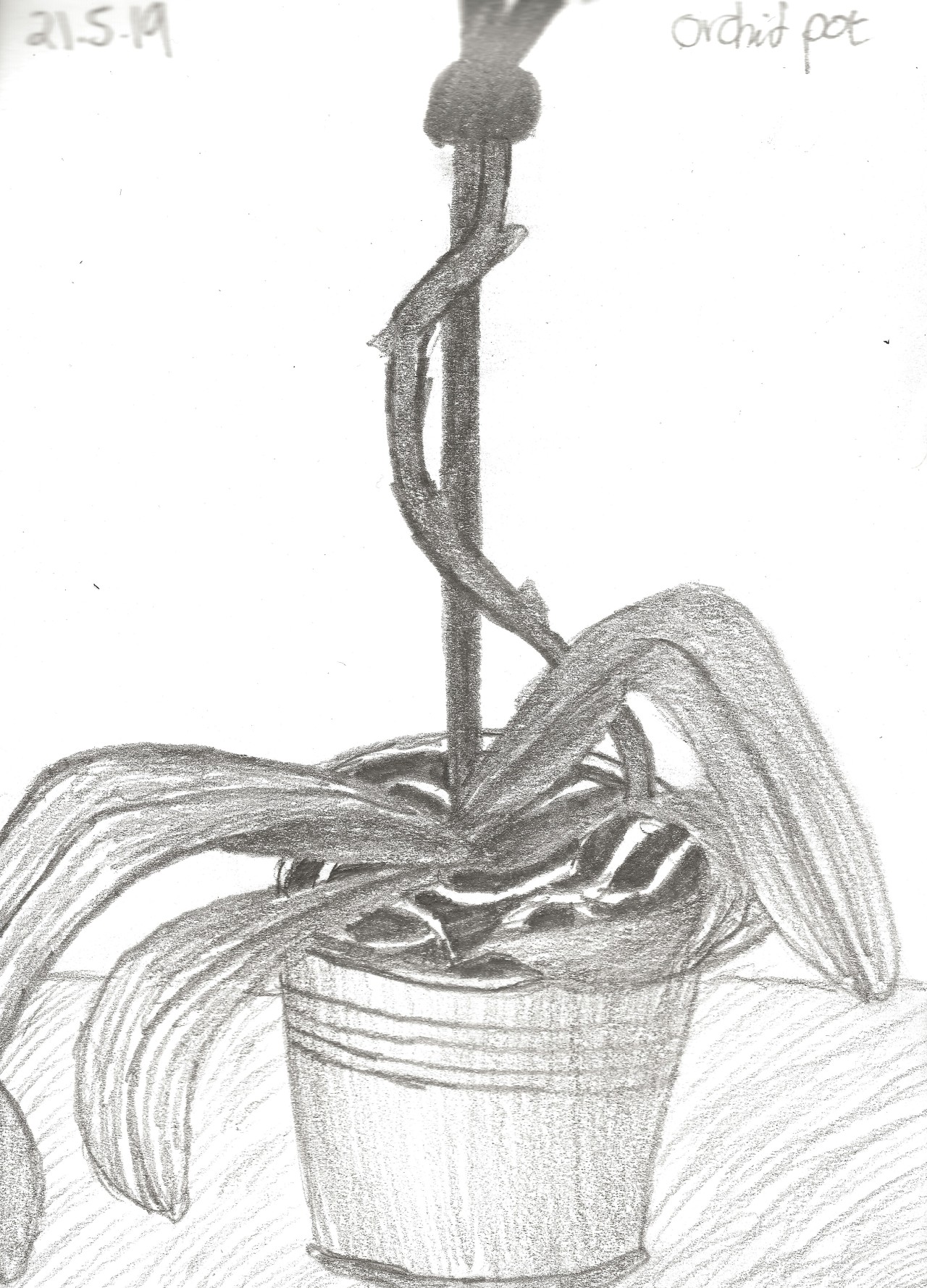
After setting up my simple still life, by placing a potted orchid on a small table, I constructed a couple of simple sketches from life of what I could see. I didn’t want to make a sketch that was too detailed or complete, so that when I come to paint my final piece I will not feel like I’m repeating myself:
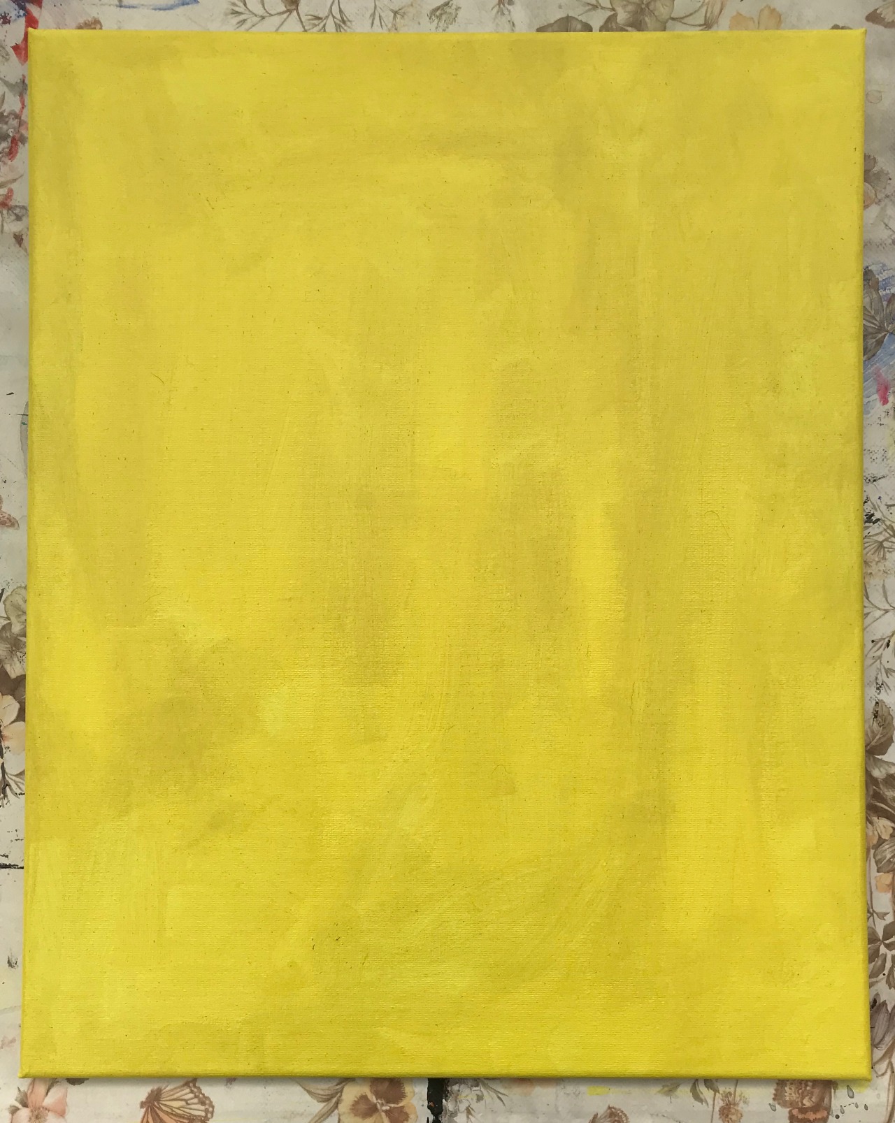
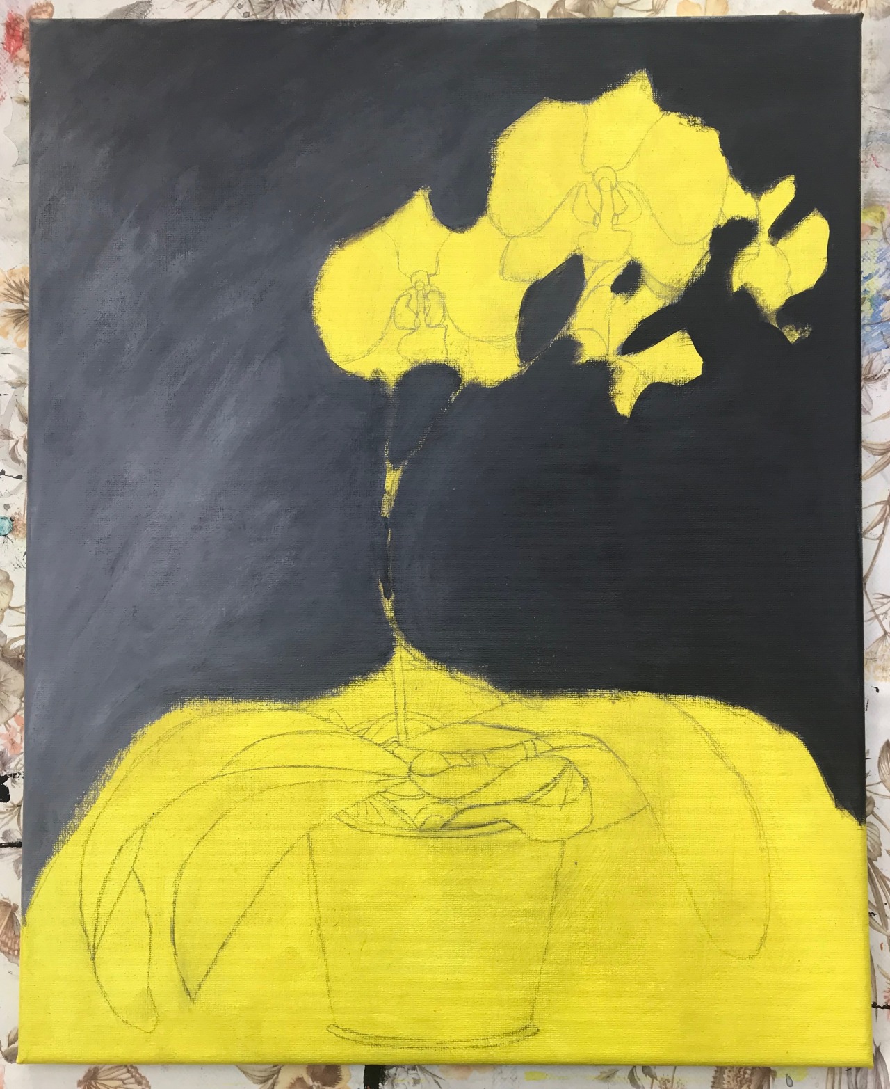
I started my painting with a base colour. I decided on yellow as I noticed this as an undertone in the peachy colour of my flowers:
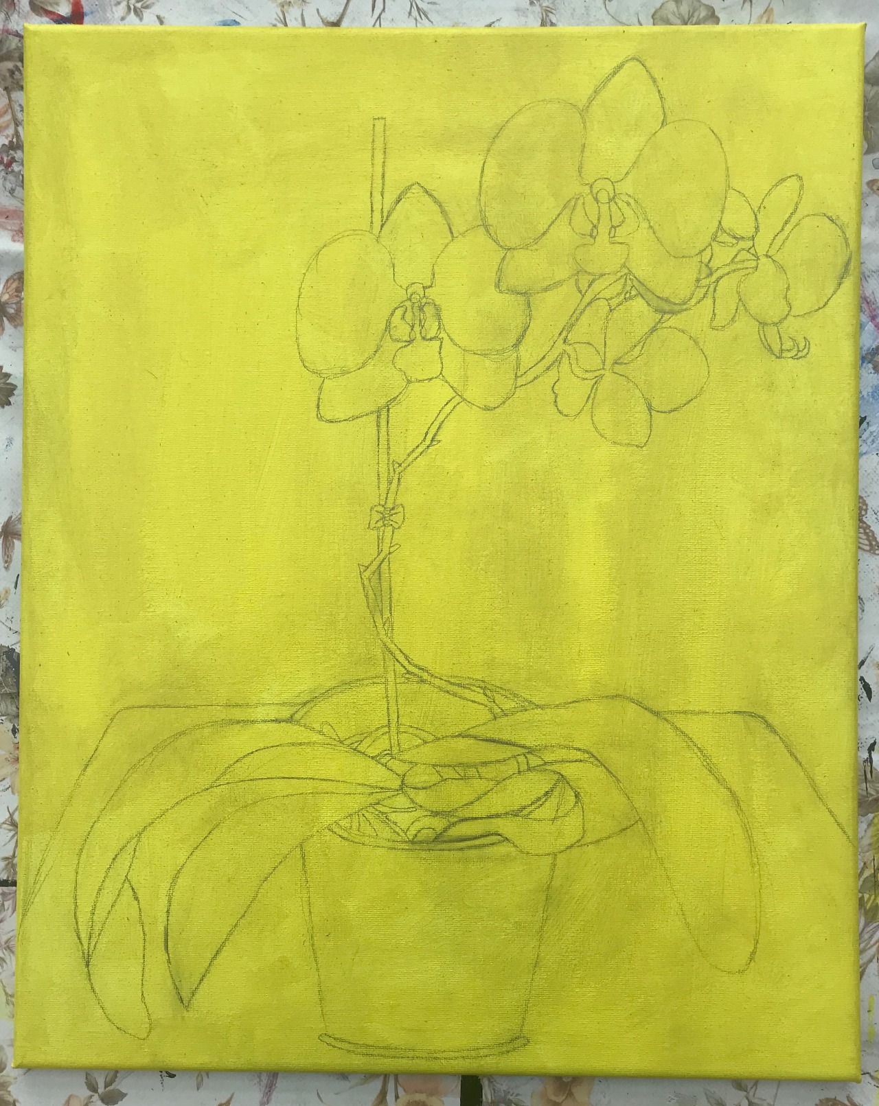
Next I used soft pencil to draw the outlines of my still life onto the canvas:
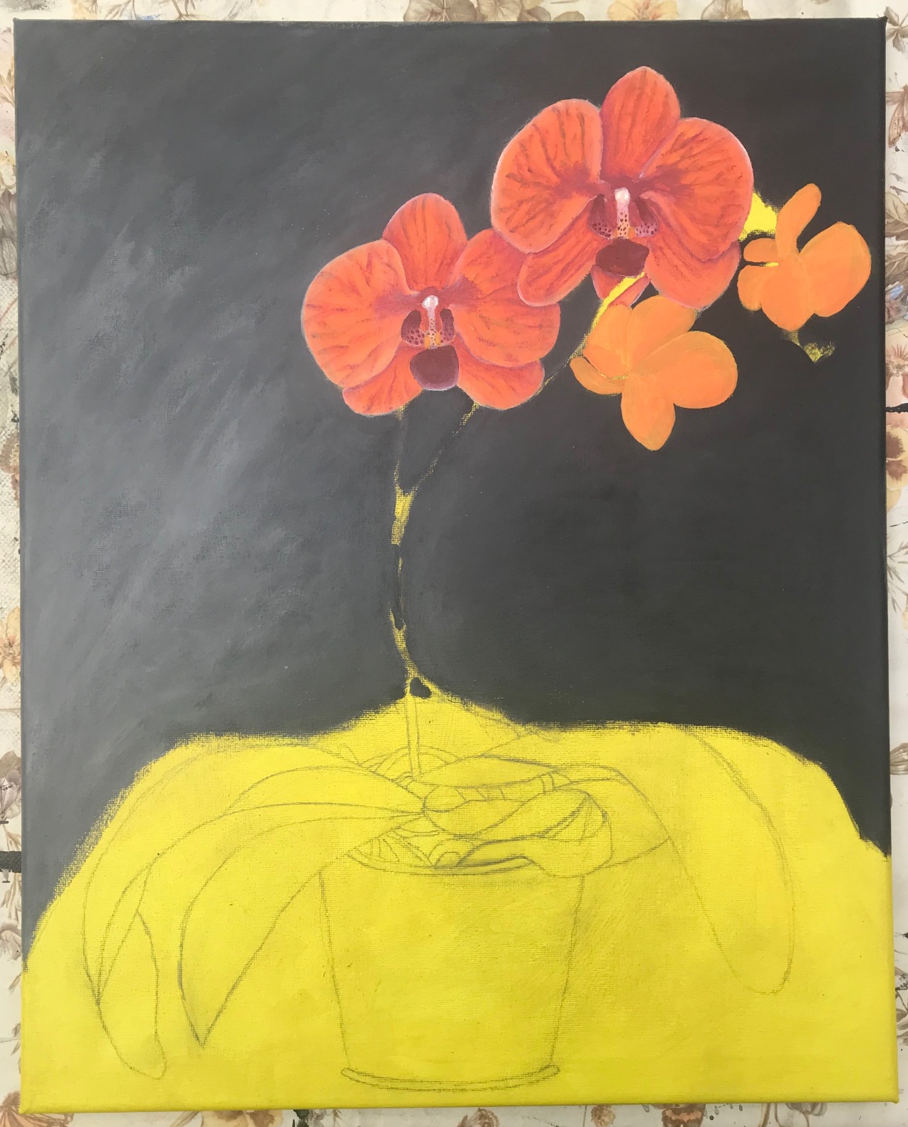
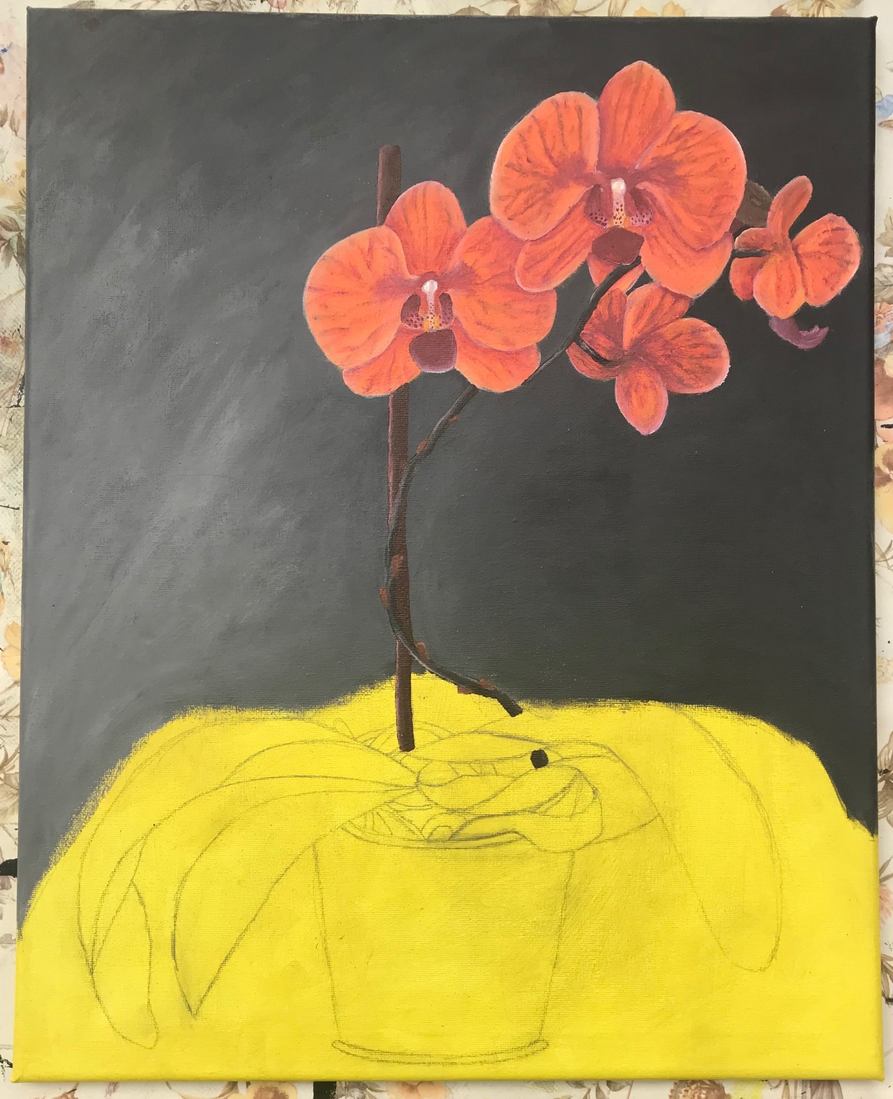
The following photos show my progress as I painted:
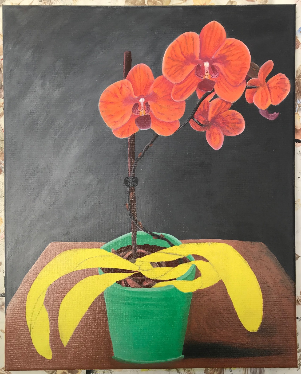
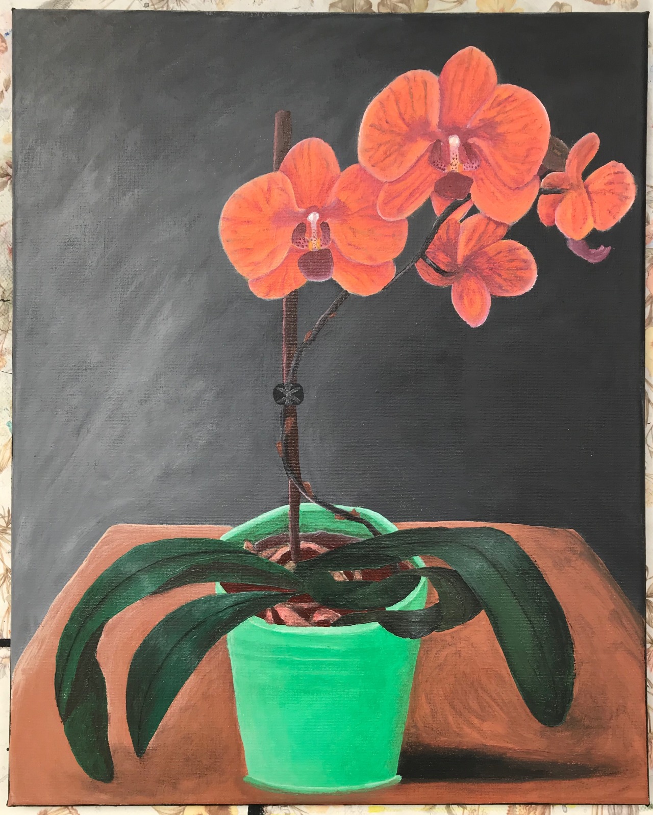
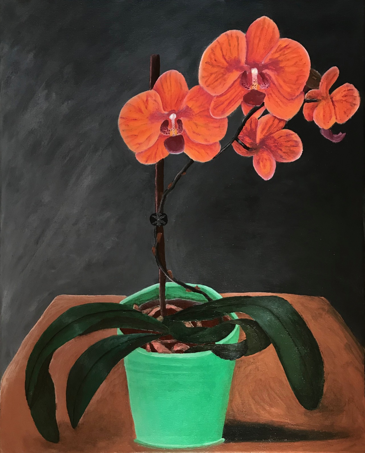
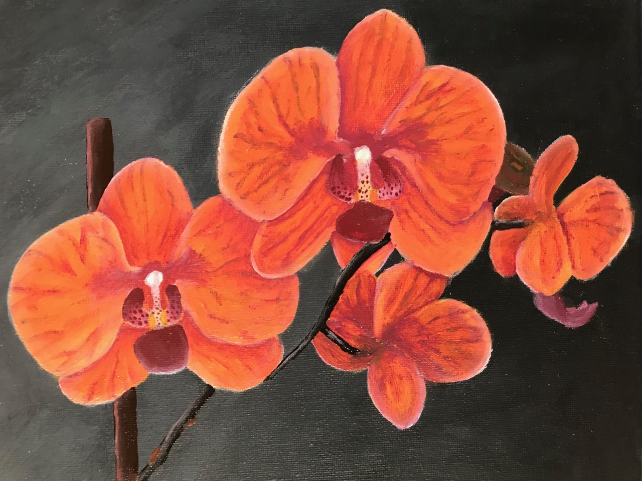
Finally, this is the finished painting with a close up of the flowers:
For this assignment I decided I would visit one of the exercises I didn’t previously have time for which was ‘still life with flowers’. I decided on only a single object in this composition because I thought it would make the painting quite striking and I think this is an effect I have achieved with my dark background and bright plant. I decided to give it a simple context by just placing it onto a table as again I didn’t want to overcomplicate the object.
I painted again in acrylic and I hope it is obvious that my technique and understanding of colour, tone and composition has improved since my last assignment. Based on my previous feedback, I have put a lot of time into practicing creating volume in my paintings and I hope that in this painting that is evident through my use of tone and shading. For example, before I would have probably gone for a block colour background, but in this painting I have tried to use the light to create a more intersting and painterly effect. I have also done my best to show the relationship between my background and my objects by using hard and soft edges in the appropriate places.
In terms of colour, I mostly stuck with what I saw in front of me although I chose a dark background, which is in contrast to the bright flowers, to create a sultry atmosphere, almost as if you are in a tropical location on a warm evening. I have slightly exaggurated the yellow and purple in the floral tones to give the striking effect of complementary colours. Having a fairly neutral grey background also helps to bring out these shades and cut out any unnecessary busyness.
Although I began by drawing the outline of my shapes with a pencil, I used this as a rough guide which enabled me to draw with paint. I also drew the key details of my work with paint such as the veins of the flowers. I also tried to pay attention to the perspective and the sharp angles of the table so the way it was painted was just as I saw it. I hope that in this painting I have shown a good development of my skills and incorporated techniques from the exercises in this part of the course.