Primary colours are colours that cannot be made by mixing other colours together. They are the fundamental colours that make up the colour spectrum and are the basis for all other colours.
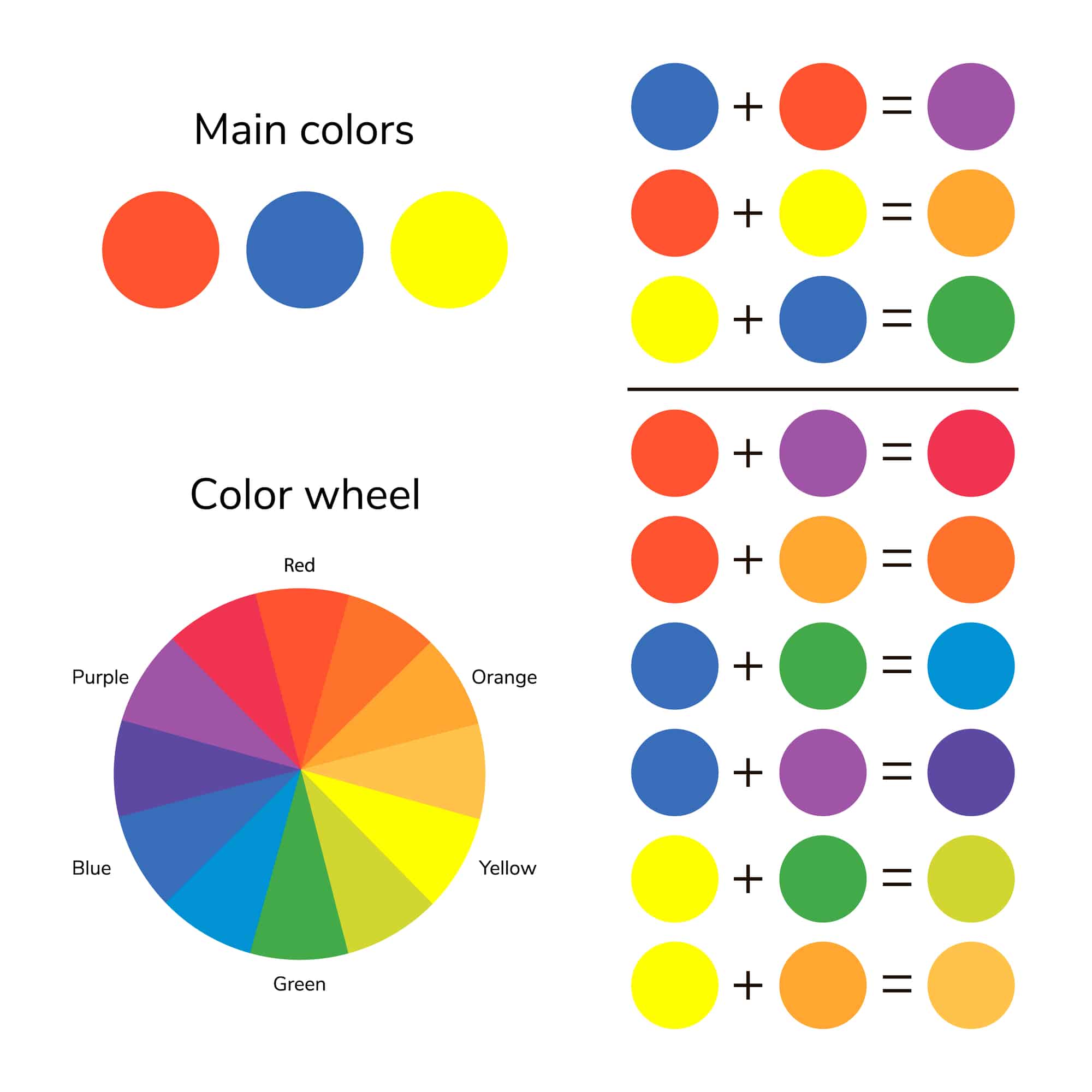
The traditional colour wheel has three primary colours: red, yellow, and blue. These colours are called primary because they are the most basic colours, and all other colours can be created by mixing them together in different combinations and proportions. Red, yellow, and blue are the primary colours in the traditional colour wheel because they are the most widely used in art and design. They are also the colours that are used in most colour printing processes, such as offset printing and screen printing. The primary colours are also used in television, computer monitors, and other electronic displays.
Primary colours are important because they are the building blocks of all other colours. When two primary colours are mixed together, they create a secondary colour. For example, when red and yellow are combined, they make orange. When blue and yellow are mixed together, they create the colour green. And when blue and red are mixed together, they create the colour purple.
There are other colour wheels that use different primary colours, such as the subtractive colour wheel, which is used in the printing industry. The primary colours in the subtractive colour wheel are cyan, magenta, and yellow. These colours are called subtractive because they absorb certain wavelengths of light and reflect others, which creates the perception of colour. When cyan, magenta, and yellow are mixed together, they create the colour black.
Other colour models use different primary colours, such as the RGB colour model, which is used in electronic displays. The primary colours in the RGB colour model are red, green, and blue. These colours are called primary because they are the colours that are used to create all other colours on a computer or television screen. When different levels of red, green, and blue are mixed together, they create a wide range of colours.
Primary colours are also important in the world of fashion and design. In interior design, primary colours are often used to create a bold and vibrant look or create a sense of balance and harmony.
Primary colours are also used in branding and marketing, as they are often associated with certain emotions and meanings. Red is often used to convey energy, passion, and excitement, while blue is associated with calmness, trust, and reliability. Yellow is often used to convey cheerfulness, happiness, and warmth.
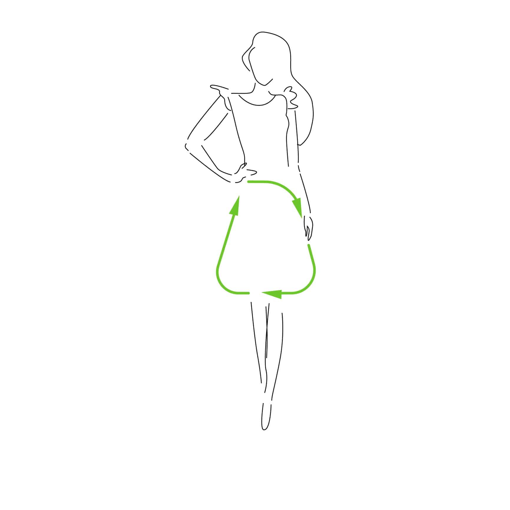
In fashion, primary colours create a wide range of looks, from bold and vibrant to sophisticated and elegant. Many fashion designers use primary colours as the basis for their colour palettes, and they mix and match different shades and tones of the primary colours to create a wide range of looks.
One way that primary colours are used in fashion is through the use of colour blocking. This involves using large blocks or blocks of primary colours in an outfit, such as a red top paired with yellow pants. Colour blocking can be a bold and eye-catching way to make a statement, and it is often used in high fashion and on the runway.
Primary colours can also be used in more subtle ways in fashion, such as through accessories or accents. A red bag or a pair of blue shoes can add a pop of colour to an outfit, while a yellow scarf or a green belt can add a touch of brightness and cheerfulness.
In addition to being used as standalone colours, primary colours can also be mixed and matched to create a wide range of secondary and tertiary colours. For example, red and yellow can be mixed together to make orange, while blue and yellow can be combined to create green. Mixing and matching primary colours can be a great way to create a more diverse and dynamic colour palette in fashion.
Primary colours are also often used in fashion to convey certain emotions and meanings. Red is often associated with energy, passion, and excitement and is often used in fashion to create a bold and vibrant look. Blue is often associated with calmness, trust, and reliability, and it is often used in fashion to create a more sophisticated and elegant look. Yellow is often associated with cheerfulness, happiness, and warmth and is often used in fashion to add a touch of brightness and cheerfulness.
In addition to being used in clothing and accessories, primary colours are also often used in branding and marketing in the fashion industry. Brands may use primary colours in their logo design, packaging, and marketing materials to convey certain emotions and meanings and to stand out in a crowded market.
Whether you are a fashion designer or simply looking to add a pop of colour to your wardrobe, understanding how to use primary colours can help you create dynamic and impactful fashion looks.
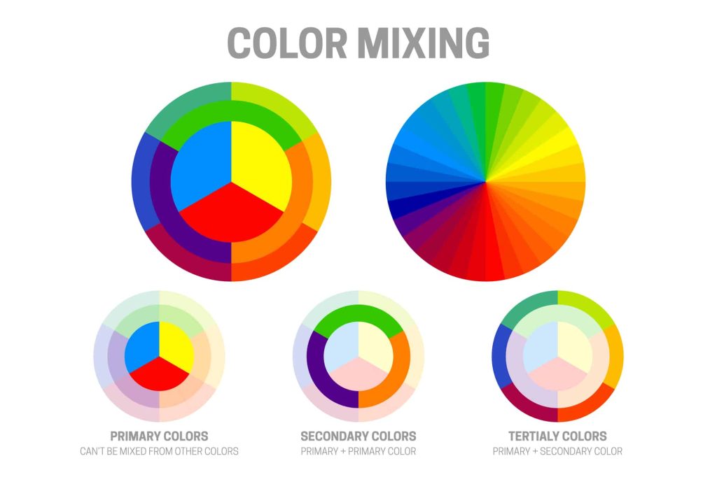
When primary colours are mixed together, they create a wide range of secondary and tertiary colours, which can be used in a variety of combinations to create different looks and effects.
One popular combination of primary colours is red, yellow, and blue, often referred to as the “primary colour triad.” This combination creates a bold and vibrant look, often used in art and design, to create a sense of balance and harmony.
Red, yellow, and blue can be used in equal proportions, or one colour can be used as an accent against the other two.
Another popular combination of primary colours is red and yellow, which creates orange. Orange is often associated with warmth, happiness, and energy, and it is a popular colour in fashion and design.
Red and yellow can be used in equal proportions to create a pure orange, or one colour can be used as an accent against the other.
A third popular combination of primary colours is blue and yellow, creating green. Green is often associated with nature, growth, and renewal, and it is a popular colour in fashion and design.
Blue and yellow can be used in equal proportions to create a pure green, or one colour can be used as an accent against the other.
In addition to these primary colour combinations, there are also many other combinations that are popular in art, design, and fashion. For example:
Primary colours can also be combined with other colours to create a wide range of looks and effects. For example, primary colours can be paired with neutral colours, such as black, white, and grey, to create a sophisticated and elegant look. Primary colours can also be paired with pastel colours, such as light pink and light blue, to create a softer and more feminine look.
Whether you are an artist, designer, or fashion enthusiast, understanding how to mix and match primary colours can help you create dynamic and impactful colour palettes.
In summary, primary colours are the fundamental colours that make up the colour spectrum and are the basis for all other colours. They are important in art, design, and branding and are used to create a wide range of looks and emotions. Whether you are an artist, designer, or marketer, understanding the primary colours and how they work together is essential for creating effective and impactful designs.
| Cookie | Duration | Description |
|---|---|---|
| cookielawinfo-checbox-analytics | 11 months | This cookie is set by GDPR Cookie Consent plugin. The cookie is used to store the user consent for the cookies in the category "Analytics". |
| cookielawinfo-checbox-functional | 11 months | The cookie is set by GDPR cookie consent to record the user consent for the cookies in the category "Functional". |
| cookielawinfo-checbox-others | 11 months | This cookie is set by GDPR Cookie Consent plugin. The cookie is used to store the user consent for the cookies in the category "Other. |
| cookielawinfo-checkbox-necessary | 11 months | This cookie is set by GDPR Cookie Consent plugin. The cookies is used to store the user consent for the cookies in the category "Necessary". |
| cookielawinfo-checkbox-performance | 11 months | This cookie is set by GDPR Cookie Consent plugin. The cookie is used to store the user consent for the cookies in the category "Performance". |
| viewed_cookie_policy | 11 months | The cookie is set by the GDPR Cookie Consent plugin and is used to store whether or not user has consented to the use of cookies. It does not store any personal data. |
Create your free account and begin your sustainability journey.