Research is a powerful tool for gaining insights into the world around us. Whether in academia, industry, or the public sector, research studies can inform decision-making, drive innovation, and improve our understanding of complex phenomena. However, the value of research lies not only in the data collected but also in the interpretation of results. Properly interpreting research findings is critical to extracting meaningful insights, drawing accurate conclusions, and informing future research directions.
In this Mind the Graph article, you’ll understand the basic concept of interpretation of results in research. The article will go over the right procedure for checking, cleaning, and editing your data as well as how to organize it effectively to aid interpretation.
What is the interpretation of results in research?
The process of interpreting and making meaning of data produced in a research study is known as research result interpretation. It entails studying the data’s patterns, trends, and correlations in order to develop reliable findings and make meaningful conclusions.
Interpretation is a crucial step in the research process as it helps researchers to determine the relevance of their results, relate them to existing knowledge, and shape subsequent research goals. A thorough interpretation of results in research may assist guarantee that the findings are legitimate and trustworthy and that they contribute to the development of knowledge in an area of study.
The interpretation of results in research requires multiple steps, including checking, cleaning, and editing data to ensure its accuracy, and properly organizing it in order to simplify interpretation. To examine data and derive reliable findings, researchers must employ suitable statistical methods. They must additionally consider the larger ramifications of their results and how they apply to everyday scenarios.
It’s crucial to keep in mind that coming to precise conclusions while generating meaningful inferences is an iterative process that needs thorough investigation.
The process of checking, cleaning, and editing data
The process of data checking, cleaning, and editing may be separated into three stages: screening, diagnostic, and treatment. Each step has a distinct goal and set of tasks to verify the data’s accuracy and reliability.
Screening phase
The screening process consists of a first inspection of the data to find any errors or anomalies. Running basic descriptive statistics, reviewing data distributions, and discovering missing values may all be part of this. This phase’s goal is to discover any concerns with the data that need to be investigated further.
Diagnostic phase
The diagnostic phase entails a more extensive review of the data to identify particular concerns that must be addressed. Identifying outliers, investigating relationships between variables, and spotting abnormalities in the data are all examples of this. This phase’s goal is to identify any problems with the data and propose suitable treatment options.
Treatment phase
The treatment phase entails taking action to resolve any difficulties found during the diagnostic phase. This may involve eliminating outliers, filling in missing values, transforming data, and editing data. This phase’s goal is to guarantee that the data is reliable, precise, and in the appropriate format for analysis.
Researchers may guarantee that their data is high-quality and acceptable for analysis by using a structured approach to data checking, cleaning, and editing.
How to organize data display and description?
Organizing data display and description is another critical stage in the process of analyzing study results. The format in which data is presented has a significant influence on how quickly it may be comprehended and interpreted. The following are some best practices for data display and description organization.
Best practices for qualitative data include the following:
- Use quotes and anecdotes: Use quotes and anecdotes from participants to illustrate key themes and patterns in the data.
- Group similar responses: Similar replies should be grouped together to find major themes and patterns in the data.
- Use tables: Tables to arrange and summarize major themes, categories, or subcategories revealed by the data.
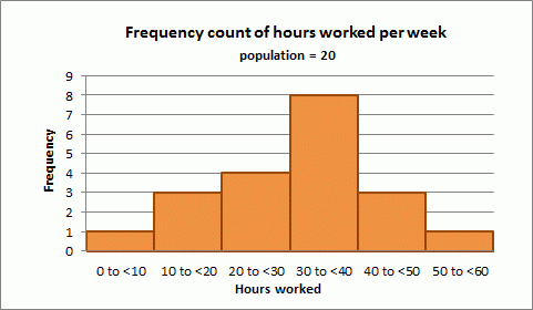
- Use figures: Figures, such as charts or graphs, may help you visualize data and spot patterns or trends.
- Provide context: Explain the research project’s topic or hypothesis being examined, as well as any important background information, before presenting the findings.
- Use simple and direct language: To describe the data being given, use clear and succinct language.
Best practices for quantitative data include the following:

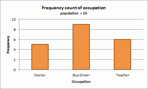
- Use relevant charts and graphs: Select the right chart or graph for the data being presented. A bar chart, for example, could be ideal for categorical data, but a scatter plot might be appropriate for continuous data.
- Label the axes and include a legend: Label the axes of the chart or graph and include a legend to explain any symbols or colors used. This makes it easier for readers to comprehend the information offered.
- Provide context: Give context to the data that is being given. This may include a brief summary of the research issue or hypothesis under consideration, as well as any pertinent background information.
- Use clear and succinct language: To describe the data being given, use clear and concise language. Avoid using technical jargon or complex language that readers may find difficult to grasp.
- Highlight significant findings: Highlight noteworthy findings in the provided data. Identifying any trends, patterns, or substantial disparities across groups is one example.
- Create a summary table: Provide a summary table that explains the data being provided. Key data such as means, medians, and standard deviations may be included.
3 Tips for interpretation of results in research
Here are some key tips to keep in mind when interpreting research results:
- Keep your research question in mind: The most important piece of advice for interpreting the results is to keep your research question in mind. Your interpretation should be centered on addressing your research question, and all of your analysis should be directed in that direction.
- Consider alternate explanations: It’s critical to think about alternative explanations for your results. Ask yourself whether any other circumstances might be impacting your findings, and carefully assess them. This can assist guarantee that your interpretation is based on the evidence and not on assumptions or biases.
- Contextualize the results: Put the results into perspective by comparing them to past research in the topic at hand. This can assist in identifying trends, patterns, or discrepancies that you may have missed otherwise, as well as providing a foundation for subsequent research.
By following these three tips, you may assist guarantee that your interpretation of data is correct, useful, and relevant to your research topic and the larger context of your field of research.
Professional and custom designs for your publications
Mind the Graph is a sophisticated tool that provides professional and customizable research publication designs. Enhance the visual impact of your research by using eye-catching visuals, charts, and graphs. With Mind the Graph, you can simply generate visually appealing and informative publications that captivate your audience and successfully explain the research’s findings.


Subscribe to our newsletter
Exclusive high quality content about effective visual
communication in science.
