Design of Dissent Analysis
February 5, 2009

marty neumeier
Nothing.
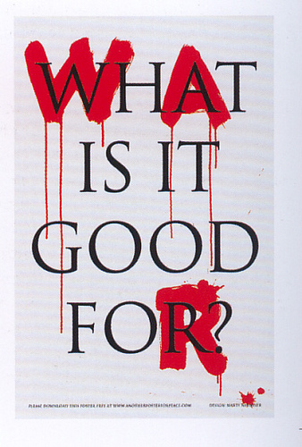
What is it good for?
it = war …
what a simple, but a brilliant way to convey the message?
The format seems so simple, clear, direct, but at the same time, it’s visually engaging and so powerful. The use of colors really conveys the powerful message regarding the war and enhances the idea of visual hierarchy. The main focuses of the poster are three red letters that make up the word, W-A-R. Each time I look at the poster, my eyes follow through these red letters. Then secondly, I read through the whole message. The poster is all about having a focus and hierarchy to convey the message. Because of the use of these elements, viewers would know exactly where to start and what to look for. Hence, it’s very easy to read. There are no extra, exaggerated elements that get in the way of reading the phrase. If the poster was complex with images of war, more text, or if any other graphic illustrations were added, the message would just be hidden. Having a simple typographic treatment with a little variation using the most powerful color, the poster draws our attention.
and what a clever way to portray the artists perspective regarding the war. The letters are simply painted in red (very expressive), and it seems like (s)he just let the paint sit on the canvas for it to naturally drip, indicating “blood.” This treatment adds a little more detail to the message (bloody war… what is it good for?) And the contrast of the classic serif font, perfect, centered, clean white space… with the crude hand markmaking red letters of WAR (that symbolizes blood, death, destruction), reinforces the idea of conflict. I believe that the goal is to instigate awareness and shock to get people to act.
I just had to do some research to fully grasp the artist’s intention. The words on this poster are actually from a very popular war protest song from the 1960’s against the Vietnam War. The song, “War” is written by Edwin Starr, and the first phrase of the lyric is… war yeah! “what is it good for?” I was never aware of it until my friend told me about it. I also found some information about the designer, Marty Neumeier, who wrote the “The Brand Gap.” After reviewing some of his other works and reading about his thinking process, I could see the reason for the poster’s simplicity (“he was trying to close the gap between the designer and the viewer” – neumeier). Overall, I think he was trying to get people’s attention for them to react, and I feel like poster like this can transcend time and cultural differences. That being said, even if the poster is first related to the Vietnam War, I believe that now, it’s applicable to the Iraq War.
Group 3. discussion questions
- what emotions can be drawn from these posters?
- all posters illustrate “peace.” which poster speaks the most? which is the most powerful?
- what possibly motivated the artists to create these posters?
- how could we improve the images/visual elements to make it more powerful?