Nabokov and Indelible Pencils

The most recent collection of short stories by Vladimir Nabokov, incorporating thirteen new stories, was published in 2008 to great fanfare. I’m just getting around to reading it now, because it usually takes me about ten years to catch up with major literary events; plus, I can’t exactly say I was a fan of this particular writer up till now. We’ll see.

Nabokov is widely known as having been a Blackwing enthusiast, and indeed his lifespan seems to have coincided with the glory days of the pencil in general. The humble instrument makes several appearances in his fiction, including the now almost-defunct indelible pencil. The following is from the short story “Bachmann,” about an egotistical musical genius of that name:

Bachmann was sitting on her bed, barefoot and in a nightshirt, with a plaid blanket humped over his shoulders. He was drumming with two fingers on the marble top of the night table, while using his other hand to make dots on a sheet of music paper with an indelible pencil.

After a memorable night, during which Bachmann’s mistress succumbs to a fatal illness, his agent inspects the aftermath:

On the night table Sack found a crumpled sheet of music paper, but no one was able to decipher the violet dots of music scattered over it.

I wonder how many modern readers will understand why the markings are “violet”? (And here I’m thankful for my crash course in pencil history over the past few years!) For my part I am curious whether Bachmann used a violet-colored indelible pencil, or used a moistened graphite one. I’d wager the latter – you’re not supposed to suck on indelible pencils because the aniline dye is poisonous, but I wouldn’t put it past any deranged artists.

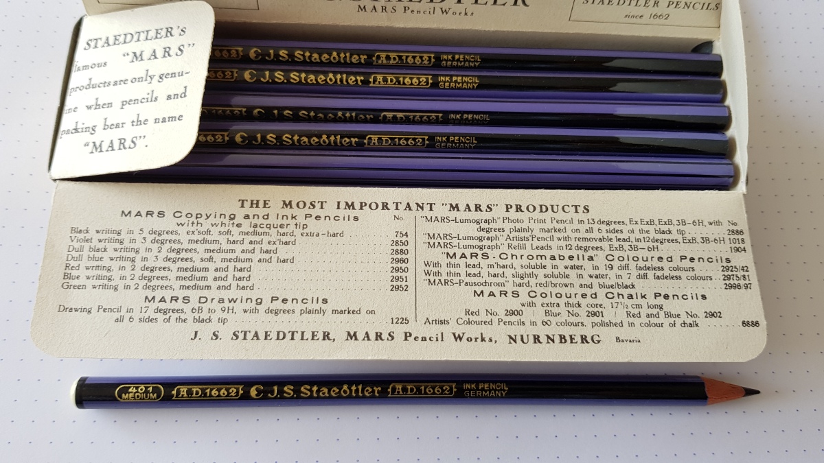
(If you are unfamiliar with indelible/copying/ink pencils, you can start here, at Pencil Talk.)

A Handsome Black Pencil (2)

Luxury probably means different things for different people. For me, it would be things like having a couple hundred new, hardcover books lined up to read.  Or being assured of a limitless supply of the world’s best teas. Or going on a polar journey on an icebreaker. Owning a proper dozen of vintage Eberhard Faber Round Gilts would belong right up there with other extravagant wishes… though for me it isn’t strictly necessary, as a single one already sparks enough joy to last a stationery lifetime. 

This striking round pencil doesn’t carry its own name (it does in different versions, for instance on the catalog page you can see @Contrapuntalism), and the black-and-gilt color scheme suggests that it was marketed to the managerial class. When I first broke it out I had the surreal impression that it had inherited half of the genetic material for the EF Blackwing, the other half having gone to the Commerce. I was feverish, I think. Later on, as the novelty wore off, I got used to the silky, almost oily smoothness, but the mystery and the romance endure. A suave, handsome pencil that keeps its secrets.

A Handsome Black Pencil (1)

An iconic pencil must be assigned an iconic color. It is certainly the case with most flagship pencils. That said, black often seems to be the paint of choice when a manufacturer wants to signal that a particular pencil is a cut above the rest.

The packaging’s only a paper sleeve, but what a sleeve! There is an additional sheet inside that keeps the pencils tight, and what’s more amazing, keeps them facing a certain way – the pointed tip of the hexagon points upwards, so the printing on the pencil shows to its best advantage.

I first saw the Commerce on Contrapuntalism (here, for example), a treasure trove of all things EF. I’m glad I got a chance to know this one, since it is so far one of only two Eberhard Faber pencils in which the lead feels related in any way to the Blackwing, unlike its more famous, similarly ferruled cousins, the Van Dyke and the Microtomic. The shade is perfect, the edges crisp, the silver print classy. A most handsome pencil.

Pencils, Onscreen and Otherwise

For the dreary winter months down here in the southern hemisphere, I have joined fellow Montevideanos in what seems to be one of their favorite pasttimes: Netflix binge-watching. And pencil-spotting is a sport in itself :)

This is Daniel Craig as Mikael Blomkvist in The Girl with the Dragon Tattoo. At first I was so excited, thinking that the movie crew made the effort to track down a real Dixon Ticonderoga Millenium for the Millenium series – but upon closer inspection, it turned out to be just an ordinary Ticonderoga Black. What’s a Dixon pencil doing in snowy Sweden anyway? Maybe they just wanted a dark pencil to blend in with the monochromatic color scheme?

I was overjoyed to spot the rare Mongol 480 in Sophie’s Choice. (It may be a regular hexagonal 482, but that barrel looks round to me!) Stingo, the aspiring writer, has a cupful of these beauties on his desk.


And, last but not least: the humble Noris is called up in the service of Art. The soprano Renee Fleming shows how to use a pencil for vocalizing practice (start watching around 1:20; it lasts only a minute or so).

Five Marigolds

image

Five variations on a classic Eberhard Faber pencil. The older ones are thicker-bodied, with ferrules that lack a Mongol-like band but are still long and luxurious. The Marigold then goes on to acquire what I think of as this universal “school-pencil” look…

Of Pencils and Pencil Boxes

There are pencils and then there are pencil boxes. A significant part of the joy in vintage pencils comes from their boxes, which are so much better made and designed compared to the ones on offer today. But there are some surprising details that we can tease out, other than what meets the eye, too.

image

image

Of these two Mongol variations, the seemingly older version on the top had a patent for box design. I often google patent numbers I find on pencils for fun – and while patents on lead composition and processing are too technical for me to understand, the one for the box was simple, and illuminating.

The design for the box (which were used for several Eberhard Faber models other than the Mongol too, such as the Van Dyke and Round Gilt) was submitted by one Carl H. Kappes in 1923 and granted in 1927. Sean of Contrapuntalism has written about the Mongol packaging before, but like a dunce I completely forgot having read about it and went over the original patent information again. I found it interesting for different reasons:

This invention relates to paper boxes of the slide-type comprising a tubular cover section and a body section slidable in said cover section […] and is specially adapted for boxes of shallow depth and extended length, such as is required for lead pencils, and similar objects, arranged in a single layer.

The invention has for one of its objects to construct a paper box of the kind specified, strong and light in construction, and which embodies a novel and improved construction and combination of the body section and the cover section which affords easy access to the contents of the box and enables such contents to be displayed without completely opening the box and by merely sliding one end of the body section from one end of the cover section. [emphasis mine]

A further object of the invention is to provide means for reinforcing such a box at the portion where strength is most required, without extending said reinforcing means throughout the entire box, thereby producing a strong serviceable box with a minimum amount of material.

Which, in practice, looks like this.

image

I always liked the look of old Mongol boxes, but thought the sliding sleeve a bit iffy – it didn’t fit snugly into a specific slot, and I was unsure where exactly to stop it (it slid around). Also you wonder how stackable it was, given the slight irregularity of the sleeve. But now I understand that the purpose of this box was as much to aid the display of the items as to store them.

image

The sleeve would have been a good idea especially if the pencils were displayed standing up (“Thus when the box is used for the display of pencils or other relatively heavy articles, the cover section […] provides a substantial brace or support for the tray and its contents”). Indeed, the Mongol boxes can stand on their own, whereas the other boxes can’t! The Mongol seems to have had other advantages too, for example not having a detachable lid like the Ticonderogas and Turquoises. The Tics are also missing the support at the back.

image

Have you ever seen pencils displayed in storefronts? I haven’t. Not ever. How wonderful to think that they were once premium products worthy of such showcasing! It’s details like these that, for example, make archival photos of window displays such as this come alive for me.

The Lost Art of the No. 1 Pencil

image

There’s something special about American No. 1 pencils. Due to an unenlightened childhood in which I never learned to distinguish between drafting pencils and common writing pencils, and biased by a tradition of labelling pencils by H’s and B’s instead of numbers, I was slow to discover American pencils that employed numerical degrees – and even when I did, I stuck to No. 2’s for a long time. But once discovered, the unparalleled smoothness and glide of No. 1 pencils have proved addictive. I recently drafted a letter with a No. 1 pencil and I had the incredible sensation that it really was an extension of my arm, the thoughts and phrases flowing. (After that I wrote out a fair copy with pen and ink, and it was a series of abrupt starts and stops compared to the pencil.)

image

One thing that I still haven’t managed to figure out is this: is the lead of a typical No. 1 pencil identical to a B(or 2B)? Because I have the distinct impression that the No. 1 pencil writes softer, but not as dark as, the corresponding degree in the drafting-pencil line. I would love to know if there were indeed any differences in the formula. The presence of the ferrule and eraser (and therefore the heft) would necessarily change the writing experience somewhat; also different manufacturers would have produced different combinations of dark and soft. In any case, the No. 1 pencil is a superbly made instrument, the art of which now seems sadly lost.

The No. 1 pencil still comes up in online searches, so they are still being made; however, it has effectively gone out of our lives (in North America), as the usual big-box stationers and even small retailers don’t stock them anymore. Moreover, after what Mary Norris of the New Yorker has written of modern Ticonderoga No. 1’s, I would be wary of any modern purchases. It is Japanese pencils that now best approximate the feel of old No. 1 pencils: in addition to the obvious alternative, the Palomino Blackwing, the pencils that come to mind as possible substitutes are the Mitsubishi 9850 and the Tombow 2558. But Japanese pencils write blacker; they’re not the same. It’s something I’d like to see again, a properly made No. 1 pencil, bearing the legend Made In U.S.A.

(The plastic-ferrule Mongol is from Sean; and the Mirado No. 1 has had at least two illustrious owners before me. Thank you Sean and Gunther!)

Eberhard Faber Mongol Stenographic 596

image

image

I don’t usually go out of my way to get a dozen box of any particular pencil. There is rarely any need to “stock up”. That said, there are some pencils that linger in the back of your mind, and it is only a matter of time before you find yourself in possession of a redundant but absolutely thrilling box.

The Mongol Stenographic is unusual on several levels. For starters, it’s round-bodied (like most steno pencils) and comes with both ends pre- sharpened; what is striking about the barrel is that it is much thinner than most pencils (it feels more like a chopstick than a pencil in the hand) – probably to make you hold it as lightly as possible. It has an appealingly natural look, due to it being coated with what seems like dark varnish, not opaque paint (the grains of the wood show through). The half-dozen box is unusual and lovely too.

That said, there seems to be generational differences in the formulation of the lead. The reason I wanted to get a proper box of these pencils was that the single copy I had of it (circumstantial evidence points to the 40’s and/or 50’s as to the period of manufacture) wrote surprisingly smooth and creamy for a stenographic pencil. I am not sure exactly when this particular box was manufactured, but the pencils in this box write more like a conventional steno pencil (such as the Venus Velvet 505), drier and harder. The body color is darker too.

image

From top to bottom: 40’s/50’s Mongol Stenographic (no box), boxed Mongol Stenographic (unknown vintage), Venus Velvet 505

There is a very interesting vintage ad for Eberhard Faber stenographic pencils and pictures of a slightly different box over at Lexikaliker. I wonder which package is older; the typography and design appear to be the same and only the color is different (silver vs. light turquoise). It’s also interesting how they advertise the Stenographic as “quicker to sharpen” – it would be difficult (at least for me) to sharpen such a thin pencil evenly!

Eberhard Faber Colorbrite Colored Pencils

image
image

This was my haul for National Pencil Day (surely foreigners can celebrate too?). I seem to be on a roll regarding colored pencils these days, but the truth is I don’t use them much. I try, though. And I keep on buying them compulsively. I left the two reds in the sharpened condition they came in; I sharpened the rest with the Deli 0635, which my son calls the “kitty sharpener” and which I use for almost everything these days. Colored pencils are, in general, better sharpened with handheld devices because they have thicker and softer cores, but the Colorbrite core is thinner and harder so sharpening with crank sharpeners is not a problem.

The Colorbrites write very similar to the EF Mongol Red-and-Blue 860, so I would guess the formula is more or less the same. The lead has some drag to it (some colors more than others), but on the other hand it is stronger and keeps its point longer than other colored pencils that write more pleasantly. I tried some old Mitsubishi Polycolor pencils for comparison (they write with much less drag) and some tips broke upon impact – so maybe this is a necessary evil?

There are two interesting things about this set: one is that three pencils carry this “Recommended for Print Marking” legend. The others don’t.

image

The other thing I noticed is that the colors contained in this vintage set seem to be a bit different compared to sets that are currently available. With smaller sets there are probably some hard decisions to make regarding what colors to put in and what to leave out, and I find the differences between past and present “standard” color selections very interesting. I present below, from left to right, the Eberhard Faber Colorbrite (12 colors), the Staedtler Noris Club Jumbo (10), and the Faber-Castell Jumbo (10) color pencils for comparison.

image

Even with two extra colors, the Colorbrite doesn’t have black. It has two yellows and two reds though (the “scarlet” is closer to vermilion), and a pink, which in modern sets doesn’t usually get a chance till you pass the 18+ mark (maybe because boys famously never use it?). It also very generously allows for a minty light green. The Colorbrite has more affinities with the Mitsubishi No. 880 Mini colored pencil set.

image

Maybe the difference stems from the fact that the Colorbrite is more of a “writing” pencil (hard, waterproof, smearproof etc.) than a coloring pencil? By the way the color selection in the higher-end Van Dyke line is also very interesting. Hot pink there too!