How does a black and blue dress sometimes appear white and gold?

By Justin Broackes

I expect everyone’s heartily tired now of the Dress … But I couldn’t stop thinking about it, and with an artist-designer friend in London, Hilary Brown, I started thinking of ways to illustrate what was going on. So here are a few images — note that all of them can be viewed in a larger size by clicking on the image shown.

Figure 1
Figure 1: Publicity photo, colour-adjusted to match the kind of colour-corrected exposure in the Tumblr photo (inset, left). The image is pale and very yellow—given the face and arms and legs, one ‘counter-corrects’ and sees the dress as blue and black. But without them (in the Tumblr photo, inset, left) many people don’t ‘counter-correct’, and see white (or pale blue) and gold: which is, more or less, what the colours (as pixels in the image) really are. You can see how extremely ‘unnatural’ the conditions have to be, to get a really blue-and-black dress to look as it does in the Tumblr image. (But look back at the full Tumblr photo, and you can see how yellow the background to the right is: a sign—if only one had known how to read it—of the extreme colour-correction (the ‘de-blue-ification’) that the camera system has imposed.)

The first (Fig. 1, right) shows the kind of thing I described in my first post: making the kind of strange colour-correction that the camera must have made, when it created the original Tumblr photo of the Dress. We’ve taken the publicity photo and transformed it (with the generous permission of Roman Originals) so the dress more or less matches the Dress in the Tumblr photo (detail in inset box, to left). The transformation of course shifts the colours towards yellow: if all you saw was the dress, you wouldn’t know any special colour-correction had happened (since, after all, dresses can be more or less any colour). But as soon as there are arms and legs and a face visible too, the visual system responds to the colour-adjustment (as when we see things in extremely yellow light) and imposes a kind of counter-adjustment: the result is that we see the dress basically as blue and black. Is this a matter of ‘inference’ and ‘judgement’? I think not: I’d say the dress on the model really looks a different colour from the dress in the inset. One might have to zoom in or mask out the outer part of the photo to check.

Figure 2: “Photoshopped” combination of the Tumblr photo and the Publicity photo. Left: The model of the publicity photo (unadjusted in colour) has been given a cut-out of the dress from the Tumblr photo (also colour-unadjusted). Most people (I think) will see the dress as blue-and-black (but more pale than in Fig. 1, given that there isn’t the extreme yellow of the flesh tones in that image). Right: Here the model (and background) have been darkened, and the dress ‘lights up’, looking to most people white and gold. This is the kind of context that the white-and-gold seers of the original Tumblr Dress treat it as having: they see (e.g.) as if it were in a darkened store, with bright light, contrasting, outside and behind. No wonder it looks white and gold in that context. The dress itself is the same (as pixels on the screen) in both images: as the strip connecting them shows.
Figure 2: “Photoshopped” combination of the Tumblr photo and the Publicity photo. Left: The model of the publicity photo (unadjusted in colour) has been given a cut-out of the dress from the Tumblr photo (also colour-unadjusted). Most people (I think) will see the dress as blue-and-black (though more pale than in Fig. 1, given that there isn’t the extreme yellow of the flesh tones in that image). Right: Here the model (and background) have been darkened, and the dress ‘lights up’, looking to most people white and gold. This is the kind of context that the white-and-gold seers of the original Tumblr Dress treat it as having: they see (e.g.) as if it were in a darkened store, with bright light, contrasting, outside and behind. No wonder it looks white and gold in that context. The dress itself is the same (as pixels on the screen) in both images: as the strip connecting them shows.

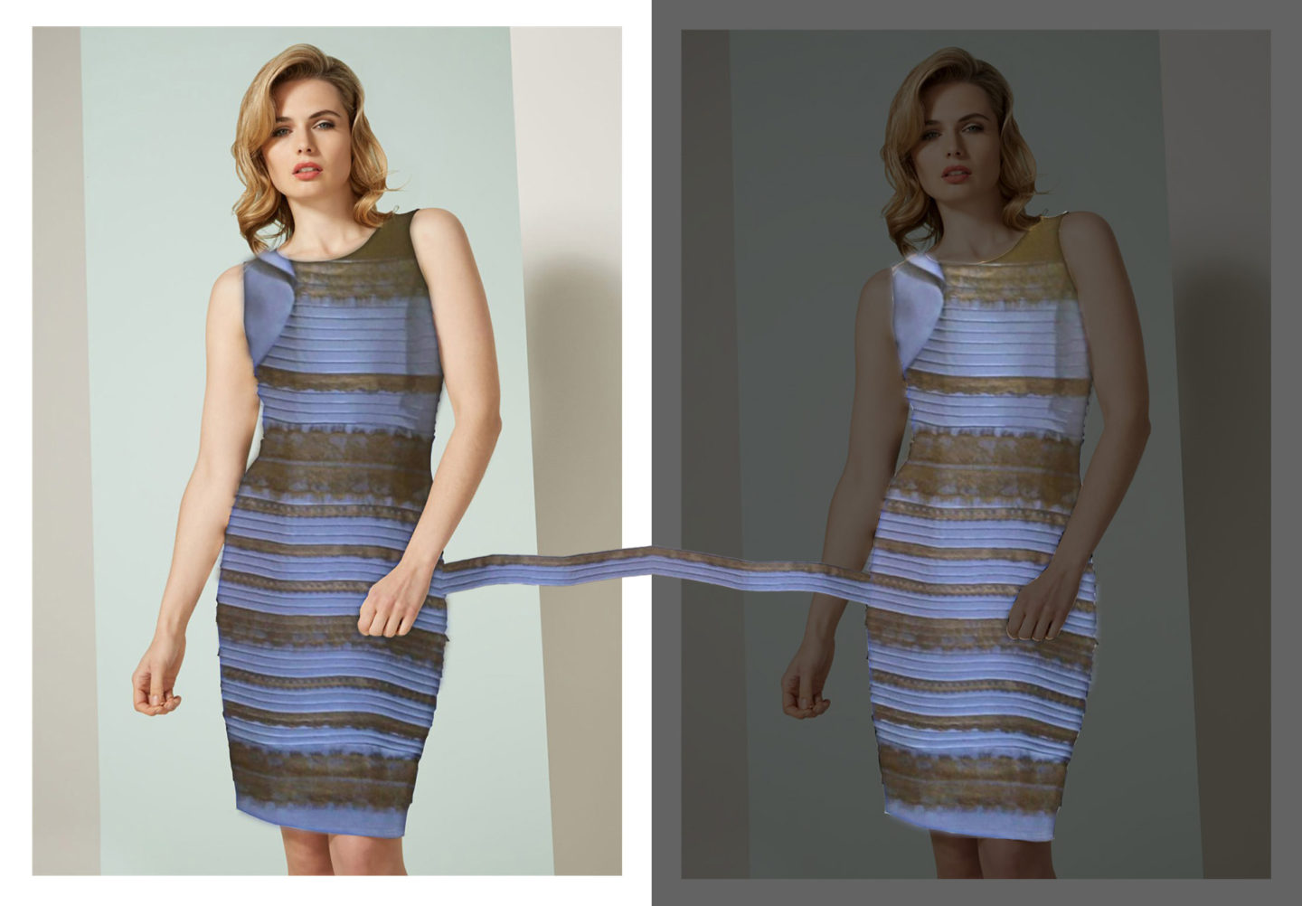
In the two pictures of Figure 2, the model is wearing the Dress that caused all the trouble — as in an identikit photo. (You can see Hilary’s tailoring to the jacket-material and adjustments to the neck and the waist-line. Thanks again to Roman Originals for permission to transform the image.) I’d say, in the lefthand image, the dress looks more or less blue and black (though a less deep blue than in the yellow-tinged Fig. 1) and in the righthand one it looks white and gold—thanks just to the darkening of the surrounding. They’re wonderful images that one could puzzle over for a long time.

The same conditions as in Fig. 2, but set out above and below, rather than right and left. Many will see the dress as blue-and-black at the bottom, and white-and-gold at the top: and it’s the relative lightness in the relevant surroundings that seems to be cue.
Figure 3: The same conditions as in Fig. 2, but set out above and below, rather than right and left. Many will see the dress as blue-and-black at the bottom, and white-and-gold at the top: and it’s the relative lightness in the relevant surroundings that seems to be the cue.

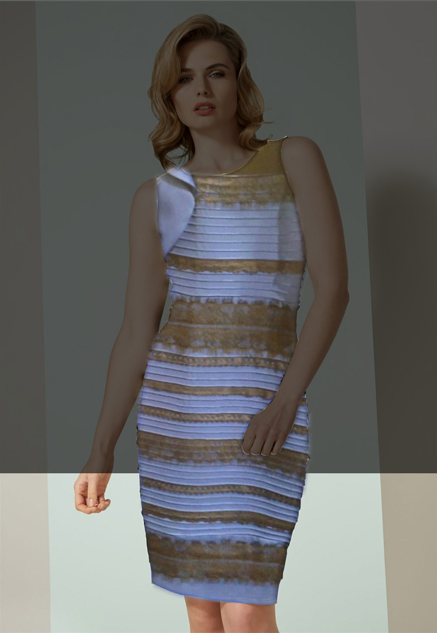
Finally, in Figure 3 the colour-adjusted dress and two different lighting conditions of the second figure are combined into a single image: the model and her surroundings are shown as brightly illuminated in the bottom part of the image, and as darkened in the top half. Here, the appearance of the dress will vary depending on where you focus your attention, or if you use your hand or a piece of paper to cover up one or the other portion of the image.

How come the blue of the dress so easily comes to look pale? I think it is partly that the dress (in the world, so to speak) is actually rather reflective: so the blue shows highlights that can easily be read as light and shade. And light and shade (on what is evidently a single surface) are often a sign of white or pale colour. (On a matt black surface, shadows don’t show up at all, and there are no highlights.) The light-and-dark variation, which actually comes from specular reflection on the blue, easily gets read (particularly since a lot of colour-detail is lost in a phone-camera picture like this) as a sign of a white or pale surface.

Back to Top