Did Facebook really change its logo? See if you can spot the difference
Meta has announced that Facebook’s logo has been changed, but most people will find it hard to notice it.

A few months ago, X (then known as Twitter), went through a significant rebranding process, where the company changed its name everywhere possible. It even got rid of the famous Larry the Bird, and replaced it with a simple X logo, voluntarily created by a user on the platform. This was one of the significant rebranding efforts undertaken by a big tech company in recent years. While it isn't anywhere near that substantial, Facebook also tweaked its logo yesterday. Although it wasn't noticed by many, a handful of eagle-eyed Facebook users spotted the subtle change. Did you?
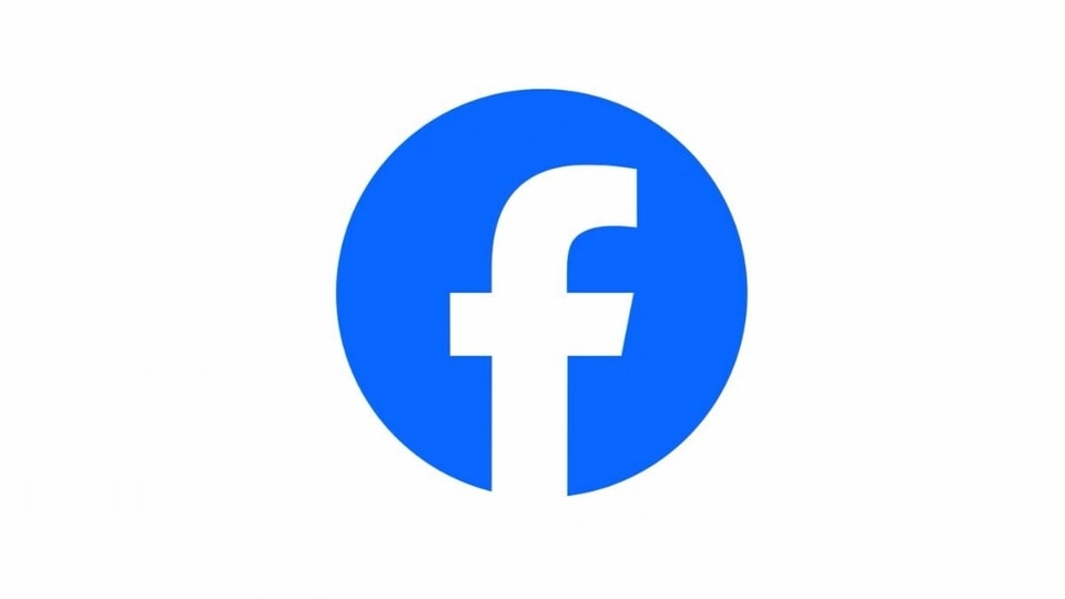
Facebook's new logo
In a bid to update the platform's “identity system”, Meta has tweaked Facebook's logo. It isn't as groundbreaking as X replacing its bird logo. The change only includes a subtle adjustment here and there. So if you haven't seen the new logo, why not head over to the Facebook app to see what has changed? Take along your magnifying glass too. Do know that Facebook wants you to know that these are "significant changes".
Dave N., Director of Design, Facebook said in a blog post, “The goal of our work was to expand upon our foundation and create the defining mark of our brand that anchors the identity system across Facebook. We wanted to ensure that the refreshed logo felt familiar, yet dynamic, polished and elegant in execution. These subtle, but significant changes allowed us to achieve optical balance with a sense of forward movement.”
What's the change?
The lowercase “f” in the logo is tweaked a bit, and there is a darker shade of blue that makes up the logo's background. The font still remains Facebook Sans. It makes the "f" standout more. What's more? Nothing. That is the only change that Meta has introduced with the ‘new' Facebook logo. Meta says that this is part of the first phase of the “refreshed identity system for Facebook”.
Explaining this change, Meta announced in a blog post on Wednesday, “Our intention was to create a refreshed design of the Facebook logo that was bolder, electric and everlasting. Each of the distinctive, new refinements drive greater harmony across the entire design as a key element of the app's identity.”
Meta also announced that it has updated the color palette of the reactions in the Facebook app to bring more dimensionality and emotion to reactions.
Catch all the Latest Tech News, Mobile News, Laptop News, Gaming news, Wearables News , How To News, also keep up with us on Whatsapp channel,Twitter, Facebook, Google News, and Instagram. For our latest videos, subscribe to our YouTube channel.


