[FREE] Fun Math Games & Activities Packs
Always on the lookout for fun math games and activities in the classroom? Try our ready-to-go printable packs for students to complete independently or with a partner!
Pie chart
Here you will learn about pie charts including what a pie chart is and how to read it. You will also learn to interpret pie charts and how to use them.
Students first learn about pie charts in the 6 th grade with their work in statistics and probability and expand their knowledge as they progress through middle school and high school.
What is a pie chart?
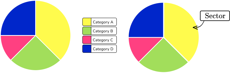
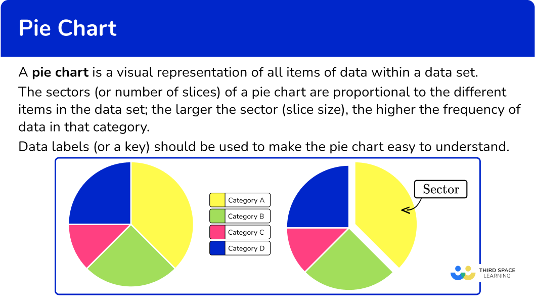
A pie chart also known as a circle chart or pie graph is a visual representation of data that is made by a circle divided into sectors (pie slices). Each sector represents a part of the whole (whole pie). Pie charts are used to represent categorical data.
The sectors (or number of slices) of this pie chart are proportional to the different items in the data set; the larger the sector (slice size), the higher the frequency or percentage of data in that category.
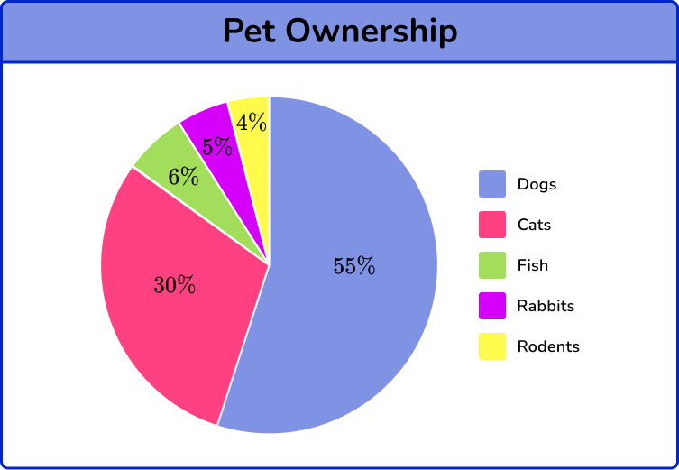
The pie chart below represents the types of pets pet owners have. The pie chart is divided into 5 categories, dogs, cats, fish, rabbits, and rodents. Each sector or slice of the pie, represents each of the categories as well as the percent. The sectors, or pie slices, add up to 100 \% (4 \%+5 \%+6 \%+30 \%+55 \%=100 \%).
From the pie chart, you can conclude that dogs are the most common type of pet for pet owners because the blue pie slice visually and numerically represents the greatest part of the circle with 55 \%. Likewise, rodents are the least common type of pet that pet owners have, representing the smallest sector (small slice) of the circle with 4 \%.
When constructing a pie chart, data labels (or a key) should be used to make the pie chart easy to understand.
What is a pie chart?
![[FREE] Pie Chart and Representing Data Worksheet (Grade 6 to 7)](https://thirdspacelearning.com/wp-content/uploads/2023/11/Representing-Data-listing-image.png)
[FREE] Pie Chart and Representing Data Worksheet (Grade 6 to 7)
Use this quiz to check your grade 6th to 7th students’ understanding of pie chart and representing data. 10+ questions with answers on representing data topics to identify areas of strength and support!
DOWNLOAD FREE [FREE] Pie Chart and Representing Data Worksheet (Grade 6 to 7)
Use this quiz to check your grade 6th to 7th students’ understanding of pie chart and representing data. 10+ questions with answers on representing data topics to identify areas of strength and support!
DOWNLOAD FREECommon Core State Standards
How does this apply to 6 th grade and 7 th grade math?
- Grade 6 – Statistics and Probability (6.SP.B.4)
Display numerical data in plots on a number line, including dot plots, histograms, and box plots.
- Grade 6 – Statistics and Probability (6.SP.B.5)
Summarize numerical data sets in relation to their context, such as by: a. Reporting the number of observations.
- Grade 6 – Ratios and Proportional Relationships (6.RP.3.c)
Find a percent of a quantity as a rate per 100 (for example, 30 \% of a quantity means \cfrac{30}{100} times the quantity); solve problems involving finding the whole, given a part and the percent.
- Grade 7 – Statistics and Probability (7.SP.A.1)
Understand that statistics can be used to gain information about a population by examining a sample of the population; generalizations about a population from a sample are valid only if the sample is representative of that population. Understand that random sampling tends to produce representative samples and support valid inferences.
How to use a pie chart
In order to use a pie chart:
- Identify the categories.
- Calculate and analyze the data.
Pie chart examples
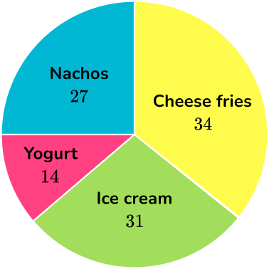
Example 1: reading a pie chart with frequency tallies
Beach Bites, the new snack place on the boardwalk, surveyed a sample of customers on their favorite snack. The pie chart below represents the data. How many more customers prefer cheese fries to yogurt?

- Identify the categories.
There are 4 categories, cheese fries, nachos, yogurt, and ice cream.
2Calculate and analyze the data.
There are 34 customers who prefer cheese fries and 14 customers who prefer yogurt.
To find how many more customers prefer cheese fries, use subtraction.
34-14=20
20 more customers prefer cheese fries to yogurt.
Example 2: reading a pie chart with frequency tallies
Beach Bites, the new snack place on the boardwalk, surveyed a sample of customers about their favorite snack. The pie chart below represents the data. How many total customers were surveyed?
Identify the categories.
There are 4 categories, cheese fries, nachos, yogurt, and ice cream.
Calculate and analyze the data.
34 customers prefer cheese fries, 27 customers prefer nachos, 14 customers prefer yogurt, and 31 customers prefer ice cream.
To find the total number of customers surveyed, sum the categories.
34+31+27+14=106
106 customers were surveyed.
Example 3: frequency table with pie chart
Jenny took a tally of the sports that the students in her class like to play. The results are on the frequency table below.
If Jenny wanted to create a pie chart to represent this data, which sport would represent the smallest sector?
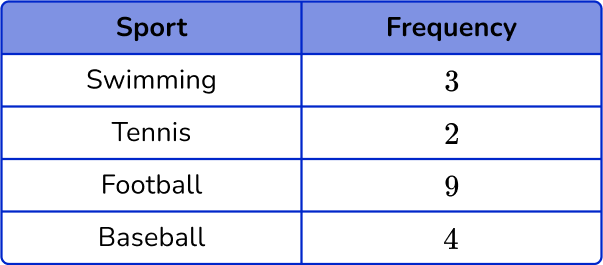
Identify the categories.
The pie chart that Jenny would create would have 4 different categories. Sectors of the circle would represent swimming, tennis, football, and baseball.
Calculate and analyze the data.
Since the frequency of tennis is the smallest number, 2. The smallest sector of the pie chart would represent tennis.
Example 4: pie chart percents
100 students were surveyed about their favorite summer activity. The pie chart represents the results. What activity do students like the best as their favorite summer activity?
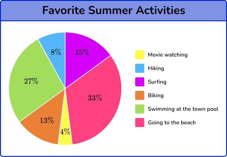
Identify the categories.
There are 6 different categories, watching a movie, hiking, surfing, biking, swimming at the town pool, and going to the beach.
Calculate and analyze the data.
Going to the beach represents the largest part of the circle because it is the largest sector. It also has the largest percentage, 33 \%.
So, going to the beach is the favorite summer activity of the students surveyed.
Example 5: pie chart percents
100 students were surveyed about their favorite summer activity. The pie chart represents the results. How many students prefer biking?

Identify the categories.
There are 6 different categories, watching a movie, hiking, surfing, biking, swimming at the town pool, and going to the beach.
Calculate and analyze the data.
Biking represents 13 \% of the 100 students surveyed.
So, 13 \% \text { of } 100=0.13 \times 100
0.13 \times 100=13
OR
You can use a proportion.
\begin{aligned}& \cfrac{13}{100}=\cfrac{x}{100} \\\\ & \cfrac{13}{100} \rightarrow \cfrac{13}{100}\end{aligned}
13 students surveyed preferred biking as their favorite summer activity.
Example 6: pie chart percents
A car dealer decided to survey customers to find out which car color people preferred.
The pie chart below represents the totals. What percent of the customers prefer red cars?
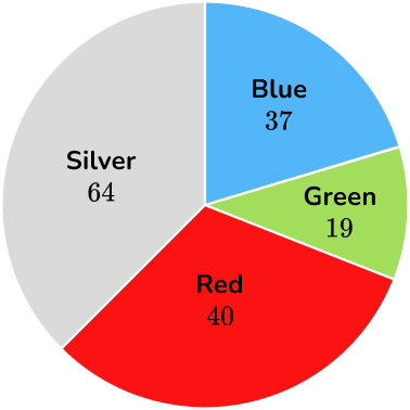
Identify the categories.
There are 4 different categories, blue cars, silver cars, red cars, and green cars.
Calculate and analyze the data.
37 customers prefer blue cars, 19 customers prefer green cars, 40 customers prefer red cars, and 64 customers prefer silver cars.
The total number of customers surveyed is:
37+19+40+64=160
160 customers were surveyed.
40 customers prefer red cars. To find the percent, you can create a proportion.
\begin{aligned}& \cfrac{40}{160}=\cfrac{x}{100} \\\\ & \cfrac{40}{160} \times 100= x \\\\ & \cfrac{4000}{160}= x \\\\ & 25=x\end{aligned}
25 \% represents the 40 customers that prefer red cars.
Teaching tips for pie charts
- Reinforce to students that pie charts are another type of graph to visually represent data, similar to bar charts, histograms, or line plots.
- Incorporate digital project based learning activities where students will have opportunity to create their own survey, collect their own data, and create pie charts.
- Instead of giving students worksheets, show them how to use Google Sheets or spreadsheets in Excel, pie chart makers, or digital data apps to organize and display data sets into pie charts and/or 3D pie charts.
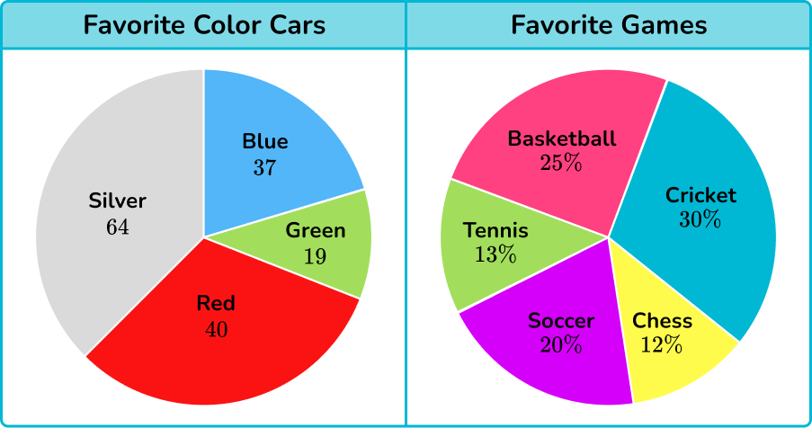
Easy mistakes to make
- Students reading the pie chart read the tallies as percents or vice versa
The pie chart on the left shows tallies of people’s favorite car colors. 37 blue means 37 people prefer blue cars. The pie chart on the right shows percentages of people’s favorite games. 12 \% chess means 12 \% of the people prefer chess NOT 12 people prefer chess.
Related representing data lessons
- Representing data
- Stem and leaf plot
- Quartile
- Box plot
- Interquartile range
- Scatterplot
- Two way tables
- Line graph
- Time series graph
Practice pie chart questions
1. The university bookstore surveyed a random sample of students on what they spend their money on. The pie chart below shows the results of that survey. How many university students surveyed spend their money on entertainment?
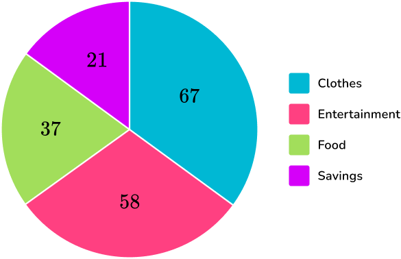


Reading the pie chart, find the sector that represents entertainment.
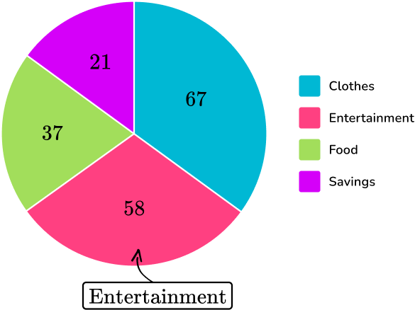
Then look for the number that represents that sector. In this case, 58 is the number that represents the “entertainment” sector. So, 58 students surveyed spend their money on entertainment.
2. The tally chart below represents 20 students that were asked about their favorite subject. If a pie chart were to be created from the tally chart, what sector would be the largest on the pie chart?
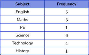
PE
Science
History
English
Out of the 20 students, 6 of them said they liked Science class the best, which is the most out of any of the other classes. Since Science represents the most students in this survey, it will be the largest sector on the pie chart.
3. Twin Lights Ice Cream Parlor surveyed 107 customers to find out their favorite flavor ice cream. The pie chart below shows the results. How many more customers prefer cookie dough ice cream to vanilla chocolate swirl?
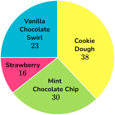
Read the pie chart and identify the sectors that represent cookie dough and vanilla chocolate swirl.
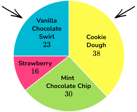
38 customers prefer cookie dough, and 23 customers prefer vanilla swirl. By subtracting the numbers, you can find out the difference.
38-23=15
15 is the difference meaning that 15 more people prefer cookie dough ice cream to vanilla chocolate swirl ice cream.
4. Rhody Diner surveyed a sample of customers on their favorite food. The pie graph below shows the survey results. How many customers participated in the survey?
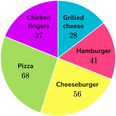
The pie chart is not in percent, so each sector represents the tallies or the number of people that favored each of the foods. To find the total number of people, add up each of the numbers on the sectors.
37+28+41+56+68=230
230 customers participated in the survey.
5. Using the same pie chart from Rhody Diner, approximately what percent of the customers preferred chicken fingers?
Reading the pie chart, the orange sector represents chicken fingers. There are 37 customers that favored chicken fingers. In total, there are 230 customers that were surveyed.
37+28+41+56+68=230
To find the percent of customers that prefer chicken fingers, you can set up a proportion.
\begin{aligned}& \cfrac{37}{230}=\cfrac{x}{100} \\\\ & \cfrac{37}{230} \times 100=x \\\\ & \cfrac{3700}{230}= x \\\\ & 16.09=x\end{aligned}
Approximately 16 \% of the customers prefer chicken fingers.
6. 150 random people were asked what type of car they preferred. The pie chart below shows the results. How many people said they would prefer an electric car?
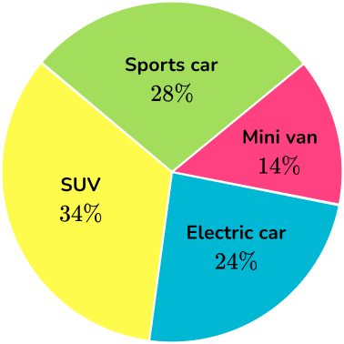
Reading the pie chart, the purple sector represents the percentage of people that prefer electric cars, which is 24 \%.
To find the number of people who prefer electric cars, you can set up a proportion.
\begin{aligned}& \cfrac{24}{100}=\cfrac{x}{150} \\\\ & \cfrac{24}{100} \times 150=x \\\\ & \cfrac{3600}{100}= x \\\\ & 36=x\end{aligned}
24 \% \text { of } 150 \text { is } 36. So, 36 people prefer electric cars.
Pie chart FAQs
A doughnut chart (or donut chart) is the same as a pie chart – a circular
data visualization. The difference is that a doughnut chart has a hole in the middle like an actual doughnut and a pie chart does not. It is another chart style to use.
Yes, there are several different types of pie charts such as doughnut pie chart and exploded pie chart.
A waffle chart is a square grid where each cell represents parts of a whole. Like a pie chart, a waffle chart is used to show different categories that add up to a whole.
The next lessons are
- Frequency table
- Frequency graph
- Sampling methods
- Units of measurement
- Ratio
Still stuck?
At Third Space Learning, we specialize in helping teachers and school leaders to provide personalized math support for more of their students through high-quality, online one-on-one math tutoring delivered by subject experts.
Each week, our tutors support thousands of students who are at risk of not meeting their grade-level expectations, and help accelerate their progress and boost their confidence.

Find out how we can help your students achieve success with our math tutoring programs.
[FREE] Common Core Practice Tests (Grades 3 to 6)
Prepare for math tests in your state with these Grade 3 to Grade 6 practice assessments for Common Core and state equivalents.
40 multiple choice questions and detailed answers to support test prep, created by US math experts covering a range of topics!