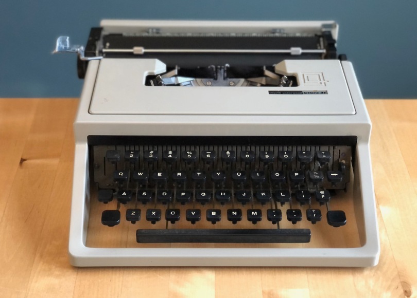
Wouldn’t you know it, as soon as I finished the Studio 45 review, up pops another Olivetti. This time it was the Lettera 31. I know, there are loads of other machines I could be getting my fingers on, but I couldn’t resist. After all, I’d ditched my trusty Smith Corona Sterling (1947) for a Lettera 32. It’s not like the Sterling was a slouch, but the Lettera was newer, easier, crisper and finer. Letteras are small, but big enough for lots of rough drafts. They fill the niche between portable and ultra-portable.
I like small typewriters, but shrink them too much, like the Hermes Rocket, and they’re just too dinky to bang out anything longer than script changes while on location in Monument Valley. You could travel with a Lettera, but its notoriously lousy zippered case is liable to stay shut or worse, come apart at the seams while at a brisk trot. No thanks. Keep it on the studio lot. But not so fast Bronco Billy, with the Lettera 31, Olivetti wisely discontinued the zippered mess of the Lettera 32. In its place is a single piece vinyl case. While it’s an improvement, it has no buckles, latches or locks to keep it shut.
I’m sure I’ll get bags of letters from the journalist jet-set praising the portability of the Lettera from Sri Lanka to Sao Paulo. Tell your cheap-skate editor to spring for a Rocket. Sorry, I digress. We’re reviewing a typewriter not the case.
If you haven’t read my praise of the Studio 45, get on it, because this Lettera 31 is cut from the same sheet of plastic. Plastic? Sounds cheap. It’s not. It feels solid. In fact, this Lettera 31 feels more solid than its metal clad predecessor the Lettera 32. If you’re confused by the numbering scheme, so am I. What company goes backwards with newer versions? I got it when they leapt a couple numbers from Lettera 32 to Lettera 35, but then back to 31? Strange. Leave the counting to the Swiss. The Italians should’ve never started numbering Letteras. The name was perfect just as it was. Even the number loving Swiss left the Rocket alone. I’m glad Hermes didn’t feel the need to append numbers to the Rocket, or else it might’ve ended up like that naming disaster of the 3000. Cases, names, who cares, right? How does it work? You’re right, compadre. Onwards.
One thing I love about Letteras, including the 31, is the distraction free zone. Nothing between you and your words. If you haven’t read my thoughts on this, pause the tape, and load this piece. The Lettera 31 offers an unobstructed view of your words hot off the slug. My only gripe, and it’s a biggie, as you type the page curls off the platen then disappears behind the typewriter. It doesn’t have paper supports! The Lettera 32 offers the best version of this crucial feature. Not only does it display the page, it does so at a smart angle that doesn’t leave you leaning over to see what’ve you written. Ok, Kerouac, just free wheel it and let the roll fly, no looking back, Jack.

Deal breaker? Perhaps, if the Lettera 31 wasn’t so capable. If you’re in the camp that feels the lightness of the Lettera 32 throws you off, and you want something with a bit more robusto, then the Lettera 31 might be your machine. It’s smaller than the Studio 45 and has the distraction free zone of the Lettera 32, but with a more solid feel.
Like the Studio 45, it’s not a looker. But under that bland exterior is an easy going and reliable typewriter. Just load a blank page and add your own flamboyance.


Another bright and cheerful review. Love them. Using your reviews as references I’ve bought most Olivettis and Olympias. Only one I’ve kept is the SM8. It came as new in a case with the original owners typing book and samples from 1966. She’s 4 years older than me but looks as fresh as she did then. I’ve had her serviced, so her next 50 years will hopefully be trouble free. I’ve found the Lettera 22 lovely but action lack confidence, the Studio was handsome but gave my wrists a workout, the new plastic versions I just binned as the were junk and mostly broken, designs were ghastly, the pocket rockets too ratchety and cramped… so I’ve settled, the second typewriter I bought and now the only one I’ve kept. Another wouldn’t feel right. She occupies a big space in my heart, and as a designer she is classy but dressed for work. The keystroke and feel of the whole machine is streets ahead of anything I’ve owned. A true class act. Keep up the reviews! David#
As always, great piece., I love my Olivettis! I just missed out on a Lexikon the other day. If you haven’t yet, maybe you can share your thoughts on those when you have the time.
Thanks!
I obtained a fine, well-maintained 31 as a “throw in” on a deal for a 22. The guy offered “free shipping or I’ll give you this 31 in addition.” I received that same gray machine Daniel shows in this pics. Wish I could share my “renovation” picture. I stripped it down (taking the plastic body off the works was easy, and put it in the spray booth. Gave it an all-over Valentine red finish and even accented the margin release key with Olivetti’s signature red… as on the tabulator of other models. It looks swell in red.
I am interested in purchasing a OLIVETTI Lettera 31 or the model 45. Can you please tell me if any of these OLIVETTI models have a typeface of let’s say; italic or block (robotic). I would like one other than just standard PICA or ELITE. I’m not interested in SCRIPT. Please let me know based on your knowledge and insight. Thank you, George Z. ++++++++++++++++++++++++++++++++++++++++++++++++++++++++++++++++++++++++++++++++++++++++++++++++++++++
Perhaps you’re looking for one with the “techno pica” typeface. Here’s a story on that:
https://xoverit.blogspot.com/2014/05/studio-techno-typewriter-principles.html
I had once a Lettera 31. Sometimes I miss it. xD
https://typewriterdatabase.com/1974-olivetti-lettera-31.6368.typewriter
I have a Lettera 31, it was the first typewriter I bought, and overall I really enjoy it. It’s lightweight but feels sturdy, and very user friendly overall. My only minor qualm is that the action on it is so light and speedy that it’s easy to get lots of skipped spaces and ghost letters when typing quickly.
Good morning- after 55 years of typing and far too many (or maybe few!) machines, I have settled on a serviced Lettera 31, made in Spain. The look you call bland is for me beautiful- clean, innovative, timeless. Maybe something Frank Lloyd Wright would have designed. The keys on mine are the ‘saddle’ version with large lettering- fabulous to use. They look like Valentine keys. The fewer features on this do not at all concern me, it is part of the entire 31/Dora charm. Always interesting to read what others have conjured up for their favorites- I have been offered a Studio 45 for $30. Maybe another note to you all soon.