

Let's take a look at some rules or good practices you want to follow when it comes to landscape painting and also on painting behavior you want to avoid. Carles Carbonell Bernado, specializing in landscape painting, will lay down these principles as a base for his upcoming workshops.
Before you start painting or even thinking about painting, you need to ask yourself why you want to use Rebelle 5 to paint landscapes or any other subject.
- Is it because it allows you to simulate the look & feel of real media?
- Is it because you are a traditional painter and you want to get used to digital painting?
- Is it because it’s cool and fun?
You might say yes, yes and yes, all of the above (especially the ‘fun’ part of it!). But there’s another reason, maybe the most important: to achieve different results each time you create a brush stroke. This will allow you to get a very unique style. In other software, you will see almost always the same look & feel on a stroke. In Rebelle, you may get a unique character. In addition to that, it is a very streamlined software. So, you can get unique results in a very short time if you wish.
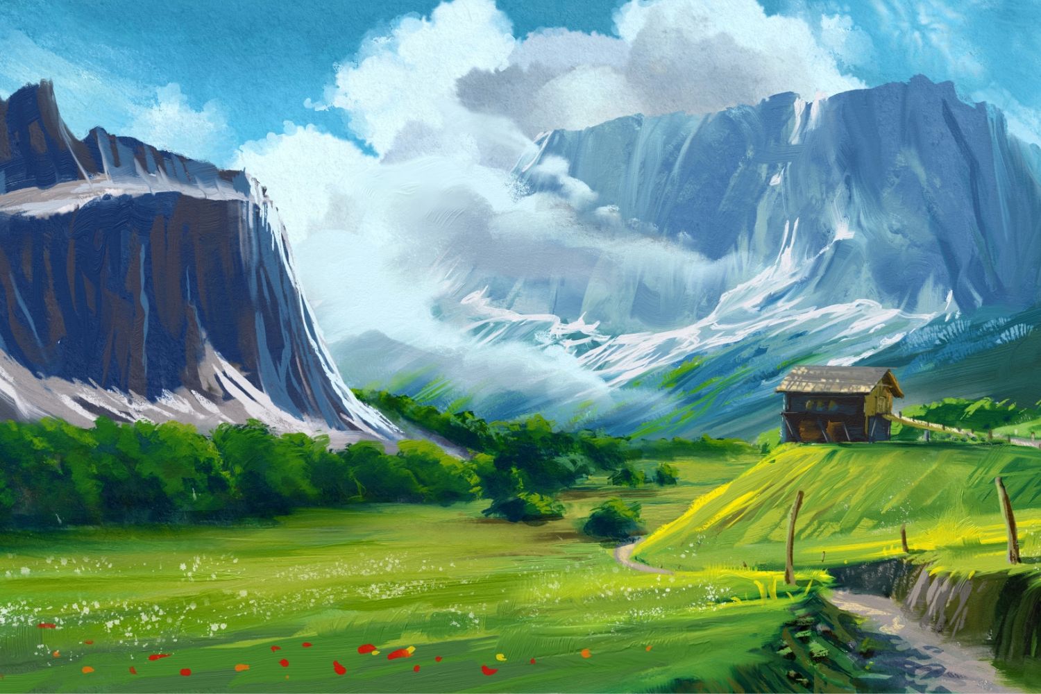
Moving to the Landscape subject, a landscape artwork may have a good harmony of three rendering techniques: hard edges, gradations or soft edges, and texture.
When painting a landscape, you should avoid a photorealistic look. There is no need to paint each detail and object of the scene, each leaf, or each cloud. Instead, focus only on painting the important subjects of the scene (it may be a mountain, a tree, a stream). Paint the feel of leaves not the entire foliage in perfect shapes. Or the clouds instead of a 100% representation of the clouds. Create an interpretation of the scene, add the feeling, and your style. You may change the entire scene lighting, even the season, add details, or create a unique scene deviated from an original reference.
The Rules of Landscape Painting
Drawing and Painting have some rules. The most important in landscape painting are depth, object distribution, the flow of the scene, contrast between objects, and color harmony. Let's explore each of these in more depth.
Depth
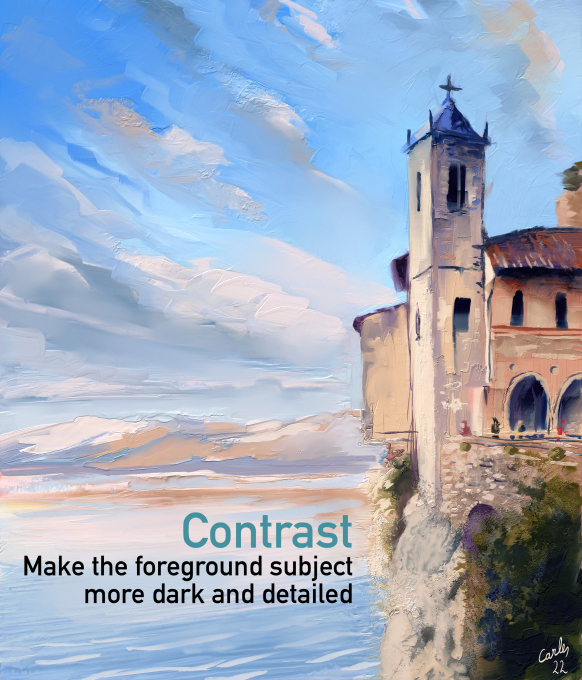
The artwork must have a sense of depth and perspective, even if the original reference doesn’t have it. You can achieve this by adding more importance to foreground objects, using darker color values for them and lighter values and fewer details to the background.
Object distribution
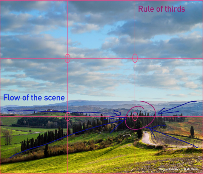
Even if the reference contains a magnificent tree in the center, there is no need to paint it. The result might be boring and hinder the sense of depth in the scene. Instead, try to use the Rule of Thirds (place the most important subject of the scene in one of the intersection points of a 3 x 3 scene grid). Your scene will be more interesting if you displace the subject to the left or right or make the sky bigger or smaller instead of half sky/half ground.
The flow of the scene
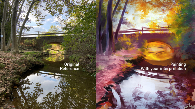
The distribution of the objects in the scene should point to the most important subject; if not, the viewer will see a mess because there’s nothing calling for their attention. In the case of the previous image, the water of the stream points to the bridge; so the viewer’s eye goes to that bridge. We guided the view to the point we wanted: the bridge. Many landscape references already guide the viewer’s eye; that reference is a successful one! But in case it isn’t true, you are free to change some shapes or the entire scene distribution. You should make the composition appealing, not a mess of objects and colors. In addition, avoid the coincidence of lines; for example, the coincidence of the angle of a wall with the trunk of a tree. Instead, maybe move the trunk or use tangential lines (changing the angle of the trunk or the wall).
The contrast between objects
Nature is organic, all trees are different, and have different colors and heights. Even if you try to paint a magnificent tree first, don’t paint each tree with the same shape or the same color! Create each tree differently and try to add depth to the forest. If you use a nice photo reference or paint at Plein-air, that forest will look awesome; but when you paint, it might look boring and low contrasted. Add contrast even if the original scene doesn’t have it. You can differentiate objects with shapes and colors.
Color Harmony
There are many rules for color harmony. For landscapes, we will try to group the colors depending on their temperature. This means we will use all cold colors or warm colors in the same portion of the scene. Maybe you have a nice scene with electric blue water and orange foliage trees around the water. You can harmonize the colors by using warmer blue in the water, trying to use colder colors in the foliage (maybe Ochre or Burnt Sienna instead of a pure orange), or both. Another idea is using near colors; in the image at the top, I used purples and pinks, which are both near to blue. It’s also a good idea to use complementary colors because their combination produces a neutral color (grey), so it harmonizes the screen. Lastly, you can add harmony to the screen by adding warm colors to the sky or blue tones to the ground, even if the original scene doesn’t have it.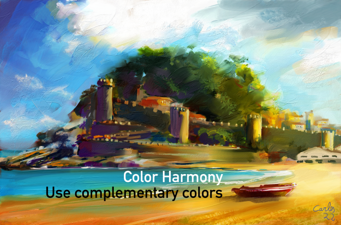
These are the simple rules of landscape painting. We will dive in and showcase them on a real example in my upcoming two-part painting workshop. I sincerely hope this was helpful!
Stay tuned for more!
Escape Motions
text and images provided by Carles Carbonell Bernado
-----
Carles Carbonell Bernado studied Art at Art Secondary School of Vic (Catalonia, Spain). As a teenager he won several prizes, some of them being Young Comic Artist from Catalonia government and World Icon Design for Modern Operative Systems. He worked as a Graphic Designer almost his entire life. Recently, he retook the painting activity, specializing in expressive landscapes and experimentation.
Visit his YouTube channel for landscape time-lapses and tutorials: youtube.com/Ibbbixx
Artist's Portfolio:
- Escape Motions Community: www.escapemotions.com/community/Carles/
- Instagram: instagram.com/carles.carbonell.bernado
- Twitter: twitter.com/Carlitusroda
Reference Image: Grafit Studio