Acrylic Paint Color Mixing: Using Nontraditional Primaries to Mix Unique Colors
Learning to mix acrylic paint colors can be tricky, especially if you’re trying to create vibrant colors for your artwork. In this post, I’m going to teach you how to create a unique color palette using nontraditional primary colors.
There are certain nontraditional primary colors that I use as the base for mixing colors in almost all of my paintings and using them has resulted in a unique color palette that gives my artwork a signature look.
Note: This post contains some affiliate links. I may make a small commission if you decide to purchase through these links at no cost to you.
Color Mixing Basics
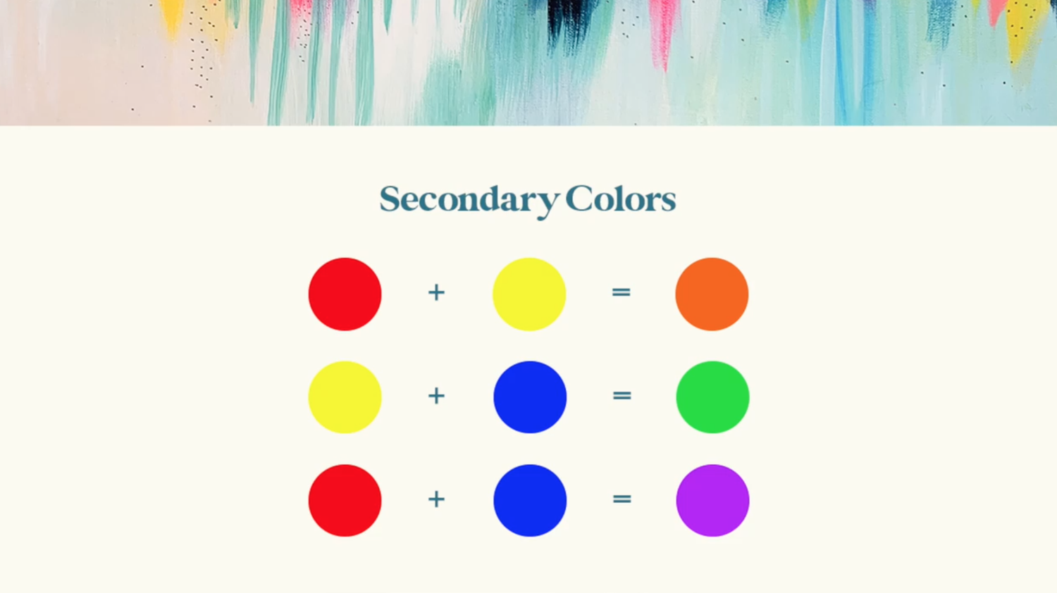
Before we dive in, here’s a quick crash course in color mixing if you’re unfamiliar! The primary colors are the foundational colors for mixing – Red, Yellow, and Blue. When mixed, the primary colors make secondary colors and together those shades make up the classic colors of the rainbow: Red, Orange, Yellow, Green, Blue, and Purple. Here are the color recipes that make up the secondary colors:
Primary Red + Primary Yellow = Orange
Primary Yellow + Primary Blue = Green
Primary Red + Primary Blue = Purple
If you want to learn more about my favorite color-mixing techniques and color recipes, check out this blog post on how to mix vibrant colors or this one on how to mix the perfect shade of green!
Choose Nontraditional Primaries
Traditionally, artists tend to use the “main” version of each primary color (i.e. what you think of when you hear the name of that color) as the basis for their paintings. But I found that when I used those traditional colors, my paintings ended up looking more muted than I was hoping for. I was searching high and low for the perfect pre-mixed vibrant colors but kept coming up short.
After lots of trial and error, I discovered a method that worked perfectly for me – using nontraditional primary colors.
You can use any color within the color family of each primary to mix stunning, unique, and vibrant colors.
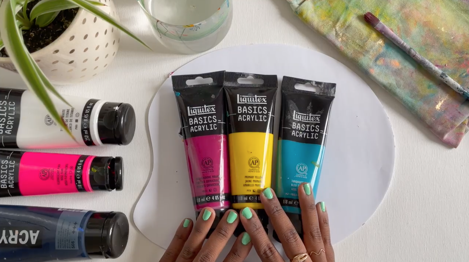
Here are my go-to nontraditional primary colors:
Turquoise Blue
I use Turquoise Blue instead of Primary Blue. It has just enough warmth to bring out the vibrancy of the colors, but it’s dark enough to create deep rich tones to create cooler colors as well.
Quinacridone Magenta
This is my alternative to Primary Red. This Magenta can still produce beautiful and rich shades, but unlike Primary Red, it brings the colors more toward the “jewel tone” space. I use a lot of purples in my work, and primary red can sometimes be a bit too warm and it muddies up the purple. Magenta is a great alternative because it is already mixed with the warmth of the red but incorporates some of the cooler tones as well.
Primary Yellow
I stick with the basics when it comes to yellow. It is bright enough to create vibrant hues and mixed with magenta and turquoise it produces great results.
Pro Tip: If I ever need to add more vibrancy to a warm tone, I tend to add a fluorescent color to help make it pop. Fluorescent pink is my go-to color for warming up colors like oranges, corals, pinks, and purples. Fluorescent Yellow can be used to warm up greens as well!
Now it’s your turn! Browse your favorite paint brand and look for some nontraditional primary colors that call to you! If you’re looking for paint recommendations, my go-to brand is Liquitex!
Create Your Own Color Wheel or Color Chart
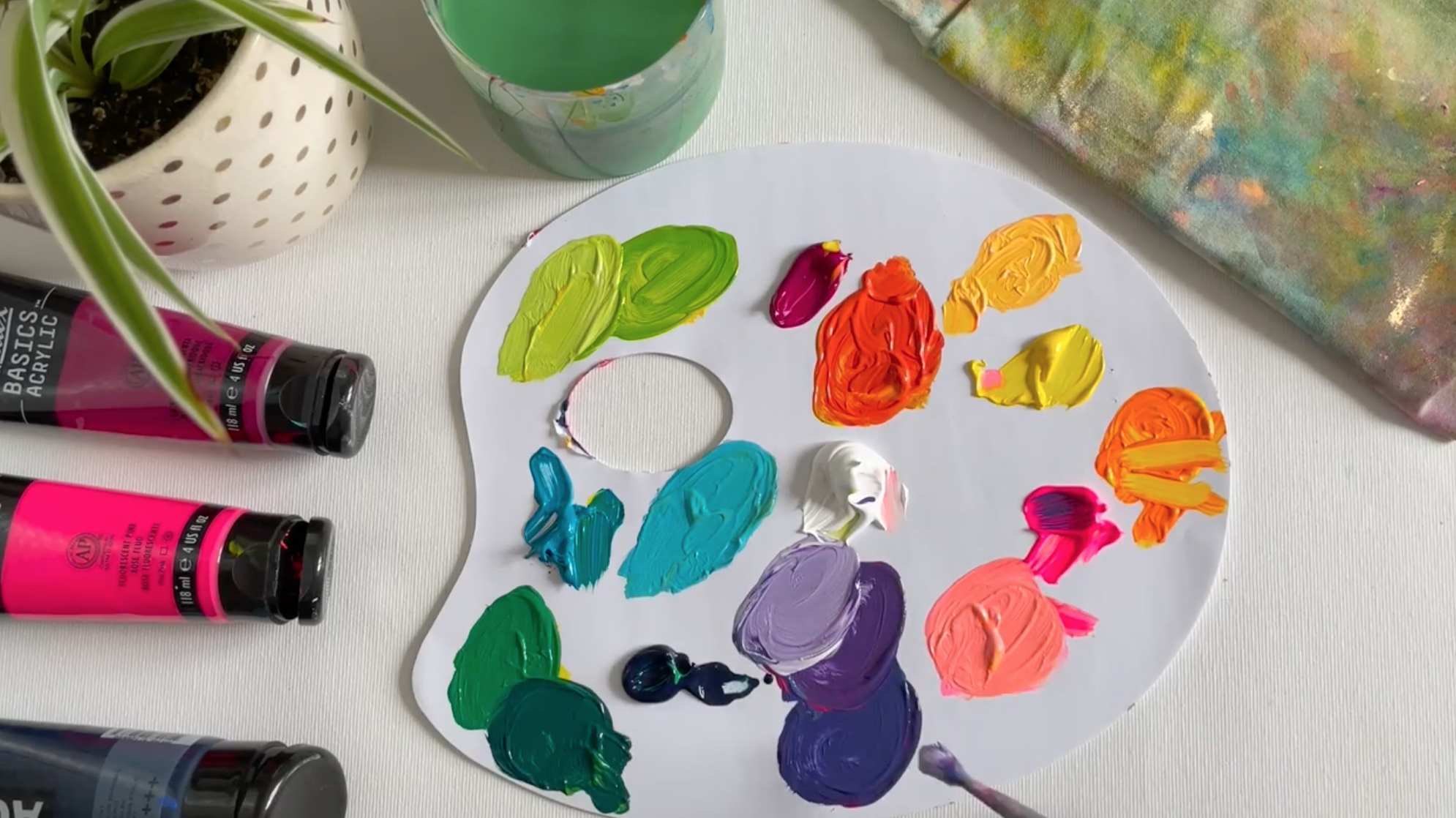
Once you’ve chosen your colors, it’s time to start mixing! I’m going to use my nontraditional primaries listed above for this example, but you can choose whatever nontraditional primary color speaks to you!
The process of acrylic paint mixing is exactly the same with your nontraditional primaries as it would be if you were using a regular primary color.
For example, instead of mixing red and blue to make purple, I use magenta and turquoise.
Take your new primary colors and create a color wheel or a color chart so you can see all the possibilities available when you mix the colors.
You can even try swatching your colors in a fun way if a color wheel or chart doesn’t speak to you. The whole point is to explore what colors you can make with your new primaries.
If you want to get more detail on how to mix different colors with your nontraditional primaries, check out this blog post where I give an in-depth explanation of how to mix all the colors of the rainbow!
Experiment and Play!
Once you’re happy with your nontraditional primaries, keep using them in your artwork! Soon, you’ll have a distinct color story throughout your body of work. Color is a big part of developing a signature style, and I’m excited for you to find yours!
I’d also encourage you to experiment and play as you’re developing your color palette. Try mixing and matching your primary colors to see just how many color possibilities are out there!
For example, I don’t always stick to my three main primary colors. It’s fun to mix things up now and then! In this blog post, I share how to mix different greens using turquoise, cobalt blue, and Prussian blue!
I hope that this blog post has encouraged you to go outside of your comfort zone and discover new color-mixing combinations!
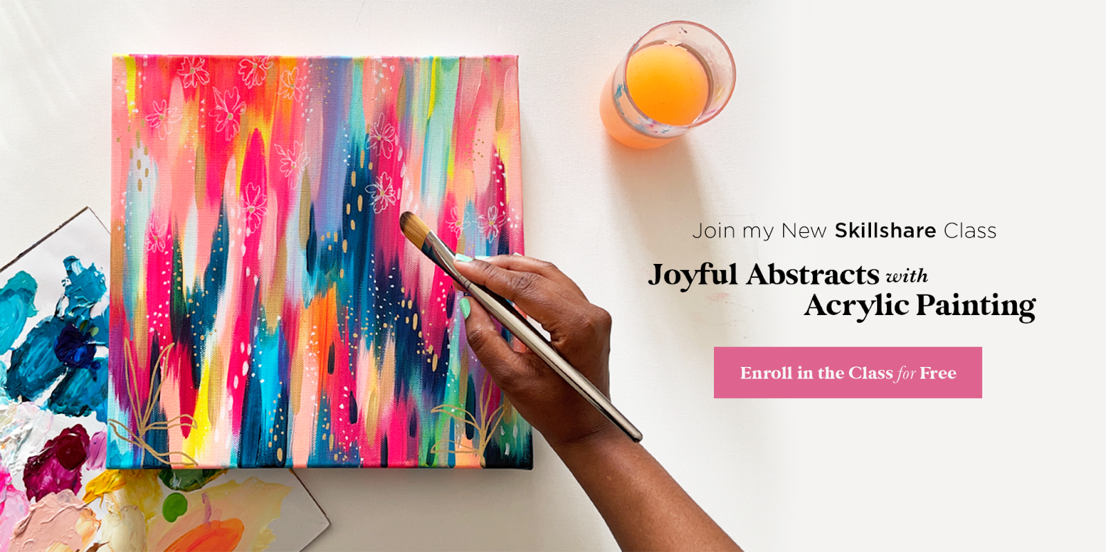
Want to learn more about acrylic painting? Join me in my class, Joyful Abstracts where I walk through the entire process of painting a colorful abstract piece from start to finish. You’ll learn how to choose a color palette, how to plan an abstract composition, and my signature brushstroke technique for creating movement in my abstract pieces.
Pin this post for later! 📌
Hover or tap on this image and click the “Save” button on the top left!


