


FigJamSlice up your data with a free pie chart maker
The numbers make sense, but they can be difficult to picture. Present your data in the clearest terms possible by graphing it on FigJam’s online pie chart maker.

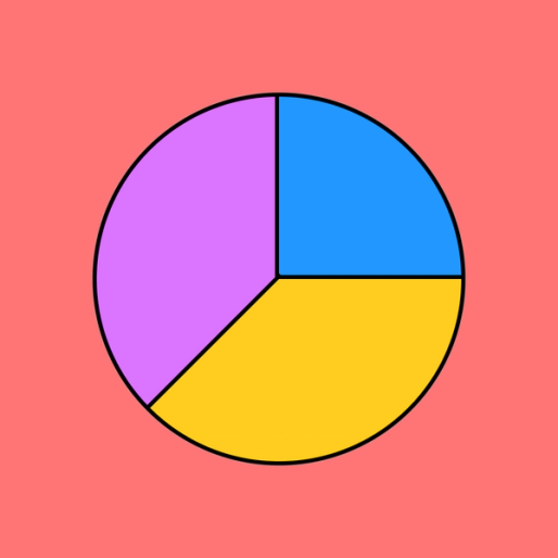
Pie chart maker
Use our pie chart maker online to show the relationships between datasets and deliver fully baked findings to the whole team.
Serve up some delectable data insights
Add value to presentations and pitches, illustrate complex relationships, and break down projects and budgets. With a blank pie chart template, the pie is the limit.
Realize relationships: Recognize relationships between datasets that previously went unseen.
See the difference: Enhance talking points and support arguments with clear visuals.
Digest your data: Make numbers and statistics more palatable to reach a wider audience.


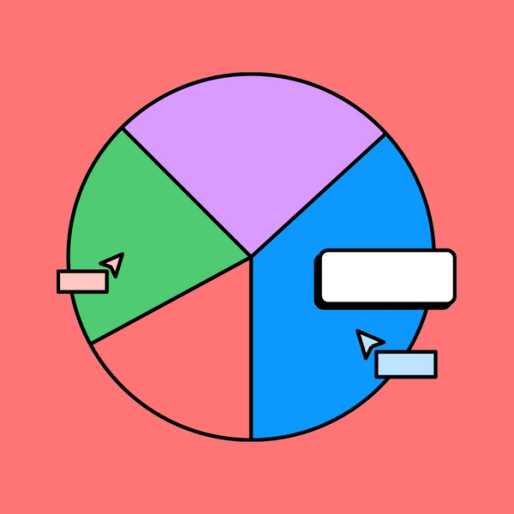
FigJamEveryone gets a slice
Whether you’re rolling out a report or sourcing feedback on design, you’ll eventually want to share a piece of the pie (chart) with your most, um, crustworthy teammates. FigJam makes it easy to bring everyone to the table with accessible, intuitive design tools and fun, functional widgets like Lil Notes, Table, and Teams.
Nourish your team with FigJam
Good ideas are like good food—they can inspire, revitalize, and even fuel you. Hungry for more? Find the recipe for success with FigJam’s Community templates.


FAQs
The process of creating a pie chart on paper is rather complicated. Beyond just gathering the initial data, it requires figuring ratios, converting to percentages by multiplication, and a fair bit of tricky work with a compass and protractor.
The fastest way to make a pie chart in the digital age is to use a free online pie chart maker. FigJam’s easy pie chart maker takes care of the math and the drawing for you, so you can pay more attention to the big picture.
Pie charts are frequently used across educational and business settings, as they tend to be fairly easy to interpret for both technical and non-technical audiences. You’ve probably seen these highly visual charts scattered everywhere from cable news to social media.
So what is a pie chart used for? A pie chart is a graph that is used to illustrate the relative size of and relationships between datasets or different categories. Pie charts are well suited to representing “parts of a whole,” or individual percentages of a total.
If you’re wondering when to use a pie chart vs. bar graph, consider the type of data at play. Pie charts are ideal for unpacking the composition of a whole—say, for example, you’re comparing relative answers in a survey. Bar charts come in handy when you’re looking at independent proportions and discrete data that does not necessarily comprise one whole sum.
When made correctly, a pie chart should be easy to read and illuminate how different sets make up a whole. All you need to do is read the labels and the legend, then compare the sizes of the pie slices to one another. This visual information should give instant insight into the relationships between the individual datasets represented.
Other templates you might like


Explore 1,000+ templates on the Figma community
Explore even more templates, widgets, and plugins—all built by the Figma community.