When one state or source has an upswing or downturn of new leads, the manager can immediately see if other states or sources had a similar pattern, indicating whether the cause of the change is related to something regional, to the strength or weakness of a particular lead source, or to the general trend in the market. If a manager wants to drill down into an individual sparkline, they could take advantage of InetSoft's built-in tooltips by hovering the mouse over the individual data points on the Sparkline to see exactly how many new leads were added in a particular month, from a particular source, in a particular state.
How to Make a Sparkline Chart in InetSoft
To create a Sparkline chart, follow the basic steps below.
Prepare Your Data
The data source for the chart (data block, query, or data model) should represent dimensions and measures as independent columns or fields, including a date column, as shown below. See Prepare Your Data for information on how to manipulate your data, if it is not currently in this form. (Note: A properly designed data model will already have the correct structure.)

Open a Chart for Editing
If necessary, create a new Dashboard. For information on how to create a new Dashboard, see Create a New Dashboard.
From the Toolbox panel, drag a Chart component into the Dashboard.

Resize the Chart as desired by dragging the handles.
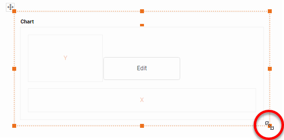
Press the Edit button in the center of the Chart or press the Edit button in the top-right corner.

This opens the Visualization Recommender. Bypass the Recommender by pressing the Full Editor button at the top right to open the Chart Editor.

Press the Select Chart Style button. Choose the Line style.

From the Dimensions folder of the Data Source panel, drag a date dimension to the 'X' or 'Y' region.

Press the Edit Dimension button next to the field name in the Chart Editor, and set the 'Level' to the desired date grouping. Then press the Apply button

If you have a preference for the color of the Sparkline(s), select one in the Color region.

Sparklines are often used in a grid of charts, where different charts represent different values of a particular dimension (here 'Source' and 'State').
To create a grid of charts, simply add dimensions into the X and Y regions to create the desired arrangement. For example, to break out the 'State' dimension on the X-axis and the 'Source' dimension on the Y-axis, place these fields as shown below in the Chart Editor.

From the Measures folder of the Data Source panel, drag a measure to the X or Y region. This places the selected field onto the chart as a measure.

Press the Edit Measure button next to the measure, and select the desired aggregation method for the measure.

Hide the axes on the individual Sparkline charts by right clicking on each axis and selecting Hide Axis on the menu that appears.

Tool to Make Sparkline Charts Online for Free
To easily and quickly create Sparkline Charts online for free, create a Free Individual Account on the InetSoft website. You will then be able to upload a spreadsheet data set.

Once you have done that, you will be able to proceed past the Visualization Recommender, which can usually get you started creating a dashboard. Since the Recommender does not allow you to hide axes or drag an additional dimension onto the x axis, press the Full Editor button.
Then proceed to build the Chart as described in the previous section.