The hidden meaning of famous logos: what is behind the symbols of brands
Are the logo designs random, or is there a deep thought behind every line? Understanding how well-known brand names work.
Brand names are created for recognition of companies, not for philosophical reflections - we easily distinguish Audi from BMW, without thinking about what the author of the logos wanted to say. Nevertheless, even if the symbol is completely abstract, there is often some idea behind it. Let's take a look at the concepts behind popular brand designs and see if logic is important to a logo's success.
What are logos
The logo can be any squiggle, figure or inscription - if any company calls it their brand name. Roughly speaking, all logos can be divided into three large groups: inscriptions, understandable pictures and incomprehensible pictures.
- Lettering (also called font logos) is chosen mainly by well-known companies whose names are well-known. These are luxury brands for which it is important to show their seriousness. And also companies with a complex field of activity, which is difficult to reflect in a laconic symbol.
- Easy-to-understand images as logos are often used by small businesses or companies that are just entering the market. Such signs tell potential clients about what the company is doing, or introduce them to the corporate concept, explain the name. It happens that at first a company has a detailed, understandable logo, and then during rebranding it is simplified to an abstraction.
- Incomprehensible pictures do not always arise in the course of the evolution of intelligible detailed signs. Sometimes an abstraction in a logo is conceived from the very beginning: in this case, the bet is placed not on the meaning, but on the mood and message. Plastics of lines, color combinations, shape and composition - all this creates a certain image and character of the brand.
Ideas at the heart of abstract logos
Incomprehensible pictures may seem to the viewer as such, but the designer is unlikely to call his own work incomprehensible. Usually, the creation of an abstraction is preceded by a very specific idea - at the stage of developing a sign. Now we will see this with examples.
Reflection of the activities of the company
If a logo is needed for a pastry shop, the first thing that comes to mind is to draw a donut. If for a fashion brand, draw a dress. Showing the company's field of activity in the logo is one of the most obvious decisions. But so that such a sign does not look trite, many designers only start from a specific image, and then stylize it almost beyond recognition.
Let's take a look at the VAIO brand mark for example. This is not just an inscription with interesting typography: the first two letters here are in the form of an analog signal, and the last letters are similar to a digital signal - one and zero. The sacred meaning of this logo is a combination of digital and analog technologies.

Often, a sign combines several images at the same time. Here is the logo of the Skyscanner flight selection service: in it you can see the sky with the rising sun, and the plane flying away into the distance, and the symbolic image of the scanning process - in the form of lines diverging in different directions. All these interpretations are directly related to the operation of the service.

Reasonable, kind, eternal
Branding includes a thoughtful message that the company carries. This is always something positive: customer focus, affordability, reliability ... And an abstract logo can also convey brand values.
For example, Toyota representatives claim their symbol is not just three ovals: the intersecting rings symbolize the unity of customers and the company, and the outer oval delineates the technical possibilities of the future. However, an alternative interpretation has also spread among the people, according to which the logo depicts a thread threaded through the eye of a needle. This is a reference to the company's history - Toyota used to make sewing machines. Although there is nothing really reminiscent of a needle and thread in the sign:

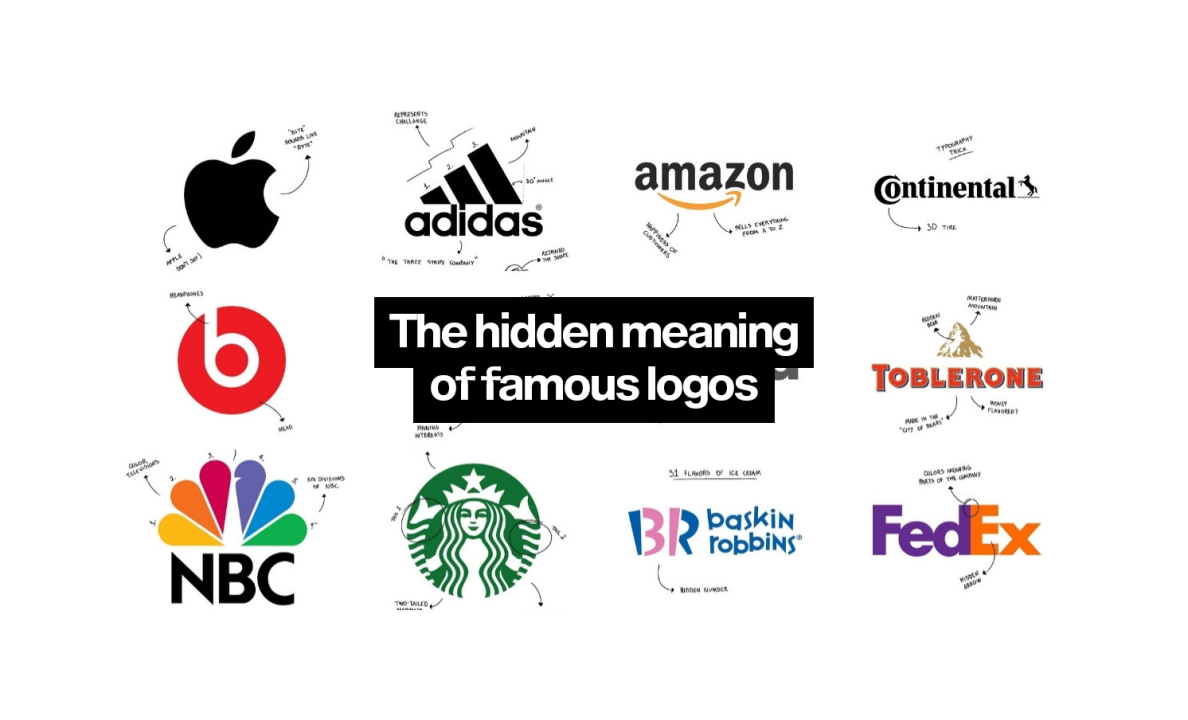
Adidas' latest three-stripe mountain logo symbolizes overcoming challenges that are important to athletes. The sign really looks like an obstacle, and this is achieved by compositional means. Firstly, the stripes are located at different levels and give a feeling of unevenness. Secondly, we read the name from left to right, and the direction of the stripes is opposite. This creates an image of resistance:

Name visualization
Another obvious idea for a logo is to depict the brand name. The apple Apple and the Burger King hamburger immediately come to mind. But these pictures are simple and straightforward.
Let's take a better look at the more abstract symbol of yet another car brand, Subaru. It depicts not just stars, but the Pleiades star cluster: this is how the name of the company is translated from Japanese.

Sometimes the details that refer to the name are almost invisible. For example, in the Pinterest icon, the letter P has a pointed end - this is the image of a button / pin (pin).

Another interesting example of the connection between a logo and a naming is the Starbucks sign. The coffee shop was named after a literary hero - a sailor. Accordingly, the sign was conceived in the marine theme - and settled on the image of a mermaid. The first logo was quite provocative, but the mermaid has survived in the modern, low-key version:

Why logic is needed in design
A natural question arises: why should designers bother with the meaning of a logo, if for a wide audience it remains a mystery in most cases?
A clear concept helps to limit the flight of design imagination. There are many graphic techniques, colors and compositional solutions, not to mention endless chains of associations with any field of activity or name.
If, before starting work, you do not decide in which direction to move, at least there is a risk of spending too much time going through all possible options. As a maximum, the final logo may turn out to be irrelevant: after all, not every abstraction will suit every brand.
There is, say, a completely abstract logo for the corporate messenger Slack and an equally abstract logo for Pepsi. But if their signs are reversed, cognitive dissonance will arise.

Still, the Pepsi sign is associated with something liquid thanks to its smooth lines, and the red color is close to the color of the drink itself. The Slack sign is assembled from many colorful pieces and demonstrates teamwork. These are very simple concepts without sacred meaning, but they work to create a coherent image of companies.
Sometimes there is a full story behind the logo, and sometimes designers start from the visual image, choosing colors and shapes that suit the brand. The carriers of the corporate identity are also taken into account. We see the Pepsi badge quite large on the bottle, and it has a thin white outline around the outline. And we always see the Slack sign in a thumbnail in the application, and there are no thin lines in it that are unreadable in a small format. Even if it seems that there is no logic in the logo, it is usually still there.