Pareto Chart: Prioritizing Tool
Prashantsagar Uppara
Manufacturing Operations Excellence Expert | Lean Six Sigma Black Belt | Total Productive Maintenance (TPM) | Operations Management
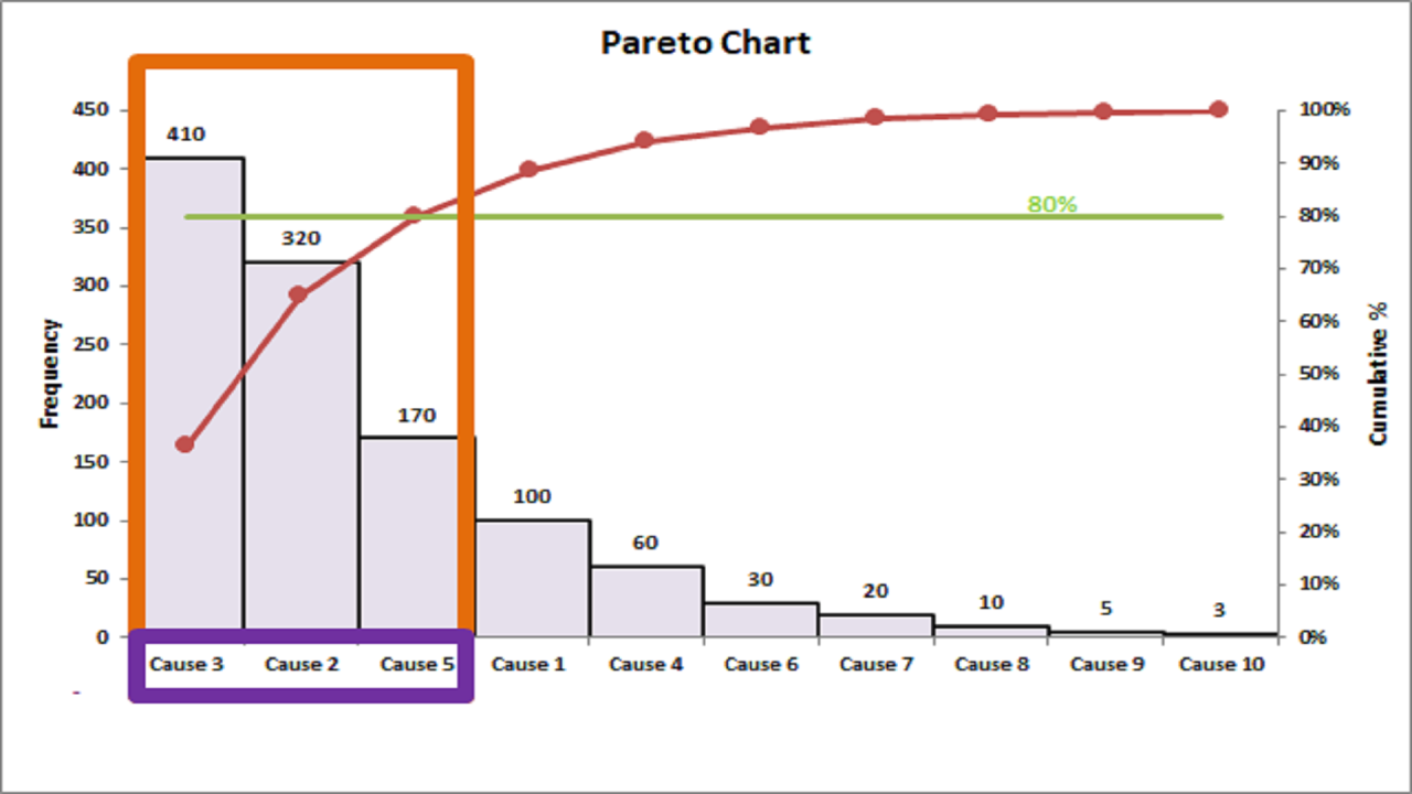
It is a simple but effective visual tool which is combination of bar graph and line graph.
Pareto chart is based on 80:20 principle, where we focus on 20% tasks that produce 80% results.
In root cause analogy, we focus on 20% causes that are responsible for 80% breakdown (or downtime).
Here, we arrange all the causes producing problems in descending order of frequency and also calculate cumulative percentage of frequency.
The graph is then plotted with causes on x axis and frequency on primary y axis. The cumulative percentage is on secondary y axis.
The intersection of the cumulative curve, projected onto the x-axis where it meets the 80% line, identifies the 20% of problems or tasks that require our focused attention.
#pareto #problemsolving #rootcauseanalysis #productivity #7qctools