
How to Draw a Simple Compass
There is probably nothing more iconic in cartography than the compass rose. Not only do they serve to orient the viewer of your map, but they are also an opportunity to get creative and reflect the culture of the world. There are nearly limitless ways to draw a compass, but in this tutorial I want to set a foundation for you to build upon later. You will learn everything you need to draw a simple compass on your fantasy maps, and hopefully it will inspire and give you confidence to take it a step further. But, I want to also say there is absolutely nothing wrong with using a simple compass on your map as well. There’s nothing wrong with the clean, classic look for your map.

Draw Two Circles for the Rim
Begin with a simple circle and draw a second circle on the inside. This will act as the main rim of the compass and will determine the overall scale it will appear on your map.
If you are just now learning to draw a compass I would encourage you to try and copy this tutorial as closely as possible. Then when you have built some confidence, try it again but this time play with the size of the different circles and see how it affects the look of the compass.
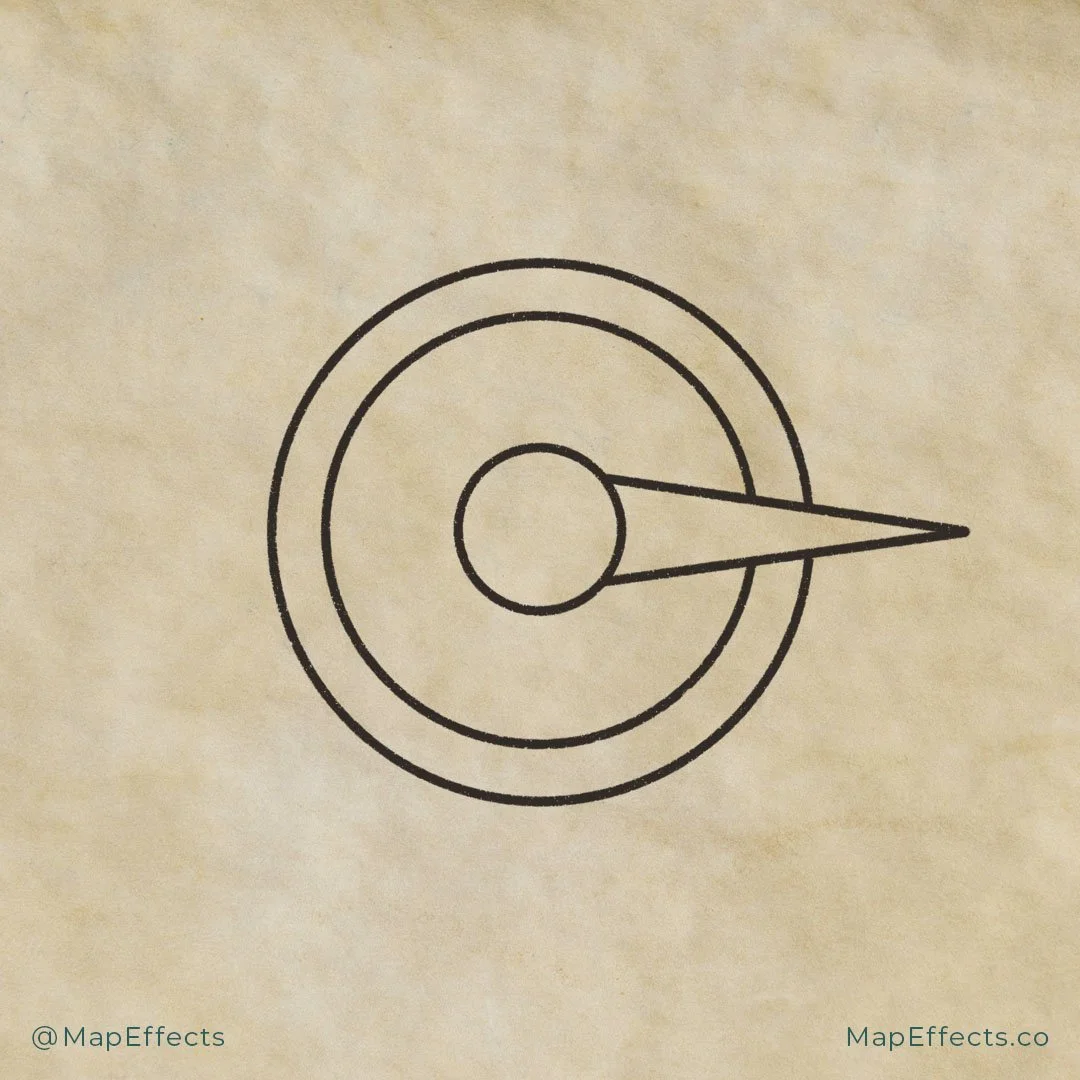
Add the Center Circle and a Point
Add another circle much smaller in the middle of the compass. Then draw a triangle from the center circle out past the outermost circle. Be sure to erase any of the lines of the outer circles that the triangle overlaps. You can see that this is already starting to create dimension by causing elements to overlap.

Finish Adding the Directional Points
You now want to add three more triangles the same size as your first one. If you are working digitally this can easily be done by copying and rotating the original one you added. If you are working with traditional tools though, I would encourage you to use a ruler and measure the length of the first point and make sure the other three are equal.
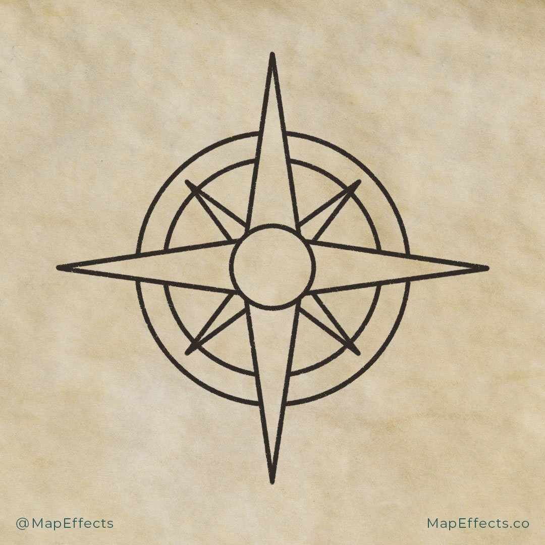
Drawing Additional Points
Now you want to make four smaller triangles and place them between your four main directional points. Once again, if you are working digitally you can easily accomplish this by copying your original four points, rotating them, and scaling them down.
For this example, I have placed the smaller points visually behind the larger points and made them end in the center of the outer rim. All of these proportions can be altered though, so when you give this tutorial another go just have some fun making slight alterations and see what you can create.
You now have the basic compass shape done and now you can move on to adding some details to really make it stand out.
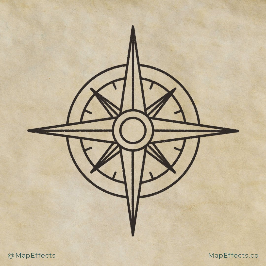
Add Some Details
The first thing you’ll want to do is draw some straight lines down the center of the original triangles. Once you add some shading this will really make them stand out.
Next, you can add another circle inside the innermost circle. Then add some small tick marks on the inside of the second circle in between each triangle you’ve drawn.
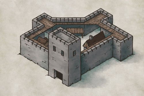
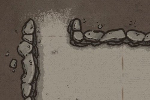
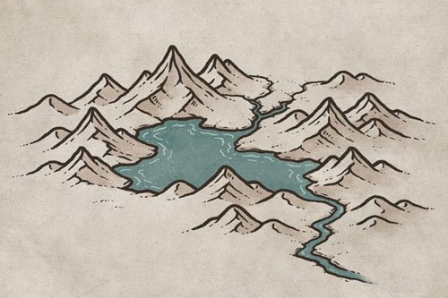
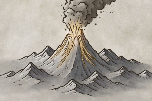
More Tutorials You May Enjoy


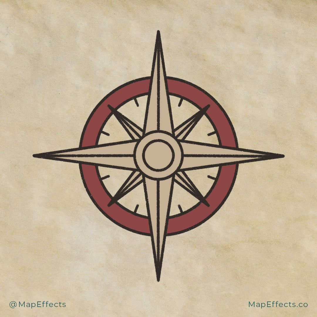
Block in the Main Colors
You can now start working on the color for the compass. I selected a red (#8c4646) for the outer ring and a beige (#c5b195) for the rest. Don’t be afraid to mix it up and try some different color palettes to match the style of your map. You want something that will complement the overall look of your project.

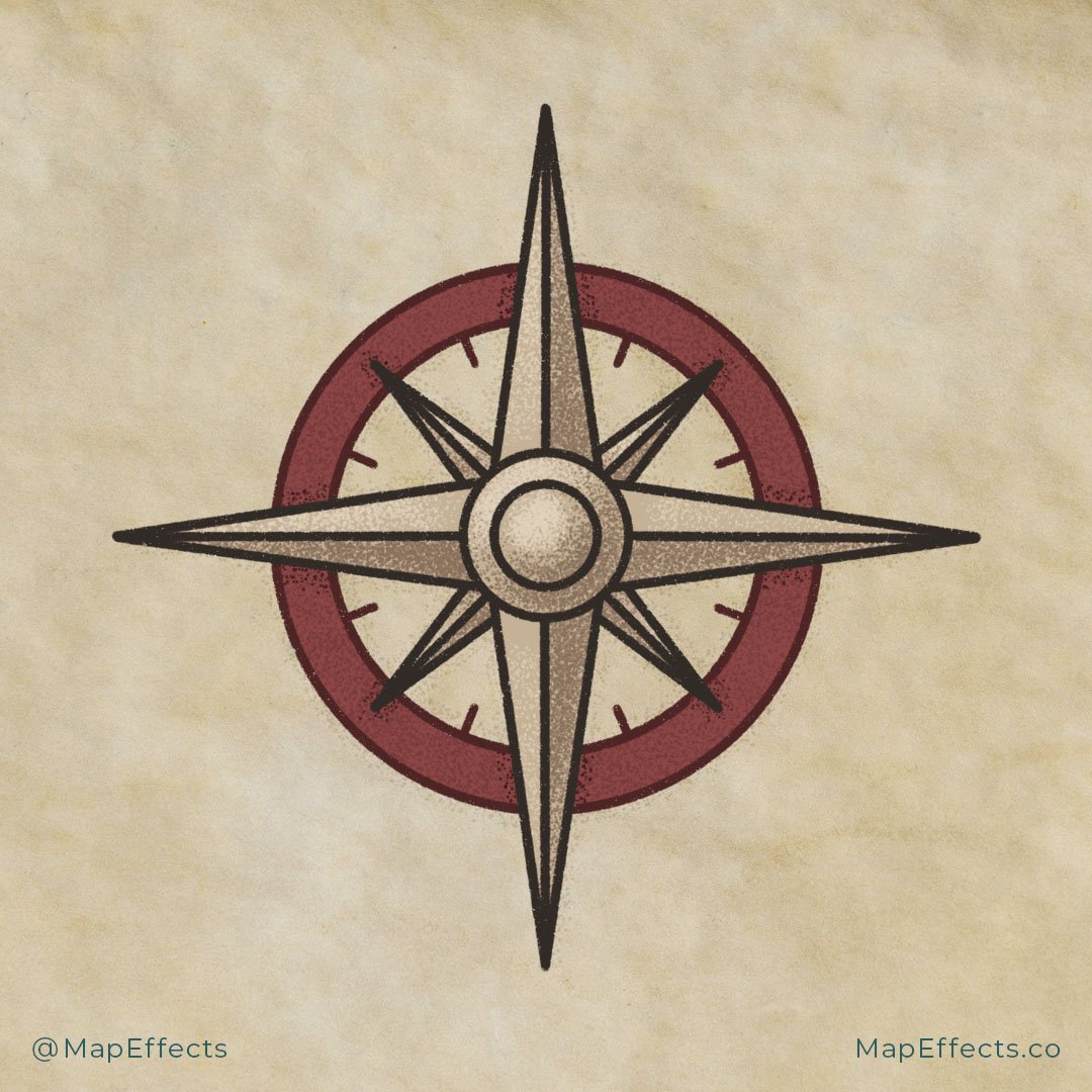
Add in Some Shadows
Imagine where the light would hit the compass, and draw shadows accordingly. In this case, my light source is coming from the upper left. This means it will throw sections on the right and bottom into shadow. The other thing you can safely do is add a little bit of shadow anywhere something overlaps.
I’m using the Vintage Stipple brush from my Liner Brush Field Kit because I wanted a more vintage look, but this brush just speeds up the process instead of drawing hundreds of individual dots. But the main thing to keep in mind is to choose the tool that will achieve the look you want for the final piece.

Add a Pop of Highlights
Now the compass is really getting some depth, but it still looks a little flat. To fix this, you can add some highlights on the opposite side of where you placed your shadows. This will really make the whole thing stand out.
One thing to keep in mind is the stronger the highlights are, the more reflective and “metal” a surface will appear. Metal is more reflective than your average stone so it will appear to have much brighter highlights.
You’re done! As you can see, there are a number of things you could potentially do to add variation to this design. Even as I put this tutorial together I came up with half a dozen different-looking compasses just by adjusting the size of the circles, the length of the points, and the amount of detail I included. The nice thing about the compass being such a basic shape is that you can easily incorporate patterns or illustrations that really match the map you are placing it on while keeping it easily identifiable as a compass.
If you found this tutorial helpful be sure to follow MapEffects on Instagram and tag me with the map you create and I may feature your work. Thank you, and I look forward to seeing your map!
Josh
