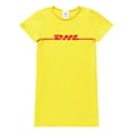
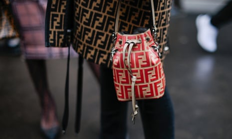
Study fashion over the past 30 years and you would think we should have reached peak logo by now. We’ve had logos as status symbols (Fendi, 1997), logos as jokes (Fuct, 1990), logos as resistance (Bristol Street Wear, 2016), logos as nostalgia trip (Versace, 2018), no logos at all (Céline, 2010) and logos drenched in irony (Vetements, 2016). Where else is there to go?

The Guardian’s product and service reviews are independent and are in no way influenced by any advertiser or commercial initiative. We will earn a commission from the retailer if you buy something through an affiliate link. Learn more.
This season, fashion’s answer to that question is to rework, destroy and mutate logos. Rather than use them as an easy visual gag, a route one approach to getting dressed, they are increasingly in-the-know statements. They can be abstracted (Kenzo), found in odd places (Gucci), ironically corporate (Martine Rose), blown up huge (Véronique Leroy) or a teeny-tiny statement (Céline).
Emily Gordon-Smith, head of fashion at research consultancy Stylus, thinks the key word is “irreverence”. She says the brands doing well are the ones “becoming more unexpected in how they’re playing with logos”, such as Gucci, which has scribbled doodles all over them, and – for ultimate subversion – made genuine Gucci items with the look of bootlegs. “That impressive nature of traditional logos and branding [logos as status symbols] doesn’t exist for this generation,” Gordon-Smith says. “Their values are very different. This whole messing around with logos and branding is much more appealing.”

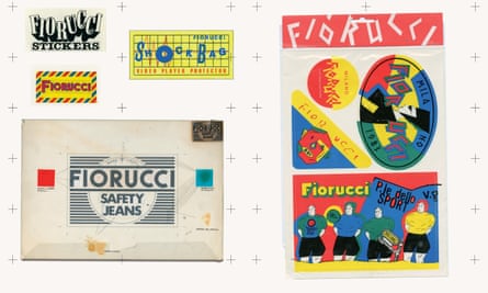
Gordon-Smith relates this new mood in part to the recent growth of streetwear, with brands such as Palace and Supreme and their non-precious use of logos. But playful logos also have history at Fiorucci. If the golden rule of branding sees a consistent logo – the Chanel double C, the Louis Vuitton LV – as a way to guarantee global visibility, the Italian brand was an early disruptor: founder Elio Fiorucci created more than 100 different logos. Janie Schaffer, who relaunched the brand with her ex-husband Stephen in 2017, says this chimes with the millennial generation they are trying to reach. “I have been in brands my whole life and people are constantly reinventing an existing logo,” she says. “With Fiorucci, we’re lucky because there isn’t just one – we can do another one next season and it will be completely different but equally authentic.” This combination – authenticity, newness and playful branding – is heady for a demographic whose attention spans developed in the internet age.
Martine Rose also has multiple logos in her collection – one has the feel of 90s corporate merch when found on hoodies, while another pays homage to MTV. The in-the-know humour of bootleg culture is key. “It’s possible I’ll get a cease and desist, though I haven’t yet,” Rose says. “Whenever I am using logos, it’s with that playful intention behind it.” Rose says this attitude is essential to using logos in a “post-ironic” way. “When I think of logos, I always think of that amazing 1997 David LaChapelle image of Lil Kim [the one with Louis Vuitton’s LVs on her body],” Rose says. “That was the height of logomania when the logo was an aspiration. I think the tone now is slightly different, it’s less dry.” The accessory to wear with your logo this season, then? An arched eyebrow.
