Florence Nightingale and statistics - it turns out the two are intimately connected. Graphics are terribly trendy at the moment - and as data floods onto the web, this is a trend we heartily applaud, here at the datablog. But sometimes it's good to know that it's not entirely new.
We all have an image of Nightingale - who died 100 years ago today - as a nurse, lady with the lamp, medical reformer and campaigner for soldiers' health. But she was also a datajournalist.
After the disasters of the Crimean war, Florence Nightingale returned to become a passionate campaigner for improvements in the health of the British army.
She developed the visual presentation of information, including the pie chart, first developed by William Playfair in 1801. Nightingale also used statistical graphics in reports to Parliament, realising this was the most effective way of bringing data to life.

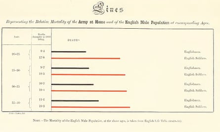
The key report is this one, (with thanks to American Libraries). Mortality of the British Army, published in 1858, was packed with diagrams and tables of data.
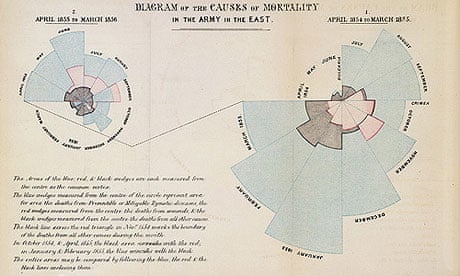
The most famous is that at the top of this page - her 'Coxcomb'. We still use this device today.
She produced two versions of this - including the one you get by clicking on the image at the top of the page. There's a great paper on it by Hugh Small here where he explains how it works:
The circle on the right has 12 sectors going clockwise representing the first 12 months of the war. The circle on the left is the second 12 months. The superimposed dark shapes show the monthly death rates. The diagram illustrates how the Sanitary Commission, sent out in the middle of the war, dramatically reduced the death rate. The length of the radial line in each month is proportional to the death rate, but both the text and the appearance imply that it is the shaded area that is proportional to the death rate, rather than the length of the radial lines. Florence recognised this error and inserted an erratum slip, but then replaced this diagram in later documents (nos. 3, 4, and 5 listed above) with what I will call the "wedges" diagram.
There's an interactive version of it below from understandinguncertainty.org which gives you an idea of how it works. It's slightly too big for our pages, so click on full screen.
National Statistician, Jil Matheson of the Office for National Statistics, recognises her influence. She says she was inspired by Nightingale to get involved in statistics: "Florence is an inspirational figure for many women in particular, the 'lady with the lamp' was also a lady with powerful ideas with the commitment and passion to put them into practice. As a consequence, she made a lasting and important impact in the fields of both medicine and statistics."
World government data
Search the world's government with our gateway
Can you do something with this data?
Flickr Please post your visualisations and mash-ups on our Flickr group or mail us at datastore@guardian.co.uk

Comments (…)
Sign in or create your Guardian account to join the discussion