From Red to Blue: Exploring the World of Primary Colors
Have you ever wondered why some colors seem to go together while others clash? Or why certain colors can be mixed to create entirely new colors?
The answer lies in the concept of primary colors, which are the building blocks of all other colors.
In this article, we will explore what primary colors are and how they are used in art, design, and everyday life. So, let us explore the realm of color and experience the wonder of primary colors!

In this article, you will learn:
- What Are Primary Colors?
- How to Use Primary Colors in Color Mixing
- Primary Colors: The Building Blocks of Color
- A Game-Changing Tool for Color Design
What Are Primary Colors?
Primary colors are the fundamental colors that can be used to create all other colors. They are the building blocks of color theory and play a crucial role in art and design.
Throughout history, primary colors have been studied and used by artists and designers to create visual harmony and balance in their work.
From the ancient Greeks to modern-day color theorists, primary colors have been a subject of fascination and exploration. So what is the specific definition of primary colors?
1. Definition of Primary Colors
Primary colors are colors that cannot be created by mixing other colors together. Instead, they are the fundamental building blocks of all other colors and can be used to create a wide range of hues and shades.
In traditional color theory, primary colors are considered to be the basic colors that cannot be created by mixing other colors together.
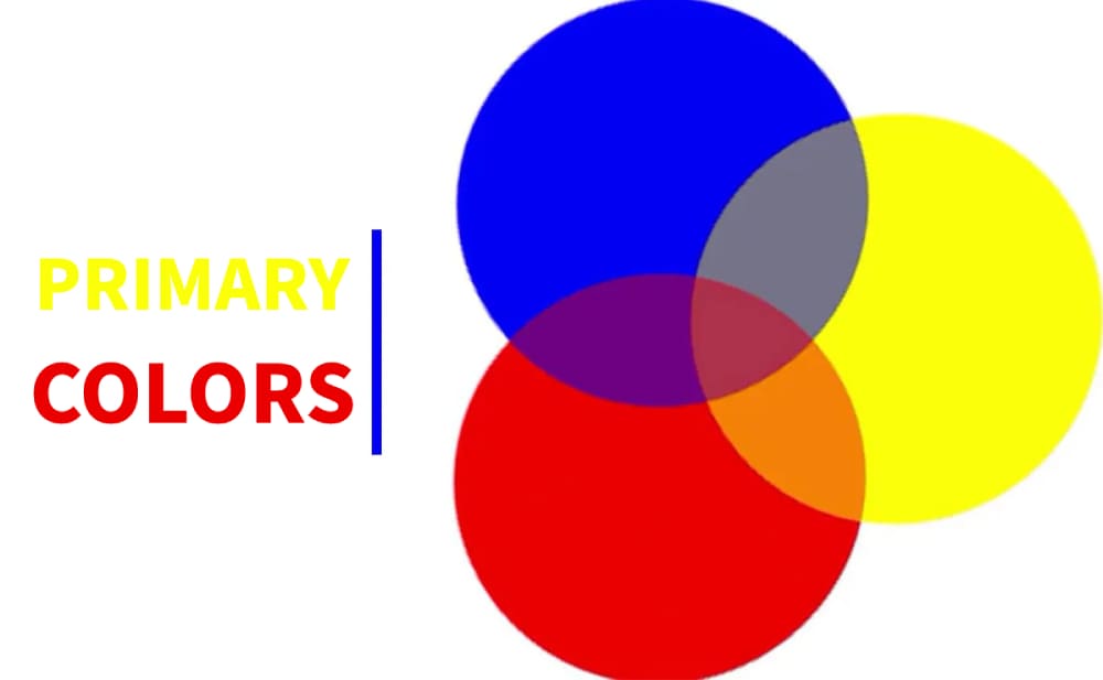
They are the foundation of the color wheel and are used to create all other colors. The three primary colors are red, blue, and yellow, and they are often depicted as equidistant points on the color wheel.
When two of the primary colors are mixed together, they create a secondary color.
For example, mixing red and blue creates purple, while mixing blue and yellow creates green. Secondary colors are located between the two primary colors that were used to create them on the color wheel.
In addition to the traditional primary colors of red, blue, and yellow, there are also other color models that use different primary colors.
For example, in the RGB color model used for digital displays, the primary colors are red, green, and blue. In the CMY color model used for printing, the primary colors are cyan, magenta, and yellow.
Understanding primary colors is important in a variety of fields:
- In art and design, it is essential for creating a wide range of colors and hues.
- In science, it is important for understanding the physics of light and how colors are perceived by the human eye.
- In color theory, it is a fundamental concept that helps explain how colors are created and how they interact with each other.
2. The Magic of Additive and Subtractive Color Mixing
Additive and subtractive color mixing are two different methods of combining colors to create new colors.
Additive color mixing is used in light-based systems, such as computer screens, televisions, and projectors.
In additive color mixing, different colors of light are added together to create new colors. When all three primary colors of light (red, green, and blue) are combined at full intensity, they produce white light.
This is why additive color mixing is also known as "RGB" color mixing, as it involves the combination of red, green, and blue light to create a full range of colors.
Subtractive color mixing, on the other hand, is used in pigment-based systems, such as paint, ink, and dye. In subtractive color mixing, colors are created by subtracting certain wavelengths of light from the spectrum of visible light.
The primary colors in subtractive color mixing are cyan, magenta, and yellow. When these three colors are mixed together in equal amounts, they produce black.
This is because each color absorbs certain wavelengths of light, and when all three colors are combined, they absorb all visible light and create darkness.
It's important to note that additive and subtractive color mixing are not interchangeable.
For example, if you mix red, green, and blue paint together, you will not get white, but instead, you will get a murky brown color.
Similarly, if you combine cyan, magenta, and yellow light together, you will not get white light, but instead, you will get a muddy color.
Knowing how to mix colors using light or pigment is important in art and design because it can impact the final look of a project depending on the materials used.
3. Examples of Primary Colors in Different Color Models
- RGB (Red, Green, Blue) Model: Red, green, and blue are the primary colors in the RGB model. This color model is used in electronic displays such as televisions, computer screens, and smartphones.
- CMYK (Cyan, Magenta, Yellow, Key/Black) Model: Cyan, magenta, and yellow are the primary colors in the CMYK model. This color model is used in printing and is based on the subtractive color mixing process.
- RYB (Red, Yellow, Blue) Model: Red, yellow, and blue are the primary colors in the RYB model. This color model is commonly used in traditional art and design, particularly in painting and color theory.
It's important to remember that although these color models use different primary colors, they are all based on the same principles of mixing colors using light or pigment.
Understanding the primary colors in each color model can help artists and designers create and manipulate colors effectively in their work.
How to Use Primary Colors in Color Mixing
Color mixing is an essential skill for anyone interested in art and design. Whether you're an artist, designer, or decorator, knowing how to mix colors can help you achieve the look you want in your projects.
At the heart of color mixing are the primary colors, which are the building blocks of all other colors. By mastering the use of primary colors, you can create an endless variety of hues and shades.
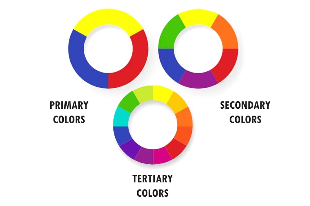
1. What Are Secondary Colors
Secondary colors are colors that are created by mixing two primary colors together in equal amounts. The three secondary colors are orange, green, and purple.
- Orange: Orange is created by mixing red and yellow together. It is a warm and vibrant color often associated with energy and excitement.
- Green: Green is created by mixing yellow and blue together. It is a cool and calming color often associated with nature and growth.
- Purple: Purple (also known as violet) is created by mixing blue and red together. It is a royal and regal color often associated with luxury and creativity.
Secondary colors are important in art and design because they can be mixed with primary colors or other secondary colors to create a lot of different colors. By combining primary and secondary colors, you can create tertiary colors.
Knowing how to use secondary colors is crucial in color mixing because they give artists and designers more colors to work with.
2. How to Mix Primary Colors to Create Secondary Colors
Mixing primary colors is a simple and effective way to create secondary colors. By combining two primary colors in equal amounts, you can create a new color that is a mixture of both. Here are the primary colors you need to create secondary colors:
- Orange: Mix equal parts of red and yellow.
- Green: Mix equal parts of yellow and blue.
- Purple (also known as violet): Mix equal parts of blue and red.
Here are some tips to keep in mind when mixing primary colors to create secondary colors:
- Start with small amounts to avoid waste.
- Mix the colors well to achieve an even color throughout.
- Adjust the color by adding more of one color or another until you get the desired hue.
- Mastering color mixing allows you to create many colors for your projects.
- Experiment with different combinations of primary colors to make your own unique palette of colors.
Primary Colors: The Building Blocks of Color
Primary colors are the building blocks of all other colors and cannot be made by mixing other colors. By mixing primary colors in different ways, all other colors can be created. The three primary colors in traditional color theory are red, blue, and yellow.
Primary colors are used in many fields, including art, design, printing, and photography:
- In art, primary colors are used to create bold and vibrant paintings.
- In design, primary colors can create attention-grabbing logos and marketing materials.
- In printing, primary colors generate all the colors we see in magazines, newspapers, and books.
- In photography, primary colors can be used to create striking images.
Here are some specific examples of how primary colors are used in different applications:
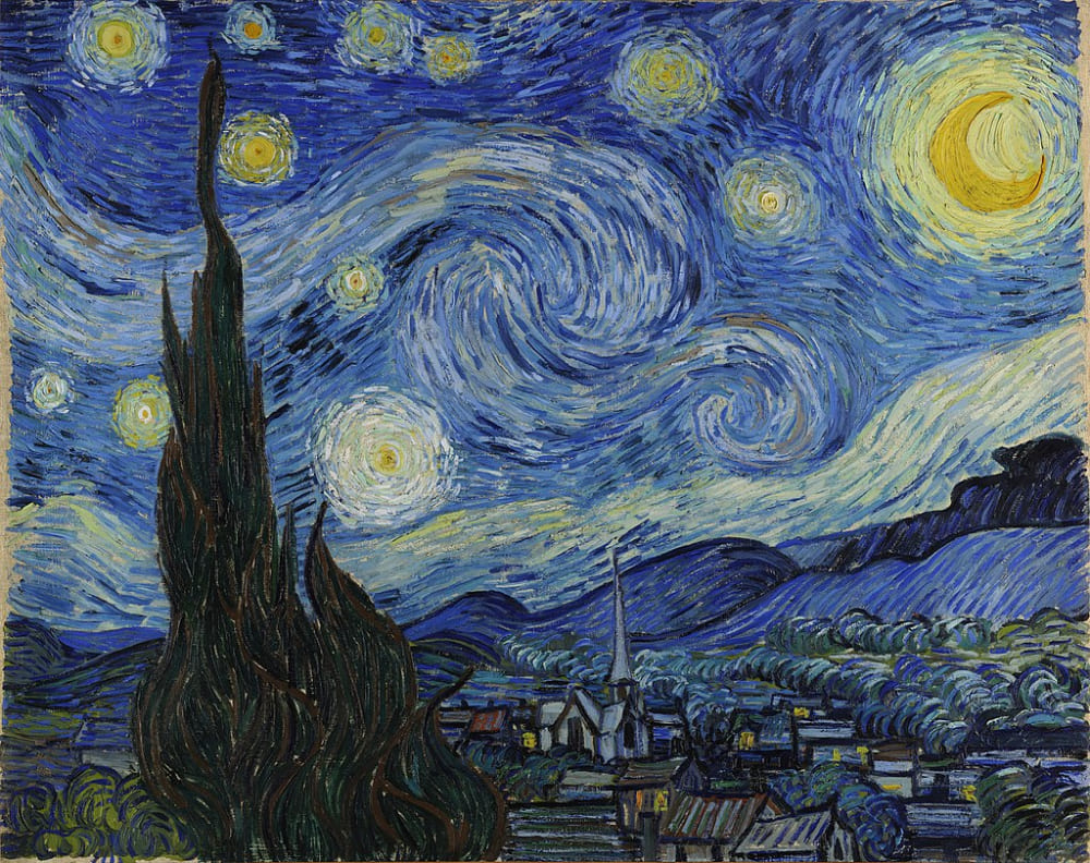
- In art, primary colors are often used to create bold and vibrant paintings. For example, Vincent van Gogh's "Starry Night" is a famous painting that uses primary colors to create a sense of movement and energy.
- In design, primary colors can be used to create eye-catching logos and marketing materials. For example, the McDonald's logo is a simple design that uses red and yellow to create a memorable and instantly recognizable image.
- In printing, primary colors are used to create the full range of colors that we see in magazines, newspapers, and books. For example, the cover of a magazine might use primary colors to create a striking visual impact.
- In photography, primary colors can be used to create stunning images. For example, primary colors are used to correct the color balance of an image. By adjusting the levels of red, green, and blue in an image, photographers can correct color casts and ensure that the colors in the image are accurate and true to life.
A Game-Changing Tool for Color Design
Primary colors are the building blocks of color theory and play a crucial role in art, design, and everyday life.
By understanding the properties and characteristics of primary colors, we can create an endless variety of hues and shades that can be used to create stunning works of art and design.
The importance of primary colors in color theory cannot be overstated. They provide a foundation for understanding how colors work together and can be used to create a sense of balance and harmony.
Whether you're a painter, graphic designer, or interior decorator, understanding how to use primary colors effectively is essential for achieving the desired visual effects in your work.
One tool that can be a great help in color design is TourBox. This intuitive device allows you to quickly and easily adjust color settings in popular creative software, such as Adobe Photoshop and Lightroom.
With TourBox, you can streamline your workflow and create stunning color palettes with ease.

The versatility of primary colors is truly remarkable. From the ancient Greeks to modern-day color theorists, primary colors have been a subject of fascination and exploration.
Whether you're working with RGB, CMYK, or RYB color models, primary colors provide a foundation for creating a virtually endless array of colors.
So go ahead and experiment with different combinations of primary colors to create your own unique palette and unleash the magic of color!