Jan Tschichold
Many things are taken for granted. We don’t stop and think about them, neither we appreciate the people responsible for their invention. Take an ordinary book for example. How often do you think about the person who discovered paper, or the printing press, or even ink? Jan Tschichold was a German typographer, responsible for the revolution in the understanding the significance of style in written word. He is among the great ones who have allowed the ordinary readers to see pictures every time they look at a page of any book, to have a visual experience on a subconscious level. There is, however, an ongoing question regarding classification of typography as art, but we’ll come back to that later.
Early Life and Education
Tschichold was born in Leipzig. His father, Franz, was a sign writer, and he provided an introduction to the world of lettering to his son. Assisting his father was a useful and practical way to learn the basics of sign writing. However, the aspects of an artistic career were not looking all too good, as his parents decided that a profession of a teacher was more suiting and promising for their son. So he began teaching illustration, a job that will take about three years. His interest in calligraphy started to develop a couple of years before his teaching position, when the visit to the World’s Fair for Books & Graphics of 1914 left a powerful impression on young Tschichold. This interest was nurtured through his personal studies of the books, focusing on those with ornamental script and writing, as well as calligraphy. When he was 17, his career in education came to a halt, and he began his studies of typography, further honing his craft and skill. The scholars at the Leipzig Academy of Graphic Arts and Book Production soon realized what a vast knowledge he possessed and thought of him more as an equal than as an ordinary student.
The jobs of freelance designer and lettering artist followed his exit from the Academy. His style up to 1923 wasn’t particularly clean, geometric san serif rich design. It was the exact opposite. Maximillian Grotesk, one of Rudolf Koch’s first fonts, influenced Tschichold greatly. He developed a habit of collecting the works of various masters of the script and analyzing them. It was a time of no strict rules of choosing the font, and the random factor played a major role. There was little regard for the text, and the gothic legacy dominated, pushing aside any use of roman weighted fonts. Then, in 1924, Tschichold went to see the Bauhaus exhibition and as a result, his passion for black letters and scripts was shattered overnight. No flare, straight edges, simple shapes, strict rules, rigorous composition and structure, white spaces – to summarize, a new set of thick rules was in place. The artist was undoubtedly inspired by the Bauhaus exhibition. As for his relations with the school itself – there is no record of any substantial contact whatsoever. Robin Kinross states that this can be interpreted as a clear sign of how the school lacked the typographic and printing-trade expertise, even at Dessau in the time of its greatest ideological commitment to designing for industrial production.
Bauhaus exhibition influenced Tschichold, making him leave behind his passion for black letters and scripts
Jan Tschichold – The Cultural Bolshevik
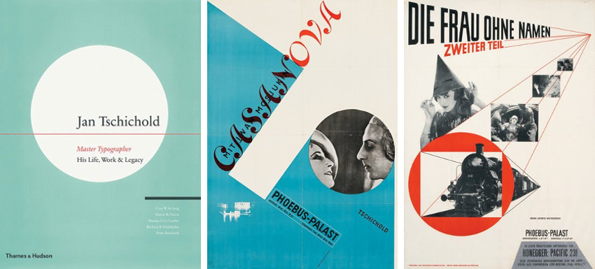
Tschichold was gaining a reputation among his fellow typographers and designers, but it was yet a number of years to pass before there was a significant rise of those who saw eye-to-eye with him and shared his beliefs. Die Neue Typographie – The New Typography, his arguably most influential work, was published in 1928, and represented a masterpiece of the modern typography and graphic design. It was a set of rules that standardized the practices relating to modern type usage. All typefaces were condemned, except for sans-serif types, standardized sizes of paper were preferable, and guidelines for establishing a typographic hierarchy when using type in design were set. The book was a perfect introduction to the modern typography that reflected a modern, universal method of communication. This design concept assumes the stance of passive visual experience, working on the subconscious levels, counting on rationality of both sides of the message – on one side, there is the graphic designer/producer of the message; on the other, there are the readers, passive, detached, and objective, where the act of perception is simple act of seeing. It’s a marvelous book, whose philosophy the artist later espoused as being fascistic. Nevertheless, it was and has remained quite influential.
Historically, the New Typography and his own rise to fame and influence coincided with the rise of the Nazi Party in Germany. Shortly after they finally took the power, all creativity was branded as non-desirable, and the Tschichold’s work was characterized as un-German. There was a raid of his house, where some materials deemed improper were discovered, so the artist was arrested and marked as a cultural Bolshevik. The help finally came from a kind police officer that provided Tschichold with a passport, so he and his family sought a passage away from Germany and its rising totalitarianism. They escaped to Switzerland, where, due to his reputation, wasn’t too difficult to acquire work. As the 1930’ were coming to an end, so did his tight grip on the Bauhaus principals that once impressed him. Now developing something that could be described as a Swiss Typography, he hastily began distancing himself from the Bauhaus teachings and principles. This new style stayed with Tschichold when he moved to England in 1947, where a new chapter of both his personal life and of the entire printed word was about to begin.
He was branded as a Cultural Bolshevik by the Nazi Government
Penguin
Tschichold first visited London in 1935, but his relationship with England started earlier. The British printers were given an insight into the continental avant-garde through the series of articles that appeared in trade magazines. Moholy-Nagy, who was already in London, as well as the New Typography, photomontage, and Russian Constructivism were presented in these articles, allowing the British readers to grasp all the changes occurring in the world of graphic design. The books became Tschichold’s main interest since leaving Germany, and, as luck would have it, or perhaps destiny, in 1946, Allen Lane, the founder of Penguin Books was searching for someone to improve the company’s production and design, and make it more professional. Founded in 1935, Penguin managed to transform the economics of British publishing by selling ‘’good books cheap’’, as its slogan claimed. High culture was suddenly made available to the mass public, and at the lower costs than ever before. Since cheaper didn’t mean inferior, Lane urgently wanted to improve the quality of his growing output. After consulting Oliver Simon, one of England’s typographer-printers and a German-speaking admirer, the two of them went to Basel in order to meet Tschichold. By March 1947, Penguin had a new leading designer.
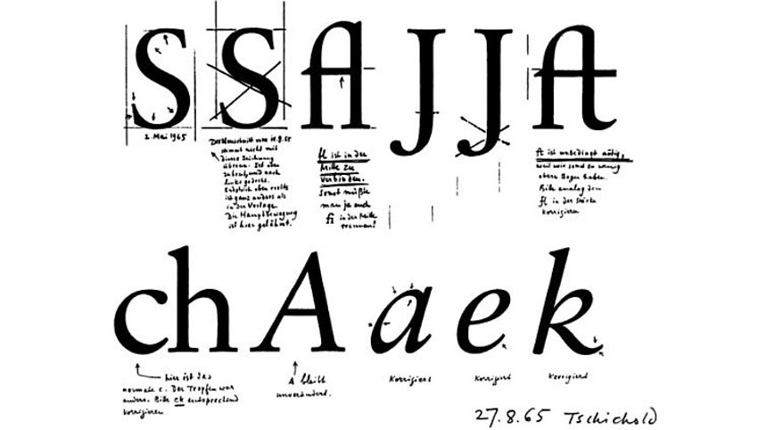
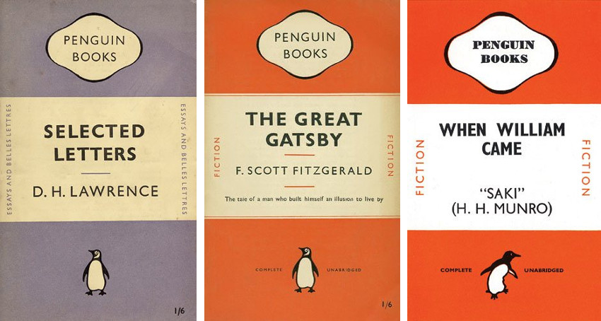
An inflexible character of the mild-mannered man brought a storm to undisciplined English typesetting, while Tschichold gave his all to improve the low standards he’d found. The printers were treated as machines more than humans, constantly pressured to produce more. In addition to this, he refined the Penguin emblem and tidied up the horizontally banded covers of the standard Penguins. Each and every of these adjustments was small and hardly changed the existing designs, but the effect was to set new standards for book production in England. These standards were remembered as Penguin Composition Rules. The rules were embodied in a four-page booklet of typographic instructions for editors and compositors. Tschichold was meticulous in detail, and the guidelines addressed all the important aspects of book design: Text Composition; Indenting of Paragraphs; Punctuation Marks and Spelling; Capitals, Small Capitals, and Italics; References and Footnotes; Folios; The Printing of Plays; The Printings of Poetry; Make-up. For some special editions, the artist brought a distinctive German tradition. The elegant format, the cover with white, bordered titling label centered on a color or patterned background, with the inside pages being laid out with impeccable and traditionally detailed typography. All of the changes were effective, and as soon as the wartime restrictions on paper were lifted, Tschichold was able to replace the grayish stock with something more cream-tinted. Lane’s wishes were coming true – a quality product was made for a ridiculously small amount of money.
Ordinary customer was able to get a quality product for a small amount of money
Is Typography Art?
The early years of Enlightenment in Europe, around 1700, marked the beginning of typography, when its process began to differentiate from the ordinary printing. So, what is typography then, can it be considered as art, and can Jan Tschichold be described as an artist? In short, typography is a visual component of the written word, and deep in its core, it serves a utilitarian function. However, the aesthetical component isn’t separable. When it comes to art, it’s all about the emotions. If a piece fails to evoke an emotional response, it simply isn’t art. Finding emotions in typography is undoubtedly difficult, but that doesn’t mean there are none. It simply means that typography primarily addresses the subconscious, so it’s harder to detect the feelings. They are there, without a doubt. So, yes, typography is art. And yes, Jan Tschichold is an artist. In fact, he’s one of the greatest in his respective field.
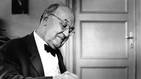
Featured image: Jan Tschichold - portrait, image via pmcinto5files.wordpress.com
Can We Help?
Have a question or a technical issue? Want to learn more about our services to art dealers? Let us know and you'll hear from us within the next 24 hours.
