
Being a data scientist and a self-proclaimed data visualization expert, I like using log scale graphs when I find them appropriate. However, as a speaker and a communicator, I refrain from using them in presentations as much as possible. From my experience as a data visualization lecturer, I noticed that even “technical” struggle grasping the concept of log scale graphs.
One of the Coronavirus side effects was the introduction of the term “exponential growth” to every living room. Naturally (to some of us), exponential growth is best presented using a semi-log graph, where the X-axis represents the time (linear), and the Y-axis represents the degree of magnitude of a value (log scale).
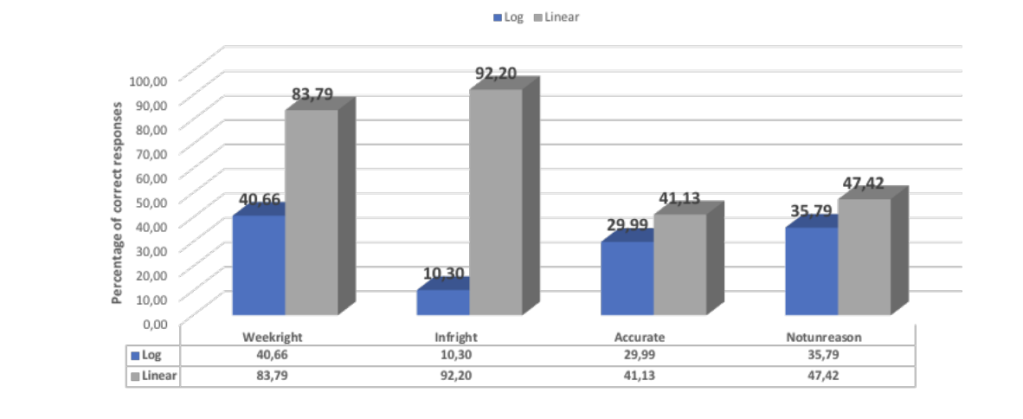
A recent study (link) tested and demonstrated how bad log-scale is. The research title is “The Logarithmic Scale Misinforms the Public and Affects Policy Preferences.” From my experience, log scale graphs misinform everybody. Except for experienced data scientists. Nothing can confuse or misinform us, obviously 😉
It is a bummer though that data visualization in that paper sucks so much.
Thanks to Bella Graph who pointed me to the original study.

1 comment