If you make the area of each nation proportional to its share of world GDP, this is what you get:
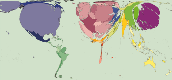
This is a pretty realistic picture of how markets view the world. Markets are mmutilitarian and care about maximizing the sum of market dollars. They care less about the entire continent of Africa than they care about single states in the USA. This is why markets devote many times more resources to developing medicines for the pets of people in the fat countries than for the tropical infectious diseases that kill the most people.
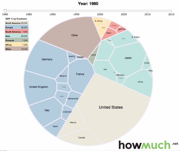
Here is another example from cost estimating website HowMuch.net that squishes GDP areas into geometric shapes that make it easier to compare sizes.
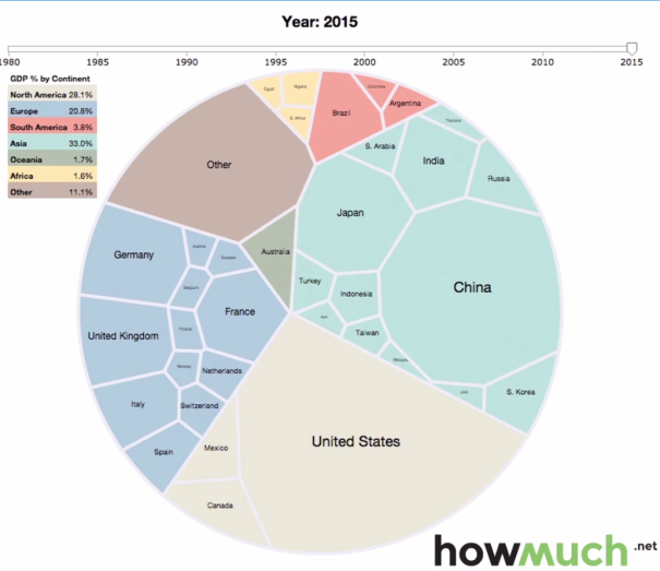
Look how much things changed since 1980:
Usually we care more about people than about dollars or areas of land and this map shows where most people live:
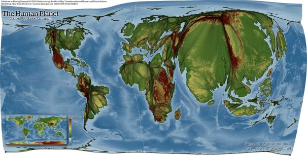
The map is created by covering the world in a grid and then adjusting the size of each area to represent the population. In areas where the population density is low, the grid-lines get all compressed together into thick black lines that represent a lot of land without many people. The color spectrum represents altitude. Notice how much of the population of the tropics lives at very high elevations, particularly in Mexico, West Africa, South America, and Central America. Much of the rest is on islands in the Caribbean and in Southeast Asia. This is because elevation and sea breezes help cool the climate in tropical areas. Most of the rest of the tropical population is in India and China which is due to the productivity of rice cultivation in lowland regions. Population growth in lowland West Africa developed in recent centuries and I believe that it too may be due to the development of rice cultivation.


[…] This map could still use work to make it more useful. For example, compare its representation of the US population distribution to the more accurate map above of just the US population that Worldmapper produced. Alaska hardly has any people in it, but it is ridiculously inflated in this Worldmapper map of the world, and the eastern US should be a lot bigger than the Great Plains and intermountain west. Benjamin Hennig has also created another version that more accurately shows population distribution within nations too. The one below shows how rivers run through the peoples of the world, and I also posted an even more beautiful version showing elevations on another post. […]