This guide was originally written by the user Clawgrip on the CBB forum, with a small contribution from the user Salmoneus. It has been reorganized, edited, condensed, and supplemented for its presentation here.
There’s a new and improved guide! If it’s your first time here, the new guide is strongly recommended: it’s much shorter, more beginner-friendly, clearly demonstrates every step, and is designed to produce better results.
This guide is better as a supplemental deep-dive that thoroughly explores design possibilities and real-life examples.
Contents
Step 1 Decide how your script works
1.1 Type of writing system
1.2 Glyph set
1.3 Writing direction
Step 2 Choose an aesthetic
2.1 Basic letterforms
2.2 Graphical motifs
2.3 Graphical constraints
2.4 Effects of physical media
2.5 Effects of practical usage
Step 3 Refine your design
3.1 Proportions: width and height
3.2 Ascenders and descenders
3.3 Structural alignment
Step 4 Choose a typographical style
4.1 Line thickness
4.2 Serifs
Full script creation demo
Introductory Videos
If you want a quick video summary first, the YouTubers Artifexian and Biblaridion have great introductions. It’s still highly recommended to read the full guide. It goes into more depth and examines many real world scripts and what they teach about good script design.
Artifexian – Creating a Writing System
This wonderful introduction is not exactly a how-to procedure, but he quickly and easily covers a lot of info and advice to help you create a script.
Biblaridion – Writing Systems
Excellent information and guidance. He approaches it as a language-construction and worldbuilding project, so it involves many details that are fascinating but not relevant for simpler projects. He also uses more technical terms.
Step 1: Decide how your script works
To create a script, you must first decide three basic aspects of how it works:
1.1 Type of writing system
1.2 Glyph set
1.3 Writing direction
What’s your goal for creating a script? Is it for a fictional world, or to protect secret notes, or to write quickly and conveniently? The purpose is important to keep in mind as you design your script.
1.1 Type of writing system
If this is your first script, it’s easiest to create an alphabet or a type of writing system used in a language you’re familiar with. If you’re unfamiliar with these options, see the types of writing systems page.
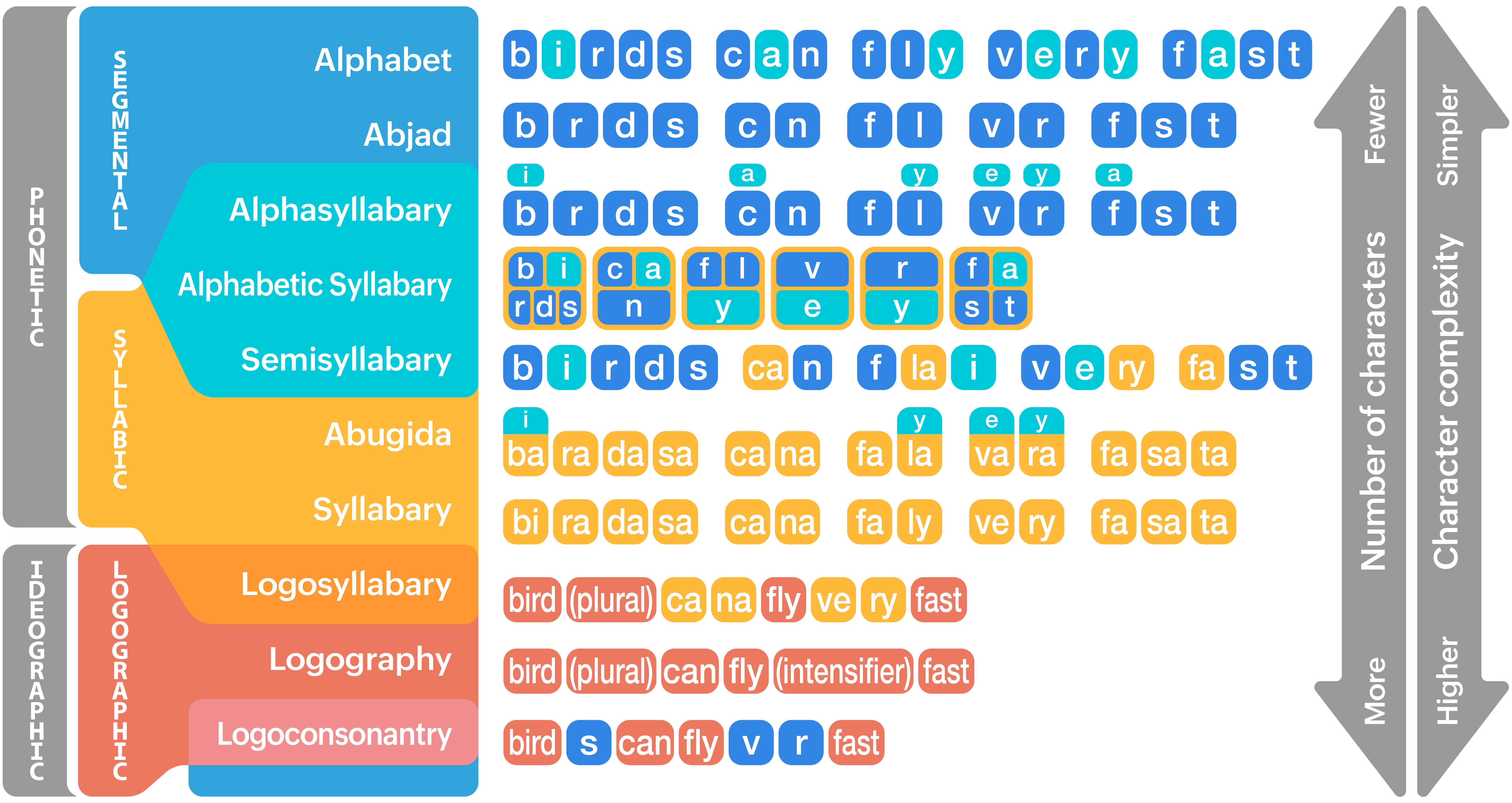

Consonants
Characters for sounds produced by varying constrictions of the vocal tract.

Vowels
Characters for high-sonority sounds. Usually the core of a syllable.

Syllabograms
Characters that represent at least one consonant and one vowel. Commonly one consonant then one vowel.

Logograms
Characters that represent words or word segments. Writing is compact, but has more complex and numerous characters.
Tips for designing other types of scripts for English
Alphabets work well for English; other aren’t so well suited. If your script is for a different language or a conlang, it’s recommended to pick a type that suitable for that language. But if you’re determined, you can hack any combination of language and writing system. Here’s how it can be done for English:
Abjad
Without vowels, English will have lots of ambiguity. For example, the words bad, bed, bid, bead, bide, and booed won’t be distinguishable. It’s a poor fit for English, but the similar alphasyllabary works fine.
Abugida or Syllabary
It’s not feasible to make a glyph for each of English’s 15,000 different syllables, but a syllabary or abugida can work using imprecise transcription. For example, using Japanese Katakana to write quick brown fox in English is rendered as kuwiku buraonu fokusu.
Alphasyllabary
This works well for English. You can think of it as an an abjad with vowels as diacritics or consonant modifications, as an alphabet where vowels are placed above or below or inside consonants, or as an abugida with no inherent vowel.
Semi-syllabary
This is basically an alphabet plus an arbitrary number of syllabograms—ideally for the most common syllables—so it works well for English.
Alphabetic syllabary
By its alphabetic nature, it works well for English. But be aware that English sometimes has more phonemes in a single syllable than Korean’s upper limit of five.
Logography
Logographies work well for analytic languages like Chinese, and not as well for synthetic languages like English. But you could do a Japanese-style mixed system with logograms for content word (like nouns, verbs, adjectives) and a supplemental phonetic script for function words (like articles, prepositions, conjunctions) and word inflections (pluralized nouns, conjugated verbs, and so on).
You’re not limited to these options: you can mix or blend different types, add logograms for common words, or experiment with new ideas.
1.2 Glyph set
Figure out how many glyphs your script will have and what sounds, words, or functions they represent.
Beginner tips
If you’re new, there’s no shame in making a simple cipher: one glyphs to substitute for each letter of the English alphabet. Depending on your goal, this might have downsides:
- If your script is designed for secrecy, it will prevent people from reading it at a glance but it is still very easy to decode.
- It’s unrealistic in a fiction. However, a basic cipher can also be desirable because it’s more accessible to casual fans.
- It will import all the illogical inconsistencies of English spelling. However, that that makes it easier to learn than purely phonetic spelling.
Here are some things you can do to spice up a simple cipher. These sorts of changes obscure English spelling, which makes it harder to decode, and are a gradual path to more advanced glyph inventories.
- Omit redundant letters: ⟨c, q, x⟩ can be spelled with ⟨k, kw, ks⟩ respectively.
- Add new letters for sounds that don’t have their own letter in English, like the digraphs ⟨th, sh, ch, ng⟩, or all the different vowel sounds.
- Add new letters for common letter combinations, like ⟨st⟩ or ⟨sp⟩.
- Replace doubled letters with an accent over one of them. For example, you might write letter accent as ⟨leṫer aċent⟩.
- Add glyphs for common words, like the or and.
Don’t feel obligated to create capital and lowercase versions of each letter. Most non-European scripts lack letter cases. And if you do have two or more cases, you can be creative about what they’re used for. For example, German capitalizes all nouns no matter where they are in a sentence, and Japanese has a whole different version of its syllabary just to write foreign names and words.
Advanced tips
If you’re making a script for a constructed language, the script should suit the phonology of that language. Otherwise, you can use the basic English phonology. You can learn more about phonetics on the Phonetics and IPA page.

You’re not obligated to create a cipher of IPA. You can create letters for specific affricates or diphthongs, or merge letters that would rarely create ambiguity, like /θ, ð/ or /s, z/. You can sprinkle in a few logograms for common words, or glyphs that indicate grammatical inflections like pluralization, definiteness, tense, and so on. You might write the mice ran as mouse.PL.DEF run.PST. You’re the creator and you can tweak it however you want.
If you’re making a logographic script, you must assemble a semantic set in analogy to a phonetic set. This is beyond the scope of this guide, but it’s similar to the process of creating vocabulary for conlangs, so you can research their methods. Consider doing this piecemeal because logographies can require hundreds or thousands of different glyphs.
1.3 Writing direction
Scripts can be written in a varety of directions, meaning the direction of a single line of text and then how those lines are arranged. Choose a direction early; it affects the shape of your glyphs and how they fit together.

Left-to-right rows
Top-down arrangement
Most of the world’s scripts are written in this direction, including the Roman alphabet which you’re reading right now.

Right-to-left rows
Top-down arrangement
This is used in Middle Eastern scripts such as Arabic and Hebrew, along with many ancient scripts associated with that area.

Top-down columns
Left-to-right arrangement
This is used for some scripts, such as Mongolian and related scripts.

Top-down columns
Right-to-left arrangement
This is the traditional writing direction for East Asian languages like Chinese, Japanese, and Korean, so that the right hand could write while the left hand unrolled a scroll. Nowadays, they generally write left-to-right, top-to-bottom due to Western influence.

Bottom-up
Whether we’re talking about the direction of vertical lines of text or the arrangement of horizontal rows, the bottom-to-top direction is extremely uncommon. But there are real-world examples, like Ogham and ancient Tifinagh.
If you’re designing your first script, it’s recommended to use one of the simpler writing directions mentioned so far.

Boustrophedon
The text direction reverses with each line. In some cases, the glyphs are mirrored too. In other cases, they’re rotated 180° because the scribe rotated the whole writing surface for each line.
For practical reasons, no modern scripts are written like this. But that shouldn’t stop you if you want to use it in your script, especially if it’s supposed to be ancient.

Overlapping diagonals
The Nastaliq form of Arabic, which is standard for writing Urdu, is written horizontally in overlapping diagonal lines. Connected letters slope downward (right-to-left), and new words start above the end of the previous word.


Variable directionality
Many scripts could be written in more than one direction. Ancient Egyptian was most commonly written right-to-left, but could also be written left-to-right or top-to-bottom, with the glyphs mirrored for left-to-right writing. Modern Chinese and Japanese are frequently written both in rows left-to-right and in columns right-to-left.

Mixed directionality
Some scripts are written in more than one direction at the same time. Many Mayan inscriptions are written left-to-right, but only for two glyphs before starting a new line. So the writing direction is effectively a zigzag: left-to-right for two glyphs, top-to-bottom columns, arranged left-to-right. Sumerian Cuneiform was similarly written with mixed directionality. Phrases or sentences were written horizontally left-to-right within cells, but the cells were arranged vertically.

Syllable or word blocks
Some scripts write syllable or words in a simple direction, but the syllables or words themselves are formed from a complex arrangement of letters or ideograms. For example, Hangul (Korean) classifies letters as initial (I), medial (M), or final (F) and arranges them into square syllable blocks.
Many Chinese characters are compounds of other characters arranged into a square block. For example, the character 鏡 is derived from 金 and 竟, the latter of which is made from 儿 beneath 音, which in turn is made from 立 and 日.


Step 2: Choose an aesthetic
So far, we’ve picked the type of writing system, the glyph set, and the writing direction. Now we can begin to work on what the glyphs actually look like.
This is a creative project. You need to design your aesthetic on your own, but there are concrete suggestions and numerous examples of real scripts to inform your design choices. This is covered in five parts:
2.1 Basic letterforms
2.2 Graphical motifs
2.3 Graphical constraints
2.4 Effects of physical media
2.5 Effects of practical usage
2.1 Basic letterforms
You can dive straight into drawing your glyphs if you’re inspired. But if you’re not sure where to start, you can imitate the natural evolution of writing systems.
The earliest writing systems—proto-writing—were pictographic, and evolved into ideographic and logographic systems. From there, smaller subsets of glyphs were often used for the phonetic value of the words they represent, forming the first alphabets, syllabaries, and so on. Scripts become more abstract as they evolve further. For example, the capital letter A originates from a glyph of an ox’s head, although it was rotated during its evolution.

The familiar Roman alphabet traces its origin all the way back to ancient Egyptian hieroglyphs. Phoenician, the second last row, was written as a boustrophedon with alternatingly mirrored letters, which is why they appear backwards.
This image leaves out some steps, along with many other descendant scripts like the Cyrillic alphabet.

Writing is known to have been independently invented about half a dozen times, and Chinese oracle bone script is one of them.
The bottom two rows, traditional and simplified Chinese, are both still used. The former mainly in Taiwan and Japan, the latter in mainland China. The Japanese syllabaries also evolved from these characters.

Cuneiform is another independent invention of written language. It gives a good demonstration of how glyphs can be rotated due to changes in writing direction, and how the reliance on pictoral representation diminishes in favor of simpler abstract glyphs.
To apply this approach, begin with simple drawings. You can draw whatever you want, but in natural scripts the subjects tend to be basic everyday things like tools, body parts, animals, figures, or places. To decide what to draw, you can use the rebus principle, where the word for the pictogram matches the phonetic value of the glyph. For example, a pictogram of a dog might evolve into the /d/ glyph.
When you have enough basic drawings for your glyph set, make simpler versions of them until they look like letters.
Here’s an example with eleven characters:

This is just a starting point. It looks bad because it’s full of beginner mistakes. There’s no consistency or guiding aesthetic. Every letter looks like it was designed separately with no relation to the others, so it looks like a collection of random clashing shapes.
How can we fix this? There are many possible solutions depending on how we want it to look. We can learn from real world scripts to inform better design, and to turn this flawed starting point into something nice.
2.2 Graphical motifs
Each script has graphical motifs (shapes, lines, angles, and so on) that appear throughout different glyphs. This makes the glyphs feel similar, even though they’re different enough to be easily distinguished.
Your choice of graphical motifs will determine the look of your script, both of the individual glyphs and the texture of your script as aggregate text.
Let’s look at some examples:

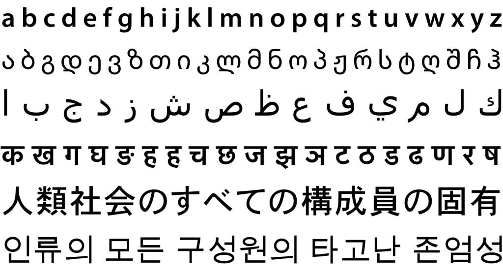
Roman lowercase letters are mostly built from a combination of vertical lines and circular arcs, sometimes with short straight horizontal or diagonal lines. The diagonal angles differ slightly, but they’re roughly parallel.
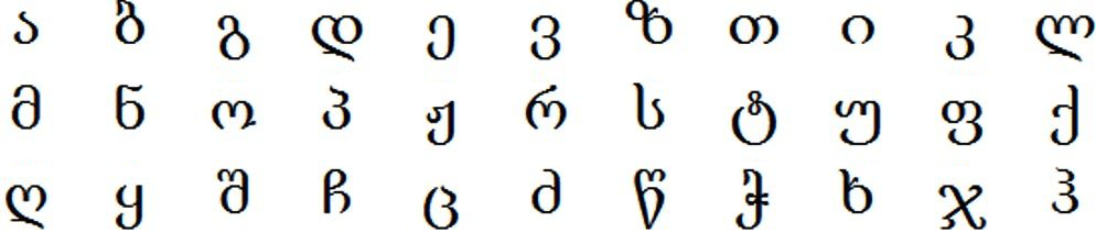
Georgian is similar to Roman, but has fewer vertical lines, many more curves, and very few hard corners.

Odia letters mostly have rounded tops. There are also a lot of circles, n-like shapes, and angled or very short straight lines.

Thai letters have a small circle or two attached somewhere. Also, every letter has at least one straight vertical line in it, and most have two. And similar to Oriya, most of them have rounded tops.

Arabic has many large cup shapes, small vertical hooks, and lots of dots.

Chinese has many straight vertical and horizontal lines, as well as gently-curving diagonals. There are no circles or arcs, but corner strokes are often rounded.

Glagolitic has circles and triangles everywhere—stylized as squares and triangles in this particular typeface—but oddly no letter that is just O or Δ.

Devanagari has a distinctive horizontal bar above most of its characters that joins adjacent characters within words. There are often vertical bars descending from this line, and a balanced mix of gentle curves and sharp corners.

Egyptian hieroglyphs are complex, but still have common patterns. The level of complexity is fairly consistent, all human and animal glyphs face the same direction, and most glyphs are fully enclosed shapes.

Mayan glyphs have blunt curves. Most shapes are squarish, but rounded off. As a result, there are few real circles in Mayan, and all that do exist are small.
2.3 Graphical constraints
Graphical motifs help make scripts feel uniform and cohesive. Constraining the shapes that are allowed is another approach to unify an aesthetic and to achieve cohesive yet distinct glyphs.
In an aesthetically cohesive script, most glyphs share certain graphical features, while few glyphs have unique features. It’s okay to have a one or two with characteristics that aren’t found in any other glyphs, like the bottom hook in ⟨ɡ⟩ and ⟨j⟩ or the hook on ⟨Q⟩, but generally you should limit the unique elements. The script will lose visual cohesion if there are too many.
Let’s look at more examples:

Buginese, also known as Lontara, has exclusively diagonal lines: no vertical or horizontal. The script has no curved lines, but all corners are rounded.

Futhark has no curves. All strokes are completely straight lines. It also entirely lacks horizontal lines.

Khmer has many small hooks, as well as flat M‑like shapes on the tops of letters. Some letters also have W‑like shapes on the bottom. Although these shapes are diagonal strokes, the script lacks longer diagonal strokes that cover the height or width of a character.

Tibetan has many elongated descenders and many curves with one end lower than the other. Many letters have horizontal lines on the tops, but horizontal lines are otherwise very rare. The most likely locations for non-top horizontals are instead occupied by the lopsided curves.

Hiragana, one of the syllabaries of Japanese, has relatively few straight lines, mostly favouring curves.

Javanese never allows an entirely vertical line on the left side of a letter; it always curves in at the bottom. It’s also rare for a single vertical to occur on the right side; usually there are at least two verticals close together.
Applying these principles
Let’s revisit the example script from earlier:

Can you apply any of the previous patterns to this? Do any consistent principles seem to guide the formation of the characters? The answer is no, but we can improve it by applying graphical motif patterns like we’ve just looked at:
Graphically unified version A

Horizontal lines now only exist on the top, diagonals are roughly parallel, and curves have consistent radius and endpoints.
Graphically unified version B

Curves are mostly removed but corners are all rounded, and diagonals are all roughly parallel.
Both versions still have problems, but they’re more unified than before. There’s at least some aesthetic behind their design. Most glyphs look somewhat related. There’s hope for these scripts yet.
This is a creative process, so you get to pick which rules to apply, what to keep, and what to eliminate. These are not requirements: just consider this guide’s advice and apply what you think is appropriate for your script.
2.4 Effects of physical media
In real scripts, graphical motifs and constraints are not chosen arbitrarily. There are also practical reasons for shapes to be favoured or excluded, often because of limitations of the physical medium on which the script is written:

Incision, such as carving on wood or stone, tends to produce angular scripts with straight lines because curves are harder to incise. Futhark and Ogham are examples. This is not always the case, though; plenty of incised scripts have curves, including Brahmi, Ikshvaku, Egyptian hieroglyphs, Kharosthi, Gupta, and even the Roman alphabet.

Contact methods, such as burning, branding, or pressing a stylus into soft clay, are likely to use few shapes repetitively so that only one impression tool is needed. Cuneiform uses a wedge-shaped stylus.

Brush strokes are able to have curves, but struggle with sharp angles, dots, and to a lesser extent with fine detail in general. It’s also harder to keep things separate because the brush tends to drift over the page unless intentionally lifted.

Materials with a grain, such as wood or leaves, can have several effects on glyph shapes. Some materials favour straight lines along the grain because it’s weaker and easier to incise, or perpendicular so it isn’t deflected along the grain. Writing along the grain can damage some material.
Several South-Asian scripts were written on palm leaves on which straight lines could tear the material, so most letters are highly curved. Similarly, lines that cross one another were discouraged because it could tear the material.

Quill pens and similar writing tools make certain movements difficult. Quills are inherently directional because writing against that direction can break the quill. Traditional Roman handwriting is always written from the top of each letter, and curves are used to return to the top or to move to the left whereas straight lines can be used to move right or downward. Pen-like writing tools that can write in long, continuous strokes might also promote quick, flowing writing like cursive.

Movable type encourages uniform heights and discourages fine detail due to limitations of casting metal type, but it can also enable details that would be difficult or tiresome to routinely write by hand, such as serifs.
The physical medium also influences the letterform style. Carving or imprinting will favour uniform stroke widths, and carving will also give distinct shapes to the line-ends depending on the tool and material used. Quills tend to give different stroke widths depending on the angle of the stroke, as do brushes depending on stroke speed. When the predominant writing medium changes, the appearance of a script often evolves to adapt.
2.5 Effects of practical usage
When you sit down and design a script, it’s surprisingly easy to forget that most scripts are meant to be written. Writing things by hand can have significant effects on a script’s appearance. For everyday usage, complex strokes tend to get simplified.
Consider the purpose of your script. If it’s an epigraphic script—used infrequently for decorative or ceremonial inscriptions—then practicality is less of a concern. Egyptian hieroglyphs were an epigraphic script; scribes wrote it very carefully to ensure that it was visually pleasing, so any conceivable shape could be faithfully rendered.
But for daily use, they wrote less carefully. Details were abbreviated, unnecessary distinctions were merged, and the script was simplified as it evolved into Hieratic and Demotic:

This isn’t unique to Egyptian. Daily, handwritten scripts can get very simplified, streamlined, or reduced to basic elements:

So ask yourself: If your script is intended to be written by hand, can it survive being written by hand? If different glyphs become indistinguishable when written quickly, here are three ways you can adjust the design:
- Avoid designing glyphs that are too similar in the first place.
- Differentiate glyphs that are too similar.
- Distinguish similar or identical glyphs with diacritics.
To determine which strokes are likely to get simplified or merged when written by hand, write your script quickly many times and see if any elements are annoying or difficult to get right.
Differentiate similar glyphs
- Avoid letters that are identical except for their width or proportions.
- Avoid letters that are distinguished only by a sharp corner versus a curved corner, such as ⟨∩⟩ and ⟨Π⟩. These similar glyphs could coexist, for example, if ⟨∩⟩ is written with a single curved stroke and ⟨Π⟩ is written in three straight lines.
- Go easy on spirals. If they’re too complicated, they’ll probably get simplified. Among real scripts, it’s rarely more complex than ⟨6, ១, ಲ, ಾ⟩, though there are more extreme cases like ⟨இ⟩.
Look at this example of closely-related scripts from the Philippines. Curves are exaggerated into wiggles. Another example is how the number ⟨7⟩ is sometimes written with a line through the middle to distinguish it from ⟨1⟩. Be aware that adding distinctiveness to one part of the glyph can detract from another part’s distinctiveness.

Distinguish glyphs with diacritics
When glyphs are too similar, another solution is to make them identical but add disambiguating diacritics. In Arabic, numerous letterforms merged, so dots were added to distinguish them. Cursive Cyrillic also does this sometimes with a bar above or below certain letters.
Applying these principles
In the original example script, the first and last glyphs were unrealistically similar. In version A, the differences were exaggerated, but in version B they became identical. To distinguish them, we’ve added an extra mark beneath the first one:
Original version

Graphically unified version A

Graphically unified version B

Step 3: Refine your design
By this point, we’ve got a serviceable script, but we want to push it to the next level of polished design. This might seem intimidating, but we can approach it in three parts:
3.1 Proportions: width and height
3.2 Ascenders and descenders
3.3 Structural alignment
3.1 Proportions: width and height
One obvious problem with the sample script is that the letters vary in size. There’s no consistent height, width, or underlying structure. There are many solutions to this.
There are several proportion paradigms that a glyphs can fit into. We’ll look at examples for horizontal scripts, since they’re more common. If you’re making a vertical script, just rotate the advice by 90 degrees!

Constant height and width
This is a simple and visually uniform solution. Although many such scripts are aesthetically pleasing, it can be difficult to achieve. Examples include Mayan, Carrier syllabics, Santali, Oriya, Chinese, Korean, and Japanese.
Numerous scripts are nearly square, but have small variations in height and width: Hmong, Ge’ez, Canadian Aboriginal Syllabics, Batak, Ranjana, Futhark, Roman capital letters, and others.


Constant height, varying width
This is found in many Indic scripts. Scripts that follow this pattern—ignoring the occasional ascender or descender—include Tamil, Persian Cuneiform, Balinese, Malayalam, Cyrillic lower case, lower case Coptic, and Hebrew. This is probably the most common style, but your script isn’t obligated to use it.

Varying height, constant width
This style is rare, but lowercase Armenian comes close.

Most scripts with variable glyph width have a bell curve distribution of different widths: medium-width glyphs are the most common, while narrower and wider glyphs are less common.
The Roman alphabet isn’t perfectly balanced, and it varies slightly for different fonts, but you can still observe this bell curve of character width:

3.2 Ascenders and descenders
Most of the time, height variation comes from ascenders and descenders: lines or curves that rise above or below the main glyph size. Let’s look at some examples:
Hebrew has only one ascender, and five descenders. Notice that the ascender is the same height as the descenders.

Roman also has ascenders and descenders of roughly the same height. Curved or angled descenders all point in the same direction so they don’t overlap when side-by-side. This isn’t the case for all fonts and written styles. Some distinguish different numbers of ascender and descender heights, but the important takeaway is that most styles are governed by an underlying structure.

Arabic is more complicated. There are multiple different heights, and some glyphs don’t quite hit the mark, most notably ⟨ل⟩. Nevertheless, it adheres to a consistent system of heights.

Khmer takes it much further with a variety of subtly different ascender heights. Still, you can recognize that they all follow a plan. Every ascender of the same type reaches the same height.

Applying these principles
When we adjust the scripts’ proportions a bit, we can get something like this:
Original version
Graphically unified version A
Proportionately balanced version A

The glyphs are now a consistent height, although there are also some ascenders and descenders. There’s also variation in glyph width.
Graphically unified version B
Proportionately balanced version B

Most glyphs here are the same height and width, though the fifth glyph is slightly wider than the others.
It’s a big improvement over the original version, but there’s still more we can do to improve these scripts.
3.3 Structural alignment
We can turn our attention to what’s going on within the home row: the space occupied by most glyphs, not counting ascenders and descenders. We’ll look at how to analyze the structural alignment of elements in this region, then how we can make informed exceptions to this structure for aesthetic reasons.
The ‘home row’ structure is easily seen in the Roman alphabet, due to its relative simplicity and uniformity. Look at the lower case Roman alphabet, stripped of nearly all of its stylistic elements and placed within guidelines as before:

This image has one extra guideline through the middle of the home row. Every horizontal line, intersection, and angle change occurs on a guideline. This rule limits how many horizontal strokes a glyph can contain. Some features don’t align precisely with this line, but that’s due to aesthetic reasons that we’ll get to soon.
All letters with a stroke on the middle guideline have something both above and below them: horizontals, as in ⟨a, g, e, s⟩, or diagonals, as in ⟨k, x⟩. This is not the case in Cyrillic, though, which allows letters like ⟨ь⟩ and ⟨ч⟩ that have an open space above or below. It’s not necessarily a formal rule of the Roman alphabet, but principles like this help tie a design together.
Scripts can be more complex and have additional guidelines. Devanagari, for example, has two middle guidelines and seven guidelines in total:

At first glance, Malayalam appears to follow the same five-line pattern as the Roman alphabet. But on closer inspection, this description doesn’t hold up. For example, why doesn’t the loop of ⟨ഇ⟩ connect to the line below it, since they both rely on the base line to govern their position? Why don’t the loops of ⟨ േ⟩ touch, since their position is determined by the middle guideline? How can this system explain the coexistence of ⟨ദ⟩ and ⟨ഭ⟩?

Malayalam allows guidelines to sort of split in two when two features would otherwise both occupy the same line. In rare cases, especially in older ligatures, these can even be further subdivided:

So you can consider guidelines to not be absolute, and add more when they become necessary.
Exceptions to the gridline structure
Some scripts seem to defy this line-based structure, and there are a few reasons why:
The script is too complex
For scripts like Egyptian and Chinese, there are just too many possible stroke positions to bother trying to align them, not to mention that they can be written both horizontally and vertically. Instead, these scripts rely on a different technique…
Glyphs are centered
Instead of aligning to a base line, like Roman or Arabic, or to a head line, like Devanagari or Tibetan, a script can instead align to a central line. Such a script can get its sense of alignment from a sort of balance on either side of the line, without reference to other glyphs. This is common in vertical scripts. Nevertheless, unless the script is a logography, most glyphs are probably going to have a similar density of strokes.

Horizontal Egyptian text is generally aligned on a central writing line. In Chinese, alignment is not always based on the exact center of the character, but on the perceived visual center based on the weight and shape of the strokes.

The writing direction has changed
Sometimes, script direction changes. This happened with Mongolian, but since all the glyphs were rotated along with the writing line, there’s no need to rethink the structure. However, for scripts like Chinese and Kulitan, the glyphs were not rotated when the writing direction changed. Like Chinese, Kulitan glyphs are aligned on a central writing line.

The writing direction is not linear
In the Nastaliq style of Arabic script—which is the default style for writing Urdu—each word is written along a gradually descending diagonal line that often overlaps with the previous one. Parallel guidelines therefore can’t be applied.
Aesthetic reasons
Gridlines explain many patterns, but many scripts make small exceptions. In curved Roman letters like ⟨C⟩, the end points are slightly below and above the head and base lines, and in ⟨g⟩›, the upper circle needs a little extra space to avoid looking cramped. Lines may be nudged out of the way to create a better visual balance.
Specific elements can also take unique heights. For example, if you try to apply straight, horizontal guidelines to the Georgian alphabet, you’ll get a headache because the elements—endpoints, joints, angle changes, and so on—don’t all align neatly on the same horizontal lines. But no glyph has more than two elements within the home row, and every type of element always occurs at the same height. The letters ⟨ვ კ ფ ც ჳ ჴ⟩ all place the middle endpoint slightly above the base line; the middle endpoints of ⟨ლ ო რ უ ღ⟩ all stop at the halfway point of the home row, and the bottom hooks of ⟨ე ვ კ ჟ უ ფ ქ ყ ჭ ჴ⟩ all end at the base line. Also, the presence of a descender shrinks the size of a circle, so, ⟨ფ⟩ has a smaller and higher circle than ⟨თ⟩.
This means that you can define the basic shapes with the guidelines, but you don’t need to follow them rigidly for the final appearance of the script. You can break the rules as much as you want, as long you do it in a consistent or understandable manner.
Other reasons
If you have a design idea that defies this theory of structure, go ahead! Maybe the ascenders of a single letter with multiple ascenders get progressively taller throughout the letter. Maybe glyphs of varying heights stack and are squashed to fit in a consistently-sized home row. We’ve looked at many different script structures, but the possibilities are far broader.
Applying these principles
Here’s how our experimental script can benefit from these lessons:
Version A so far
Structurally balanced version A

This script has been restructured with a single central line, to which strokes are rigidly fixed. Strokes have been rearranged or eliminated as a result.
Version B so far
Structurally balanced version B

This script now has two guidelines in the home row, but the lines are not rigidly fixed to them. Their exact position depends on their surroundings. One letter also has an extra guideline.
These scripts have developed some character and distinction from each other, but they still lack a strong identity. The next step is where you can add real character to your script and finish it off.
Step 4: Choose a Typographical Style
All modern scripts come in a variety of fonts and styles. You can settle on whichever is best for your script. There are two main types:
Print or traditional

This is the most common style in physically printed media like books and newspapers. It generally has more stylization and detail than the modern sans serif style.
Some scripts also distinguish a traditional style that is distinct from the printed style but didn’t make the transition to moveable type for some reason. Chinese is a notable example.
Sans serif
Also known as gothic, which shouldn’t be confused with traditional blackletter. Sans serif has uniform line thickness and no serifs. This is the most common style for on-screen media because it’s easier to read on limited screen resolutions. Some scripts use sans serif as their main style though, such as Odia, Gurmukhi, and even some ancient scripts despite the concept of sans serif didn’t exist back then.
There are many other script styles in the world. Japanese has a calligraphy style specifically for writing sumo wrestling rankings, and another for kabuki signs.
So how do you decide what traditional-style details to put in your script? Usually these are artifacts of the physical medium used to write it, which we discussed in step 2.4.
You need to choose factors like the writing tool, line thickness, nib orientation, and types of serif.
4.1 Line Thickness
There are three options for line thickness: uniform line thickness, variable thickness at a fixed angle, and variable thickness.
Uniform thickness
This is the gothic style we’ve already covered. Although it’s uniform in principle, notice how each of these examples nevertheless has subtle variations in line thickness:

This is often done to counteract optical illusions. For example, horizontal lines are perceived as thicker than vertical lines of the same width, possibly because the human visual field is wider than it is tall. You can often see this in ⟨H, T⟩, where the horizontal lines are noticeably thinner than the vertical lines if you look at it sideways. Curved strokes do this too, but gradually change in width.

Here are some more corrective illusions:
- Lines that converge at acute angles are thinner. If they were really uniform, they’d seem too thick.
- Larger capital letters have thicker lines. This compensates for their greater negative space; if they had the same thickness as lowercase letters, they’d seem too thin.
- Curves on top or bottom slightly overshoot the heights of straight vertical lines. Otherwise, they’d seem slightly too short. This compensates for where the perceived ‘mass’ of the stroke is.
- The vertical stem of ⟨r⟩ is narrower above where the stroke joins than below.
Variable thickness at a fixed angle
This usually results from writing with a pen whose nib is always oriented the same way. The nib is usually horizontal or at a low angle. Vertically oriented nibs are uncommon, though Hebrew and Arabic come close.

The line thickness depends entirely on the angle of the nib and stroke, so the angle you choose will influence the appearance of the script. Small variations are possible if the writer lifts or angles the nib, but not many since doing so is impractical.
Variable line thickness
In this case, line thickness doesn’t depend on direction, but purely on stylistic concerns. This can be due to either a pen or brush that varies width based on pressure or simply aesthetic preferences in carefully written script.
There are many examples of variable line thickness styles:

- Armenian
Although it’s nearly a fixed angle style, you can see that angled strokes aren’t wider than horizontal strokes as you’d expect in a fixed-angle style. Look at the angled tops and bottoms of ⟨ա բ ե⟩, the inner curves of ⟨գ զ⟩, the inner parts of ⟨թ Խ⟩, and the rotated orientation of ⟨Հ⟩. It’s basically a fixed-angle script with aesthetic alterations.
- Roman
The Roman alphabet mostly forbids thick horizontals. It also forbids directly adjacent straight verticals and diagonals from having the same width, as in ⟨A, M, N, V, W⟩. Rounded strokes are always thick on the vertical and taper to thin on the horizontal.
- Tamil
Tamil follows a similar design principle. The left stroke is thin and the right stroke is thick. These alternate, like Roman, and curves follow their own patterns. Javanese has an even more exaggerated alternation between thin and thick vertical strokes.
- Chinese
Lines begin thick where the brush is pressed to paper, then thin as it’s dragged along. Sudden changes in direction also start thick before reorienting and thinning.
You can do whichever line style you want. As long as you’re consistent, your script should look good.
4.2 Serifs
Serifs are small elements on the ends of strokes, generally a small triangle or rectangle. They originate as artifacts of the physical writing process, but become a standard part of the aesthetic. They can even get conflated with line shape and evolve into fully fledged lines over time.
Serifs can add a considerable sense of realism and sophistication to your script.

Notice the various repeating serifs, and the various types of serif within a single script. Look at these two:

In the first sample, Bhaiksuki, the top line—equivalent to the top line of Devanagari—has become a triangle. The entire stroke is dominated by its serif, obscuring the distinction between serif and line shape. Bhaiksuki doesn’t really distinguish top types; there’s only the one triangle, but you can see that the closely-related Tocharian below it has four distinct top serifs and two bottom serifs.
We’ll discuss two cases of serifs in particular: Roman and Chinese.
Rules for serifs in Roman capitals
- Vertical and diagonal endpoints have horizontal serifs on both sides of the endpoint.
- Horizontal endpoints on the top or bottom have one vertical serif pointing inward: ⟨E, F, L, T, Z⟩.
- Horizontal endpoints in the middle have two vertical serifs pointing up and down: ⟨E, F⟩.
- Corners formed by two diagonals don’t have serifs: ⟨A, M, V, W⟩.
- Corners between a vertical and a horizontal or diagonal line have a single serif pointing outward. Some fonts lack this serif for the bottom-right corner of ⟨N⟩, and ⟨G⟩ is usually an exception to this.
- Verticals ending in a curve have a ball-shaped serif inside the curve, as in ⟨J⟩ and many lower case letters.
- Curved endpoints have one vertical serif that usually points outward: ⟨C, G, S⟩.
Rules for serifs in Chinese characters

- Vertical top endpoints have wide, angled serifs.
- Horizontal left endpoints have a narrow, angled flare.
- Horizontal right endpoints have a thick ovoid, which is noticeably raised above the main body of the line and usually expands below too. If another stroke extends down from it, the serif extends somewhat along the downward stroke.
- Downward right-to-left strokes and upward left-to-right strokes, including short dot-like strokes, have a hook-like serif on the top or left side and taper off at the other end.
- Downward left-to-right strokes, but not dots, end in a distinct triangle-shaped flare.
- Downward left-to-right dots become thick and rounded on the bottom right end. In box-like shapes, the outer verticals extend slightly below the bottom horizontal, but any in the middle do not. In some fonts or in handwriting, the bottom horizontal in the character ⟨口⟩ can sometimes extend to the right instead of the right vertical extending down.
- Bottom-hooked strokes, as in ⟨永⟩ and ⟨滅⟩, usually become slightly thicker around the hook.
Full script creation demo
With the addition of typographical style and serifs, we’ve completed the process of improving a terrible starting script into fairly cohesive and distinct scripts. Some turned out better than others, and some might need more tweaking, but the improvement shows how powerful the principles we discussed are.
Original version
Graphically unified version A
Proportionately balanced version A
Structurally balanced version A
Final typographical versions of script A


Graphically unified version B
Proportionately balanced version B
Structurally balanced version B
Final typographical versions of script B


There was no plan for how this script would turn out. At each step in this guide, principles we discussed were chosen and applied. There’s no one way to do this. Just tinker and experiment until you’re satisfied with how your script looks.
With experience, you can do steps 2‑4 more or less simultaneously. After all, when scripts evolve naturally, they don’t proceed through these steps in order; these principles all apply at the same time. They’ve only been separated and organized in this guide for the sake of clarity.
You can see a similar process fully applied to the demo script in the new guide:


One final note about the process of creating and learning: Getting invested in your creations or attaching them to your ego can help drive interest and improvement, but it can also lead to frustrations and discouragement when things don’t go smoothly. Remember to be patient when things don’t turn out well quickly, and keep experimenting and practicing. With every new script, you get better and less invested in each one, which frees your creativity.
The original guide by Clawgrip includes an additional step about how to evolve your script into new scripts or even into a whole family of scripts. This section has not been adapted here yet, but you can view it on the original CBB forum post.
