Wistly
The Brief:
Wistly, the next Uber for package deliveries, was wrapping up its courier and sender flows to be launched in Fall. As the content designer, I was in charge of identifying and solving inconsistencies, creating new user flows, and establishing the content design of the app.
Role:
Content Design, Product Design
Approach:
Reflect brand voice and tone
Check that content fits in to the user flow
Simplify language for users
What is Wistly’s brand voice?
Casual
Friendly
Modern
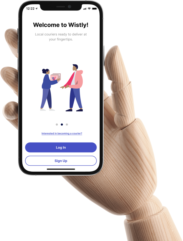
Login Screens
I noticed an inconsistency in the login screens and hopped on to help the team.
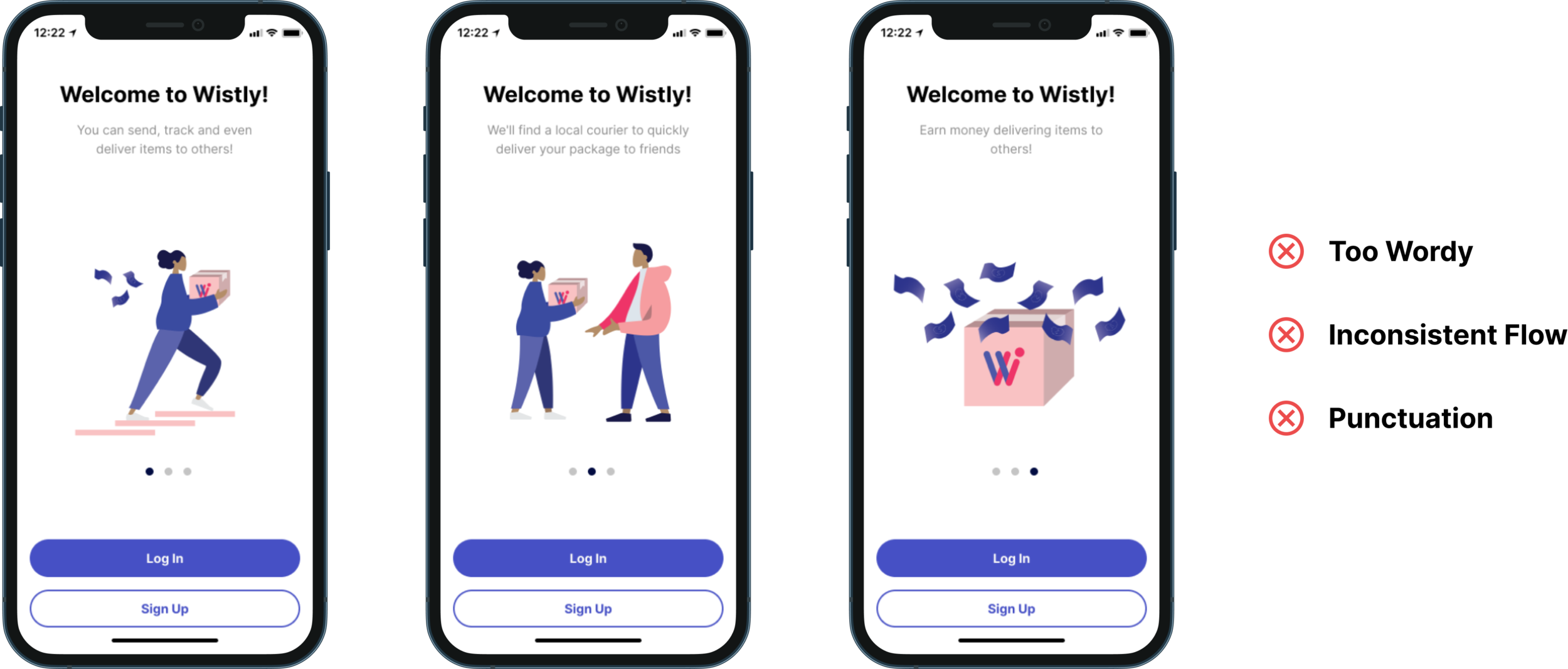
Initial Design
The initial login screens of Wistly were too wordy, had an illogical flow, and misused punctuation.
In terms of flow, the first two screens targeted the sender while the last screen focused on the courier.
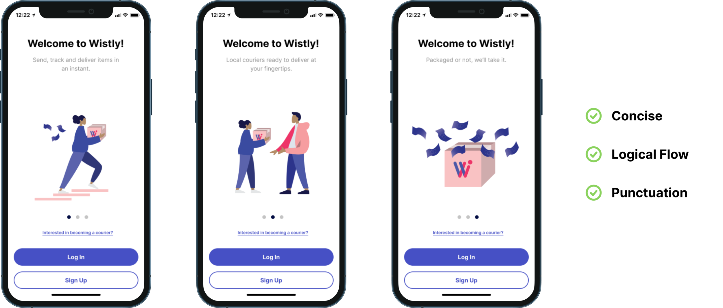
Final Result
To keep it concise and clear, I got rid of unnecessary words such as ‘You can’ and ‘We’ll find’ in the first two screens.
Also, I reworked the content on the third screen to keep it consistent with the sender flow and reflect one of Wistly’s top value prop.
As for punctuation, I kept one exclamation per screen by changing the subhead punctuations to periods in order to keep the tone enthusiastic but focused.
I pitched in the idea to link a separate onboarding flow for couriers through the link under the images.
Onboarding Screens
While reviewing the onboarding flow, I noticed how cluttered the screens were and initiated a redesign.
Initial Design
The initial onboarding screens of Wistly’s courier flow were too cluttered, wordy, and had an illogical flow. At first glance, the information overwhelms the user and does not provide an appealing user experience.

Final Result
I focused on simplifying both the text and modules on the screens to create less noise. I also created an extra screen to disperse the information about becoming a Wistly courier. Lastly, due to potential confusion by the user on Wistly’s location constraint, I created a pop-up documentation that would allow the user to get notified once the app had expanded. The tone of the pop up documentation works to ease the user’s confusion in a light-hearted but succinct way. It brands Wistly’s voice as a friendly courier, always ready to help.

Invite Screens
I was asked to create an “invite a friend” form and “past invites” screen to expand user sign ups.

First Iteration
The first iteration I made of the invite a friend screen struggled to stay concise and consistent in its text. In addition, there was no way to get from the “Invite a Friend” form to “Your Invites”.
Second Iteration
The second iteration I made incorporated fewer words while making the message clearer. In addition I created a new flow that would allow users to access their past invites as well. Lastly, I changed “Invite a Friend” to “Referral” to minimize the usage of the word “invites” in one screen.
Feedback Screens
I was asked to create popup feedback screens for couriers after their deliveries.
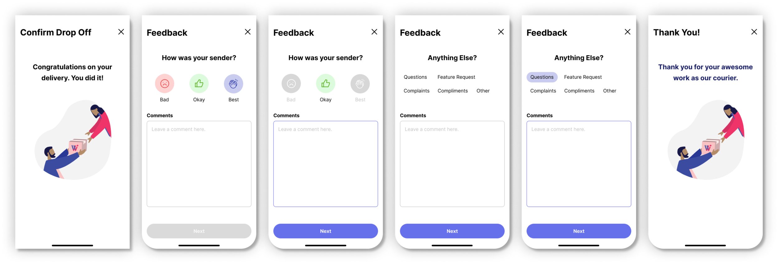
For the feedback screens, I focused on making the questions reflect Wistly’s voice as a local and friendly courier, genuinely curious about the user’s experience. Especially when asking for feedback, it’s crucial that the user doesn’t feel overwhelmed but instead pleased to provide commentary on their experience. Thus, I focused on making the tone approachable and neighborly, just as a friend would ask.