


Arkitektenes fagforbund (AFAG)
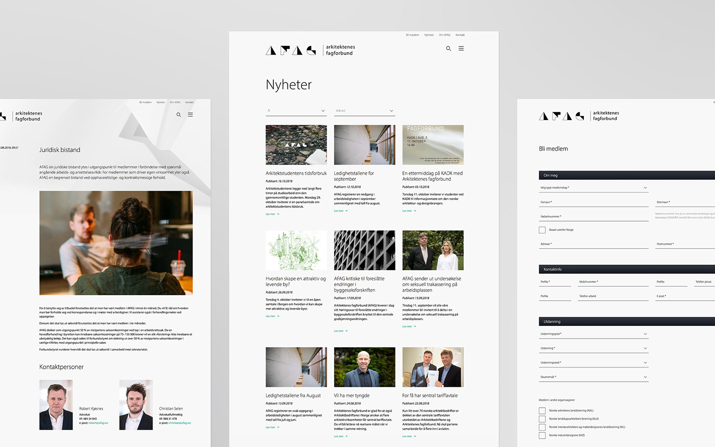
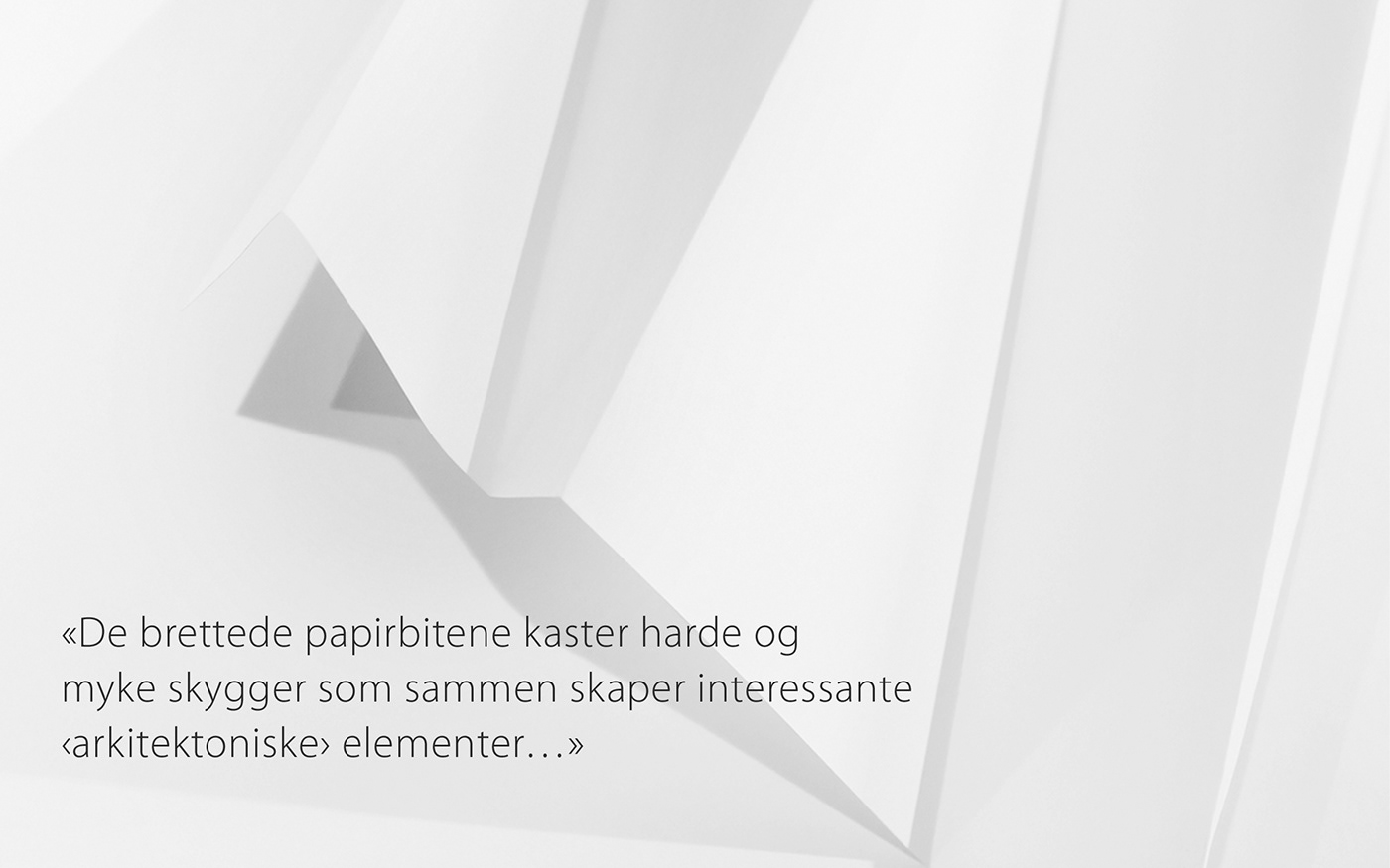
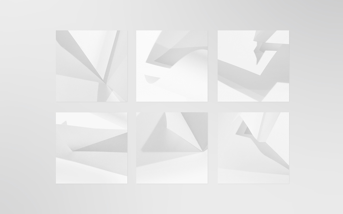
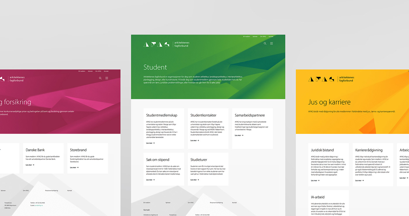
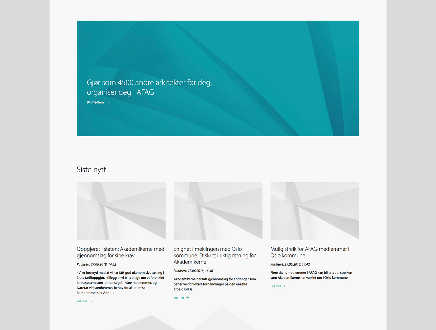
The project was part of a larger renewal process for the union, where we also have been redesigning the logo and visual identity. The logo is based on the concept of cutting and folding paper. Furthermore the abstract structures used on the website as design elements are the result of simple play with paper and light, resulting in clean and light architectural elements.
—
Client: Arkitektenes fagforbund AFAG (the Norwegian Union of Salaried Architects)
Role: Webdesign / Creative-Direction / Design
Discipline: Webdesign
Role: Webdesign / Creative-Direction / Design
Discipline: Webdesign
Team: Freiland Oslo, Medicineheads
—
For more information about this project visit our website Room meets Freiland
To discuss a new project or idea please contact our Project Director Eirik Søderblom


