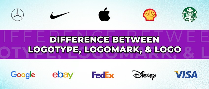
Difference Between Logotype, Logomark, And Logo
Looking to get a logo designed and can’t figure out the jargon? Don’t know why they’re stressing over words that appear to have the same meaning? You are not alone.
We often use a lot of terms interchangeably because of how closely related they are. While it works for us in general discussions, what happens when you encounter technical aspects of the topic?
When it comes to logo designing, it can get confusing when graphic designers ask whether to make a logotype or a logomark.
Without knowing the right vocabulary, you can end up miscommunicating your ideas, and the results can be messy!
So what do these terms mean? Let’s get to it and find out.
What Is A Logo?
A logo is an umbrella term that refers to a unique symbol, mark, signature, or an image used as a brand’s identity. It can have text, pictures, shapes, cartoon, drawing, or all of them as part of it.

You come across different types of logos in your daily life. Some of them have a set pattern, while others don’t. Since logo designing is an art, there are no hard and fast rules to it.
However, over the course of decades, marketers and designers have figured out a few best practices. Along with that, three distinct categories have emerged.
Let’s talk more about them.
What Does Logotype Mean?
A logotype is a logo made out of text or words. It can consist of letters, names, slogan, or tagline. It is safe to say that a logotype is quite similar to a signature.

Word art, fonts, colors, and the way words are placed, all contribute to the visual aspects of your logo, and how people see your company’s name.
For example, soft round edges and colorful letters give an impression of fun and casual attitude, while bold black letters suggest strength and stability.
Although many brands prefer using their full names as logotypes, a great number of companies use their initials only. And that simplifies the logotype to a great degree.
There is a lot you can do when designing a logotype, including wordplay, puns, and visual depiction of the concept by giving the letters a certain shape.
Logotypes have their own sets of pros and cons. And you should know when to use them.
Pros
- Helps create brand awareness.
- Your logo helps people remember your name.
- Room for puns.
- Can’t be mistaken for another company.
- Helps people guess what your business is about.
Cons
- There’s less room for creativity when dealing with text.
- It won’t work for longer names or complex phrases.
- Can’t shrink beyond a certain point.
- Can’t fit everywhere.
- Hard to pronounce words can be disastrous in logos.
Which Brands Need Logotypes
Logotypes work best for newly found startups or brands whose names are not widely known yet. When designed right, logotypes display a company’s name and show what the business is all about.
Apart from these companies, logotypes are good for businesses that deal with a formal audience. Such as law firms, property management, brokerage, and finance companies.
Businesses aiming to establish a classic, historic or more sophisticated image choose logotypes as well. Monograms, motifs, and similar logotypes can give an impression of value or quality.
Dos And Don’ts Of Designing A Logotype
There is a lot that can go wrong with a logotype. Let’s talk about some basic flaws you should look out for when designing yours.
First and foremost, there shouldn’t be too much to read on your logotype. A glimpse should be enough to register everything that’s written on your logo.
Your logo will be on banners, boards, your outlet, roadside, and places with traffic or passersby. A great chunk of them won’t have the opportunity to have a second look or more than a couple of seconds to observe.
Here’s a logotype for example.

While the words Grand Est are clear and most people can read it in the first glance, the line below it can come off as gibberish to many.
It requires a tad bit of focus to read it. In some cases, it can be too tiny to read, while many might not look at it for long enough to read it.
Another reason having too wordy of a logotype is a bad idea is that it won’t be distinct and recognizable in smaller sizes.
If you shrink it to the size of an average Facebook profile picture that appears as an icon beside your comments or posts, and it becomes unrecognizable, you should consider redesigning it.
One more point to keep in mind is that while clear fonts are good for your logotype, it should not appear as plain text and nothing else. There has to be a difference between a typed out phrase and a logotype.
What Is Logomark?
Logomark is a symbol that depicts your brand. It can be a picture, drawing, shape, object, or any form of art that doesn’t include text.

This type of logo is a visual representation of your brand, concepts, or values. It can also represent what you do or offer as a business, just like WhatsApp’s logomark does.

Or it can depict your brand’s unique theme; like Twitter has a bird as its logomark with a baby blue theme. Puma has a leaping puma in monochrome.
Apple has a bitten apple as a logomark. Microsoft Windows has a window divided into four sections as their logomark, and the list goes on.
Pros
- Logomark is easier to recognize.
- People tend to remember the visuals better.
- Logomarks tend to spark an emotional response.
- There’s a lot of room for creativity.
- It can be abstract.
- Resize and scale all you want.
- Design possibilities are endless.
Cons
- There’s a chance of getting confused with another brand.
- Your name might not get as much recognition as the logo.
- You can’t spell out your message, name, or concept.
- Can be misinterpreted.
Which Brands Need Logomarks
Logomarks are the best suit for any brand whether it’s popular or popular, large or small.
If your business is well known and you’re looking to reinforce certain values, concepts, or themes, a logomark will work great.
If you want your audience to truly bond with your brand, a logomark can help you take a step into that direction.
Dos And Don’ts Of Designing Logomark
A logomark can be tricky to design. You have to know what type of images have the potential to get stuck into your target audience’s heads.
There are messages you want to convey through it. And you have a theme you’d like your logomark to align with.
Designing a logo that remains consistent with your brand’s image while conveying the message you want it to, and still be eye-catching is no piece of cake.
But it’s not as complicated as it appears to be. There are a few basics to keep in mind and your logo will do quite well in the market.
The best thing you can do to your logomark is to simplify it. We all feel compelled to add more details and objects into the design because it looks cool, artistic, or creative.
But in reality, however cool your design may be, it won’t fit all places if it’s complex or has too many objects in it, or if it requires too much of a focus to just register the pattern.
While it may be cool and impressive to make a whole sketch in your logo, it may not catch attention at the first glance.
Take this picture for example.

It looks beautiful as art, but it won’t be recognizable when shrunk for an icon. When displayed on a billboard, passengers in vehicles may not fully register it in the split second they glance at it for.
When seen from far away, many details of the picture won’t be clear enough. And the message won’t reach the audience in the given time.
Fewer objects, simpler shapes, bolder outlines, and sharper colors in comparison are easier to recognize, remember, and decipher. Take this illustration of the sun for example.

It speaks louder to the audience than a sketch with multiple fine objects and characters. It catches the attention of onlookers in less than a second. And they recognize it as the sun without any mental effort.
Everything associated with a sun, and it’s cartoon-like drawing pops up in their mind. The emotional; and in some cases, physical; responses are triggered in a glimpse.
That’s one of the main purposes of a logo. And that’s what makes a logomark successful.
There Are Hybrids Too
Remember when I said there are no hard and fast rules for logo designing?
That’s because while logotypes and logomarks are two distinct categories, the lines are often blurred while designing. This results in hybrids.
The logos that don’t fall under either of the two categories or have a bit of both in them are normally referred to as hybrids.
Some logos have both, text and symbol in them. They are either tall, meaning symbol and text arranged vertically; above or below each other.

And some hybrid logos can be wide; which means the text and symbols are placed side by side.
Apart from these, there are more innovative types, where symbols and text are merged to form a whole logo. Like this Wi-Fi logo where the symbol forms the background of the text.

The yin-yang is clear in this logo. You’ll see other types of logos where text and symbols are fused together in a way that text appears to a part of the symbol and vice versa.
All of these and more fall under the category of hybrid. Needless to say, it gives you a lot of freedom in terms of designing.
Pros
- Endless possibilities of innovation.
- Maximum brand awareness.
- Name recognition.
- Best of both worlds.
- Room for visual puns.
- Room for wordplay.
- Reinforcement of the theme.
- Can fit almost anywhere.
- Room for more color and contrast.
Cons
- It can turn out cluttered.
- More objects in the design can reduce the impact of the logo.
- Simplifying hybrids can be tough.
- Text can be hard to read if not designed carefully.
Which Brands Need Hybrids
The best part about hybrids is that they can work for almost all types of brands; whether you’re a startup, midsized business, or an established corporation.
You can promote your symbol, name, and theme, all at once through your logo. Your target audience will be able to recall your name whenever they think of your logo.
If you’re going for a minimalistic approach to your logo design, getting a hybrid logo to match your needs can be tough.
Dos And Don’ts Of Designing A Hybrid Logo
While hybrid logos allow a great deal of liberty in terms of designing, there are still a few best practices to follow. For example, don’t clutter your logo just because you can add more stuff.
Try your best to have no distractions in the design so that focus objects can stand out. Remember, less is more. Treat a person’s attention as a limited resource.
The more elements there are to share it in logo design, the less likely any person is to fully notice, register and remember either of those, and the more cluttered or noisy the logo will appear to be.
Take this picture for example.

While it is all cheery and colorful, there’s a lot of distraction in the background. You can hardly see the smaller fruits and vegetables in it.
There are too many words in there, and you hardly read any of them at first glance.
One more problem with it is that there are a lot of different colors, and they’re all over the place without any sequence or pattern.
While it looks nice as a one-time post for a relevant topic, it is not a great idea to mimic this style for a logo.
A logo should be simple, neat, free of extra distractions, and have a set color pattern that amplifies your brand’s theme. CISCO’s logo is a good example here.

It has clear bold text and a symbol. There are just two colors that create a contrast between the symbol and the text. That makes both of them prominent.
No extra elements to distract the viewer, and no irregular colors messing with the theme. It can be shrunk to any size and it will remain clear, prominent, and distinct.
People can recognize it easily, read it in a glimpse, and it can be distinguished from quite a long distance. It fulfills the basic requirements of logo design.
Variable Logo Design
There are times when you need a logotype, logomark, and a variety of hybrids, all at once to fit different scenarios, places, and requirements.
For example, it can be the case that you have booked a stall in an exhibition, and a wide hybrid fits that place better. Meanwhile, a logomark sits well with your digital profile or the staff’s uniform.
You may as well need a logotype to venture into new markets and create brand awareness.
This is where variable logo design comes into play. A variable or responsive logo design is a collection of variants of the same logo to fit different places and occasions.
A prime example of this would be LinkedIn. It has at least two variations of its logo. Though, both of these can be considered logotypes.

One of these is a wide logo, best for banner ads. And the other is a shorter version that appears to be a blue box containing the last two letters of its name.

This shortened version is perfect as an icon. They use it as their display picture for almost all of their digital profiles.
It is currently used as the icon for the LinkedIn app, and it appears as its symbol on tabs in the web browser.
Another brand that uses responsive logo design is Nike. They have logo variants to be used on different layouts, objects, places, and occasions.

There is a logomark containing just a tick; Nike’s symbol; and then there is a hybrid with the brand’s name on it.

This hybrid can be considered a tall hybrid since the text is placed above its symbol. You’ll see the logomark on most of their products and ads, and the hybrid has been seen on certain places too.
If you plan to run campaigns with a lot of activities on several platforms, there’s a high chance you need variable or responsive logos.
You’ll need them in the long run anyway, it’s better to have them ready in advance even if you don’t plan on running campaigns in the near future.
To Sum Up
We’ve had a lengthy discussion over logos and their types. Let’s sum it up so you don’t miss a point.
A logo is a general term that refers to any image, symbol, or signature used as part of an organization’s identity.
Logotype and Logomark on the other hand are two distinct categories of a logo. There’s a third type called hybrid too.
A logotype is text-based logo design. It is formed mainly by assembling words, letters, or phrases in a unique pattern; much like a signature, but with more options in terms of arts.
Logotypes are often made by playing around with color, font, shapes, sizes, and arrangement of words and letters. It could be a company’s full name or just the initials.
Logomark is more of a visual representation of a brand’s identity. It doesn’t include text. It can be made out of anything and everything; such as shapes, colors, drawings, sketches, objects, or characters.
A hybrid logo is where both, text and symbols are used. It could contain a symbol and a phrase as separate elements, or it can have them fused together to form a design.
Responsive logo designs are variations of the same logo that serve different purposes. A logotype, for example, can be a great fit for a certain platform and audience.
All the while a logomark might fit other places better; like icons and digital displays. And there can be occasions where a hybrid might come in handy, like events, TVCs, or brand awareness campaigns.
Now that you have your vocab in check, feel free to talk to your graphic designer. You will be able to explain your ideas better.
You might as well save a lot of time and energy.
Originally Published at Fullstop360.com/blog.