Download
1 / 24
250 likes | 538 Views
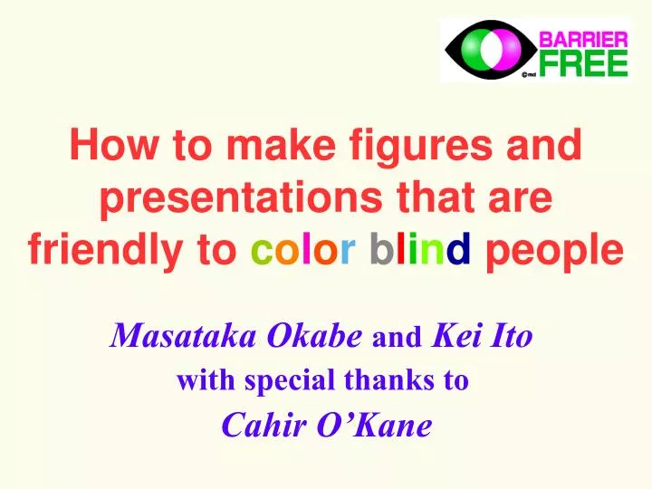
How to make figures and presentations that are friendly to c o l o r b l i n d people. Masataka Okabe and Kei Ito with special thanks to Cahir O’Kane. Type 1 ( protanopes ) and Type 2 ( deuteranopes ) : functional defects in red and green cone cells, respectively.

E N D
How to make figures and presentations that are friendly tocolorblind people Masataka Okabe and Kei Ito with special thanks to Cahir O’Kane
Type 1 (protanopes) and Type 2 (deuteranopes): functional defects in red and green cone cells, respectively. How common is color blindness? One in twelvemales (8%) and one in 200females (0.5%) are red-green color blind. (Asian: 5%, French and Scandinavian : >10%) People with defects in blue cone cells (type 3: tritanopes) are relatively rare (one in tens of thousands.) Red-green color blindness is commoner than AB blood group. There should be around 10 color blind people in the room with 250 people !
protanope (redcone cells defective) deuteranope (green cone cells defective) tritanope (blue cone cells defective) Can color blind people see colors? Do they see everything black and white? non color blind Color blindnessisnot a total loss of color vision. Butcertain ranges of colors are hard to distinguish. Color blind simulator: VisCheck (http://vischeck.com)
Types of color blinds protanope dichromacy deuteranope dichromacy 1% 1% anomalous trichromacy anomaloustrichromacy tritanope 0.001% 1% 5% non color blind 92%
protanope (red) deuteranope (green) tritanope (blue) How can you see this color ? (common question ;-) A typical confocal picture • Double-staining with • redandgreensignals. • Not understandable for color blind people ! Let’s simulate how color blind people see this.
Another problem: recognition of double positive cannot distinguish light yellow from green protanope deuteranope tritanope This appears like…
Not good. Then… 1. Presentgrayscale pictures of each channel. 2. Don’t use red. Use magenta (purple) instead. How can you make double staining understandable both for color blind and for non-color blind people ?
red-green double staining In magenta-green pictures, double positive area becomes white. magenta-green double staining How to convert red channel to magenta? Let’s try with Photoshop.
original red channel �-1 select all �-A copy �-C blue channel �-3 paste �-V all channel �-~ or �-0 How to convert red channel to magenta? REVIEW Just type “� - 1AC3V~” !
protanope deuteranope tritanope “Single labeling should be OK !” not so... Some colors are very difficult to see. (especially red pictures for protanopes.)
when printed • Pure green and red are out of gamut (printable color range). • Subtle gradation will be lost in the published paper. Monochrome is the best for tonal reproduction ! Even if you don’t care about color blinds... Can you convey more information by making it color? If you just want to show what kind of label you used (GFP, Cy3, etc.), a sentence in the figure legend might be enough.
Show grayscale pictures of each channel. (when distribution of each signal is interesting) Show combinations of two channels in green / magenta. (when spatial correlation between channels is interesting) How about triple labeling? Don’t show the combined picture only. Please: green blue red
2. Fail to see some objects.Dark red or magenta symbols and thin linesover black or dark blue background. How about characters and drawings? Four problems that color blind people suffer: 1. Cannot distinguish certain colors.Symbols and lines in:blueand violet;red, orange, yellow, yellow green and green Non color blinds Color blinds 3. Difficult to see emphasized parts.Dark red characters in black text.(For protanopes, dark red appears similar to black…) 4. Very difficult to tell the name of colors.“Recognition of color difference” and “identification of color names” are totally different task.
Colors difficult to distinguish and identify The border of color-name categories is not the same among people.
Example of colors that are easier to identify Red: Avoid pure red (RGB=100,0,0%). Use vermilion(RGB=80,40,0%) or change to orange(RGB=90,60,0%). Green: Avoid pure green (RGB=0,50,0%), which is confusing with red or brown. Use bluish green(RGB=0,60,50%) Light green■(RGB=0,100,0%) and yellow ■(RGB=100,100,0%) will appear the same to color blinds. Avoid using colors between yellow and green.
Good! Line Drawings Make lines thicker, symbols larger. Use various types of lines and symbols. Avoid separate keys. Add labels within the drawings. Bad!
Graphs Bad! Good! Use vivid colors with different brightness.Or, add hatching. Avoid separate keys. Add labels within the drawings.
Don’t make a diagram like this… London subway
Deuteranope simulation... London subway
This one is much better. Lines are thiker. Line names are shown within the map rather than in separate keys. Paris subway
How to make slides and figures? Do not convey information with color only. Show differences BOTH in color and in shape.“redundant coding” In addition to color, use the combinations of :- solid and various dotted lines- various hatching- circles, triangles and rectangles- alphabets and numbers - etc. Keep the number of colors to a minimum.Use combinations of different symbols with a few, vivid colors rather than a single symbol with various colors. v.s. Keep contrast not only in hue but also inbrightness. Make it possible to communicatewithout using color name. First, design figures in gray scale. Then, add colors as “ornament.”
Anything else? 1: “Cannot see red laser pointer well…” Green laser pointer is good for color blind people. The same also for non-color blinds. 2: “Which is that ‘red cell’ you are talking about?” Avoid indicating objects only by color name. Describe shapes and positions. Use pointer.
Useful URLs 1: Color Blind SimulatorVischeckhttp://vischeck.com/ Freeware (Plug-in for NIH Image J: Win, Mac, Unix) Windows (Plug-in for Adobe Photoshop) Online conversion service Colorfield Insighthttp://www.colorfield.com/ Macintosh (Plug-in for Adobe Photoshop) 2: Green Laser PointerDeHarpporte Trading Companyhttp://store.yahoo.com/deharpport/ 3: Download the PDF and PowerPoint files of this presentationhttp://jfly.nibb.ac.jp/html/color_blind
Conclusion There are always color blind people among the audience, readers and referees. Please take this into account when preparing your presentations (papers, slides, web pages etc.) Thank you for your cooperation! Acknowledgements: Michina Shiraki, Tomoko Hashimoto, Kazuo Ikeo, Olympus Co. Ltd.(photographs and figures) Kenji Kitahara and Makiko Ohkido(ophthalmology issue) Kohei Musha (barrier free trademark)