:format(webp)/cdn.vox-cdn.com/uploads/chorus_asset/file/12789265/nexus_main.1419963073.jpg)
:format(webp)/cdn.vox-cdn.com/uploads/chorus_asset/file/12789265/nexus_main.1419963073.jpg)
To say I've been eagerly awaiting a chance to review the Galaxy Nexus would be an understatement. As I mentioned last week, I've been thinking pretty seriously that this device would be the next phone I lay out cold cash for. And really, is that so crazy?
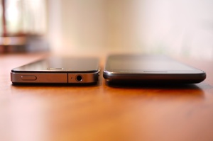
The Galaxy Nexus is a beast of a device. The phone — which was built by Samsung in conjunction with Google — is the same thickness as the iPhone 4S, but sports a massive, 4.65-inch, 720p display, and a speedy dual-core CPU. In the US, it will come equipped with LTE on Verizon's network, and will also be available internationally as a pentaband HSPA+ device (I tested the HSPA+ device).
But the big story is that the Galaxy Nexus is the first phone to run Google's newest mobile operating system, Ice Cream Sandwich (or Android 4.0, if you like). The new software is probably the biggest alteration to Android smartphones ever. The OS is a further evolution of the work Google started with Honeycomb, and is not only a complete revamp of the phone OS, but a unifying component of the entire platform, bringing Android tablets and phones to parity at last.
Want to know just exactly what the Galaxy Nexus is really like to use (and whether or not you should shell out the cash for it)? Read on for my full review below!
Note: our testing was done on a pre-production model, so there are some minor hardware build issues unrelated to performance. Our time for battery and data testing was limited, and we'll update the post with further findings as we get them.
Hardware / design
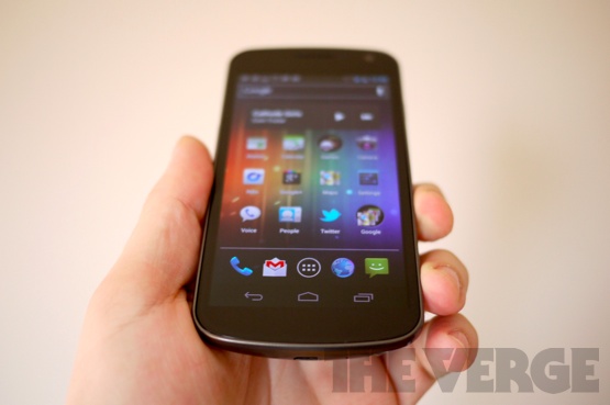
The Galaxy Nexus is one of the better looking phones that's come across my desk
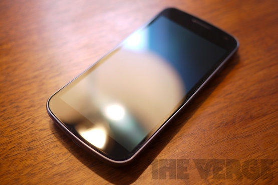
The Galaxy Nexus is a striking phone. It looks like someone took the Nexus S, steamrolled it, stretching out and flattening most of the more bulbous curves. The phone itself is a rather tall and broad affair, measuring 5.33 inches tall by 2.67 inches wide (though big, the device weighs just 0.3 pounds). As I said in the intro, the thinness of the Galaxy Nexus is obvious when you first touch it, and that thinness definitely serves to diminish the awkward feeling of holding A Very Big Phone.
The casing of the device is a gunmetal-gray plastic, which is a bit of a disappointment considering the gorgeous metal and glass of the iPhone 4S, the solid new HTC devices, and the futuristic polycarbonate of the Lumia 800 / N9. According to reps at Google, the internal frame of the phone is metal, thus making it feel slightly more solid than other devices made of similar materials. I do think it feels more rigid in the hand than other phones of this type. The front of the device is something Samsung is calling a Contour Display due to its slight curvature, though the glass used is "fortified," not Corning's Gorilla Glass.
There's a welcome addition of an LED notification light which sits on the front of the device, centered towards the bottom of the display. The light is RGB, meaning it's capable of creating all sorts of hues depending on the type of notification you're getting. For instance, a TweetDeck notification alerts you in yellow. That's pretty handy.
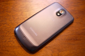
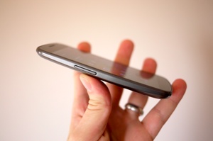
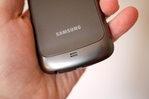
Now that Android has moved beyond buttons, the Nexus is a fairly no-frills affair when it comes to protrusions. You've got a sleep / wake button on one side, and a volume rocker on the opposite edge. On the bottom of the phone you'll find a 3.5mm headphone jack and micro USB port. The removable back piece of the phone is an astonishingly thin wedge of plastic which feels like it's going to snap every time you take it off, though apparently Samsung has spent a lot of time and energy engineering the material. There's no microSD slot here, in case you're wondering.
Overall, the Galaxy Nexus is one of the better looking phones that's come across my desk. It's not exactly taking big risks in the industrial design department, but it still manages to come off as relatively unique. I would love to see an Android phone maker really start to take some risks and get daring with design and materials, but I can't honestly complain about too much I see in the Galaxy Nexus.
Internals / display
Samsung and Google left little out of the guts of the Galaxy Nexus. Inside the device you'll find a dual-core TI OMAP 4460 CPU clocked to 1.2GHz, 1GB of RAM, 32GB or 16GB of storage (I tested a phone with 16GB), and the usual assortment of radios (Bluetooth 3.0, Wi-Fi 802.11b/g/n, GPS). The device is also equipped with an NFC chip, as well as a compass, proximity sensor, ambient light sensor, gyroscope, accelerometer, and barometer.
The camera on the rear of the device is a 5-megapixel shooter with a companion single LED flash, while up front there's a 1.3-megapixel camera.
For external audio, there's a small speaker on the rear of the phone. I was somewhat disappointed with the volume levels for music playback, notifications, as well as speakerphone calls. The device just seems to be quieter than most other phones I've tested recently (particularly Motorola's last few Droids). Earpiece sound quality, on the other hand, was excellent.
The display on the Galaxy Nexus is a relatively significant feature here, as it's one of the first devices to sport a full 720p screen. The 1280 x 720, 4.65-inch display is quite a handsome affair, utilizing Super AMOLED technology, which produces rich colors while keeping battery consumption to a minimum. While the screen is a pentile display, the crispness of text and images was far superior to most lower resolution pentile displays I've seen.
Generally, I'm in love with the Galaxy Nexus screen, though it isn't exactly perfect. As with the Nexus S, I noticed some color aberrations and odd striations which were visible when there was a large swath of solid, lighter colors visible (a plain gray background, for instance). This problem seemed less obvious when the brightness was a bit higher, however.
Speaking of brightness, Ice Cream Sandwich seems to have an overly aggressive auto-brightness setting, and the screen was often too dark for my preference when I had the function turned on. This seems more like a software issue than anything else, but it also seems like an attempt to over-manage battery consumption.
Small issues with the display aside, the Galaxy Nexus is a fully equipped and capable modern smartphone. There's nothing here that really left me wanting — at least not to any great degree. From a pure spec perspective, the Nexus is not just rock solid, it's right up there with the best-in-breeds.
Generally, I'm in love with the Galaxy Nexus screen

Battery life / performance
The Galaxy Nexus feels blazingly, stupidly fast to me

As I've had a very short testing period with the phone, I won't go into great detail on battery life just yet. I will say that I have concerns about the overall battery stamina given the time I've spent with the phone thus far. It might just be that I've been putting the handset through its paces, but I've noticed a faster dip in battery life than I would like to see. Obviously I can't speak to the LTE version's battery capabilities, though I should have Verizon's iteration in hand soon, and will add my testing results to this review.
Update (11/25/11): I've now had well over a week to test the battery life on the Galaxy Nexus, and I'm pleased to say the results are better than expected. On a typical day of heavy use (phone calls, lots of email, Twitter, general productivity tasks) I'm more than able to go through my entire workday. Squeezing out 19 hours or more on a single charge is not uncommon. Some days, that number is shortened if I'm watching video, taking more calls than usual, or playing games, but it's no more dramatic a dip than you might see on any other smartphone. In using the device as my daily driver, I haven't found any major issues with battery life which would I would consider show-stopping.
As far as phone performance is concerned, however, the Galaxy Nexus feels blazingly, stupidly fast to me. Touch response is excellent on the phone — everything reacts quickly to your movements. Homescreen scrolling was snappy, moving into and out of apps was instantaneous, swiping through long lists was stutter free, and web browsing (even on heavy pages like ours) was super speedy. Game frame rates were smooth, photo viewing and editing was frictionless, and the phone handled heavy multitasking with aplomb. It's obviously a combination of great hardware and great software, but the Nexus is probably the tightest feeling, snappiest Android phone I've ever used. It's awesome.
Reception / data speeds
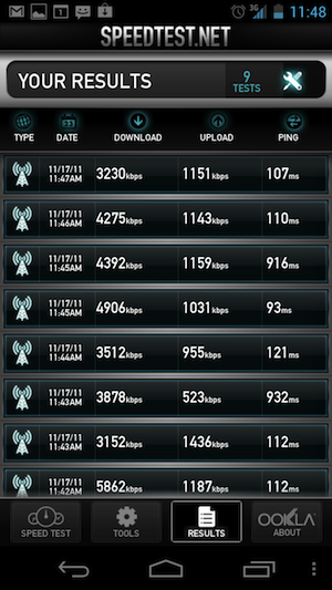
Because I tested the HSPA+ version, I can't speak to the data performance or reception of Verizon's forthcoming LTE version of the Galaxy Nexus. What I can say, however, is that the HSPA+ iteration on AT&T's network exhibited better-than-expected performance with call quality and stability, as well as data rates.
While using the device, I had nearly no dropped or failed calls — even in locations like the first floor of my house, which is typically bad for phone calls.
Data rates were frankly off the charts for me in my testing. In a spot where I typically see 2.2Mbps down and 1Mbps up on AT&T, the Nexus amazingly grabbed an average of about 4.5Mbps and consistently over 1Mbps, respectively. I'm still probably going to nab the LTE version when Verizon finally makes it available, but I was impressed by what I saw on AT&T (at least in my corner of Brooklyn and various spots in Manhattan).
When I originally saw camera shots from the Galaxy Nexus (during my interview with Matias Duarte at the Google campus), I was blown away by the quality of what I was shown. The pictures were taken on a sunny day at the beach, and they looked incredible. I'd like to report that all photo results on the Nexus are as impressive as the ones I saw that day, but that's not exactly the case.
The 5-megapixel shooter on the device is most definitely capable of taking great looking photos, and that's aided by a super-fast auto focus (with tap-to-focus as well), consistent face detection, and a generally forgiving sensor. The camera taking and photo editing software Google provides with Ice Cream Sandwich is truly outstanding. I was impressed by the panorama and time-lapse modes provided, and there are some relatively powerful tools for editing your pictures after you've done some snapping. Google is even providing a set of filters not wildly dissimilar to some of what Instagram is doing, obviously gunning for the retro picture craze that's sweeping the globe. The filters are good — though not as good — as the Instagram offerings, and they'll go a long way to salving the wounds of Android users who are envious of their iPhone-owning brothers.
But while the software is excellent, it can't make up for that so-so sensor. Even though you can get great results with the camera, it's pretty easy to get bad results as well. Compared to something like the iPhone 4S camera, I found the Nexus' lens to be lacking.
Color reproduction wasn't as true as that of the iPhone 4S
I had mixed results while shooting. While that zero shutter-lag feature is really great when trying to quickly capture moments, I feel like its speediness can sometimes contribute to slightly shakier looking photos. It's almost too fast, if that's possible. Some of my photos and macro shots looked really gorgeous, but others were ever-so-slightly out of focus in a way that kind of drove me crazy. Obviously shooting in bright daylight is the optimum environment for the Galaxy Nexus, and my lower light results were not inspiring. I saw a lot of noise in darker scenes, and focusing was doubly difficult. I also felt color reproduction wasn't as true as that of the iPhone 4S; images can look washed out in certain settings.
There's no question that I was able to get good photos out of the phone, and I think overall the camera is very capable, but I don't think Samsung built a world-beater with the sensor used in the Galaxy Nexus.
As far as video is concerned, the Galaxy Nexus can capture great 720p and 1080p recordings, though the quality suffers from the same issues as the still camera. One thing that's kind of interesting is that Google has included a batch of realtime video effects which use face tracking to create some surprisingly cool modifications of your subjects. There's no practical use for the software (at this point), but it's a great example of just what the Nexus is capable of.


Software: Ice Cream Sandwich
As I said before — and as should be abundantly clear — this isn't just a hardware story. With the introduction of Ice Cream Sandwich, Google is making a big, important step forward in the evolution of Android. The new OS is a huge leap in functionality as well as fit and finish, and it's nothing like any Android you know.
Look, feel, USABILITY
For starters, Ice Cream Sandwich just looks really different than previous versions of the OS. While Gingerbread attempted a stark, neon green on black, striving-for-futurism dance (with lots of mixed messages on styling and tone), ICS is much more unified. The general motif of the user interface centers on use and reuse of blue and gray dotted with bursts of color, mixed in with flattened navigation, and multi-leveled, multidimensional panels and icons. Dimensionality seems to be a theme in ICS, and you can see it even in the redesigned applications icons, which now seem to suggest physical depth as well as multiple strata of use. There is some of the "Tron" feel from Honeycomb here, but it's been scaled back and humanized in a way that makes the OS feel a lot more approachable.
Nearly every piece of the operating system, from the homescreen to the core apps, menus, widgets, and even pop-ups has been redesigned. That goes for the font in the OS, which is a custom, in-house typeset called Roboto — a subject of some controversy. I happen to think the new typeface is a welcome, clean addition to Android, and a big improvement over the previous Droid Sans face.
Starting at the lock screen, things are really different. The standard unlock sequence is now a swipe of a lock icon left or right — the latter to get into the phone, and the former to jump right into the camera. I love the convenience of this, but unfortunately you can't use the camera jump if you pin or password protect the device (that goes for Face Unlock and pattern locks as well).
Notifications have been cleaned up and tweaked too. Not only can you access your notifications from the lock screen (provided you're not password protected), but you can individually swipe messages or alerts away. There's also a persistent quick jump to settings in the notification window (which has been restyled and made subtly transparent).
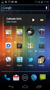
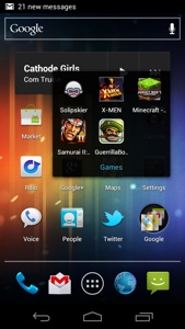
When you hit the homescreen, you'll see a fairly familiar setup of five main screens, but with persistent navigation elements along the bottom. A row of the on-screen buttons, and then a customizable lineup of your favorite apps or folders, plus a center button which brings you to your app and widget drawer. Google search is now a persistent box at the top of all your homescreens (it's very similar to webOS' "Just Type").
You can now make folders of apps by simply dragging one icon onto another, and the folder will auto-arrange itself when you move the icons around. It's very reminiscent of iOS.
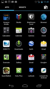
Opening the app drawer brings you a grid of your applications, and you can tab into your widget selections as well. There's also a persistent link to the Android Market in the corner. It's similar to the way Honeycomb handles these pages, but it all feels much more natural here.
Menus and lists have been changed as well, and particularly in settings, it's easier to find the toggles you're looking for without hunting and pecking.
One big new feature that Google has added to the settings menu is the ability to set data warnings, hard limits, see application data activity, and limit background data on an app-by-app basis. That's a welcome relief for people looking to contain their bills, especially if you've got a hard stop on something expensive, like Verizon's LTE service. The look and feel of these screens is refreshingly stark with just the right amount of futurism (a theme here).
I want to note that moving around all of these screens is buttery smooth. There's no lag, no stutter. Animations are fluid, and everything feels cohesive and solid. It's like Ice Cream Sandwich is more "there" than previous versions of Android. Additionally, there are repeated motifs that really work, such as the concept of swiping left of right through panels of an app to get at different pieces or layers of content. That's used throughout the OS now, and it makes a lot of sense.
Another thing that's been done is that navigational items previously buried in menus have been pulled out and placed into touch-friendly, exposed rows. There are still some options hidden in a small "overflow" tab (a consistent triple-dotted nav item), but these are generally the less frequently visited areas of an app, such as settings. I find that the new system makes it even easier to get around in the OS, and compared to its nearest competition (iOS), it is actually far simpler in some instances. Take, for example, clearing your cache in the browser. In iOS, you actually have to exit the app, open settings, find Safari settings, and then do your cache clearing. In ICS you simply tap on the overflow box, click settings, and clear away — without ever leaving your app. It's a great blend of the desktop and mobile user interactions, and one of the things I liked best about what Google did with Honeycomb.
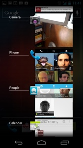
One last big piece worth mentioning is the vast alteration to multitasking on the phone. Previously, multitasking was done by holding down the home button and waiting for a pop-over of your last few apps to appear. The trigger to get into that screen was blind, and the apps your were heading towards were blind as well. Google has rectified that situation in ICS by providing a dedicated multitask button in your persistent virtual button list, and by not only showing what app you've been using, but a small snapshot of the last screen you were in. You can also triage this list by swiping away the apps you're not using. It's kind of like webOS cards running vertically instead of horizontally — and it really, truly works well. It does take a moment to get used to, but after a few minutes with it, I was wondering how I'd been living with multitasking in Android (and other platforms like iOS) that was so clunky.
The core of the redesign here is about exposing options, reducing steps and confusion, and making Android generally more delightful to use. I would say Google has accomplished what it set out to do. That's not to say that there aren't still some imperfections here, but generally Ice Cream Sandwich feels like a modern — and most importantly, elegant — operating system that's been thoughtfully designed.
Keyboard, Text selection, voice dictation
A lot of people (yours truly included) have long griped about the consistency and accuracy of the keyboard and text selection options in Android. Well I'm happy to report that Google has finally stepped up to the plate on the much-needed changes to both of these items.
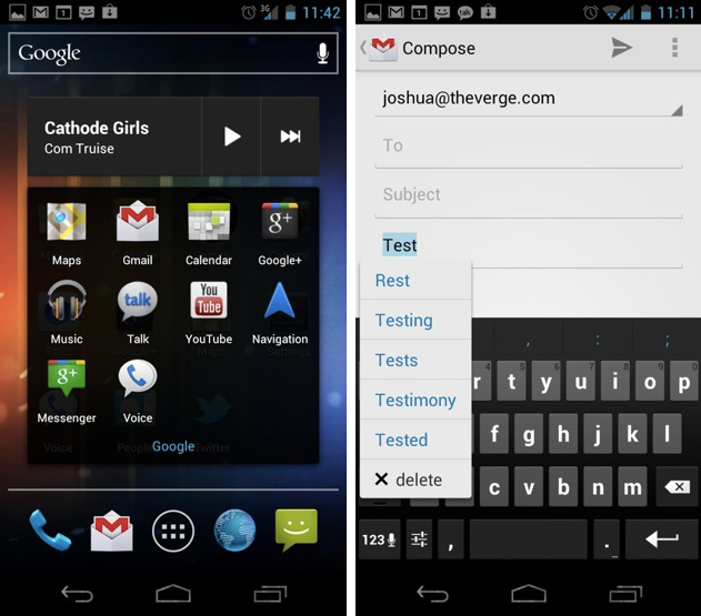
For starters, the keyboard is now far more accurate than previous versions. I would put the text prediction and auto-correction on par with iOS at this point. My typing speed noticeably improved with ICS, and not only was it easier to bang out messages quickly, but moving back to correct mistakes or change words has been massively tweaked. Android is tracking mistakes (or perceived mistakes) much more closely now and red-underlining anything that looks amiss — a simple tap on that word and you get a contextual dropdown of suggestions. Additionally, you need only double tap on a word and the cursor below it (or long press on that word) to get a context menu with choices to replace.
Even better, Google has finally solved its copy and paste / selection issue. You can now easily long press on any text pretty much anywhere on the device and get options to copy, share, or find-in-page for that snippet. It works brilliantly, and the provided start and end cursors work just as you'd expect. It's stupid to have taken so long to do something so simple, but it's incredibly refreshing to not have to think about it anymore.
One other item worth noting — Google's voice-to-text feature now processes your input nearly in realtime, meaning you can get your dictated messages into the phone much faster. In testing, the service was generally accurate, though we still have a long way to go before it can steer clear of all of the natural pitfalls of this sort of human to machine translation.
Third party app compatibility
As of this update (11/25/11), I have noticed a few issues with third-party app compatibility in Ice Cream Sandwich. While most applications are not affected, I have seen some significant issues with a handful of apps I use. For instance, Andchat, an IRC client I've used on every Android I've owned seems to display incorrectly for a few moments, and then crash completely. TweetDeck, my Twitter client of choice, works well save for a menu which is missing when composing a tweet in portrait view.
There are other small issues I've noticed in a handful of apps, such as menus not appearing and formatting seeming off, but the majority of the problems strike me as screen size related, not fundamental issues with the platform.
Core, notable ICS apps
It's not just new hardware and whole new look and feel. Google's overhauled the core apps as well.
Gmail
Gmail has been redesigned from the ground up, utilizing most of the changes made in Honeycomb. Weirdly, however, these changes make a lot more sense when your fingers aren't darting from one corner of the screen to the other.
Instead of the awkward, unresponsive controls of the older Gmail app, the icons and navigation in Ice Cream Sandwich's Gmail are superb. I never had any missed touches (a common issue in Gingerbread and earlier iterations), and I found I was able to manage and read my email much more quickly. Google is utilizing that swiping motif here to great effect, allowing you to simply page through your emails and conversations.
Additionally, you can now search your mail offline (at least 30 days back), meaning my train rides are going to be about a million times more productive.
More than anything though, just as in the rest of the OS, Gmail is just a lot less ugly and clunky than it used to be. It feels fast and modern, and frankly might be better than Gmail in the browser in some ways.

calendar
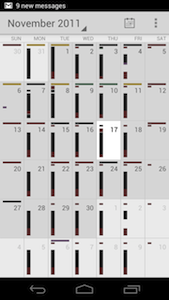
Just like Gmail, the calendar app has been prettied up and made more functional, but the biggest alteration comes in the form of a new gesture here: pinch-to-zoom. If you've got a massively packed schedule (I do, you just don't see it in the video below), this is a life saver. The basic concept is that you can zoom in or out on your more cluttered days, and get increasingly granular information on the events you have upcoming.
In use, I thought the feature was terrific. All too often, designers add this kind of window dressing to an app for the visual flair without taking into account any kind of actual utility. That's not the case here. The gesture is beautiful and functional. You know if you can excite people about your calendar app, you're doing something right.
Talk
The Google Talk app in ICS has been massively redesigned, and now heavily relies on the swipe left / right gesture to help you move through conversations. I found it pretty reliable and helpful during busy hours, and Google has thoughtfully added little breadcrumbs suggesting which conversation is to the right or left of the one that you're currently in.
If you're jumping between conversations a lot (and I am), this is pretty radical feature in the world of mobile IM applications. I felt more able to triage and respond to incoming messages in the new Talk than I have on any other smartphone messaging client.
Another nice thing about Talk is that it integrates with the People app (which is basically your new address book), meaning that you can see statuses from multiple areas on the phone.

Browser
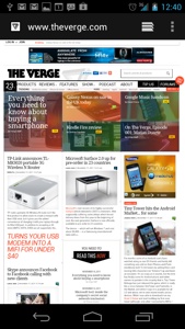
Let me just say this — the browser in Ice Cream Sandwich does some serious ass-kicking. I don't often use profanity in my gadget reviews, but I felt it was worth emphasizing just how much better the browser on the Galaxy Nexus is compared with much of its competition.
Not only has the look and feel of the app been cleaned up along with the rest of the OS, but its speed is rather impressive. Testing with SunSpider, I scored a staggeringly low number of 2012.9ms. Comparatively, the iPhone 4S scored 2246.8ms back when I did my review.
There are some minor issues with the browser — like the fact that it doesn't seem to be rendering certain elements (such as TypeKit) correctly, and some of its JavaScript performance seems laggy in comparison to Mobile Safari. Still, it's one of the best mobile browsing experiences I've ever had. I used to dread having to use the browser on the Nexus S. This is the polar opposite.
People
The People app is a new — and welcome — addition to Android. Google has essentially done away with the concept of a "contacts" application, and is instead aggregating all of your contacts into People, where you can not only star your favorites, but see updates from social networking services (Google+ and Twitter seem to be wired up already).
The company says its offering a social API for the app that developers can plug into, and I have to imagine that a lot of third-parties will be taking advantage of it. Google may have just taken a page out of the Windows Phone playbook with this one, but it works in a really organic way across the device, and I found myself really liking it.
Video Review
Live Q&A
It's one of the best smartphones ever made... and it could be the best ever
The Galaxy Nexus is the best Android phone ever made. It's one of the best smartphones ever made, and with a couple of minor tweaks (particularly to the camera), it could be the best smartphone ever produced.
Still, there's really not much to knock here. The hardware is elegant and smartly designed. The software is beautiful and useful. Google has cleaned up a lot of the bad, and replaced it with a serious amount of good. It's faster, smarter, and a lot more friendly than any of its predecessors. Ice Cream Sandwich easily gives iOS and Windows Phone a run for their money, and in many ways, it's a superior operating system than either of them.
If there's a bone to pick, perhaps it's with the size, which could be off-putting to some, or the fact that right now the only carrier you can definitely get the phone on in the US will be Verizon. But those are minor blips on the radar, not show stoppers.
Since day one, I've been waiting for an Android device that lived up to the promise of such a powerful OS. I think I can stop waiting now.
Want more? Compare the Galaxy Nexus to the iPhone 4S, Droid RAZR, and more in our product tool!
Read our review of the Verizon Galaxy Nexus right here
Share this story