:format(webp)/cdn.vox-cdn.com/uploads/chorus_image/image/64903741/shutterstock_157520087.0.0.1485150217.0.jpg)
The United States of America is many things. It is the world’s most powerful country, and one of the largest. It has a history of political revolution and social progress, as well as a legacy of slavery and genocide. In one sense, mapping the United States should be a simple matter of displaying borders and geography. But America is a complex nation with a long and fascinating history that could never be captured in a single frame. Here’s a glance at America’s past and present, in 70 maps.
Table of Contents
1. The original Americans
2. Europeans come to America
3. The conquest of North America
4. Slavery and the Civil War
5. Becoming the United States
6. American Diversity
7. The civil rights struggle
8. America as global power
9. America today
The original Americans
1) Ecoregions of North America
:format(webp):no_upscale()/cdn.vox-cdn.com/uploads/chorus_asset/file/780518/EPA-EcoregionsLev02x600.0.jpg)
The vast size and ecological diversity of the North American continent, the third largest on Earth, has played a central role in determining how it was settled and developed over millennia. This map shows how North America’s geography, climate, and wildlife have produced its different ecoregions, coded by color, from the wooded plains of the Northeast to the enormous semi-arid prairies at the continent’s center to the plateau deserts of the Southwest. So much of America’s history has been about movement — centuries of migration and settlement and, finally, agglomeration — and geography and ecology have greatly influenced how that played out.
2) First human migration to the Americas
:format(webp):no_upscale()/cdn.vox-cdn.com/uploads/chorus_asset/file/780640/26271801-1.0.jpg)
Humans are relative newcomers to the Americas: the rest of the world had been settled for tens of thousands of years, perhaps longer, when the first migrants crossed from Asia into the New World. Many arrived by walking, very slowly over many generations, up to the northeast extreme of Asia and then crossing a land bridge, since submerged by ocean, that reached to Alaska. However, newer research shows that there may have been a second route: fantastically brave Polynesians who crossed the South Pacific in canoes, bringing tools, chickens, and certain plants with them.
3) Economic activity in pre-Columbus North America
:format(webp):no_upscale()/cdn.vox-cdn.com/uploads/chorus_asset/file/780716/2map-01-02.0.jpg)
The history of North America before European contact is recorded spottily; if there was an ancient American Marco Polo who traveled across the continent recording observations about life across societies, his or her work was lost in the European invasions. But what we do know still tells an interesting story.
This map, for example, shows the basic economics of pre-Columbus America. The agricultural communities, in purple, tended to be more settled and more densely populated, because agriculture requires fixed infrastructure but can also support more people. Settlement also requires a certain degree of politics: social hierarchies, divisions of labor, ownership, and diplomacy between communities. Hunting-based economies, by contrast, could afford to be more nomadic and informally organized.
4) The native peoples and languages of North America
:format(webp):no_upscale()/cdn.vox-cdn.com/uploads/chorus_asset/file/780820/Langs_N.Amer_.0.png)
North America before Columbus didn’t have nation-states of the sort that we know today (with some possible exceptions, such as the Aztec Empire), but it did have nations of a sort: peoples who shared common cultural traits, especially language. This map shows the major language families and their spread: dark green, for example, shows the Muskogean-speakers (Chickasaw, Choctaw, and others) clustered in the Southeast. The Pacific and Gulf coasts are divided by numerous tribes, each covering small swaths of land, whereas the sprawl of the Central Plains shows how certain groups came to dominate huge areas.
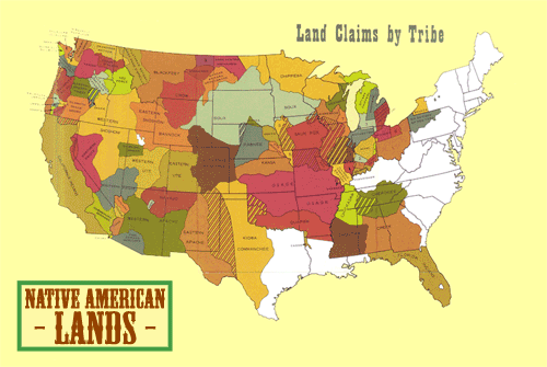
5) What the US might look like now if Europeans hadn’t come
:format(webp):no_upscale()/cdn.vox-cdn.com/uploads/chorus_asset/file/780882/indian_tribes.0.jpg)
It’s impossible to say what North America would look like today if Columbus had never arrived, but this map of Native American tribal, cultural, and linguistic areas is a thought-provoking approximation. Colors represent language groups, whereas lines demarcate the different tribal groups and their areas of control. What if those groups had had a chance to form modern nation-states of their own? Had Europeans not colonized North America, this map and its unfamiliar shapes hint at what today’s sovereign Native American countries and states might look like.
Europeans come to America
6) European exploration of North America

Christopher Columbus sailed west from Spain in 1492, sponsored by the Spanish government, which hoped to find an overseas trade route to southeast Asia. Instead, Columbus landed in the Bahamas, in a part of the world most Europeans had no idea existed.
This event set off a century-long race among Europe’s major powers to explore and claim the continent (Portugal promised, in a treaty with Spain, to focus instead on Africa and Asia). This development was purely about economics, but which explorer happened to land where ultimately shaped centuries of history: Spanish-explored areas became Spanish-controlled, whereas French explorers’ journeys through the Saint Lawrence River, Lake Ontario, and the Mississippi River meant that Quebec and the Mississippi Delta would become French colonial territory.
7) Where place names come from in the Americas
:format(webp):no_upscale()/cdn.vox-cdn.com/uploads/chorus_asset/file/781392/etymomap21.0.png)
This map breaks out the language of origin for each US or Mexican state, Canadian province, and Central/South American nation. The East Coast is dominated by English names, most taken from various British monarchs (the Carolinas are named in honor of Charles I, Virginia for Elizabeth I, etc.), cities and regions (York, Hampshire, Jersey), or other figures (William Penn). Also, unsurprisingly, the West Coast has a number of Spanish names, and there are a handful of French ones (Maine, Vermont, Louisiana).
But the plurality of states have names rooted in one or another American Indian language. The problem is that the states claiming the names were often nowhere near where the tribes whose words they’d taken lived. Radical Cartography’s Bill Carter explains, “Places like ‘Mississippi’ (Algonquin for ‘large river’) and ‘Wyoming’ (Lenape for a grassy area) were moved thousands of miles by European settlers.”
8) How economics and trade shaped the new world
:format(webp):no_upscale()/cdn.vox-cdn.com/uploads/chorus_asset/file/781646/2042920_orig.0.jpeg)
When Europeans ended 10,000 years of separation between the western and eastern hemispheres, they did much more than settle and conquer; they permanently and fundamentally altered the ecosystems of both the old and new worlds. They brought plants from Europe, Africa, and Asia to the Americas, such as rice, wheat, and citrus, as well as domesticated animals such as horses. And they brought American plants back: potatoes, corn, tomatoes, tobacco, and so on. Known as the Columbian Exchange, this process transformed agriculture and food, and thus economics and culture, on both sides of the Atlantic.
9) Immigration from England
:format(webp):no_upscale()/cdn.vox-cdn.com/uploads/chorus_asset/file/781730/Puritan-migration.0.jpg)
The 1607 settlement at Jamestown and the 1620 landing of the Mayflower were just the initial steps in British colonization of North America. As this map shows, just as many people came later to Bermuda and to various Caribbean islands. Indeed, the slave-dependent sugar industry of Barbados was perhaps more economically important to Britain than anything in New England. The inset map here also shows the English origins of places settled in what is now Massachusetts.
10) The first European colonies, as of 1660
:format(webp):no_upscale()/cdn.vox-cdn.com/uploads/chorus_asset/file/3409350/map10.0.png)
This map shows the very early stages of European colonization, in the mid-1600s. Even 170 years after Columbus’ arrival, Europeans had established permanent settlements on very little of North America. Yet these initial settlements established the contours of later empires and nations. French colonists encamped along the Saint Lawrence River, a major trading hub that later became Quebec, and the Spanish had an outpost in present-day Florida. English and Dutch settlers — the latter of whom founded New Amsterdam at what is now New York City — established what would eventually become formal British colonies, and then later the United States.
The conquest of North America
11) The political division of North America since 1750
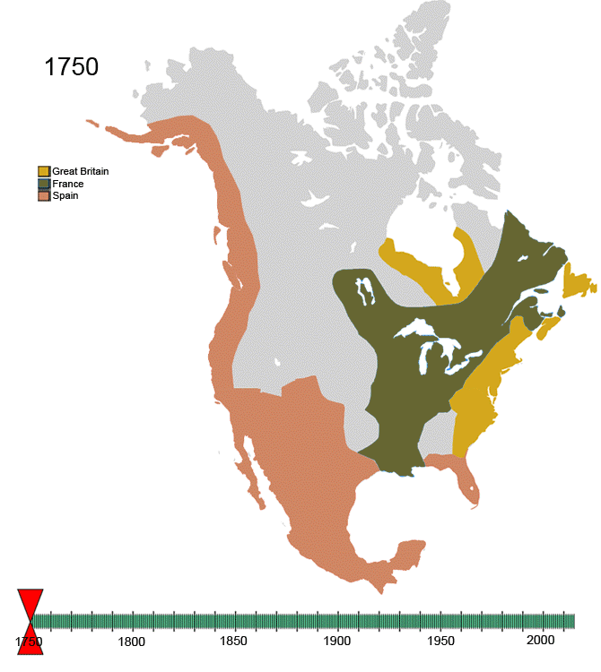
This animated map shows the changes to North America’s colonial and post-colonial borders from 1750 to the present. There are some interesting nuggets to pull out, such as the tiny transfer of land between Nebraska and the Dakota Territory in 1882, or the fact that it took until 1949 for Newfoundland to join Canada. There’s also an interesting US-Mexico border dispute that was resolved during the Nixon administration.
12) The major Revolutionary War battles
:format(webp):no_upscale()/cdn.vox-cdn.com/uploads/chorus_asset/file/3409354/map12.0.png)
The most salient fact about the Revolutionary War is not that the colonists won, but that the British Empire, at that point the most powerful country in the world, lost. That looked, at first, unlikely: Admiral William Howe, invading from England in 1776, captured New York City and New Jersey.
But Howe got greedy. Rather than marching north to link up with British troops coming south from Quebec — the idea was to seal off New England, then divide and conquer — Howe attacked the rebel capital of Philadelphia to the south. The British forces, divided, suffered a humiliating defeat in Saratoga in 1777.
This convinced France, which had been quietly funding the Americans to weaken the British, that the colonists might actually win. France declared war against the British in 1778, as did Spain in 1779; the American colonies were just one front in a global war in which the British had no allies and several strong enemies. It launched a last-ditch invasion at Georgia in 1780 but, when that failed, the war was over.
13) The French and Indian War
:format(webp):no_upscale()/cdn.vox-cdn.com/uploads/chorus_asset/file/782014/map-7yr-war.0.jpg)
In Europe, the Seven Years’ War was more or less pointless, with no side gaining any land at its conclusion. But the territorial repercussions were much more serious in North America. In the 1763 Treaty of Paris, which concluded the war, France not only lost New France to Britain — including all of the future US between the Mississippi and the 13 colonies, as well as all of French Canada — but also ceded the Louisiana territory to Spain. Napoleon would seize back Louisiana and sell it to the US in 1803, but New France was lost forever.
14) Theft of Native Americans’ land
This map looks at the conquest of North America from the other perspective: that of the people being forced off of their land. It begins by showing Native Americans’ land in 1794, demarcated by tribe and marked in green. In 1795, the US and Spain signed the Treaty of San Lorenzo, carving up much of the continent between them. What followed was a century of catastrophes for Native Americans as their land was taken piece by piece. By the time the US passed the Dawes Act in 1887, effectively abolishing tribal self-governance and forcing assimilation, there was very little left.
Slavery and the Civil War
15) The trans-Atlantic slave trade
:format(webp):no_upscale()/cdn.vox-cdn.com/uploads/chorus_asset/file/18436012/map.jpg)
About 12.5 million Africans were sent on slave voyages to the Americas, Europe, or elsewhere in Africa; due to the horrifically high mortality rates involved, only 10.7 million disembarked. The vast majority landed at sugar plantations in the Caribbean or Brazil; only about 388,747 disembarked in mainland North America.
But the United States’ slave population grew, unlike those in the Caribbean and Latin America. “In the antebellum period, US slaves showed a natural population growth of some 25 percent per decade,” according to the University of Liverpool’s Michael Tadman. “In sharp contrast, Caribbean and Brazilian slaves commonly suffered rates of natural decrease of 20 percent per decade.” The result was an ever-increasing slave population in the US, magnifying the institution’s importance and the political power of slaveowners.
16) The evolution of slavery in the United States
The fight over slavery in the United States began even before independence, as constitutional framers clashed over whether or how to reconcile the world’s most barbaric practice with the idealistic new nation. Though abolitionists lost, states such as Pennsylvania and New Hampshire ended slavery almost immediately after independence. But the divide became more than just political, as slavery developed into a sort of cultural institution upon which southern whites depended for their economic livelihood and their identity. As America expanded westward, both pro- and anti-slavery factions tried to claim new territories as their own. The cultural and political divide deeply polarized the nation, leading inexorably to war.
17) Concentration of slaves in the US
:format(webp):no_upscale()/cdn.vox-cdn.com/uploads/chorus_asset/file/782300/map_20slave_20growth.0.jpg)
The swift growth in the slave population during the antebellum period helped fuel the institution’s spread. States outside the original colonies — particularly in the Deep South (Louisiana, Mississippi, Alabama) — developed significant slave industries. Existing slave centers, particularly South Carolina, saw the practice grow.
This would eventually influence the politics of secession. As Princeton’s James McPherson notes in Battle Cry of Freedom, slaves constituted 47 percent of the population in the first states to secede (South Carolina, Mississippi, Alabama, Georgia, Florida, and Texas), where 37 percent of white families owned slaves. By contrast, slaves were only 24 percent of the population in the upper South (Virginia, Tennessee, North Carolina, Virginia, Missouri) and only 20 percent of white families in those states owned slaves. The states of the upper South initially declined to secede, though all but Missouri ultimately joined the Confederacy in the aftermath of the Battle of Fort Sumter.
18) The crucial 1860 election
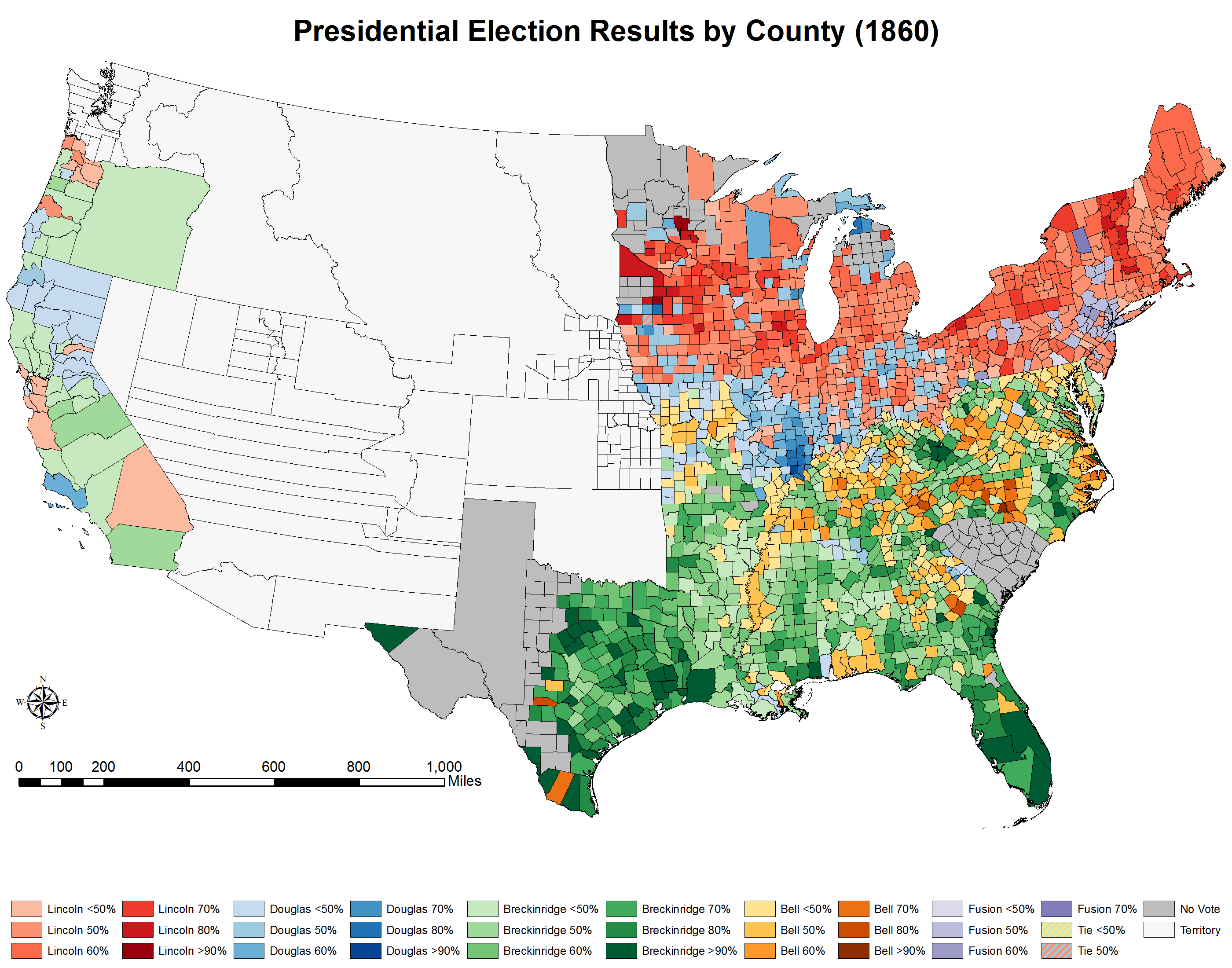
US politics in the 1850s were dominated by slavery. The Supreme Court’s 1857 Dred Scott decision, which forced western territories to allow slavery, only intensified debate over the issue. Members of the new, anti-slavery Republican Party, such as ex-Rep. Abraham Lincoln, warned that the Court could force slavery on the North next unless the practice was ended outright.
In 1860, the Republicans nominated Lincoln for president in a four-way race. The Democrats split on regional lines, with pro-slavery Southern Democrats nominating John C. Breckinridge, and compromise-minded northern Democrats picking Stephen A. Douglas. John Bell of the Constitutional Union Party, which advocated for the status quo and against secession, was also a major contender.
Lincoln won with 40 percent of the vote, without carrying a single southern state. Southerners, feeling they were no longer represented by the GOP-dominated government and that their way of life was under threat from Lincoln’s abolitionism, almost immediately began to secede. (Note: South Carolina is grey because its presidential electors were chosen by state legislators, not popular vote.)
19) When states seceded in the months before the Civil War
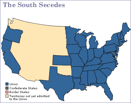
On December 20, 1860, South Carolina became the first southern state to secede in reaction to Abraham Lincoln’s victory. It was explicit that Lincoln’s anti-slavery views, and those of many in the North, were the primary motivation for separation. The declaration of secession stated, “A geographical line has been drawn across the Union, and all the States north of that line have united in the election of a man to the high office of President of the United States, whose opinions and purposes are hostile to slavery.”
Before Lincoln’s inauguration on March 4, Mississippi, Florida, Alabama, Georgia, and Texas followed suit. While the “Upper South” had initially rejected secession, North Carolina, Arkansas, Tennessee, and Virginia flipped after the Confederate raid on Fort Sumter on April 12.
20) The Civil War
https://www.youtube.com/watch?v=Nw8wEqe5XwA
(EmperorTigerstar)
There are, very broadly speaking, two stages you can see in this time-lapse map of the war. From the war’s 1861 start until July 1863, it was defined by southern Confederate victories that halted Union invasions designed to end the war by capturing Richmond. Confederate General Robert E. Lee even invaded the north, threatening mid-Atlantic cities with the aim of strengthening the northern anti-war movement such that it might unseat Lincoln in the 1864 election and end the war.
In July 1863, however, two things happened: Lee’s northern assault was defeated at Gettysburg, Pennsylvania, and Union troops captured a crucial confederate stronghold at Vicksburg, Mississippi. It was the turning point in the war, the end of Lee’s northern invasion and the beginning of the Union’s divide-and-conquer strategy, which culminated in General William Sherman’s devastating 1864 “march to the sea” across Georgia.
21) The Anaconda Plan
:format(webp):no_upscale()/cdn.vox-cdn.com/uploads/chorus_asset/file/782674/Scott-anaconda.0.jpg)
Winfield Scott was 74 years old and had been in the Army for 53 years when the Civil War broke out. He was in nowhere near good enough health to lead an army to battle, and would resign later that year, leaving George McClellan and then Ulysses S. Grant to lead the Union Army for the duration of the war. But in May, a little over a month after Fort Sumter, he devised the plan that would — in very altered form — lead to victory.
Derided as “the Anaconda Plan” by its opponents, Scott’s plan involved blockading the Confederacy along the Atlantic and Gulf Coasts, and then launching a campaign down the Mississippi River to divide the South. Sure enough, the North’s blockade grew more effective over time and imposed significant pressure on the South, and Grant’s victory in the Vicksburg campaign secured the Mississippi for the Union and marked a major turning point in the war. While his strategy proved prescient, Scott’s promise that it would bring about a relatively bloodless end to the war was sadly not fulfilled.
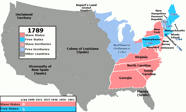
Becoming the United States
22) US territorial evolution
:format(webp):no_upscale()/cdn.vox-cdn.com/uploads/chorus_asset/file/782736/yse4XJE.0.jpg)
European settlers and homesteaders had been moving west from the Atlantic coasts since first arriving. But shortly after independence, that expansion grew from piecemeal settlements to national policy.
That policy, however, was not always as coherent and deliberate as the lore of Manifest Destiny implies. For example, when American agents traveled to Paris to negotiate the Louisiana Purchase from Napoleon Bonaparte, they initially sought only New Orleans, then one of the largest and richest cities in North America, but the cash-strapped Bonaparte sold half a billion acres to fund his expanding wars in Europe.
Further expansions came in part due to the collapse of the Spanish Empire and the efforts of pro-slavery legislators to incorporate new slaveholding territories.
23) The Trail of Tears
:format(webp):no_upscale()/cdn.vox-cdn.com/uploads/chorus_asset/file/6367471/Trails_of_Tears_en.png)
The largest act of ethnic cleansing perpetrated by the United States government began in 1830, when Andrew Jackson signed the Indian Removal Act into law, which gave him the power to negotiate the removal of Native American tribes in the South to land west of the Mississippi. Of course, those negotiations were corrupt and rife with coercion. Take, for example, the removal of the Cherokee, which was conducted via a treaty never approved by leaders of the Cherokee nation and resulted in, according to a missionary doctor who accompanied the Cherokee during removal, about 4,000 deaths, or one fifth of the Cherokee population. Later scholarship suggested the numbers could be even higher than that.
24) The Mexican-American War
Upon independence in 1821, Mexico gained vast but largely unincorporated and uncontrolled Spanish-claimed lands from present-day Texas to northern California. American settler communities were growing in those areas; by 1829 they outnumbered Spanish speakers in Mexico’s Texas territory. A minor uprising by those American settlers in 1835 eventually led to a full-fledged war of independence. The settlers won, establishing the Texas Republic, which they voluntarily merged with the United States in 1845.
But Mexico and the US still disputed Texas’ borders, and President James K. Polk wanted even more westward land to expand slavery. He also had designs on Mexico’s California territory, already home to a number of American settlers. War began in 1846 over the disputed Texas territory, but quickly expanded to much of Mexico. A hardline Mexican general took power and fought to the bitter end, culminating in the US invading Mexico City and seizing a third of Mexico’s territory, including what is now California, Utah, Nevada, Arizona, New Mexico, and Texas.
25) Settling the West
:format(webp):no_upscale()/cdn.vox-cdn.com/uploads/chorus_asset/file/782900/ah4_m004.0.jpg)
This is both a map and a chart, each of which demonstrates a crucial fact about the development of America’s immigrant population. The map makes clear that while the Upper Midwest, the Rocky Mountains region, and Northeastern cities were major immigrant destinations, immigrants generally steered clear of the South, which lacked the opportunities for industrial employment that the rest of the country offered. The chart shows that this wave of immigration came to a sudden halt in 1914. We tend to forget this now, but with some exceptions (like the US anti-Chinese policy) immigration was fairly open between Western nations before World War I. The outbreak of war ended the open borders era, and while almost all the nations of Europe maintain open borders with each other, the US remains restrictionist.
26) The mean population center over time
:format(webp):no_upscale()/cdn.vox-cdn.com/assets/4299403/Screen_Shot_2014-04-14_at_6.00.55_PM.png)
Yes, the 1800s were the age of westward expansion, but the trend never really stopped. One way the Census Bureau measures geographic shifts is by measuring the US’s “mean center of population” — that is, “the place where an imaginary, flat, weightless and rigid map of the United States would balance perfectly” if all Americans weighed exactly the same. As of 2010, that point was near the village of Plato, Missouri. But the point’s westward and southward trajectory doesn’t necessarily mean that lots of Americans are packing up and moving west and south, although that was an early trend. Rather, it often means that the populations of the West and South have grown faster than the Northeast and Midwest. That includes people moving, but also shifts in birth rates and immigration. — Danielle Kurtzleben
27) The Dust Bowl
:format(webp):no_upscale()/cdn.vox-cdn.com/uploads/chorus_asset/file/681846/populationchangedepression.0.jpg)
Most of the devastation wrought by the Great Depression doesn’t lend itself easily to maps, but the Dust Bowl does. This map shows changes in population by county from 1930 to 1940. You’ll notice two clear trends: the Plains states shrank dramatically, while the West Coast grew. The combination of wind erosion and drought made it nearly impossible for thousands of families to make a living farming, prompting a mass migration to California — just like their fictional counterpart, The Grapes of Wrath’s Joad family. According to a 2009 study by Harvard economic historian Richard Hornbeck, only 14-28 percent of the damage done by the Dust Bowl to farmland values has been reversed since then.
28) Great Migration
:format(webp):no_upscale()/cdn.vox-cdn.com/uploads/chorus_asset/file/783038/020_blackpop_northern_cities_horiz-01.0.png)
The Dust Bowl occurred in between two other transformative migrations: the first and second Great Migrations, in which millions of African Americans moved from the South to cities in the North, Midwest, and West Coast, spurred both by the brutality of Jim Crow and the southern sharecropping economy and by the economic opportunities offered by cities like New York, Chicago, Philadelphia, Detroit, and Los Angeles. The vast cultural, political, and economic impact of the Great Migrations is difficult to overstate. “It would transform urban America and recast the social and political order of every city it touched,” Isabel Wilkerson writes in The Warmth of Other Suns, her masterful history of the migrations. “It would force the South to search its soul and finally to lay aside a feudal caste system. It grew out of the unmet promises made after the Civil War and, through the sheer weight of it, helped push the country toward the civil rights revolutions of the 1960s.”
29) How migration spread the blues
:format(webp):no_upscale()/cdn.vox-cdn.com/uploads/chorus_asset/file/783136/8_007Mw.0.jpg)
One concrete cultural product of the Great Migration was the development of northern blues. Blues music originated in the Mississippi Delta, but was developed significantly by northern performers like Chicago’s Muddy Waters and Howlin’ Wolf, Detroit’s John Lee Hooker, and Los Angeles’ T-Bone Walker. And that’s just the tip of the iceberg. The Great Migrations contributed to the Harlem Renaissance in the 1920s, to the emergence of New York City’s jazz scene, and — principally through Motown in Detroit — the development of soul.
30) Interstate highway system
:format(webp):no_upscale()/cdn.vox-cdn.com/uploads/chorus_asset/file/783206/Interstate_Highway_plan_August_14__1957.0.jpg)
This map of the nation’s interstates was made in 1957, just a year after construction of the interstate system was authorized by the Federal Aid Highway Act of 1956. Initially designed in part to move military convoys in case of a foreign invasion (the project was originally named “Interstate and Defense Highways”), it became a massive infrastructure project with significant economic and cultural impacts. The highways increased interstate trade and tourism. They also made long-distance commuting more viable, enabling suburbanization — and the cultural homogenization that came with it.
American diversity
31) Every presidential election since 1856
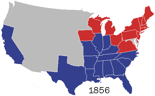
Since 1856, every American presidential election but one featured the Democratic and Republican nominees as its top two contenders. (The exception is 1912, in which Republican incumbent William Taft placed third after Democrat Woodrow Wilson and Progressive Party candidate Teddy Roosevelt.)
As this map shows, until very recently Republicans were the party of the North and Democrats the party of the South. That makes sense: Republicans were the party of the Union and Reconstruction, whereas Democrats were avid advocates of slavery and segregation, making the South a natural power base.
But after Democrats’ embrace of civil rights at the 1948 convention, and especially after Lyndon Johnson signed the Civil Rights Act in 1964, the parties’ power bases began to flip. It was a slow process: Democrats were winning Tennessee and Louisiana as late as 1996, and Republicans won Vermont as late as 1988.
32) Sources of immigration over time and largest group per state in 2010
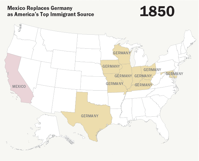
Mexico is, of course, America’s largest source of immigrants today. But as late as 1990, many states still counted Germany as their largest source. German-Americans have been more or less fully assimilated, and identification as German-American — rather than just white — is increasingly rare, but this time-lapse map emphasizes just how recently first-generation German immigrants were a major demographic group in the US.
33) American ancestry by county
:format(webp):no_upscale()/cdn.vox-cdn.com/uploads/chorus_asset/file/3842442/0de3c01396db7b1f5e8ce64ae8347109.0.jpg)
Here’s another way to illustrate the scale of German immigration to the US. While the data is 15 years old, the basic point conveyed here — that in the Midwest and Plains, pluralities in most counties claim German ancestry — stands. The map also serves to illustrate the “Black Belt,” the region of the South with the largest concentration of African Americans, as well as large Italian- and Irish-American communities in the Northeast. You can also see the trend in Appalachia and other parts of the South, where people tend to simply identify their ancestry as “American.”
34) Indigenous population density
:format(webp):no_upscale()/cdn.vox-cdn.com/uploads/chorus_asset/file/783566/ueuMds4.0.png)
This map of indigenous population density today shows the effects not just of the initial disease-driven depopulation of North America in the wake of European settlement in the 15th-18th centuries, but the long effort of the US government in the 19th century to remove Native Americans from their homes and place them in reservations of its choosing. The Cherokees of Georgia are gone, having been forced to relocate to eastern Oklahoma. A handful of counties in the upper Plains states, Arizona, and New Mexico have large or majority native populations. Alaska Natives are still a majority in a number of counties. But in most of the country — especially in the South, Midwest, and Northeast — Native Americans make up a vanishingly small percentage of the population.
35) What Americans call their flavored soft drink
:format(webp):no_upscale()/cdn.vox-cdn.com/assets/4565741/soda_v_pop.png)
Here’s an oldie but a goodie. The question of what to call carbonated soft drinks is surprisingly divisive, with coastal elites picking “soda,” the Heartland opting for “pop,” and the former Confederacy largely standing up for “coke” for maximum confusion.
36) Most popular Christian denomination
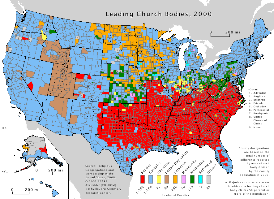
It’s tempting to look at this chart and divide the US between the Baptist South, Lutheran Plains, and Mormon Utah-plus-neighbors, with everything else overwhelmingly Catholic. But that’s largely a reflection of splintering between Protestant sects. Only in counties with black dots in them is the largest religious group an outright majority, and while almost all counties in Utah count Mormons as a majority — and many counties in Kentucky, Texas, and Mississippi do the same for Baptists — most Catholic counties don’t boast Catholic majorities.
37) Latino population in the US today
:format(webp):no_upscale()/cdn.vox-cdn.com/uploads/chorus_asset/file/688890/Latino_population.0.png)
It’s not a huge surprise to see that the US Latino population is concentrated in the Southwest and California, as well as in southern Florida and major northern cities like Chicago or New York. But there are still some surprises — the size of the Latino populations in eastern Washington state and in southern Idaho, for example. The map also shows which major cities don’t have large Latino populations, like Detroit, Pittsburgh, Cleveland, and most of the rest of the Rust Belt.
The civil rights struggle
38) Women’s suffrage
:format(webp):no_upscale()/cdn.vox-cdn.com/uploads/chorus_asset/file/783754/trowbridge2_1.0-fig05_031.0.jpg)
This shows the voting rights of women before the 19th Amendment’s ratification in 1920, which effectively ended gender-based restrictions on voting. Women’s right to access the ballot box was guaranteed, at least de jure. But a number of states had already offered suffrage to women before the amendment took effect. Many — mostly on the West Coast but also New York, Michigan, Texas, and some Plains states — had offered full suffrage, across the board, while others allowed women to vote in certain elections but not others. But before the 19th Amendment, eight states didn’t give women the right to vote at all. A constitutional amendment was necessary to give women in those states a voice.
39) Redlining in Chicago, 1939
:format(webp):no_upscale()/cdn.vox-cdn.com/uploads/chorus_asset/file/697180/redlining.0.jpg)
The New Deal brought with it a number of government institutions meant to expand access to housing, including the Federal Housing Administration (FHA) and Home Owners’ Loan Corporation (HOLC). This is an HOLC map of Chicago from 1939, with neighborhoods color-coded by stability, as judged by the government.
”On the maps, green areas, rated ‘A,’ indicated ‘in demand’ neighborhoods that, as one appraiser put it, lacked ‘a single foreigner or Negro,’” Ta-Nehisi Coates explains in the Atlantic. “These neighborhoods were considered excellent prospects for insurance. Neighborhoods where black people lived were rated ‘D’ and were usually considered ineligible for FHA backing. They were colored in red.”
This practice became known as “redlining,” and would be the norm in the housing sector as a whole for decades to come, effectively denying black people the ability to own homes.
40) Selma march
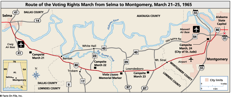
Anyone who’s seen Selma should recognize this one. This is the route that Martin Luther King’s Southern Christian Leadership Conference (SCLC), the Student Nonviolent Coordinating Committee (SNCC), and the Dallas County Voters League (DCVL) took in their march from Selma, Alabama, to the state capitol of Montgomery in support of voting rights.
There were three attempts at a march. The first — the “Bloody Sunday” march — ended with law enforcement officers savagely beating demonstrators as they crossed the Edmund Pettus Bridge (which you can see in the top left of the map, by the bend in the Alabama River).
After a second abortive attempt, a federal judge finally granted SCLC, SNCC, and DCVL the right to march all the way, and President Lyndon Johnson sent thousands of troops to ensure the marchers made their way to Montgomery safely. That march ended with King delivering a speech on the steps of the Alabama state capitol. Within months, Johnson had signed the Voting Rights Act — proposed a little over a week after Bloody Sunday — into law.
41) African-American voter registration in the 1960s
:format(webp):no_upscale()/cdn.vox-cdn.com/uploads/chorus_asset/file/784038/sm_ah6_m003.0.jpg)
This map not only highlights the locations of major events in the civil rights struggle of the 1950s and 1960s — the desegregation of Central High School in Little Rock, Arkansas, the Freedom Rides of 1961 — but also shows just how much black-voter registration grew from 1960 to 1971. The effects are dramatic: from 5 percent registration to 55 percent in Mississippi, from 14 percent to 55 percent in Alabama, from 29 percent to 64 percent in Georgia. A lot of that is attributable to the Voting Rights Act’s passage in 1965. Few pieces of legislation in American history can boast that level of impact, that quickly.
42) Housing in Chicago by race, 2010

Two things stand out in this time-lapse map documenting the racial composition of Chicago neighborhoods from 1950 to 2010: first, more of the city became majority nonwhite over that period, and second, the city didn’t get visibly more integrated racially. The former is an old story by now: in the 1970s, white fear of crime (and, implicitly, black people) drove whites to the suburbs, leaving the urban core as majority black and Hispanic. But the stark segregation even in 2010 — there are a lot of dark blue and red areas, and not a lot of light ones — is equally striking, and a sobering sign of how far we have yet to come.
43) The student protests
:format(webp):no_upscale()/cdn.vox-cdn.com/uploads/chorus_asset/file/784132/pic642840_lg.0.jpg)
Even by 1960s protest standards, Columbia’s 1968 student takeover was intense. Protestors seized buildings and held the acting dean of Columbia College hostage. People nationwide took notice, and within weeks, prominent activist Tom Hayden was calling for “two, three, many Columbias.”
The Columbia Daily Spectator’s Jerry Avorn and Jim Dunnigan made this board game — titled “Up Against the Wall, Motherfucker!” after the New York-based anarchist group of the same name — based on the event, with the game board modeled on the school’s campus. The Washington Monthly’s Daniel Luzer quotes Dunnigan describing the gameplay: “The playing board of Up Against the Wall Motherfucker! is made up of eleven tracks, each of which represents a quasi-political subgroup likely to be involved in the spring demonstration: black students, liberal faculty, alumni, uncommitted students, and so on.”
44) The evolution of marriage equality
:format(webp):no_upscale()/cdn.vox-cdn.com/uploads/chorus_asset/file/3390856/US_same-sex_marriage_map.0.png)
The spread of same-sex marriage across the US has been decades in the making. In 1993, a Hawaii judge became the first to strike down a law excluding same-sex couples from marriage. A federal ban (the Defense of Marriage Act) and an anti-marriage amendment to the Hawaii state constitution followed. A 1999 ruling in Vermont was the first to actually stick, though Gov. Howard Dean and the state legislature opted for civil unions rather than full marriage equality.
Even in 2004, when Massachusetts’ high court struck down that state’s ban and San Francisco Mayor Gavin Newsom began issuing marriage licenses to same-sex couples, the backlash was strong enough that 11 states passed constitutional amendments banning same-sex marriage.
But after California voters amended their constitution to ban it in 2008, the tide turned, and state after state started repealing their bans. Today, 37 states have marriage equality (plus select counties in Missouri), and the Supreme Court looks poised to expand that to the whole country.
America as global power
45) The Spanish-American War
:format(webp):no_upscale()/cdn.vox-cdn.com/uploads/chorus_asset/file/3702182/spanish_american_war_-_alternate_colors-01.0.0.png)
If there was a single moment when the US became a global power, it was the war with Spain. The Spanish Empire had been crumbling for a century, and there was a ferocious debate within the US over whether America should become an imperial power to replace it. This centered on Cuba: pro-imperialists wanted to purchase or annex it from Spain (pre-1861, the plan was to turn it into a new slave state); anti-imperialists wanted to support Cuban independence. In 1898, Cuban activists launched a war of independence from Spain, and the US intervened on their side. When the war ended in Spanish defeat, US anti-imperialists blocked the US from annexing Cuba, but pro-imperialists succeeded in placing it under a quasi-imperialist sphere of influence, seizing three other Spanish possessions: Puerto Rico, Guam, and the massive Philippines.
46) America as Pacific imperial power
:format(webp):no_upscale()/cdn.vox-cdn.com/uploads/chorus_asset/file/784302/pacific_area_-_the_imperial_powers_1939_-_map.0.png)
America’s brief experiment with overt imperialism came late in the game, and mostly focused on one of the last parts of the world carved up by Europe: the Pacific. This began in Hawaii, then an independent nation. American businessmen seized power in an 1893 coup and asked the US to annex it. President Cleveland refused to conquer another nation, but when William McKinley took office he agreed, absorbing Hawaii, the first of several Pacific acquisitions. Japan soon entered the race for the Pacific and seized many European-held islands, culminating in this 1939 map, two years before America joined World War II.
47) World War ll
This shows the battle lines of World War II every single day throughout the war. By the time the US formally entered the war, with Japan’s December 1941 attack on Pearl Harbor, millions had already died in Europe and Asia. The war ended with an Allied victory, which marked the end of a world in which, for centuries, there had been many competing powers. There were only two global powers left: the US and the Soviet Union.
48) Korean War

Korea was divided in World War II, when Japan lost control of it to Soviet and American forces, who occupied the northern and southern halves, respectively, and installed puppet governments. In 1950, North Korean leader Kim Il-sung invaded the South, expertly playing Russia and China off of one another to get their support for a war that neither wanted. The US and 20 other countries came to the South’s defense, wrongly seeing it as the beginning of a communist plot for world domination. China wrongly feared it was about to be invaded and sent as many as a million soldiers into the war. After three devastating years, both sides reached an armistice, leaving Korea divided and in an official state of war that remains in place today, and setting up the world for a half-century of Cold War proxy conflicts.
49) Vietnam War
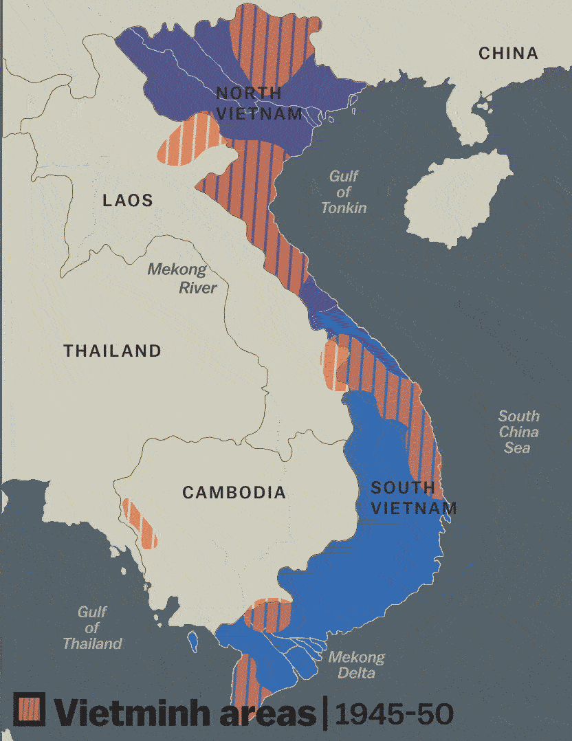
There were two Vietnam wars. In the first, Vietnamese independence leaders fought from 1945 to 1954 to expel French imperial rule. They won and took control of the northern half; the southern half was temporarily left under the pro-French Vietnamese emperor until elections could reunify the country. But the US opposed elections, fearing a pro-Soviet takeover. The Viet Cong, pro-independence guerrillas, activated throughout the South and in neighboring Laos and Cambodia to unify the nation by force. The US, again wrongly fearing a monolithic communist takeover of Asia, sent 2.7 million uniformed Americans, one third of them drafted, from 1961 to 1975 to fight the Viet Cong. The tens of thousands of American deaths, the alarming footage of US-committed atrocities, the American failures against irregular insurgents, and the sense that the war was meaningless ultimately transformed not just American politics but much of American society itself.
50) Cold War alliances in 1980
:format(webp):no_upscale()/cdn.vox-cdn.com/uploads/chorus_asset/file/784722/New_Cold_War_Map_1980.0.png)
American and Soviet fears of a global struggle became a self-fulfilling prophecy: both launched coups, supported rebellions, backed dictators, and participated in proxy wars in nearly every corner of the world. By 1971, though, the US and the Soviet Union settled into a stalemate; Nixon’s detente policy accepted the Soviets as something to be managed, not defeated. This map shows the world as it had been utterly divided by the stalemate. In 1979, the Soviets invaded Afghanistan; a year later, Ronald Reagan ran for president, promising to end detente and defeat the Soviet Union.
51) Afghanistan War
:format(webp):no_upscale()/cdn.vox-cdn.com/assets/4232335/afghanistan_war_le_monde.jpg)
Today’s Afghanistan War began in the Cold War: the Soviet Union invaded in 1979 to defend its puppet government from rebels, who were later sponsored by the US, Saudi Arabia, and Pakistan in an attempt to bleed the Soviets. When the Soviets withdrew in 1989 and the US disengaged, the country devolved into civil war between the rebel factions. In the 1990s, Pakistan helped a new extremist group, the Taliban, seize control. When the Taliban sheltered al-Qaeda during and after 9/11, the US and many other countries invaded, and found a mess 20 years in the making. This map conveys the war’s post-2001 complexity; the most important elements may be the Taliban areas, in orange overlay, and the opium production centers that fund them, in brown circles.
52) Iraq War
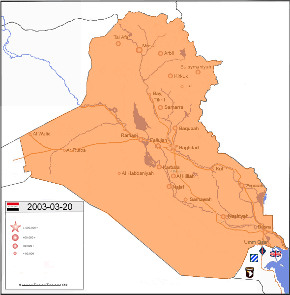
A faction of American neoconservatives agitated throughout the 1990s for an invasion of Iraq, believing that replacing the monstrous Saddam Hussein with a US-backed democracy would transform the long-troubled Middle East. Many of those neoconservatives won high positions in George W. Bush’s government. After 9/11, they pushed the CIA for evidence (in some cases fabricated) that Saddam had backed al-Qaeda and/or was developing weapons of mass destruction. In 2003, the world largely refused to sign on to the US-led war. The mostly American and British invasion was a huge success, overrunning Iraq in only a month. But the US had not planned for the occupation or reconstruction, and the country quickly collapsed into bloody sectarian civil war and multiple anti-US insurgencies. Overwhelming US force finally paused the civil war by 2008, but in 2013 and 2014 the country collapsed back into war.
53) The nuclear powers of the world
:format(webp):no_upscale()/cdn.vox-cdn.com/uploads/chorus_asset/file/784952/ILPI_world_map_Umbrellas.0.png)
In the glory years after the collapse of the Soviet Union, America became the sole global superpower, unprecedented in world history. That’s still true today, but less so, and this map of nuclear powers and military treaties is an imperfect but useful proxy for how the world is slowly re-dividing itself. In brown are the countries under the American (or NATO) “nuclear umbrella,” which means the US has pledged to protect them with nuclear weapons. Russia has formed its own such network, in blue. While Russia is much weaker than it was, it still possesses one of the world’s largest militaries and the largest nuclear arsenal, and is aggressively positioning itself as a hostile competitor to the Western system. At the same time, the countries in grey — nuclear-armed nations in neither camp — are fiercely independent from either the American- or Russian-led orders.
54) Global defense budgets
:format(webp):no_upscale()/cdn.vox-cdn.com/uploads/chorus_asset/file/18471518/Infographic.0.jpg)
Another way to show America’s status as the sole global superpower is its military budget: larger than the next 12 largest military budgets on Earth, combined. That’s partly a legacy of the Cold War, but it’s also a reflection of the role the US has taken on as the guarantor of global security and the international order. For example, since 1979, the US has made it official military policy to protect oil shipments out of the Persian Gulf — something from which the whole world benefits. At the same time, other powers are rapidly growing their militaries. China and Russia in particular are rapidly modernizing and expanding their armed forces, implicitly challenging global American dominance and the US-led order.
America today
55) Gun violence
:format(webp):no_upscale()/cdn.vox-cdn.com/uploads/chorus_asset/file/785094/s3.amazonaws.com_2Fpolicymic-images_2F649f37134abb9694871b302df9639abca1599003f9b7952eb08e0fedbb0b3c89.0.jpg)
America’s firearm-homicide rate far exceeds that of most developed countries, and as this map from the Martin Prosperity Institute’s Zara Matheson shows — using data from the CDC and the Guardian — many of our cities have rates closer to those of developing or middle-income countries than to those of Western Europe. Incredibly, the cities with the highest rates — Baltimore, Detroit, and, especially, New Orleans — face rates similar to those in Central America, the homicide capital of the world at the moment.
56) More than half of America’s wealth is inside this circle
:format(webp):no_upscale()/cdn.vox-cdn.com/uploads/chorus_asset/file/785148/m9QOWPu.0.png)
The northeast corridor — encompassing the 500-odd-mile stretch from Boston to DC, along with the rest of New York, Pennsylvania, Delaware, New Jersey, and much of New England and Virginia — accounts for 50 percent of individuals’ wealth in the United States. And it’s no wonder, either; despite making up a relatively small share of the US population, this stretch contains the New York, DC, Boston, and Hartford Metropolitan Statistical Areas, all of which are among the 10 highest earning MSAs in the entire country. More income means more assets and less debt, naturally, accounting for the remarkable fact showcased in this chart.
57) Unemployment rates by county

Talking about the United States economy as a whole can sometimes obscure the vast differences in economic well-being that exist between and within states. Take unemployment, for instance. In much of the Plains — as well as central Vermont and Grafton County, New Hampshire, and parts of Oklahoma and Texas near the Plains — there isn’t much of an unemployment problem to speak of, with the rate below 3.9 percent. But other pockets face unemployment in excess of 14 percent, a mark the US as a whole never exceeded even in the worst of the Recession. In Yuma County, Arizona, the rate was a staggering 30.2 percent from October 2013 to November 2014.
58) If the states were equal in population
:format(webp):no_upscale()/cdn.vox-cdn.com/uploads/chorus_asset/file/785302/electoral10-1100.0.jpg)
One consequence of the Senate’s design is that the voters of Wyoming get 66 times the influence as do the voters of California when it comes to Senate representation. Urban planner and illustrator Neil Freeman illustrated a creative way to deal with that problem: divvy up the country into 50 new states of equal population. The resulting map isn’t just interesting as a political document; it’s a beautiful illustration of how densely — and sparsely — populated much of the country is. The massive state of Shiprock — including Las Vegas, Albuquerque, Santa Fe, and Amarillo — has as many people as the state of Los Angeles.
59) Chance of poor kids escaping poverty
:format(webp):no_upscale()/cdn.vox-cdn.com/assets/4667565/socialmobility.jpg)
For some people, the American dream — the promise that working hard will earn you a better life — is alive and well; immigrants to the US often find their incomes multiplied many times over upon arrival. But for people born in the US, prospects are more dire. This map shows estimates from the Harvard Equality of Opportunity Project, spearheaded by economist Raj Chetty, which sought to estimate economic mobility at the county level. It found that in only a smattering of counties, mostly in the Plains, did children born into the bottom 20 percent of the income distribution have a decent shot of making it into the top 20 percent. In the South and Midwest, the odds are perilously close to zero.
60) High school grads by county
:format(webp):no_upscale()/cdn.vox-cdn.com/assets/4669731/highschool.png)
About 86 percent of Americans aged 25 or older have a high school degree or equivalent. But the rates vary dramatically depending on what region you’re looking at. In much of the South, pockets in the West, and basically all of Puerto Rico, high school completion rates are much lower. At a time in which demand for more educated workers is starting to outstrip supply, that’s concerning. Also note that maps like this can conceal inequalities lurking within individual counties. DC has a higher high school completion rate than the US as a whole, but big gaps in educational attainment between rich and poor neighborhoods persist.
61) States labeled by GDP-equivalent countries
:format(webp):no_upscale()/cdn.vox-cdn.com/uploads/chorus_asset/file/785416/USmap.0.jpg)
The US is so rich that it can be hard to wrap your mind around how much larger our GDP is than any other country’s. So Mark Perry of the University of Michigan-Flint made this map to help out. One important thing to keep in mind here is that in many if not most cases, the country being matched to each state has a larger population. California has 38 million people to Italy’s 60 million, meaning it’s significantly better off in per-person terms. There are a few exceptions to this rule, however; Sweden is less populous than Ohio, and Finland is less populous than Missouri, which means good things for Scandinavia and bad for the Midwest.
62) Female life expectancy
:format(webp):no_upscale()/cdn.vox-cdn.com/assets/4670045/femalelifeexpectancy.png)
The inequality conversation in the US tends to focus on income or wealth, but health inequalities can be just as concerning, and there’s really staggering inequality in life expectancy across the US. In Marin County, California — the longest-living county for women — life expectancy is 85.02 years; the wealthy DC suburbs of Montgomery County, Maryland, are a close second. By contrast, women in Perry County, Kentucky, have a life expectancy of 72.65 years, a difference of more than 12 years from Marin. Put another way: female life expectancy in Marin County is about the same as that in Hong Kong, while female life expectancy in Perry County is about the same as that in Bangladesh.
63) Political polarization is worse than ever
:format(webp):no_upscale()/cdn.vox-cdn.com/assets/4627051/Screen_Shot_2014-06-17_at_9.52.52_AM.png)
In 1994, 2004, and 2014, the Pew Research Center asked Americans 10 questions about their political beliefs, ranging from gay rights to environmental protection to defense to the economy. They then measured how likely people were to be consistently liberal, consistently conservative, or somewhere in between (which could mean they’re moderate, or have strong liberal views on some things and strong conservative ones on others). They’ve found that over the past 20 years, the share of Americans expressing ideologically consistent viewpoints has grown. It’s common knowledge at this point that politicians have been polarizing ideologically, but Pew demonstrates that regular Americans are, too.
64) Obesity over time
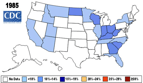
This map highlights the rapid increase in obesity rates from the 1980s to the present, as well as the disparate geographic impact the rise has had. Rates in the Deep South and Appalachia are notably higher than in the rest of the country. But every part of the country has seen an increase. In 1994, the first year for which we had data for every state, every one had an obesity rate between 10-19 percent. By 2010, every state had a rate over 20 percent, and the trend continues.
65) Shale plays
:format(webp):no_upscale()/cdn.vox-cdn.com/uploads/chorus_asset/file/785636/shale_gas.0.jpg)
This map highlights areas in the US where shale gas and oil exploration is currently ongoing. The most famous are in the Marcellus Shale (upstate New York, Pennsylvania, West Virginia, Ohio) and the Bakken Formation (North Dakota and Montana), and while those are the largest sources, there are plenty more basins across the country. This shows the remarkable growth of US energy production, driven in part by shale, which has changed the energy trade not just domestically but globally.
66) Bakken shale formation

The Marcellus Shale is the most significant shale source of natural gas, but the Bakken is almost certainly the most significant shale source of oil. This map visualizes the explosion in oil production in the late 2000s, which has had huge repercussions for the region. A one-bedroom in Williston, North Dakota, will run you $2,394 a month on average, compared to $1,504 in New York City. The fact that workers flocking to the area are overwhelmingly male has had profound and at times concerning implications for women in the area.
67) School segregation
:format(webp):no_upscale()/cdn.vox-cdn.com/uploads/chorus_asset/file/14822733/Screen_Shot_2014-08-28_at_11.18.32_AM.0.0.1543548487.png)
The demographics of America’s public schools are changing. This year, for the first time in American history, nonwhite students outnumber white ones. But racial segregation in schooling — driven in large part by segregation in housing, and thus in school-district placement — persists. The vast majority of white students attend majority-white schools. Black and Latino students are also likely to be in schools that are majority nonwhite, except in heavily white rural areas.
68) Happiness
:format(webp):no_upscale()/cdn.vox-cdn.com/assets/4802328/Screen_Shot_2014-07-23_at_6.54.20_PM.png)
This map shows the metropolitan areas in the United States with above average and below average levels of self-reported life satisfaction, based on CDC data analyzed by Harvard’s Ed Glaeser and Oren Ziv and University of British Columbia’s Joshua Gottlieb. This chart controls for demographic facts about the areas in question but not income; since income depends in large part on where you live (and may depend on your happiness level) controlling for it in this context might be more trouble than it’s worth. “The map shows a band of less happy areas in parts of the Midwest and the Appalachian states, stretching from Missouri in the West and Alabama in the South well into Pennsylvania and even New Jersey in the East,” the authors write. “New York City, Detroit, and much of California also have lower SWB [subjective well-being] than the happiest areas, which are concentrated in the West, Upper Midwest, and rural areas in the South.”
69) Cost of living
:format(webp):no_upscale()/cdn.vox-cdn.com/uploads/chorus_asset/file/2923942/Metro_20Price_20Parity_0.0.0.png)
The feeling that everything is more expensive in New York City isn’t an illusion. There’s considerable variation between states and metropolitan areas in terms of cost of living. This map takes price comparisons for metropolitan areas and then adds in state-level numbers for counties not in a metropolitan area. As you’d expect, dense urban areas are significantly more expensive, and rural areas in the Plains, Midwest, and South significantly less expensive. There are some conceptual difficulties here: living in Manhattan is more expensive than living in Indiana, yes, but part of that is because there are intangible benefits to living in Manhattan that are hard to model. But overall it’s an illuminating comparison.
70) Wealth inequality
:format(webp):no_upscale()/cdn.vox-cdn.com/uploads/chorus_asset/file/820548/SaezZucman2014Slides.0.png)
Economic inequality is on the rise, not just in incomes but in wealth, which arguably matters more for political power and long-term privilege. Thomas Piketty, of course, has argued that such a rise is inevitable in rich countries. But it’s worth noting just how concentrated a phenomenon the rise in wealth inequality is, as recent work by frequent Piketty coauthors Emmanuel Saez and Gabriel Zucman shows. The share of wealth going to people in the top 1 percent but not the top 0.1 percent did not grow at all over the last 100 years. The entire increase is explained by the top 0.1 percent, and especially the top 0.01 percent.
Learn more
- 42 maps that explain World War II
- 41 maps (and charts) that explain the Midwest
- The real state of the union, in 33 maps and charts
Credits
Writer Max Fisher
Writer Dylan Matthews
Developer Yuri Victor
Correction: This post originally mistakenly stated that Sweden is more populous than Ohio and Finland more populous than Missouri; the reverse is true.